What is motion design? A plain guide for marketing teams
Motion design is graphic design that moves: type, shapes, logos and interfaces timed to explain something. How it differs from animation, editing and VFX, the tools, and how to brief it.

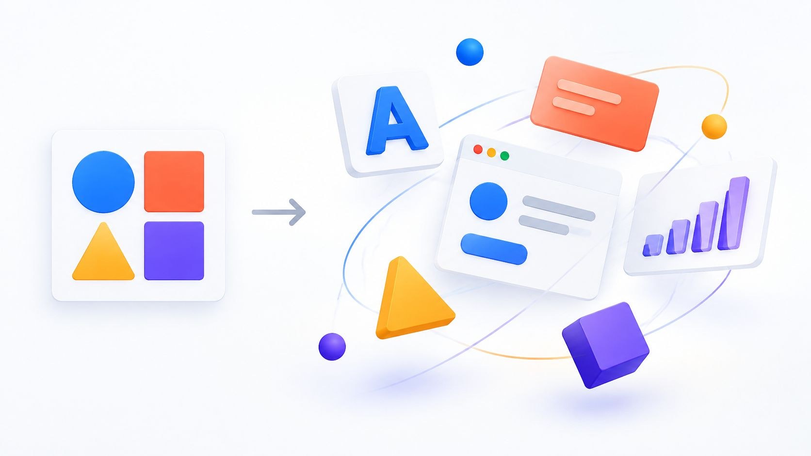
Motion design is graphic design that moves: type, shapes, logos, charts and interface elements, timed so the movement itself tells the viewer something.
One marketer wants a logo that animates. Another wants “something moving for LinkedIn.” Both are motion design, and they need completely different briefs. I work at Moonb on motion graphics projects, where the term rarely means the same thing twice.
What motion design means in practice
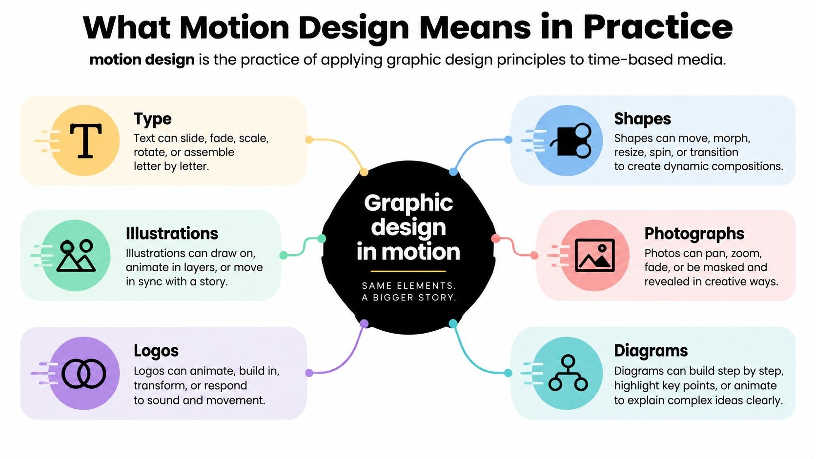
A motion designer uses the graphic designer’s materials (typography, shapes, illustrations, photos, logos, diagrams, interface screens) and adds time. Most of the job is deciding when things appear and where the eye goes after that.
Say a software company wants to show how a support request becomes an assigned task. A static diagram puts the stages side by side. Motion can follow a single request through the queue until it reaches the right person. Watching that is far easier than decoding four boxes and three arrows.
Most of my notes to clients come back to one idea, that the movement should be telling the viewer something. If a box grows, it should be because it matters more, and a transition between two ideas should mean they’re connected. I go through drafts removing any move that would lose nothing if it stood still.
The craft is older than the software. The animator John Whitney worked with the graphic designer Saul Bass on the titles for Hitchcock’s Vertigo (1958), and in 1960 he founded Motion Graphics Incorporated, which made film and TV title sequences and commercials on an analog computer he built himself (his Wikipedia entry has the details). Title sequences are still where most people first notice the craft.
How motion design differs from nearby crafts
Briefs mix up motion design, motion graphics and animation more than anything else. Someone sends one request to three people, gets three quotes for three different jobs, and assumes somebody is overcharging. Usually each quote is fair for the job that person pictured. This is roughly how I tell the jobs apart.
| Craft | What it makes | Typical tools | Where marketers meet it |
|---|---|---|---|
| Motion design | Designed elements (type, logos, UI, diagrams) timed to explain or identify | After Effects, Cinema 4D, Figma prototypes | Brand idents, product launch teasers, animated data |
| Motion graphics | The finished pieces motion design produces; most people use it as the deliverable name | After Effects, Cinema 4D | Titles, lower thirds, explainer graphics, social cutdowns |
| Animation | Characters, objects and stories performed over time | Cinema 4D, Rive (for interactive characters) | Character explainers, mascots, illustrated spots |
| Video editing | A sequence shaped from footage someone already shot | Adobe Premiere | Interviews, event recaps, testimonial films |
| VFX | Imagery added, removed or composited inside a shot | After Effects, Cinema 4D | Screen replacements, product cleanups, CG environments |
I took the tool column from the vendors’ own pages. Adobe describes After Effects as “a motion design and visual effects software app” and recommends editing video clips in “a dedicated video editing app like Adobe Premiere.” Maxon’s Cinema 4D page pitches it to motion designers for “broadcast graphics, brand animation, title sequences, kinetic typography,” and separately to 3D and VFX artists.
A single product film can need an editor for the interview, a motion designer for chapter titles and callouts, and a VFX artist to clean a reflection off a filmed device, so describe each need separately.
Don’t sort by look either, since a hand-drawn sequence can explain a workflow and a polished 3D piece can tell a character story. Our guide to animation styles covers the look side; for picking the craft, start from what the piece has to do.
The full catalog of formats (kinetic type, logo animation, infographics and so on) lives in the companion post on types of motion graphics, and motion graphics explainer videos goes deep on explainers.
The principles that make movement mean something
Most motion design borrows character animation’s old rulebook. A University of Waterloo computer graphics course (CS488 slides), which assigns John Lasseter’s 1987 SIGGRAPH paper on applying traditional animation principles to 3D as reading, lists twelve of them. For marketing work I’d keep these six in your head:
- Timing: how long an action takes, which also tells the viewer how heavy something is (light things move quickly, heavy ones slowly).
- Staging: making the important action easy to spot.
- Anticipation: preparing the viewer for a change, like a card pulling back slightly before it expands.
- Follow-through: “actions seldom come to an abrupt stop,” as the slides put it.
- Overlapping action: related parts start and stop at slightly different moments.
- Slow in and slow out: an object slows down as it reaches a pose and as it leaves it, the way most real things start and stop gradually.
Designers usually talk about slow in and slow out as easing, and the illustration below mixes that with two working terms of its own, spatial continuity and contrast.
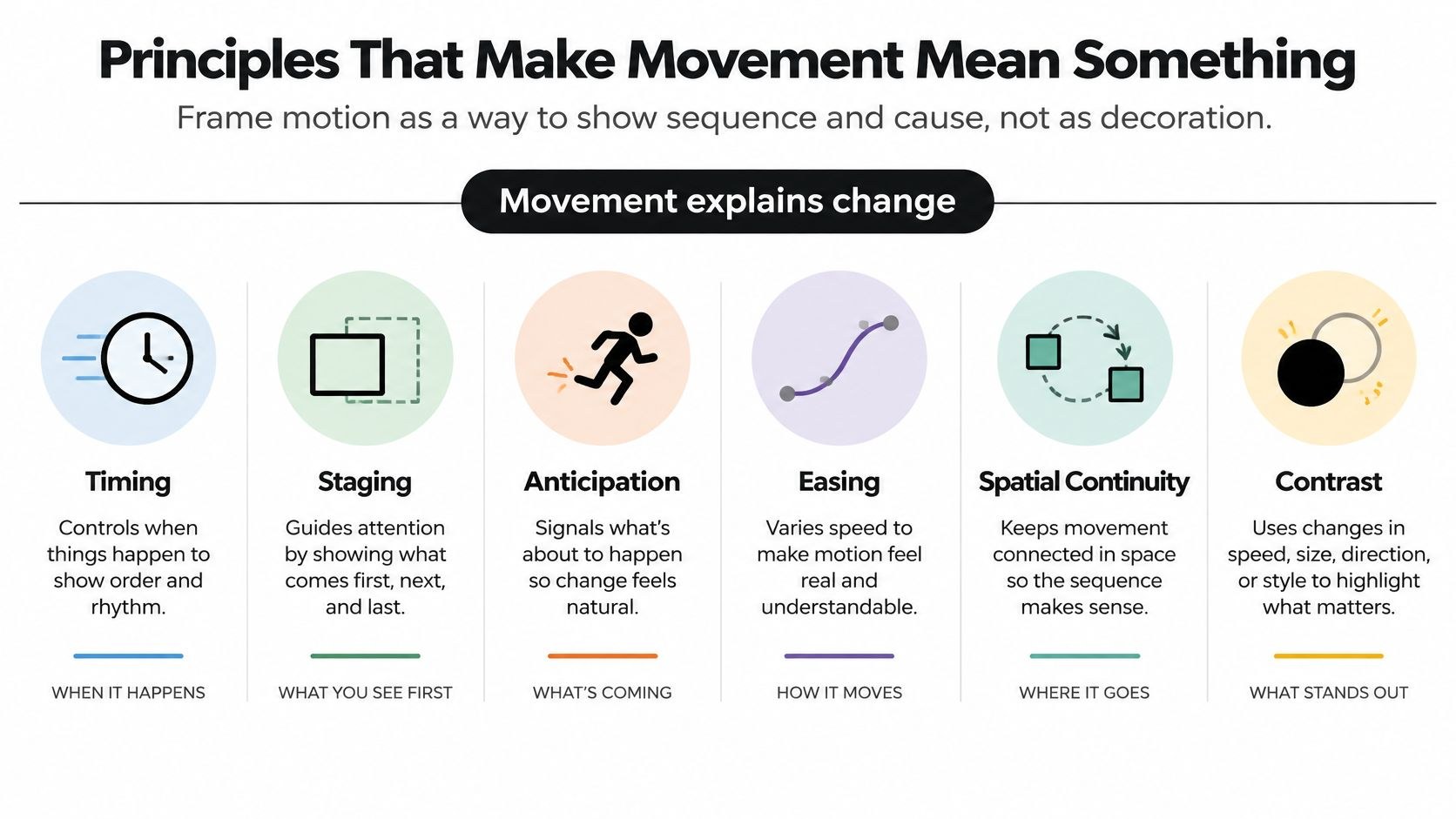
Picture a selected card expanding into a detail view. If it keeps its title and color, the viewer reads it as the same object in a new place; move everything on the screen at once and that connection is gone. Staging in a demo is similar: highlight the field someone should fill in, and only then show what happens when they do.
When the words are the whole show, the same rules apply to text, through pacing and emphasis. I wrote about how that looks in my piece on kinetic typography.
Google’s design team has a tutorial on implementing motion with Material Design, its own set of product motion rules.
Write down behavior next to color and type
Brand guidelines usually stop at static rules, which bugs me. Design systems now publish motion rules as tokens, named values for duration and easing, and I like how Google’s Material Design 3 spec does it. It says “Selection controls have a short duration of 200ms with Standard easing,” while “A Card expanding to full screen uses a long 500ms duration with Emphasized easing.”
For a brand, write down how long a move lasts, how its speed changes (the easing curve), when it starts relative to the move before it, which direction things enter and leave, and, for product UI, what happens if someone clicks again halfway through. Keep that next to the palette and type scale.
Where marketing and product teams run into it
Titles and lower thirds open a film, name a speaker or split chapters, and the motion should stay quiet so the subject keeps the attention.
Product UI motion is the least visible of these. It tells someone their click worked, or guides them through a task step by step. Our UI animation guide has a dozen real interface examples. A lot of it ships as Lottie, which Airbnb’s Lottie docs describe as a library that “parses Adobe After Effects animations exported as JSON with Bodymovin and renders them natively on mobile and on the web”; our explainer on what a Lottie animation is goes through the format.
Social cutdowns squeeze a longer story into a smaller frame for someone who may have the sound off, so the type has to carry the message alone and stay on screen long enough to read.
Then brand idents and logo stings, which give a mark a recognizable way to arrive or sign off. The rhythm and direction of that move (and the sound, if there is one) end up as part of the identity.
Data in motion reveals a chart or comparison in a deliberate order. My rule here is to show the baseline before the change and keep the labels still while the values move.
Plan formats early. A horizontal composition often loses its labels or its main action when someone crops it to vertical later. Google Ads’ video specs give recommended HD sizes for the three main shapes:
| Shape | Aspect ratio | Recommended HD size |
|---|---|---|
| Horizontal | 16:9 | 1920 x 1080 px |
| Vertical | 9:16 | 1080 x 1920 px |
| Square | 1:1 | 1080 x 1080 px |
The tools, and what each one is for
After Effects is the default for timeline-based motion graphics: titles, logo animation, animated charts, compositing. Cinema 4D brings 3D forms and lighting, and Maxon highlights its “native After Effects integration,” so designers often run the two as a pair. Footage gets edited in Premiere, and the After Effects graphics get dropped into that edit.
For product and web motion, Figma holds the static design system and quick prototypes, and its Smart Animate feature “looks for matching layers, recognizes differences, and animates layers between frames in a prototype.” Rive is built for interactive graphics that respond to input, with open-source runtimes for apps and websites. Lottie is different again, since the animation gets made in After Effects and ships as a JSON file.
AI tools are arriving too. ShipTeaser’s post on AI motion graphics draws a distinction I found useful. Prompt-to-video models invent scenes from scratch, while AI motion graphics tools assemble a short teaser from assets you already have, such as page copy, screenshots and your logo.
If you want a feel for what learning After Effects involves, Adobe’s own beginner workshop is the one I’d send a marketer to.
How a motion project runs and how to brief it
Start with two answers: what the viewer should understand afterward, and where they’ll watch it. Most later decisions follow from those.
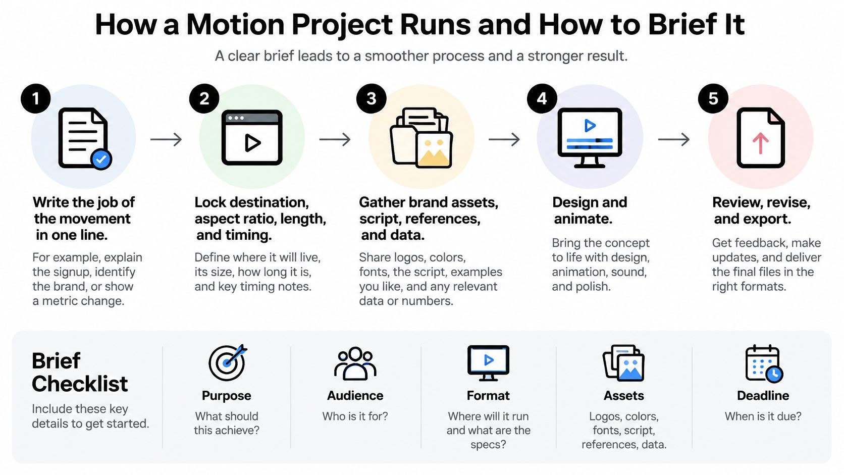
The image keeps it to five steps. In practice, most projects I work on run through seven, in about this order.
- Write the job in one line. “Show how signup works in three steps” is a brief; “Make it pop” gives the designer nothing to work with.
- Lock the destinations (aspect ratios, lengths, sound, captions) before anyone draws a frame, and list every version you need so the compositions are planned to survive the crop.
- Agree on a frame rate that matches any footage the graphics will sit in, or the motion stutters when the pieces are combined.
- Storyboard the beats and the copy: what appears, what changes, what the viewer has to read. Changing a rough board takes minutes, and the same change in finished animation can eat days.
- Design the key frames, then animate them.
- Review the actual export on the screen it’s made for, since compression can soften thin type and change how fast effects feel.
- Deliver the full package: masters, cutdowns, caption files, and the editable project files your team will need later. Label versions so an old export doesn’t get published by accident.
My guide to the animation process covers the handoffs in more detail, and our creative brief guide is a good starting template. A motion brief should name:
- Who’s watching and the one thing they should take away
- Inputs: brand files, references you like, approved data and any wording that can’t change
- Brand rules: logo clear space, type, colors, treatments that are off limits
- Delivery: lengths, ratios, destinations, sound and captions
- Approval: the deadline and the one person who signs off
Projects slow down most in review. A note like “Make it more energetic” leaves everyone guessing, while one that names the problem, say “The label disappears before I can read it”, is often an afternoon’s fix.
You’ll be comparing independent specialists, in-house hires and studios, in a small field that leans freelance. Special effects artists and animators held “about 51,900 jobs in 2025,” per the US Bureau of Labor Statistics, and 63 percent of them were self-employed. A one-off logo sting suits a freelancer. A steady stream of social and product work usually needs a team that keeps the motion rules consistent. Whoever you hire, ask who keeps those rules consistent over time and which source files you’ll own when the work ends.
Limits that keep motion useful and safe
Parallax backgrounds, endless loops, fast cuts and flashes distract people, and some viewers get physically unwell from them.
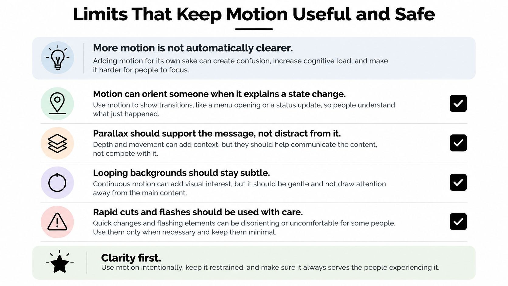
The web accessibility guidelines draw specific lines. WCAG success criterion 2.3.3, Animation from Interactions, says “motion animation triggered by interaction can be disabled, unless the animation is essential,” and explains that scroll-triggered movement and parallax can set off vestibular reactions such as dizziness and nausea. On a website, the practical way to respect that is the CSS media feature prefers-reduced-motion, which MDN says detects “if a user has enabled a setting on their device to minimize the amount of non-essential motion.”
Two more criteria apply to marketing assets. Pause, Stop, Hide (2.2.2) asks for a pause, stop or hide control on any movement that plays on its own, runs alongside other content and “lasts more than five seconds,” unless the movement is essential. Three Flashes or Below Threshold (2.3.1) rules out anything that “flashes more than three times in any one second period” unless it stays below the defined thresholds. Glitch effects and strobe transitions need checking against that one.
For video, plan readable captions with enough contrast against every moving background, and hold important text still long enough to read. Check type size and how crowded each frame is while it’s still a storyboard.
How to tell if the motion is working
Use measures your team already reads, and record a baseline before you publish.
| Metric | What it shows | Where to read it |
|---|---|---|
| View-through rate | Share of viewers who watch to a set point | Video platform analytics |
| Completion rate | Share of viewers who reach the end | Video platform analytics |
| Click-through rate | Clicks per impression on a motion ad | Ad platform reports |
| Time to complete a task | Whether an animated step helps people finish faster | Product analytics or usability sessions |
| Support tickets per screen | Whether a flow confuses fewer people after a change | Support desk records |
| Page load time | What the animation costs the page | Browser performance tools |
No universal target fits an interface transition, a brand film and a performance ad alike, and definitions of completion and view-through can differ between platforms, so check the definitions before you put two reports side by side. When you test, keep the message and placement and change only the motion, or you won’t know whether the movement helped.
Frequently asked questions
Mostly, yes. People tend to use motion design for the discipline and motion graphics for what it produces: titles, animated charts, logo stings. In a brief the label hardly matters. Describe what the movement has to do and list every format you need delivered.
A motion designer, if the asset is mostly type, logos, interface screens or diagrams moving to explain or identify something. An animator, if a character or object has to perform, act or tell a story. Plenty of people do both. When you look through a reel, pay most attention to the pieces that resemble your job.
Where it plays decides most of it. A logo sting can be over in a couple of seconds, while a social cutdown has to make its point before the viewer scrolls past. Pick the destination first and let the script set the length. Cutting a long piece down later usually costs more than planning the short versions from the start.