Brand Identity Design
Logo, color, type, and the rules that keep all three working together. Your dedicated design team builds the system, then applies it everywhere it goes, so you read as one confident company on the site, the deck, and the hundredth social post. No drift. No lookalike assets that only share a name.
See our approach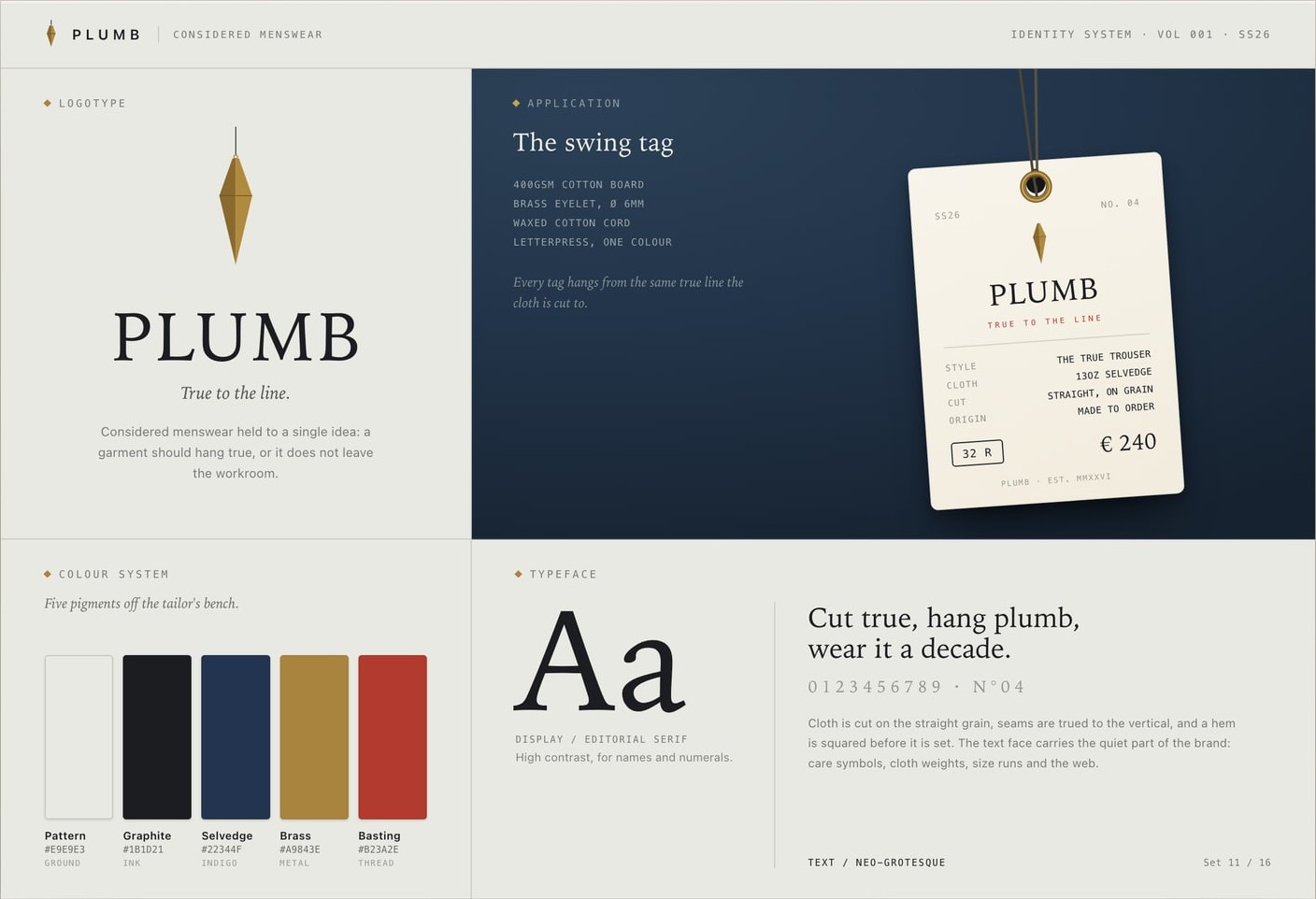



What we produce
Everything your brand needs designed, by one team that already knows exactly how it should look.
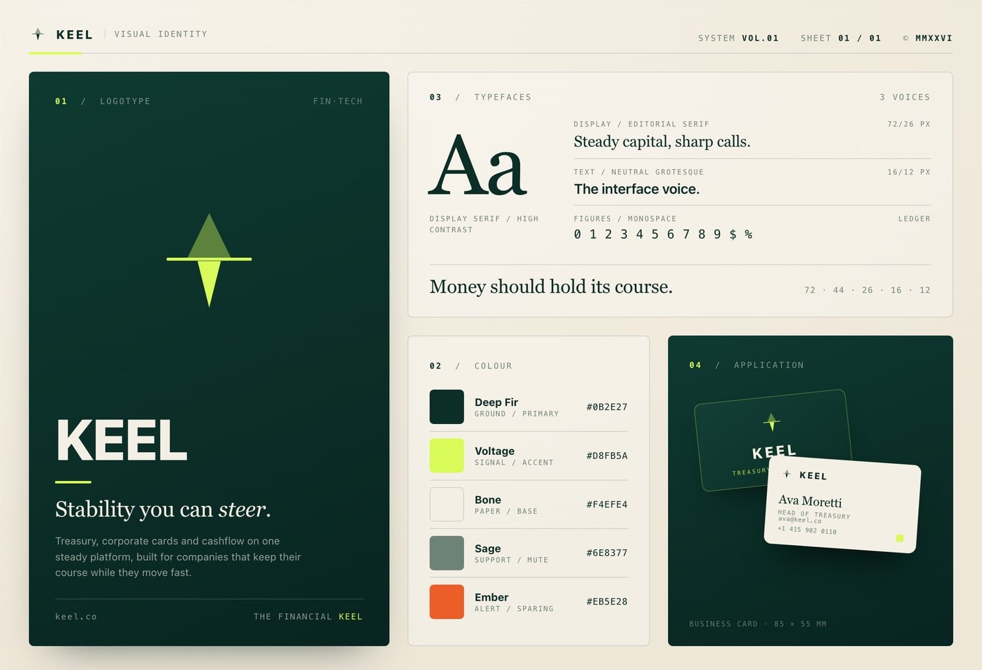
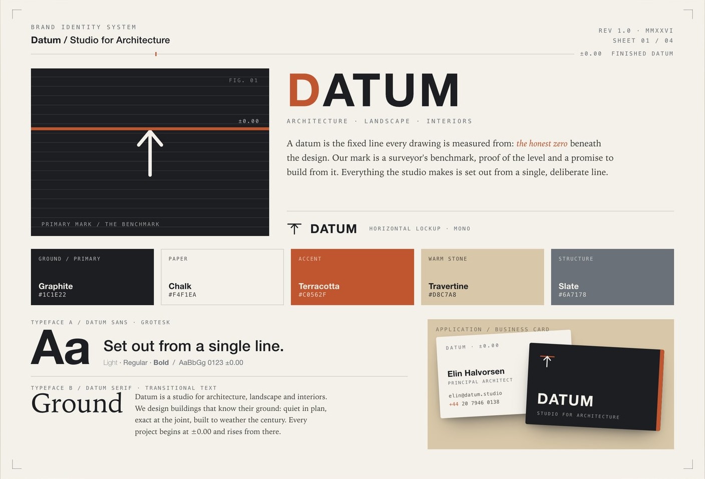
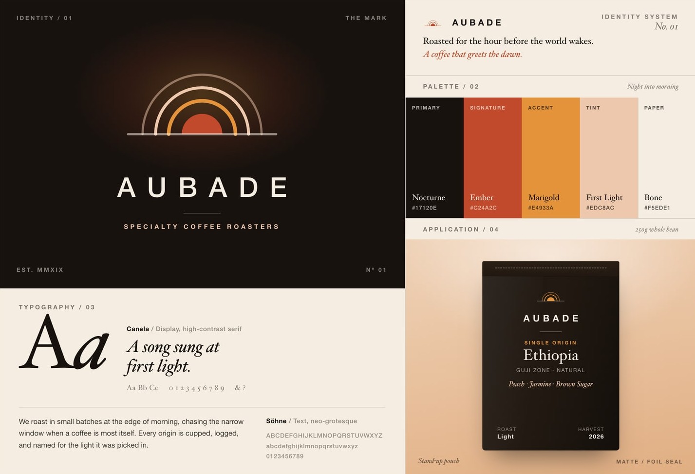
Logo design
One mark that works everywhere, plus the smaller cuts that do the real work. Favicon, app icon, and the twelve-pixel version in a slide corner that still reads as yours.
Visual system
Color, type, spacing, and the layout rules that tie them together. This is what turns one logo into a look that carries across a landing page, a billboard, and a business card.
Brand guidelines
One document your whole team can actually follow. Not a rulebook nobody opens, but the clear short version of how the identity gets used, and how it does not.
Typography system
The right typefaces at the right sizes and weights, paired and set once. So a headline and a caption both read as unmistakably yours.
Color palette
Exact values for screen and print, run through contrast checks so text stays legible, with clear rules for what pairs with what.
Rebrand and refresh
Update an identity that has drifted or started to age, without throwing away the recognition you already paid for.
And plenty more. If it needs designing, it comes back looking unmistakably like you.
Consistency is where brands fall apart.
A logo is the easy part. The identity is everything around it staying in agreement, so the hundredth asset still matches the first. That agreement is also the first thing to slip, usually because the work gets scattered across people who never see each other's files. We keep it in one place.
The logo gets all the attention. It matters the least.
Everyone obsesses over the logo reveal. Meanwhile the thing your customers actually see is the hundredth social post, the sales deck, the email footer, the box on the doorstep. That is where a brand either feels like one confident company or three that happen to share a name.
So we design for the boring middle, not launch day. A system simple enough that whoever makes next Tuesday's post gets it right without pinging a designer. Consistency isn't a limit on your brand. It is your brand.
The same people, holding the line.
You get a dedicated design team that learns your identity once, then applies it everywhere after. New asset, new channel, or a refresh two years in, it goes back to the people who built the system, so it reads on-brand the first time, not the third. A Creative Director signs off on all of it, which is why the fiftieth thing still looks like it came from the same place as the first.
Why a dedicated team keeps a brand consistent
An identity does not break on launch day. It breaks six months later, when a new hire, a freelancer, and an agency have all touched it and none of them saw the same files. A dedicated team is the fix. The same people apply your identity every week, they already have the source artwork, and a Creative Director signs off, so the fiftieth asset still matches the first instead of drifting into three brands that share a name.
What brand identity design costs
These are the 2026 ranges for a branding project by who you hire, from a template builder to a full brand agency. A dedicated Moonb team builds identity work on a per-project quote, or as part of one set monthly rate when the brand keeps evolving after launch.
| Who you hire | Typical project cost | What you get |
|---|---|---|
| Templates and DIY tools | under $500 | a placeholder before you have traction |
| Freelancers and marketplaces | $500 to $8,000 | one person's hours, quality varies |
| Independent studios | $8,000 to $40,000 | senior hands on the work |
| Brand agencies | $40,000 to $150,000+ | a full team and a process |
| Dedicated Moonb team | a per-project quote, or one set monthly rate when the brand keeps evolving | senior designers and a Creative Director who stay on the brand after launch |
What each deliverable adds to the number is in our guide to what branding costs.
What a Full Identity Includes
One team builds the whole system, then keeps applying it, so every piece stays in agreement instead of drifting apart.
- Logo and its smaller cuts
- Color system for screen and print
- Typography system and scale
- Brand guidelines your team can follow
- Social and content templates
- Deck and document styling
- Iconography and brand assets
- Packaging and print
The part that compounds
A new team's first asset is rarely their best. Their fiftieth is. When the same people apply your identity long enough, they stop guessing: they know which layouts hold, where the brand bends, and what to reach for on a Tuesday deadline. The system tightens, the shared library grows, and it stays on-brand without anyone policing it.
The longer the same team holds it, the less it drifts.
How it works
From signup to first delivery in under 2 days.
Meet your team
You get a Creative Director and a team who learn your brand, your files, and how you like to work.
About 30 minutesSend the work
Brief them like colleagues. Your Creative Director runs the queue and keeps everything on-brand.
As much as you needGet it back fast
Polished work comes back on a steady weekly rhythm, revisions included until it is right.
No change-order feesThe ability to quickly understand and adapt to the company branding was impressive.
Ready to start your brand identity?
Book a CallFrequently Asked Questions
Freelancers and marketplaces run $500 to $8,000, independent studios $8,000 to $40,000, and brand agencies $40,000 to $150,000+, with strategy, naming and the size of the application set moving the number. A dedicated Moonb team builds identity work on a per-project quote, or as part of one set monthly rate when the brand keeps evolving.
Yes. The logo files, source artwork, and guidelines are yours outright. Fonts are the one thing to watch: we either license them in your name or choose solid open-source typefaces you can use freely, and we tell you which is which before you sign off. No licensing surprise a year later.
Often, yes. If the logo is doing its job, we keep it and build the color, type, and layout system it has been missing. If it is quietly holding you back, we will say so and show you what a refresh would actually change before you commit. We would rather tell you the logo is fine than sell you a new one.
A focused identity (the logo, the core system, and a working set of guidelines) usually arrives in a few weeks, not months. Because it is a dedicated team working closely, you review real work early and often, instead of waiting on one big reveal at the end and hoping you like it.
The logo with its spacing and its don'ts, color values for screen and print, the type scale, and real examples on the assets you use most, like a slide, a social post, and an email. Built for the non-designers on your team to actually use, not to sit in a drive looking impressive.
Yes, and that is the real point. The same people go on to design your social posts, decks, one-pagers, and whatever comes next in it, so it stays consistent instead of slowly drifting. You are not handed a PDF and left to police it on your own.
Less than you would think. Whatever brand materials already exist, a sense of the companies you admire and the ones you never want to be mistaken for, and a bit of time from someone who can actually make decisions. That last one matters most. Identity work stalls when feedback comes from a committee that never quite agrees.
A few strong ones, not thirty. We would rather show two or three directions we can each stand behind and explain, then refine the one you pick, than bury you in options and leave you to sort out the mess. More concepts usually means less thinking behind each one.
Everything in the formats your team and tools actually need. Vector source for the logo and icons, web and print color values, packaged fonts or licenses, and the guidelines as a shareable doc. If a specific tool needs a specific export, just ask and it is in the handoff.
Ready to level up your creative?
Tell us what you're working on and we'll take it from there.
Book a Call


