7 Kinetic Typography Examples for Brand Video
Seven real kinetic typography examples, from Apple's restraint to Spotify Wrapped's loud data statements, with the production order that protects the idea.

Kinetic typography is animated text whose movement, timing, scale, and transformation help carry a message over time. The strongest brand examples right now come from Apple, Spotify, and Nike, three companies that animate words for completely different reasons. Apple uses restraint, Spotify turns personal data into loud statements, and Nike strips the screen down to nothing but words.
I review motion work all week as part of a creative team that produces it, and clients forward me kinetic type references more than any other format. Most of those references share a problem. The team liked the energy of the motion and never asked what the words were doing. So before the list, one piece of research worth knowing: an eye-tracking study on kinetic typography compared animated text against static serial presentation and found that fluid typography produced more saccades, longer total saccade duration, and shorter average fixations in the tested conditions. Motion changes how people read. That can help scanning, and it can also make reading harder when the timing gets careless.
Here are seven real brand examples, each with the real work on the page, followed by the production decisions that separate the good ones from the decorated ones.
1. Apple’s product reveal films
Apple’s product films make a single short statement do the work of an entire scene. The iPhone Air reveal below opens on its claim, incredibly light and thin with pro-level performance, then spends most of its runtime proving it with the product itself.
The observable choice is restraint. A phrase may fade, scale, or slide into place, but the animation never competes with the message. Apple’s own type family, San Francisco, gives the work a consistent voice across product pages, presentations, social edits, and retail screens, so the brand moves between formats without rebuilding its visual language each time.
The rule I take from Apple: if the brand already has a strong typeface, use it confidently. Extra outlines, shadows, and decorative effects usually weaken the authority of a restrained system. The failure mode I see most often is the opposite instinct, a team that distrusts its own type and piles on treatment until the words look like a party flyer.
The production lesson is simple. Lock the copy and audio before timing anything, then test the animatic on a phone held at arm’s length. Generous white space either preserves readability or exposes a type size that was too cautious. Teams building this kind of work can look at our kinetic typography service for how animated text extends into manifesto films, title sequences, and lyric-style pieces.
2. TED-Ed’s animated lessons
TED-Ed uses moving type as part of a teaching system. In Where do new words come from?, the words are both the subject and the visuals: key terms land on screen in display type beside the illustrations (villain gets a full blackletter treatment), and the Oxford English Dictionary appears as a wall of numbered spines.
The concrete strength is sequence. A key term appears as the narration explains it, never as a dense block. The motion follows the spoken cadence and gives viewers a visual marker for the idea being explained. That makes kinetic type a natural fit for education, where emphasis and order matter more than spectacle.
Writing for this format means writing for the ear. A sentence that reads fine in a document can feel crowded when a narrator says it aloud over animation. Once the voice track exists, the designer reveals terms in step with the narration, then tests the piece with sound off to confirm every important line still makes sense. Our guide to the animation process covers this kind of ordered production in more depth.
TED-Ed’s example works because motion reveals information in sequence. It never asks movement to replace the explanation.
3. Spotify Wrapped’s data statements
Spotify’s Wrapped campaign is the loudest kinetic type system in mainstream marketing, and its home is the in-app data story. Every year-end the app deals out a run of animated cards: bold sans-serif statements, saturated colour, and your own listening data turned into copy. The brand art below, from Spotify’s own design team, shows the system at full volume.
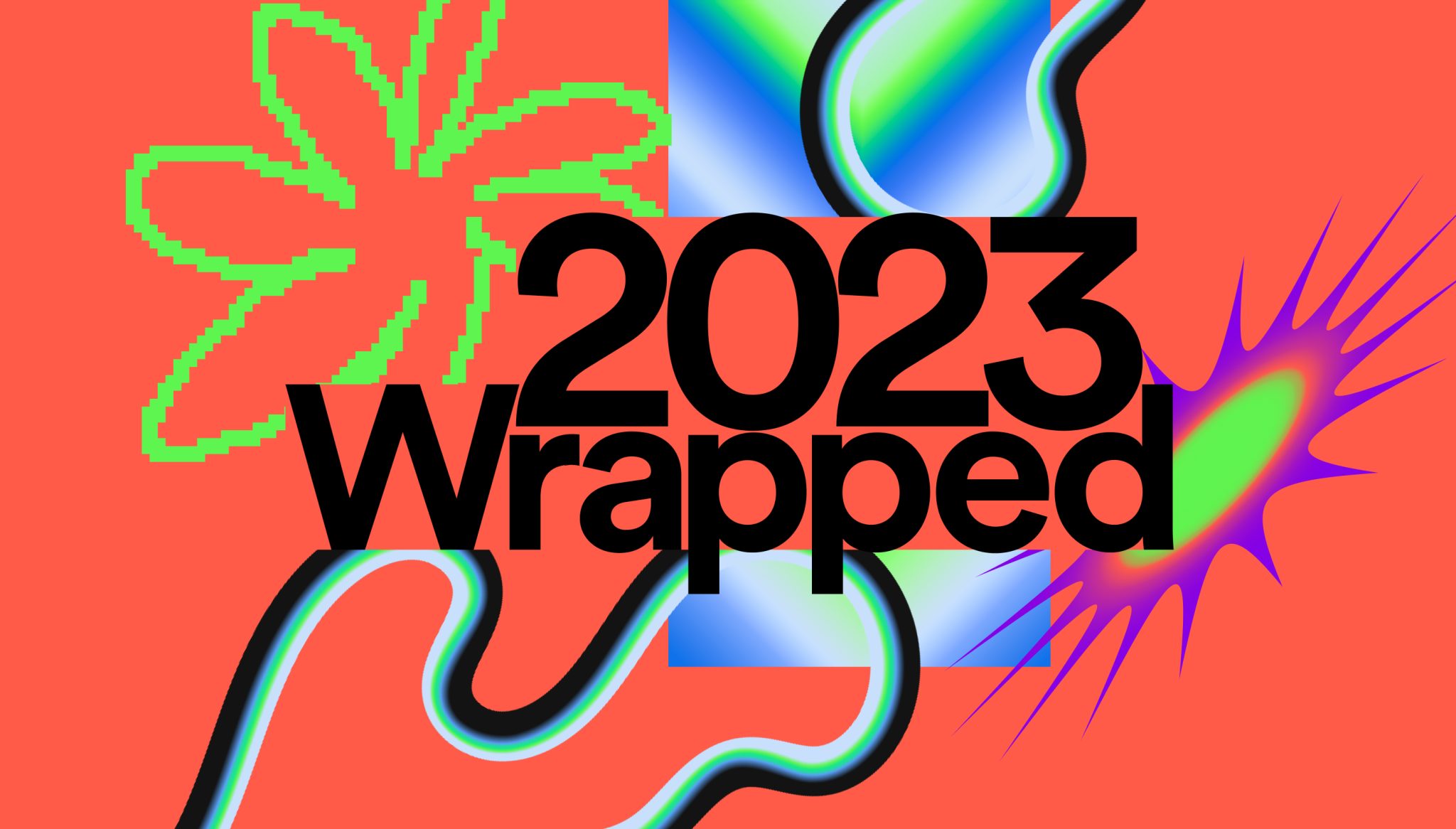
The visible choice is accumulation. One card establishes a thought, the next reinforces it, and the composition keeps shifting as the story builds toward your top artist. That structure suits Spotify because the campaign is selling a feeling of personal recognition rather than a product feature. The numbers and phrases are the content, so the type has to carry the whole frame.
A grey-text animatic is still the honest test for this kind of work. If the sequence has no rhythm in plain words, colour and texture will not repair it. Assign each phrase to a beat or a pause, then decide which words earn scale, weight, or a position change.
Layered typography brings a real risk. Overlapping statements that feel energetic on a big screen become an unreadable tangle on a phone. The mobile check has to happen while the layout is still simple, before the final effects go in. Wrapped also shows the value of a versioning plan; the same timing map feeds the in-app cards, short social edits, and campaign placements without inventing a new language for each.
4. Nike’s type-only message film
Nike proved the format can carry its most serious message. For once, Don’t Do It is nothing but white type on a black screen, one line at a time, and it opens by inverting the most famous tagline in sport.
The observable technique is reduction. No footage, no faces, no colour, no music video pacing. Each line appears, holds until it lands, then gives way to the next; the rhythm is closer to someone speaking carefully than to a montage. When the film reaches “Don’t pretend there’s not a problem in America”, the stillness is the point. Footage behind those words would have softened them.
Type-only films look simple to make and are unforgiving to write. With nothing else on screen, every extra word shows, and a line that holds a beat too long reads as padding. Test the edit with sound off and at the faster playback speeds social viewers actually use; here the type is also the caption track, so timing has to survive both.
The restraint doubles as protection. White on black gives every line total priority, and the single typeface keeps the film feeling like one voice from first frame to the closing swoosh. The approach works when the copy is already short and forceful. It falls apart the moment a team tries to force a full paragraph into the same treatment; I have watched that exact edit die in review more than once.
5. Headspace’s calm pacing
Headspace takes kinetic typography in the opposite direction. In its Breathe mini meditation, the guiding words sit in soft grey below a slowly breathing shape, and each word brightens as the guide reaches it. The motion feels closer to breathing than to a beat drop.
That pacing fits the job. A meditation product needs to reduce pressure, and a gentle word-by-word highlight guides attention without making the viewer chase a line across the screen. The type has room to settle, and because the instructions are on screen, the piece survives muted playback completely.
Slow is not automatically readable, though. A line can enter softly and still leave the screen too soon, especially when the viewer is reading at natural pace rather than following a voiceover. Test every screen with someone seeing the content for the first time.
Two practical checks matter here. The typeface licence has to cover screen use and the intended digital applications. And thin weights at low contrast can disappear on mobile even when the composition looks polished on a large monitor. For in-app experiences, a static or reduced-motion sequence gives users control without removing the content.
Headspace makes the broader point clear. Kinetic typography is not defined by speed. Its meaning comes from the relationship between the words, the movement, and the emotional job of the brand.
6. GoPro’s spec callouts
GoPro uses animated text to make technical information visible inside action footage. Its HERO launch content places specifications and capability statements around a fast-moving frame, as in this HERO13 Black feature rundown.
The concrete choice is timing. Bold condensed capitals land right over the action in short readable holds, one spec at a time, and changes tend to land on edit points in the footage, so the graphic feels attached to the camera experience rather than pasted over it.
This is a different job from Nike’s message film. GoPro’s words need to inform. If a specification flashes by before the viewer can parse it, the animation has failed even when the edit feels exciting. A slower web version and a faster social cut can share one design system with different holds.
A dependable pass on this style checks four things: each text change enters on a meaningful cut or action beat; the same callout works in 16:9, 9:16, and 1:1; captions match the on-screen wording and timing; and weight and colour stay stable unless a change signals a clear priority. The format works for GoPro because the footage proves the product while the type names what to notice.
7. Dropbox’s interface storytelling
Dropbox has leaned on simple demonstrations since its earliest days, when a plain demo video did most of the selling. For All Things Worth Saving keeps the story inside the interface itself: a search field types out what someone is looking for, folder names and file labels settle over scanned family photos, and the words do the narrating.
The visible strength is clarity through staging. One idea appears, gets context, and gives way to the next. The moving text is familiar interface type, a typed query, a breadcrumb, a file name, so the viewer reads it the way they read their own screen. That suits Dropbox because the product’s job is invisible until you watch it holding something a person cares about.
Typed-on text has its own timing discipline; the cursor has to move at reading speed, and the audio track’s pauses set where each label can land, so choose the audio before finalising any type timing. A plain-text animatic reveals whether the story is overloaded, and it keeps revision fast because the team is fixing structure before anyone spends hours on movement, illustration, or sound. Captions belong in the plan from day one rather than as an export afterthought.
For a wider look at the format, our guide to company explainer videos and this roundup of explainer video examples are useful companions. Dropbox’s example works because the motion organises text the viewer already knows how to read. The words never have to carry the whole film alone.
How the seven examples compare
| Example | Brand goal | The move to steal | Watch out |
|---|---|---|---|
| Apple, iPhone Air reveal film | Make one product claim feel inevitable | One short statement per scene, held in generous space | Restraint exposes weak copy; the words must earn the silence |
| TED-Ed, Where do new words come from? | Teach a narrated idea in order | Land each key term on screen as the narration explains it | Scripts written for the page feel crowded when spoken |
| Spotify, Wrapped data cards | Turn personal data into a shareable moment | Let statements accumulate, each card building on the last | Layered type that sings on desktop tangles on a phone |
| Nike, For once, Don’t Do It | Carry a serious message with words alone | White lines on black, one thought per hold | With nothing else on screen, weak copy has nowhere to hide |
| Headspace, Breathe mini meditation | Lower the viewer’s pressure | Long holds and a word-by-word highlight that lets type settle | Slow entrances still need enough on-screen time to read |
| GoPro, HERO13 Black feature rundown | Make specs legible inside action | Land bold capitals on edit points, one spec per hold | A spec that flashes past has failed, however exciting the cut |
| Dropbox, For All Things Worth Saving | Make an invisible product feel personal | Let typed searches and file labels narrate | Interface-sized type still needs readable holds |
When kinetic type is the right call
Choose kinetic type when the message is a quote, statistic, tagline, manifesto, or lyric, when there is no useful footage or product UI to show, when the piece may run with sound off, and when the brand has a typeface strong enough to carry the frame. On length, the pieces I review hold up best under about 90 seconds; past that, even good type starts to feel like a lecture.
A product launch with no usable footage is the clearest case. The message lives entirely in the copy, so animated type can carry the statement instead of pretending unrelated stock footage represents the product. One type system then supports a 16:9 launch film, a 9:16 social cut, and a 1:1 version, and animated captions can extend it across the feed afterwards.
Know where the format stops working. It cannot show a product interface, a face, or a workflow. If the audience needs to see how a feature operates, a screen recording or illustrated explainer will do the job better. Localisation adds real labour too; German runs long, Japanese changes the shape of a composition through different line breaks, and every language version needs its own readability pass. Plan for that before the first polished frame.
Hybrids are often the strongest answer. A key statistic set in kinetic type inside a live-action explainer, or animated captions over footage, gets the emphasis of motion without asking type to do everything.
The production order that protects the idea
Order matters because every word is also a visual object. A late line change forces the team to re-time scenes, rebuild layouts, and adjust transitions across every aspect ratio.
Lock the copy first: exact words, line breaks where possible, and the language plan. Choose the audio next, because the pauses, accents, and duration of the track or voiceover become the timing foundation. Then build a beat sheet mapping which phrase lands on each beat and where the viewer gets a still moment. Pull the type system from the brand, with weights, sizes, colours, and safe zones defined for 16:9, 9:16, and 1:1. Create style frames to prove the look, and finally make a plain-text animatic to test rhythm, order, and readability before any polish.
The animatic is where fixes are quickest and least expensive. Once the timing works, full animation, sound design, exports, captions, and language versions hold far fewer surprises. Our guide to animating text online covers the tool side; the principle is the same everywhere. Never polish a scene that has not earned its place in the timing map.
Accessibility and measurement
Fast cuts and flicker raise real accessibility concerns. WCAG success criterion 2.2.2, Pause, Stop, Hide requires a mechanism to pause, stop, or hide moving content that starts automatically, lasts more than five seconds, and runs alongside other content. WCAG 2.3.3 says motion animation triggered by interaction should be possible to disable unless the animation is essential. On the web, the prefers-reduced-motion media query detects a system-level preference, and a calm fallback should be designed rather than improvised.
For an animated web headline, confirm that layout shift and Largest Contentful Paint do not regress; follow Google’s Core Web Vitals guidance rather than treating visual polish as a performance exception.
Measure the job rather than the animation. For paid and organic social, watch hold rate, average watch time, and completion, and compare click-through against a static or live-action control where the platform allows it. Those metrics come from video measurement generally, so they never prove that motion alone caused an outcome. Add the qualitative checks that actually catch failures: can a first-time viewer read every line at natural speed, does the message survive muted playback, does the content stay clear with animation reduced, and can the animated version be tested against a static card? Our roundup of video analysis tools can sit alongside those checks without replacing anyone’s judgement.
Make the type earn its motion
The strongest kinetic typography examples use movement to clarify a message that already deserves attention. Apple earns it through restraint, Spotify through accumulation, Nike through reduction, TED-Ed through sequence, Headspace through calm, GoPro through timing, and Dropbox through staging. Different jobs, same discipline: the words come first.
The format’s production advantage is real. It needs no shoot, and once the type system exists the team can cut reusable versions across channels with less new design work. The trade-off is just as real. It cannot show a product, a face, or a workflow, and weak copy gets more exposed because rhythm cannot rescue a vague statement.
For teams exploring where type and motion are heading next, this pragmatic guide to generative typography is a useful angle on the tooling side. And when the work needs regular planning, production, and delivery rather than a one-off film, Moonb operates as a dedicated creative team that produces this kind of motion work on a steady rhythm, on brand and ready when needed.
Pick the example that matches your job, write copy that can carry the frame, and test the motion in a plain animatic before you decorate it.
Frequently asked questions
Kinetic typography is a subset of motion graphics where the text itself is the main visual, and its movement, timing, and scale carry the message. Motion graphics is the broader craft that also covers animated icons, illustrations, charts, logos, and interface mockups. In practice most brand films mix the two; a piece counts as kinetic typography when removing the words would remove the film.
Adobe After Effects is the industry standard for brand-level kinetic type because it gives frame-level control over per-character animation, easing, and audio sync. Teams also use Apple Motion, and simpler browser tools like Canva or CapCut for social captions. The tool matters less than the order of work: the copy, the audio track, and a beat sheet should exist before anyone opens the animation software.
No, but it needs a licensed one. Most licences for desktop fonts do not automatically cover broadcast, web embedding, or app use, so check the foundry's terms for video before production starts. A strong existing brand typeface usually beats a custom face bought for one film, because the whole point of the format is that the type sounds like the brand. Reserve custom lettering for manifesto pieces where the type is the campaign.



