31 Best Explainer Videos, Every One From the Brand's Own Channel
Thirty-one explainer videos worth studying, every one verified as the brand's own upload in September 2026, with the style, length, year and the single craft decision behind each, plus the patterns the best ones share.

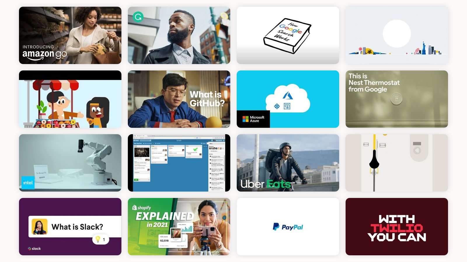
I have watched a lot of explainer videos. Some as a viewer, most as someone who has to figure out why one works and the next one slides off your brain by the second sentence. After enough of them, you stop grading on production polish and start noticing something simpler: the good ones make a decision early about what they are willing to leave out.
That is the whole game. An explainer has maybe sixty to ninety seconds before a person decides whether to keep watching, and every extra idea you cram in costs you attention you cannot buy back. So when I look at a piece, I am really asking a few things. Does it commit to one idea? Does the pacing respect my time? And does the visual style carry meaning, or is it decoration sitting on top of a script?
The thirty-one below answer those questions well, across the styles I keep pointing clients to: flat 2D, isometric 3D, screen walkthroughs, mascot-led, kinetic type, live action with overlays. In September 2026 I re-checked every one of them: each is live, and each is uploaded by the brand itself, not a fan, a re-uploader or an animation studio. That cost the list six videos that earlier versions of this page carried, including the famous Common Craft Dropbox cut and Chipotle’s “The Scarecrow,” neither of which is on the brands’ own channels. The replacements are better anyway.
How I chose these
I skipped anything that only looks expensive. Every video below earns its place on a decision I can point at: a story structure, or a way to make an invisible product visible. I have grouped nothing by industry on purpose, because the lesson usually transfers sideways. A fintech team can steal a beat from a mascot cartoon, and a B2B platform can steal restraint from a payments ad. Watch them for the move, not the logo. Under each one I have put the style, the running time and the year, because a 0:39 and a 5:15 on the same subject are different lessons, and because “2016” tells you which of these you are allowed to copy and which you have to update.
Chipotle, a stop-motion short that sells a worldview
- Style, length, year: stop-motion miniature, 2:45, 2021
This barely mentions the product, and that is the point. A stop-motion farm, a Chipotle truck, and a Kacey Musgraves track carry a story about young farmers, seed grants and long-term contracts, and the brand promise arrives as a feeling long before any words do. Chipotle no longer hosts “The Scarecrow” or “Back to the Start” on its own channel, so this is the one in that lineage you can still point to. I bring it up whenever someone insists an explainer has to list features: you can explain a company’s values through story alone and trust the audience to close the gap.
Duolingo, three words and a mascot doing the heavy lifting
- Style, length, year: flat 2D with mascot, 0:30, 2020
Bright flat 2D, the owl front and centre, and a script that hangs the entire pitch on three adjectives. What I like is the discipline: they picked three words and refused to add a fourth. The mascot gives the animation a consistent personality so every scene feels like the same brand talking, which is harder to pull off than it looks. It was a TV spot, per Duolingo’s own description, and it has 1.6 million views on the brand’s upload.
Uber Eats, a service flow made legible
- Style, length, year: motion graphics, 1:41, 2019
Clean motion graphics walking through how the thing works, step by step, with no wasted frames. This is the unglamorous workhorse format, and I mean that as praise. When your product is a sequence of actions, the job is to show the sequence clearly, and the animation here moves at exactly the speed a first-time user can follow.
Amazon, live action with graphics doing the explaining
- Style, length, year: live action with overlays, 1:49, 2016
Amazon Go had a weird premise to sell: walk out of a store without checking out. So they shot real people in a real space and layered graphic overlays to reveal the invisible technology tracking the whole thing. Seventeen million views later it is still the strongest example I know of grounding an unbelievable claim in live footage while the overlays explain the magic without slowing the human moment down.
Grammarly, a benefit dramatised in type
- Style, length, year: kinetic typography, 1:00, 2020
Typographic animation where the words themselves are the visual, which fits a writing product perfectly. Instead of demoing the software, they dramatise the feeling of finally finding the right phrase. The style and the benefit are the same thing here, and that alignment is what makes it stick; eleven million views on a sixty-second piece is the evidence.
Microsoft Azure, isometric 3D for an abstract idea
- Style, length, year: isometric 3D, 2:25, 2018
Cloud infrastructure has no natural picture, so they built one: tidy isometric 3D that turns data centres and services into objects you can point at. The isometric angle is doing real work, giving abstract concepts a physical footprint on screen. When a product lives entirely in software, I almost always reach for a spatial metaphor like this.
monday.com, fast UI motion tied to the real product
- Style, length, year: product-UI motion graphics, 1:33, 2019
Layered, quick-cutting motion built on actual product screens rather than fake mockups. The pace is deliberately busy, which mirrors the promise that the tool does a lot. I flag this one for teams tempted to abstract their UI into cartoons: sometimes the real interface, animated with energy, sells better than a simplified stand-in.
Zapier, one concept in under a minute
- Style, length, year: flat 2D motion graphics, 0:57, 2020
Zapier’s whole product rests on one idea, a Zap is a trigger plus an action, and this explains exactly that and nothing else in 57 seconds. Its own description is a single sentence: Zapier automatically performs actions whenever a trigger event happens. I use it as the model for a micro-explainer: pick the one concept a new user has to grasp, and stop the moment they have grasped it.
Google, an invisible process turned into an infographic
- Style, length, year: 2D infographic animation, 5:15, 2019
Search is a process nobody can see, and this friendly 2D infographic makes crawling and indexing feel concrete. Five minutes is long for an explainer, but it earns the runtime by breaking one big invisible system into small visible steps, and twenty million people have sat through it. I use it as proof that length is fine when every added minute buys a new piece of understanding.
Google, the same story compressed to forty seconds
- Style, length, year: presenter with kinetic graphics, 0:39, 2024
Here is the tight version of that same subject from Google Search Central: a host, kinetic graphics, thirty-nine seconds. Watching it back to back with the longer cut is a masterclass in editing to length. The short one drops detail and keeps the shape, which is exactly the trade you make when you cut a five-minute idea down to under a minute.
Ahrefs, a SaaS overview that mixes screencast and motion
- Style, length, year: screen recording with motion graphics, 1:31, 2016
A dense tool with a lot of features, sold by pairing real screen recording with motion graphics that keep you oriented. The graphics act like signposts so the screencast never feels like a firehose. For any product with a deep interface, this hybrid is often the right call, because you show what people will actually use.
Notion, a launch teaser built from type and doodles
- Style, length, year: kinetic type with hand-drawn stickers, 1:00, 2025
Notion is famously hard to describe, and this sixty-second launch piece for Notion Mail does not try. It compresses the pitch to one line, “your inbox thinks like you,” and lets typography and hand-drawn stickers carry the personality while the interface stays in the background. Six million views on a launch teaser is the payoff for restraint. A quiet brand deserves a quiet explainer, and this one keeps its voice down.
Intel, generative storytelling built from your own data
- Style, length, year: generative CG, 1:28, 2011
The Museum of Me pulled your own social data into a generated CG gallery, turning a processor pitch into something personal and strange. It is more of an experience than a classic explainer, and I include it as a stretch goal: proof that the format can be a canvas for an idea nobody has seen before. Most briefs will not support this, but it is worth knowing the ceiling.
Google Nest, hero product shots plus animation
- Style, length, year: product footage with animation, 2:06, 2020
For a physical device, they blend glossy hero footage of the object with animation that explains what it does. The two modes trade off cleanly: the beauty shots make you want it, the animated bits make you understand it. That rhythm, desire then comprehension, is how I think about most hardware explainers.
Crazy Egg, problem then solution in sixty-five seconds
- Style, length, year: 2D motion graphics, 1:05, 2018
The older agency-made Crazy Egg explainer that every roundup quotes is not on the brand’s channel any more, so this is the one Crazy Egg actually stands behind. It ties each feature to a visible outcome, snapshots that show where people come from, what they see and where they get stuck, in sixty-five seconds. Nothing about it is flashy, and that is the lesson: a clear problem and a plain walkthrough of the fix outperform a prettier film when the script is doing its job.
Slack, a calm onboarding explainer
- Style, length, year: 2D motion graphics, 1:12, 2021
Clean 2D motion graphics introducing the product to someone who has never opened it. The tone is unhurried and the colour system keeps everything on-brand, so it feels like an extension of the app rather than an ad about it. This is the reliable default for a first-touch explainer, and it is done well here.
Slack, one feature given its own fifty-five seconds
- Style, length, year: product-UI motion graphics, 0:55, 2024
Where the last one covers the whole product, this narrows to a single feature and makes three promises only: catch up faster, find things faster, get a daily recap. Zooming in like this is smart once people already know the brand, because you can afford specificity instead of basics, and the description ends on the one fact a customer needs, that it is available to every paid user. Feature-level explainers are how mature products keep teaching without repeating the intro.
Asana, animation fused with real screen recording
- Style, length, year: animation stitched to product UI, 1:16, 2020
Here the animation and the live product screens are stitched into one continuous move, so it never feels like you left the software. That fusion keeps the piece grounded in reality while still letting motion emphasise what matters, and it has nearly eighteen million views to show for it. It is a tidy answer to the constant tension between showing the real UI and keeping things visually lively.
Asana, kinetic type carrying the platform story
- Style, length, year: kinetic typography and 2D motion, 1:35, 2024
A different Asana approach, this one built on kinetic typography and 2D motion rather than the interface. It sells the idea of organised work at a higher altitude, before you get into buttons and boards. Comparing it with the fused-UI version above is a good reminder that one product often needs several explainers, each aimed at a different moment in the buyer’s head.
GitHub, mixed media with a sense of humour
- Style, length, year: mixed media, 2:43, 2022
This mixes media and comedic timing to explain a developer platform to a broader crowd, and two and a half million people have watched it. The charm does real work here: it lowers the barrier to a topic that scares non-engineers off. Humour, used with intent, buys you patience from an audience that would otherwise tune out.
Shopify, an onboarding explainer with UI and graphics
- Style, length, year: product UI with supporting graphics, 1:39, 2021
Straightforward and effective: walk a would-be merchant from question to first store using UI plus supporting graphics. It answers the literal search query, what is this and how does it work, without dressing it up. Sometimes the best move is to build the video around the exact sentence people are typing.
PayPal, a fintech flow for a broad audience
- Style, length, year: simple 2D animation, 1:14, 2015
Simple 2D animation explaining how money moves, pitched at everyone rather than the finance-literate. The simplicity is a deliberate accessibility choice, because payments touch people of every technical level. For a genuinely general audience, plain and slow wins over clever and fast.
Zendesk, character-driven animation for service software
- Style, length, year: character 2D animation, 1:33, 2016
This leans on characters to put a human face on customer service. People and their little frustrations make an abstract software category feel like it is about actual relationships. Characters are worth the extra animation cost when your product is really about how people feel, not just what a tool does.
Loom, a concept film for the future of meetings
- Style, length, year: live action, 2:05, 2023
A presenter, a laptop and a pink-and-purple set, and instead of a UI tour it stages a “journey to the office of the future, where meetings are transformed,” in Loom’s own words. It frames the problem, shows the async fix, and gets out in two minutes. For a product that saves you from another meeting, the economy is the message.
Salesforce, an enterprise AI explainer with a mascot
- Style, length, year: 3D CG mascot with typography, 1:30, 2024
“AI agents” is about as abstract as a product gets, and Salesforce’s answer is a 3D mascot, bold type and two concrete jobs: a service agent that deflects routine cases and a sales agent that nurtures leads. The description promises exactly what the video delivers, what it is, how it works and why it matters, in ninety seconds. I point to it when a client wants to explain a platform-level idea without a single screenshot.
Figma, a launch built from the real interface
- Style, length, year: product UI, 1:35, 2024
Figma Slides entered a category everyone thinks they understand, so the launch film leads with the one thing that is different, bringing the audience into the conversation through built-in interactivity, before it lists a single editing feature. The whole piece is the real slide grid in motion. When you are late to a category, explain the difference, not the category.
Canva, a feature-suite launch in under two minutes
- Style, length, year: mixed media with bold type, 1:55, 2023
Most explainers sell one feature. This one had to sell a whole collection of AI tools at once, and it works because it treats them as one idea, “let the power of AI supercharge your work,” and shows each in a single beat rather than demoing any. Half a million views for a suite launch tells you the framing landed. If you ever have to explain five things, find the sentence that makes them one thing first.
Mastercard, payments in a minute
- Style, length, year: branded illustration, 1:15, 2017
A branded illustration style compresses a global payments network into about a minute. The house look holds the whole thing together, so even a rushed topic feels intentional and owned. A strong, consistent visual system is what lets a brand move fast without looking generic.
Mastercard, the same style pushed toward purpose
- Style, length, year: branded illustration, brand film, 1:24, 2024
Same illustration language, aimed at brand purpose rather than mechanics. Seeing the two Mastercard films together shows how one visual system can flex from how it works to why it matters. That range is the payoff of investing in a real style instead of a one-off look.
Trello, a screen-led demo of a visual tool
- Style, length, year: screen recording, 4:56, 2015
Trello is already a visual product, so the demo just shows the boards and cards moving in the real app, and two million people have watched a five-minute screen recording because of it. There is little reason to abstract an interface that is this intuitive to watch. When the product demonstrates itself, get out of the way and record the screen.
Twilio, motion graphics for invisible APIs
- Style, length, year: motion graphics, 2:09, 2025
Communications APIs are pure abstraction, so the video traces messages flowing through channels as animated paths. Giving invisible infrastructure a visible route is the core trick for any developer product. I keep this one handy for exactly those briefs where there is nothing physical to point a camera at.
The 31 in one table
If you are scanning for a specific move rather than reading start to finish, here is the whole set in one place: the style, the length, the year, and the single decision worth stealing.
| # | Video | Year | Length | Style | The move to steal |
|---|---|---|---|---|---|
| 1 | Chipotle, A Future Begins | 2021 | 2:45 | Stop-motion short | Sell a worldview through story, barely show the product |
| 2 | Duolingo, three words | 2020 | 0:30 | Flat 2D with mascot | Hang the pitch on three words and add no fourth |
| 3 | Uber Eats | 2019 | 1:41 | Motion graphics | Show the sequence at first-user speed |
| 4 | Amazon Go | 2016 | 1:49 | Live action with overlays | Ground an unbelievable claim in real footage |
| 5 | Grammarly | 2020 | 1:00 | Kinetic typography | Make the style and the benefit the same thing |
| 6 | Microsoft Azure | 2018 | 2:25 | Isometric 3D | Give an abstract product a physical footprint |
| 7 | monday.com | 2019 | 1:33 | Product-UI motion | Animate the real interface with energy |
| 8 | Zapier, What's a Zap? | 2020 | 0:57 | Flat 2D motion | Explain one concept and stop |
| 9 | Google, 5 minutes | 2019 | 5:15 | 2D infographic | Earn the runtime by adding understanding each minute |
| 10 | Google, 39 seconds | 2024 | 0:39 | Presenter with kinetic graphics | Drop the detail, keep the shape |
| 11 | Ahrefs | 2016 | 1:31 | Screencast with motion | Use graphics as signposts through a dense UI |
| 12 | Notion Mail | 2025 | 1:00 | Kinetic type with doodles | Match restraint to a quiet brand |
| 13 | Intel, Museum of Me | 2011 | 1:28 | Generative CG | Turn a viewer's own data into the experience |
| 14 | Google Nest | 2020 | 2:06 | Hero shots with animation | Desire first, then comprehension, for hardware |
| 15 | Crazy Egg 101 | 2018 | 1:05 | 2D motion | Tie every feature to a visible outcome |
| 16 | Slack, intro | 2021 | 1:12 | 2D motion | The reliable first-touch default, done cleanly |
| 17 | Slack AI | 2024 | 0:55 | Product-UI motion | Zoom to one feature once the brand is known |
| 18 | Asana, fused | 2020 | 1:16 | Animation with real UI | Stitch motion and screens into one move |
| 19 | Asana, kinetic | 2024 | 1:35 | Kinetic type | Sell the idea above the interface |
| 20 | GitHub | 2022 | 2:43 | Mixed media with humour | Use comedy to lower a scary topic's barrier |
| 21 | Shopify | 2021 | 1:39 | UI with graphics | Build the video around the exact search query |
| 22 | PayPal | 2015 | 1:14 | Simple 2D | Plain and slow beats clever for a general audience |
| 23 | Zendesk Support | 2016 | 1:33 | Character 2D | Use people when the product is about feelings |
| 24 | Loom | 2023 | 2:05 | Live action concept film | Let economy be the message |
| 25 | Salesforce Agentforce | 2024 | 1:30 | 3D mascot with type | Explain a platform idea with two concrete jobs |
| 26 | Figma Slides | 2024 | 1:35 | Product UI | Explain the difference, not the category |
| 27 | Canva Magic Studio | 2023 | 1:55 | Mixed media with type | Make five things one thing before you show any |
| 28 | Mastercard in a Minute | 2017 | 1:15 | Branded illustration | A visual system lets you move fast without looking generic |
| 29 | We Are Mastercard | 2024 | 1:24 | Same system, brand film | One style flexing from how it works to why it matters |
| 30 | Trello | 2015 | 4:56 | Screen recording | When the product demos itself, record the screen |
| 31 | Twilio | 2025 | 2:09 | Motion graphics | Give invisible infrastructure a visible route |
What the best ones share
Watch all thirty-one and the same handful of moves keep surfacing.
They pick one idea and protect it. Duolingo’s three words, Zapier’s single concept, Notion Mail’s one line. None of them try to say everything, and that restraint is why you remember any of it.
They match style to meaning. Grammarly animates type because it is a writing tool. Azure goes isometric because software has no natural shape. Trello just records the screen because the screen is already the pitch. In a good explainer the visual choice is always an argument about the product.
They respect the clock. The Google pair proves that the same idea can live at five minutes or thirty-nine seconds, and the length should follow how much understanding each minute adds, not how much you want to say. Most of the thirty-one run under two minutes.
And they make the invisible visible. Amazon Go and Twilio both take something you cannot see and give it a body on screen. If your product is abstract, your first job is to make it visible, before you try to persuade anyone.
How to get this right
If you are about to brief one of these, a few things save you from the most common misfires.
Write the script before you think about style. The animation should serve a sentence you already believe in, and if the idea only works because the visuals are pretty, the idea is not finished. I would rather see a rough cut with a sharp script than a gorgeous render with a muddy one.
Cut your feature list in half, then look at cutting it again. Every product team wants to show everything, and every strong explainer above shows almost nothing by comparison. Pick the one thing a stranger needs to understand and build the whole piece around it.
Decide who is watching and where. A cold viewer on a landing page needs the basics; a returning user needs a single feature with more personality, like the two Slack cuts show. One product usually deserves a few explainers, each aimed at a different moment, not one video trying to serve everyone at once.
Then commit to a style you can repeat. The Mastercard films work because the look is a system, not a mood board. If you nail one visual language, the next video is faster to make and unmistakably yours. If you want the mechanics of that, I wrote a separate piece on how to make an explainer video, there is more on the flat-animation route in this 2D explainer video breakdown, and if you are pricing one, the guide to what an explainer video costs is the next read.
Where this leaves you
None of these landed by accident. Behind the polish there is always a decision about what to leave out and a style chosen to mean something. That is the part you cannot fake with a bigger budget, and it is the part worth stealing.
If you are staring at your own product wondering which of these to imitate, the answer is usually none of them exactly. The move is to figure out your one idea and the one style that argues for it, which is most of the work we do at Moonb, the creative team I run, before a frame gets animated. Get that decision right and the rest is just craft. Get it wrong and better motion design will not save it.
Frequently asked questions
Most of the thirty-one videos on this list run under two minutes, and the strongest single-idea pieces are under a minute. Length should follow how much understanding each extra minute adds: Google's search explainer earns five minutes because every minute reveals a new step, while Zapier's explains one concept in fifty-seven seconds and stops.
It depends on whether the interface is the pitch. Trello, Asana and monday.com show the real screens because the product is visual; Azure, Twilio and Salesforce use isometric 3D, animated paths and a mascot because their products have no natural picture. Pick the style that argues for what your product actually is, not the one that looks most expensive.
Every video here is uploaded by the brand itself. Well-known pieces such as the Common Craft Dropbox video and Chipotle's Scarecrow now exist only as fan or studio re-uploads, so they were replaced with videos the brands still host. That matters because a re-upload can vanish or carry someone else's branding, and because a brand-hosted video tells you what the company stands behind today.



