2D Explainer Videos: 22 That Actually Explain
A working breakdown of 22 great 2D explainer videos, from Google and Slack to AWS, and what each one gets right about turning an idea into motion.

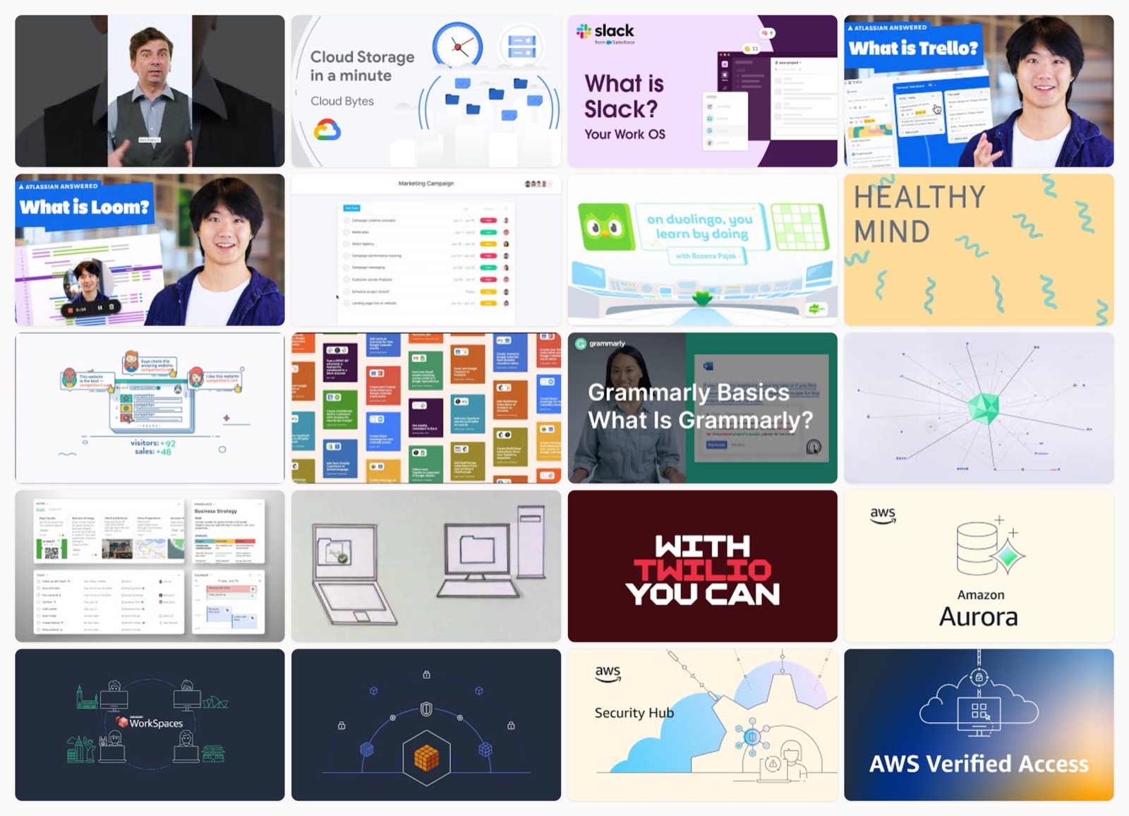
I have watched a lot of explainer videos. Some I finish. Most I close after four seconds. The difference is almost never the production value or the render quality. It comes down to whether the animation is doing a job or just moving around to look busy.
A good 2D explainer takes something you cannot see, a database or a habit of mind, and gives it a shape you can follow. That is the whole trick. When it works, you understand the product before anyone has explained a single feature. When it fails, you get pretty shapes and a voiceover reading the website out loud.
What I look for is simple. One idea per video, animated so the motion actually maps to meaning, in a style that belongs to the brand rather than a template. The examples below all clear that bar, each for a different reason.
How I picked these
I skipped the award-reel eye candy and the videos that are really just logo animations. Every piece here is a real explainer from a real company, still live, still doing the job it was made for. I watched each one start to finish before it made the list, and I ordered them so you can see the same principles show up across very different styles.
Google, the three pillars of Search
Google builds its whole argument out of flat brand-colored shapes that assemble as the narrator talks. Nothing is decorative. Each shape stands for one of the three things Search actually does, and they lock into place right as the point lands, so the picture and the sentence finish together. It is restrained to the point of feeling obvious, which is exactly why it teaches.
Google Cloud, one minute of isometric infrastructure
Sixty seconds, one isometric diagram, an abstract storage concept made concrete. The camera stays calm and lets the diagram grow piece by piece instead of cutting around it. The isometric angle does real work here. It gives depth to something that has no physical form, so storage stops being a word and becomes a place data goes.
Slack, chaos into order
Slack’s video opens in mess, with scattered geometric shapes and competing colors, and resolves it into a tidy grid using only the brand palette. The morph is the message. You feel the before as visual noise and the after as calm, which is the exact emotional promise of the product. No feature list required.
Trello, boards building themselves
Trello leans on friendly character animation while boards, lists and cards assemble on screen in real time. Watching a card slide from one column to the next explains the product faster than any sentence about workflow. The characters keep it warm. The assembling UI keeps it literal.
Loom, async versus the meeting pile-up
Loom dramatizes a problem everyone recognizes: the meeting that should have been a message. Flat characters drown in calls, then the tone lifts the moment async video shows up. It sells the feeling of relief before it ever shows the product, which is why it lands.
Asana, scattered tasks becoming a graph
Asana takes a messy pile of tasks and organizes them into a structured work graph through tidy motion graphics. The animation mirrors what the tool does to your day. By the end you have watched disorder become a system, and that visual promise is the pitch.
Duolingo, the mascot teaching the loop
Duolingo hands the explanation to its owl and lets expressive character animation carry the learning loop. The mascot does the teaching, which is why the method feels playful instead of instructional. This is what brand-owned character work buys you: nobody else could have made this video.
Headspace, a calming concept drawn calmly
Headspace uses its signature warm, hand-drawn characters to illustrate a single mindfulness idea. The pacing is slow on purpose, and the minimal linework leaves room to breathe. The style is the product experience rendered as animation, which is why it never feels like an ad.
Ahrefs, illustration doing all the talking
Ahrefs strips the voiceover entirely and lets motion graphics explain the whole thing. That is a hard constraint to work under, and it forces every frame to earn its place. When illustration alone carries the meaning, you know the storyboard was airtight before a single asset got animated. If you want to see how much rides on that plan, look at our walkthrough of how to make an explainer video.
Zapier, apps wiring themselves together
Zapier animates flat app icons connecting through triggers, so automation stops being abstract and becomes a visible chain of cause and effect. You watch one thing happen and another thing follow. That literal depiction of when-this-then-that is the clearest way to sell software most people find hard to picture.
Grammarly, suggestions appearing inline
Grammarly keeps the UI in motion, showing real-time writing suggestions surface inside a sentence exactly as you would see them. It resists the urge to abstract the product into metaphor. Sometimes the honest choice is to just show the thing working, cleanly, in close-up.
Grammarly, the AI reading a sentence
The companion video visualizes the parsing itself: a sentence broken down and turned into feedback. It makes an invisible process legible without pretending to show real code. This is the harder of the two to pull off, because it has to dramatize thinking, and the motion graphics keep it concrete instead of vague.
Evernote, everything into one workspace
Evernote’s explainer collects notes, reminders and your schedule into a single workspace through simple flat animation. The restraint is the point. It trusts the core idea, scattered things finding one home, to carry the video, which suits a product about reducing clutter.
Dropbox, the cut-out style that started it all
Dropbox’s early intro is the Common Craft paper cut-out look that basically defined the explainer format. Hands slide paper shapes around a white field while a plain voice walks you through the idea. It is dated now, and it still works, which tells you the format was never about production polish.
Twilio, a message flowing through channels
Twilio traces a single message as it moves through programmable channels, and the kinetic motion graphics keep your eye on the path the whole way. Following one object through a system is a reliable structure, and Twilio uses it well. You leave understanding what the product routes, not just that it exists.
AWS, Amazon Aurora as a visible diagram
AWS makes a managed database concrete with isometric 2D diagram animation. A database is about as abstract as products get, so the isometric build gives it walls and flow you can point at. This is technical explainer work aimed at engineers, and it respects them by staying precise rather than cute.
AWS, WorkSpaces as desktop-in-a-box
This one pairs a flat character with a device to show desktop-as-a-service in action. The character gives you someone to follow. The device shows where the desktop actually lives. It is a small human touch that keeps an infrastructure product from feeling cold.
AWS, Shield as a literal shield
AWS turns DDoS protection into a shield metaphor and lets the motion graphics carry it. The metaphor is obvious, and that is a feature. For a security product, something-is-attacking-you-and-this-blocks-it is exactly the mental model you want the viewer to walk away holding.
AWS, Security Hub aggregating findings
Security Hub animates scattered findings gathering into one dashboard, using a consistent brand system across the frame. The whole video is one motion: many things becoming one view. That single-idea discipline is why a dense product reads clearly in under two minutes.
AWS, Verified Access checking every request
This explainer shows each request getting validated before access is granted, as a flat animated flow. The step-by-step gating is the security model made visible. You watch the check happen, which convinces far better than being told the check exists.
AWS, VPC Lattice untangling connections
VPC Lattice uses network-diagram animation to untangle service-to-service connectivity, taking a knot of connections and combing it straight. Connectivity products live or die on whether you can picture the mess they fix. Showing the tangle first and then resolving it is the right order.
AWS, Network Firewall as filtered traffic
The Network Firewall video sends traffic through animated firewall rules and lets you watch what passes and what gets stopped. It is the same follow-the-object-through-the-system move as the Twilio piece, applied to packets. Simple, legible, and it matches the mental model an engineer already carries.
What the best ones share
Watch enough of these back to back and the pattern is hard to miss.
- One idea per video. Every strong example commits to a single concept and animates that, not five.
- Motion that means something. The animation maps to what the product does. When a card slides or a shape locks in, it stands for a real action.
- A style the brand owns. Duolingo’s owl, Headspace’s linework. You could hide the logo and still know who made the video.
- Restraint over spectacle. The clearest videos here are also the calmest. Nobody is showing off render muscle.
The AWS set is worth studying as a group. Seven videos, one visual system, and each still explains a different product without ever confusing you about which is which. That is a design system doing its job, not a coincidence.
How to get this right
If you are briefing one of these, a few things move the needle more than anything on the render side.
Start with the single idea. Before anyone opens an animation tool, write the one sentence the video has to make obvious. If you cannot, the video is not ready. This is the storyboard stage, and it decides everything downstream. Our breakdown of the types of motion graphics is a decent map of the styles you can reach for once the idea is locked.
Make the motion mean something. If a shape moves, it should stand for an action the viewer cares about. Decorative motion reads as filler, and people feel it even when they cannot name why.
Keep it short and keep it one thing. Most of the best examples above run under ninety seconds. The temptation is always to add a second feature. Resist it and ship a second video instead.
Match the style to the brand, not to a trend. The character-led approach that suits Duolingo would feel wrong on an AWS security product. Pick the register your audience already lives in.
Where this leaves you
None of this requires a giant production or a year of work. A 2D explainer is one of the more forgiving formats precisely because clarity beats polish, and clarity is a thinking problem before it is a rendering one. Get the idea right and a modest animation will outperform a lavish one that never decided what it was about.
At Moonb, my embedded creative team starts from that single idea and stays with it through the final frame. But even if we never talk, watch these examples one more time with the sound off. The ones that still make sense are the ones that got the thinking right.
Frequently asked questions
One clear idea, motion that maps to what the product does, and a style the brand owns. The strongest examples commit to a single concept and animate that, instead of cramming in every feature and hoping something sticks.
Most of the best examples run under ninety seconds. If you have a second feature to explain, make a second video rather than stretching one past the point where attention drops off.
2D is usually the better call for explaining software or a concept, because flat shapes keep the focus on meaning. Reach for 3D when physical form or spatial realism is the actual point of the video.



