10 SaaS Explainer Videos, Taken Apart Move by Move
Ten live SaaS explainer videos with the one craft move doing the work in each, plus what the best ones share and how to build yours.

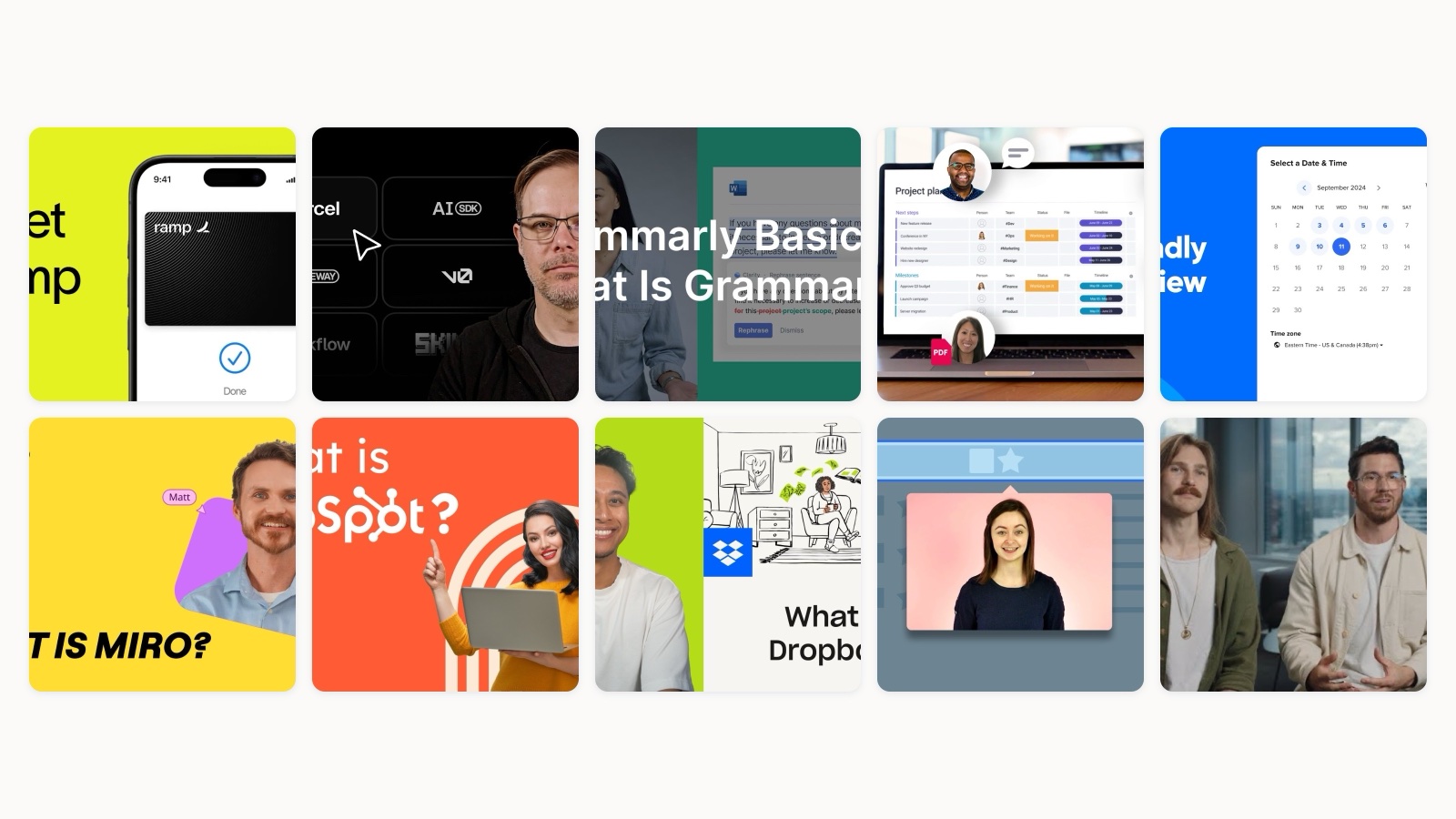
Most “best SaaS explainer video” lists do the same thing. They rank ten videos, call each one engaging, and move on. You finish reading and you still have no idea what to do on Monday.
I work at Moonb, a creative studio, and I spend a lot of my week watching how software companies try to explain themselves on screen. So I wanted to write the opposite of a ranking. For each video below I embedded the real thing, straight from the company’s own channel, then pulled apart the single move doing the heavy lifting. Not the vibe. The specific decision you could copy into your own edit this quarter. This page stays focused on software; for the wider set across every industry, our hub of explainer video examples covers the rest.
A quick note on why the source matters. Everything here is a currently live video the company chose to ship on its own YouTube channel, not a studio showreel cut for portfolio glory. That distinction changes what you learn from it. A showreel shows you what an editor is proud of. A company channel shows you what a marketing team was willing to stand behind to real customers, which is a far more useful teacher.
One more thing before we start. Length is doing real work in every good one of these. Videos under a minute hold around 52% average engagement, meaning viewers watch roughly half, and with B2B audiences short videos reach about a 65% completion rate before that number falls off a cliff on longer cuts. Almost none of the examples here run long. Keep that in the back of your mind as you watch.
Ramp, the problem-first cold open
Ramp opens on the pain, not the product. Before you see a single dashboard you feel the drag of finance operations, the manual chasing, the time leaking out of a small team. Then the film resolves that tension with a benefit (“saves you time and money”) rather than a feature list. The move to steal is the order of operations. Name the ache your buyer already feels, out loud, in the first five seconds, and the product lands as relief instead of as a pitch. When you lead with the pain, the viewer is nodding before you have asked them for anything.
Vercel, the screen-native walkthrough
Vercel skips the abstraction entirely. No metaphor, no floating icons, just a team member narrating the real deploy flow end to end on the actual product. For a developer audience this is exactly right. The people watching can smell a fake demo instantly, and a polished animation of “what deploying feels like” would insult them. Showing the true screens, including the small moments of loading and confirmation, builds a kind of trust that no motion graphic can fake. If your buyer is technical, resist the urge to prettify. Let them watch the thing work.
Grammarly, the in-context demo
Grammarly never shows you a settings panel. It shows suggestions appearing live inside real apps, in an email, in a browser, on a phone, at the exact instant someone is writing. That is the whole insight. The value of Grammarly only exists in context, so the video proves it in context. If your product is a layer that sits on top of the tools people already use, do not pull it out onto a clean stage. Film it doing its job in the messy real environment where the buyer will actually meet it.
monday.com, the single-metaphor motion piece
monday.com has an impossible pitch: a platform that does almost everything, which usually means a video that explains almost nothing. They solve it with one unifying board metaphor and bold, color-coded motion that keeps snapping into place. The board becomes the through-line that holds a dozen use cases together. The lesson for any “do-everything” product is to pick a single visual spine and hang all the breadth off it, so the range reads as flexibility instead of as chaos. Motion graphics earn their keep here precisely because the real product is abstract. If you want to go deeper on that, there is a separate piece on motion graphics explainer videos.
Calendly, the expectation flip
Everyone already thinks they know what Calendly is: the scheduling link. The title of this video (“Way More Than a Scheduling Link”) turns that assumption into the hook. It reframes a familiar single feature into a broader workflow story, which is a smart play when your brand is famous for one narrow thing and you are trying to grow into something bigger. If buyers have already boxed you in, name the box, then open it. The reframe does more persuasive work than any feature you could list flat.
Miro, the product as its own stage
Miro stages the entire film on its own infinite canvas, zooming and panning across the board so the medium itself becomes the demo. You are not being told the canvas feels expansive and fast. You are feeling it, because the camera is moving the way your cursor would. This is the most elegant trick on the list when it fits: build the video inside the product so the format and the message are the same object. It only works for products with a strong spatial or visual character, but when it works it is unforgettable.
HubSpot, the connected-platform story
HubSpot could have listed its hubs one by one and lost everyone by the third. Instead the video ties the separate products together under a single customer outcome, the “grow better” promise, so the platform reads as one connected system rather than a menu. When you sell a suite, the narrative job is unification, not enumeration. Find the one result all your modules point at, and let that outcome be the spine the features hang from. Buyers do not buy your org chart. They buy the thing on the other side of it.
Dropbox, the plain-English explainer
Dropbox does something almost old-fashioned, and it is a relief to watch. It names the jobs the product does, store and share and access, and shows each one with a simple screen visual and zero jargon. No mood, no metaphor, no cleverness. Just clarity. For a broad, non-technical audience this jobs-to-be-done structure is hard to beat, because it maps directly onto how a normal person would ask “what does this actually do for me.” Not every explainer needs a concept. Sometimes the bravest choice is to be plain.
Intercom, the feature that demos itself
This one is a small joke that also happens to be perfect strategy. Intercom’s video for Product Tours is, essentially, a product tour. The feature demonstrates itself by being used, which means the viewer experiences the benefit at the same moment they learn the feature exists. If you have a single, well-defined feature to sell, ask whether the video can simply be the feature in action. The most convincing proof of what something does is watching it do it, with no narrator standing between the buyer and the thing.
Figma, the social-proof film
Figma barely explains its features. It shows real teams at brands you recognize using the product inside their actual workflow. The persuasion is not “here is what Figma does,” it is “here is who already trusts Figma to do it.” Social proof told through real usage is a heavier lever than any feature reel once you have the customer logos to back it up. It is also the hardest technique to fake, which is exactly why it lands. If your customers are your best argument, put them on screen and get out of the way.
What the best SaaS explainers share
Watch all ten back to back and the same handful of moves keep surfacing. None of them are secret. They are just disciplined.
| Company | The move | Steal it when |
|---|---|---|
| Ramp | Open on the pain | Your buyer feels the problem daily |
| Vercel | Show the real screens | Your audience is technical |
| Grammarly | Demo in context | You sit on top of other tools |
| monday.com | One visual spine | The product does many things |
| Calendly | Flip the assumption | You are famous for one feature |
| Miro | Film inside the product | Your product is visual or spatial |
| HubSpot | Unify under one outcome | You sell a suite |
| Dropbox | Name the jobs plainly | Your audience is broad |
| Intercom | Let it demo itself | You have one clear feature |
| Figma | Put real customers on screen | Your logos are your argument |
Underneath the specific techniques, a few habits repeat. They all get to the point fast, which matters because short-form video was named the highest-ROI social format by more marketers than any other, at 21%, and that reward only exists if you respect the viewer’s time. They all pick one idea and make it impossible to misread, rather than cramming every feature into 90 seconds. And they all treat the video as a piece of the product experience, not an ad bolted on afterward. The tone and the screens and the language all match what you meet when you actually sign up.
How to make yours
You do not need a huge production to apply any of this. You need a decision.
Start by writing down the one thing a viewer must understand and believe after watching. Just one. If you cannot name it in a sentence, the video will wander, and a wandering explainer is a video nobody finishes. This is also the moment to decide format. A technical buyer wants Vercel’s real screens. A broad audience may want Dropbox’s plain narration. An abstract platform may need monday.com’s motion spine. Our piece on animation versus live action unpacks that trade-off more fully if you are stuck on the choice.
Then keep it short and script it around the buyer’s problem, not your feature roadmap. How-to and explanatory content earns more viewer attention than almost any other category on YouTube, which tells you people want to be shown how something works, as long as you show them quickly and clearly. Cut everything that does not serve the one idea. When you think it is too short, it is probably close to right.
Finally, place it where the decision happens. The same video can live on the landing page, inside onboarding, and in a sales follow-up, and it will do a slightly different job in each spot. Build it once with that reuse in mind and it keeps paying you back long after the shoot is done.
How we approach SaaS explainers at Moonb
When my team takes on a SaaS explainer, the first conversation is never about style. It is about the single idea we are protecting, the one thing the video has to make land. I have watched too many good-looking videos fail because they tried to say six things and landed none of them. So we fight for the one idea first, then choose the technique that serves it, whether that is a real screen walkthrough, a motion-graphics spine, or a real customer on camera. As an embedded creative team, we sit close enough to the product to know which of these ten moves actually fits your buyer, and close enough to tell you when the fanciest option is the wrong one. The craft is in the restraint, not the render.
Frequently asked questions
For most SaaS use cases, keep it under two minutes, and under 60 seconds if it is going in an email or an ad. B2B viewers finish short videos at much higher rates and drop off fast on long ones. Almost every strong example runs a minute or so. The length forces you to pick one idea, which is exactly what makes these videos work.
It depends on your buyer and your product. Technical audiences respond to real product screens because they can spot a faked demo instantly. Abstract or do-everything platforms often need motion graphics to give an intangible product a visual shape. Broad, non-technical audiences do well with plain screen visuals and clear narration. Pick the format that serves your one core idea, not the one that looks most impressive.
The same video can work on your landing page, inside onboarding, and in a sales follow-up, doing a slightly different job in each. Build it with that reuse in mind from the start. Place it wherever the buyer is making the decision it is meant to influence, and you get far more value out of a single production than treating it as a one-time launch asset.



