15 Animated Product Video Examples Worth Studying
A gallery of 15 real animated product videos from Slack, Razer, Headspace and more, with a first-person breakdown of the style and takeaway behind each.

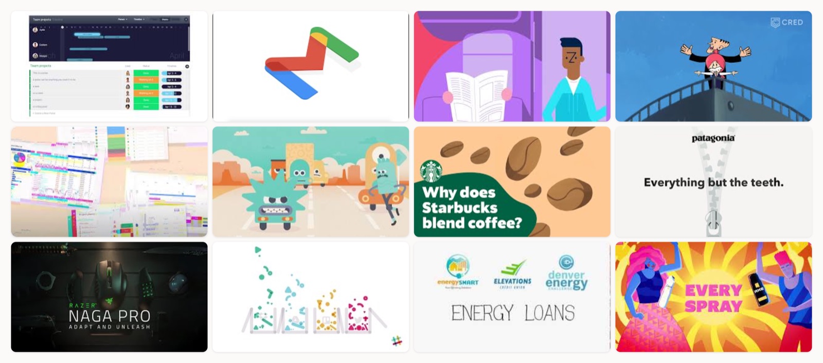
The fastest way to work out what your animated product video should feel like is to watch a stack of good ones and borrow the moves that fit your product. So that is what this page is: fifteen animated product videos that earned their runtime, each with a short note on the style and the single idea I would take from it, and I have closed with one my own team made. I have produced these formats for years, and the pattern holds up. The videos that work are the ones where the animation choice fits the job, and the most expensive render is almost never what makes the difference.
Animation earns its place when the thing you are selling is hard to film. Software has no physical form, and a new product or an internal mechanism often cannot be filmed at all. It is a lighter-touch cousin of the live-action product demo video, with two real advantages: you can change the voiceover or on-screen copy later without booking a reshoot, and the asset ages well because there is no on-camera face whose relevance fades. Online video also keeps taking a bigger share of digital ad spending (Statista), which is part of why more brands reach for animation to stand out.
The five styles of animated product video
Almost every animated product video is one of five styles, or a blend of them. Knowing which is which is the first real decision, because it sets the cost and the timeline before a single frame is drawn, and it shapes the feeling too.
3D and CGI animation builds a fully textured model you can light and rotate to any angle. I reach for it when the product does not exist yet, or when the inner workings are too complex to film (an engine cutaway, say). It looks premium and it costs the most, so I only push a client toward it when the product itself is the hero.
2D animation is drawn or vector-based, usually character-led, and faster to produce than 3D. It is where I land for playful brand explainers and stories where personality matters more than photoreal detail. Most of the warm, illustrated explainers you remember are 2D.
Motion graphics layers animated type and graphic elements over stills or real footage. It is the quickest and lightest of the group, which makes it my workhorse for feature callouts and short social cuts. When you want the real interface on screen with a bit of energy on top, this is what I use.
Character or cel animation puts a hand-drawn character at the center and lets it carry the message. Zocdoc’s doctor and Headspace’s little figures are the whole tone of the brand rather than decoration. It is 2D at heart, but I give it its own line because a consistent character is a durable brand asset.
Whiteboard animation shows a story being drawn in real time. It is plain to produce and it holds attention on education-heavy or finance topics that would otherwise lose people, because watching the drawing appear keeps the eye moving.
Which style fits which job
Start from the job rather than the look you happen to like. A few rules I go by:
On a SaaS product, where the whole thing is a screen, I put a light 2D or motion-graphics layer over the real UI so it still reads as a credible SaaS product demo while feeling alive. When the detail on a physical product is the sell, 3D earns its higher cost. An abstract brand story is where character or cel animation buys you emotion a UI tour never will, and anything educational tends to work best in whiteboard or idea-led 2D, with the viewer following the idea as it gets drawn. For an app whose whole feel is the selling point, character animation doubles as an app demo video.
One principle cuts across all of them: show, do not tell. Adidas visualising eleven plastic bottles kept out of the ocean does more than any voiceover stating the fact, and animation is the simplest way to make the invisible visible.
15 animated product videos worth studying
Every video below lives on the brand’s official channel, so you are watching the real thing rather than a reupload. I have kept the analysis to what you can actually reuse.
1. monday.com: In 60 seconds
What I like here is the discipline. The animation never strays far from the real interface, so credibility stays high while colour and pace keep it lively. If you want a short explainer that stays product-true, copy this: keep the UI recognizable and let motion carry the rhythm.
2. Google Workspace: A little design love
Google turns something abstract (files moving between Drive and the rest of Workspace) into objects you can watch, and the brand palette does the heavy lifting for comprehension. The move worth stealing: when your product is invisible, give it physical form and let one strong colour system guide the eye.
3. Zocdoc: Book an appointment anytime, anywhere
Hand-drawn cel animation with a Seussian doctor makes a healthcare booking app feel warm instead of clinical, and the video deliberately shows people booking from all sorts of places to sell the “anytime, anywhere” line. Character work like this earns trust for categories that usually feel cold. If your product lives in an anxious moment (health or money), a friendly character lowers the temperature.
4. CRED: Not an ad
This one plays as a brand film instead of a feature tour. CRED borrows nostalgic 90s Indian comic characters to talk about digital payments through story, a reminder that animation can build feeling and not just explain a screen. If you have room for a real brand piece, character animation gives you emotion that a walkthrough cannot.
5. Coda: Meet Coda
Coda mixes light 2D animation with real screen recordings, which keeps production manageable while still showing the actual doc tool at work. It is a practical route for a startup that wants the video to feel product-true rather than purely illustrated. Steal the hybrid: animate the story beats, then cut to real screens for proof, the way a strong software demo video does.
6. Headspace: Changing Perspective
Headspace’s pastel characters are the product experience, so the video works as brand film and app demo at once. That is the payoff of a consistent illustration system: every asset reinforces the same feeling. If your app has a distinct visual world, put it on screen and let it do double duty.
7. Starbucks: Why does Starbucks blend coffee?
Here animation explains a process (why blend coffee at all) rather than a screen, and a strong voiceover turns a dry subject into a small story. It is proof the format is not only for software. When you are explaining the reasoning behind a product decision, illustration plus a good narrator beats a talking head.
8. Patagonia: The Better Sweater Just Got Better
Patagonia uses animation to tell a recycled-materials story for a physical sweater, with subtitles so it reads with the sound off. It is a clean answer to anyone who thinks animated product video is a SaaS-only trick. If sourcing or sustainability is your angle, animation shows the invisible steps a camera could never reach.
9. Razer: Naga Pro, Adapt and Unleash
There is no voiceover here, just film-grade lighting and every swappable side-plate rendered in CGI, which is how you hero a physical gadget. The 3D route lets Razer show detail and motion that a real shoot would fight with, so when the product is the star and the details matter, CGI earns its cost.
10. Slack: Communication Without Chaos
A minimal flat-colour explainer that captures the remote-work pain of scattered messages. It is simpler and older than Slack’s later work, which makes it a useful reminder that clarity beats polish. If your first explainer carries one tight message, you do not need a huge production to make it work.
11. Elevations Credit Union: Save energy and money
This is my go-to reference for whiteboard style. Watching the story get drawn in real time holds attention on a finance topic that would otherwise lose people, which is exactly what the technique is good for. Reach for whiteboard when the content is educational and you want the viewer learning alongside the pen.
12. Unilever: Every U Does Good
Unilever packs a whole portfolio into one energetic, sound-designed piece tied to its sustainability program. If you need to feature many products at once without a slideshow feel, motion graphics and a strong sound mix carry the pace.
13. Duolingo: How we animate the Duolingo world
This is a behind-the-scenes look at how Duo and friends get animated, more studio tour than product spot. I include it because mascot animation is its own discipline, and Duolingo treats its character as a real brand asset. If a mascot is central to your product, invest in a consistent rig and personality; it pays back across every channel.
14. Apple: Every product carbon neutral by 2030
Apple’s carbon-neutral film leans heavily on live action (the Mother Nature sketch), so I file it as motion-graphics-and-hybrid rather than pure animation. What is worth studying is how animated text and sound design carry an abstract accountability narrative between the live scenes. When your message is a promise rather than a feature, hybrid motion graphics give it weight.
15. Moonb: Finding the Right Therapist (Unobravo)
I will close with one of ours. We produced this animated film for Unobravo, a therapy-matching platform, and it works the way I keep advocating for, with warm 2D character animation carrying an emotional service story instead of a feature checklist. It is a fair example of what animation does that a screen recording cannot, which is make an intangible service feel human.
| # | Video | Brand | Style | Length |
|---|---|---|---|---|
| 1 | monday.com in 60 seconds | monday.com | Motion graphics + product/UI animation | ~1:00 |
| 2 | Let's show a little design love for Google Workspace | Google Workspace | 3D motion graphics | ~1:00 |
| 3 | Book An Appointment Anytime Anywhere | Zocdoc | Cel / character animation | ~0:45 |
| 4 | Not an ad | Ft. Chacha Chaudhary & Suppandi | CRED | 2D character animation (comic-book style) | ~2:46 |
| 5 | Meet Coda | Coda | 2D animation + screen capture | ~1:30 |
| 6 | Quick Meditation: Changing Perspective | Headspace | 2D character animation | ~1:00 |
| 7 | Why does Starbucks blend coffee? | Starbucks | 2D animation | ~1:30 |
| 8 | The Better Sweater Just Got Better | Patagonia | 2D animation | ~1:00 |
| 9 | Razer Naga Pro | Adapt and Unleash | Razer | 3D animation | ~1:00 |
| 10 | Communication Without Chaos | Slack | 2D animation | ~2:00 |
| 11 | How To Save Energy & Money with Elevations Energy Loans | Elevations Credit Union | Whiteboard animation | ~1:30 |
| 12 | Every U Does Good | Unilever | 2D motion graphics | ~1:00 |
| 13 | How we animate the Duolingo world | Duolingo | Character animation (behind-the-scenes) | ~3:00 |
| 14 | Every product carbon neutral by 2030 | Apple | Motion graphics + live-action hybrid | ~1:50 |
| 15 | Finding the Right Therapist | Unobravo (by Moonb) | 2D character animation | ~1:30 |
How to choose your animation style
Choosing a style is really about matching production effort to the message. Motion graphics over real UI is the lightest lift and the fastest turnaround, 2D sits in the middle, and 3D is the heaviest because everything gets modelled and lit from nothing. If you have a screen-based SaaS product and a tight timeline, I would start with motion graphics or light 2D. When the product is a physical object whose form is the point, that is where 3D pays for itself.
Length is where a lot of animated videos go wrong. Wistia’s video research shows engagement stays fairly steady for shorter videos and falls off as they get longer, and Vidyard’s benchmark data finds most business videos run under two minutes. HubSpot’s marketing research also ranks short-form video among the formats marketers say return the most. In practice I aim for 30 to 60 seconds for a social or ad cut and up to about two minutes for a full explainer, and I only go past that when there is a real story to tell. CRED’s near three-minute film earns the length; a feature tour rarely does.
What a good brief includes
The briefs that produce sharp animated videos share a few things, and the sloppy ones skip them. Nail these before anyone opens After Effects:
- One message. Decide the single thing a viewer should remember, and cut everything that does not serve it. Cramming five features is the most common way these videos die.
- The style, chosen on purpose. Pick 2D, 3D, motion graphics, or whiteboard based on the job above, not on a look you saw and liked. Locking it early saves an expensive change of direction mid-production.
- A script and storyboard first. Write the words and board the beats before a single frame gets animated. Our walkthrough on how to make a product demo video covers that order in detail, and it is the same rhythm behind strong SaaS demo best practices.
- Sound-off by default. Most product video gets watched muted in a feed, so design subtitles and on-screen text as part of the frame, not an afterthought. Patagonia’s sweater film is the model.
The mistake I see most often is animating away from the real product until the video is pretty but no longer believable. Keep it product-true and short, and let the strongest idea run the show.
Who actually makes videos like these
Most of these came out of in-house brand teams working with animation studios, or a studio commissioned for a single film. The work spans 2D, 3D, motion graphics and character animation, and it usually takes a director who can hold the idea together across every frame. Moonb is one option there, an embedded creative team that produces these formats end to end under a dedicated Creative Director, so the same people who set the style also ship the final cut. Whoever you work with, pick the style that fits the job first, then find the team that can execute it well.
Frequently asked questions
The cost depends mostly on the style and how much custom illustration I have to draw, with length as the other lever. A motion-graphics cut layered over your real interface is the lightest lift and the fastest to turn around, 2D character work sits in the middle, and a fully modelled 3D piece is the most involved because everything is built and lit from scratch. A short social cut and a two-minute flagship explainer are different orders of effort even inside the same style.
2D animation is drawn or vector artwork, usually character-led, animated to tell a story. Motion graphics animates type and interface elements, often over real footage or product screens, and it is quicker to produce. My rough rule is that if a character carries the message it is 2D, and if animated type and UI carry it, it is motion graphics.
Yes, and I lean on it constantly for hardware. Razer heroes a physical mouse entirely in 3D, and Patagonia tells a recycled-materials story for a sweater with subtitles for sound-off feeds. Animation is often the only way to show an internal mechanism or a manufacturing step a camera cannot reach, which makes it as useful for hardware and consumer goods as for software.



