SaaS Product Demo Videos: 7 Great Examples and How to Make Yours
Seven of the best SaaS product demo videos, embedded and broken down, plus the principles that separate a demo that converts from one that gets skipped.

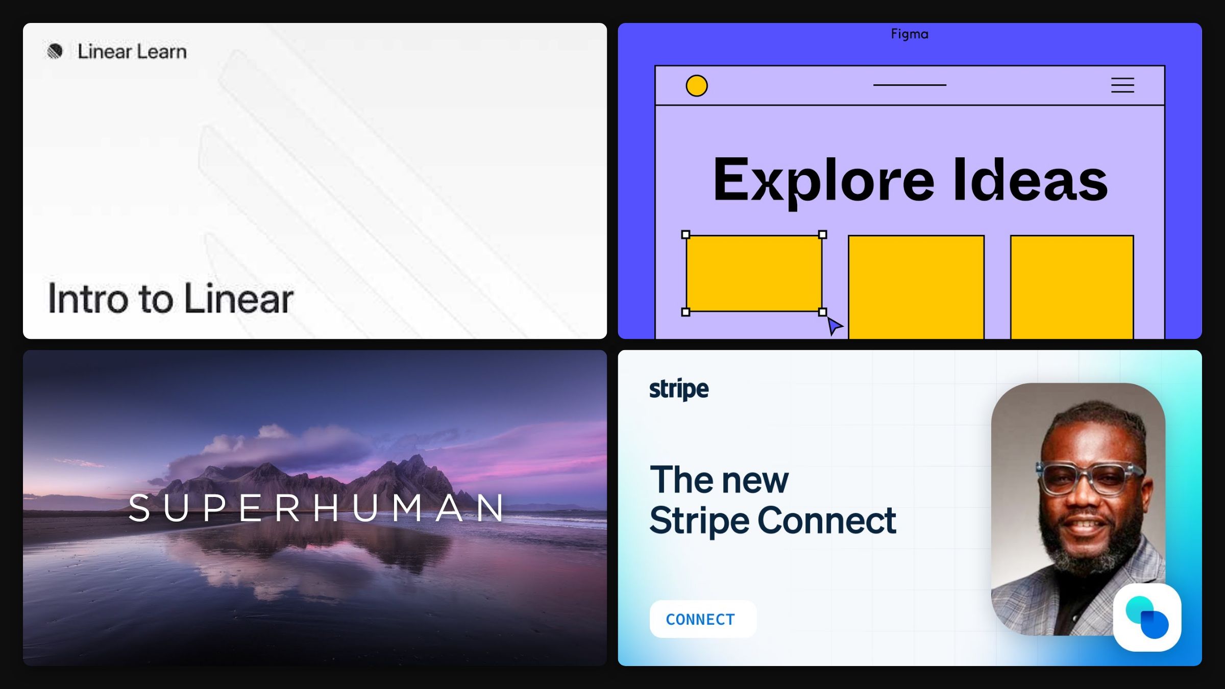
A SaaS product demo video has a brutal job: make a stranger understand and want your software in about two minutes, using footage of a screen. Most demos fail by doing the opposite of what works, touring every feature instead of selling one clear outcome. I run a creative studio, so I have made a lot of these and watched what separates the demos that convert from the ones that get closed. Below are seven of the best, each embedded and broken down, followed by the principles you can lift for your own.
The thing to watch across all seven is restraint. None of them shows you everything the product does. Each makes you feel one thing it does for you.
Seven SaaS demos worth studying
Linear, “Intro to Linear”
Linear’s own product tour walks through its core concepts with the same minimalist, high-craft polish that made the product famous. The demo does not just show the software, it embodies the taste the software is known for. Lift this: let the demo’s craft match the product’s. A tool that sells speed and elegance should have a demo that feels fast and elegant. The medium is part of the pitch.
Figma, “Figma for Beginners”
The first part of Figma’s four-part series follows one real project, designing an app, from idea through prototype. Instead of listing features, it shows the product doing a job the viewer recognises. Lift this: anchor the demo in a real workflow. Watching the tool complete an actual task teaches more than any feature list, and it lets the viewer imagine their own work in it.
Superhuman, “Introducing Superhuman”
Superhuman’s launch film leads with a single sharp promise, the fastest email experience ever made, and shows the keyboard-driven flow rather than dumping features. One benefit, demonstrated relentlessly. Lift this: pick the one promise and build the whole demo around it. A demo that says one thing clearly beats one that says ten things vaguely, every time.
Stripe, “The New Stripe Connect”
Stripe introduces a technical B2B feature with clean motion design, crisp UI walkthroughs, and a confident voiceover that makes a developer product feel premium. It proves a demo can be technical without being dry. Lift this: production value signals product quality. In a category full of screen recordings with a stock-music bed, a properly well-made demo tells buyers you care about the details, which is exactly what they are buying.
Notion, “Meet Notion Calendar”
Notion’s launch film for its calendar keeps the interface front and centre, showing the tool inside a real day rather than narrating a feature list, with the calm confidence the brand is known for. Lift this: show the product in the rhythm of real use. A demo that mirrors how someone actually moves through their day makes the value obvious without a single bullet point.
Webflow, “Introducing Webflow”
Webflow introduces a genuinely complex product, visual web development, by leading with the outcome (build a real, professional site without code) rather than the mechanics. It makes a deep tool feel approachable. Lift this: lead with what becomes possible, not how it works. For a powerful, intimidating product, the demo’s job is to lower the perceived difficulty, not to prove the depth.
Airtable, “Meet Omni”
Airtable’s showcase for its AI features keeps the demo grounded in a concrete task on a real database, rather than an abstract claim about capability. Lift this: ground an AI feature in a specific job. “AI” means little until a viewer sees it complete a task they recognise, so show the outcome, not the technology.
The principles behind a demo that converts
Strip these seven down and the same rules keep surfacing.
- Sell one outcome, not every feature. The failing demo is a feature tour. The winning demo picks the single most important thing the product does and makes you feel it. Everything else is a distraction.
- Show real work, not an abstract concept. Watching the product complete a task the viewer recognises does more than any animated metaphor of the value. Concrete beats conceptual for software.
- Match the craft to the product. The demo’s polish is read as the product’s polish. A slick tool deserves a slick demo, and a careless one undercuts even a great product.
- Lead with the promise, prove it fast. Open on the single benefit in the first few seconds, then spend the rest demonstrating it. Do not make the viewer wait to learn why they should care.
- Put it where the decision happens. The demo belongs on your homepage and in your signup flow, not just on YouTube. It earns its keep at the point of conversion.
When to hire this out
You can record a serviceable demo yourself with a screen recorder, and for an early product that is often the right call. The gap shows up when the demo needs to sell rather than simply show: the editorial judgment about what to cut, the motion design that makes a UI feel premium, the single-promise discipline that keeps it tight. That is demo video production, not recording.
At Moonb we make SaaS and product video with a senior Creative Director shaping the story, which is the part that turns a demo into a conversion asset. Here is a Moonb product piece for the app Franz:
I co-founded Moonb, so read that as the house view. If you want a demo built to convert rather than just document, see how Moonb works, and our roundups of product demo video companies and demo video creator tools cover the production and DIY routes.
Frequently asked questions
For a homepage or signup-flow demo, aim for 60 to 90 seconds. The "about two minutes" mentioned earlier is the upper limit before attention starts dropping. A launch film can run longer if it earns the time, the way Superhuman's does, but the version sitting on your homepage should be the tightest cut you can make. Runtime is usually a symptom, not a target. Once you have picked one outcome to sell, the length tends to settle on its own.
Show the real interface. Buyers can tell when a demo has been faked into something the product does not actually look like, and that gap becomes a trust problem the first time they log in. Clean up the account (realistic names and sensible content, never "test test 123"), record at high resolution, and slow the pace slightly so each action reads. Notion and Figma both land because you are watching the actual tool do actual work, not a rendering of it.
Both approaches work, and the product decides which. A voiceover carries a technical or unfamiliar concept, which is why Stripe leans on one to make a developer feature legible, while music and captions suit a visually obvious tool where the UI explains itself. If you go voice-only, put real money into the script and the read. A flat voiceover undercuts the polish faster than no voiceover at all. Whatever you pick, design the demo to still make sense on mute, because most first views happen with the sound off.



