How to Optimize Thumbnails for Higher Click-through Rates
Learn how to optimize thumbnails for higher click-through rates and boost your video engagement with our expert tips and strategies.

Optimizing your thumbnails isn’t just about making something look pretty. It’s a mix of smart, emotionally-driven design, a clear promise of value, and a whole lot of testing. Think of it as creating a visual hook that literally stops someone mid-scroll and makes them want to click. If you can get this right, it’s single-handedly the most effective way to drive views and build an audience.
Why Thumbnails Are Your Most Powerful First Impression
In a feed packed with endless content, your thumbnail is the #1 reason someone decides to watch your video. It’s a tiny billboard for your content, and its performance has a huge effect on your overall visibility. This isn't just about picking a cool image; it’s about understanding the psychology of a visual hook and how platforms like YouTube react to it.
YouTube, for example, sees your click-through rate (CTR) as a massive signal for how relevant and interesting your content is. A high CTR tells the algorithm, "Hey, people are really into this!" In turn, the platform will start showing your video to more people through suggestions and browse features, which kicks off a powerful growth cycle. A weak thumbnail, on the other hand, can kill even the greatest video before it ever gets a chance.
The Impact of CTR on Your Visibility
Let's break it down. Every time your thumbnail pops up on someone's screen, that’s an "impression." Your CTR is simply the percentage of people who actually click on it. A strong CTR isn't just a number to brag about—it's direct feedback from your audience that your thumbnail and title combo is making a compelling promise. This feedback loop is what fuels sustainable channel growth.
So, what’s a "good" CTR? It definitely varies, but for about half of all YouTube channels, a typical click-through rate lands somewhere between 2% and 10%. Newer or smaller channels might see wilder fluctuations, but that range is a solid benchmark to aim for.
To help you gauge your own performance, here’s a quick breakdown of what different CTRs might indicate.
CTR Benchmarks: What to Aim For
This table breaks down typical Click-Through Rate (CTR) percentages to help you gauge your thumbnail's performance and set realistic optimization goals.
| CTR Percentage | Performance Level | Indication |
|---|---|---|
| 10%+ | Excellent | Your thumbnail and title are highly compelling and resonating with the audience. |
| 5% - 9% | Good | You're doing well, but there's room to test and optimize for even better results. |
| 2% - 4% | Average | Your thumbnail is performing okay but could be stronger. Time to experiment. |
| Below 2% | Needs Improvement | This is a clear signal that your thumbnail isn't grabbing attention. |
These numbers give you a tangible goal. If you're sitting below average, it's time to start experimenting with new designs to see what clicks with your audience.
Your thumbnail isn't just a preview; it's the gatekeeper to your content. A low-performing thumbnail means fewer people ever get to experience the value you've created, no matter how great the video is.
Setting the Stage for Success
Once you grasp the link between design and the algorithm, your whole perspective shifts. Thumbnails stop being a last-minute task and become a central piece of your content strategy. The goal isn't just to design visuals that look good, but to create visuals that work to earn that click.
Keep these key ideas in mind:
- A First Impression is Instant: Viewers make a snap judgment in less than a second. Your thumbnail has to communicate its core value immediately.
- It's a Promise: The visual sets an expectation. A great thumbnail accurately promises a solution, an emotion, or an entertaining experience that the video will actually deliver on.
- Branding is Built Visually: Consistent, high-quality thumbnails build brand recognition, helping followers instantly spot your content in a crowded feed. Thinking about how to incorporate unique visuals, like those found in animated business videos, can give your brand a dynamic edge.
The Unspoken Rules of High-Converting Thumbnail Design

Let's move past the theory. Designing a thumbnail that actually gets clicks comes down to a few practical, repeatable principles. These are the subtle but powerful rules that separate a thumbnail people scroll past from one they have to click. It's all about engineering a tiny visual experience that grabs a viewer's eye and sparks an immediate emotional reaction.
Forget vague advice like "use nice colors." We're going to build a strategic design framework. This approach will make sure every thumbnail you create is optimized for clarity, impact, and most importantly, a higher click-through rate.
Master Your Color Palette
Your color choices are about much more than just looking good; they're about being seen. A high-converting thumbnail uses a limited, high-contrast color palette to slice through the noise of a crowded feed. Think of it as your visual signature.
Many top creators develop a branded palette with two or three core colors, which helps build recognition and makes their content instantly identifiable. A critical, often overlooked detail is checking how your colors look in both light and dark modes. Bright, saturated colors like yellows, greens, and blues tend to pop against both white and black backgrounds.
A simple trick I've used is to pick one bright color to highlight the single most important element—a person, an object, or a key piece of text. It instantly tells the viewer where to focus.
Harness the Power of Human Connection
There's a good reason you see so many faces in successful thumbnails. Our brains are hardwired to notice and connect with other people, especially their expressions. A face showing a clear, strong emotion—like shock, excitement, or intense curiosity—is an instant emotional hook.
The data absolutely confirms this. Custom, well-designed thumbnails are non-negotiable for good performance. In fact, videos with custom thumbnails see a 60-70% higher CTR on average compared to the auto-generated ones. Add a face with a strong emotional expression, and you can tack on another 20-30% boost to your CTR.
Pro Tip: Make sure the facial expression aligns with your video's title and content. A look of surprise is perfect for a big reveal video, while intense concentration works great for a complex tutorial. The emotion sets the viewer's expectation.
Guide the Viewer with Smart Composition
Composition is simply how you arrange things in your thumbnail to control where someone looks first. The most fundamental principle here is the rule of thirds. Imagine a tic-tac-toe grid over your image and place your key elements along those lines. It just makes things more visually interesting.
Beyond that, here are a few compositional tactics I swear by:
- Use Leading Lines: Arrange elements like arrows, roads, or even a person's gaze to point directly at your main subject. It's like giving the viewer's eye a roadmap.
- Leverage Negative Space: Don't cram every pixel with information. White space (or just empty space) around your subject makes it stand out and feel less cluttered, which is crucial for readability on tiny mobile screens.
- Create Visual Hierarchy: Make the most important thing the biggest or brightest. If your video is a product review, that product should be front, center, and well-lit.
These aren't complicated design school techniques; they're simple tools anyone can use to create a thumbnail that feels clean, intentional, and easy to understand in a split second. For more platform-specific guidance, understanding the best Pinterest image dimensions can also offer valuable insights into what works best visually.
Creating a Branded and Consistent Look
While every thumbnail needs to be unique to its video, maintaining a consistent visual style is how you build a recognizable brand. This doesn't mean slapping a boring, rigid template on everything. Think of it more like a set of brand guidelines for your visuals.
Here’s what to keep consistent:
- Consistent Font: Use the same one or two bold, easy-to-read fonts for any text overlays.
- Color Palette: Stick to your established brand colors. This creates a cohesive look across your entire channel.
- Logo Placement: If you use a logo, always put it in the same corner of the thumbnail.
This consistency acts as a mental shortcut for your audience. When they see your distinct style pop up in their feed, they don't even have to read the channel name to know it’s you. That familiarity builds trust and encourages clicks every time. This idea of visual branding is also a key part of creating the https://www.moonb.io/blog/best-video-ads, where instant recognition is everything.
Crafting Text and Visuals That Work Together
A great thumbnail isn't just a pretty picture; it's a micro-story that your viewer understands in a split second. The real magic happens when your image and text work in perfect harmony to send one clear, powerful message. That's what turns a casual scroll into a deliberate click.
Your mission is to stop the scroll. To do that, the core idea of your video needs to be almost instantly obvious. Every single element, from the font you pick to the image in the background, has to support that one idea.
Writing Minimal Yet High-Impact Text
When it comes to text on a thumbnail, less is almost always more. You're not trying to write a sentence—you're crafting a hook. The sweet spot is usually around three to five powerful words that build curiosity and offer a bit of context that your title might be missing.
The most common mistake I see is creators just repeating the video title on the thumbnail. It's a massive waste of prime real estate. Think of it this way: use the thumbnail text to create a little mystery or highlight something unexpected.
Let's say your video title is, "My Honest Review of the New Super Gadget." Don't just slap "Super Gadget Review" on the image. Try something that makes people lean in:
- "Is It Worth It?"
- "The Hidden Flaw"
- "Mind-Blown!"
This tactic plants a question in the viewer’s mind, and the only way to get the answer is to click. It complements the title beautifully without being redundant, making the whole package impossible to ignore.
At its core, optimizing thumbnails is about mastering visual communication to convey your message effectively at a glance. Your text and images must speak the same language to achieve the highest impact.
Choosing Fonts for Ultimate Readability
Those perfectly crafted words are completely useless if nobody can read them. And with over 70% of YouTube views coming from mobile devices, your font absolutely must be legible on a tiny screen.
Ditch the thin, fancy, or complex script fonts. On a phone, they just turn into an unreadable smudge. Your best friends here are bold, thick, sans-serif fonts. Think of workhorses like Montserrat, Bebas Neue, or Impact. They're built for clarity and punch, even when shrunk down.
Want to make your text pop even more? Place it inside a solid color block or add a thick outline (a "stroke") in a contrasting color. This carves the text out from a busy background, ensuring it’s the star of the show.
Using Visual Cues to Direct Attention
Beyond the text, you can use simple graphics to steer the viewer’s eye right where you want it. These visual cues act like a spotlight, instantly highlighting the most crucial part of your thumbnail. It's a foundational technique if you want to optimize thumbnails for higher click-through rates.
Try adding some of these simple but incredibly effective elements:
- Arrows: A bold arrow pointing to a key detail or a surprising result is one of the most direct ways to create focus. It's like a visual command.
- Circles or Boxes: Encircling a detail instantly draws attention. It practically screams, "Look here, this part is important!"
- Highlights: A bright color wash or a subtle glow effect on a person or object makes it jump out from the rest of the image.
These cues are so powerful because they break the visual pattern of the thumbnail, creating a focal point that's impossible to miss. In a DIY tutorial, for example, a single arrow pointing to a perfectly finished detail can say more than a whole sentence.
This strategic use of visual aids is a cornerstone of great content presentation, much like the clear storytelling you’d find in a well-made explainer video. If you're looking to apply these principles more broadly, our guide on how to make an explainer video is a great place to start. When you combine a clear visual hook with minimal text, you create a thumbnail that doesn't just ask for a click—it demands it.
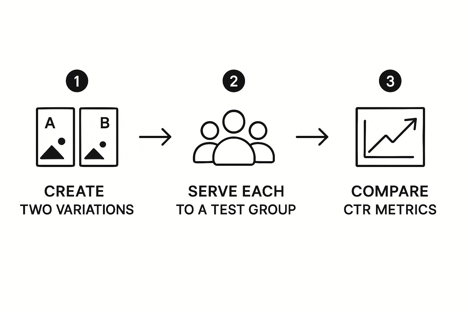
Using A/B Testing to Discover What Really Works
Designing thumbnails based on established best practices is a solid starting point. But if you're serious about maximizing your click-through rates, you have to move from educated guesses to data-driven decisions. This is where A/B testing comes into play.
It’s the single most powerful way to figure out what your specific audience actually responds to, taking all the guesswork out of your creative choices. The idea is simple: create two different thumbnails for one video, show each version to a different slice of your audience, and see which one gets more clicks. Over time, these small, data-backed wins stack up to create significant channel growth.
The Golden Rule of A/B Testing
Before you jump in, there's one non-negotiable rule you absolutely must follow: isolate one variable at a time. It’s tempting to change everything at once—the background color, the text, and your facial expression—but if you do, you’ll have no idea which change actually moved the needle.
A clean, effective test means changing just one thing. For example:
- Version A: Your face with a neutral expression.
- Version B: Your face with a surprised expression.
Everything else—the background, text placement, and colors—has to stay identical. This approach is the only way to get clear, actionable results that you can apply to future thumbnail designs.
Choosing Your A/B Testing Tools
When it comes to running these tests, you’ve got a couple of solid options, each with its own pros and cons.
- YouTube's 'Test & Compare' Feature: This is YouTube's own free, built-in tool. It allows you to upload as many as three different thumbnail versions for a new video. YouTube then handles the rest, automatically showing them to your audience and, after a testing period of up to 14 days, crowning a winner based on which one drove the most watch time.
- Third-Party Services: Dedicated platforms like ThumbnailTest offer more powerful and faster testing. A huge advantage here is the ability to test thumbnails on videos you've already published, giving you a fantastic opportunity to breathe new life into your older content.
Interpreting the Data for Maximum Impact
Collecting data is just the first step. Knowing how to read it is what separates the pros from the amateurs. Your main metric is the click-through rate (CTR), but it's crucial to understand that a "good" CTR is a moving target.
Data from vidIQ suggests that while a 5-7% CTR is good, anything over 10% is phenomenal. Keep in mind, though, it's totally normal for your CTR to dip as a video gains more impressions and reaches a wider, less-targeted audience.
Pay close attention to your traffic sources. A high CTR from Browse Features is gold. This means your thumbnail is grabbing the attention of brand-new viewers—people who are just discovering your channel, not your existing subscribers. That's a huge, positive signal to the YouTube algorithm that your content has broad appeal.
Likewise, a high CTR from YouTube Search tells you that your thumbnail and title are working together perfectly to answer a viewer's specific question. Analyzing these sources gives you a much clearer picture of what makes your thumbnails work for both discovery and search, which is essential to any strategy aiming to optimize thumbnails for higher click-through rates.
Common Thumbnail Mistakes That Kill Your CTR

Knowing what makes people click is half the battle. The other half? Knowing what makes them scroll right past your video.
So many creators unknowingly sabotage their own videos with a few common, and totally avoidable, thumbnail mistakes. The good news is that fixing these is one of the fastest ways to see a real jump in your video's performance.
These slip-ups usually aren't about a lack of effort. They come from a misunderstanding of how people scan information in a crowded feed. A thumbnail has less than a second to grab someone. Let's break down the most damaging mistakes and, more importantly, how to fix them so your content finally gets the eyeballs it deserves.
The Cluttered and Unreadable Design
The single biggest mistake I see is trying to cram too much into one tiny space. When a thumbnail is a chaotic jumble of images, text, and clashing colors, it becomes an unreadable mess. This is especially true on mobile, where over 70% of views happen.
A cluttered design is overwhelming. Instead of sparking curiosity, it creates visual friction, and people’s brains are wired to just scroll past it. The human eye craves a single, clear focal point.
To fix this, think like a minimalist.
- One Big Idea: Your thumbnail should communicate one powerful idea or feeling. What's the one thing you want the viewer to take away?
- Minimal Text: If you use text, stick to three to five high-impact words. Make them intriguing, not just a repeat of your title.
- Embrace Negative Space: Don't be afraid of blank space! It’s your best friend. It makes your main subject pop and gives the whole design room to breathe, which dramatically improves readability.
Inconsistent and Off-Brand Visuals
Another common pitfall is treating every thumbnail like a one-off project, with no connection to your other videos. When your thumbnails have different fonts, color schemes, and layouts every single time, you're throwing away a massive opportunity to build brand recognition.
Consistency is your visual handshake. It helps your subscribers instantly spot your content in a sea of recommendations. A lack of it makes your channel feel disjointed and less professional, which can subtly erode viewer trust and make them hesitate to click.
A consistent visual style does more than just look good; it builds familiarity. Studies show that strong brand consistency can boost click rates by creating a mental shortcut for your audience, telling them "this is content you already know and trust."
The fix is to develop a simple style guide for your thumbnails. This doesn't mean a rigid, boring template. Think of it as a set of guardrails. Use the same bold font, a consistent color palette, and a similar layout. This ensures every thumbnail feels fresh but is still instantly recognizable as yours.
The Misleading 'Clickbait' Trap
There's a fine line between creating intrigue and just lying to your audience. True "clickbait" means using a thumbnail that promises something shocking or extraordinary that the video completely fails to deliver. This could be a photoshopped image of something that never happens or text that makes a totally false claim.
Sure, this tactic might score you a click in the short term, but it’s a terrible long-term strategy. It shatters viewer trust and sends horrible signals to the algorithm. People click away the second they realize they've been duped, and that high drop-off rate tells YouTube not to recommend your content.
The solution is to be honest but compelling. Your thumbnail should accurately reflect the most exciting or valuable part of your video. Your job is to set the right expectations while still making the viewer curious. This approach builds a loyal audience that trusts you, which is way more valuable than a few empty clicks. Building that trust is key, whether you're making content for the public or figuring out how to make training videos for employees that they’ll actually watch.
Your Thumbnail Optimization Questions Answered
Even with a solid plan, you'll always have questions once you're in the trenches, trying to squeeze more clicks out of your thumbnails. Let's tackle some of the most common ones I hear with direct, practical answers to get you unstuck and moving forward.
Think of this as your go-to guide for those moments when you're staring at your analytics, wondering what to do next.
https://www.youtube.com/embed/MP-wdpn6BtQ
How Long Should I Wait Before Changing a Thumbnail?
I know the temptation to swap a thumbnail after a few hours is real, but you have to be patient. Give a new thumbnail at least 24-72 hours to find its footing. This window lets the initial traffic spikes and lulls even out, giving the algorithm enough data to work with.
Before you make a move, dive into your analytics. You need to see a solid number of impressions—I'd say over 1,000 at a minimum—for the click-through rate to mean anything. If the CTR is still painfully below your channel average after three days, that's a clear signal it's time to try a new version.
Does My Thumbnail Really Need My Face In It?
This is a classic question. While it’s not a hard-and-fast rule, putting a human face in your thumbnail is usually a smart bet. Our brains are hardwired to notice faces, especially ones showing a strong, clear emotion like shock or excitement. It creates an instant connection that can stop someone dead in their tracks while scrolling.
But context is king here.
- For tutorials or project-based videos, a clean, crisp shot of the amazing final result will likely be way more enticing than your face.
- For personality-driven content like vlogs or commentary, you are the brand. Leaving your face out would just feel weird and disconnected.
The only way to know for sure is to test it. I always recommend pitting a thumbnail with a face against one without. Let the data show you what your audience responds to for different video topics.
Should I Use the Same Thumbnail Style for Every Video?
You want a consistent style, not a copy-and-paste template. Building a recognizable brand is huge. When a viewer sees your familiar fonts, color scheme, or logo placement, they immediately know the video is yours. That builds trust.
That said, you can't get lazy. While the branding elements should be consistent, the main image and text must be unique to that specific video's content. Reusing the exact same layout for everything looks uninspired and won't hook anyone. The sweet spot is a perfect blend of brand consistency and content-specific intrigue.
A complete video marketing checklist can help you zoom out and see how thumbnails fit into your larger strategy.
What Are the Best Dimensions and File Size for a YouTube Thumbnail?
Getting the technical stuff right is a simple win you can't afford to mess up. YouTube officially recommends 1280x720 pixels, which is a 16:9 aspect ratio. Following this ensures your thumbnail looks sharp and professional everywhere, from a giant TV to a tiny phone screen.
For the file itself, you can use JPG, GIF, or PNG. The most critical thing to watch is the file size—you have to stay under YouTube's 2MB limit. Always export your image at the highest quality possible that still keeps you under that cap. This will help you avoid any nasty, blurry compression artifacts.
And remember, thumbnail optimization is just one piece of the puzzle. For a wider view on getting more clicks across all your marketing, check out this article on 10 powerful strategies to increase click-through rate.
Struggling to create consistently high-quality thumbnails that drive clicks? Moonb provides on-demand access to a full creative team, including graphic designers who can craft compelling, on-brand visuals for all your videos. Stop guessing and start growing with professional creative assets at a fixed monthly fee. Find out how we can elevate your content at https://moonb.io.
Frequently asked questions
Written documentation matters more than meetings. Loom recordings beat live calls for context. The work moves at the speed of the slowest reviewer, so clarity upstream is the only real speed lever.
If you can describe the audience, the action you want, and the channel in three short sentences without using marketing jargon, the brief is ready to move into production.
Group feedback by intent, not by source. Resolve structural notes first, then polish. Most apparent contradictions disappear once the notes are grouped this way.

