8 of The Most Important Graphic Designers That Ever Lived
The graphic designers who taught design to move, from Saul Bass to Susan Kare, plus the one idea from each that a modern brand video team still uses.

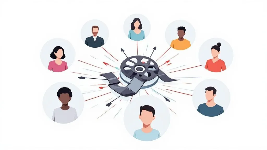
If you came here for Paul Rand, Milton Glaser, and Massimo Vignelli, I will send you straight to them, and the FAQ at the end lists the full print canon. This piece answers a different question, the one I care about from inside a working motion studio: which designers taught the page to move?
Every roundup from the big design sites runs the same forty-name walk through the print greats. I have read most of them. They make fine history and they help me not at all on a Tuesday, because none of those names surface when a headline has to animate, when a title card has to build a mood in four seconds, or when a product screen has to feel alive under someone’s thumb.
So here are eight designers whose ideas my team actually reaches for once the screen starts moving. A few of them worked in film. One designed an operating system. One barely built anything and instead taught the rest of us how to read the work. I count all of them as graphic designers because they wrestled with the things every designer wrestles with, type and composition and hierarchy and contrast, only they solved those problems in time instead of on a fixed page.
Why does an old lineage matter now, when design trends and news move every week? Because the craft-level judgment these people had is the exact part getting squeezed. The U.S. Bureau of Labor Statistics projects the field to grow just 2 percent through 2034, slower than average, naming automated AI design tools as one reason demand is soft, per the BLS Occupational Outlook Handbook. The median designer earned $61,300 in 2024, per the same BLS data. Software keeps getting better at making shapes. It is nowhere near as good at deciding which shape means something, and that decision is what all eight of these people were unusually good at.
If you only want the through-line: every one of them put the idea before the execution, and every one gave motion a job to do beyond decoration.
Saul Bass: the title sequence became the first scene
Saul Bass turned the opening credits into a film’s first act, and that instinct is exactly what a brand video needs in its opening seconds. Before Bass, titles were a list you sat through while people found their seats. He treated them as a prologue, using motion and cut-paper shapes to set the mood and the theme before the first line of dialogue.
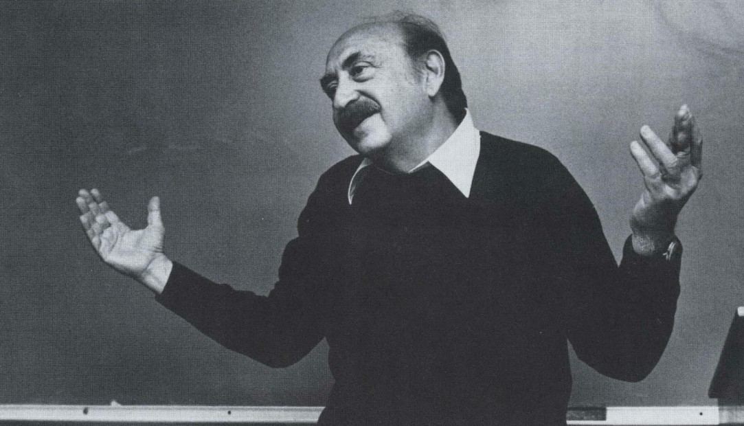
His run with Alfred Hitchcock, Otto Preminger, and Billy Wilder produced the sequences designers still study. The hypnotic spirals of Vertigo (1958) stand in for obsession and vertigo before the plot explains either, and Bass built them with the computer-animation pioneer John Whitney, whose analog machine generated the shapes, which links two names on this list to one landmark, per Art of the Title. In North by Northwest (1959), text slides onto a grid that becomes the face of a skyscraper. In Anatomy of a Murder (1959), a cut-apart body assembles and comes apart with the credits. He also drew logos that outlived him, including the AT&T bell and the United Airlines tulip, so his eye worked whether the mark held still or ran.
Here is where I reach for him. A client once asked me to make their logo “do something,” which is the vaguest brief on earth. I pulled up the North by Northwest opening and we stopped guessing, because Bass shows you that motion should carry meaning, not just movement. The lesson I take to every kickoff is that the first three seconds of a brand film are the whole pitch, and if the motion there does not say what the film is about, the rest is wallpaper. A tight design process is what lets a small idea like that survive contact with production.
Pablo Ferro: type with a living voice
Pablo Ferro proved that lettering could have a handwriting and a personality, not just a font. He hand-drew titles that broke free of clean mechanical typesetting, giving text a nervous, human rhythm that reads as a voice rather than a label.
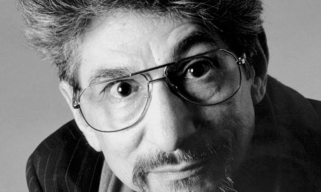
The work everyone cites is his sequence for Stanley Kubrick’s Dr. Strangelove (1964), where tall, thin, hand-lettered titles crawl across footage of a B-52 refueling in mid-air, delicate script laid over a machine built to end the world, a joke you feel before you name it, per Art of the Title. He then built the split-screen, quick-cut editing language of Bullitt (1968) that action films borrowed for the next fifty years.
What I steal from Ferro is the idea that type is a performance. When a client says their brand is warm or precise or a little irreverent, kinetic typography is often the fastest way to show it without a single voiceover word, and the way the letters move says as much as the letters themselves. The trap I watch teams fall into is animating text for energy alone, so it dances and nobody can read it. Ferro kept his legible at speed, which is the harder skill. If you want to see how far that voice can stretch, the different types of motion graphics mostly trace back to his sense that letters are characters.
George Lois: the big idea comes before the animation
George Lois built his whole career on the concept arriving before any craft, and that order is the single most useful habit I have taken from anyone on this page. He was an art director and adman more than a motion designer, so I am placing him here in good faith, for the thinking rather than the frames. His thinking is worth more than most people’s frames.
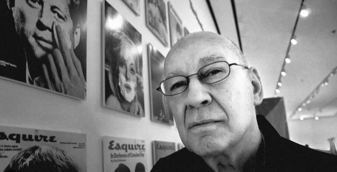
Lois translated the shock of his Esquire magazine covers into television, most famously with the “I Want My MTV” campaign that turned a cable channel into a demand, and earlier with the animated Maypo cereal spots that made a kid crying for oatmeal a national catchphrase. The covers and the spots share one thing: a single-minded idea you could describe in a sentence before anyone drew a storyboard.
I run every brief through a Lois test now. If I cannot say what the video is about in one plain line, the animation will not save it, because motion amplifies whatever idea is underneath and an empty idea just gets louder. On the flip of that, a real concept survives a rough cut, a stripped soundtrack, even a bad export, which is how I know it is real. This is the least glamorous lesson in the article and the one that has saved the most budgets I have worked on.
Kyle Cooper: texture, dread, and the title reborn for the digital age
Kyle Cooper picked up where Bass left off and used digital tools to make something scratched, organic, and frightening. He is the reason a title sequence in the 1990s stopped feeling clean and started feeling like a warning.
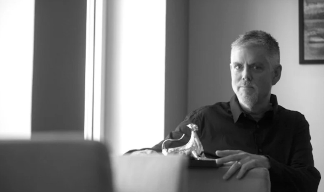
His opening for David Fincher’s Se7en (1995) is the landmark, all hand-scratched type, jittering frames, and macro shots of a killer’s notebooks, and it is routinely named one of the most influential title designs ever made, per Art of the Title. He kept going with Mission: Impossible, the Spider-Man films, The Mummy, and the sickly, flickering titles for American Horror Story. The through-note across all of it is that texture is emotion. Grain, distress, and imperfection do real work on how a piece feels.
I bring Cooper into the room whenever a brand thinks premium means glossy. Sometimes premium means a little rough, a little handled, a little dangerous, and a flawless render reads as forgettable while a textured one reads as alive. That is a directorial choice, not a plugin, and it is the sort of thing the good motion graphics studios get right on purpose rather than by accident.
Susan Kare: motion that made machines feel human
Susan Kare designed the animations that taught a cold machine to feel friendly, and she is the strongest straight-up graphic designer in this whole lineup. She is best known for the bitmap icons on the original 1984 Macintosh, but the part that matters for motion is subtler.

Kare gave the machine feedback you could feel. The animated wristwatch cursor told you the computer was thinking, and the blinking insertion point gave you a living target for your next keystroke, effectively the first interface animations millions of people ever saw, per the Museum of Modern Art. These were tiny motions doing enormous work, turning a blank, intimidating box into something that answered you.
Her lesson shows up in every product demo and app walkthrough I help make. A button that confirms a tap, a check that lands with a small bounce, a loader that reassures instead of nagging, that is Kare’s grammar, and it is the difference between software that feels responsive and software that feels dead. Consistency is the whole game here, which is also why a shared icon library matters more than any single clever animation.
Michel Gondry: the handmade edge against digital polish
Michel Gondry made his name proving that visible, tactile, in-camera craft beats slick digital perfection at feeling real. As the industry rushed toward flawless CGI, he ran the other way with paper, mirrors, forced perspective, and stop-motion.
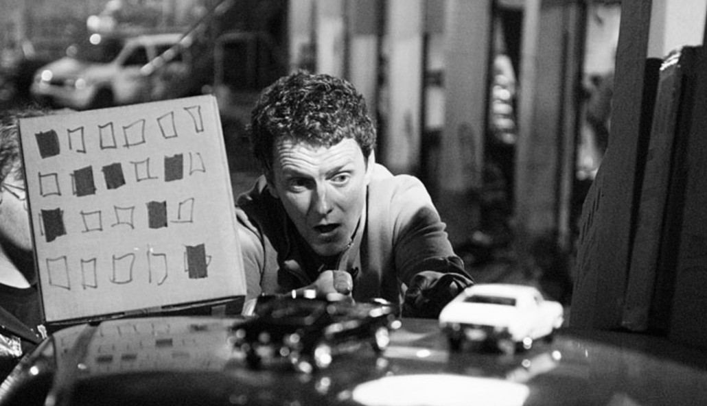
His music videos are the masterclass. Björk’s “All Is Full of Love” and The Chemical Brothers’ “Let Forever Be” built dizzying, dreamlike sequences almost entirely in the camera rather than in post. His film Eternal Sunshine of the Spotless Mind (2004) used practical effects and clever sets to picture memory falling apart, and the fantastical never lost its handmade warmth.
Gondry is more relevant now than he was in 1999, and I say that as someone watching feeds fill with slick, weightless, machine-made clips. The imperfect, physical, obviously-made-by-hands look is becoming the thing that stops a thumb, because a jitter or a seam signals a person was here. I keep an eye out for briefs where a paper cut-out or a real object on a real table will outperform a perfect vector, and lately that is more of them, not fewer. (I looked for an owner-channel upload of a Gondry video to embed here and could not verify one I trusted, so I left it out rather than link something shaky.)
John Whitney: motion as pure mathematics
John Whitney treated animation as math you could see, and he is the forefather of every procedural and generative graphic your team uses today. While his peers drew cels by hand, Whitney built machines to compute motion.
He assembled a mechanical analog computer out of surplus anti-aircraft gun parts and used it to make Catalog (1961), a reel of geometric patterns nobody had been able to produce before. He co-created that Vertigo spiral with Saul Bass, and later films like Permutations (1968) pushed further into the marriage of algorithm and aesthetic. His whole argument was that pure movement, driven by mathematical harmony, could be the subject itself, no story required.
Whitney is why I am comfortable pitching a brand system that is generative rather than hand-placed. Data-driven loops, algorithmic backgrounds, motion that regenerates on a rule instead of a keyframe, all of it descends from his machines, and the discipline he brought is worth copying: constraints breed better work, not worse. Set the rules, then let the system surprise you. Most of the modern technique of animation is his idea running on faster hardware.
Kevin B. Lee: learning to read motion, not just make it
Kevin B. Lee earns the last slot not for designing motion but for teaching a generation how to read it critically. He is a film critic and video essayist, not a graphic designer in the traditional sense, and I am keeping that straight. His contribution is a different kind of literacy.

Lee pioneered the “desktop documentary,” a form that films the screen itself, and helped make the video essay a serious way to take visual language apart and understand why it works. His breakdowns treat a title sequence or an edit the way a critic treats a poem, asking what each choice is doing and at whose expense.
I put him on the list because making is only half of a creative team’s job. The other half is reading, and a team that studies reference critically before it briefs makes sharper work than one that only collects pretty screenshots. When my designers can name why a sequence lands, not just that it does, the next brief gets better. Lee is the reminder that taste is a muscle you build by paying attention.
The one principle each pioneer gave us
Eight designers, eight ideas I actually use. Here is each principle next to where it turns up in brand video now.
| Designer | The one principle | Where it shows up in brand video today |
|---|---|---|
| Saul Bass | The title sequence is the story's first scene. | The opening seconds of a brand film, where the mood is set before a word is spoken. |
| Pablo Ferro | Type has a handwriting and a voice. | Kinetic typography that carries a brand's tone, not only its words. |
| George Lois | The big idea comes before the animation. | Concept-led work where the hook survives even without the motion. |
| Kyle Cooper | Texture and grit are emotional tools. | Distressed, tactile sizzle and title work that makes a film feel dangerous or premium. |
| Susan Kare | Motion makes a machine feel human. | Micro-animations in product demos and UI that confirm, reassure, and delight. |
| Michel Gondry | Handmade imperfection reads as real. | In-camera and practical looks that cut through a feed of machine-made clips. |
| John Whitney | Motion can be pure mathematics. | Procedural and generative graphics, data-driven loops, rule-based brand systems. |
| Kevin B. Lee | You have to read motion to make it well. | Teams that study reference critically before they brief, not after they miss. |
The through-line: what all eight actually share
Stack the eight up and the same shape appears. Each one refused to treat motion as garnish. Bass would not let credits be a formality, Whitney would not let animation be random, Kare would not let feedback be silent, and Lois would not let an execution stand in for an idea. The common enemy was decoration, motion with no argument underneath it, and every one of them fought it in their own medium.
The clearest statement I have found of why that fight matters comes from Paula Scher, who is missing from my list only because she belongs to the print-and-identity canon this piece steps around on purpose. In her talk she separates design that is serious from design that is merely solemn, and that line is the exact one all eight of these designers kept crossing on purpose. Here it is, from TED’s own channel.
Scher’s point, that the safe choice and the good choice are rarely the same one, is the tax every designer on this page paid to be remembered. None of them made the obvious version.
How a modern creative team uses these lessons
You do not need a mechanical computer or a Kubrick budget to use any of this. The eight principles collapse into a short working checklist I hand my own team, and it costs nothing to adopt.
- Lead with the idea, not the software. Before anyone opens a timeline, write the one plain sentence the video is about. If it does not survive being said out loud with no visuals, it is not ready. That is Lois, and it is free.
- Give every motion a job. Ask what each move is doing for the viewer’s understanding, the way Bass and Kare did. A piece of animation that is not clarifying or setting mood is just noise, and noise is the fastest way to look generic.
- Reach for texture and the handmade when polish is getting you nowhere. Cooper and Gondry both knew that a little grit, a little friction, a little visible human hand often beats a flawless render, and in an AI-saturated feed that gap is only widening.
- Read before you make. Steal Lee’s habit. Pull three references apart and name why they work before your team briefs, so the brief is sharper on the way in.
This is the part my team owns for clients at Moonb, keeping the taste steady from the first frame of a title to the fortieth deliverable in a quarter, because the judgment these pioneers had does not scale on its own. It has to be built into how a team works. The tools change every year. What Bass, Ferro, Lois, Cooper, Kare, Gondry, Whitney, and Lee left behind does not, and it is still the best brief I know for making something worth watching once the page starts to move.
Frequently asked questions
Several worked in film, interface, or advertising rather than print, and I am upfront about that in the piece. I still count them as graphic designers because they solved the core design problems, type, composition, hierarchy, and contrast, only they solved them in time instead of on a static page. Susan Kare is a straightforward graphic designer by any definition; George Lois was an art director; Kevin B. Lee is a critic. I included each for the specific idea they contributed to design that moves, and labeled the ones who sit outside the traditional job so you can weigh them yourself.
If you want the classic canon of static design, the usual names are Paul Rand (IBM, ABC, UPS logos), Milton Glaser (I Love NY, Bob Dylan poster), Massimo Vignelli (the New York City subway map and signage), Josef Muller-Brockmann (Swiss grid systems), and Paula Scher (Citibank, Public Theater). This article deliberately skips that list because every other roundup already runs it. My eight are the motion lineage instead, which is the part almost nobody maps.
More than you would think, because their lessons are about judgment, not tools. Write the one-sentence idea before you brief (Lois). Make sure every animation clarifies or sets mood rather than just fills time (Bass, Kare). Reach for texture and a handmade feel when slick is not landing (Cooper, Gondry). Pull references apart and name why they work before you start (Lee). None of that requires a bigger budget or newer software. It requires deciding what the work is for before you make it, which is the habit that separates memorable brand video from forgettable brand video.



