Top Free Icon Libraries That Don’t Look Generic (2026)
Discover the Top 20 Free Icon Libraries That Don’t Look Generic. Find unique, high-quality icons for your next project and avoid the overused look.
In a digital world saturated with visuals, generic icons are the equivalent of digital white noise; they're seen but not felt. The right icon set can elevate a user interface from functional to fantastic, reinforcing your brand's unique voice and improving usability. But finding high-quality, free icons that haven't been used on a million other sites is a significant challenge. This guide cuts through the clutter, presenting a curated selection of the top 20 free icon libraries that don’t look generic, offering style, flexibility, and a professional edge without the cost.
This comprehensive resource is designed for busy professionals. We'll explore why developers and designers are moving beyond standard choices and how you can use these resources to create truly distinctive digital experiences. Each entry includes a direct link, key features, and practical use-case recommendations to help you find the perfect fit for your project quickly.
Just as a unique icon set enhances your UI, high-quality visuals are crucial for your overall brand presence. For broader asset needs, exploring the top sources for royalty-free images for commercial use can provide the photography and illustrations necessary to complete your creative vision. Now, let’s dive into the icon libraries that will make your designs stand out.
1. Google Material Symbols
When you need a cohesive, product-ready visual language, Google Material Symbols is an unparalleled choice. As the successor to the classic Material Icons, this library moves beyond static assets into a powerful variable font format. This single font file contains thousands of icons, and you can dynamically control four axes: fill, weight, optical size, and grade, directly in your CSS. This innovative approach makes it one of the top free icon libraries for modern web and app development, ensuring crisp, consistent visuals at any scale.
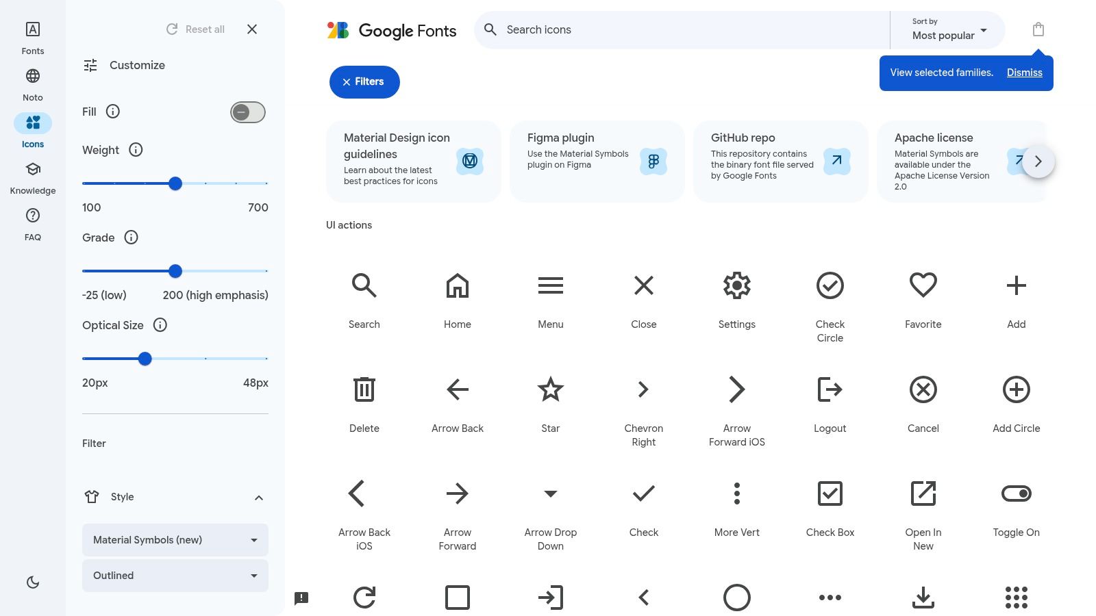
This eliminates the need to manage multiple SVG files for different states, like filled or outlined, allowing for smooth animations and transitions. The icons are meticulously designed to complement Google’s Material Design system, which can give your project an instantly familiar, high-quality feel. Their clean aesthetic pairs well with modern UI design; for guidance on creating a visually harmonious interface, explore how to use a color palette generator to complement your icon choices.
Key Details & Features
Key Details & Features
| Feature | Description |
|---|---|
| Variable Font Controls | Adjust Fill, Weight, Grade, and Optical Size via CSS. |
| Available Formats | Delivered as a variable font, but also available as SVGs and PNGs. |
| Icon Styles | Includes Outlined, Rounded, and Sharp variations for design flexibility. |
| Licensing | Free for commercial and personal use under the Apache 2.0 license. |
- Best For: UI/UX designers and developers building applications, dashboards, or websites that require a polished, consistent, and scalable icon system.
- Limitation: The distinct Material Design style might not suit every brand, potentially feeling too "Google-like" if you're aiming for a completely unique aesthetic.
Website: Google Material Symbols
2. Heroicons
Created by the team behind Tailwind CSS, Heroicons offers a library of hand-crafted SVG icons with a clean, modern aesthetic that feels both professional and approachable. The library is intentionally focused, providing essential icons for UI development without overwhelming you with obscure options. Its distinct but neutral style integrates seamlessly into contemporary designs, making it one of the best free icon libraries for developers who value simplicity and cohesion.
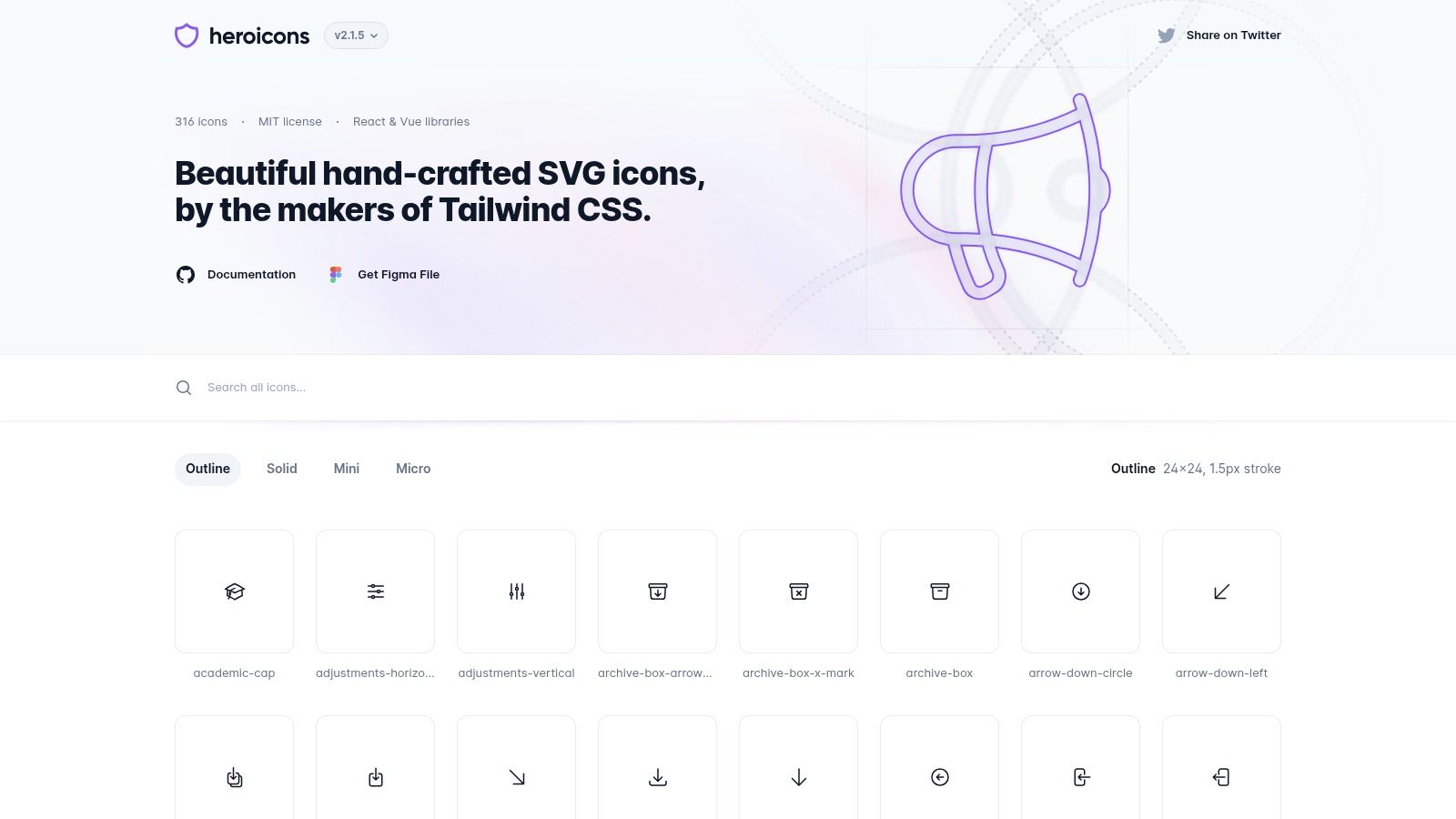
What sets Heroicons apart is its developer-first approach. It provides official React and Vue packages for easy importing, and the icons are designed to be styled directly with CSS utility classes, which streamlines the entire development workflow. This tight integration is a key part of an efficient design process in graphic design, as it reduces friction between design and implementation. You can simply copy the SVG code or use the framework-specific components to get started instantly.
Key Details & Features
Key Details & Features
| Feature | Description |
|---|---|
| Developer-Focused | First-party packages for React and Vue, plus simple copy-paste SVGs. |
| Available Formats | Primarily SVG, optimized for web development frameworks. |
| Icon Styles | Comes in Solid and Outline variations, with multiple sizes (16/20/24px). |
| Licensing | Free for commercial and personal use under the permissive MIT license. |
- Best For: Developers and designers using Tailwind CSS or modern JavaScript frameworks who need a beautiful, no-fuss icon set that works out of the box.
- Limitation: The icon catalog is smaller than comprehensive libraries like Material Symbols, so you may need to supplement it for highly specialized use cases.
Website: Heroicons
3. Phosphor Icons
For teams needing a truly versatile and developer-friendly icon system, Phosphor Icons is a standout choice. This flexible icon family was built with a core focus on variety, offering an impressive six weights for every icon: Thin, Light, Regular, Bold, Fill, and a unique Duotone style. This stylistic breadth makes it incredibly easy to match the icons to your brand’s specific typographic voice, ensuring visual harmony across your entire interface. It’s one of the top free icon libraries for projects that demand more personality than a standard single-weight set can offer.
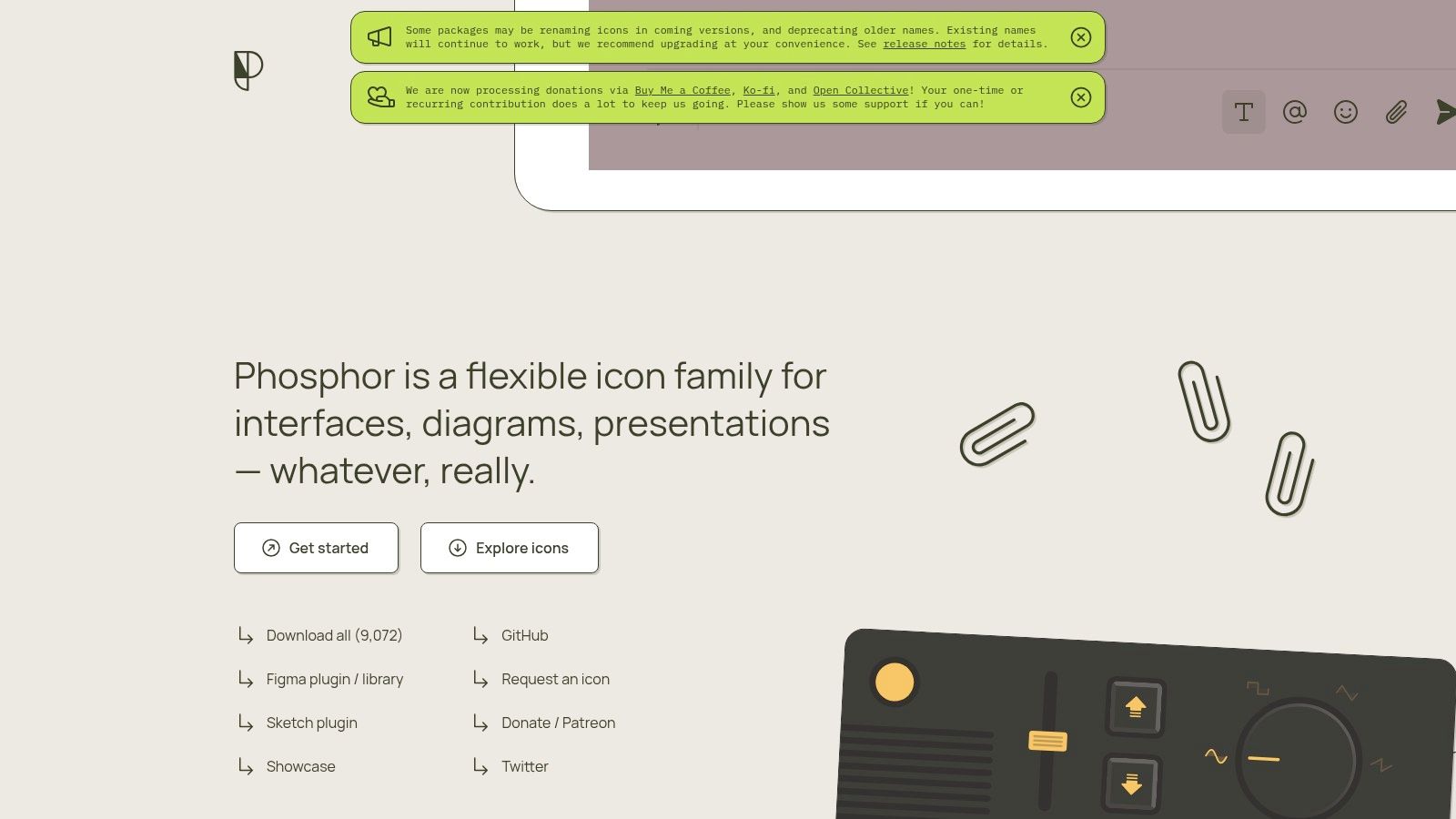
Phosphor excels in its developer ergonomics, providing dedicated packages for modern frameworks like React, Vue, and Flutter. This makes integration seamless, whether you prefer using a simple web font or importing components directly to optimize your bundle size. The icons are crisp, thoughtfully designed for user interfaces, diagrams, and presentations, making them a robust all-in-one solution for product design. The MIT license further solidifies its position as a go-to resource for both personal and commercial projects without any restrictions.
Key Details & Features
Key Details & Features
| Feature | Description |
|---|---|
| Multiple Weights | Every icon is available in Thin, Light, Regular, Bold, Fill, and Duotone. |
| Developer-First | Dedicated component libraries for React, Vue, Flutter, and others. |
| Available Formats | Web Font, SVG, PNG, and framework-specific components. |
| Licensing | Free for commercial and personal use under the permissive MIT license. |
- Best For: Developers and designers who need a highly flexible icon set that can be easily integrated into modern web and mobile application stacks.
- Limitation: The library contains over 1,200 icons, which is substantial but smaller than massive collections like Material Symbols, potentially requiring supplementation for niche use cases.
Website: Phosphor Icons
4. Tabler Icons
For projects that demand precision and a clean, utilitarian aesthetic, Tabler Icons is a standout choice. This extensive library features over 5,600 icons, all meticulously designed on a 24x24 pixel grid. Their stroke-based construction makes them incredibly versatile and easy to customize directly with CSS, allowing developers to adjust properties like stroke width and color on the fly. This focus on consistency and customization makes it one of the top free icon libraries for data-heavy interfaces.
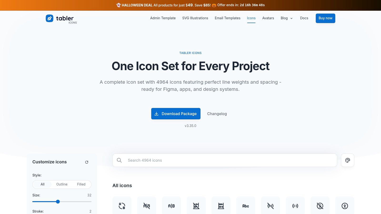
The library’s sharp, geometric style is perfect for dashboards, admin panels, and technical applications where clarity is paramount. Its cohesive design ensures that every icon, from a simple arrow to a complex chart symbol, feels part of the same visual system. The icons are easily accessible as individual SVGs or through an npm package, streamlining the integration process for developers and ensuring a high-quality, professional result without any clutter.
Key Details & Features
Key Details & Features
| Feature | Description |
|---|---|
| Grid-Based Design | Over 5,600 icons built on a consistent 24px grid for perfect alignment. |
| Available Formats | Delivered as individual SVGs, SVG sprites, and as an npm package. |
| Customizable Stroke | The stroke width of all icons is easily tunable via CSS for stylistic variations. |
| Licensing | Free for commercial and personal use under the permissive MIT license. |
- Best For: Developers and designers creating dashboards, web applications, and technical interfaces that require a sharp, highly consistent icon set.
- Limitation: The aesthetic is primarily line-style and functional, which may feel too technical or sterile for more creative or brand-focused websites.
Website: Tabler Icons
5. Lucide
For developers who prioritize performance and modularity, Lucide is a community-driven fork of the popular Feather icon set. It expands upon the original’s minimalist aesthetic with a larger, actively maintained library of over 1,600 icons. Its primary advantage lies in its lightweight, tree-shakeable packages for modern JavaScript frameworks, ensuring that only the icons you actually use are bundled into your final application. This makes it an exceptional choice among free icon libraries for performance-critical projects.
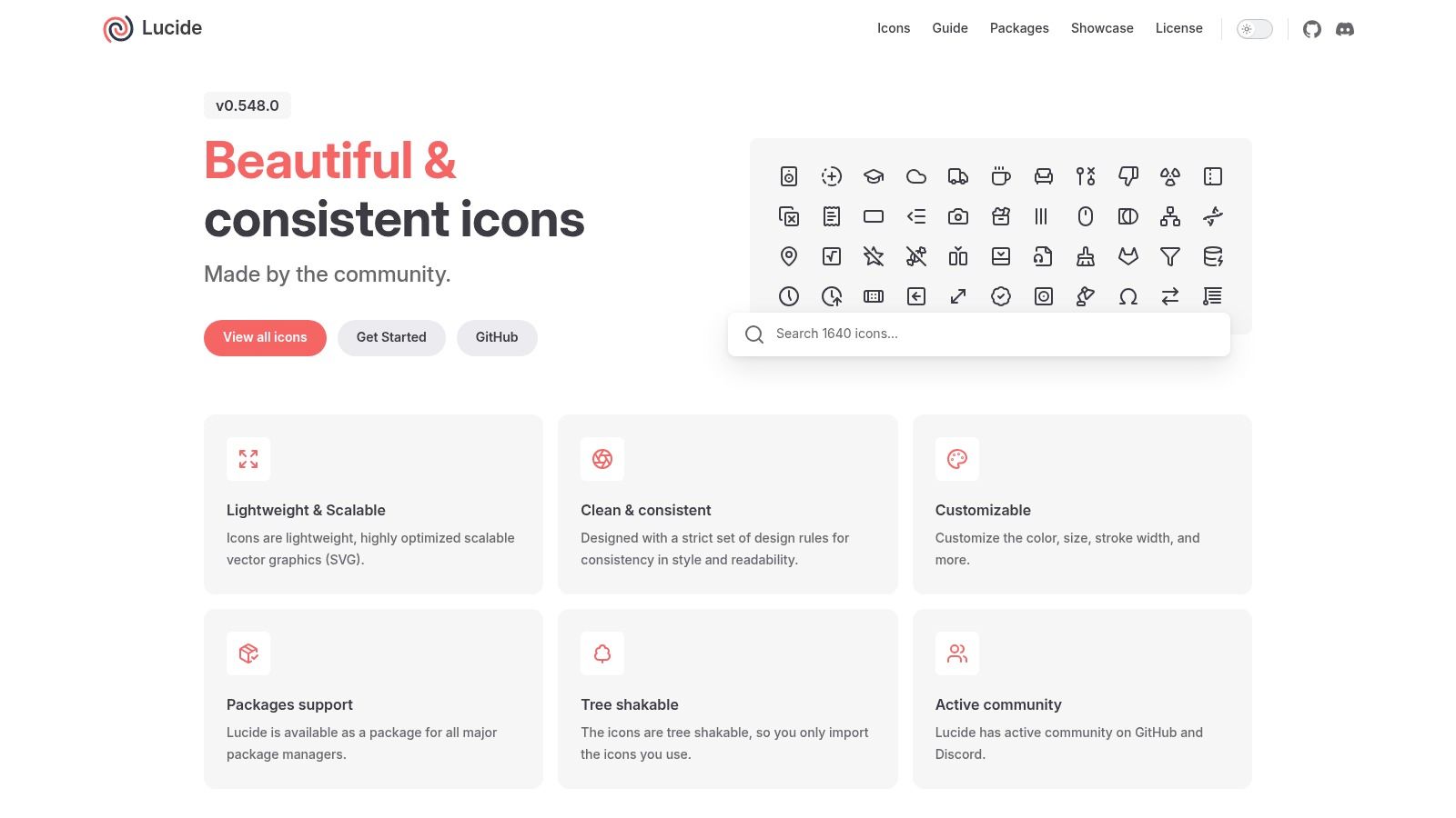
The icons are designed with a consistent, clean-line style that is both modern and highly readable. The on-site customizer is a standout feature, allowing you to quickly adjust stroke width, color, and size before downloading the SVG. This level of control, combined with its developer-first approach and permissive ISC license, makes Lucide a powerful and flexible tool for any project where speed and customization are key. The active community ensures the library continues to grow and adapt to user needs.
Key Details & Features
Key Details & Features
| Feature | Description |
|---|---|
| Framework Packages | Tree-shakeable libraries for React, Vue, Svelte, Angular, and more. |
| On-Site Customizer | Instantly adjust color, stroke width, and size before downloading. |
| Icon Styles | Primarily a consistent outline style, focused on clarity and minimalism. |
| Licensing | Free for commercial and personal use under the permissive ISC license. |
- Best For: Developers building fast, modern web applications who need an easily integrated, high-performance, and customizable icon solution.
- Limitation: The library intentionally excludes brand logos, and its focus on a single outline style may not fit designs requiring more stylistic variation.
Website: lucide.dev
6. Remix Icon
Remix Icon is a beautifully crafted, neutral-style icon system designed for clarity and versatility in user interfaces. Each of its 3,000+ icons comes in a matching outlined and filled pair, making it simple to implement different states for buttons and interactive elements. Designed on a precise 24x24 grid, the icons maintain legibility even at small sizes, ensuring a clean and professional look across your entire project. This focus on readability and consistency makes it a top choice among free icon libraries for product design.
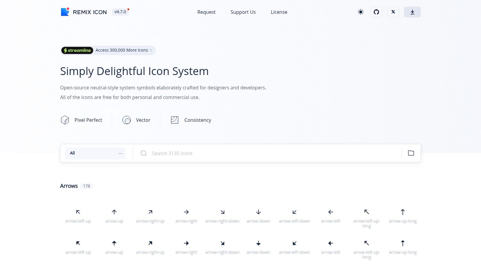
The library strikes a perfect balance between being comprehensive and not stylistically overbearing, allowing it to blend seamlessly into various brand aesthetics. Whether you're building a minimalist web app or a complex dashboard, Remix Icon provides a solid foundation. Its developer-friendly integrations, including an NPM package and a Figma plugin, streamline the workflow from design to implementation, saving valuable development time.
Key Details & Features
Key Details & Features
| Feature | Description |
|---|---|
| Dual-Style System | Every icon is available in both an Outline and a Filled style for state changes. |
| Available Formats | Downloadable as individual SVGs, PNGs, or usable via an icon font. |
| Developer Tools | Official NPM package for easy project integration and a dedicated Figma plugin. |
| Licensing | Free for commercial and personal projects under the Apache 2.0 license. |
- Best For: UI/UX designers who need a clean, readable, and theme-friendly icon set for web applications, mobile apps, and design systems.
- Limitation: The visual style is limited to the outline/fill pairing, lacking the variable weight or grade options found in more dynamic libraries.
Website: Remix Icon
7. Feather Icons
Feather Icons is the epitome of minimalist design, offering a beautifully crafted set of open-source icons perfect for clean, modern interfaces. Created by Cole Bemis, this library focuses on simplicity, readability, and consistency. Each icon is designed on a 24x24 grid with a consistent 2-pixel stroke, making them feel balanced and lightweight. This focused approach makes Feather a standout choice among free icon libraries for projects where clarity and elegance are paramount, avoiding the overwhelming nature of massive collections.
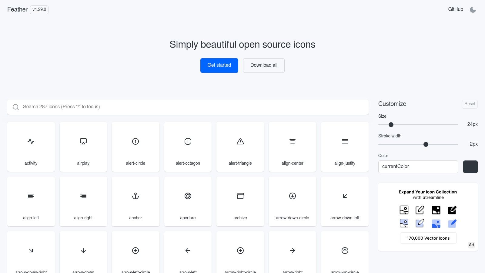
The library's small footprint and extremely optimized SVGs are a major advantage for performance-conscious developers. While it doesn't offer the vast selection of larger libraries, its curated catalog ensures that every icon is purposeful and well-executed. Its simple, line-based style is highly versatile, blending seamlessly into various brand aesthetics without overpowering the user interface. The availability of wrappers for popular frameworks like React makes implementation incredibly straightforward for developers.
Key Details & Features
Key Details & Features
| Feature | Description |
|---|---|
| Design Philosophy | ~280 minimalist icons designed on a 24×24 grid with consistent 2px strokes. |
| Available Formats | Primarily SVG, with easy copy-paste functionality directly from the site. |
| Developer Ecosystem | Includes official wrappers for popular frameworks like React and Vue. |
| Licensing | Free for commercial and personal use under the MIT License. |
- Best For: Developers and designers creating minimalist web apps, dashboards, or mobile UIs where performance and a clean, unobtrusive aesthetic are critical.
- Limitation: The library has a relatively small and focused set of icons, which may not cover all niche use cases. Updates are also less frequent compared to larger, actively managed projects.
Website: Feather Icons
8. Iconoir
Iconoir is a standout open-source library that strikes a perfect balance between a unique, geometric aesthetic and broad usability. It offers a meticulously crafted set of icons that feel distinct without being overly stylistic, making it a flexible choice for projects that need a touch of personality. The library’s strength lies in its exceptional support for both designers and developers, with dedicated packages for major frameworks and design tools. This focus on integration streamlines workflows, ensuring consistency from mockup to final product.
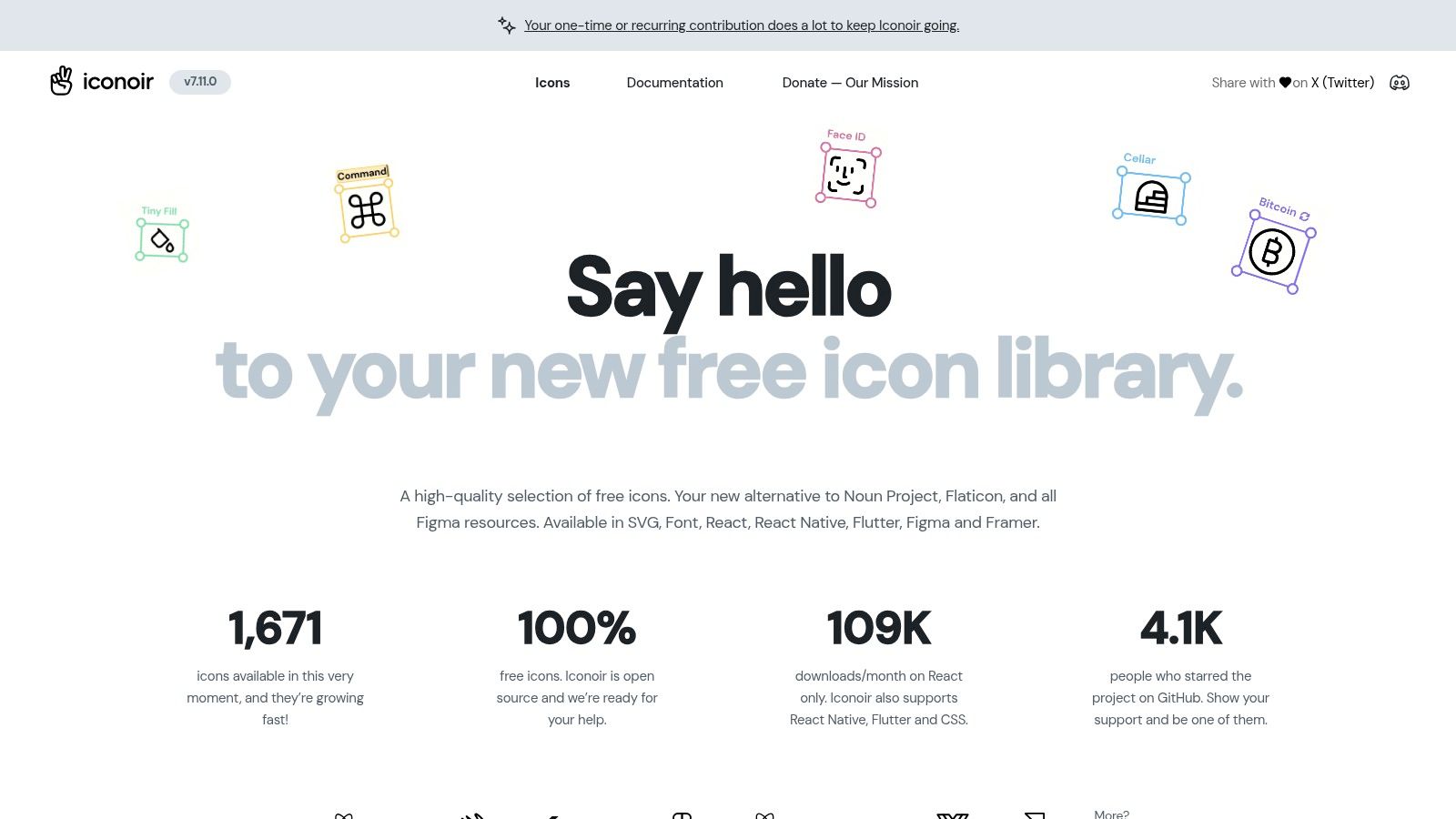
One of its most practical features is the on-site browser, which allows you to customize the stroke width and overall size before downloading, giving you precise control over the final look. This customization, combined with its comprehensive framework support, makes Iconoir one of the top free icon libraries for teams seeking a cohesive visual system. The clean, line-based style is highly versatile, fitting well into minimalist interfaces, tech dashboards, and creative portfolios.
Key Details & Features
Key Details & Features
| Feature | Description |
|---|---|
| Broad Framework Support | Provides official packages for React, React Native, Flutter, and CSS. |
| Available Formats | Icons are available as SVGs and through various libraries and plugins. |
| Design Tool Integration | Includes plugins for Figma and Framer for seamless design workflows. |
| Licensing | Free for commercial and personal use under the permissive MIT license. |
- Best For: Developers and designers who need a stylish, consistent icon set that integrates directly into their existing toolchains, from Figma to React.
- Limitation: The library contains over 1,600 icons, which is extensive but smaller than some mega-libraries. It also primarily focuses on an outline style without offering filled or duotone variants for every icon.
Website: Iconoir
9. Font Awesome
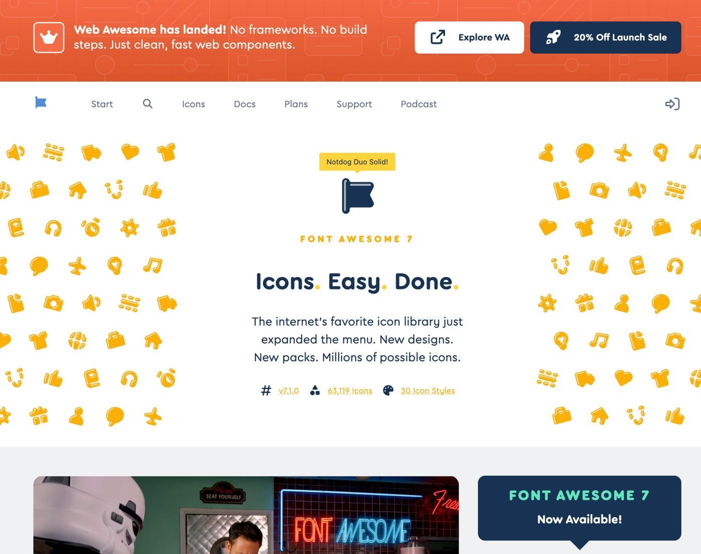
Font Awesome is one of the most established and widely used icon toolkits on the internet, and its robust free tier earns it a solid place on this list. While it is incredibly popular, its extensive ecosystem and ease of use make it a powerful choice for projects needing a vast range of icons without a steep learning curve. Its maturity means you get fantastic documentation, framework integrations (React, Vue, etc.), and a powerful CDN that makes implementation a breeze.
The library is more than just a set of images; it’s a full-fledged system. You can easily manage icons using its web font or modern SVG frameworks, and the search functionality on its website is second to none. While its distinct style is very recognizable, you can still maintain brand consistency. For tips on integrating icon styles cohesively, explore this guide on how to create brand guidelines to ensure your visuals remain unique.
Key Details & Features
Key Details & Features
| Feature | Description |
|---|---|
| Massive Library | The free plan includes thousands of icons, with a significantly larger catalog available in the Pro version. |
| Multiple Formats | Available as SVG, web font, and via CDN kits for flexible integration. |
| Framework Support | Offers official components for React, Vue, Angular, and other popular frameworks. |
| Licensing | Free tier (Font Awesome Free license) for commercial use; expanded Pro library requires a subscription. |
- Best For: Developers who need a reliable, all-in-one toolkit that is quick to implement across different tech stacks and projects.
- Limitation: Its immense popularity means the icons can feel familiar or generic if you're aiming for a completely bespoke look. The most unique styles are locked behind the paid Pro subscription.
Website: Font Awesome
10. Noun Project
When you need an icon for a specific or abstract concept, Noun Project is the go-to resource. It's a massive, community-driven library with millions of symbols from a diverse range of global creators, making it one of the best free icon libraries for avoiding generic visuals. If you're looking for an icon representing "sustainable agriculture" or "blockchain consensus," you are far more likely to find a unique, well-designed option here than in more standardized UI-focused sets. The platform excels at breadth and artistic variety.
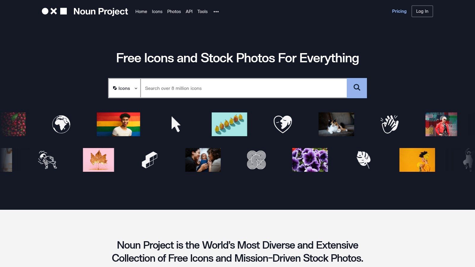
The free model operates on an attribution basis, requiring you to credit the creator for each icon used. For projects where attribution isn't feasible, a paid subscription provides royalty-free access and unlocks integrations with tools like Adobe and Microsoft Office. This hybrid approach supports individual artists while offering a scalable solution for professional teams.
Key Details & Features
Key Details & Features
| Feature | Description |
|---|---|
| Massive Library | Over 8 million icons covering nearly any topic imaginable. |
| Available Formats | Free downloads as PNGs and SVGs with attribution. |
| Integrations | Offers apps and plugins for Mac, Adobe, Microsoft, and an API for developers. |
| Licensing | Free with required attribution, or Royalty-Free with a paid subscription. |
- Best For: Marketers, content creators, and designers needing specific or unique icons for presentations, articles, and niche websites where stylistic consistency is managed on a case-by-case basis.
- Limitation: The variety is also a weakness; icons from different creators have inconsistent styles, so building a cohesive UI set requires careful curation.
Website: Noun Project
11. IconScout
IconScout positions itself as a comprehensive design asset marketplace, extending far beyond typical icon sets. While it offers millions of high-quality icons, its real strength lies in providing a unified source for illustrations, 3D assets, and Lottie animations. This makes it an invaluable resource for teams looking to maintain a consistent visual style across diverse media, from a website UI to animated presentations. A significant portion of its library is available for free, making it one of the top free icon libraries for projects needing more than just static images.
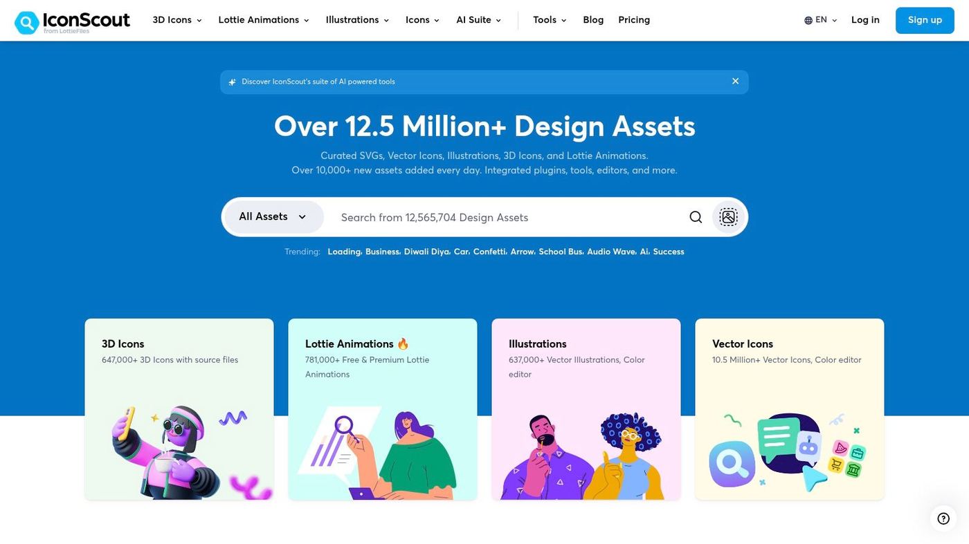
The platform includes powerful integrated tools, like an icon editor for quick color changes and format conversions directly in the browser. For teams managing a large volume of visual content, IconScout's integrated ecosystem can streamline workflows. Properly organizing these assets is key; understanding the principles of creative asset management will help you maximize the value you get from such an extensive library. The platform also offers plugins for Figma, Adobe XD, and other popular design tools, bringing the entire library into your existing workflow.
Key Details & Features
Key Details & Features
| Feature | Description |
|---|---|
| Asset Variety | Huge library of over 12.5 million assets including icons, illustrations, 3D, and Lottie. |
| Integrated Tools | In-browser editor for customizing colors and converting file formats. |
| Free & Paid Tiers | Offers a substantial collection of free assets, with premium plans for unlimited access. |
| Licensing | Free assets require attribution; paid plans offer a royalty-free license for commercial use. |
- Best For: Design teams and creators who need a wide variety of high-quality assets (icons, 3D, animations) from a single source to ensure visual consistency.
- Limitation: The sheer volume means quality and style can vary between different creators; you need to vet individual asset packs carefully. Full access and no-attribution licensing require a paid subscription.
Website: IconScout
12. Flaticon
For sheer volume and variety, Flaticon is a giant in the world of free icon libraries. It boasts millions of icons and stickers, making it an essential resource when you need to find visuals for highly specific or niche concepts that other collections might miss. Its massive catalog is sourced from a global community of designers, ensuring a continuous flow of fresh and diverse creative assets for any project.
The platform’s strength lies in its powerful search and on-site editing tools, which allow you to quickly find an icon, customize its color, and organize it into collections directly in your browser. While the free plan requires attribution for its PNG downloads, it provides an invaluable starting point for projects on a budget. For those looking to dive deeper into the world of visual assets, you can explore more details about free icons and illustrations to expand your creative toolkit.
Key Details & Features
Key Details & Features
| Feature | Description |
|---|---|
| Enormous Library | Access over 18 million icons and stickers covering a vast range of topics. |
| Available Formats | Free PNGs with attribution. Premium unlocks SVG, EPS, PSD, and BASE64. |
| On-Site Tools | Includes an icon editor for color changes and a collection management system. |
| Licensing | Free with mandatory attribution. A Premium subscription removes this requirement. |
- Best For: Marketers, content creators, and designers who need a wide variety of icons for presentations, social media graphics, or infographics.
- Limitation: The quality and style can vary significantly between different contributors, and the free license's attribution requirement can be restrictive for professional UI work.
Website: Flaticon
12 Free Icon Libraries — Style & Feature Comparison
Icon Set Comparison
| Icon Set | Core features | Quality (★) | Price / Value (💰) | Target (👥) | Unique selling points (✨ / 🏆) |
|---|---|---|---|---|---|
| Google Material Symbols | Thousands; variable-font axes (fill/weight/optical); SVG/PNG; Apache 2.0 | ★★★★★ | 💰 Free (Apache 2.0) | 👥 Product & mobile UI teams | ✨ Variable font controls; 🏆 Product-grade Material system |
| Heroicons | Outline & solid SVGs; React/Vue packages; MIT | ★★★★☆ | 💰 Free (MIT) | 👥 Frontend devs, Tailwind users | ✨ Framework packages + CSS-friendly styling |
| Phosphor Icons | ~1,200+; multiple weights (Duotone); multi-framework; MIT | ★★★★ | 💰 Free (MIT) | 👥 Brand-focused UIs & apps | ✨ Wide weight range to match brand voice |
| Tabler Icons | 5,600+ SVGs on 24px grid; tunable stroke; MIT | ★★★★ | 💰 Free (MIT) | 👥 Dashboards & technical apps | ✨ Highly consistent geometry; sharp in dashboards |
| Lucide | 1,600+ lightweight SVGs; multi-framework; on-site customizer; ISC | ★★★★ | 💰 Free (ISC) | 👥 Performance-conscious devs | ✨ Live customizer; active community updates |
| Remix Icon | 3,000+ outline/filled pairs; 24×24 grid; Apache 2.0 | ★★★★ | 💰 Free (Apache 2.0) | 👥 General UI designers & developers | ✨ Readable small sizes; paired outline/filled system |
| Feather Icons | ~280 minimalist SVGs; 24×24 grid; MIT | ★★★ | 💰 Free (MIT) | 👥 Minimalist sites & lightweight apps | ✨ Extremely lightweight & consistent |
| Iconoir | 1,600+ geometric icons; adjustable optical size; MIT | ★★★★ | 💰 Free (MIT) | 👥 Cross-platform designers & devs | ✨ Geometric aesthetic + multi-tool bindings |
| Font Awesome | Massive library; SVG/webfont/kits; free + Pro tiers | ★★★★★ | 💰 Free tier + Pro (paid) | 👥 Teams needing broad coverage & legacy support | ✨ Huge ecosystem, search & design tool integrations; 🏆 extensive coverage |
| Noun Project | 8M+ curated icons; apps/plugins/API; attribution or subscription | ★★★★ | 💰 Free with attribution / Paid subscriptions | 👥 Designers needing niche/unique metaphors | ✨ Massive curated marketplace; creator ecosystem |
| IconScout | 12.5M+ assets (icons, illustrations, 3D, Lottie); editors & plugins | ★★★★ | 💰 Subscription for unlimited/no-attribution | 👥 Teams needing multi-asset libraries | ✨ One-stop shop for icons + 3D & Lottie; editing tools |
| Flaticon | 18M+ icons & stickers; editor, collections; Premium tiers | ★★★★ | 💰 Free w/ attribution / Premium paid | 👥 Designers needing massive variety | ✨ Enormous variety + on-site editor and collections |
Integrating Your New Icons into a Cohesive Brand Strategy
Navigating the world of free icon libraries can be overwhelming, but armed with this list, you're now equipped to move beyond generic, overused visuals. We've explored a powerful range of options, from the expansive and developer-friendly collections of Lucide and Tabler Icons to the handcrafted charm of Iconoir and the robust ecosystems of Font Awesome and Noun Project. The key takeaway is that high-quality, distinctive icons are accessible without a significant budget.
The challenge now shifts from discovery to implementation. Choosing a library from our "Top 20 Free Icon Libraries That Don’t Look Generic" is just the beginning. True brand cohesion is achieved when these small but mighty visual assets are woven into the very fabric of your brand's identity.
From Selection to Strategic Integration
Before you commit to a library, step back and evaluate how it aligns with your existing brand elements. Does the minimalist, sharp style of Heroicons complement your sleek, modern typography? Or does the friendly, rounded feel of Phosphor Icons better match your brand's approachable voice?
Consider these critical factors for seamless integration:
- Consistency is Non-Negotiable: Once you select a library, stick with it. Mixing styles from different collections can create a disjointed and unprofessional user experience. If your chosen library is missing a specific icon, it's better to have one custom-made in the same style than to pull a mismatched one from another source.
- Establish Clear Usage Guidelines: Document how and where icons should be used. Define standard sizes, colors, and spacing rules within your brand style guide. This ensures that every team member, from developers to marketers, implements icons consistently across all platforms and materials.
- Technical Implementation Matters: For web projects, using SVG icons is almost always the best choice for scalability and performance. When sizing icons for responsive designs, using relative units is crucial for maintaining visual harmony across different screen sizes. A handy tool like a responsive unit converter can streamline the process of converting pixel values to
remunits, ensuring your icons scale proportionally with your user's font-size preferences.
Beyond the Icon: Building a Visual System
Ultimately, icons are just one component of your brand's visual language. The most successful brands build a comprehensive system where typography, color, imagery, and iconography all work together to tell a cohesive story. Your icon's line weight should feel related to your font weights, and its color should be a deliberate choice from your brand palette.
By moving from simply choosing free assets to strategically integrating them, you elevate your brand's perceived value and create a more intuitive and memorable experience for your audience. The perfect icon set won't just fill a space on your UI; it will reinforce your identity, clarify your message, and build trust with every interaction.
Frequently asked questions
Clarity of the single message, the opening five seconds, and the call to action. Polish notes on icon library selection belong in the final pass, not the first.
Editorial taste during pre-production. Choosing what NOT to include in icon library selection matters more than what to include, especially under time pressure.
If you ship the same icon library selection format more than twice a quarter, in-house compounds. Below that frequency, an embedded partner stays leaner.

