How to Create Brand Guidelines (a Brand Manager's Guide)
How to create brand guidelines that people actually use: the strategy, logo, color, type, voice, imagery, and governance sections a real brand book needs, with examples.

Brand guidelines are the single reference for how a brand looks, sounds, and behaves everywhere it appears, and the only version worth building is the one your team can find and follow without asking anyone. I have written these from scratch and rebuilt plenty that had already gone stale, and the split is always the same. A brand book structured around the decisions people actually make on a normal working day gets used. A beautiful PDF sitting in a folder nobody can locate gets ignored while someone eyeballs the logo color off a two-year-old slide. This is the version people open, written for whoever is going to own the thing after it ships.
There is a real payoff for getting it right. Consistent brand presentation across channels correlates with roughly a 23 percent revenue lift, the original Lucidpress finding, which I cite carefully because wildly inflated versions of that number float around online. The document is what makes that consistency possible once more than two people are touching the brand.
Start with strategy, not the logo
Open with why the brand exists, not what the mark looks like. The most common mistake I see is a set of guidelines that leads with logo geometry and never explains the thinking underneath, so every rule downstream reads as arbitrary taste. Put the purpose, the vision, the values, the positioning, and the personality up front, and every later rule traces back to something real. When a designer three months from now asks why the primary color is this loud, the answer should already be written into the strategy section instead of “the last designer liked it.” Strategy is the part that turns a style sheet into a brand.
Logo: the page people open the most
Make the logo section exhaustive, because it gets opened more than anything else in the book. On every brand I have owned, the logo page is the one people screenshot and drop into Slack when they are mid-layout, so I treat it as the load-bearing wall of the whole document:
- The primary logo plus every approved variation and lockup (horizontal, stacked, icon-only, one-color, reversed or knockout).
- Minimum size and clear space, the exclusion zone nothing may enter.
- Approved backgrounds.
- A misuse gallery: an explicit set of what not to do (stretched, recolored, drop-shadowed, set on a low-contrast photo). The misuse examples are what actually hold the line, because they show people the failure before someone ships it into the wild.
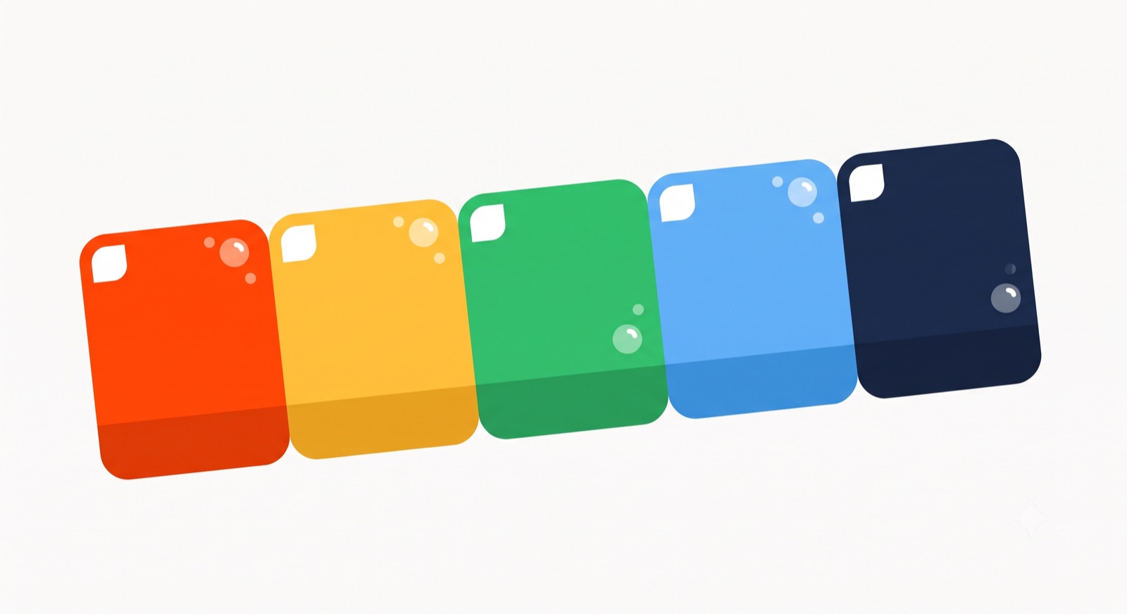
Color: specs, not just swatches
Give every color its full technical spec or it drifts the moment it leaves the deck. I have watched one brand blue turn into three slightly different blues across a website, a trade-show banner, and a printed one-pager, all because someone eyeballed it each time instead of pulling the value from a spec:
- HEX for web, RGB for screen, CMYK for print, and Pantone for anything brand-critical heading to a printer.
- A defined role per swatch (primary or hero, secondary, neutral, accent) with rough usage ratios so the palette has a hierarchy, not just a set of colors.
- Accessible pairings. I bake WCAG contrast minimums straight into the palette (4.5:1 for normal text, 3:1 for large) so it survives a real interface, not only the brand deck.
Locking a signature color matters more than most people expect. In one study, 78 percent of people recalled a logo’s primary color while only 43 percent recalled the brand name, so the color is often doing more recognition work than the wordmark.
Typography: a system, not two fonts
Define a real type system: primary and secondary typefaces, the weights actually in use, a hierarchy (H1, H2, body, caption) with size, leading, and tracking, pairing rules, and licensed-font fallbacks for web and print. I want anyone on the team to be able to set on-brand type without guessing or messaging a designer, and a proper system is what gets you there.
Voice and tone: make them measurable
Voice is the constant, and tone flexes with context. An error message and a launch celebration carry the same voice in a different tone. Vague adjectives like “bold” or “human” or “premium” do not travel from one person’s head to another, so I define voice with explicit “we say / we don’t say” pairs, and Mailchimp’s guidelines are still the model everyone copies here. For tone, I would rather pin it to measurable scales than to moods. The Nielsen Norman Group’s four dimensions are the framework I reach for:
Imagery and art direction
Specify the visual world beyond the logo, because a brand can be recognizable with the mark cropped out entirely. I always pin down photography style (subject, lighting, composition, color grade), illustration style, iconography, and any graphic patterns, each with do-and-don’t frames so nobody has to interpret a vibe. A signature treatment carries a huge amount of that load. Spotify’s duotone is the textbook case, and it makes their work identifiable long before you spot a logo.
Usage, governance, and accessibility
This is the part that turns a lookbook into a rulebook. Put in real-world mockups for the surfaces the brand actually lives on (business cards, social, ads, packaging, web, email, decks), co-branding and partner-lockup rules, a spacing system, accessibility standards, and increasingly a set of guardrails for AI-generated content. Then I name an owner and write down how to request assets or an exception, because a brand book with no maintainer goes stale fast, and I have inherited enough abandoned ones to insist on that line.
Study the best, then right-size your own
The canonical brand books are worth an afternoon of reading before you write a word of your own. Here are the ones I point people to, and what each of them is doing better than everyone else:
| Brand book | What it nails | How it is published |
|---|---|---|
| Mailchimp | Voice and tone, with “we say / we don’t say” pairs | Web, content-first |
| Spotify | A signature treatment (duotone) plus partner rules | Web, with downloadable assets |
| Slack | Co-branding and partner-lockup governance | Web |
| Uber | Logo clearance and motion | Web, with downloadable files |
| Apple | Product-shot precision | Tightly controlled PDF |
The thing to steal from the best is not the visuals, it is the delivery. Notice that most are web-based and searchable, and they let you download the actual logo files, tokens, and fonts straight from the page instead of forcing you to recreate them.
Then scale the document to whoever will use it. A solo founder needs a tight one-pager covering the logo, a couple of colors, one type pairing, and a few voice traits. A large organization needs a deep system with tokens, governance, and localization. I build for the people who open it week to week, not for a shelf, and that single decision does more for adoption than any amount of polish.
Building brand guidelines a team will actually use, then applying them across every asset so the brand holds as it scales, is a chunk of what I do at Moonb, with a senior Creative Director keeping the whole system coherent. If that is the part you need help with, see how Moonb works.
Frequently asked questions
It depends entirely on how many people touch the brand. A solo founder can live on a single well-built page. A growing company usually lands somewhere around 20 to 40 pages, or the web equivalent. A large organization runs a full token-based system with governance and localization. Length should track the number of hands on the brand, not how impressive you want the file to look, and most teams over-build long before they under-build.
Review them lightly once a year and do a real revision whenever something structural changes, like a rebrand, a new product line, or a new primary channel you now publish to. Version the document and date it so anyone opening it knows they are looking at the current rules rather than a file left over from two rebrands ago. Stale guidelines quietly cause more inconsistency than no guidelines at all.
People use the terms interchangeably, but a style guide usually means the visual rules alone, so logo, color, and type. Full brand guidelines add strategy, voice and tone, imagery, and governance on top. If a vendor quotes you a style guide, check whether voice and usage rules are included before you sign, or you will be back commissioning a second document a few months later.

