10 banner ad examples and the small-space craft behind them
Ten real banner ads from 2021 to 2026, grouped by goal, with the one message and the craft decision behind each, plus the sizes and animation limits to design for.

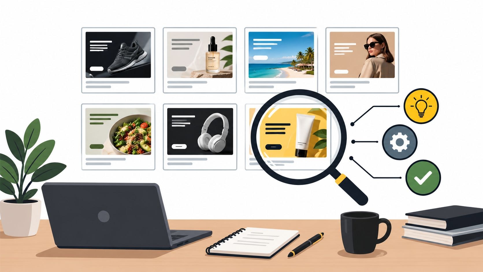
Good banner ad examples from the last few years include StepChange’s “Debt can happen to anyone” (2023), Hackensack Meridian Health’s “Ready for Every Body” (2024), Vogelbescherming Nederland’s “Listen to the Birds” (2025), Ukraine’s “How tourist advertising in Russia looks now” (2022), Diedamskopf’s Avalanche Alert Ads (2026), Hearst’s “There’s More with the Chronicle” (2025), VIA Rail’s “Book your comeback” (2021), THE ICONIC’s livestreamed banner change room (2025), Burger King Czechia’s UV ads (2024) and Cricket Wireless’s playable “Destination: Destress” (2023).
In the campaign briefs we get at Moonb, banners sit on the last line and nobody argues about them. I like them anyway. A 300 by 250 rectangle gives you a second or so, one message and maybe one picture, so a weak idea shows straight away. The ten below are grouped by job (awareness, bringing people back, asking for an action), and the sizes and animation limits come after the list.
Awareness banners
1. StepChange, “Debt can happen to anyone” (2023)
StepChange, the debt charity, ran this with AML Group for Debt Awareness Week in March 2023. The brief was to take the stigma out of debt and show it doesn’t only happen to a certain type of person. Ads of the World’s campaign page sums up the answer as “strips of different faces, all brought together in one banner.”
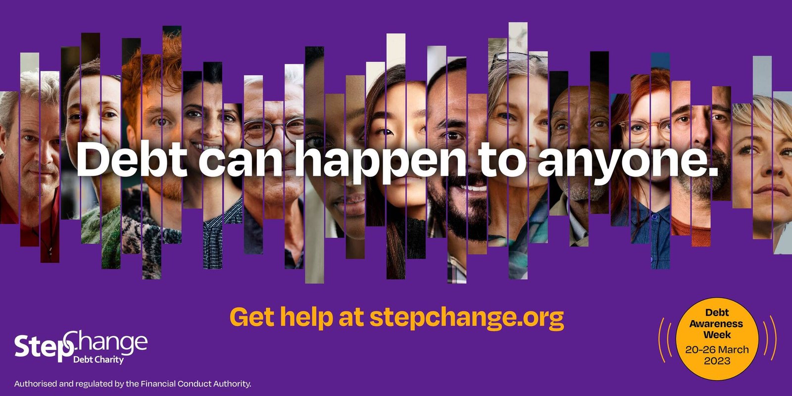
If a client asked me for one banner to look at, I’d show them this. A short, wide frame can’t hold a row of full portraits, but it can hold a crowd sliced into narrow vertical strips, and each strip still reads as a face. The headline runs across the middle in white, and “Get help at stepchange.org,” sits on its own line in yellow. Look for a few seconds and you’ll probably find someone like you in there.
2. Hackensack Meridian Health, “Ready for Every Body” (2024)
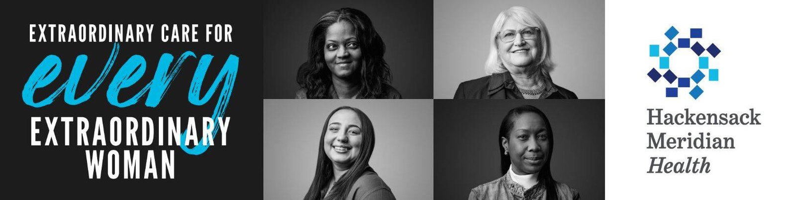
Hackensack Meridian Health launched this women’s health campaign with its agency Doner on May 7, 2024, in print, outdoor, social and digital banners, according to the Ads of the World listing, and the women in the photos are real patients. The wide version is the one I’d copy for leaderboards. Line on the left, four portraits in the middle, logo on white at the right, and all of it black and white except “every,” written in blue script across the headline, the same blue as the logo at the far end.
3. Vogelbescherming Nederland, “Listen to the Birds” (2025)
KesselsKramer made this donation campaign for the Dutch bird protection society in February 2025. Almost half of the breeding bird species in the Netherlands are threatened with extinction, the campaign description says, and the work ran as short videos, social content, display ads, radio and a site, reddevogels.nl.
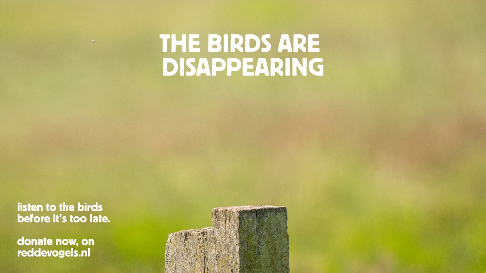
The campaign description calls the idea a riff on “now you see them, now you don’t,” and this visual reads as the “don’t” half, an empty fence post in a soft-focus meadow with no bird on it. That reads at any size, so it suits small slots. The donation line is tucked bottom left where it never fights the post.
4. Ukraine, “How tourist advertising in Russia looks now” (2022)
Airbnb and Booking had left the Russian market, so in May 2022 the agency Bickerstaff.734 picked tourism as its way in, per Ads of the World. With support from the State Agency for Tourism Development of Ukraine, it built a site imitating Airbnb whose listings included ruined apartments (Indeed agency handled the site build). Booking an apartment brought up an invitation to open a Telegram bot with the truth about the war. Bickerstaff.734 also made banners with photos of destroyed Ukrainian cities, and that’s what you see below.
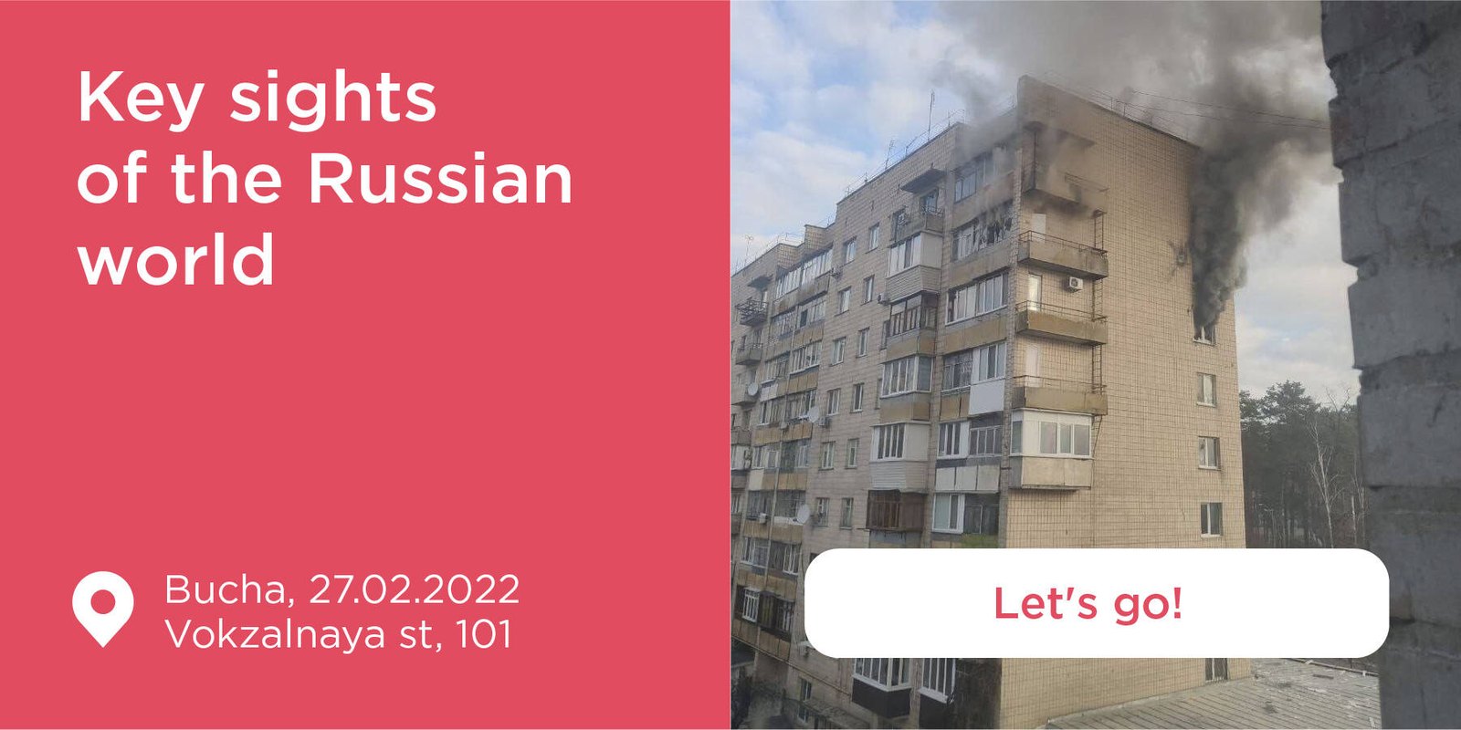
This is the hardest one on the list to look at. Every part of a holiday rental ad is there, the soft pink panel, the breezy headline (“Key sights of the Russian world”), a map pin with a place and a date, a white “Let’s go!” button. Then you notice the photo. It’s a burning building in Bucha.
5. Diedamskopf, “Avalanche Alert Ads” (2026)
The Diedamskopf ski area in Austria’s Bregenzerwald swapped ads for avalanche warnings, with DMB as its agency. The terrain is divided into digital safety zones, based on avalanche reports and set up with mountain rescue services. When a phone enters a high-risk zone, a warning for that spot is served through programmatic ad placements, and nobody has to install an app or sign up for anything. VOL.AT reported on March 5, 2026 that the system went live across the ski area at the end of February after a two-month test. The agency’s Ads of the World entry claims it can reach up to 90% of smartphones in the area and cut entries into closed slopes by as much as 37%. Those are the agency’s own numbers, so I’d quote them carefully.
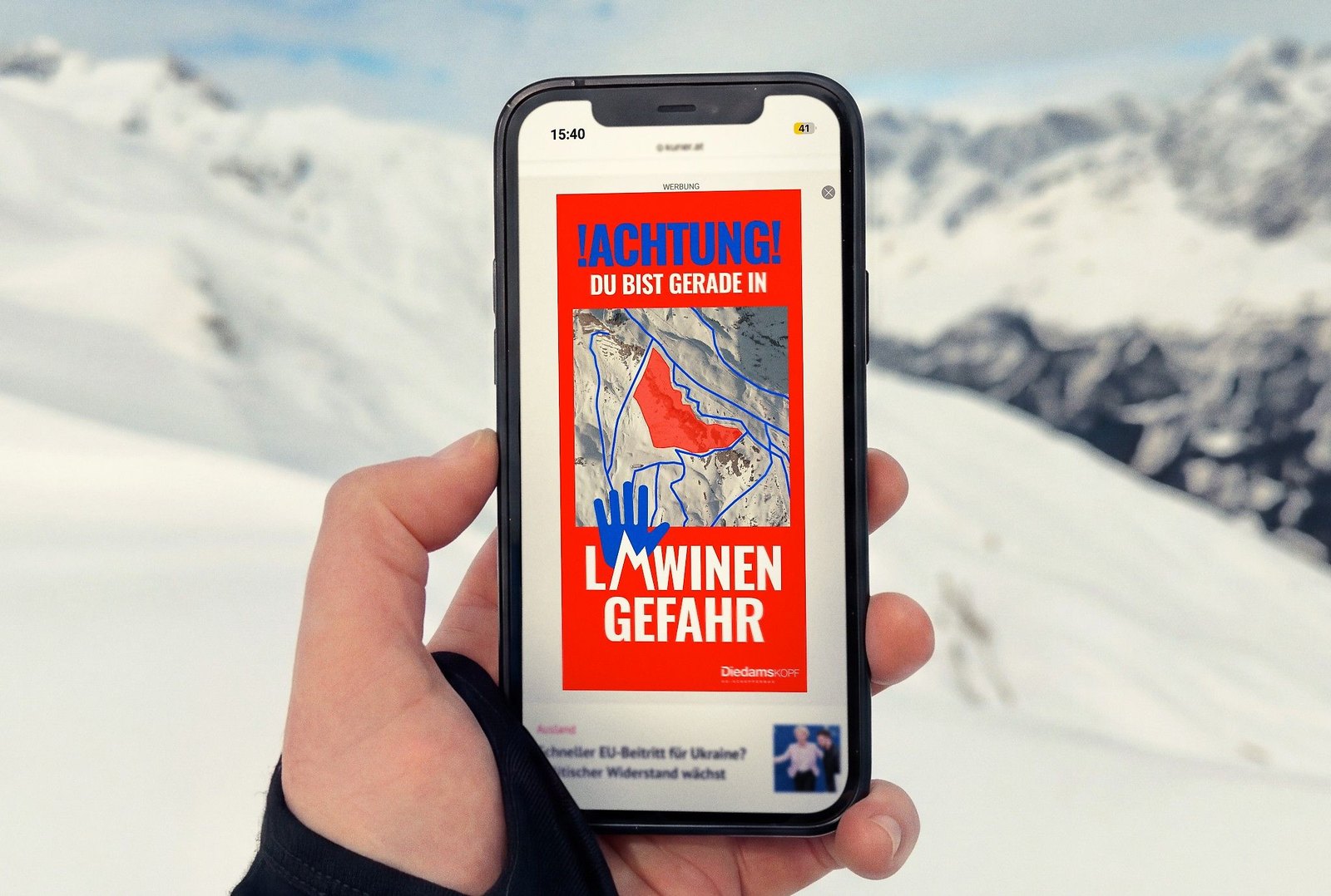
I love how blunt the unit is. ”!ACHTUNG! Du bist gerade in Lawinengefahr” means “Warning! You are in avalanche danger right now,” and a map of the slope, danger zone shaded red, sits in the middle of that sentence. Big condensed type on red, one smaller line, the map, a small logo. It sits in an ordinary ad slot and still carries the “Werbung” (advertising) label, and I like that they didn’t dress it up as anything else. The video VOL.AT posted with its article includes a shot of skiers on a chairlift, one of them checking a phone.
6. Hearst Newspapers, “There’s More with the Chronicle” (2025)
If you build banner sets, study this one. The line is a sentence with one blank in it (“There’s more to savor,” “to taste,” “to the city,” “to rodeo” with the Chronicle), set in heavy white capitals over a photo, with the logo and web address at the bottom of every version. Swap the word and the picture and you’re done, so the layout goes from a wide unit to a tall one with very little redesign.
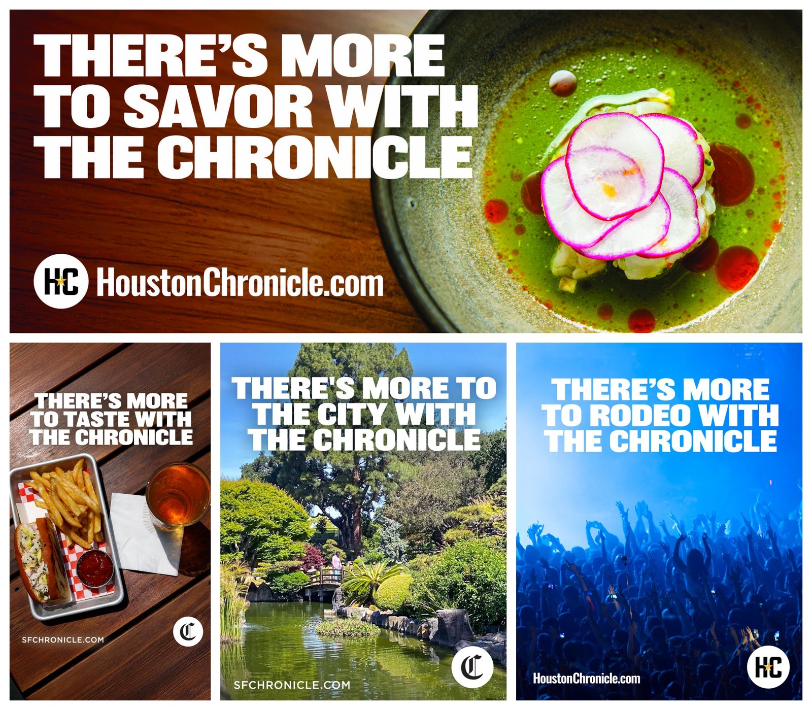
Hearst Newspapers started this in March 2025 for two of its papers, the San Francisco Chronicle and the Houston Chronicle, with PMG as its agency. The campaign description says PMG built the imagery from each paper’s own video and photography, with a media mix running from billboards and TV to podcasts and digital display ads. Each new market, it adds, will “tailor the ‘There’s More with…’ message” to the coverage its readers care about, which is the same swappable blank traveling to other papers.
Banners that bring people back
Retargeting is the banner work you almost never see in public. It’s built from a brand’s own visitor data, and hardly anyone enters it for awards. The closest public example I found is a win-back campaign aimed at people who already knew the product.
7. VIA Rail, “Book your comeback” (2021)
VIA Rail Canada wanted back the riders who had switched to their cars during the pandemic. Ads of the World’s entry says the campaign set out to “re-seduce and welcome back previous VIA Rail passengers,” with a 30-second film by director Jeremy Comte and, for digital outdoor and web banners, photography by Norman Wong that “sought to recreate the look and feel of a moving train.”
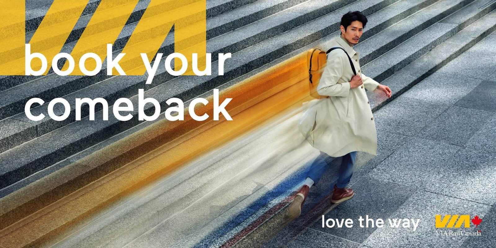
The traveler leaves a motion blur in VIA yellow behind him, so the brand color doubles as the sense of speed, and there’s no train in the frame at all. The headline only makes sense to someone who has ridden before (you can’t come back to something you never used). With a win-back audience I’d skip the product explanation too. They know what a train is. VIA’s own channel carries the campaign film.
Banners that ask for an action
8. THE ICONIC, the banner ad change room (2025)
THE ICONIC, the Australian fashion and lifestyle platform, built a physical box the shape of a banner and put its customers in it. On March 17, 2025, it set up on Sydney’s York Street as part of its “Got You Looking” campaign with Dentsu Creative. According to LBBOnline’s report, shoppers picked an outfit, stepped into “a content box that mimicked the size of a banner ad,” and were livestreamed into shoppable banners across News Corp sites, VOGUE and news.com.au among them, then featured on an outdoor site in Martin Place.
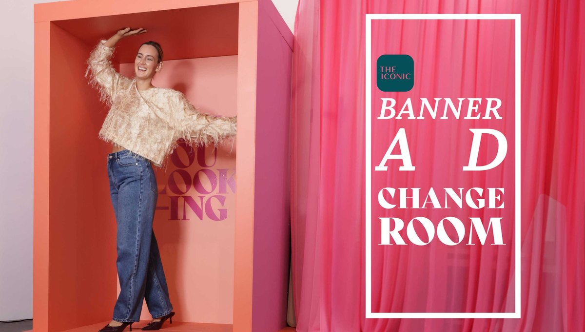
The set had the ad’s proportions, so the framing was right in camera. Most banner photography I see is shot wide and cropped later, and that’s where heads and products get cut off. Dentsu Creative’s associate creative directors said in the LBB report that “curing banner ad blindness was always going to be a tough ask,” and I’d agree; a live person trying on clothes is about as hard to scroll past as a banner gets.
9. Burger King Czechia, “Don’t grill yourself, you’re not a Whopper” (2024)
Each ad has a UV dial at the top with a reading under it, “UV 6, high level,” “UV 9, very high level,” “UV 11, extreme level.” The reading picks the line, from “Don’t grill yourself. You’re not a Whopper” to “Is that Whopper sizzling? Or is that your skin?” Behind it there’s a close-up of red, striped skin, with the logo small at the bottom.
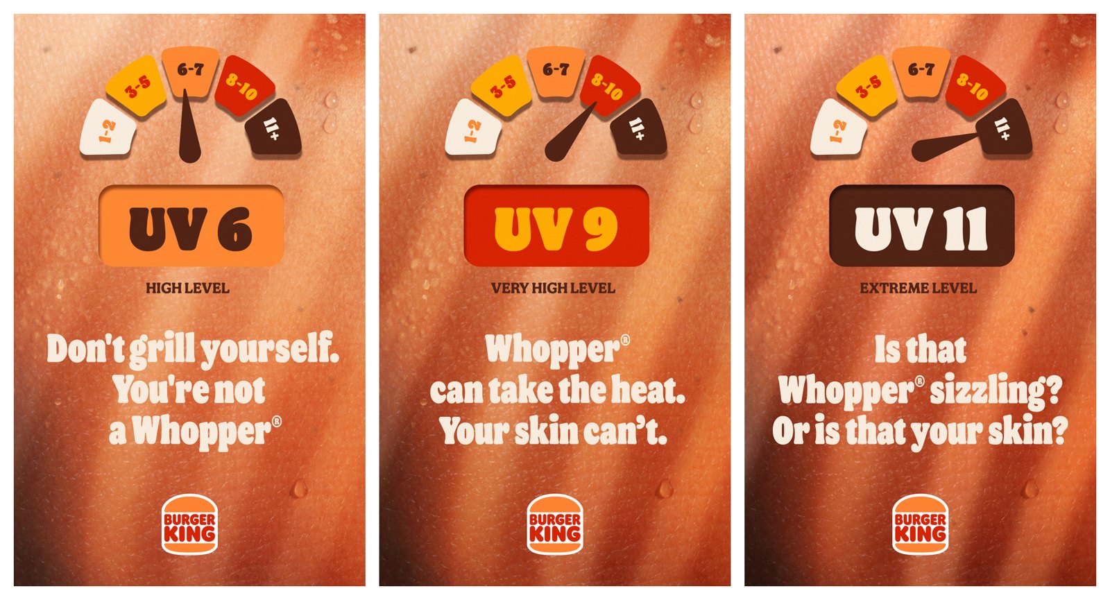
Burger King in Czechia and the agency Zaraguza ran it in the summer of 2024, turning the brand’s flame-grilling into a sunscreen reminder. The Ads of the World entry describes “interactive outdoor and digital ads with real-time UV scale” and “complimentary SPF50+ dispensers at every Burger King restaurant in Czechia.” I’d have filed the ads alone under public service jokes. The dispensers give people a reason to walk in.
10. Cricket Wireless, “Destination: Destress” (2023)
Cricket Wireless, the US wireless brand, made its first playable ad with Argonaut and OS Studios in March 2023. It looks like an old 8-bit game. You steer Miles, one of the brand’s characters, over traffic cones to reach his friend Lucy for a vacation, and the run ends when he hits an obstacle. Per the campaign listing, it “will appear as a banner ad on a variety of desktop sites and mobile apps, including ABC.com, Bestbuy.com, ESPN.com, and more.”
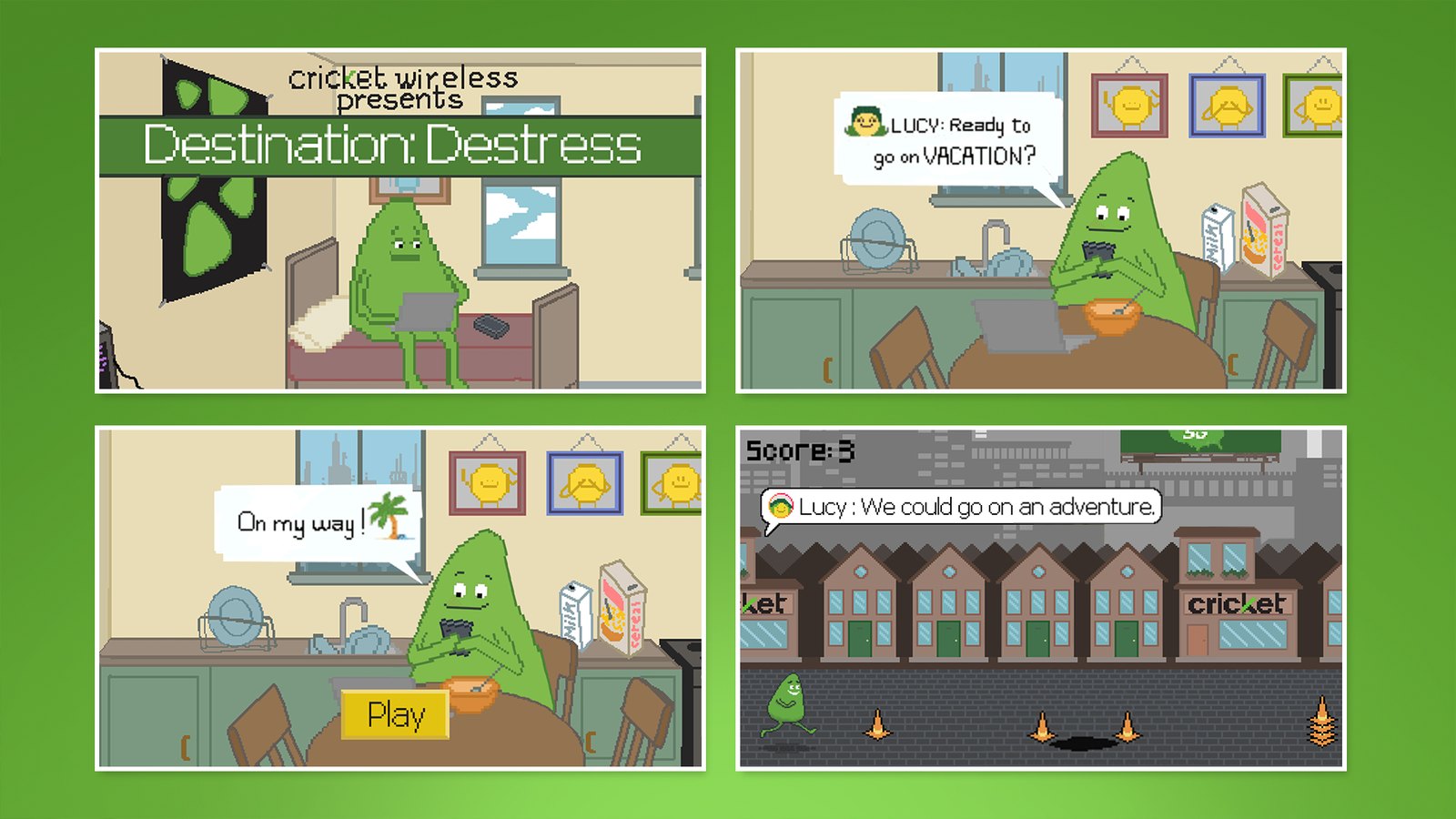
Nobody reads instructions in a banner, so a banner game has to be learnable at a glance. This one has a single mechanic (jump) and a goal you can see. Cricket’s branding is in the scenery, little storefronts and billboards along the street. Players can share a screenshot of their high score, and the listing notes the backgrounds and characters were built to be swapped for seasonal versions, so the same build can come back at the holidays.
Where to look at live banners yourself
Most of the work above came from Ads of the World. It files each campaign with its date, agency and credits, handy when you want to check a reference before it goes into a deck. For what brands are running right now, use Google’s Ads Transparency Center. When Google launched it in March 2023, it described a “searchable hub of all ads served from verified advertisers,” where you can see the ads an advertiser has run, which ones showed in a given region, and the last date and format of each. Search a competitor, filter to your region, and you can see what they have been running. As a swipe file I trust it more than any award gallery. For the formats around the banner, our display ad examples cover rich media, native and dynamic units, and the social media ad examples cover the feed.
Standard sizes worth designing first
Google Ads accepts twenty sizes for uploaded image and HTML5 ads, listed on its uploaded display ads specifications page. Nobody needs twenty on day one. AdSense, the publisher side of the same network, flags five as “top performing” in its guide to ad sizes, and I start every set with those plus the standard mobile strip:
| Size (pixels) | Name in Google’s specs | Shape | What it’s good for |
|---|---|---|---|
| 300 × 250 | Inline rectangle (AdSense calls it the medium rectangle) | Near-square | In-article placements on desktop and mobile; the size to design first |
| 336 × 280 | Large rectangle | Near-square | The same layout as 300 × 250 with a little more room |
| 728 × 90 | Leaderboard | Wide strip | Top of page on desktop; one line of copy and a logo |
| 300 × 600 | Half-page ad | Tall | The most room for imagery; AdSense calls it one of the fastest growing sizes |
| 320 × 100 | Large mobile banner | Wide strip | Twice the height of 320 × 50, room for a product shot |
| 320 × 50 | Mobile banner | Thin strip | The standard mobile strip; a short line, a logo, a button |
Do the 300 × 250 first because it forces a real hierarchy. Then the 320 × 50, which shows you what survives when almost nothing fits. Wide strips want three zones at most (the HMH banner is a good reference), and StepChange’s strips are a neat way to get many faces into a short height. If a layout only works at 300 × 600, I go back to the idea.
The same Google page sets file weight: image and GIF ads can be up to 150KB, HTML5 ads up to 600 KB. If you also run responsive display ads, where Google assembles the ad from your parts, its responsive display ad specs ask for horizontal images at 1.91:1 (1200 × 628 recommended, 600 × 314 minimum) and square images at 1:1 (600 × 600 recommended, 300 × 300 minimum). One picture gets fitted to a lot of slot shapes, so keep the subject in the middle.
Animation length limits per platform
Look these up for the placement you’re buying before anyone starts animating:
| Source | Length limit | Other motion rules |
|---|---|---|
| Google Ads, uploaded animated ads | 30 seconds or shorter | Loops are allowed but must stop after 30 seconds; animated GIFs must run slower than 5 FPS |
| IAB New Ad Portfolio | 15 seconds | “No looping beyond 15 seconds”; flashing animation (high contrast, very bright colors, fast-moving content) is not allowed |
| WCAG 2.2, Pause, Stop, Hide | Five seconds before a control is needed | Anything that moves by itself for over five seconds next to other content must give people a pause, stop or hide control |
The IAB guidance also recommends starting the animation when the ad comes into view. Meanwhile the Media Rating Council’s viewability guideline counts a display ad as viewable once at least 50% of its pixels are on screen for one continuous second. One second is a low bar, so I put the message in the first frame and let the motion add to it. The last frame has to work as a static ad too, since it’s the one most people actually see. And even where Google allows 30 seconds I build to 15, which keeps the file lighter as well. When you have versions to compare, our guide to ad creative testing covers what to test and how to read the winners.
The examples side by side
| # | Brand | Campaign | Year | Goal | The single message | The small-space decision |
|---|---|---|---|---|---|---|
| 1 | StepChange | Debt can happen to anyone | 2023 | Awareness | Debt affects all kinds of people | Faces sliced into strips so a crowd fits one short frame |
| 2 | Hackensack Meridian Health | Ready for Every Body | 2024 | Awareness | Care for every woman | Black and white throughout, one word in brand blue |
| 3 | Vogelbescherming Nederland | Listen to the Birds | 2025 | Awareness and donations | Birds are disappearing | The bird is missing from its own ad |
| 4 | Ukraine (Bickerstaff.734 and Indeed) | How tourist advertising in Russia looks now | 2022 | Awareness | Look at what the war did | A travel ad layout around a photo of destruction |
| 5 | Diedamskopf | Avalanche Alert Ads | 2026 | Safety awareness | You are in avalanche danger now | Served by location, a map with the danger zone in red |
| 6 | Hearst Newspapers | There’s More with the Chronicle | 2025 | Brand awareness | The paper covers more than news | A headline with one swappable word |
| 7 | VIA Rail | Book your comeback | 2021 | Win back past riders | Come back to the train | Motion blur in brand yellow stands in for the train |
| 8 | THE ICONIC | Got You Looking (the banner ad change room) | 2025 | Shoppable reach | Real customers can be the models | A set built to banner proportions, livestreamed into the slot |
| 9 | Burger King Czechia | Don’t grill yourself | 2024 | Footfall and goodwill | Protect your skin, free sunscreen inside | A live UV reading as the headline hook |
| 10 | Cricket Wireless | Stress Less, Smile More (the game Destination: Destress) | 2023 | Engagement | Take a break | One-button game with branding in the scenery |
When the banner is one piece of a bigger campaign
Most of these banners were one channel among several. In the good ones the banner carries one piece of the bigger idea. VIA Rail’s banners borrow the film’s motion, and THE ICONIC’s livestream ended up on an outdoor site. B2B campaigns tend to pair banners with video on LinkedIn, and there are LinkedIn video ad examples for that side. If the same line is heading outdoors too, look at it at street scale before anyone books media. Nim’s billboard video creator places a product photo on generated city billboards as a short clip, the sort of mockup that goes into a pitch deck. For real boards that ran, my billboard ads roundup has ten, and our magazine ad examples show the same discipline on paper.
Once a campaign needs dozens of sizes in static and animated versions, most of the hours go into deciding what to cut at each one. Our comparison of ad design services looks at eleven teams that take that work on.
Frequently asked questions
Start with the 300 by 250 medium rectangle. Google AdSense lists it among its five top performing sizes and it runs on desktop and mobile. Being near-square, it forces you to pick what leads before you have room to hedge. Next comes the 320 by 50 mobile strip, which shows what survives when almost nothing fits. The wider and taller sizes adapt from those two.
That depends on where it runs. Google Ads allows animated image ads up to 30 seconds, loops included, and GIFs have to run slower than 5 frames per second. The IAB New Ad Portfolio says 15 seconds, with no looping past that. If you build to 15 seconds and end on a frame that works as a static ad, one file covers most platforms.
Usually one message, carried by one visual decision. In the strongest recent banners the picture explains the idea. StepChange slices many faces into strips, and Vogelbescherming leaves the bird out of its own ad. Keep the copy to a line and the logo small, and give the call to action its own clear spot so it doesn't compete with the idea.



