10 best billboard ads and what they teach
Nine recent billboard and out-of-home campaigns plus one classic, from Canva's oversized logo to Pedigree's adoptable dogs, and why each one works in a glance.

The best billboard ads right now include Canva’s logo that grew too big for its own board in London (2025), Tesco’s billboard tipping the weekly shop into an Uber Eats bag (2026), TD’s “Own a piece of it” cutouts in Canada (2025), Nike’s course-side boards at the Chicago Marathon (2025), Apple’s Simon Landrein illustrations in Paris (2024), Selleys’ glue billboard in Australia (2025), Magnum’s sunshine-tracking posters (2024), Pedigree’s adoptable shelter dogs (2024), UNICEF Finland’s live air raid alerts in Helsinki (2025), and one classic, British Airways’ plane-spotting screen at Piccadilly Circus (2013).
A passer-by gives a billboard a second or two, from a bus window or halfway across a crosswalk. There’s no voiceover to rescue it and no second paragraph to explain it, so it shows up a weak idea faster than any other brief I work on. Most “best billboard” lists I come across recycle the same silhouettes and slogans from last century, so I picked nine that ran between 2024 and 2026, plus one from British Airways in 2013 that digital outdoor still borrows from.
1. Canva, “Make the logo bigger” (2025)
Canva took the most dreaded note in design and built it. In June 2025 it put up special outdoor builds at Waterloo Station in London, made with Stink Studios and OMD. In one execution, according to The Drum’s Ad of the Day column of June 19, 2025, “the huge Canva sign” sits on top of the 48-sheet; in another the design juts out at the side and partially covers a staircase.
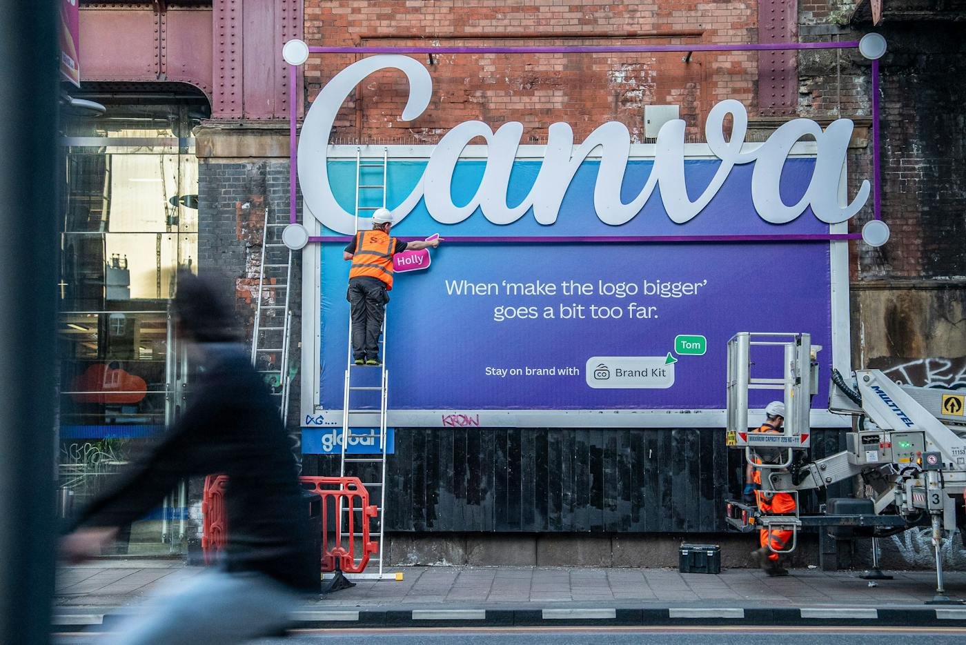
The board says “When ‘make the logo bigger’ goes a bit too far.” You barely need the line. A logo escaping its frame reads from across the street, and anyone who has sat through a feedback round gets the joke before they reach the words. The product pitch (Brand Kit, for staying on brand) sits small at the bottom, well under the joke.
2. Tesco and Uber Eats, the weekly shop (2026)
When Tesco groceries arrived on Uber Eats, the launch billboard looked like an accident. In the words of Famous Campaigns on September 21, 2026, “a Tesco billboard appears to have slipped from its frame, dropping the weekly shop directly into an oversized Uber Eats delivery bag.” Mother created it, PHD handled media and Grand Visual built the special execution, with large-format digital running across the UK.
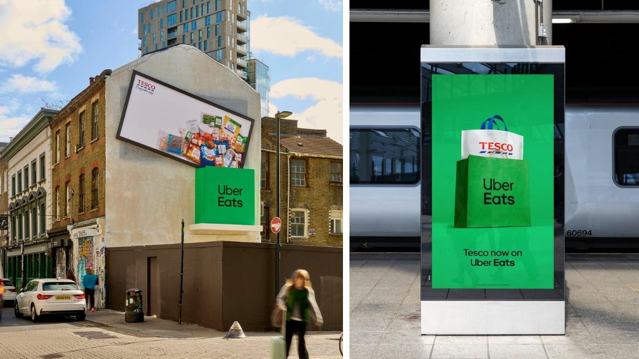
Co-branded boards are usually a mess, two logos fighting over the top corner. This one has almost no copy. The groceries are shot on Tesco’s usual white and they tip straight into the green Uber Eats bag, so each brand is doing something in the picture instead of waiting in a corner for its logo slot.
3. TD, “Fractional Window Shopping” (2025)
If I could show a client only one board from this list, it would be this one.
TD had to sell partial shares, the ability to buy a slice of a famous company’s stock. With Ogilvy Canada, it put bright green boards on streets across Canada, each with a small window cut out of it, placed so the cutout framed a piece of the real storefront logo behind it. The line on the panel is “Own a piece of it.” LBBOnline covered the launch on July 31, 2025 and noted that the feature lets Canadians own fractional shares “for as little as $1.”
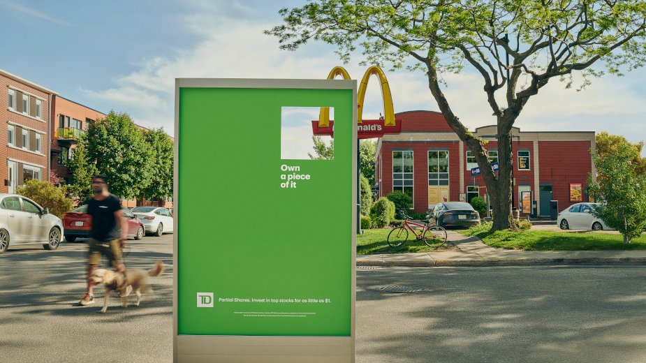
The panel itself is a flat green rectangle. Everything else comes from the storefront behind it, so each one only works where it stands; put it on the wrong corner and it’s a green board with a hole in it. The pun couldn’t be more literal. You see a piece of the arches through the hole and you get “a piece” of the company. The same LBBOnline piece reports a brand lift study showing “a 78% increase in positive perception toward the featured brands” among people exposed to the placements.
4. Nike, Chicago Marathon course boards (2025)
For the 2025 Chicago Marathon, Nike lined the route and the city with red boards and black all-caps lines, every one written for a runner in the middle of the race. Famous Campaigns rounded them up on October 16, 2025: “SHUT UP, BRAIN.”, “TOENAILS ARE FOR LOSERS.”, “WHATEVER YOU’RE DOING, KEEP DOING IT. FOR 22 MORE MILES.” Every board signs off with “RUN” and the swoosh.
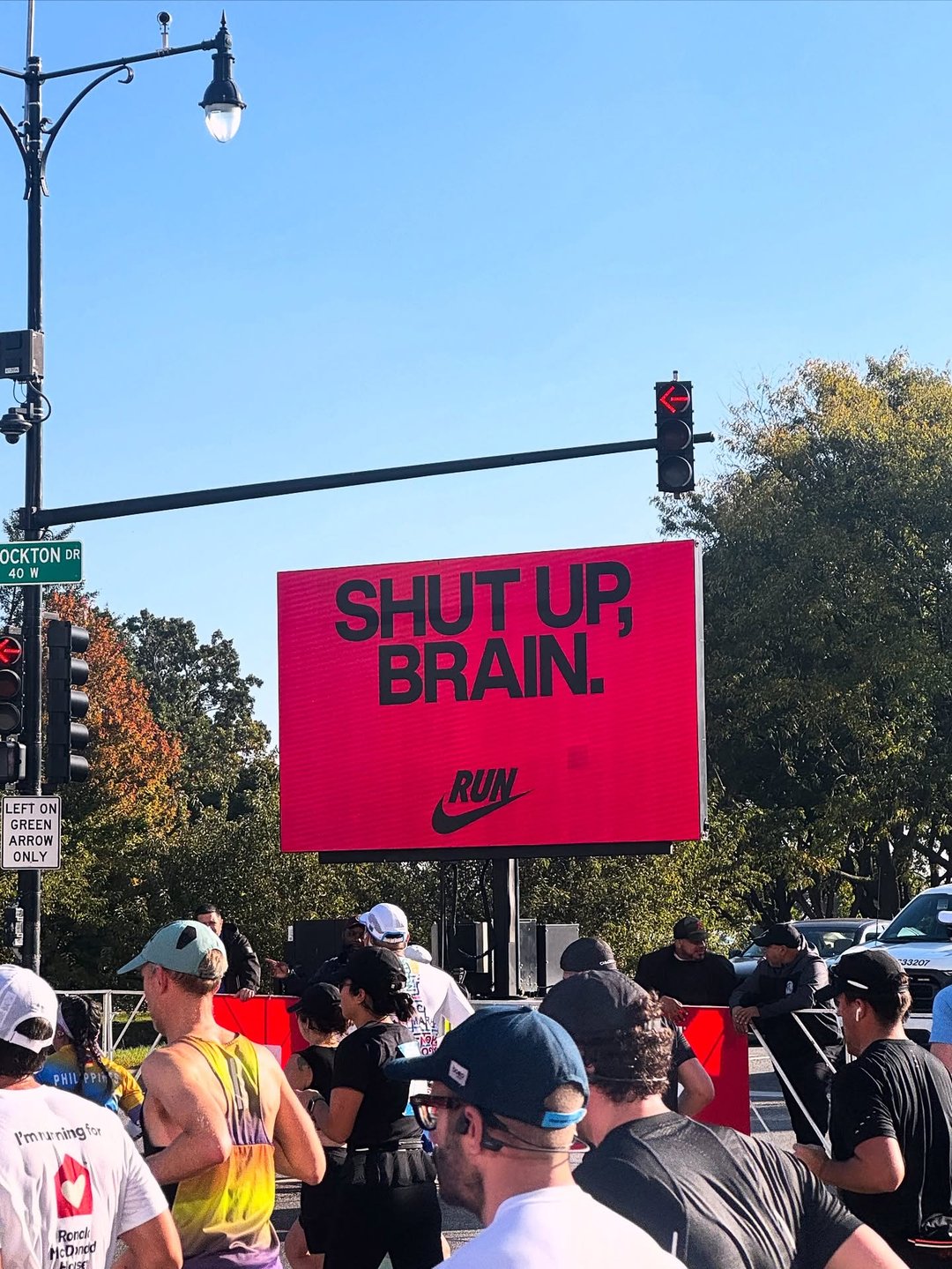
No product shot, no athlete. The lines are the things runners mutter to themselves once it starts to hurt, and the spectators on the sidewalk get them too. “SHUT UP, BRAIN.” is three words on a saturated field, which is about as legible as outdoor gets, and a runner reads it in two strides. The lines photograph well too, and that’s how the boards ended up on Instagram, shared by accounts like the running retailer Pro:Direct Running.
5. Apple, “Designed on the iPad” by Simon Landrein (2024)
Apple was not an official sponsor of the Paris 2024 Olympics, and its summer outdoor campaign never says the word. What went up across Paris and Marseille were stretchy cartoon athletes playing the summer’s sports, drawn by French illustrator Simon Landrein, all on iPad Pro. LBBOnline reported on August 12, 2024 that Landrein created “23 unique illustrations of playful athletes, each tailored to its specific media space,” and The Drum’s review on August 7, 2024 credits TBWA\Media Arts Lab, London.
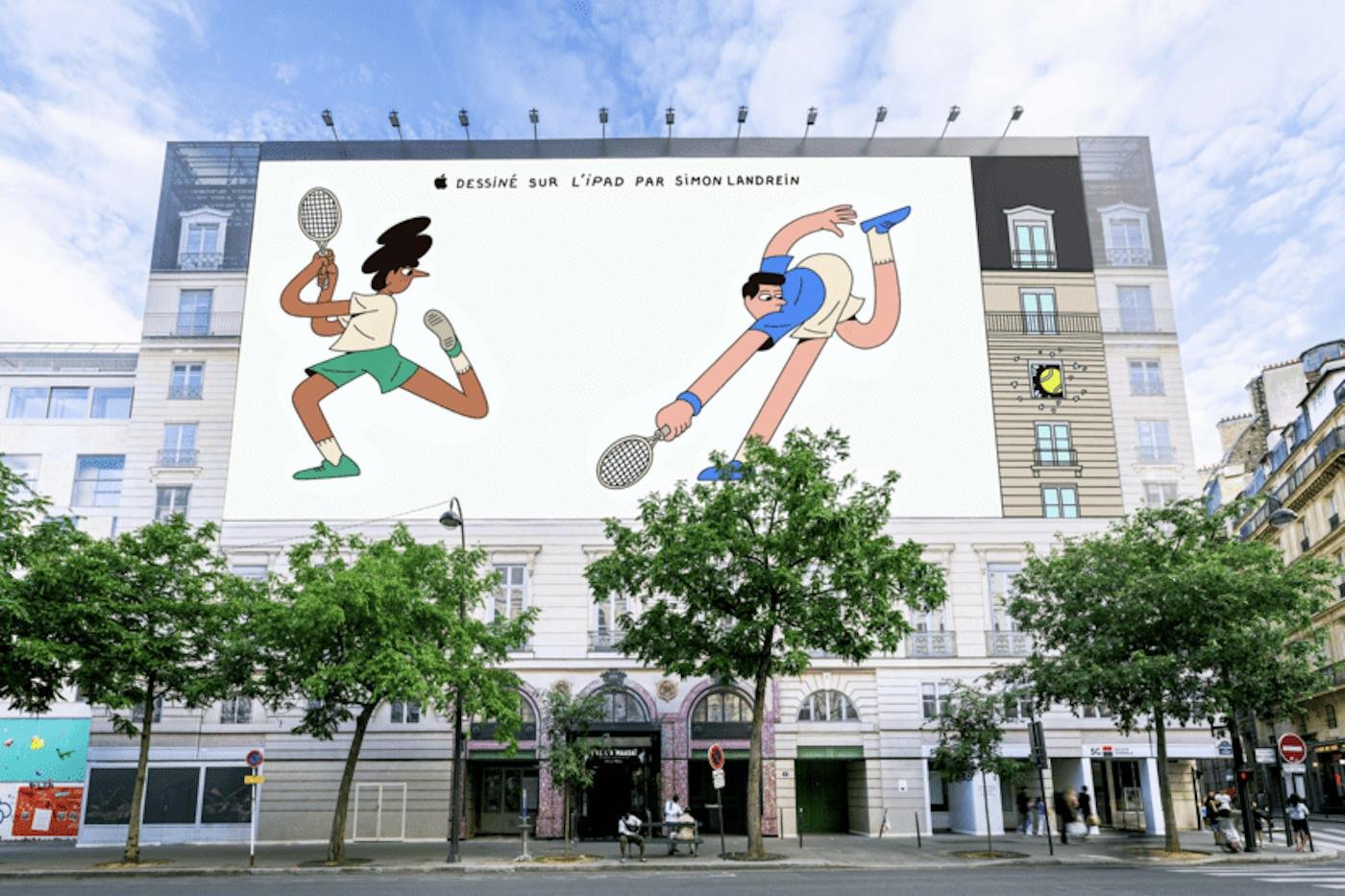
Look at the right edge of the wrap. The artwork redraws the building’s own facade, and the tennis ball has smashed through one of its windows. That’s “tailored to its specific media space” taken literally. The only copy is a hand-lettered credit, “Dessiné sur l’iPad par Simon Landrein,” and there’s no feature list anywhere near it. It’s the “Shot on iPhone” logic applied to illustration, and it let Apple own the summer of sport without buying the rings.
What annoys me in most outdoor plans is one key visual stretched across every format. It throws away the best thing outdoor has, which is whatever surrounds the board. Landrein drew each piece for its wall.
6. Selleys Liquid Nails, “If you can take it, it’s yours” (2025)
Selleys glued a kayak, an arcade machine and a 2.8-meter mounted marlin to a giant outdoor billboard in Australia and dared the public to pull anything off and keep it. Campaign Brief covered the stunt on October 8, 2025; Howatson+Company created it and James Dive directed. Creators and tradies hung off it and heaved, and, in the trade title’s words, “nothing budged.”
The brand’s own film shows the attempts, marlin included.
Nobody needs to argue the claim (“If it’s Selleys, it works”) when grown adults are hanging off the board trying to disprove it. Picking the objects must have been the fun part of that job. Each had to be something people would really want to take home, and absurd enough to photograph. Senior art director Dan Smith put the brief plainly in the same article: “No tricks, no special effects just brute Aussie effort against a canister of glue.”
7. Magnum, “Find Your Summer” (2024)
Ice cream is a seasonal habit, so Magnum went looking for sunshine in winter. LOLA MullenLowe created the campaign, which ran in the UK and Turkey in February 2024 with black-and-white photography of people eating a Magnum in narrow patches of winter sun. LBBOnline’s launch report on February 21, 2024 describes an out-of-home focus in Glasgow, “with digital posters identifying specific locations from weather data where moments of summer can be found.”
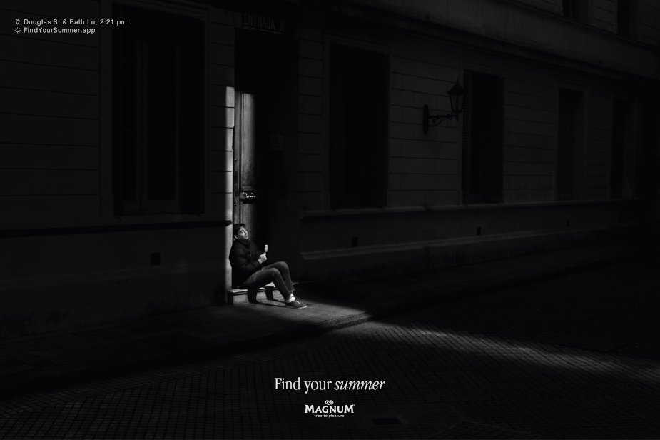
Almost the whole poster is dark, and the one lit patch is where your eye goes, which is where Magnum wants it. The small line in the corner gives a street crossing and a time, which is enough to go and stand in that sun yourself.
It took an Outdoor Grand Prix at Cannes Lions 2024. Contagious reported jury president Marco Venturelli’s view that, data layer aside, the creative “also worked beautifully as a simple poster.” I agree with him. A lot of data-driven outdoor is clever plumbing behind a dull poster.
8. Pedigree, “Adoptable” (2024)
Every Pedigree ad has a dog in it. Colenso BBDO asked why that dog couldn’t be one waiting for a home. Adoptable, launched first in New Zealand, uses a bespoke AI model that takes a basic shelter photo and makes studio-quality imagery from it, posed for any format, and drops the dog out of rotation the moment it’s adopted. Campaign Brief reported on May 17, 2024 that “within the first two weeks, 50% of shelter dogs featured had been adopted.”
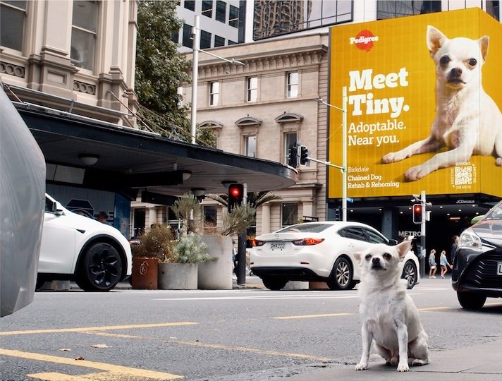
The board reads “Meet Tiny. Adoptable. Near you.” Four words and a name, with Pedigree’s familiar yellow telling you whose ad it is. Tiny is one specific dog, which is what makes you stop, and “near you” tells you that dog is somewhere down the road. It won the other Outdoor Grand Prix at Cannes Lions 2024, and the jury’s point, per Contagious, was that it used AI because the idea “would be impossible without” it.
9. UNICEF Finland, live air raid alerts (2025)
For a week in November 2025, UNICEF Finland connected almost all of Helsinki’s outdoor advertising screens to Ukraine’s official Air Alarm app. UNICEF’s own announcement on November 3, 2025 explains that whenever an alert starts in one of Ukraine’s six largest cities, the screens immediately show that an air raid is under way, with a MobilePay number for donations. The organization expected around twenty alerts a day. Bauer Media Outdoor, JCDecaux Finland, Mediateko, Ocean Outdoor and Outshine all donated their screens.
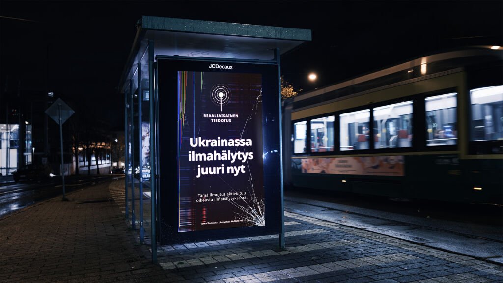
The screen says, in Finnish, “Air raid alert in Ukraine right now,” and underneath, that the notice was triggered by a real alert. For me that second line carries the campaign, because it means a siren is going off in a Ukrainian city while you stand there reading it. It’s set white on dark with a cracked-glass effect, so it reads as an emergency notice.
10. British Airways, “Look Up” (2013)
In 2013 British Airways ran screens at Piccadilly Circus and in Chiswick that reacted to its own planes flying overhead. As a plane passed, a child on screen pointed up at it, with the flight number and origin shown. The Drum’s retrospective on November 3, 2025 notes it needed “custom-built software that mapped the flight’s path and timing to the billboard’s location” and won the Cannes Lions Grand Prix for Direct.
The airline’s own upload shows the screen in action.
There’s no hard sell anywhere, just a child, a white background, a short line of flight data and the real plane overhead. To finish the ad you have to look up from the screen at the actual plane. Magnum’s and UNICEF’s boards above run on the same trick, a screen reacting to something real outside it.
The ten boards side by side
| Brand | Campaign | Year | Where | Format | The trick |
|---|---|---|---|---|---|
| Canva | Make the logo bigger | 2025 | Waterloo Station, London | Static special build | The logo physically breaks out of its frame |
| Tesco and Uber Eats | The weekly shop | 2026 | UK | Special build plus digital | Each brand plays a part in one action |
| TD | Fractional Window Shopping | 2025 | Streets across Canada | Static cutout panels | A cutout frames the real storefront behind it |
| Nike | Chicago Marathon course boards | 2025 | Chicago | Static and digital | Copy written for runners mid-race |
| Apple | Designed on the iPad by Simon Landrein | 2024 | Paris and Marseille | Static and digital, site-specific | Each illustration drawn for its wall |
| Selleys Liquid Nails | If you can take it, it’s yours | 2025 | Australia | 3D stunt board | The board is the product test |
| Magnum | Find Your Summer | 2024 | UK, with a Glasgow focus | Static plus data-driven digital | Weather data picks the sunny spots |
| Pedigree | Adoptable | 2024 | New Zealand first | AI-driven digital | A dog leaves the board once adopted |
| UNICEF Finland | Live air raid alerts | 2025 | Helsinki | Live-data digital | A real alert triggers the screen |
| British Airways | Look Up | 2013 | Piccadilly Circus and Chiswick, London | Interactive digital | The screen reacts to the plane overhead |
Line them up and they all run short copy on one dominant visual. Each also uses something only outdoor has, like the street it stands on or the sky above it. You’ll find the same instinct in the best print ads and in wider ad campaign examples.
Build the board, then test it
My rule for roadside boards is six words or fewer, and then I cut again. Pedigree used four plus a name, and Nike’s sharpest line used three. If an idea needs a second sentence, it probably belongs in a magazine ad, where people have time to read. And a line short enough for a board often makes a good brand tagline later, since both have to survive being seen once and remembered.
The test I trust most is low-tech. I print the layout small, stick it on a wall across the room and walk past it. If I can’t tell whose ad it is and what it wants in a glance, the picture gets simpler before anyone touches the headline. I check contrast from over there too; thin type and mid-gray on mid-tone photography go first.
Smaller physical formats play by the same rules. A retractable banner stand at an event booth gets the same few seconds from people walking past, so I’d write it like a small billboard.
Measure what the board did
Attributing outdoor takes more work than attributing a click. A Nielsen case study on a Luxottica campaign that included out-of-home in Los Angeles and New York found that, nationally, the 2023 campaign was “1.31x more efficient than the previous year’s”, with higher unaided awareness than in 2022. An older analysis of 45 case studies released by the OAAA, published in May 2019, found OOH lifted store visits by 50% to 127% and purchase intent by 10% to 35% among exposed consumers compared with those who were not. Those numbers belong to specific campaigns. I read them as a reason to measure your own and nothing more.
So decide how you’ll measure before the board goes up. A dedicated URL or QR code, geofenced exposure data or a brand lift study like the one TD ran will each tell you something. This guide to offline marketing analytics goes through the options for tying physical placements to results.
Extend the idea into film and social
Several of these boards had a second life on phones; Selleys, for one, backed its stunt with social films. When I review a board concept at Moonb, I try it as a vertical social cut, a six-second film and a still. If the whole idea is one clever sentence, it rarely survives that. Ideas built on an object or a place carry over much better. Our social media ad examples show what that looks like when the feed is the main stage, and once the cuts exist, the ad creative testing playbook covers finding out which one deserves the spend.
Frequently asked questions
Six or fewer on a roadside board, and then try to cut again. Drivers give it a glance, so the picture has to tell them whose ad it is and what the idea is before they read a word. Boards in stations, bus shelters and waiting areas can carry a bit more because people are standing still, but the headline should still work in one look.
A single idea on one dominant visual, in a place that adds something to it. The strongest recent boards use what only outdoor has, like the street behind the board, the crowd walking past, the weather or a live event, so the location finishes the message. From a distance, high contrast and a brand cue you can still recognize matter more than detail.
Decide how before the board goes up. The usual options are a dedicated URL or QR code, geofenced mobile data comparing people who passed the board with people who did not, and a brand lift survey in the markets where it ran. Reach and impressions tell you about the media buy. Lift in visits, searches or awareness tells you whether the creative worked.



