7 Best Print Ads and the Ideas Behind Them
Seven verified print ad classics, from Think Small to Share a Coke, with the brand problem each solved and the move worth stealing for your next campaign.

The best print ads in advertising history, campaigns like Volkswagen’s Think Small, Apple’s Think Different, and Absolut’s bottle series, all run on a single idea strong enough to survive any format. That is the test worth stealing. A beautiful page that only works as a page is a dead end; a clear idea on a page can become a film, a social post, or a billboard without falling apart.
I work on the production side of a creative team, and print classics show up in briefs constantly. Clients forward me moodboards with the same five campaigns circled and a note that says “like this, but for us.” So I went back and studied what these ads actually do on the page, rather than what the award books celebrate. Every campaign below is real and publicly documented. Where a number could not be traced to a named source, I cut it rather than repeat it.
For each one I cover what is visible on the page, the brand problem it solved, and how the idea travels into other channels. Seven campaigns made the cut.
1. Apple, “Think Different” (1997)
Apple’s Think Different campaign made the portrait the whole ad. Black and white images of Einstein, Gandhi, Amelia Earhart and other figures ran with a small Apple logo and the two-word line, and nothing else. The campaign came from TBWA\Chiat\Day and ran from 1997 to 2002 across magazines, billboards, and posters. The television spot won the 1998 Emmy for best commercial, and the campaign took the Grand Effie in 2000.
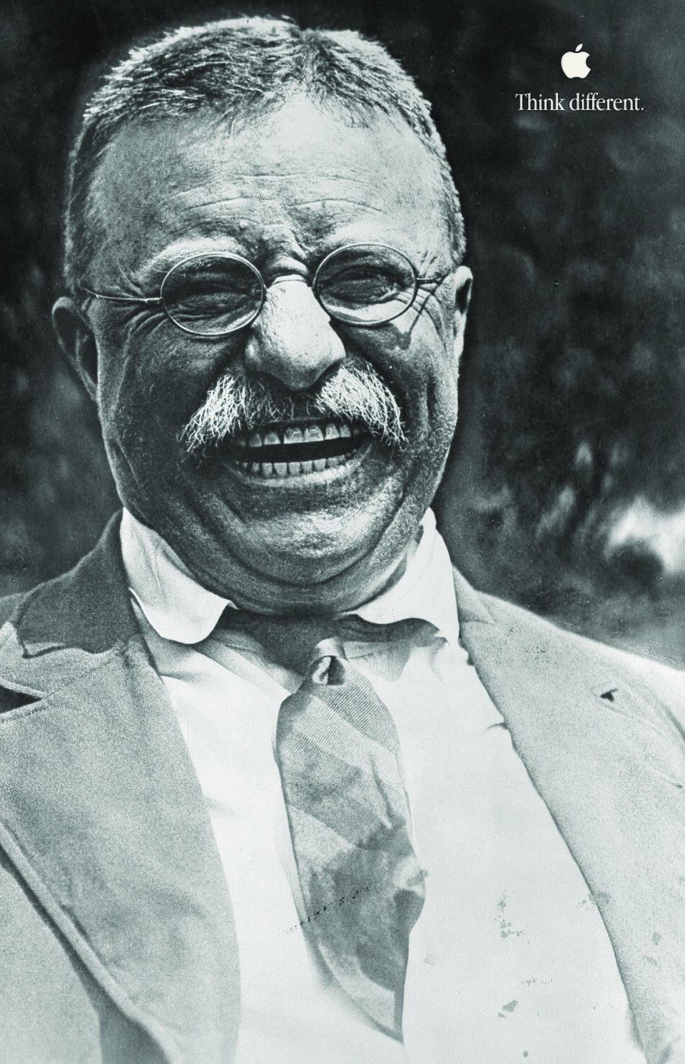
The important choice is what Apple left out. No feature list, no technical diagram, no computer in frame. The portrait carries the emotional weight, and the brand positions itself as a home for people who challenge convention. That solved a meaning problem: in 1997 Apple needed to stand for a way of thinking, and no spec sheet could deliver that. The connection to brand archetypes and identity is right there on the page, no theory lesson required.
The monochrome treatment is what makes the system portable. Any portrait, any placement, same recognition. The danger in adapting it is over-explaining. I watched a client kill their own tribute concept by adding narration to every portrait; the quiet confidence was the idea, and the voiceover buried it. If the brand idea is about people, let the people carry it before the product appears.
2. Volkswagen, “Think Small” (1959)
Volkswagen’s Think Small campaign addressed an awkward fact head on. The Beetle was small in a market that celebrated enormous American cars. Doyle Dane Bernbach, with art director Helmut Krone and copywriter Julian Koenig, put a small black and white Beetle inside a huge field of white space and paired it with candid, conversational copy. Advertising Age named it the best advertising campaign of the 20th century in 1999.
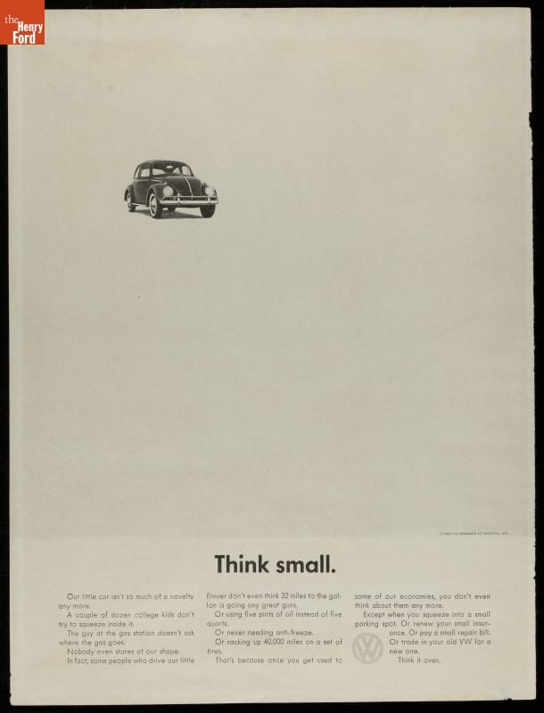
The layout makes the argument before you finish the headline. The car occupies a sliver of the page, and the emptiness around it reads as confidence. The copy then turns size into practicality and economy. Volkswagen never pretends the Beetle is something it is not; it hands the reader a new way to value what they can already see.
The creative system has three parts: a modest product photo, a candid headline, and body copy that answers the reader’s objection before they raise it. That structure repeats across any product truth without losing its voice. The weakest imitation copies the white space without finding an honest limitation underneath it. If you want more cases of visual and verbal choices working together, these advertisement examples cover a wider set.
3. Absolut, the bottle campaign (1981)
Absolut turned its bottle silhouette into the longest-running creative device in the category. The first ad, Absolut Perfection, ran in 1981: the bottle with a halo over the cap, shot by TBWA for the brand’s US importer. The format held for more than 25 years. A visual idea creates or completes the bottle shape, then the word Absolut plus one more word closes the joke. In 1985 Andy Warhol painted the bottle, which became the Absolut Warhol ad and opened a long run of artist collaborations.
Here is the brand’s own look back at the Warhol chapter, from Absolut’s channel.
The bottle is often small on the page, yet the shape stays instantly readable. That is the point. Vodka is hard to sell on features, so the brand built a visual world around a distinctive package instead. The campaign could be playful, artistic, local, or seasonal while staying tied to the product.
The risk in copying this is that a random object placed in every ad builds nothing. The device has to belong to the brand and stay legible at a glance. When I audit ad creative for repeatability, this is the first question: is there one asset here that survives a hundred variations, or just a layout that survives three?
4. Guinness, “Guinness is Good for You” (1930s)
Guinness built one of the great poster campaigns of the century around a slogan and a zoo. Facing falling sales, the brand ran prominent campaigns from the 1930s onward, and the most recognizable series came from the S.H. Benson agency, drawn mostly by artist John Gilroy through the 1930s and 1940s. The posters featured a hapless zookeeper and animals making off with his pint, including the toucan that became as much a Guinness symbol as the harp.
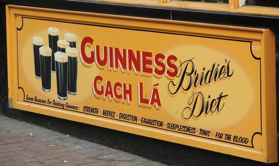
What is observable on the posters is warmth. Flat, saturated illustration, a simple gag, and a line short enough to read from across a pub. The brand problem was affection: Guinness needed to be liked, not explained. Cartoon animals gave a heavy, serious product a sense of humor, and the slogan gave every execution the same sign-off.
The proof of the system is how long it outlived its media buy. The line and the toucan still show up on pub walls and merchandise nearly a century later. That endurance is what a strong verbal identity buys you; I collected more cases like it in these brand tagline examples. The trade-off is that a character-led world needs discipline, because one off-model execution reads as counterfeit.
5. Coca-Cola, “Share a Coke” (2011)
Share a Coke started in Sydney in 2011, when Coca-Cola swapped its own logo for the 150 most popular Australian first names. By the company’s own account, Australians bought more than 250 million named bottles and cans in a nation of just under 23 million people, and the campaign has since reached more than 70 countries. The history is on Coca-Cola’s own site.
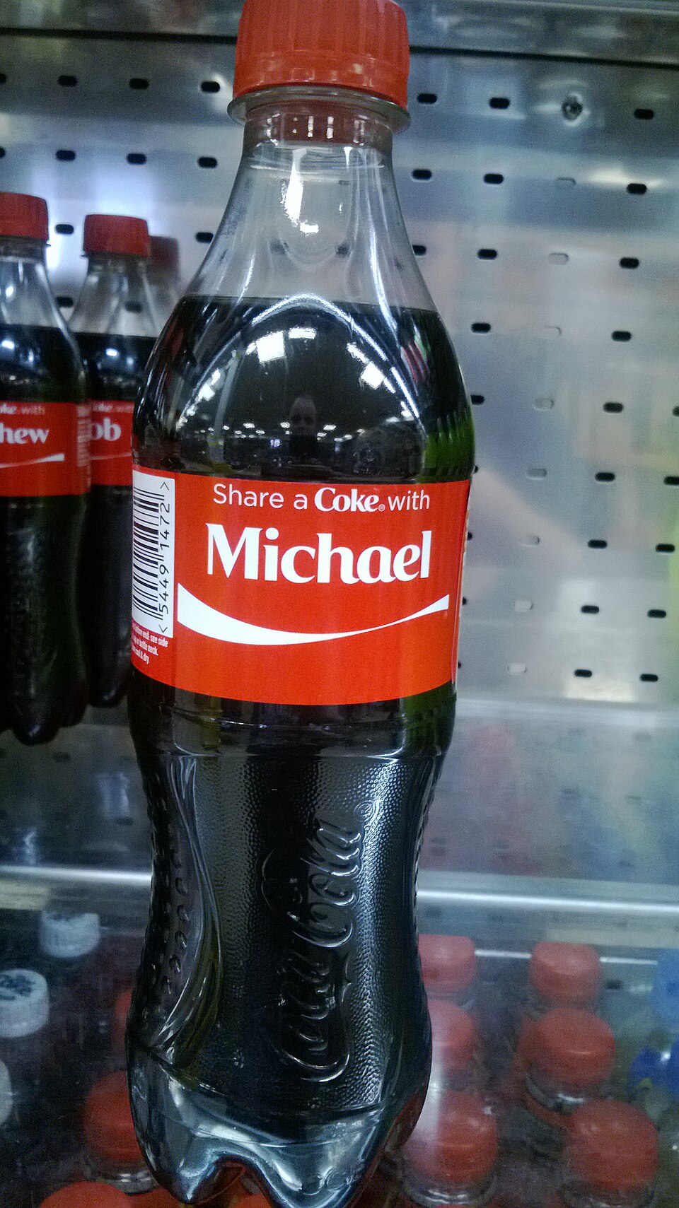
The device is the package itself. The name on the label is the message, and the print, billboard, and retail work simply enlarged it. A reader needs no metaphor: they look for their own name, or think of someone else’s. It solved a participation problem for a brand everyone already knows. Nobody needed Coke explained; they needed a reason to hand one to somebody.
The campaign keeps returning because the mechanic still works. Here is a recent official relaunch, this one from Coca-Cola’s South Africa channel.
The limit is worth naming. Personalization without a social prompt feels mechanical. The name is an invitation, and the surrounding creative still has to supply the reason to share.
6. Nike, “Just Do It” (1988)
Just Do It began in 1988 at Wieden+Kennedy, where cofounder Dan Wieden coined the line. The print work that grew around it follows one rule: athletes in motion, dramatic photography, sweat and effort, and the short line. The product plays a supporting role. The athlete’s body carries the message, and the ask is movement.
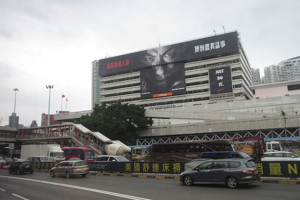
What I like about the photo above is that it proves the system travels. A local boxer in Hong Kong, shot with the same intensity as any American basketball star, and the line needs no translation. The visual changes; the relationship between effort and the brand stays fixed.
A still image in this campaign has to suggest the frame before and after the one you see. That takes timing, light, and physical detail, and it is why the weakest imitations look posed. There is also a real trade-off in product visibility. Minimal product presence builds brand feeling but does little for a specific retail push, so when conversion matters the campaign needs a clearer product layer. When identity matters, the athlete stays the subject.
7. Chanel, the No. 5 campaign (1921 to present)
Chanel No. 5 launched on 5 May 1921, and its print advertising has run in fashion magazines for over a century on the same few ingredients: luxury photography, restrained typography, the bottle, and the number 5 as a recurring visual anchor. The campaign’s most famous moment was not even paid media. In April 1952, Marilyn Monroe told Life magazine that what she wore to bed was Chanel No. 5, and in 2013 Chanel built an entire campaign around a recorded interview in which she tells the story.
Chanel’s own film about that history is worth three minutes.
The number is the smart part. It is both product information and design: it can sit huge on the page, hide inside a composition, or act as a quiet signature. The bottle and the number give the reader something concrete while the photography builds atmosphere around them. That solves the core luxury problem, communicating value without reducing a fragrance to a list of notes.
The risk is imitation from the inside. Half the luxury shelf uses black, white, serif type, and polished photography. Chanel stays recognizable because number, bottle, styling, and tone operate as one system. Strip the specific assets out and the ad could belong to anyone, which is the test I run on any luxury layout that crosses my desk.
The seven campaigns side by side
| Campaign | Year | Brand goal | The move to steal | Watch out for |
|---|---|---|---|---|
| Apple, Think Different | 1997 | Stand for a way of thinking | Let portraits carry the message; remove the product | Over-explaining kills the quiet confidence |
| Volkswagen, Think Small | 1959 | Reframe a product limitation | Admit the weakness, then argue its value | White space with no honest truth under it |
| Absolut, bottle campaign | 1981 | Recognition for a featureless product | One owned shape, endless variations | A borrowed object builds no equity |
| Guinness, Guinness is Good for You | 1930s | Affection for a heavy, serious product | Characters plus a sign-off line that never changes | Off-model executions read as counterfeit |
| Coca-Cola, Share a Coke | 2011 | Turn buyers into participants | Make the package the ad | Personalization without a reason to share |
| Nike, Just Do It | 1988 | Tie the brand to effort and action | Athlete first, product second, line last | Weak for conversion when a product push is the goal |
| Chanel, No. 5 | 1921 | Sustain luxury meaning for a century | A number as a visual anchor across eras | Generic luxury styling without owned assets |
Turn the print idea into a campaign system
The strongest examples share a practical quality: the idea is never trapped in one finished page. Apple’s portraits define a point of view. Volkswagen makes a limitation persuasive. Absolut turns a bottle into a repeatable format. Guinness gives a slogan a cast of characters. Coca-Cola makes the package personal. Nike stakes the brand on effort. Chanel holds one number steady for a century.
That is the value of studying the best print ads. You are looking for a working creative system, not a museum piece. A system gives your team rules for the next ad, the next post, the next film, and the next landing page. Usually it does at least one of these things: builds a recognizable visual device, makes a limitation useful, ties the brand to one clear feeling, creates a repeatable format, or uses the medium itself as part of the message. The same test applies to visual storytelling in any channel: ask what changes between the first look and the second, and why the brand belongs inside that change. A useful reference point for teams studying that kind of consistency is this set of inspiring brand identity examples.
Print deserves real measurement too. When response matters, use campaign-specific promo codes, unique phone numbers, QR codes, tracking URLs, or dedicated landing pages, then compare exposed and unexposed groups or track sales inside a defined window. Attribution beats impressions every time, and a print piece with no response path is a brand bet, which is fine as long as you made that bet on purpose.
The adaptation work should preserve the idea while changing the format. A print crop may need a faster opening for social. A silent visual may need sound. A static transformation may need pacing in motion. At Moonb, a good share of my week is exactly this: taking a print-strength idea and moving it into video and motion without flattening it. The core stays stable while the audience’s behavior changes.
If you are heading toward actual production, it helps to understand how modern print work gets made and placed; this primer on digital print advertising covers the production side. Then pick one of these seven systems and test it against your next brief. Write the idea in one sentence, name the device that makes it recognizable, and map that device across print, social, video, and motion. One idea, carried everywhere, beats a folder of disconnected executions.
Frequently asked questions
It survives translation. Write the idea in one sentence, then check whether it still works as a 6 second video, a social tile, and a billboard read at 90 kilometers an hour. If the idea only works with the original layout, you have a nice page, not a system. The classics all pass this test: Think Small works spoken aloud, and the Absolut bottle works at any size.
Yes, in specific situations: reaching a local or older audience, signaling seriousness (a full-page ad is a costly, visible commitment), standing out where competitors are digital-only, and events or retail spaces where a physical piece lingers longer than a feed impression. Treat print as a targeted move with a defined audience and response path, not a default line item.
Give every piece its own response path: a campaign-specific QR code, promo code, vanity URL, or phone number that appears nowhere else. Then compare behavior between exposed and unexposed groups, for example matched regions with and without the placement, or sales inside a defined window after the run. If a print piece has no response path at all, you are making a brand bet, which is fine only if you decided that on purpose.





.jpg)
