12 Advertisement Examples: High-Impact Campaigns
Discover 12 high-impact advertisement examples. See what makes them work & get tactics for your next 2026 campaign.

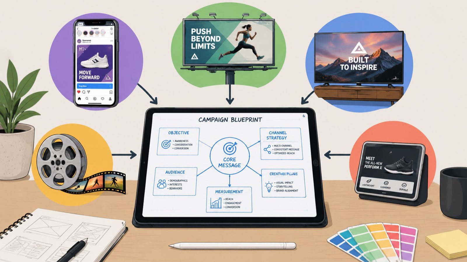
Most roundups of advertisement examples stop at the surface. They show a slick spot, name the brand, then move on. I want to go further than that. I’ve spent years producing video and motion for marketing teams, and the ads I keep returning to all share one thing you can actually use: a single clear idea, matched to the right moment, executed with taste.
So here are 12 advertisement examples I think are worth studying, the kind still taught and copied years after they ran. For each one I’ll cover what it was, why it worked, and the takeaway you can carry into your own campaign. If you plan creative for a living, I hope it saves you some guesswork.
1. Old Spice, “The Man Your Man Could Smell Like”
What it was: A 2010 body wash campaign from Wieden+Kennedy starring Isaiah Mustafa, shot to look like one continuous take as he glides from a bathroom to a boat to the back of a horse, talking straight to the camera the whole time.
Why it worked: It spoke to women, who buy a lot of men’s body wash, with a fast and self-aware joke, and the direction itself was the strategy. The illusion of an unbroken take plus the relentless prop swaps made a stale category feel current. Then the team filmed real-time video replies to fans for two days, which turned a spot into a live event.
The takeaway: Visual direction is not decoration; it is the mechanism that carries the idea. Old Spice body wash unit sales rose about 60% year over year by mid-2010, according to the Effie case study on the campaign. Pick one bold execution idea and let it do the heavy lifting.
2. Chipotle, “Back to the Start”
What it was: A stop-motion film directed by Johnny Kelly at Nexus Studios, following a farmer who industrializes his farm and then reverses course toward more sustainable practices, set to Willie Nelson covering Coldplay’s “The Scientist.”
Why it worked: It told a full brand-values story with almost no dialogue. Animation let Chipotle compress a big idea, where your food comes from, into two minutes, because every frame was under control. It won the Film Grand Prix at Cannes Lions in 2012, which is a real marker of craft.
The takeaway: When a live camera would struggle to show a system or a before-and-after, animation earns its place. Lock the script before anyone opens After Effects, because one small change can ripple through timing and sound. If you build this kind of work often, think in reusable components rather than one-off scenes; here’s my take on the types of motion graphics worth systematizing.
3. Apple, “1984”
What it was: A 60-second spot directed by Ridley Scott for agency Chiat/Day, aired nationally just once during Super Bowl XVIII in January 1984 to introduce the Macintosh. A runner hurls a hammer through a giant screen where a Big Brother figure drones at rows of grey figures.
Why it worked: It sold a feeling, rebellion against conformity, instead of listing specs. It made a computer launch feel like a cultural moment, and it proved that a single well-placed airing can outlast a year of frequency.
The takeaway: You do not always need to explain the product inside the ad. Sometimes the job is to make people feel something and remember who caused it.
4. Nike, “Just Do It”
What it was: Wieden+Kennedy launched the “Just Do It” line in 1988. The first spot featured 80-year-old runner Walt Stack jogging across the Golden Gate Bridge.
Why it worked: Three words that fit both a marathoner and someone lacing up for the first time. The ad was not really about Nike; it was about the person watching, which turned the brand into a coach instead of a seller.
The takeaway: A durable line speaks to the customer’s ambition, not the product’s features. The strongest positioning leaves room for millions of different people to see themselves in it.
5. Dove, “Real Beauty”
What it was: Ogilvy’s Campaign for Real Beauty launched in 2004 with everyday women in place of models. It grew into the 2006 “Evolution” film, a time-lapse of a model reshaped by makeup and retouching, and the 2013 “Real Beauty Sketches,” where an FBI-trained artist drew women as they described themselves versus how strangers described them.
Why it worked: It challenged its own category’s conventions and tied the brand to a point of view women recognized. The sketches film became one of the most-watched ads of its era because the insight rang true and people wanted to pass it on.
The takeaway: A specific, true insight about your audience can outperform any product claim. Show real people saying what actually changed for them; concrete detail beats vague praise every time.
6. Spotify, “Wrapped”
What it was: Spotify Wrapped, launched in 2016, turns each listener’s yearly data (top songs, artists, minutes listened, a “listening personality”) into a bright, swipeable story built for sharing.
Why it worked: It makes the customer the star. Every recap is different, so millions of people post their own version each December, and the brand gets a wave of reach it never has to buy.
The takeaway: Personal data, packaged playfully, is some of the most shareable creative there is. If you can reflect the customer back to themselves, they will handle your distribution for you.
7. Always, “#LikeAGirl”
What it was: Leo Burnett and documentary director Lauren Greenfield built a 2014 film that asked people to do things “like a girl.” Adults mimed weakness; young girls did the same actions with full force. Always ran a 60-second cut in the 2015 Super Bowl, the first feminine-care ad ever to air in the game.
Why it worked: It reframed an insult into a rallying line, grounded in real research about girls’ confidence dropping at puberty. The message was bigger than the product, so people shared it as a stance rather than an ad.
The takeaway: Purpose lands when it connects to a truth about your customer’s life and your category has permission to speak on it. Give people something they want to repeat.
8. John Lewis, the Christmas films
What it was: Since 2007, the UK retailer John Lewis has released an emotional Christmas film almost every year, many of them made by adam&eveDDB. Favorites include “Monty the Penguin” (2014) and “Man on the Moon” (2015), usually scored with a slowed-down cover of a well-known song.
Why it worked: It built an annual ritual. People now wait for the John Lewis ad the way they wait for a holiday tradition, which delivers earned press and social buzz before a penny of media runs.
The takeaway: Consistency compounds. A recognizable format you repeat every year can become an event in itself, and anticipation is reach you do not pay for.
9. Cadbury, “Gorilla”
What it was: A 2007 spot from Fallon London, directed by Juan Cabral. A gorilla sits in soft light and, for 90 seconds, does almost nothing, until it drums along to Phil Collins’ “In the Air Tonight.”
Why it worked: There is no chocolate until the very end. The ad manufactured a moment of pure joy and let the brand borrow it. It trusted the audience’s patience and was repaid with enormous word of mouth and a Cannes Grand Prix.
The takeaway: An ad does not have to demo the product to sell it. Attach your brand to a feeling people love and they will connect the dots themselves.
10. Volvo Trucks, “Epic Split”
What it was: A 2013 film from Forsman & Bodenfors, directed by Andreas Nilsson, in which Jean-Claude Van Damme performs a full split balanced between two Volvo trucks reversing in formation, set to Enya’s “Only Time.” It was captured in a single take on a runway at sunrise.
Why it worked: The stunt was a live demonstration of the actual product claim, steering precision and stability, dressed up as spectacle. It was built for YouTube, hit tens of millions of views within days, and even pushed Enya’s song back onto the charts.
The takeaway: The most persuasive demo turns a real product truth into something people want to watch and forward. Make the proof the entertainment.
11. Airbnb, “Belong Anywhere”
What it was: Airbnb’s 2014 “Belong Anywhere” rebrand centered on the Bélo symbol and a simple promise: travel should feel like belonging, not just booking a place to sleep. The idea carried through later work, including the 2017 “We Accept” spot.
Why it worked: It moved Airbnb from a transaction (a room for the night) to an identity (belonging), which gave the brand meaning beyond price. That opened the door for real host and guest stories to become the campaign.
The takeaway: When you sell an emotional outcome instead of a feature, your customers’ real stories become your best creative. Define what belonging to your brand feels like, then let people show it.
12. Coca-Cola, “Share a Coke”
What it was: Ogilvy Sydney launched “Share a Coke” in Australia in 2011, swapping the logo for 150 popular first names and inviting people to find a bottle for someone they knew. It rolled out to the US in 2014 and to more than 80 countries.
Why it worked: A name on a bottle turned a mass product into a personal gift, and it sent people hunting shelves and posting what they found. In the US it lifted sales by more than 2% after years of decline.
The takeaway: Personalization at scale can make a commodity feel like a present. Give people a reason to look for their own name, or a friend’s, and buyers turn into promoters.
How I’d put these examples to work
A pattern runs through all twelve, and it has nothing to do with the size of the media buy. Each ad had one clear idea and a format that fit the job. Old Spice needed a fast, funny take built for reach. Chipotle needed animation to show a values story a camera could not. Volvo turned a product truth into a stunt. Coca-Cola made a commodity personal with a name on a label. Most campaign waste I see comes from mismatching the idea to the task: asking a culture film to drive signups, or asking one hero video to do the work of ten social cuts.
The channel decides a lot of the execution. A short-form social video needs a hook in the first second and captions baked into the edit, because most people watch on mute. A product demo should open on the outcome, not the interface. An explainer works when it starts with the friction the viewer feels and turns the abstract into simple steps. Broadcast rewards a single tight premise, because TV production magnifies every weak decision once crew and talent are locked in. Many modern campaigns extend the same idea through creators, and briefing creator and UGC partners as carefully as you would an agency keeps the premise intact across dozens of native posts.
The other thing these campaigns share is that someone protected the idea the whole way through. Before I start any project I want four things agreed: a brief, a script, a shot list, and one person who owns the final call. That last one spares you the revision spiral where the brand gets edited by committee. If you want my full process, I wrote up how I plan a video production and how I keep creative work moving.
If you need this kind of output steadily instead of one big push a year, a dedicated creative team helps. That is what we do at Moonb: video, motion, design, and animation produced by a team that learns your brand and works on a steady weekly rhythm, extending your in-house marketing and creative leads rather than replacing them. The hard part is rarely making one good ad. It is making enough good ones across channels without losing the thread.
Frequently asked questions
Old Spice's "The Man Your Man Could Smell Like." It shows how one execution idea, held with real discipline, can carry a whole campaign and even move sales. If an idea survives that kind of focus, it usually travels to other formats too.
Often, for anything that benefits from demonstration or emotion. A still image can win on a quick comparison or a clean message, but examples like Volvo's "Epic Split" or Dove's sketches do things a static frame simply cannot. Match the format to the job rather than defaulting to video every time.
Explainer animation paired with a clear product demo. One simplifies the concept, the other shows it in use. Fintech, healthcare, enterprise software, and other workflow-heavy categories lean on this pairing because a camera alone cannot show a process well.
More than one, fewer than you probably have time for. In paid social, testing several hooks against the same core idea beats polishing a single version forever. The right count depends on your capacity to produce, not on a magic number.
Spotify Wrapped. It proves that reflecting the customer back to themselves, in a format built to be shared, can generate more reach than any media buy. Make the viewer the subject and they will spread it for you.



