8 magazine ad examples and the page craft behind them
Eight real magazine ads, from Sainsbury's Roald Dahl spread to Oatly's long-copy page in Grazia, with the specific page craft each one gets right.

The best magazine ad examples use the page itself, its size, its fold, its neighbours, as part of the idea. Three on this list show the range: Sainsbury’s arced one borrowed Roald Dahl word across a double-page spread, Oatly filled a page of Grazia with typewriter copy about talking to your dad, and Aldi had a carrot tear through the editorial and ask readers to search the rest of the issue.
I work on the brand side of a creative team, and magazine pages are the reference material clients underrate most. Everyone studies billboards and social cuts; almost nobody studies what a brand does with a captive reader, a physical fold, and zero autoplay. The other problem is that most magazine ad roundups are the same museum tour, the 1959 Beetle, the Economist red, the Apple portraits. So this list works the other way. Seven of the eight ads ran between 2021 and 2025, each is named, dated, and tied to a source you can check, and each comes with the actual page or the campaign film. One classic stays at the end of the long-copy section as the control, because it invented the rules the others still play by.
The entries are grouped by how the page does its work: headline-led ads, image-led ads, long-copy ads, ads that take more than a page, and ads shaped by their placement. If you want the wider print and outdoor picture, the companion piece on the best print ads covers that ground with a different set of campaigns.
Headline-led pages
1. Sainsbury’s, “Christmas just got Scrumdiddlyumptious” (2025)
Sainsbury’s built its Christmas 2025 campaign around Roald Dahl’s BFG, who teams up with Annie, a real store colleague, to replace a family’s eaten Christmas food shop. The TV spot, made with New Commercial Arts, premiered on 2 November 2025. The magazine execution strips the whole thing down to typography: “Christmas just got Scrumdiddlyumptious”, set in the brand’s orange, with the giant invented word swooping across both pages of a spread. The page was picked out by Magnetic, the UK magazine industry’s marketing body, in December 2025.
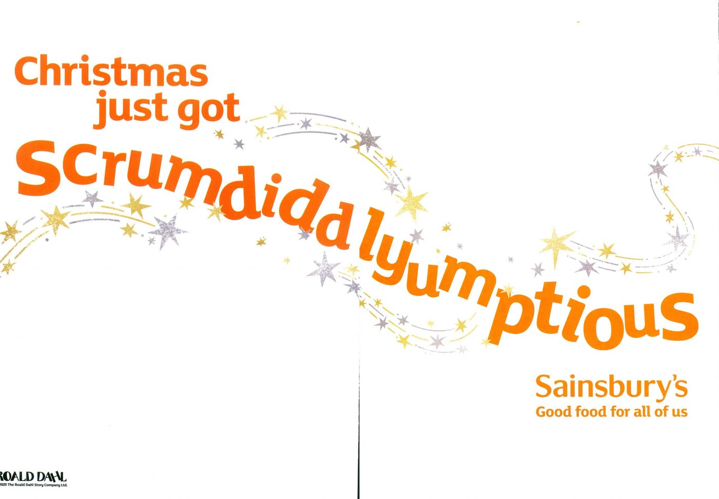
Look at where the letters sit. “Scrumdiddlyumptious” arcs across the gutter, and the layout places the fold between letterforms so the physical seam never cuts a character in half. That is spread craft you only learn by shipping spreads. The bigger lesson is borrowed language: Sainsbury’s did not write a new slogan, it licensed a word an entire country already loves and let the typography do the celebrating. A borrowed word only works when the association is genuinely yours to borrow, which the licensing partnership made true. I collected more cases of lines that carry this much weight in these brand tagline examples.
Here is the film the page connects to, from Sainsbury’s own channel.
Image-led pages
2. Fortnum & Mason, “A Fantastical Christmas” (2025)
Fortnum & Mason’s Christmas 2025 campaign, created with Otherway and the animation house Studio AKA, wraps the retailer’s food in an illustrated world of creatures, covered by Creative Boom at launch. The magazine page puts a Blanc de Blancs bottle at a diagonal through gold light, then adds two tiny mice in party hats: one riding the label with a butterfly net, one floating inside a bubble. The headline, “Pop a fantastical Christmas”, is hand-lettered to match, and the page ran in the Christmas glossies, where Magnetic logged it in December 2025.
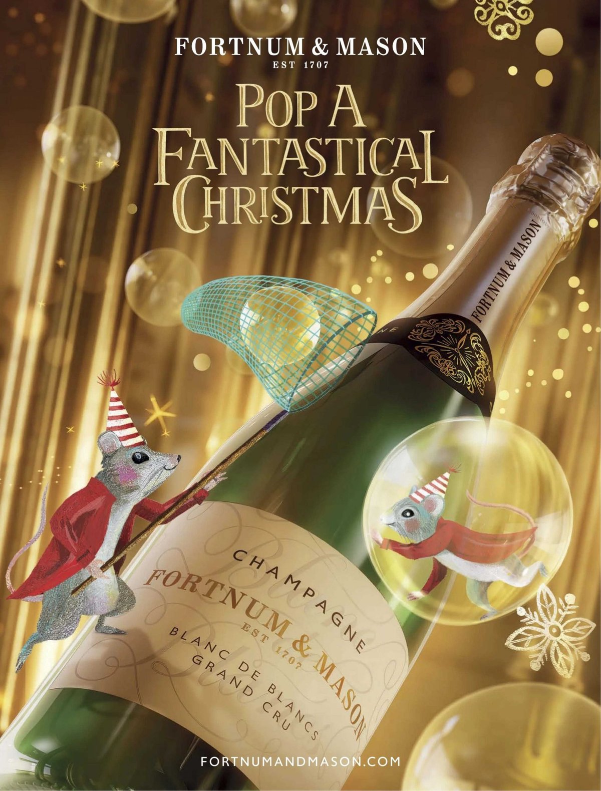
The craft worth stealing is the mixed register. A straight bottle shot would be a catalogue page; a fully illustrated page would lose the product. Fortnum’s compositors put photoreal glass and painted mice in one frame and let the scale gap between them create the fantasy. It suits a 300-year-old retailer that sells theatre as much as groceries: the mice are the same characters that appear in its Piccadilly windows, so the ad, the shopfront, and the film all read as one world. That cross-surface consistency is the thing to copy, and it is the same discipline covered in these visual storytelling examples.
3. Pepsi, “Better With Pepsi” (2021)
For National Hamburger Day 2021, Pepsi ran close-up photographs of crumpled burger wrappers from the three biggest US burger chains, none of which served Pepsi at the time. In the creases of each wrapper, the folds form the Pepsi globe, ringed with a thin white circle and the words “better with”. Adweek told the story behind the shoot, and the work sits in the D&AD awards archive.
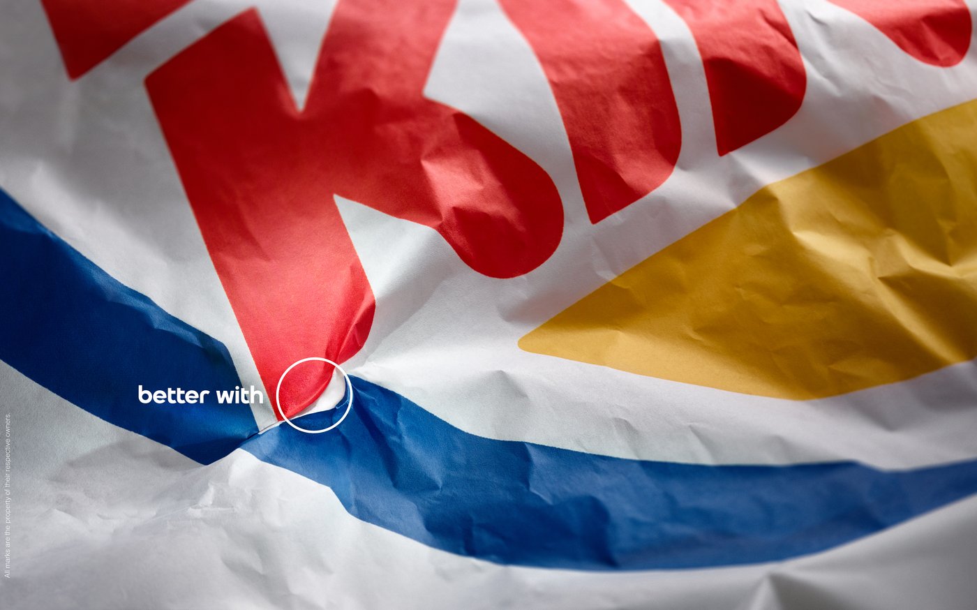
This is the purest image-led construction on the list: no product shot, no pack, one found symbol. The wrappers were physically folded until the logo emerged, which matters, because the texture of real paper is what makes the trick feel discovered rather than composited. It also shows how an image-led page handles a legal minefield. Pepsi never names the chains; the reader’s own recognition of the wrapper colours does the naming. The trade-off is fragility. The idea depends on the reader knowing those wrappers on sight, so it would die in a market where the chains’ visual identities are weaker.
4. Dove, “Reverse Selfie” (2021)
Dove’s Reverse Selfie launched in April 2021 as a film and a set of print executions, the sequel to its 2006 short Evolution. The print image is a split composition: the polished, retouched selfie a 13-year-old posted, and beside it the same girl as she actually looks. The campaign built the altered image with the same retouching app teenagers actually use, a detail The Drum reported at launch, and Unilever documented the project on its own newsroom.
The film runs the process backwards, undoing every edit until the child appears. It is on Dove US’s own channel.
As a magazine page, the device is a before-and-after where the “after” is the lie. That inversion is what makes it land in print specifically: a static page lets you hold both faces at once and study the gap, which a 15-second cut never allows. The risk with advocacy work like this is that the brand lectures. Dove avoids it by making the image do the arguing and keeping the copy short. Twenty years of the Self-Esteem Project behind it means the page reads as a continuation, one more chapter in a story the brand has earned the right to tell.
Long-copy pages
5. Oatly, “How to talk to your 58-year-old dad about milk” (2021)
Oatly took a full page in Grazia in February 2021, logged by Magnetic at the time, as part of its Help Dad campaign aimed at getting UK families to talk middle-aged men out of dairy. The headline fills half the page in fat, wobbly letters. Below it, two dense columns of typewriter text walk through the actual dinner-table problem: dads protected by “a nostalgic force field that fends off all manner of fact and logic”, the “That’s nice, sweetheart” deflection, and a pointer to a site full of counterarguments. A footnote at the bottom cites the Ipsos survey behind the targeting.
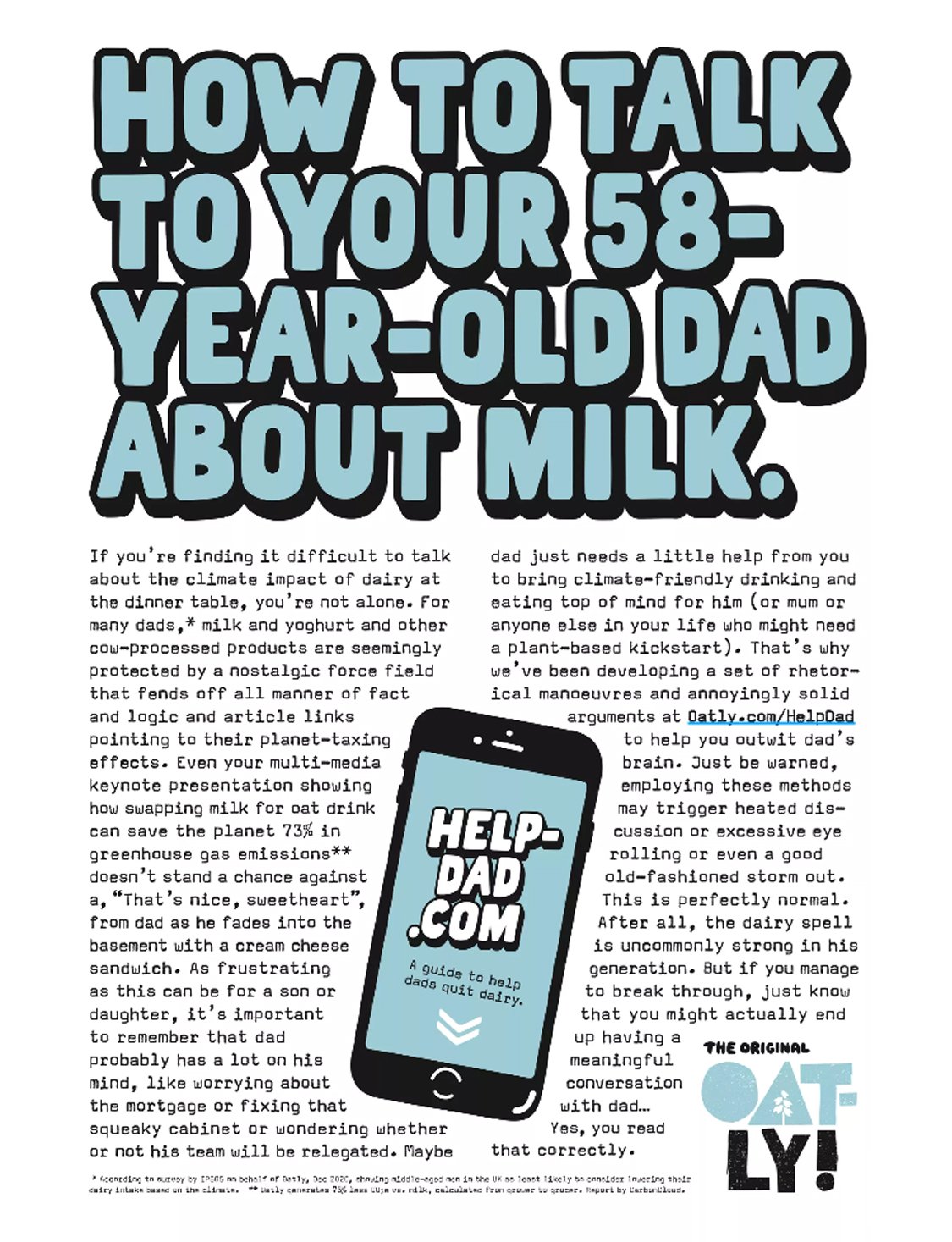
Long copy survives in 2020s magazines for exactly one reason: the reader is already sitting down. That puts a page like this closer to editorial craft than to advertising craft, a distinction worth reading up on if you brief writers regularly, since content writing and copywriting pull in different directions and a long-copy page needs both at once. Oatly writes like a funny friend rather than a nutrition brand, and every joke is doing persuasion work; “the dairy spell is uncommonly strong in his generation” reframes a diet argument as an affectionate family comedy. Notice also who the ad talks to. Grazia’s reader is not the 58-year-old dad; she is his daughter. Buying the page in that title, with that headline, is a targeting decision made in the media plan and finished in the copy. That is what separates a long-copy ad from a manifesto: it knows exactly which chair it will be read in.
6. Rolls-Royce, “At 60 miles an hour” (1958)
One classic stays on the list, because every long-copy page since is negotiating with it. David Ogilvy’s 1958 Rolls-Royce ad opens: “At 60 miles an hour the loudest noise in this new Rolls-Royce comes from the electric clock.” The line is not Ogilvy’s invention; the ad itself credits it to the technical editor of The Motor, whose review supplied the quote. Below a plain photograph of the Silver Cloud, the page lays out 13 numbered facts, from the engine run for seven hours at full throttle before installation to the picnic table veneered in French walnut. Copywriting teachers still dissect it line by line, as Enchanting Marketing does here.
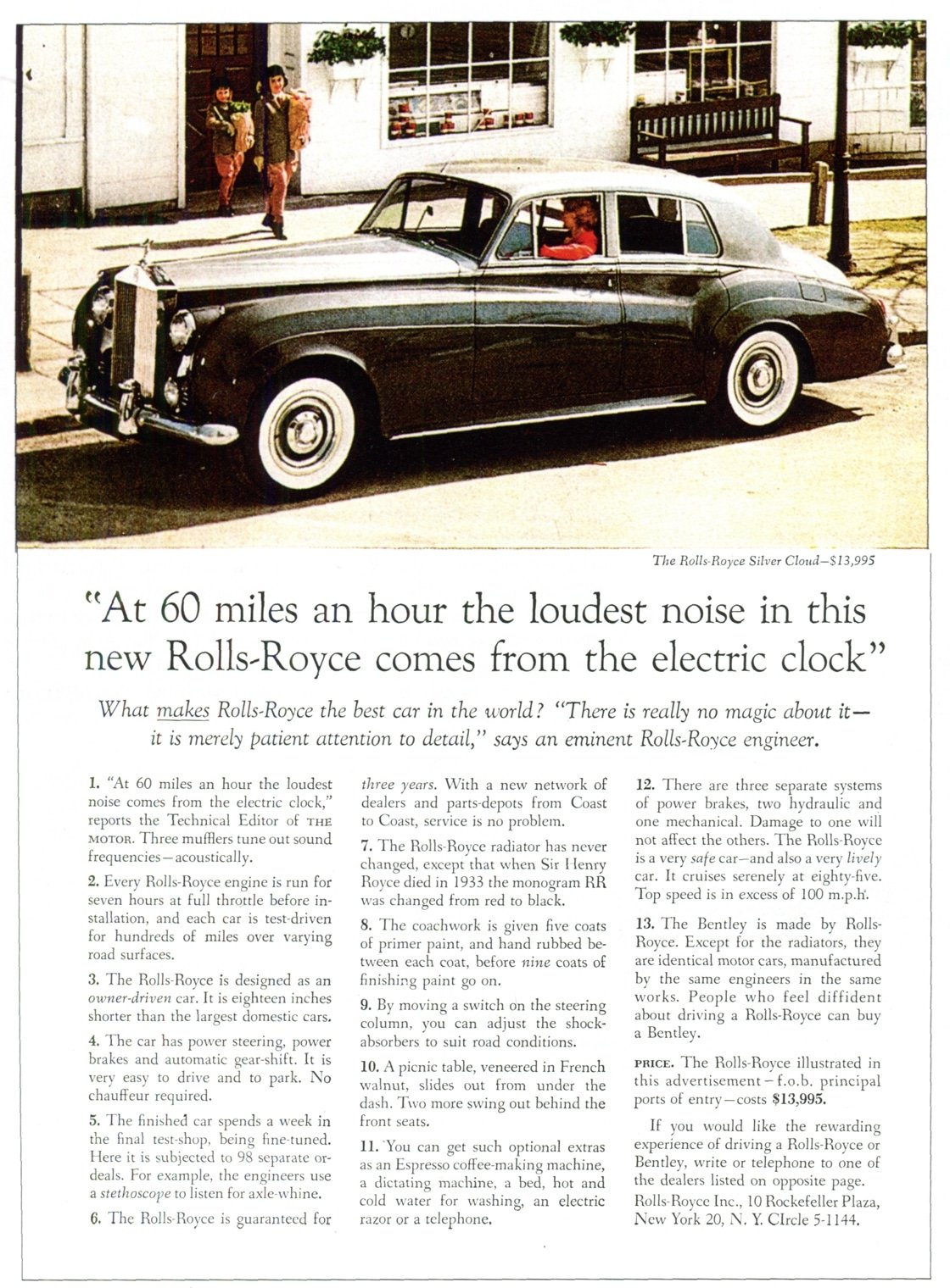
The mechanics are the point. The headline is a specific, reported observation, so the reader performs the listening test in their own head and concludes “quiet” without being told. The numbered format gives permission to skim, which paradoxically gets more of it read. And the whole page trusts facts to carry status; there is not one adjective doing the work a detail could do. Put it next to the Oatly page and the lineage is obvious: same structure, same faith in the sit-down reader, sixty-three years apart.
When the ad takes more than a page
7. The LEGO Group and Immediate Media, “Share What You Love” (2025)
Not every magazine ad is a page. The LEGO Group ran a year-long partnership with the publisher Immediate Media across Radio Times, BBC Top Gear, BBC Gardeners’ World and MadeForMums, built to make brick sets feel like year-round gifts rather than a December purchase. The print side included advertorial pages and product reviews written from children’s perspectives, alongside a video series about families building together and a build station at the Gardeners’ World Live show. Magnetic’s case study reports the video series alone reached 15.8 million people.
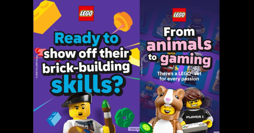
This is the modern version of what gatefolds and bound-in inserts used to do: buy a deeper slice of the reader’s attention than a single interruption can. The clever part is matching each title’s reason for existing. A build feature in a gardening magazine works because the audience already spends weekends making things; a review written by a child works in a parenting title because that is whose opinion the reader actually trusts. The caution is disclosure. Advertorial that hides its label spends the magazine’s credibility instead of borrowing it, and readers notice faster than media plans assume.
Ads shaped by their placement
8. Aldi, Kelvin the Carrot tears through the page (2025)
Aldi’s Christmas 2025 campaign was a three-part soap: Kevin the Carrot goes missing after a stag do, and best man Kelvin has to get him home in time for his wedding to Katie, which closed the saga on TV in late November. The magazine execution, run with the publisher Bauer and picked out by Magnetic, stages Kelvin bursting through a torn editorial page, holding a “missing” poster of Kevin. The copy is wall-to-wall carrot puns: things have gone “a little bit pear-shaped”, he needs Kevin to “turnip in time”, and readers should “keep your eyes peeled”, because Kevin is hidden somewhere in that issue.
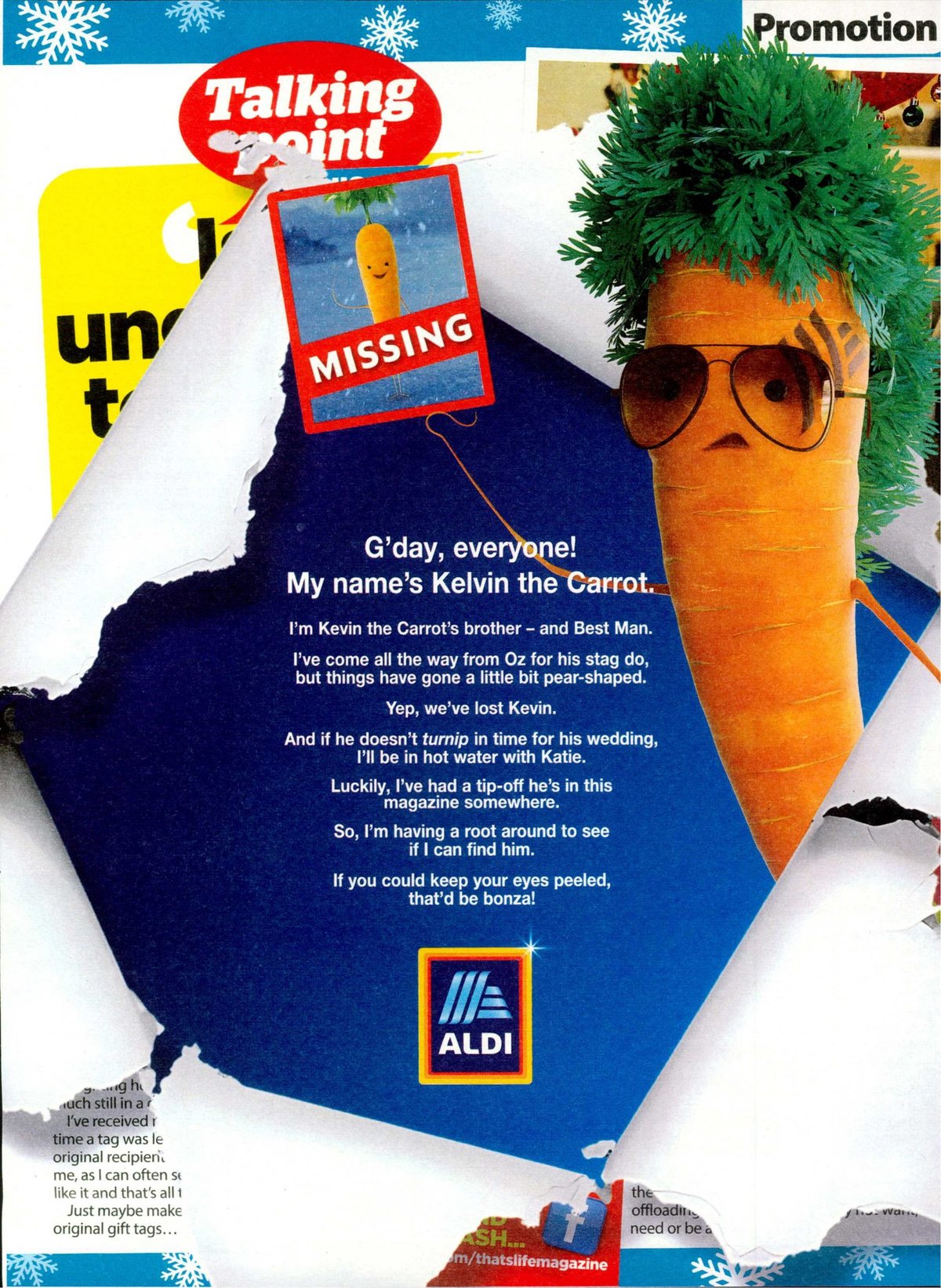
Two placement tricks stack here. First, the ad uses the physical fiction of the medium: the torn-paper illusion only makes sense on an actual page, surrounded by actual editorial, which is why this execution could never be a social post. Second, it converts the rest of the issue into the campaign, sending readers hunting through pages Aldi never paid for. That hunt only works because a decade of Christmas TV made Kevin a character people recognize from a thumbnail-sized cameo. A brand without that equity would just be tearing a hole in someone’s magazine. The TV side of these supermarket sagas is its own discipline, and these commercial advertisement examples break down how the film half earns that recognition.
The eight ads side by side
| Campaign | Year | Page type | The move on the page | Watch out for |
|---|---|---|---|---|
| Sainsbury’s, Scrumdiddlyumptious spread | 2025 | Headline-led spread | One licensed word arced across the gutter | Borrowed language needs a real association behind it |
| Fortnum & Mason, A Fantastical Christmas | 2025 | Image-led page | Photoreal product plus painted characters in one frame | Whimsy without product grounding turns into wallpaper |
| Pepsi, Better With Pepsi | 2021 | Image-led page | A rival’s wrapper folded into your logo | Depends on readers knowing the rival’s colours on sight |
| Dove, Reverse Selfie | 2021 | Image-led page | Before-and-after where the polished image is the lie | Advocacy pages collapse if the copy starts lecturing |
| Oatly, Help Dad in Grazia | 2021 | Long-copy page | A comic argument written for the exact reader of that title | Long copy dies when the voice sounds like a press release |
| Rolls-Royce, At 60 miles an hour | 1958 | Long-copy page | A reported detail as headline, numbered facts as proof | Specifics age well, adjectives do not |
| LEGO Group x Immediate, Share What You Love | 2025 | Multi-title partnership | Advertorial matched to each magazine’s reason for existing | Unlabelled advertorial spends the title’s credibility |
| Aldi, Kelvin tears through the page | 2025 | Placement-shaped page | Fake page damage plus a hunt through the whole issue | Needs an already-famous character to reward the search |
What the page teaches that a feed cannot
A few patterns run through all eight. The strongest pages make one move each: a word, a fold, a wrapper, a tear. None of them needs a second idea to prove it was worth the placement, and the discipline of cutting to one move is most of the job. The wider tour of advertisement examples across formats shows the same rule holding everywhere, but the magazine page enforces it hardest because nothing moves, nothing loops, and there is no second frame to recover in.
The recent entries also share a media habit worth copying: they were designed for a named title, not for “print”. Oatly wrote for Grazia’s reader, Aldi wrote for an issue readers would physically search, LEGO wrote for four audiences separately. The magazine is a context, and the ads that respect the context outperform the ones that treat it as a rectangle. When a page idea is strong enough to become the spine of a whole platform, film, social and all, the process looks like the systems in these ad campaign examples.
And the classic earns its seat by explaining the rest. The Rolls-Royce page proves that a specific, checkable detail beats any superlative, which is exactly the engine inside Oatly’s footnoted comedy and Pepsi’s foldable proof. At Moonb we keep a folder of pages like these for exactly that reason; when a brief stalls, the fastest way forward is usually asking what the one checkable detail is and what single move would make a sitting-down reader stop.
Frequently asked questions
A magazine ad is built for a named title and a sitting-down reader, which changes the craft. You know who is holding the issue, so copy can be written for that exact person, the way Oatly wrote its Grazia page for the dad's daughter rather than the dad. You also get physical tools no poster has: the fold between pages, the neighbouring editorial, and a reader giving you minutes instead of seconds. If an idea works identically as a billboard or a social post, it is not using the magazine yet.
For the right audience, yes, and the recent work proves brands still invest in the format: Sainsbury's, Aldi, Fortnum and Mason and the LEGO Group all ran significant magazine executions in 2025. The case is attention quality rather than reach. Magazine readers chose the title, pay for it, and read slowly, so a page gets a depth of engagement feeds rarely match. The practical approach is treating the magazine as a context to design for, then carrying the same idea into social, video and display so the page is one surface of a larger system.
As long as the argument needs and no longer, which in practice means committing to one of two modes. Either the page makes a single move in a glance, one word, one image, one visual trick, or it earns a real read with structured long copy the way the 1958 Rolls-Royce ad did with numbered facts and Oatly still does with comic argument. The pages that fail are the ones in between, with three paragraphs of filler no one chose to read. Decide whether you are stopping the reader or sitting with them, then cut everything that serves the other mode.



