9 display ad examples across every major format
Nine real display ad examples from 2022 to 2026 across formats: standard sizes, responsive, native, carousel, video, expandable, AI-matched and in-app, with the craft decision behind each.

Frame.io’s standard-size set, Babbel’s 4th of July responsive ads, Allbirds’ native-style card, a Spotify for Artists carousel, Warby Parker’s video units, the Minnesota Lottery’s in-screen expandable video, Coloreria Italiana’s AI-matched banners on Amazon, Save the Children’s “The Tiniest Room” listing in Romania and Glo On’s keyboard ad in Bangladesh are the display ad examples I’d study right now. Each shows a different format, and all of them sit on pages nobody opened to look at ads.
Display is the job that gets handed over last and judged fastest, at least in the campaigns I see working at Moonb. A team spends weeks on a campaign film, then two days before launch someone asks for “the banners,” as if a 320 x 50 strip were the same job made smaller. The format decides what the creative is allowed to do, so I went looking for one strong example per format. If you want classic static and animated banners sorted by goal, our sister piece on banner ad examples has those.
Nine ads, nine formats
| # | Brand and work | Year | Format | What it says | How it’s built |
|---|---|---|---|---|---|
| 1 | Frame.io, standard-size set | 2026 | Standard display, uploaded image sizes | One source of truth for every stage of your project | Same black field, purple button and logo spot in every size, copy cut to fit |
| 2 | Babbel, 4th of July sale | 2026 | Responsive display | 20% off this 4th of July | Assets written so any combination still reads |
| 3 | Allbirds, New Wool Collection | 2026 | Native-style image card | A whole new world of comfort | Product photo does the talking, text stays small |
| 4 | Spotify for Artists, Campaign Kit | 2026 | Carousel | I am an artist looking to grow my audience | First card is a fill-in-the-blank sentence about the viewer |
| 5 | Warby Parker, contacts | 2026 | Video in display | Save on contacts when you shop at Warby Parker | Muted video, with the sales line in a plain text panel |
| 6 | Minnesota Lottery, “Wait, What?” | 2025 | In-screen expandable video | North 5 now has instant wins | Built on one reaction, readable with the sound off |
| 7 | Coloreria Italiana, “The Media Hacking” | 2023 | AI-matched retail banners | Don’t buy another sweater, recolor the one you have | A banner generated for each garment people searched |
| 8 | Save the Children, “The Tiniest Room” | 2024 | Native listing on property sites | A 0.2 square meter room for 10 euros | The ad copies the listing card it sits between |
| 9 | Glo On, “G for Glo On” | 2022 | In-app contextual placement | Glo On Pink Glow Cream, now in Bangladesh | Triggered by one typed letter, gone in three seconds |
The first five come from Google’s Ads Transparency Center, which shows what an advertiser has run on Google and when each ad was last shown. The other four come from agency filings on Ads of the World, plus the Minnesota Lottery’s own YouTube channel.
The sizes worth designing first
Google’s AdSense guide names five “top performing ad sizes”: the 300 x 250 medium rectangle, the 336 x 280 large rectangle, the 728 x 90 leaderboard, the 300 x 600 half page and the 320 x 100 large mobile banner. It says the 300 x 250 (like the 336 x 280 and the 728 x 90) tends “to have more ad inventory available from advertisers” and that the 320 x 50 “mobile leaderboard” works well “particularly when used at the bottom of a page” (Google AdSense Help). Google Ads’ list of common computer sizes adds the 160 x 600 wide skyscraper and the 970 x 90 large leaderboard (Google Ads Help).
The banner piece has the full size table, so I’ll keep this short. Inventory is the argument for the 300 x 250 here: Google says it tends to have more of it, and in a format roundup that matters more than layout. The phone pair (320 x 50, 320 x 100) comes next, the desktop pair (728 x 90, 300 x 600) after that, and the 970 x 250 billboard waits until somebody has actually bought that placement.
1. Frame.io: one message cut into six standard sizes (2026)
Frame.io’s ads run under the advertiser name Adobe, Inc, and the Transparency Center lists this set of uploaded image ads as last shown on October 11, 2026. Three short lines rotate through it, “One source of truth for every stage of your project,” “Capture, collaborate, review and deliver. All on one platform.” and “Search beyond the file name.”, across the leaderboard, half page, medium rectangle, large rectangle and both mobile banners.
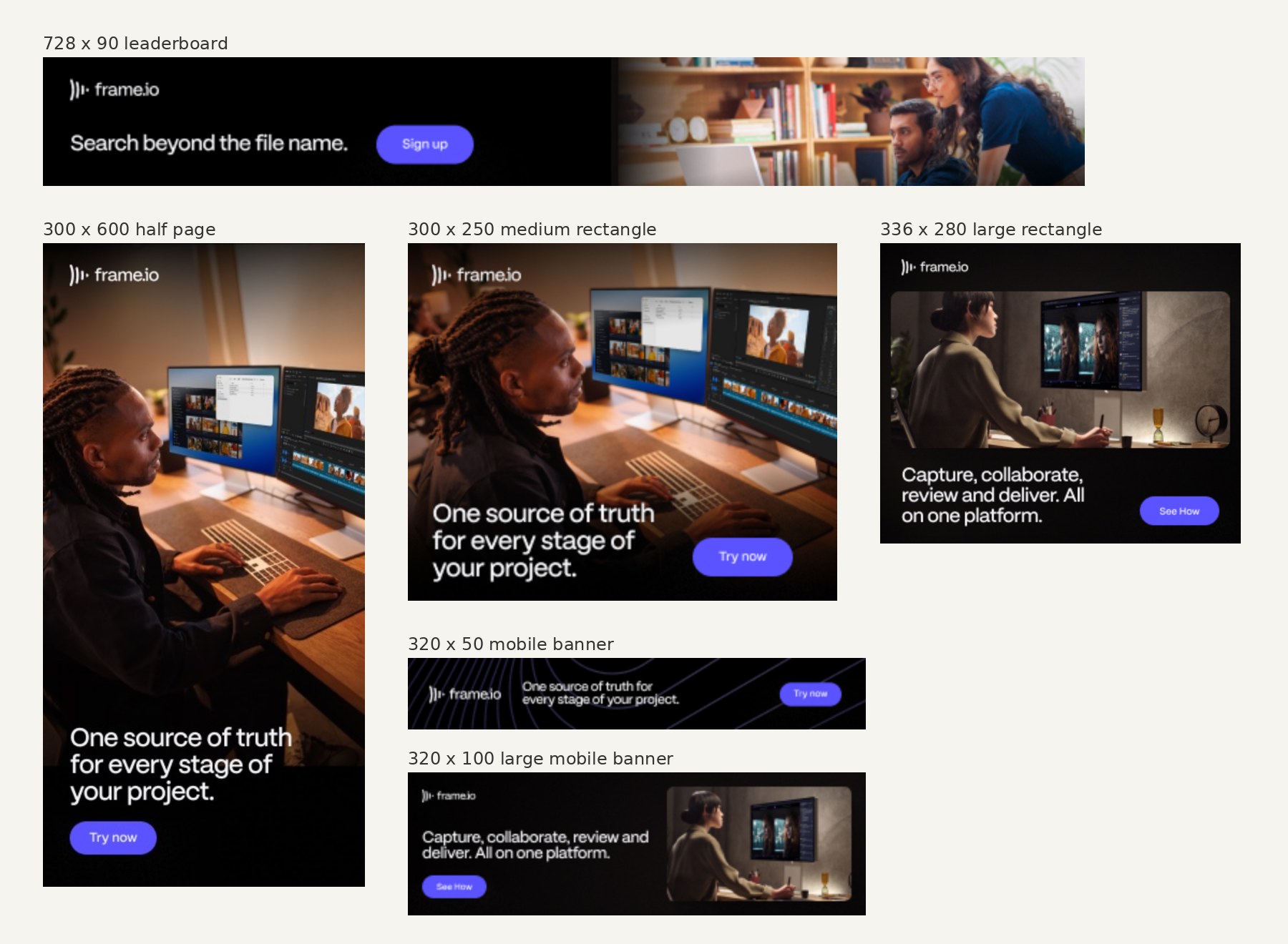
So little changes between sizes, and that’s the whole lesson. Every unit is black, every button the same purple pill, the logo always on the left. The tall and square sizes get a photo of someone editing at a desk; in the 320 x 50 the photo is gone and you’re left with the logo, one line and the button, which still makes sense because the line was short to begin with. Someone who saw the half page on a laptop will recognize the phone banner later without reading it.
2. Babbel: a 4th of July sale built as a responsive display ad (2026)
A responsive display ad is a bundle of headlines, descriptions, images and logos that Google assembles into whatever shape the page has free. Babbel’s 4th of July sale ads in the US have that look: each Transparency Center entry holds several separate images, rendered into Google’s own layouts with a “Visit Site” button, and these were last shown between July 7 and July 10, 2026.
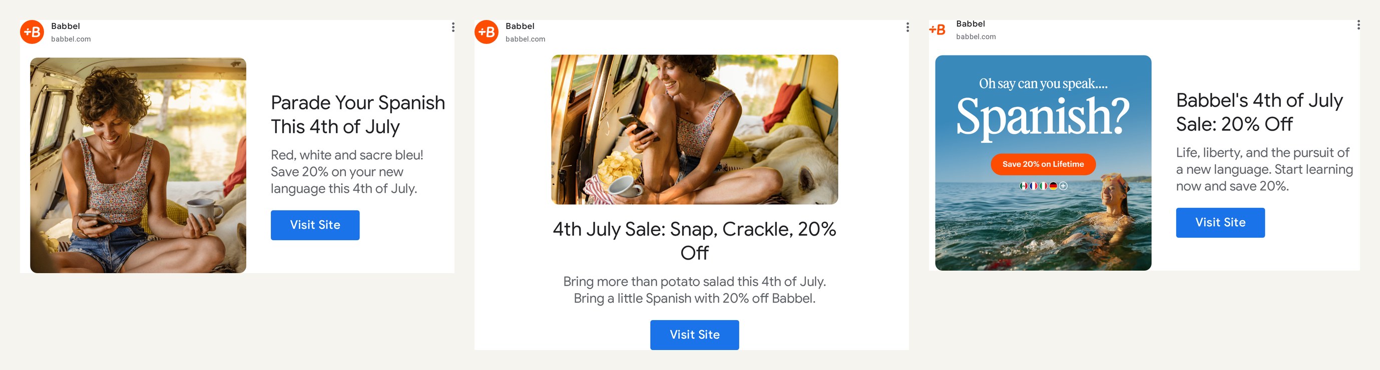
The headlines: “Parade Your Spanish This 4th of July,” “4th July Sale: Snap, Crackle, 20% Off,” “Babbel’s 4th of July Sale: 20% Off.” Each names the holiday and the 20% sits in a headline or the description, so any pairing Google picks still reads. My favorite piece is an image: “Oh say can you speak… Spanish?” over a photo of a woman swimming in the sea.
The check I’d run on any responsive set is boring: put every headline next to every image, and cut the lines that only make sense with one picture.
Google’s walkthrough shows how the assets get uploaded and combined:
The specs allow one to five headlines of 30 characters, one long headline of 90 characters and one to five descriptions of 90 characters (Google Ads Help). Thirty characters is about five short words. Babbel’s three lines above run 34 to 37 characters, so in a responsive set they’d only fit the long-headline slot.
3. Allbirds: a native-style card that sells with the photo (2026)
Some placements render an ad as a content card, image on top and copy underneath, like an article teaser. Allbirds’ New Wool Collection ad, last shown on October 11, 2026 according to the Transparency Center, is made for that slot.
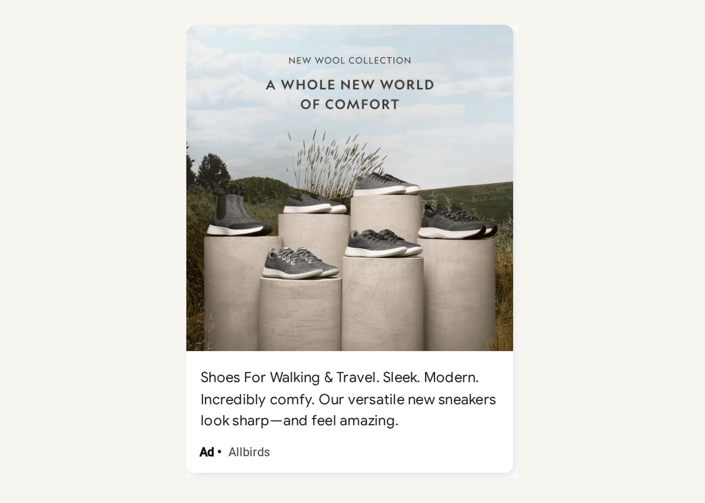
Grey wool sneakers on stone plinths in a field, “New wool collection / A whole new world of comfort” in spaced capitals at the top, no price, badge or button in the image. It could be a magazine still life. The practical bit, “Shoes For Walking & Travel.”, lives in the copy below.
4. Spotify for Artists: a carousel that starts with the viewer (2026)
A carousel lets someone swipe through several cards inside one ad slot. Spotify for Artists is running one for Campaign Kit, pitched as a way to “promote your music on Spotify,” and last shown on October 11, 2026.
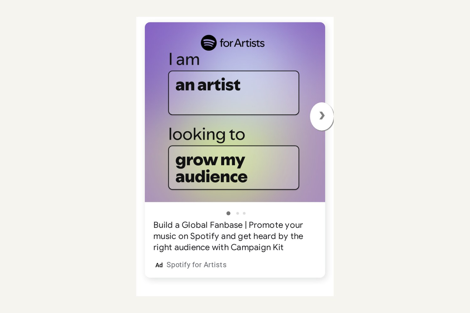
This first card is the cleverest copy on the list. It is a sentence with two boxed blanks already filled in: “I am / an artist / looking to / grow my audience.” An artist reads it as a form about themselves and claims the ad before knowing what’s for sale.
An arrow beside the card and three dots under it say there’s more, and the line underneath (“Build a Global Fanbase | Promote your music on Spotify and get heard by the right audience with Campaign Kit”) names the product. Most carousels I see save the good card for later, assuming a swipe nobody owes them.
5. Warby Parker: video inside a display slot, with the pitch in text (2026)
Display slots can carry video too, usually muted. Warby Parker’s contact lens ads are filed under Image in the Transparency Center, but each render is a muted video frame (mute icon in the corner, a burned-in caption on one) paired with a plain text panel.
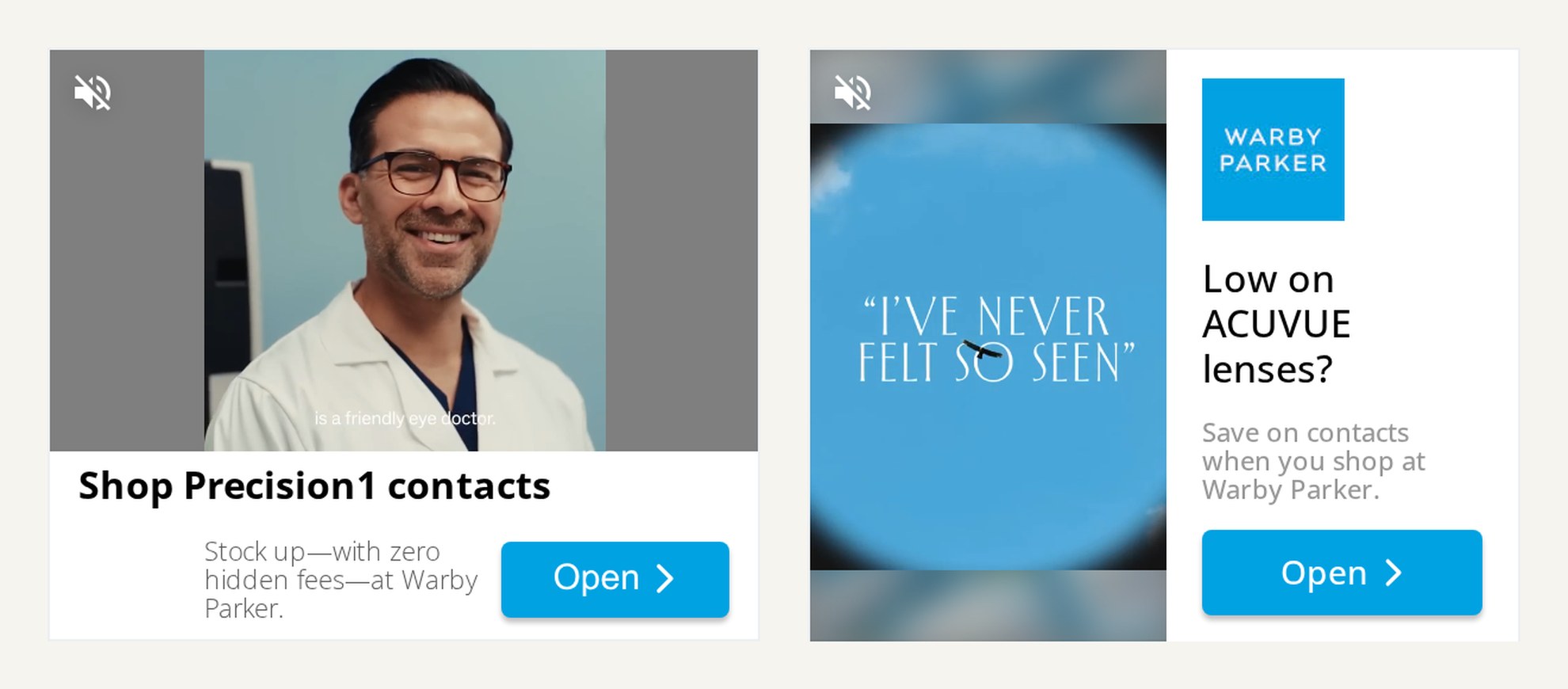
One clip is a smiling eye doctor, the other a frame of blue with the words “I’ve never felt so seen” on it. That’s the brand side. The text panels do the selling and would work with the video frozen: “Shop Precision1 contacts” with a promise of “zero hidden fees,” and “Low on ACUVUE lenses? Save on contacts when you shop at Warby Parker.” Both were last shown on October 11, 2026.
Naming the exact lens brand is a targeting call as much as a copy one; the line only speaks to people already wearing those lenses (the audience logic is in this explainer on what behavioral targeting is and how it works).
6. Minnesota Lottery: an in-screen expandable video built on one reaction (2025)
The Minnesota Lottery launched its “Wait, What?” campaign for the North 5 game on February 3, 2025. The filing on Ads of the World lists the media as “broadcast TV, connected TV, pre-roll, YouTube, native, display, GumGum (in-screen expandable video), social media and print,” so the same campaign also ran in a unit that starts small and expands into a larger video. The spot below is the campaign film itself.
In the spot, on the lottery’s own YouTube channel, a man at a convenience store hears about the game’s new instant-win feature, EZ Match, and his “wait, what?” gets longer and more exuberant each time. For an expandable unit that’s ideal: a face reacting in close-up reads in a small frame with the sound off, and the reaction is what makes you tap. A film built on dialogue would have nothing left at that size.
7. Coloreria Italiana: a banner generated for every sweater search (2023)
Coloreria Italiana sells color for re-dyeing the clothes you already own. The agency Different, working for Coloreria Italiana and Henkel, used its display ads to argue against buying new clothes at all. “With the AI-d of artificial intelligence we hacked Amazon searches: are you looking for a sweater? Thanks to AI, a banner of a colorful sweater in one of Coloreria Italiana’s 16 colors immediately appears,” says the November 2023 filing on Ads of the World. It adds that the team “created hundreds of custom banners to appear live for every single garment that was searched for on Amazon.”
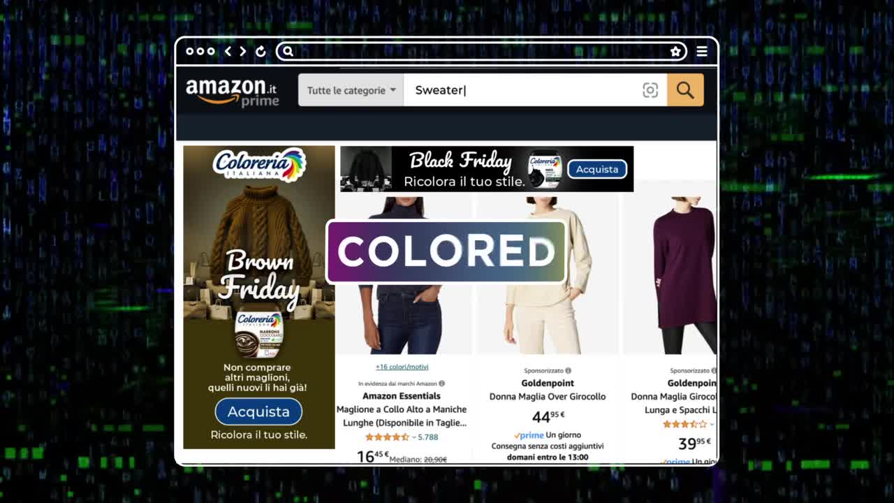
In the case film, a search for “Sweater” on Amazon Italy brings up a vertical Coloreria banner beside the results: the words “Brown Friday” under a brown cable-knit sweater, the line “Non comprare altri maglioni, quelli nuovi li hai già!” (don’t buy more sweaters, you already have new ones) and a “Ricolora il tuo stile” sign-off. Another frame stacks up the variants, Black, Pink, Yellow and Green Friday among them.
The banner barely has to explain itself. You were about to buy a sweater, and there it is, in another color, already yours.
8. Save the Children: a native listing that looks like a real flat (2024)
This one doesn’t look like an ad at all. In Romania, “Save the Children listed The Tiniest Room on the most visited Romanian real estate platforms, right between homes and studio apartments. For just €10, visitors could rent the listing, over and over again, transforming a real estate click into a real-world donation,” according to the April 2024 filing by the agency Golin on Ads of the World. The room is a neonatal incubator, which the filing describes as missing from most of Romania’s maternity wards.
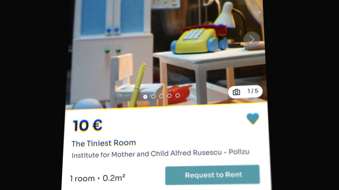
Price, title, address, “1 room • 0.2m²,” a photo counter, a “Request to Rent” button. The card follows the property site’s format to the letter, and the size is the only thing out of place. A good native unit obeys every convention of the page and breaks exactly one.
9. Glo On: a keyboard ad triggered by one letter (2022)
Glo On, a pink glow cream from Marico Bangladesh, launched with an in-app placement that, by the agency’s account, no brand had used before. The September 2022 filing by Asiatic Marketing Communications on Ads of the World says the team partnered with the Ridmik keyboard app: “Every time someone types g/G/গ, the Glo On ad appears & stays in the mobile screen for 3 seconds & then disappear.”
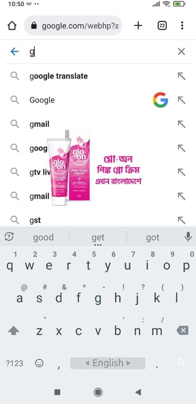
The creative is tiny: a tube, its box and three short lines of Bangla floating over the suggestion list. It gets three seconds to tie the letter “g” to the brand name, and the trigger does half of that for it. I’d want guardrails on anything like this, though. A rule that fires on a word alone can’t tell BANNERS’ artist page on the OohYeah music marketplace from a page about banner ads, and every contextual buy that matches on text has the same blind spot.
Animated display and its file-weight limits
Google caps display animation in kilobytes and in seconds. Uploaded image ads, GIFs included, max out at 150KB. “Animation length must be 30 seconds or shorter,” animations “can be looped, but the animations must stop after 30 seconds,” and “Animated GIF ads must be slower than 5 FPS” (Google Ads Help). HTML5 ads go up as a ZIP of 600 KB or smaller, and the same page says HTML5 access needs an account “open for more than 90 days” with “more than $9,000 USD total lifetime spend,” among other criteria.
Storyboard around that from the first sketch. Flat color, type and one moving element will fit inside 150KB; a photograph plus motion usually won’t, so I keep the photo still and animate the words. Under 5 frames per second a GIF can’t fake smooth motion either, so use it for a couple of clean state changes, a price appearing or a color swap. If the motion started life as video, our video to GIF tool shows how much of it survives.
What separates a clicked ad from one that was only seen
“Seen” has a narrow industry definition. Under the Media Rating Council’s 2015 measurement standard, an impression counts as viewable only if “Greater than or equal to 50% of the pixels in the advertisement were on an in-focus browser tab on the viewable space of the browser page” for “greater than or equal to one continuous second, post ad render” (MRC Viewable Ad Impression Measurement Guidelines). Large ads of 242,500 pixels or more need only 30% of their pixels in view, and video needs two continuous seconds of play.
One second, half visible. The ads above that get clicked inside that window finish their message at the smallest size (Frame.io’s 320 x 50 still tells you what the product is) and start from the viewer, as Spotify’s first card and Coloreria’s sweater both do by picking up what the person was already doing. They also use their format for the one thing it’s good at. The Tiniest Room borrows a listing’s credibility, and the lottery spot relies on a face that reads small.
Then test the click on its own: one line against another, with the audience and landing page held still, which is how our ad creative testing walkthrough sets it up. If some of your clicks come from search, Digital Skyrocket’s local business guide on how to improve click-through rates covers title and snippet tests on the results page. For video that has to match the page around it, see our piece on contextual video advertising, formats that invite a tap get the interactive video marketing guide, and in-display video is placed next to pre-roll and CTV in our overview of types of video advertising.
Frequently asked questions
A banner ad is one kind of display ad: a fixed rectangle of image or animation in a standard size, like 300 x 250 or 728 x 90. Display is the wider family of visual ads on websites and apps. It also covers responsive ads that Google assembles from separate assets, native cards styled to look like content, carousels, video in display slots and expandable units. Pick the formats before anyone starts designing, since each one changes what the creative can do.
The 300 x 250 medium rectangle. Google's AdSense guide puts it among its top performing sizes and says it tends to have more ad inventory available. Get the message working there, then adapt it to 320 x 50 and 320 x 100 for phones and to 728 x 90 and 300 x 600 for desktop. The 320 x 50 is the hardest edit, so if the message still reads there, the bigger sizes are rarely the problem.
Search for the advertiser in Google's Ads Transparency Center and filter the format to Image. You get the display ads that ran on Google with the date each was last shown, and the renders often show the full size set or the combinations Google built from responsive assets. Targeting and results stay hidden, so use it to study creative decisions and draw your own conclusions about performance elsewhere.



