How to Rebrand Without Losing What Works
Learn how to rebrand with a clear, honest playbook covering audits, positioning, identity, rollout, and real cases from Gap to Airbnb that show what works.


Most rebrands I have watched fail did so for one plain reason. The team started with the logo instead of the equity. They changed what people already recognized before they had decided what still mattered, and then they acted surprised when customers went quiet or got confused. I have sat in those rooms. The energy is all on the new mark, and nobody is protecting the thing that was actually working.
So if you are trying to figure out how to rebrand, I would start you on a harder question than most people expect. Do you need a rebrand at all, or do you just need to tidy up what is already there?
Do You Actually Need a Rebrand
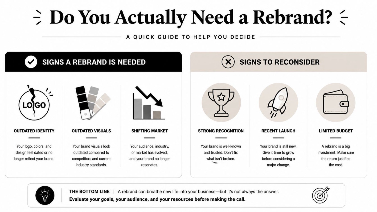
A refresh and a full rebrand are not the same thing, and I see teams mix them up constantly. That confusion is where a lot of the bad decisions get made. A refresh updates the look, maybe the logo, the color, or the type, while the core identity stays put. A full rebrand changes the strategy, the positioning, the name, or the meaning sitting behind the brand.
I tell clients to take the lighter path when the brand still has equity but the execution feels dated. That is the right move when the business is basically sound and the identity just needs a sharper face. If you want the gentler route, the grow your brand online resource is a useful place to think through brand building before you touch the deeper strategy.
When a full rebrand is justified
A full rebrand earns its place when the business has genuinely changed. A merger. A new direction. A damaged reputation. A name that no longer fits what the company actually does. HubSpot’s rebranding guide puts the strategy decision ahead of the identity work, and I think that order is correct. When the business has shifted underneath you, the old brand may be quietly lying on your behalf. I keep HubSpot’s rebranding framework on hand for the moment you need to settle strategy before design.
Practical rule: If you can still explain the business clearly with the current name and identity, you probably do not need a full rebuild.
The wrong move I see most often is overreaching because the old look feels tired. Plenty of teams pay for a full rebrand when a refresh would have solved the problem. That wastes equity and invites risk you did not need to take on.
Before you commit, I would ask one blunt question. Are we changing how the market should understand us, or just how we look? If it is the second one, stay closer to a refresh. If it is the first one, you are in for the harder work, and there is no shortcut around it.
The Rebrand Process in the Right Order
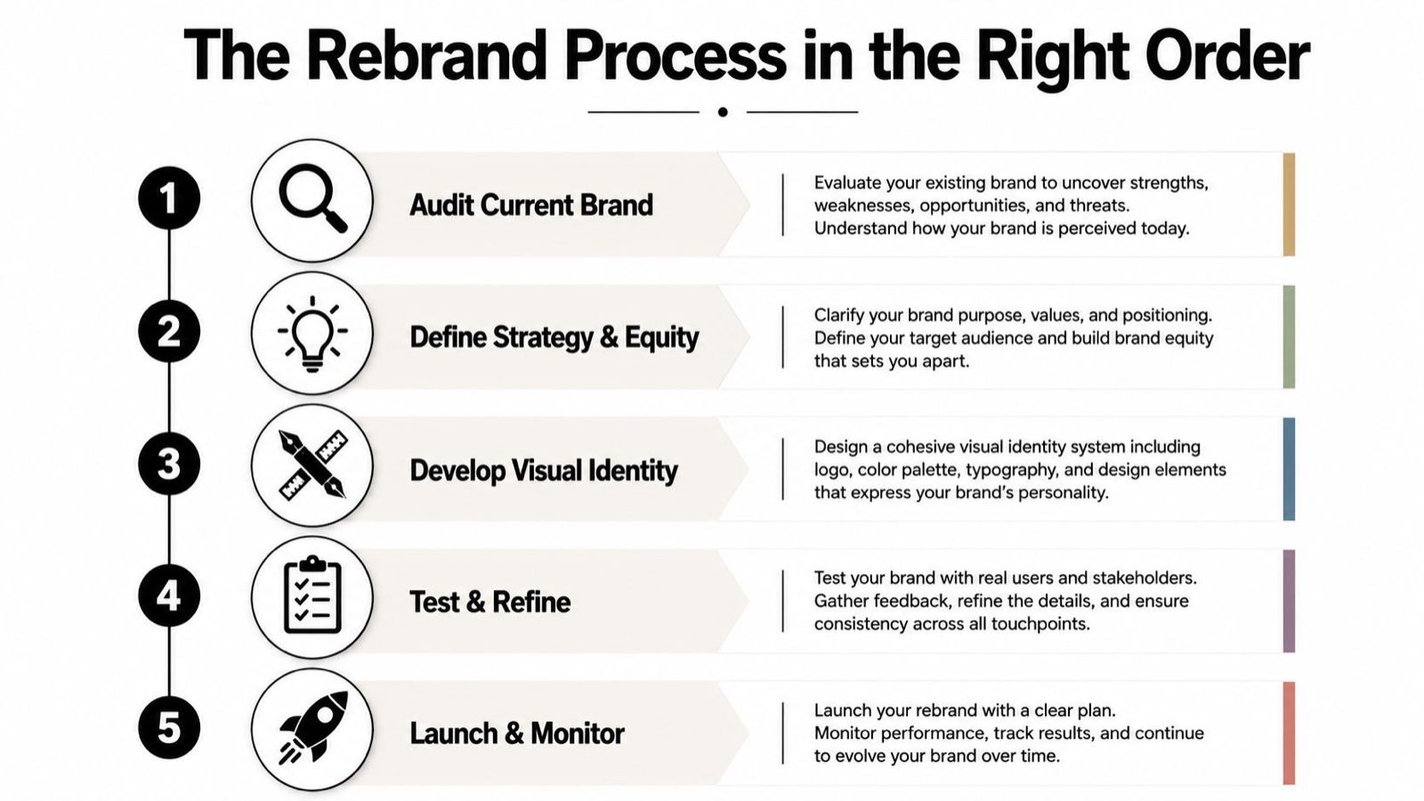
I start every one of these with a brand audit. Map every touchpoint, from the website and the sales deck to packaging, support docs, social profiles, and the product UI. A proper audit shows what people already recognize, what they trust, and what needs to go. The point is not to admire the brand. It is to separate what is broken from what is worth keeping. For a deeper pass on that first step, the brand audit guide is a solid companion.
Once you know what equity you actually own, define the business strategy and the positioning. This comes before any visual work, every time. A new logo with no positioning decision behind it is just decoration, and I have seen expensive decoration solve nothing.
Build from strategy outward
After strategy, define the audience again. Not the broad market. The actual people you need to reach next. If the audience has changed, the language, the proof points, and the design system all need to move with it.
Then build the verbal identity. Name, mission, messaging, voice. Only after that do you develop the visual identity, the logo, color, typography, imagery, and the full system that holds them together. I hold this order because design should express the strategy, not invent it. When a studio starts drawing before the strategy exists, the design is guessing.
Practical rule: If you can’t say what changed in the business, don’t change the logo yet.
Document the work in brand guidelines before you launch. The brand guidelines resource shows how that documentation protects consistency, and I lean on that discipline on every job. Then plan the rollout across every touchpoint. Expert guidance recommends inventorying every branded asset, prioritizing them, assigning owners, and sequencing the rollout across website, social, packaging, ads, internal documents, and customer communications, because inconsistent timing creates brand fragmentation.
The rollout is where I watch teams get lazy. They treat launch day like the finish line. It is not. You still owe internal training, customer messaging, redirects, partner updates, and a clean handoff across every live surface. The sequence matters because people notice inconsistency faster than they notice design polish. I have never seen a customer compliment a kerning fix, but I have watched plenty of them flinch at a homepage and a sales deck that no longer match.
Cautionary Rebrand Cases Worth Studying
The best cautionary tales are simple ones. Gap and Tropicana both show what happens when a team underestimates a familiar cue.
Gap changed its logo in 2010, then reversed the move within a week after the backlash. The lesson was not about typeface taste. It was about who owns the recognition. Customers had an attachment to the old mark, and the company learned too late that a logo can carry more trust than leadership expects. I bring this one up on calls whenever someone wants to bin a mark just because they have grown bored of it.
Tropicana’s 2009 packaging change was a different failure with the same root problem. The redesign made the brand harder to spot on shelf, and the packaging got rolled back after a reported sales drop. If shoppers cannot find you fast, the brand is not “fresh.” It is hidden.
For a launch framework that respects timing and sequencing, I point people to MarTech Do’s GTM framework as a cross-check. It is a good reminder that brand change needs go-to-market discipline, not just creative approval.
What these reversals teach
The principle is straightforward. Evolve recognizable equity. Don’t throw it away unless strategy demands it. Customers do not owe you a reset just because your team wants one, and I would push back hard on anyone who assumes they do.
These cases make one more thing obvious to me. Test with real customers before the full public switch. If the change strips out the cues people use to spot you, you have manufactured friction exactly where you needed confidence. For a deeper list of the operational traps, the branding mistakes guide is a useful follow-up.
Instructive Rebrands That Landed Well
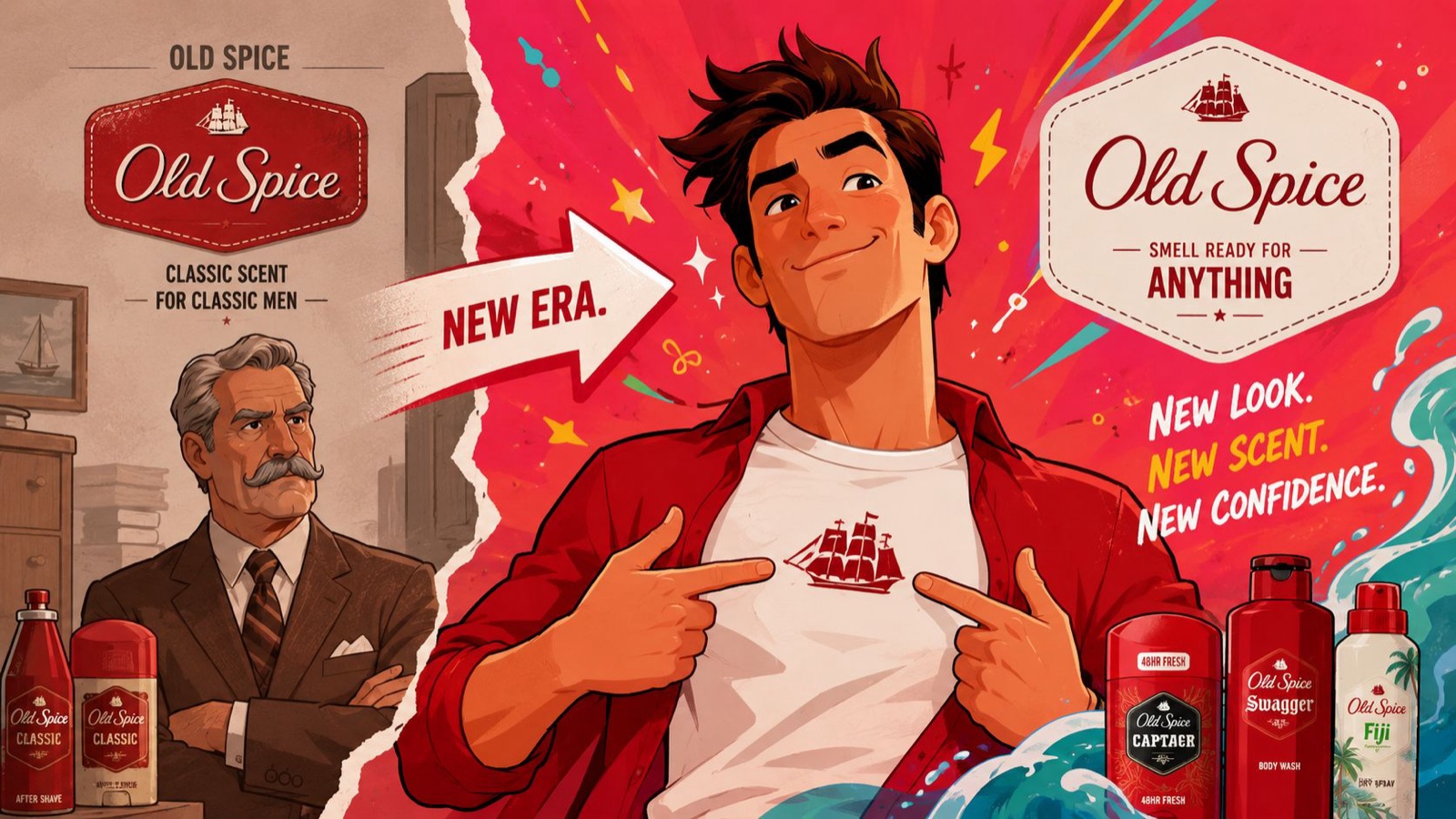
Some rebrands work because they make a real strategic point, not because they look clever. Old Spice moved toward younger buyers, and the creative shifted along with that audience change. That is the right sequence. Audience first, tone second.
Burberry pulled back from an overexposed look and reclaimed some of its prestige by simplifying the visual feel. That kind of move only works when the brand is ready to stop shouting. When the market is tired of the old signal, restraint can do more than decoration ever will.
What the stronger examples have in common
Mailchimp built a bold identity system that gave the brand room to stay distinctive in a crowded category. The lesson is simple, and I repeat it often. If your whole market sounds the same, verbal and visual discipline matter more, not less. A brand that is easy to ignore will always struggle.
Airbnb introduced the Belo symbol in 2014 and gave itself a mark that could travel across markets. The point was never the shape alone. It was the idea that a strong symbol can carry meaning without needing a long explanation every time you use it.
Dunkin dropped Donuts from the name and kept the recognition that already mattered. That move worked because it sharpened the brand without pretending the history did not exist. They edited the identity instead of erasing it, and that restraint is the part most teams skip.
Harvard Business Review makes the case better than I can for why you should think twice before touching a brand that still works.
For more on building a story that can survive a change, the brand story examples resource is a smart next stop.
Realistic Timelines and Cost Ranges
A refresh can take a few weeks to a couple of months for a small team. A full strategic rebrand for a mid-sized or larger organization often runs several months to a year, because strategy, research, identity, guidelines, and rollout all need real time. That is the honest version I give clients. Anything faster usually means something got skipped, and I would rather tell you that up front than at the launch.
Cost varies so much that a single figure is mostly fiction. The primary drivers are company size, scope, and who is doing the work, a freelancer, a small studio, a large team, or a dedicated creative partner. The rollout is usually the piece people underestimate, because every live asset has to be touched, checked, and launched cleanly. If you are planning for execution support, the digital branding services page can help you think through the work involved without pretending the cost is fixed.
Practical rule: Budget for the cleanup, not just the reveal. The reveal is the easy part.
If you are rebranding a larger business, plan for the long tail. Internal training, partner coordination, and asset replacement all take longer than teams expect. In my experience that is where a real share of the time and money actually goes.
Common Rebrand Mistakes That Derail Good Work
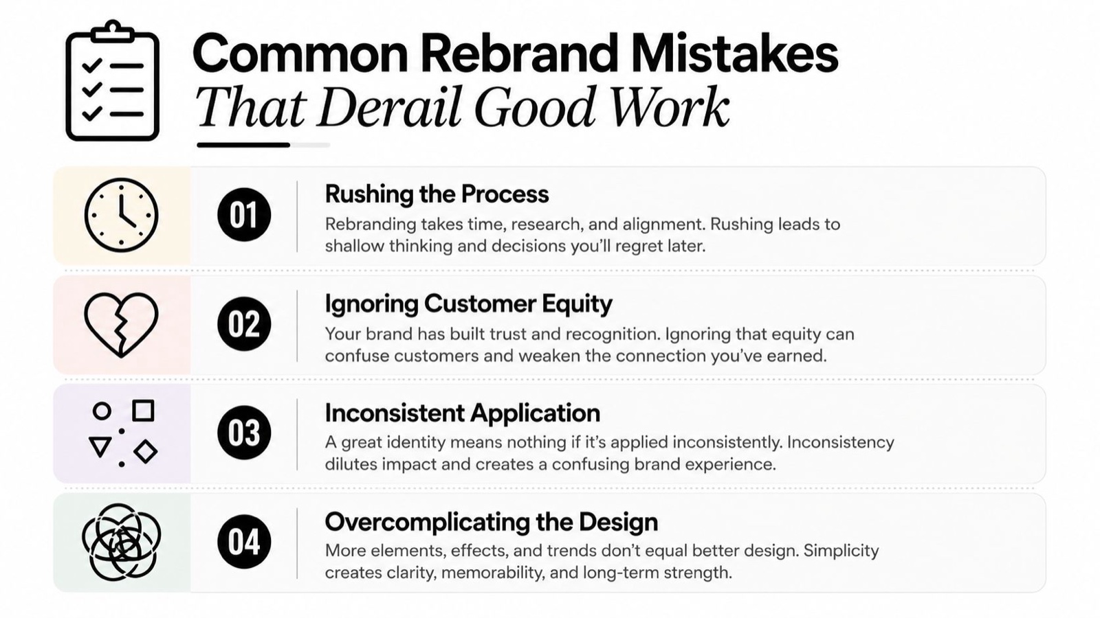
The fastest way I know to waste a rebrand is to start with visuals and call it strategy. That gives you a fresh surface and leaves the core problem sitting right where it was. The harder mistake is throwing away brand equity that customers already know. If people recognize your colors, your symbol, or your name, do not treat that memory like clutter.
Bring customer and employee input in early. Your employees have to explain the change with confidence, and they cannot do that on launch morning. Your customers need to see enough of the old brand in the new one to stay oriented. When neither group is part of the process, the rollout turns into guesswork.
The failures that show up late
A weak rollout across every touchpoint does more damage than teams expect. One new logo on a homepage means little when packaging, social, sales decks, product screens, and support templates still tell different stories. Poor internal communication creates the same mess, because staff cannot explain the change in plain language. A rebrand built to chase a trend is another poor choice. Trends fade. Confusion stays.
The other failure I see often is inconsistency. Some teams update the system, others keep reaching for the old assets, and the brand starts arguing with itself. That is usually the exact moment customers lose trust. A rebrand also falls apart when it makes the old brand harder to recognize without giving people a clearer reason to care. I use that as the test every single time.
If you want a fuller list of the traps and how to avoid them, the branding mistakes post goes further on prevention.
Putting It All Together Before You Decide
Rebranding is an equity-preservation problem first and a design problem second. Protect what customers already recognize. Change only what strategy demands. That is the line between a smart move and an expensive reset, and I have watched businesses land on both sides of it.
If you want a quick self-check, use this one. Can we clearly name what’s broken, what stays, what changes, and why now? If the answer is fuzzy, keep working the strategy. If the answer is sharp, the process can move forward with real confidence.
Sometimes the right support is a dedicated creative team that can handle the design and the rollout assets on a steady weekly rhythm, on brand and ready when you need them, especially when you want extra hands without building the whole capability in house. That is the gap we built Moonb to fill, an embedded creative team for the video, design, motion, and branding work, so you are not standing up a department just to get a rebrand out the door. Whether you handle it internally or bring in that kind of support, keep the work grounded in audits, guidelines, and a careful rollout.
If you are ready to keep going, start with a brand audit, then review a lighter refresh option, then lock the guidelines, and then clean up the mistakes that usually derail the launch.
Frequently asked questions
Change what is holding the business back and protect what customers use to recognise you. That usually means keeping a core asset or two, a colour, a shape, a name people already say, while you fix the positioning underneath. A full reset from zero throws away recognition you paid years to build.
When the real problem is the product, the pricing or the sales motion. A new logo will not fix those, and it can distract a whole team for a quarter. If customers understand who you are and still do not buy, the brand is rarely the thing to change first.
A focused refresh runs a few weeks; a full strategic rebrand with new positioning, architecture and a rollout across every surface runs months. The visible design is the fast part. The slow part is aligning the people who have to live with the decision, which is where most timelines actually slip.



