16 App Demo Videos That Actually Work
Sixteen real app demo videos from Google, IKEA, Slack and more, each embedded with one takeaway to steal, plus how to pick a style.

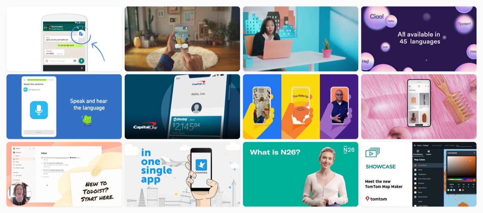
If you are about to make an app demo video, the fastest way to get unstuck is to watch how strong apps have already solved the same problem you have. I have produced these for mobile and web products, and the thing that separates a demo people finish from one they skip is almost always the first ten seconds. The good ones open on a real moment of use. A logo animation up front is the surest way to lose someone before they know what the app even does.
Below are sixteen app demo videos, each embedded, and I have paired each with the single thing I would take from it, closing with one my own team made. I grouped them by the four styles you actually pick between, then lined them all up in a table at the end so you can compare styles and lengths side by side.
The four app demo video styles
Most app demo videos fall into one of four styles, and picking the right one is mostly a question of what your product looks like when someone uses it.
2D motion graphics. Animated icons and illustrated type stand in for the interface. This style is best when your app is abstract, or when you want to show a single feature clearly without a literal screen recording. Google Translate and Capital One both use it.
Screen-capture UI walkthrough. A real recording of the app, usually with on-screen taps highlighted and a light layer of motion graphics or voiceover on top. Reach for it when the interface is the selling point and you want new users to see exactly where to tap. Headspace and Apple’s own Journal how-to are clean models.
Live-action. Real people in real environments, with the phone held in frame. This is the style for apps whose value only reads in the physical world, like camera or AR products. IKEA Place is the clearest example.
App-store-style promo. A short, punchy cut built to sit on the store listing itself, usually under 30 seconds and often without narration so it plays on mute. Duolingo’s mascot-led clip is the template.
That last style matters more than most teams realize. An app demo usually doubles as your App Store or Google Play preview video, the clip that sits directly on your listing, so many demos get cut specifically to store-preview specs, which can lift both conversion and discoverability (ASO). Apple lets you add up to three app previews to a listing, each 15 to 30 seconds long (Apple), while Google Play shows a single promo video above your screenshots (Google Play Console Help). If the store listing is where downloads happen, the demo is doing double duty.
16 app demo videos worth studying
I picked these because every one is on the brand’s own channel (no reuploads, no reel edits), the lengths are real, and each teaches something you can copy. They run from 30-second store cuts up to two-minute app explainers.
1. Google Translate: Introducing Tap to Translate
This opens on a problem everyone recognizes, switching apps just to translate a message, then shows the one feature that fixes it with quirky animation and a calm voiceover. It never touches a real screen recording and it is still perfectly clear. If you have a single feature to explain, steal the structure: name the annoyance in the first five seconds, then show the fix doing its job.2. IKEA: Say Hej to IKEA Place
Shot from the user's point of view with the phone held up in frame, so you watch AR furniture land in a real room the way you would actually use it. For a camera or AR app this is the move, because the magic only reads when you see it happen in real space. The takeaway is simple: if your product changes what the camera sees, put the camera in the video.3. Slack: You’ve Probably Heard of Slack
The "Brianna" explainer reframes Slack as a recommendation from a friend rather than a list of features, using a relatable on-camera persona over motion graphics. It works because it borrows the trust of word of mouth. If your product is familiar but misunderstood, give viewers a character they recognize instead of a feature tour.4. Loom: Introducing Loom AI
This one launches a bundle of new AI features by showing each capability happening on real recordings, so nothing feels theoretical. It is a clean pattern for a feature-launch demo that has to cover several things without dragging. What I would copy: give every feature one concrete before-and-after moment rather than a bulleted claim.5. Duolingo: Learn 30+ Languages
This runs about 30 seconds, with text on screen and the Duo mascot bouncing through real app screens, and not a word of narration. It proves a demo can carry full brand personality and land the whole value fast, which is exactly what you want for a store listing or a social feed. Build one cut that works on mute and you have covered most of where people will actually see it.6. Capital One: Download the Mobile App
Bright, icon-led motion walks through the core jobs (moving money, depositing checks) in a friendly and low-anxiety tone. For a mainstream finance app that has to feel simple and safe, that calm register does most of the persuading. The lesson is tone: match the emotional temperature your category needs, and do not stop at the feature set.7. Headspace: Using the Headspace App
This is the straight UI-tour counterpart to Headspace's more emotional brand films, showing exactly where to tap to start a session. It is a useful reminder that many brands make both an emotional demo and a practical walkthrough for different moments in the funnel. If a viewer is close to converting, a plain "here is how it works" can beat another mood piece.8. Klarna: Welcome to the Klarna App
A tidy welcome tour that frames the app around shopping and payments in one flow, with a light motion-graphics layer over the screen capture. It is a strong model for an onboarding demo that orients a brand-new user around the main tabs before they get lost. Steal the framing device: give the tour a reason to move from screen to screen, not just a menu order.9. Todoist: Getting Started
A practical first-run walkthrough that turns an empty task app into a working setup step by step. This is the format that reduces time-to-value and heads off support questions, which is worth real money for a productivity tool. If your app looks blank on day one, a getting-started demo is often more valuable than a glossy launch film, and it pairs well with a written [app walkthrough](/blog/app-walkthrough-examples) on your help site.10. Traveloka: Introduction to the Traveloka App
Upbeat animation carries you through booking and the messier moments like rescheduling and refunds, then signs off with a confident line, all without a dry menu tour. For a multi-feature marketplace, animation lets you cover a lot of ground while keeping the pace up. The takeaway: when you have many features, group them into a short journey a real user would take rather than listing them out.11. N26: What Is N26?
It positions a mobile-only bank by showing account opening and real-time controls happening inside the app, which makes a branchless bank feel trustworthy. That is the whole job for a fintech with no physical presence: prove the app is the branch. Copy the sequencing and open the account on screen first, because that is the exact moment a skeptical viewer decides whether to believe you.12. TomTom: The TomTom Map Maker
Dark-UI screen capture plus simple graphics guide you through a map-customization tool one step at a time, keeping a technical product approachable. It is a good model for a developer or power-user tool aimed at a semi-technical buyer. What I would take: slow down on the one workflow that matters and show it end to end, rather than teasing every menu. A [software demo video](/blog/software-demo-video) usually lives or dies on that single walkthrough.13. Apple: How to Use Journal on iPhone
Apple's own device-frame capture with on-screen taps highlighted is a masterclass in the clean how-to walkthrough. It doubles as onboarding and as support, which is why the format is so efficient. If you want a reference for high-contrast, easy-to-follow screen capture, this is the one to study frame by frame.14. Spaceti: The Smart Workplace App
Minimal flowing scenes and a confident voiceover make an abstract B2B workplace platform feel tangible, which is the hard part for software you cannot really photograph. When your product is invisible, animation is often the only way to show its value. This is the reference for a less-visual B2B app that needs motion to explain itself, and it is a close cousin to a good [animated product video](/blog/animated-product-videos).15. Robinhood: The World Is Flat
I am including this one as a counterpoint. It is a concept-led brand film, light on actual app screens, and it shows what happens when a company chooses narrative over a UI tour. Most of the time you want the interface on screen, but there is a moment in a brand's life when a bigger story earns more than a walkthrough. Decide which one you are making before you start, because the two briefs are completely different.16. Moonb: Meet Franz (the all-in-one messaging app)
I will finish with one of ours. We made this for Franz, an app that pulls every messaging service into a single window, and it sells the product on the feeling of a calmer inbox rather than a feature-by-feature tour. When the benefit is relief from chaos, lead with that feeling and let the interface show up to prove it.
| # | Video | Brand | Style | Length |
|---|---|---|---|---|
| 1 | Introducing Tap to Translate | Google Translate | 2D motion graphics with voiceover | ~1.5 min |
| 2 | Say Hej to IKEA Place | IKEA | Live-action first-person AR walkthrough | ~1 min |
| 3 | You've Probably Heard of Slack | Slack | 2D motion graphics with a live actor | ~1.5 min |
| 4 | Introducing Loom AI | Loom | Screen-capture feature demo with motion graphics | ~1.5 min |
| 5 | Learn over 30+ languages for FREE with Duolingo | Duolingo | Screen recording with mascot animation, no voiceover | ~30 sec |
| 6 | Download the Capital One Mobile App for Banking Tools & Features | Capital One | 2D motion graphics app promo | ~1 min |
| 7 | Using the Headspace App | Headspace | Screen-capture UI walkthrough | ~1.5 min |
| 8 | Klarna App | Welcome to the Klarna App | Klarna | Screen-capture app tour with motion graphics | ~1 min |
| 9 | Getting Started with Todoist | Todoist | Screen-capture onboarding walkthrough | ~2 min |
| 10 | Introduction to Traveloka App | Traveloka | 2D animated app explainer | ~2 min |
| 11 | What is N26? | N26 | Motion graphics plus screen-capture explainer | ~1.5 min |
| 12 | The TomTom Map Maker | TomTom | Screen-capture tool walkthrough with motion graphics | ~1.5 min |
| 13 | How to use Journal on your iPhone | Apple (Journal app) | Screen-capture UI walkthrough (official how-to) | ~2 min |
| 14 | Spaceti App for Smart Workplace - Product Video | Spaceti | 2D motion graphics product video | ~1.5 min |
| 15 | Robinhood Presents: The World is Flat | Robinhood | Cinematic brand/product film (light UI) | ~2 min |
| 16 | Meet Franz | Franz (by Moonb) | Motion graphics brand/product film | ~1 min |
How to choose the right style for your app
The choice is less about taste than about what your app looks like when someone actually uses it. When the value is visual and physical, like a camera or AR feature, I shoot live-action so the phone and the real world share the frame. When the interface itself is the pitch, record the screen and add a light layer on top, because raw screen captures tend to underperform on their own, and a voiceover or a mascot gives the walkthrough the pace it needs. If the product is abstract or you only need to sell one idea, 2D motion graphics will be clearer and easier to change later. And when the clip is headed for the store listing, I cut a version under 30 seconds that reads on mute from the very first frame.
Two questions settle most debates. What is the one thing a viewer must understand, and where will they watch it, on a store listing or in an ad? I answer those before anyone opens a storyboard. If you want the longer version of this, we wrote a full guide to making a product demo video.
What a strong app demo brief includes
The best briefs I get are short and specific. They name the single feature or workflow the video has to sell, not the whole product. They state the length and the destination up front, because a 20-second store cut and a 90-second landing-page explainer are not the same video. They include the real problem the app solves, written the way a user would say it out loud, which becomes the opening beat. And they point to two or three reference videos from a list like this one, so everyone in the room is arguing about the same thing.
The structure most of the strong examples above share is worth writing straight into the brief: open on the problem or the moment of use, show the actual interface in motion, keep it short (roughly 30 seconds to two minutes), and end on one clear call to action. If you are also scripting it, our notes on software demo scripts cover the beats in more detail.
Common mistakes I see
The most common one is opening on a logo and a tagline. Nobody has decided to care yet, so the first frames are the worst possible place for branding. Lead with the problem and earn the logo at the end. The second mistake is a screen recording with no layer on top, which reads as a bug report instead of a demo. The third is trying to show everything, which turns a two-minute video into a menu no one remembers, so pick the one workflow that matters and let the rest wait for a second video.
One more mistake is specific to apps: forgetting the video has a second home on the store listing. If you shoot only a wide 16:9 explainer and never cut a vertical, store-spec version, you have left your highest-intent placement empty. HubSpot’s research keeps landing on video as the format marketing teams rely on most (HubSpot), and Wistia’s benchmarks show engagement holds up best on shorter videos (Wistia), so the store cut deserves as much care as the hero explainer. A lot of the payoff actually lives there.
Who actually makes videos like these
Most of the examples above came from a brand’s in-house team or a specialist production shop hired for the project, and a few of the simpler screen-capture cuts are the kind a freelancer can handle alone. Which route fits depends mostly on how often you need these: a single launch demo is a fine one-off, but a steady stream of them every time you ship a feature is a different problem. That second case is closer to what we do at Moonb, where an embedded creative team runs the work as an ongoing relationship rather than a string of separate projects.
Either way, watch a few of these again before you brief anyone. The clearest thing you can hand a team is a reference and one sentence about what the video has to make someone understand. For the neighboring formats, our roundup of product demo videos goes deeper on the walkthrough end of the spectrum.
Frequently asked questions
It depends on where it will play. For an App Store or Google Play preview, keep it to a 15 to 30 second cut that reads on mute. For a landing page or a launch explainer, 60 to 90 seconds is a good target, and I would rarely go past two minutes. If your app is complex, make a series of short videos, one per feature, instead of a single long tour that no one finishes.
Apple lets you add up to three app previews to a listing, each 15 to 30 seconds, shown in a device frame. Google Play instead shows a single promo video that you add as a YouTube link, sitting above your screenshots. Because the two placements have different rules, most teams shoot one master demo and then re-cut it to each store's spec rather than making three separate videos from scratch.
No. Duolingo's 30-second clip carries its whole value with text on screen and a mascot, no narration at all, which is ideal for social feeds and store listings where video autoplays muted. That said, a voiceover earns its place on longer screen-capture walkthroughs, where it adds pace and explains what the taps are doing. Decide based on where the video will be watched and whether the sound will be on.



