22 App Explainer Videos Worth Studying
A working teardown of 22 app explainer and walkthrough videos, from brand launch films to hands-on tutorials, and what each one gets right about showing software on a small screen.

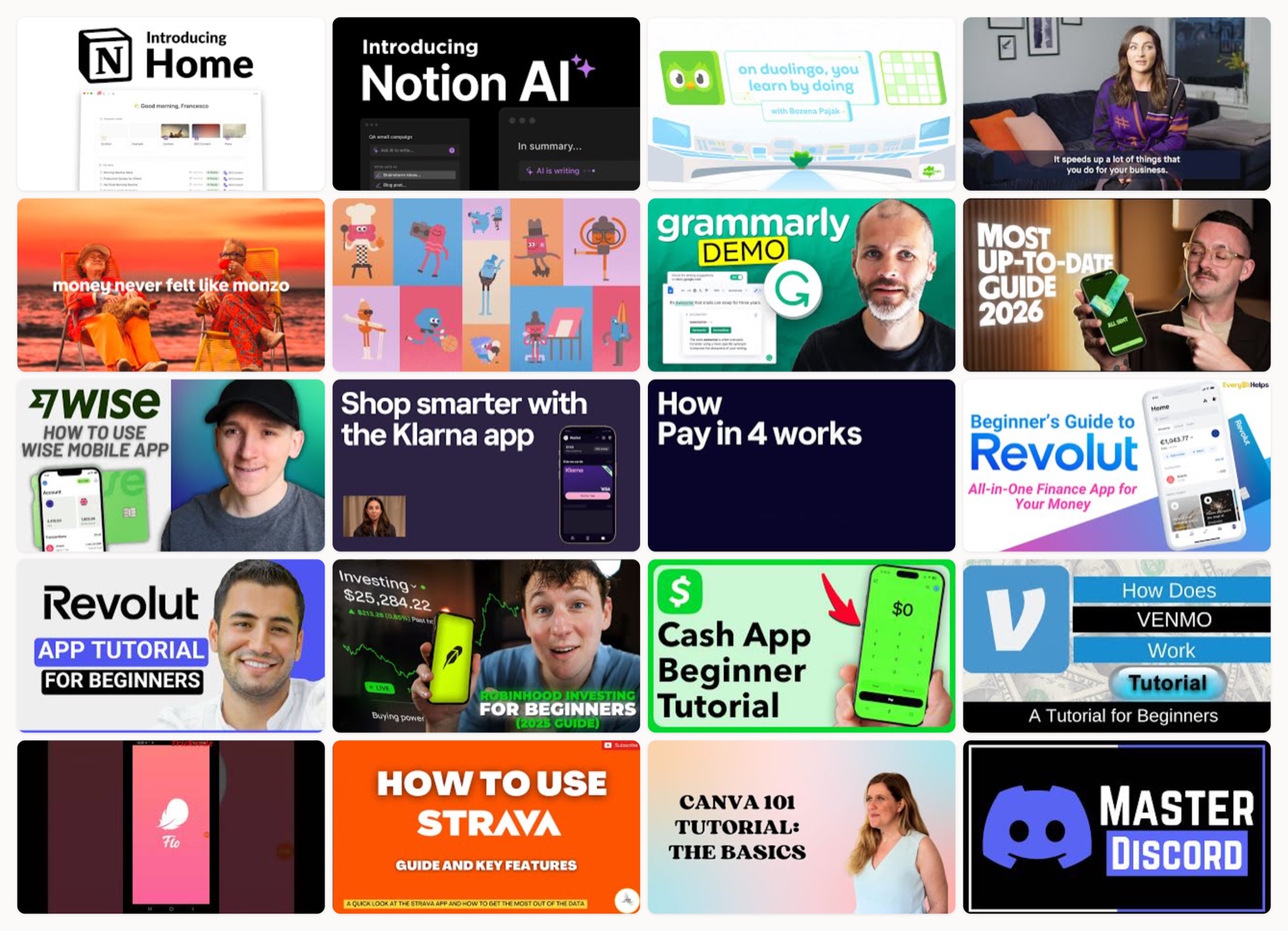
I have watched a depressing number of app videos where the app itself barely appears. Thirty seconds of a person smiling at a phone in a sunlit kitchen, a swelling piano line, one blurry two-frame flash of an actual screen, then a logo. I understand the instinct. Software is hard to film and easy to make boring. But when someone is deciding whether to download your app, the thing they want to see is the app.
So I went and pulled 22 videos that get this right, and a few that deliberately do the opposite because they have earned the room to. They split into two rough camps. Some are brand films that sell a feeling and treat the interface as a supporting actor. Some are step-by-step walkthroughs that put the screen dead center and narrate every tap. Both jobs are valid. The mistake I see most often is a company trying to do both in one video and landing neither.
What I look for is simple. Can I tell what the app does within the first ten seconds. Does the footage move at the speed a human actually reads a screen, or does it flick past like a slideshow on fast-forward. And does the video know which of the two jobs it is doing. Everything below is graded against that.
How I picked these
I stuck to real apps you have probably heard of, across fintech, productivity, wellness, and social, so the comparisons are fair. Some of these are the brand’s own launch or onboarding films. Some are creator-made tutorials that out-rank the official app page for “how do I use this,” which is a lesson in itself. Every video here plays, and I have ordered them so the brand films and the how-to walkthroughs sit next to each other where the contrast is sharpest. If you want the fundamentals before the examples, my guide on how to make an explainer video covers the scripting side.
Notion, the product-home tour
This is screen-capture done with restraint. The cursor is the narrator here, and the edit trusts it to move you through the surface without a voiceover shouting over the top. What sells it is the holding time: each panel sits on screen long enough to actually read a line or two before the next move, which is the single thing most product tours get wrong. It looks calm because the app is being sold as calm.
Notion, the AI feature reveal
Here the cutting is faster because the story is different. Instead of a leisurely tour, it intercuts big typographic title cards with tight shots of the AI doing a specific thing inside a real document. The type carries the claim, the screen delivers the proof, and the two keep handing off. It is a good template for any single-feature launch: say the promise in words, then immediately show it happening, and do not let more than a couple of seconds pass between the two.
Duolingo, the mascot-led method film
Notice this one barely shows the interface at all, and that is the right call. Duolingo sells a learning loop rather than a set of screens, so the video reaches for illustration and the mascot to explain a mechanic instead of a menu. Animation lets it dramatize an idea (little and often, keep the streak) that no amount of UI capture could make legible. If your product’s value is a philosophy more than a feature list, this is the direction to steal.
Monzo, the business launch film
This is the hybrid done properly. It cuts between real people running actual businesses and clean inserts of the app doing the relevant thing, so the phone always appears in the context of a life it fits into. The lifestyle footage buys the emotion, the app inserts pay it off with proof. The reason it works where most hybrids fail is discipline: every app shot is tied to a specific human moment, not dropped in as generic B-roll.
Monzo, the pure brand ad
Now the opposite extreme, and I include it on purpose. This one is high-gloss and emotional and shows almost no UI, because its job is to make you feel a way about your bank, not to teach you the app. A challenger brand can afford to sell a feeling once enough people already know what the product is. Do not mistake this for a template if nobody has heard of you yet; you have to earn the right to be this abstract.
Headspace, the how-it-works illustration
Headspace has one of the most recognizable illustration systems in software, and this video is a masterclass in matching craft to promise. The pacing is unhurried, the shapes are soft, the color is warm, and the whole thing moves at roughly the speed of a slow exhale. A meditation app that felt frantic in its own explainer would be lying about itself. The lesson is that tone is part of the product argument, not a coat of decoration on top.
Grammarly, the in-context walkthrough
This is the screen-recorded walkthrough at its most useful, because it shows the assistant working inside real writing rather than a sanitized demo document. You watch actual sentences get flagged and fixed, which is far more convincing than a marketing string that was clearly written to trigger the perfect suggestion. Whenever you record UI, use realistic content in the fields. Lorem ipsum tells the viewer you did not want them looking too closely.
Wise, the single-transfer tutorial
Sending money abroad makes people nervous, and this walkthrough is built to remove exactly that nerve. It is literal and numbered, moving through one transfer from start to confirmation with the on-screen UI held clearly at every step. There is no attempt to be clever, and it should not be. When the action carries real anxiety, the most persuasive thing you can do is show it going smoothly and slowly.
Wise, the full app tour
Where the last video did one job, this one covers the whole surface from onboarding to using the card. It works because it is chaptered by feature, so a viewer who only cares about the card can find that section without sitting through setup. The trade-off with a full tour is length, and the fix is structure. Signpost the sections clearly and let people skip, rather than pretending everyone will watch linearly.
Klarna, the end-to-end shopping flow
This follows one complete path through a shopping and pay-later flow, which is smart for a product whose value only becomes obvious once you see the full loop. Splitting a payment sounds abstract described in a bullet point and becomes concrete the moment you watch it happen at checkout. If your product’s payoff is at the end of a sequence, do not summarize the sequence, walk it.
Klarna, the single-feature explainer
Compare this to the tour above and you see the value of scope. Pay in 4 gets its own video that does nothing else, so the mechanic (four payments, this is when each one lands) is fully explained without any competing information. One feature, one video, is almost always clearer than one video trying to cover ten features. This is the kind of narrow, high-intent piece that answers a specific question a buyer typed into search.
Revolut, the beginner walkthrough
Here is a video the brand did not make, and it is worth studying for that reason. A creator walks a beginner through add-money, transfer, and exchange in a plain, patient voice, and it earns trust precisely because it is not a polished ad. The takeaway for brands is uncomfortable but real: a lot of people looking for your app search “how to use it” and reach a third party first. That demand is yours to serve if you choose to.
Revolut, the updated hands-on tour
This is the same genre refreshed for a new year, which points at something people forget. App tutorials rot. Interfaces get redesigned, tabs move, and a video shot two versions ago starts showing screens that no longer exist. The fact that creators keep re-cutting these is a signal that a current walkthrough has ongoing value, and that your own onboarding video needs a maintenance schedule, not a one-time shoot.
Robinhood, the signup-to-first-trade guide
A ten-minute guide sounds long until you remember the stakes: this is money, and a beginner wants their hand held from account creation to placing a first trade. The structure is a straight line with no detours, which is right for a nervous first-timer who does not yet know what they can safely ignore. Length is fine when every minute maps to a step the viewer will actually take.
Cash App, the screen-driven demo
Sending, receiving, and investing all get shown on the actual screens, and the video keeps the phone in frame the whole way through. What I like is that it never cuts away to a talking head for long. The screen is the story, and the narration serves the screen instead of competing with it. For a payments app where trust is everything, keeping the real UI on camera is itself a form of reassurance.
Venmo, the core-loop explainer
This one is refreshingly small in ambition. It explains a single loop, you send money and you receive money, and it stops there. Venmo’s social feed and splitting features could have padded it out, but the video correctly assumes a first-timer only needs the one thing to get started. Resisting the urge to explain everything is an underrated skill. The best onboarding gets someone to their first success and then gets out of the way.
Flo, the health-tracking walkthrough
Tracking apps live or die on whether people understand the logging habit, and this walkthrough centers exactly that. It shows the daily act of entering data and then the prediction screens that data produces, so the value of the habit is visible rather than promised. For any app built on user input, show the input and the payoff in the same breath. People need to see that the small daily effort turns into something useful.
Strava, the feature tour
Strava has two distinct sides, the activity recording and the social feed, and this tour is careful to give both their due. That matters because someone who thinks it is only a GPS tracker will miss half the reason people stay. Showing the feed reframes the whole product as something you keep coming back to. When your retention lives in a feature that is not the headline one, put it on camera.
Canva, the onboarding walkthrough
Canva’s whole promise is that design is not scary, so its getting-started video has to feel that way too. It leads with templates, which is the fastest path to a beginner feeling capable, before touching the deeper editor. Sequencing matters here: start people where they get a win, not where the feature list starts. A first-run video should be built around the quickest route to “I made something,” not the org chart of your menus.
Discord, the social-app tour
Discord has a vocabulary problem for newcomers (servers, channels, voice, DMs) and this guide’s real work is teaching the mental model, not just the buttons. It walks through how the pieces nest so the layout stops feeling like a wall of unfamiliar terms. When your product has its own jargon, the video has to teach the concepts before the taps. A tour that clicks around without explaining the structure leaves people more lost than before.
Spotify, the media-app basics
Even an app most people think they already understand has a beginner audience, and this covers search, playback, and playlists at a comfortable pace. The lesson is that “everyone knows how to use this” is usually false. There is always a cohort at the start line, and a clear basics video keeps serving them long after launch. Do not assume familiarity your newest users do not have.
Todoist, the official quick-start
I wanted to close on this because it is the brand doing its own quick-start, cleanly and without ceremony. It is a plain screen capture of the core task-manager flow, platform-specific, made to get a new user productive fast. There is nothing flashy about it, and that is the point. Sometimes the highest-value app video you can make is the unglamorous one that answers “how do I actually start” better than any creator’s version could.
What the best ones share
Watching all 22 back to back, a few patterns hold no matter the category.
The best videos show the app instead of talking around it. The cursor moves like a narrator and the real interface stays on screen, paced to how fast a person reads rather than how fast an editor can cut. Every video that lost me did so by flicking through screens too quickly to register.
They also know their one job. A launch film sells a feeling and can afford to keep the UI abstract. A walkthrough sells competence and has to keep the UI central. The failures are almost always the videos that tried to be both, hedging the emotion and burying the instruction.
And the strongest ones respect scope. A single feature gets a single video. A full tour gets clear chapters so people can skip. Nobody watches a product tour linearly, and the videos that accept this beat the ones that pretend otherwise. If you want more on matching the animation style to the job, my breakdown of 2D explainer video approaches it from the craft side.
How to get this right
If you are making one of these, start by deciding which job it does before you write a word. Launch film or walkthrough. Feeling or competence. Trying to answer that later, in the edit, is where most app videos go soft.
Record real UI at real speed, with real content in the fields. Hold each screen long enough to read it. Script to what is on screen so the words and the picture reinforce each other rather than running on separate tracks. Keep any single video to one flow, and if you really need to cover the whole product, chapter it and let people jump.
Caption everything, because most of this gets watched on mute in a feed, and end on the next action rather than a logo. The last frame should tell someone what to do next, whether that is downloading the app or starting a transfer, rather than showing them your mark and fading out.
None of this needs a huge budget. It needs someone who understands both the product and the pacing, and the patience to shoot the boring, clear version instead of the dramatic, confusing one.
The wrap
An app explainer is less one format than a decision about what a viewer needs at the exact moment they are considering you. Sometimes that is a feeling. More often, especially for anything involving money or an unfamiliar habit, it is the plain reassurance of watching the thing work at human speed. The videos above are worth returning to because they each committed to one answer and executed it without hedging.
If you are weighing whether to make these in-house or bring in a team that does this every week, the honest test is whether you can consistently ship the clear, well-paced version and keep it current as your app changes. That is the part most people underestimate, and it is the part my studio, Moonb, is built to carry.
Frequently asked questions
It depends on the job. A brand launch film or a single-feature explainer usually lands between 30 and 90 seconds. A full walkthrough or beginner's guide can run several minutes, and that is fine as long as every minute maps to a step the viewer will actually take and the video is chaptered so people can skip to the part they need.
Use screen recordings when the value is in the interface itself, like a transfer flow or an editing tool, because seeing the real UI builds trust. Reach for animation when you are selling a concept or a mechanic that no single screen can show, the way Duolingo explains its learning loop or Headspace illustrates its approach. Many strong videos blend both, tying each app shot to a real moment.
Because a lot of people search 'how to use' a specific app, and creators make videos that answer that exact question in a plain, patient voice. Those walkthroughs feel like help rather than an ad, so they earn trust and clicks. The lesson for brands is that this how-to demand exists whether or not you serve it, and a current, well-made official walkthrough can capture it.



