14 Animated Educational Videos Worth Studying
A working breakdown of 14 animated educational videos, from Kurzgesagt to TED-Ed to whiteboard doodles, with what each one gets right about teaching an idea on screen.

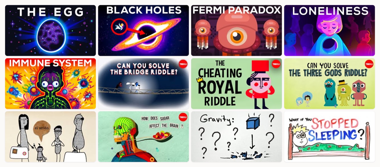
I have watched a lot of animated educational videos, both as someone who studies them and someone whose team makes them. The good ones pull off a small trick I still respect every time. They take an idea that would be a slog to read and land it in two minutes, and it sticks. That is the bar I hold these to. I am not asking whether a video is nice to look at. I am asking whether I understood something I did not before, and whether I still remember it a week later.
When I sit down with one of these, I am really watching for three things. Does the animation carry the actual explanation, or is it decoration sitting next to a voiceover that does all the work? Is the pacing built around comprehension, giving me a beat to catch up right as a new idea arrives? And does the thing have a reason to exist beyond “here is some information”? The videos below all clear that bar, and they clear it in different ways, which is the part I find worth studying.
How I picked these
I left out the product demos and the corporate explainers for this list. These are pieces made to teach a concept to a general audience, mostly on YouTube, where nobody is obligated to keep watching. That constraint is unforgiving and useful. If the craft is not working, people leave, and the view counts tell you plainly who solved it. So I leaned on a few channels that have done this thousands of times, then added some standalone films that show one technique cleanly. If you want a wider net across formats, I also keep a running set of eLearning video examples that go beyond animation.
Kurzgesagt, a philosophy essay turned into a mood piece
The Egg is Kurzgesagt working against its own house style, and that is why I open with it. Most of their catalogue is crisp flat vector. Here they wash soft watercolor textures over those shapes so the whole thing breathes like a painting rather than a diagram. There is almost no data on screen. The animation slows right down, holds on wide empty frames for seconds at a time, and lets Andy Weir’s short story set the tempo. It is the clearest proof I know that an educational piece does not have to be busy, and that restraint is a real craft decision.
Kurzgesagt, cosmic scale made legible
This is the Kurzgesagt everyone pictures: bold flat vectors, saturated color, and never more than one physics idea on screen at once. What I want you to notice is scale management. Falling into a black hole involves distances and forces that mean nothing to a human brain, so the animation keeps re-anchoring you against something you can hold in your head, a tiny human figure or a single line of motion. Each abstract jump gets a concrete handhold before the next one arrives. That is the whole reason the physics stays legible instead of turning into pretty noise.
Kurzgesagt, a data-heavy argument with a duck to hold onto
The Fermi Paradox is built on numbers and nested probability filters, the kind of content that usually flatlines a viewer. Kurzgesagt solves it two ways at once. The diagrams do the reasoning, animating each step of the funnel so you watch the logic narrow, and the signature duck mascots ride along as a warm, slightly silly counterweight so the piece never feels like a lecture. That pairing of rigorous structure and a friendly recurring character is a formula I keep coming back to.
Kurzgesagt, a heavy human topic handled with warmth
Loneliness is the hardest thing on this list to pull off, because the subject can tip into either cold clinical distance or mawkish sentimentality. The animation threads it by staying character-driven and small. You follow a single figure through crowds and empty rooms, and the desaturated blues in those crowd scenes carry the emotion so the narration does not have to over-explain it. I point people to this one whenever a client worries that a serious or sensitive topic cannot be animated without feeling flippant. It can. It just needs tone control.
Kurzgesagt, biology staged as a battle
The immune system is a mess of overlapping processes, so this video does something smart: it turns your body into a world, and the cells into characters with roles in a fight. Once the invaders and the defenders have personalities, you stop trying to memorize a diagram and start following a story with stakes. The science stays accurate, but the framing is dramatic, and that dramatic frame is what makes an eleven-minute biology explainer feel short.
TED-Ed, a logic puzzle you can reason along with
TED-Ed’s riddle series is a masterclass in staging information, and the bridge riddle is the cleanest example. The animation lays out the constraints spatially, the four travellers and the single torch that has to cross back and forth with them, so you can see the whole problem at once and actually attempt it. Then it gives you a real pause to think before walking through the answer. The visuals work as the puzzle board itself, and you are reading them rather than just watching them. That participatory design is why the lesson lodges in your head instead of washing over you.
TED-Ed, a riddle carried by playful character design
The cheating royal riddle leans harder into narrative than the bridge one. It wraps the logic in a little story with a cast of characters, and the character design does real work here, giving you distinct figures to track as the conditions stack up. When a puzzle involves several agents doing several things, faces and costumes become a memory aid. You remember “the one in red” far more easily than “variable three,” and the animation knows it.
TED-Ed, abstract logic made watchable with color
The three gods riddle is brutally hard, the kind of nested logic that falls apart the moment you try to hold it in your head. The animation rescues it with a strict color code: each god and each possible answer gets a consistent color, so the reasoning becomes something you can follow with your eyes rather than juggle in your head. This is my favorite argument that good educational animation is really information design first and pretty pictures a distant second.
TED-Ed, cognitive science translated into metaphor
Talking about what happens inside a bilingual brain is a translation problem, because none of it is visible. This video keeps converting the invisible into a picture: brain activity becomes regions lighting up, and cognitive load becomes something with visible weight. Every abstract claim gets a visual metaphor within a second or two of being spoken. That tight coupling of word and image is exactly what separates a real explainer from a slideshow with narration.
TED-Ed, a biochemical process shown as a cutaway
Sugar hitting your brain is a chain of chemical events, and this video animates that chain as a series of clean cutaway diagrams: the tongue first, then the reward pathway lighting up as dopamine floods it. It moves through the body like a guided tour, each stop building on the last. What I admire is the discipline of showing only the one system that matters at each moment, and hiding the rest. Explaining a process is mostly about deciding what to leave off screen, and this piece decides well.
minutephysics, a physics concept sketched in minutes
minutephysics proves you do not need a big studio or a large crew to teach well. This is hand-drawn whiteboard animation, a pen sketching ideas in real time, and gravity gets compressed into a few tight minutes. The rough drawing style works in its favour. It keeps the focus on the idea and the analogy, and the speed of the sketching sets a brisk rhythm that never lets you drift. When the thinking is clear, the production can be humble.
AsapSCIENCE, a doodle that paces the whole explainer
AsapSCIENCE built a whole audience on marker-on-whiteboard stop-motion, and this sleep video shows why it works. The drawing appears in sync with the narration, so each new fact arrives as a fresh doodle, and that steady draw-and-reveal rhythm becomes the pacing engine of the entire piece. There is a small satisfaction in watching a hand build the idea in front of you. It feels less like being told something and more like sitting next to someone thinking out loud.
AsapSCIENCE, drawing timed to the narration
I included a second AsapSCIENCE video on purpose, because The Science of Kissing shows the same format handling a lighter, more playful subject. The whiteboard doodles stay locked to the voiceover, but here the humor lives in the drawings themselves, little visual jokes landing on the beat of a spoken fact. It is a good reminder that a format is not a genre. The same technique can teach a grim sleep-deprivation lesson and a cheeky one about kissing, and the tone comes entirely from how you draw.
CrashCourse, flat graphics layered over a host
CrashCourse is a hybrid, and it closes the list because it shows a different model. There is a real host talking fast to camera, and the Thought Cafe flat-graphic cutaways drop in to put a date or a map on screen the moment he speeds past it. The animation runs as a support layer that keeps a dense, fast lecture from losing you. If your teacher or founder is already engaging on camera, this hybrid gives you the energy of a person plus the clarity of motion graphics, and you do not have to animate every single second.
What the best ones share
After watching enough of these, the same handful of patterns keep surfacing, and they cut across every style from watercolor Kurzgesagt to a raw whiteboard doodle.
The visual does the teaching. In every video I kept, the animation does the explaining rather than sitting beside it. The diagram narrows the logic. The cutaway walks you through the process one stage at a time. When you can mute the narration and still roughly follow the idea, the piece is working.
They teach one thing. None of these try to cover a whole subject. They pick a single question, whether that is a black hole or what sugar does to you, and stay with it. The scope is small on purpose, which is what lets the pacing breathe.
Pacing is built for comprehension. The strong ones give you a beat right when a new idea lands, whether that is a literal pause in a TED-Ed riddle or the natural rhythm of a hand sketching on a whiteboard. They never dump three concepts into one breath.
There is a point of view. Even the driest topics here have an angle, a recurring character, a joke, a mood. That personality earns its place. It is what keeps a viewer watching to the end on a platform where leaving is one click away.
How to get this right
If you are planning one of these, a few things are worth deciding before anyone opens After Effects.
Start from the one idea, and let the style come after. Pick the single concept the video has to land, then choose the technique that serves it. A logic puzzle wants a clear board. An emotional topic wants character and restraint. The style follows from the idea.
Match the production to the idea’s demands, not to a trend. minutephysics teaches beautifully with a pen and a whiteboard, and Kurzgesagt needs full vector rigs and watercolor passes. Neither is more “correct.” The rough sketch and the polished frame are both right answers to different problems, so be honest about which problem you actually have. If you want a fuller walkthrough of that decision, I wrote one on how to make educational videos.
Write for the ear and the eye together. The best explainers pair each spoken idea with its visual almost instantly. So storyboard the script and the visuals in the same pass, and cut any line the picture already says.
Give the viewer somewhere to catch up. Build in the pause or the recap frame where the idea can settle. Comprehension needs a small gap to happen in, and most weak educational videos fail simply by never leaving one.
Where this leaves you
If you take one thing from this list, let it be that the animation style is the last decision you make, after everything else is settled. Every video here earned its clarity by knowing exactly what it was teaching and building the visuals to carry that, and the range of styles that pulled it off should feel freeing rather than confusing. There is no single “educational” look to copy.
Making one that actually holds attention is harder than these make it appear, because the invisible work is in the structure and the pacing, not the surface. That is the part a good creative team spends its time on, and it is the part my studio, Moonb, tends to obsess over before we draw a single frame. Watch a few of these with the sound off, notice where the picture is doing the thinking, and you will start seeing the difference between a video that decorates an idea and one that teaches it.
Frequently asked questions
Long enough to teach one idea well, and no longer. Most of the strongest examples here run between two and twelve minutes, and the length tracks the concept rather than a fixed rule. TED-Ed riddles land in a few minutes because the scope is one puzzle, while a Kurzgesagt biology explainer earns eleven minutes because it builds a whole world. Pick the single thing you are teaching first, then let that decide the runtime instead of padding to hit a number.
There is no universal best style, which is the useful lesson from this list. Flat vector suits data and processes, whiteboard doodles suit fast concept explainers made with a small crew, and character animation suits emotional or narrative topics. The right choice is whichever technique most directly shows the idea you are explaining. Decide what has to be taught, then choose the style that carries it.
Not always, though most use one. The Egg by Kurzgesagt leans almost entirely on narration and mood, while a strong TED-Ed riddle stays clear even with the sound off because the visuals carry the logic. A good test is to mute the video and see whether you can still roughly follow it. If you can, the animation is doing the teaching, and the voiceover is reinforcing rather than doing all the work.



