17 eLearning Video Examples Worth Studying
Seventeen eLearning videos I keep coming back to, with a working teardown of the craft choice behind each one and the patterns the best ones share.

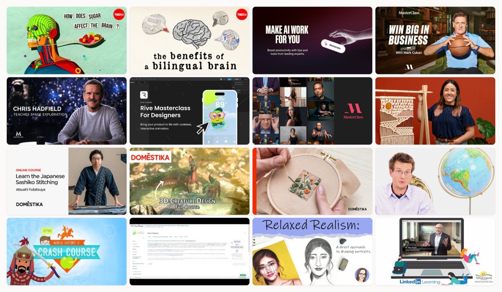
I have watched a lot of eLearning videos that taught me nothing, and a handful I still think about years later. The gap between those two is almost never the topic. It is the craft. A course trailer for a business class and a course trailer for embroidery can use the exact same tools and land in completely different places, because one director understood what a viewer needs in the first eight seconds and the other one did not.
So this is not a list of “inspirational” videos. It is a list of pieces I keep open in a tab when I am building something and want to steal a specific move. For each one I will tell you the single choice that makes it work, so you can lift the choice, not just admire the result.
How I picked these
I looked for videos that do one job well and let you see the seams. Some are microlearning lessons that teach a full concept in five minutes. Some are course trailers whose only job is to make you enroll. Some are platform sizzle reels selling a whole catalog. I mixed the formats on purpose, because most people building eLearning content are actually building two things at once: the lesson itself, and the thing that convinces someone to press play. These examples cover both, and every one of them plays start to finish, so you can watch the craft instead of taking my word for it.
TED-Ed, animated microlearning on how sugar hits the brain
This is the format at its cleanest. One idea, explained through motion that is doing real teaching work rather than decorating the voiceover. When the narration talks about dopamine firing, the animation shows the signal traveling, so the picture and the words reinforce a single mental model instead of competing for attention. If you take one thing from TED-Ed, take this: your visuals should carry information the audio cannot, not repeat what the narrator already said.
TED-Ed, character animation on the bilingual brain
Cognitive science is abstract, and abstract topics are where most educational video falls apart into floating icons and vague gradients. This one gives you characters, so the “two languages sharing one brain” idea has a body to happen to. The lesson sticks because you watched it play out on someone, not because a bullet point told you it was true. Character-driven animation is more work up front, and for dry material it almost always earns the effort.
MasterClass, the GenAI course trailer
Watch the pacing here. MasterClass edits course trailers like film trailers, with a cold open, a build, and a payoff, and that structure is what makes a class about software feel like an event you are missing. The instructors are framed with real authority: low angles, considered light, no clutter behind them. If you sell courses, this is the reference for how production value converts into perceived expertise.
MasterClass, Mark Cuban selling himself as the reason to enroll
This trailer barely lists what the course covers, and that is the point. It sells the instructor. The whole edit is built to make you feel like a few hours with Cuban is the actual product, and the curriculum is just the container. When your teacher is the draw, stop itemizing the syllabus and start building the belief that this specific person is worth listening to.
MasterClass, Chris Hadfield and the aspirational course setup
Notice how much of this trailer is about stakes rather than content. It uses story and a sense of scale to make an online lesson feel like it opens a door to something enormous. You are not being sold a video course. You are being sold the version of yourself that understands space. Aspiration is a legitimate hook for eLearning, as long as the course itself pays off the promise.
MasterClass, the Rive software trailer
Software teaching lives or dies on the screen capture, and most of it is unwatchable because it plays back in real time. This trailer cuts the screen recording to a hook, so the tool looks fast and capable instead of tedious. That edit is the whole trick for any tutorial content: record everything, then cut hard so the viewer sees results, not every misclick along the way. I dig into this more in my piece on how to make instructional videos.
MasterClass, the “This Is MasterClass” platform reel
A single course trailer sells one class. This reel sells the whole idea of the platform, which is a harder brief. It works by rhythm: rapid cuts across wildly different instructors, unified by one consistent visual grammar, so the variety reads as range instead of chaos. If you ever have to pitch a catalog rather than a single lesson, study how tightly the edit holds everything together.
Domestika, “I Created a Domestika Course”
Domestika pairs the instructor’s voice with footage of the actual process, and that combination does something specific: it makes the skill feel learnable. You hear a real person explain their approach while you watch their hands do the work, so the class feels like access to a practitioner rather than a lecture. For any craft or creative course, that voice-plus-process pairing is the template.
Domestika, the Japanese Sashiko trailer
This one leads with tactile close-ups, thread pulling through fabric, the texture of the stitch, and it hooks you before a single word about the curriculum. Craft courses sell on desire, and desire comes from the material itself looking beautiful. If you teach something physical, shoot the texture first and explain the modules later.
Domestika, the Playful Creature Design trailer
Here the trailer leans on the finished work. It previews the polished creature you could make, and that outcome is the entire pitch. Showing the destination up front is a strong move for skill courses, because it answers the only question the buyer really has: will I be able to do that. Just be sure the course actually gets a beginner to that result, or the trailer writes a check the lessons cannot cash.
Domestika, the mini social teaser
This is the same course compressed into a short-form cut for a feed. It keeps only the hook, drops all the setup, and front-loads the most arresting frame because it has roughly a second to earn a stop. Worth studying as a lesson in itself: your social teaser is not a shorter version of your trailer, it is a different edit with a different job.
Crash Course, the series-launch preview
Crash Course basically defined a whole register of educational YouTube: fast host energy, dense graphics, no dead air. This launch preview is where that format announces itself, and the pace is deliberate, teaching your brain to expect a lot per minute so the series feels substantial. The energy is the promise, and the show delivers on it week after week.
Crash Course, the World History Year 2 preview
A season preview has a quieter job than a launch trailer: set expectations for what the curriculum will cover. This one blends host charisma with quick graphic beats so the scope of the season lands without a dry table of contents. If you run a series, this is how you tell returning learners what they are signing up for while keeping the energy that made them subscribe.
Coursera, the “Learning How to Learn” orientation
This is not a trailer, it is an orientation video, and it is doing a job people underrate: walking learners through how the course actually works before they start. Reducing that friction at the front end is one of the highest-leverage videos you can make, because a confused learner drops off before they ever reach the good material. Not every eLearning video has to sell. Some just have to get people comfortably in the door.
Skillshare, the Relaxed Realism drawing trailer
An instructor-led class trailer that previews the hands-on lessons directly, so you know exactly what the sessions feel like before you commit. It is warm and unhurried, which matches the “relaxed realism” promise in the title. That alignment between the trailer’s tone and the course’s actual vibe matters more than polish. A mismatch here is how you get refunds.
LinkedIn Learning, the platform intro
This one frames on-demand upskilling for a professional audience, and the whole tone is built around fitting learning into a working life. It is less about any single course and more about the promise of the platform as a habit. If your product is ongoing professional training, notice how the video sells the outcome of being someone who keeps learning, rather than any one lesson.
Duolingo, the Adventures product intro
Duolingo turns a feature launch into a little narrative demo, so a new mode feels like a story rather than a settings menu. The characters carry the pitch, and the gamified loop is shown in motion instead of described. For anyone building learning products, this is the reference for making a feature feel like play, which is most of what keeps people coming back.
What the best ones share
Watch enough of these back to back and the through-lines get obvious.
The strongest pieces make the visual do the teaching. TED-Ed’s animation carries information the narration never states, and that is why the lessons stick better than any talking head could manage. Weak educational video treats the picture as wallpaper behind the audio. Strong educational video makes the two say different things that add up to one idea.
The trailers all sell a feeling before a fact. Mark Cuban’s trailer barely mentions the syllabus, and Hadfield’s runs on stakes rather than modules. People do not enroll because a course has twelve lessons. They enroll because they want to become someone, and the trailer lets them feel that person for ninety seconds.
Every good one respects the first few seconds. The Domestika social teaser front-loads its best frame, Crash Course sets its pace immediately, and the sashiko trailer opens on texture. None of them warm up. In a feed, the opening frame is the whole negotiation.
And the format always matches the job. An orientation video is calm and clear. A launch reel is fast and loud. A craft trailer is tactile and slow. The mistake I see most often is one house style stamped onto every video regardless of what that specific video needs to accomplish.
How to get this right
Start by naming the one job. This video either teaches a concept, sells an enrollment, orients a new learner, or introduces a feature. Those are four different edits. Trying to do two at once is how you get a video that does neither.
Then decide what the visuals are for. If you are teaching, the picture should show something the words cannot. If you are selling, the picture should build desire or authority. Write the voiceover and storyboard the visuals as two tracks that reinforce each other, not one narrating the other.
Cut for the first five seconds like your project depends on it, because it does. Open on your most compelling frame, whether that is a result, a texture, or a face. Everything you think of as necessary setup can almost always move later or disappear.
Finally, cut your screen captures and demos hard. Nobody wants real-time. Record long, then compress to the moments that show progress. The Rive trailer feels effortless because someone removed every second that was not.
If you want the deeper build process rather than the reference reel, I wrote a companion on how to make educational videos that walks through scripting and structure.
A closing note
The examples above cover a huge range of production values, and I want to be clear that expensive is not the lesson. The TED-Ed lessons and the MasterClass trailers cost very different amounts to make, yet both are excellent, because both nailed the one job in front of them. Clarity of intent beats spend almost every time.
Where the money actually goes, and where a real team earns its keep, is in the decisions: what to open on, what to cut, when the animation should teach and when it should get out of the way. That judgment is the hard part, and it is most of what my team at Moonb does when we make this kind of work. But you can get a long way on your own by watching these closely and stealing the specific choice, not the whole thing.
Frequently asked questions
A clear single purpose and visuals that do real work. The best examples pick one job (teach, sell, orient, or introduce) and make the picture carry information or emotion the narration cannot, rather than decorating it. Respecting the first five seconds and matching the edit's pace to the material do most of the rest.
As long as its one job requires and no longer. A microlearning lesson can teach a full concept in five minutes, a course trailer often works best under two, and a social teaser lives or dies in the first second. Rather than target a length, cut everything that is not doing work. Long-form is fine when the content really earns the runtime.
No. The examples here span very different production values, and both the animated lessons and the polished trailers succeed because they nailed intent, not because of spend. Clarity about what the video is for, a strong opening frame, and disciplined editing matter more than money. Spend mostly buys better decisions and faster execution, not automatic quality.



