12 Animation Styles and How to Pick the Right One
A field guide to the 12 animation styles worth knowing, what each is best for, its trade-offs, and how to match one to your brief.

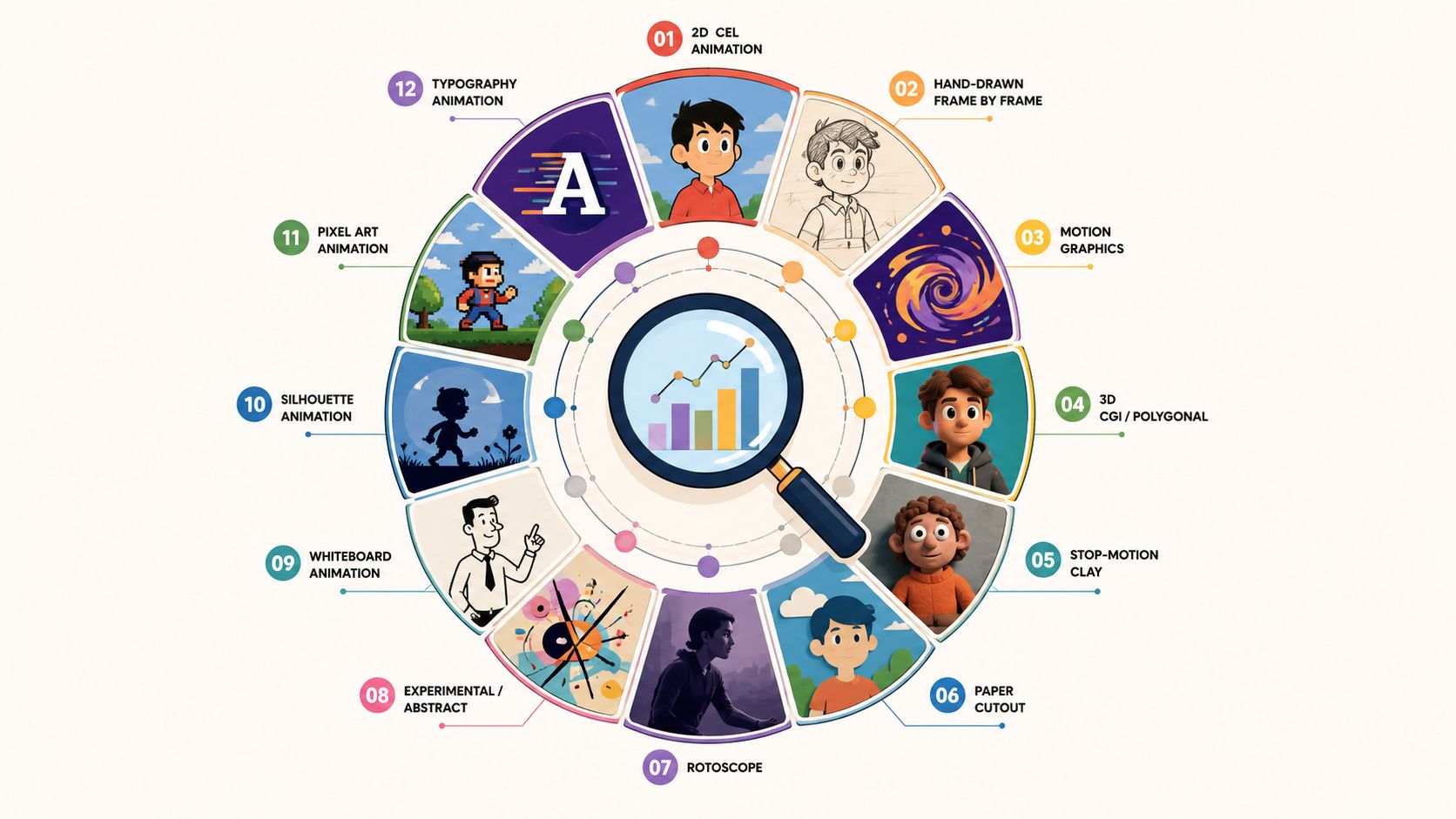
The 12 animation styles worth knowing are 2D vector and motion graphics, traditional frame-by-frame 2D, 3D CGI, stop motion, claymation, cutout, kinetic typography, whiteboard, cel and anime, rotoscoping, mixed media, and isometric. Each one sets the tone of a piece, decides how many revisions you can absorb before the timeline breaks, and shapes how the message lands. Naming the right one at the brief stage is most of the work.
I co-founded Moonb, a creative studio, and almost every brief that reaches me shows up the same way: a mood board, a half-written script, and no agreed name for the look. When the team can name the style, scoping and quoting and reviewing all get easier, and the project stops drifting into re-briefs. When it can’t, we spend the first week arguing about taste instead of fit. This catalog is the vocabulary I wish more briefs arrived with.
Animation built up in waves, from frame-by-frame drawing to digital production systems, and those waves still decide what is practical to make today. If you want the long version, the history of animation traces how each technique grew out of the last.
The four families I sort these into
Before the list, a map. I group the twelve into families, because the family usually tells you more about cost and timeline than the individual name does.
Flat and graphic styles are built from digital assets you can reuse: 2D vector and motion graphics, kinetic typography, whiteboard and explainer, cutout, and isometric. They are the quickest to iterate. Hand-made 2D covers traditional frame-by-frame and cel and anime, where the drawing itself carries both the value and the labor. Physical and tactile styles are shot one frame at a time in the real world, which is stop motion and claymation. Dimensional work means 3D CGI, modeled and rendered rather than drawn. And hybrids blend sources: rotoscoping traces live footage, and mixed media layers animation over film.
The rest of this piece walks each one, with what it does well and where it will cost you.
1. 2D vector and motion graphics
2D vector motion graphics are built from shapes, icons, type and simple illustrated assets, drawn in a tool like Illustrator and animated in After Effects. Because the art is vector, it stays crisp on a phone or a conference screen, and it reads as clean and organized rather than busy.
This is the workhorse for product explainers, SaaS walkthroughs, onboarding flows and social ads, where the job is to move through information without clutter. It also lets a team build a reusable branded system, which matters when someone needs new assets every week. When a SaaS client needs a fresh feature video every couple of weeks, this is almost always where I steer them, because the asset library pays for itself by the third video.
The discipline that makes or breaks it is hierarchy. Motion should guide the eye to what matters, and when every icon spins and bounces the viewer loses the thread, so the piece looks designed but not understood. Production sits on the lighter side compared with character work, though a script packed with UI steps still eats time. You see this style in Slack onboarding videos, Stripe demos, and the flat educational look associated with Kurzgesagt. I go deeper on the lane in our guide to types of motion graphics.
2. Traditional frame-by-frame 2D animation
Frame-by-frame 2D is exactly what it sounds like: each drawing made one frame at a time, then sequenced into motion. It is the oldest hand-crafted animation language, and it still carries a warmth that comes from the artist’s hand being visible in the movement. Studio Ghibli films, classic Disney features and indie work like Wolfwalkers show how far it goes when the story earns it.
The cost is labor. Frame count drives the schedule, every pose is drawn with care, and a few seconds of finished screen time can hide weeks of work. The last hand-drawn sequence I scoped ran a few seconds on screen and the better part of a month on the calendar. That math is why the style fits projects with a real emotional payoff, character-led brand films and story-driven shorts, and why it rarely fits routine updates or fast-turn marketing. Disney’s Snow White and the Seven Dwarfs and later hand-drawn classics like The Lion King are the reference points, and the NYFA animation timeline covers how hand-drawn work came to dominate the twentieth century.
3. 3D CGI and computer animation
3D CGI builds a world with depth. Artists model the characters and environments, then rig, light, animate and render them, and the result can look photoreal or stylized depending on the design. It is the natural choice when the viewer has to understand form, surface or spatial movement, which is why product teams lean on it for automotive demos, electronics launches and technical visuals where the camera needs to orbit an object and show how parts fit. I reach for 3D when a client needs the audience to trust a physical product, a device that has to be rotated and shown in cross-section.
The cost and schedule can climb quickly, because more geometry means more rigging, lighting, rendering and revision risk. Photorealism is the heavy lift, and when the brief does not demand realism, simplified models and cleaner materials make the work faster to control. The clearest examples are Pixar features like Toy Story, Coco and Inside Out. I break down the product-video side in our guide to 3D explainer videos.
4. Stop motion photography
Stop motion uses real objects, puppets and sets. The crew nudges them, shoots a frame, nudges them again, and repeats until the sequence moves. It feels tactile because it is, and viewers sense the physicality even when the world on screen turns strange. That charm suits brands chasing a hand-made feel and seasonal campaigns where the physical world itself is part of the appeal.
The burden is high. Lighting has to stay consistent across a long shoot, puppets need to survive repeated handling, and a single knocked-over set piece can cost real time. I only greenlight stop motion when the calendar has real slack, because a broken joint on a Friday can eat the following week. Aardman’s Wallace and Gromit, Chicken Run, Laika’s Coraline and Wes Anderson’s Fantastic Mr. Fox are the touchstones. When a brand wants movement that feels made by hand rather than generated by software, this is usually the right conversation to open.
5. Claymation
Claymation is stop motion where the material changes everything. Characters and sets are sculpted from clay and reshaped frame by frame, so the movement can look softer and more alive than rigid puppet work, as if the surface itself is breathing. The small imperfections are the appeal, which is what makes it read as charming rather than clinical.
The practical problem is that clay deforms under heat and handling, so teams work with durable materials and keep backups and repairs ready, since every frame can leave a mark. Aardman’s Morph and Shaun the Sheep are the obvious touchstones, along with the Gumby lineage and Laika’s Anomalisa, which shows sculptural stop motion can still feel intimate. It is slower than flat 2D and less flexible than digital work, and the one time a client asked for clay warmth on a two-week turnaround, I talked them into 2D instead.
6. Cutout animation
Cutout animation moves flat pieces, whether paper, cardboard, felt or their digital equivalents, in layers. It is one of the oldest approaches, and modern digital versions keep the silhouette look while making production far easier to manage. Because the figures are built from separate parts, the motion can read as angular or deliberately limited, which gives it a distinct graphic feel.
The load is lighter than hand-drawn or 3D work, since reusable rigs help and strong silhouettes do most of the lifting, though weak character design shows immediately because there is nowhere to hide. The clearest mainstream example is South Park, which moved to digital cutout after its early paper origins, while Paper Mario shows the idea inside a game world. I like cutout when a series needs a distinct look but has to ship on a weekly cadence, because the rig carries the volume.
7. Kinetic typography
Kinetic typography makes the text perform. Letters move, scale and snap in time with voiceover, music or dialogue, so type becomes the main visual engine rather than an overlay. It can read as punchy, formal or playful depending on the typeface and timing, which makes it a fit for quote pieces, lyric videos, title sequences and message-first social clips.
The difficulty hides in the details. A poor typeface, sloppy kerning or weak timing sinks the piece even when the animation is simple, because people read type differently than they watch a character move. I have killed more kinetic-type drafts over kerning than over the animation itself. You see the technique in TED title sequences and in the short quote animations that circulate on social, and it often turns up inside other styles when a single line needs emphasis. If a project is mostly words and pacing, I cover it in our guide to animating text online.
8. Whiteboard and explainer animation
Whiteboard animation uses a drawing hand, or the illusion of one, to reveal ideas on a plain background. The effect is teaching by design, because information appears in sequence, so the viewer absorbs each step as it arrives instead of all at once. That makes it strong for process explainers, internal training, educational content and product stories that need to shed complexity without losing structure.
The work is moderate, and the real constraint is the script rather than the drawings. When a whiteboard script wanders, the visuals wander with it, so I spend more time tightening the narration than decorating the frame, and a simple icon set with clear voiceover timing beats ornament every time. Common Craft’s In Plain English series and Khan Academy lessons are recognizable examples, and plenty of SaaS walkthroughs borrow the logic without the literal hand. I go further into the broader explainer lane in our guide to 2D explainer video.
9. Cel animation and anime style
Cel animation uses flat color and bold outline that echo the hand-painted look of traditional cells, and anime is a specific idiom inside that family, with expressive eyes, stylized proportions and dynamic posing that audiences recognize on sight. That recognition cuts both ways: the style carries real cultural weight, but the audience brings expectations with it, especially when the work is branded content rather than entertainment.
Production demands vary with the approach. Pure 2D cel-inspired work needs very clean drawings, while cel-shaded 3D buys camera flexibility and faster iteration as long as the design holds up under a flat treatment. Batman: The Animated Series is the classic cel reference, anime series like Attack on Titan and Demon Slayer show the idiom at full strength, and Arcane shows how cel-shaded 3D can borrow the language without being literal 2D. I turn down most anime-style briefs from brands with no real claim to the language, because borrowed cool reads as borrowed.
10. Rotoscoping
Rotoscoping starts with live-action footage, then traces or masks it frame by frame to turn it into animation or to isolate part of the image. It keeps the natural movement of real people, the timing and body language that would be hard to invent, while letting the artist restyle the result. That makes it useful for music videos, artful pieces and the kind of VFX work that needs precision around edges and motion.
The trade is labor, and it scales with the footage. The trick I have learned is to shoot with the roto in mind, because clean source edges save days of tracing while messy footage makes the tracing messy too. The iconic example is a-ha’s Take On Me, with Ralph Bakshi’s American Pop as a feature-length reference, and modern VFX teams still rotoscope for subject separation and background removal. I keep a fuller reference in our guide to the technique of animation.
11. Mixed media and live action plus animation
That spot is ours: a Toyota bZ4X piece we made at Moonb, with illustrated elements riding on top of live footage, which is exactly the balance this section is about.
Mixed media combines live action, photography, motion graphics and animation in one piece, with the animated elements sitting on top of footage, interacting with people on screen or sharing the frame by design. It is versatile, but only under control. It works when one visual language leads and the others support, and it falls apart when every layer competes for attention. The pieces that fail here are the ones where nobody decided which layer is the hero.
The upside is that live action brings human presence while animation clarifies what the camera cannot show, which is why tech ads, sports broadcasts, educational pieces and tourism videos lean on overlays, stats and diagrams inside real footage. Sports programming that drops animated statistics onto live play is the everyday example, and product demos do the same with UI callouts and motion labels. If the footage is the hero, let animation support it, and if the animation leads, treat the footage like a stage rather than a second lead.
12. Isometric animation
Isometric animation uses a flattened, 3D-like projection with no vanishing point, so objects keep their scale as they move through space and the result reads as technical, architectural or blueprint-like. That system-driven feel suits software diagrams, infrastructure visuals, process explainers and product overviews where the audience needs to see how parts connect, and it can make dense information less intimidating because the space is simplified.
Production is moderate, and the rule is consistency, since the geometry has to obey the isometric grid and the illusion breaks the moment the perspective slips. The style shows up in UI design, system maps and technical brand work. This is my default when a client wants something more dimensional than flat graphics but the budget and calendar cannot carry full 3D.
The 12 styles at a glance
| Style | What it is | Best for | Main trade-off |
|---|---|---|---|
| 2D vector and motion graphics | Shapes, icons and type animated from vector art | Product explainers, SaaS demos, social ads, brand systems | Looks polished even when the message is muddy |
| Traditional frame-by-frame 2D | Every frame drawn by hand, then sequenced | Character-led brand films, story-driven shorts, premium campaigns | One of the slowest, most labor-heavy pipelines |
| 3D CGI | Modeled, rigged, lit and rendered dimensional worlds | Product visualization, feature-quality work, spatial explainers | Cost and time climb fast, especially toward photoreal |
| Stop motion | Real objects and puppets shot one frame at a time | Craft brands, holiday films, tactile premium work | Slow, fragile and unforgiving of set changes |
| Claymation | Stop motion with sculpted clay reshaped each frame | Playful brand films, family content, warm promos | Clay deforms with heat and handling, so consistency is hard |
| Cutout | Flat jointed pieces, paper or digital, moved in layers | Fast series, educational shorts, comedy, web pieces | Weak character design has nowhere to hide |
| Kinetic typography | Text itself animated in sync with audio | Lyric and quote pieces, titles, message-first social | Bad type or timing sinks it instantly |
| Whiteboard and explainer | A drawing hand reveals ideas in sequence | Training, process explainers, SaaS walkthroughs | Only as good as the script underneath it |
| Cel and anime | Flat color and bold outline in a recognizable idiom | Youth campaigns, action stories, gaming and comic tie-ins | So recognizable the audience arrives with expectations |
| Rotoscoping | Live footage traced or masked frame by frame | Music videos, artful hybrids, VFX isolation | Tracing labor scales with how messy the footage is |
| Mixed media | Live action, photography and animation in one frame | Product demos, ads, sports and data overlays | Falls apart unless one layer clearly leads |
| Isometric | Flattened 3D projection with no vanishing point | UI onboarding, system maps, process visuals | Wrong for emotional or character-driven stories |
How to pick a style for your brief
The brief usually narrows the choice faster than any style chart. If the job is to explain a product clearly, motion graphics, whiteboard or isometric are the cleanest starting points. If the goal is warmth and character, frame-by-frame, stop motion or claymation fit better. If the message depends on physical form and space, 3D is the direct answer.
Timeline comes next, because production weight decides which revisions you can survive. A premium hand-drawn film, a detailed 3D launch or a stop-motion piece can each be the right call, but not against a tight deadline with a brief that is still moving. Short schedules reward flatter styles with reusable assets, since they leave room to fix things without rebuilding the whole piece.
Budget matters, but only next to scope. Heavier styles buy more art, more revision surface and more coordination, so a hand-drawn film or a full 3D launch costs more to make than a flat motion-graphics piece, not because a rate card says so but because there is simply more to build and redo. Style choice is really a choice about how much art and iteration you are paying for.
Brand personality is the last filter. A playful, tactile brand can carry claymation or mixed media, a clean B2B product usually reads better in motion graphics or whiteboard, and a premium entertainment or lifestyle brand may justify 3D or stop motion when the story needs that presence. Chasing a trend rarely helps when the look fights the message.
Mixed styles work when one style stays in charge. Live action plus motion graphics is common for tech ads because the footage gives context and the graphics carry the explanation, and animated data over filmed footage makes a report readable without turning it into an experiment. For a real brief I start with four questions rather than software: what is the goal, who is the audience, how much time is there, and how much change is likely after the first review. That comparison is easier once the narrative is tight, which is why a storyboarding resource is worth a pass before anyone starts building.
Name the look before you commit to it, and the rest of the project gets easier to scope, quote and review.
Frequently asked questions
2D vector motion graphics, cutout, kinetic typography, and whiteboard are the quickest to produce because they lean on reusable digital assets rather than drawing every frame or building physical sets. Frame-by-frame 2D, stop motion, claymation, and rotoscoping sit at the slow end, where the workload rises with every pose, puppet move, or traced frame. If a deadline is tight and the brief may still change, a flatter asset-based style leaves the most room to revise without rebuilding.
Motion graphics is usually the cleanest choice for a product explainer, because vector shapes, icons, and type move through features quickly and stay crisp on any screen. Whiteboard animation fits when you are teaching a process step by step, and isometric works when the audience needs to see how parts of a system connect. All three keep production moderate and let you build a reusable branded asset library for the videos that come after the first one.
Choose 3D only when the viewer genuinely needs to understand a physical form, a surface, or a spatial relationship, such as a product that has to be rotated or shown in cross-section. For everything else, 2D is faster to produce, easier to revise, and cheaper to coordinate, since 3D adds modeling, rigging, lighting, and rendering, and photoreal work is the heaviest lift of all. A good rule: if the shape itself is the message, go 3D, and if the information is the message, stay 2D.



