UI animation: 12 real examples and what each one teaches
UI animation explained through 12 real examples from Google, Apple, Stripe and Atlassian, grouped by component, with the job each motion does and how to build it.

UI animation is motion inside an interface that tells people what just happened: a button registered the tap, a switch changed state, a menu came from the control they touched, a list is refreshing. The good kind is short and answers something the person just did. It also has to make sense for someone who has switched motion off in their settings.
At Moonb we get asked for product motion all the time (a loader for an onboarding flow, a success state for a checkout, a Lottie file a developer can drop into an app), and the brief usually starts with a link to a slick demo and the words “something like this.” Often that demo is a concept shot that never shipped in anything. The examples below come from Google’s Material and Android docs, Apple’s iOS 26 guidelines, Stripe’s payment form and Atlassian’s design system (Atlassian makes Jira and Trello). I started with 15 components and dropped accordions, hover cards and onboarding steps, because I couldn’t find a product source for them I trusted.
If you’re newer to interface work, Figr’s beginner guide to user interface design covers the parts these examples are built from (input controls, navigational components, containers) and principles like visibility of system status. That last one is most of what UI animation is for.
The 12 examples at a glance
| Component | Real example | Job the motion does | Build it with |
|---|---|---|---|
| Button states | Wear OS icon buttons (Compose Material 3) | Feedback on press | CSS transform and border-radius transitions |
| Toggle switch | iOS 26 switch with a Liquid Glass knob | State change | CSS transition on the knob and track |
| Loader | Material 3 Expressive loading indicator | Status during a short wait | CSS keyframes, or Lottie for a branded shape |
| Pull to refresh | Android Jetpack Compose PullToRefreshBox | Guidance plus feedback | Gesture code driving transforms |
| Dropdown menu | Apple Notes More menu, iOS 26 | Guidance (where the options came from) | CSS transform-origin plus opacity |
| Focus state | Stripe Elements floating labels | State change on focus | CSS transform on the label |
| Success check | Apple SF Symbols Draw On | Confirmation | SVG stroke-dashoffset, or Lottie |
| Skeleton screen | Atlassian Skeleton with shimmer | Status, shape of incoming content | CSS gradient keyframes |
| Modal sheet | iOS sheets with medium and large detents | Hierarchy and context | CSS transform on the sheet, or native APIs |
| Toast | Atlassian Flag | Temporary feedback | CSS transform plus opacity |
| Carousel | Material 3 carousel | Progression | Scroll snapping plus masks |
| Drag and drop | Atlassian Pragmatic drag and drop (Trello, Jira, Confluence) | Affordance and confirmation | Pointer events, drop indicator, background flash |
1. Button states: Wear OS icon buttons that change shape when pressed
A pressed button should tell you the tap counted before your finger comes off the glass. Google does it in Compose Material 3 for Wear OS with a shape change. The reference docs describe IconButtonDefaults.animatedShapes() as returning “the default IconButtonShapes with a animation between two CornerBasedShapes when pressed.” So the corners animate to a different shape while your finger is down, and on a screen that small, that’s enough.
Chiara Chiappini builds round buttons, ButtonGroup and TransformingLazyColumn for Wear OS in this Android Developers tip from July 2025. Partway through, the FilledIconButton code with animatedShapes() sits next to a watch running a stopwatch with play and reset buttons.
Material on phones works the same way. The Material Components for Android docs list “Shape morphs when pressed” among the Material 3 Expressive button changes, and in a button group the pressed button’s size changes by 15% (the childSizeChange default), so the feedback happens right under your finger.
In a browser, border-radius and transform: scale() on :active with a short transition gets you most of the way. Nielsen Norman Group puts simple feedback at roughly 100 ms, short enough that it feels immediate.
2. Toggle switches: the iOS 26 switch with a Liquid Glass knob
Apple’s iOS 26 switch does something extra halfway across. From the “Adopting Liquid Glass” guidance: “For controls like sliders and toggles, the knob transforms into Liquid Glass during interaction.” These frames come from the short film on Apple’s June 2025 newsroom post. The knob swells into a clear lens as it crosses the track, then settles as a plain white knob on a grey track.

The glass is decoration on top of a state change, and it gets away with it because the end states are unmistakable: green and on, grey and off. Apple’s own Human Interface Guidelines say “In apps, generally avoid adding motion to UI interactions that occur frequently.” A settings toggle is about as frequent as interactions get, so in an app I keep toggles plain and leave the glass to Apple.
Transition the knob’s transform: translateX() and the track’s background together, same duration and easing, so the knob never shows up after the color, and if you want the squash, scale the knob wider for the first half of the move. And keep a real state underneath it, a checkbox or role="switch" with aria-checked; the animation only shows that the state changed.
3. Loaders: the Material 3 Expressive loading indicator
Google’s new loader came with the Material 3 Expressive update in May 2025: a filled shape that keeps morphing between rounded polygons and scalloped circles. The Material Components docs say it “is designed to show progress that loads in under five seconds” and “should replace most uses of the indeterminate circular progress indicator.” It can sit inside a container or on its own, and it uses “shape and motion to capture attention.”
Google Design’s short launch film shows the whole update in motion. One frame has a grid of the new components, with a circular progress indicator on a wavy track just below a set of progress bars (one of them wavy); another is a wall of buttons in different sizes and shapes.
Google tested the boring part, which is why I trust this one. Its research write-up says the team “evaluated options for progress indicators, assessing which made waiting time feel faster.” Across the whole update, Google reports 46 separate research studies and more than 18,000 participants, and in one email-app test people found the Send button four times faster in the expressive design (Google Design).
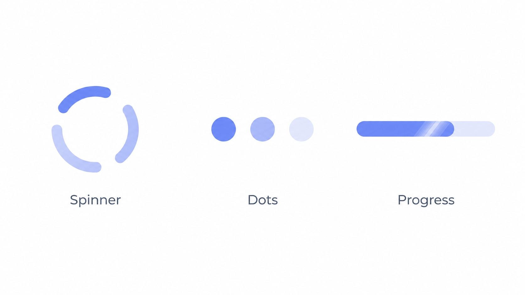
An indeterminate loader suits a short wait when you can’t say how long it will take; with known progress a bar is better, and when you already know the layout, a skeleton (number 8) beats both.
A spinning ring in CSS is a single @keyframes rotation. A morphing branded shape is better as a Lottie file, which you can check in our Lottie viewer before it goes to engineering, and if all you need is a GIF placeholder for a deck or a doc, the loading GIF maker will do.
4. Pull to refresh: Android’s PullToRefreshBox
Pull to refresh has no visible button, so the animation has to teach the gesture. Android’s Jetpack Compose docs define the component plainly: it “allows users to drag downwards at the beginning of an app’s content to refresh the data.” PullToRefreshBox wraps your scrolling list and takes three main parameters: isRefreshing, onRefresh and indicator.

The circular indicator follows the drag, shows a refresh arrow once you’ve pulled far enough, turns into a spinner after release, and then new rows appear above the old ones (the list now starts at Item 35). The whole thing is over in under six seconds.
Browsers don’t ship one. You write pointer-event code that moves the indicator with transform as the finger travels, plus a threshold. If the indicator itself should have some personality (a mascot stretching, a logo filling up), that’s a job for a Rive state machine. Rive describes state machines as “a visual way to connect animations together and define the logic that drives the transitions,” and pulling, armed, refreshing and done is a textbook set of transitions.
5. Dropdown menus: the More menu in Apple Notes
Menus in iOS 26 grow out of the button you tapped. Apple’s guidance says “buttons fluidly morph into menus and popovers,” and its pull-down button guidelines use Notes as the example: a More button (the ellipsis) in the top toolbar that expands into the More menu with Scan, Pin Note, Lock, Find in Note and the rest.
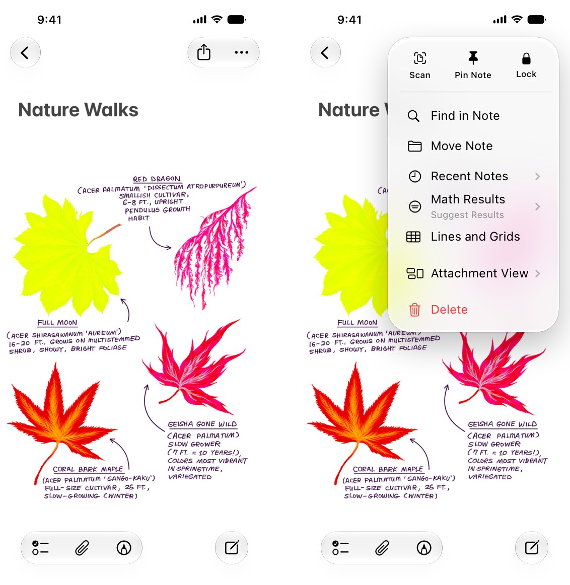
Because the menu comes out of the button, nobody wonders which control opened it, and the reverse motion on close shows where it went. Apple’s HIG is also frank about the cost of hiding things behind a More button: the ellipsis “doesn’t necessarily help them predict its contents.”
Set transform-origin to the corner nearest the trigger and animate in from a slightly smaller scale plus opacity: 0. Atlassian’s design system uses 150 ms for a dropdown entrance. Go much slower and the people who open that menu all day start to feel it. Keep the menu items as real, focusable elements, and close it with the same motion reversed.
6. Focus states: Stripe’s floating labels
Payment forms are where I have the least patience for clever motion, and Stripe shows how little you need. Stripe Elements supports a floating label variant in its Appearance API: “Labels float within the input fields.” With the default auto setting, “When inputs are condensed, labels are floating.” The label has its own states you can style, including --resting, --floating and --focused.
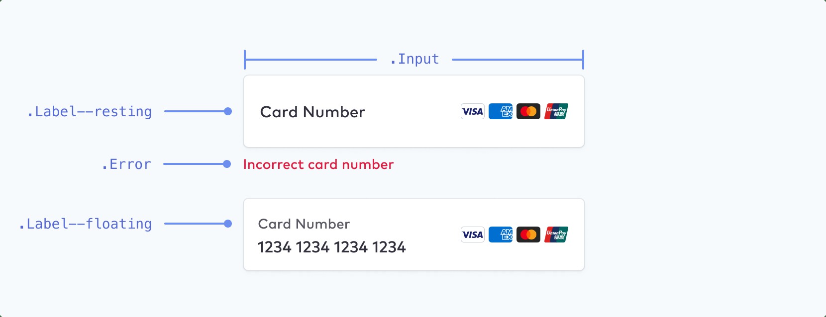
Between those two states the label shrinks and moves up to make room for the card number, which means the text telling you what to type is still on screen after you start typing (a plain placeholder just vanishes).
Use transform: translateY() and scale() on the label, triggered by :focus-within or by a “has value” class. Don’t animate top or font-size here, since transforms leave the layout alone. Keep a visible focus ring as well and treat the floating label as an extra on top of it.
7. Success checkmarks: Apple’s SF Symbols Draw On
A checkmark that draws itself is the classic success animation, and Apple has made the technique part of the system. Its SF Symbols page describes Draw On and Draw Off as “animation presets inspired by the calligraphic movement of handwriting, designed to let symbols more expressively animate into and out of your app’s interface.”
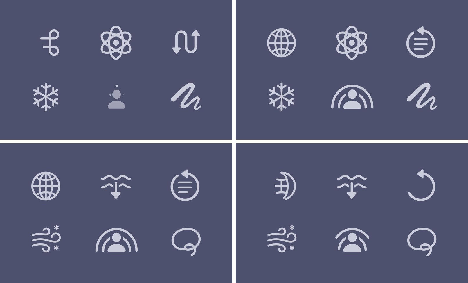
There’s no checkmark in Apple’s demo (it uses a globe, a command key, a snowflake and other symbols), but the mechanism is the one you want for confirmation. The stroke draws in from start to end, the way you’d write the mark by hand. Keep it short and put a text label next to it (“Payment sent”), because a check on its own doesn’t say what succeeded.
For an SVG check in CSS, set stroke-dasharray to the path length and animate stroke-dashoffset from that length to zero (MDN’s stroke-dashoffset reference covers the property). If the check needs a burst or a bounce and has to look the same on iOS, Android and web, make it a Lottie file and test it in the Lottie editor. Our roundup of free Lottie animations is a decent place to find a starting file, as long as you check the license.
A custom check should also match the icons around it. If your product uses Google’s Material Symbols Outlined, Font Checker Pro’s Material Symbols Outlined page has a specimen and the license details.
8. Skeleton screens: Atlassian’s Skeleton with shimmer
Atlassian’s design system describes its Skeleton as a component that “acts as a placeholder for content, usually while the content loads,” and its usage notes are the best short brief on skeletons I’ve read: “Match the size and shape of the expected content so the page does not jump when loading completes. Use shimmering skeletons when loading may take noticeable time. Avoid using shimmer for very short loading states, repeated dense lists, or places where the motion would distract from nearby content.”
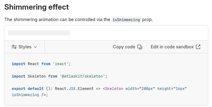
A skeleton says something is coming and roughly where it will sit. In Atlassian’s React component the shimmer is one prop, isShimmering, and one line further down their guidance is the one teams forget: “Remove skeletons as soon as content is ready.” In CSS, a skeleton is a block with a linear-gradient background whose background-position moves in a @keyframes loop; under prefers-reduced-motion, drop the moving highlight and keep the grey blocks.
9. Modals: iOS sheets that rest at two heights
Apple’s Human Interface Guidelines explain that on iPhone “detents specify particular heights at which a sheet naturally rests,” and “the system defines two detents: large is the height of a fully expanded sheet and medium is about half of the fully expanded height.” People drag the grabber to move between them, or tap it to cycle through.
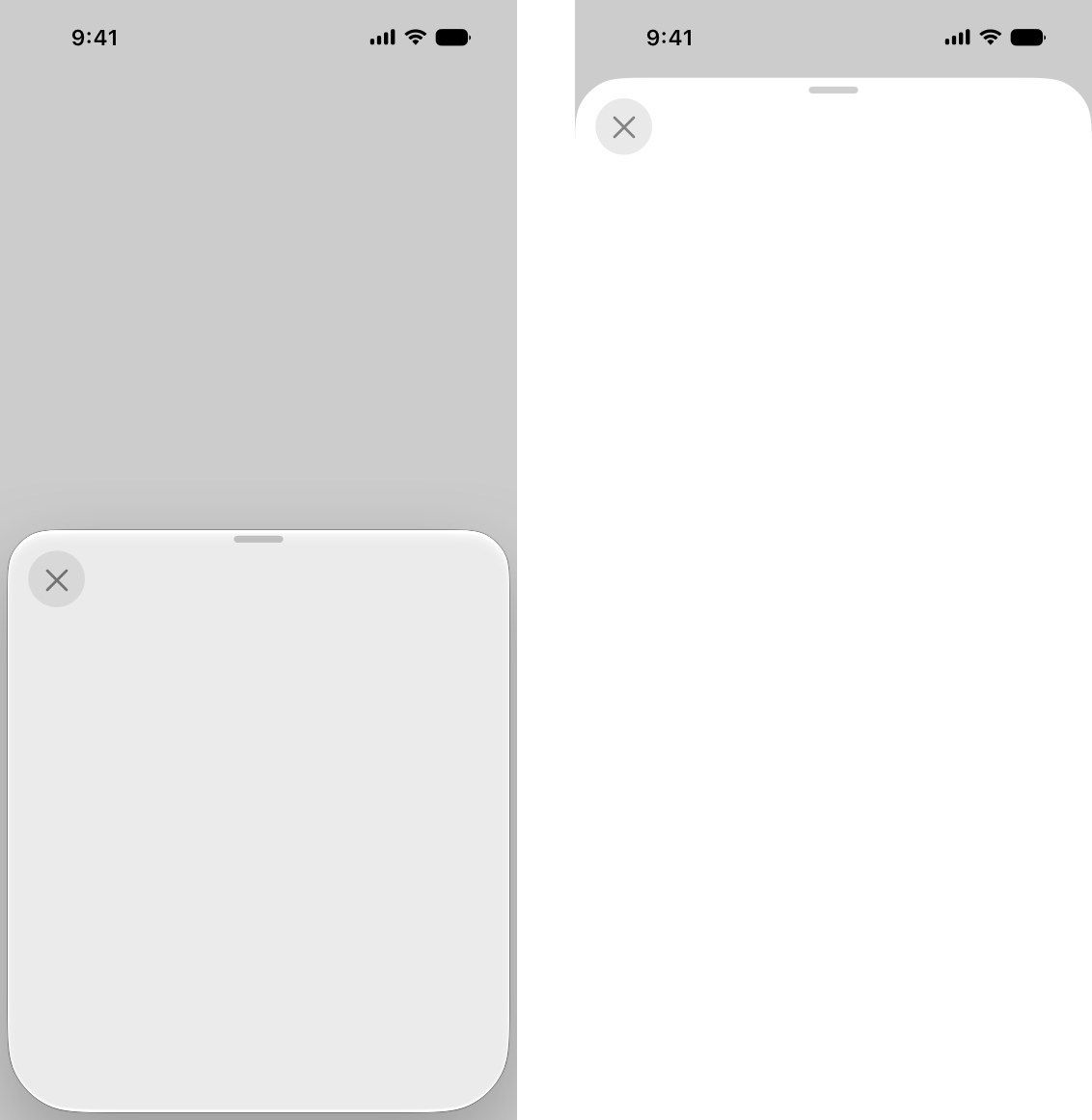
In iOS 26 the motion also changes what’s behind the sheet. Apple’s Liquid Glass guidance says “When a half sheet expands to full height, it transitions to a more opaque appearance to help maintain focus on the task.”
A modal in a browser gets the same idea with a transform on the panel (a short rise from the bottom, or a slight scale up) and a backdrop fading in behind it. Nielsen Norman Group suggests 200 to 300 ms for a modal entering, and Atlassian’s system uses 250 ms. Then handle focus. It moves into the dialog, stays trapped there, and goes back to the trigger on close, and I’d check that before I tuned a single curve.
10. Toasts: Atlassian’s Flag
Atlassian calls its toast a Flag. Bold flags “are reserved for messages about success, loading, warnings, and errors,” and they “can’t be dismissed until the issue is resolved or the message has expired (in the case of a success message).” Default flags are for event-driven messages people can dismiss.
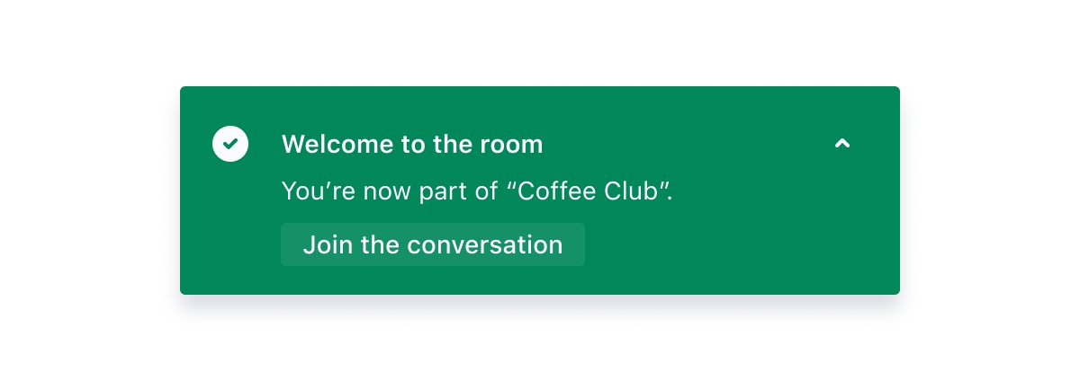
The motion spec sits in Atlassian’s motion foundations: an ease-out curve, cubic-bezier(0, 0.4, 0, 1), where “elements arrive quickly and decelerate to a stop,” recommended “for elements like Panel or Flag entering the screen.” That curve suits nearly any toast, because the message is readable almost as soon as it starts moving.
CSS transform and opacity handle the motion. The timeout is the part that needs thought, and Atlassian’s accessibility note says it outright: “Flags that automatically dismiss will no longer be visible to people.” If the message is an error someone has to act on, keep it in the page too.
11. Carousels: the Material 3 carousel
In Material’s carousel, items change width as they move, which most web carousels never bother with. The Material Components docs explain that each item sits in a MaskableFrameLayout that clips it to a percentage of its width, and that “Carousel masks and unmasks items as they are scrolled across the viewport.” In the default multi-browse layout, large items come first, followed by medium and small ones.
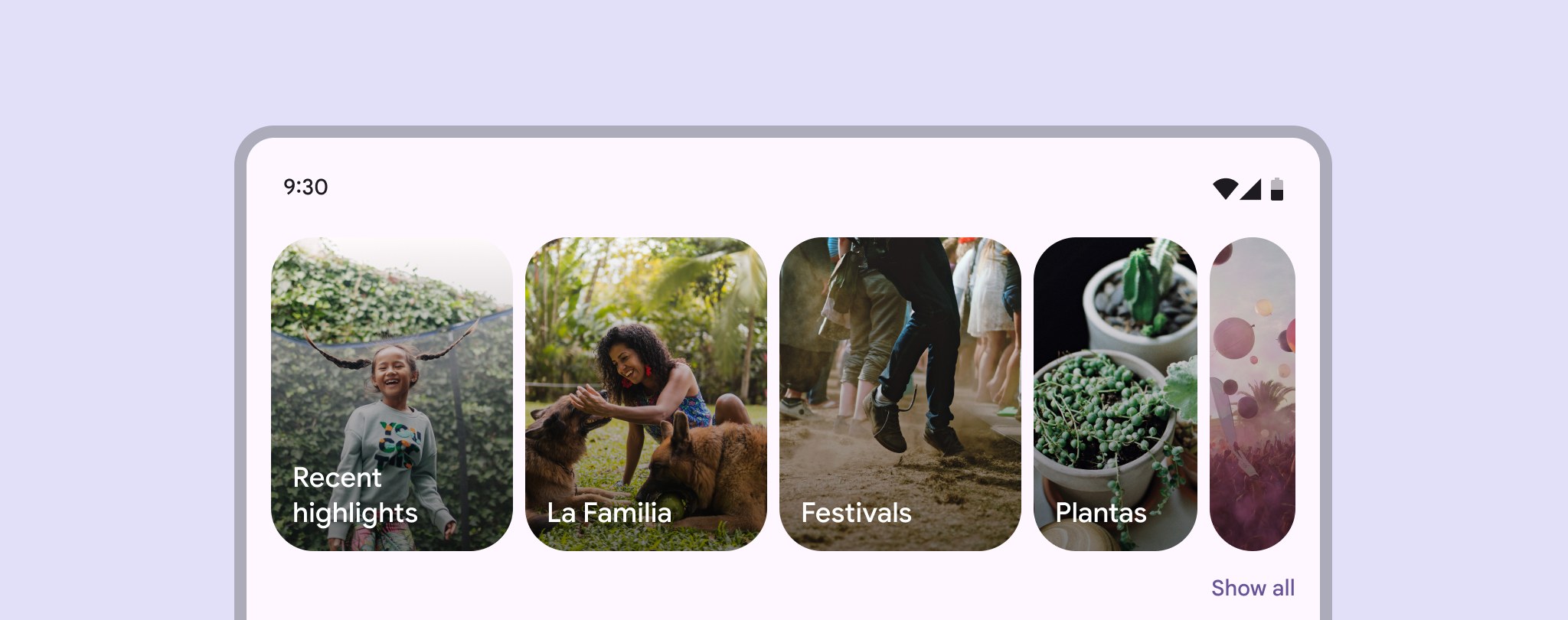
The narrow sliver at the edge tells you there’s more, and the way a sliver widens into a full card as it scrolls in shows where it came from. Google recommends pairing the multi-browse layout with CarouselSnapHelper so the list snaps to the nearest item.
CSS scroll snapping (scroll-snap-type on the track, scroll-snap-align on the items) handles the settle, and a scroll-driven clip-path or width change gives you the masking. Add previous and next buttons and a position indicator anyway, for people who don’t swipe.
12. Drag and drop: Atlassian’s Pragmatic drag and drop
Pragmatic drag and drop is Atlassian’s drag and drop library, in its own words “powering some of the biggest products on the web, including Trello, Jira and Confluence,” and the design guidelines that ship with it are full of motion decisions worth copying. While you drag, a drop indicator line shows exactly where the item will go. After the drop, “the background color of the moved item should flash once it has been moved,” using 700 ms and cubic-bezier(0.25, 0.1, 0.25, 1.0).
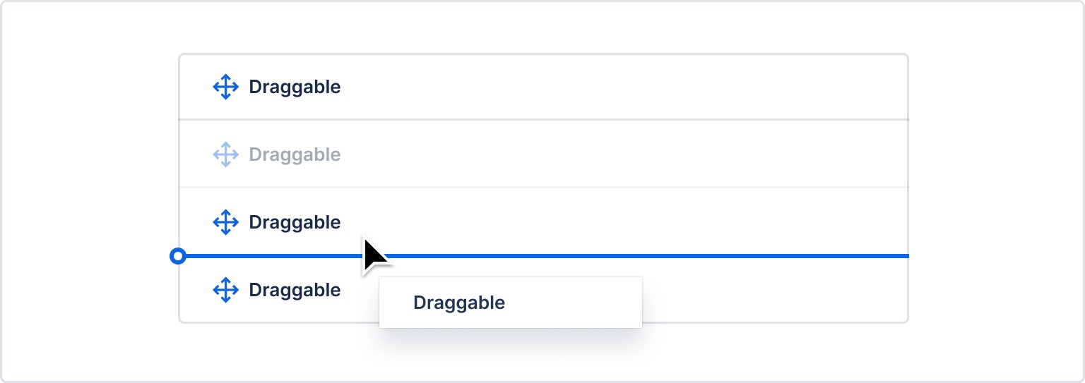
My favorite detail is an exception. The guidelines say “Do not rotate card drag previews. Exception: Trello, which has a 4deg rotation.” Somebody decided the tilt was worth keeping for Trello and wrote it into the rules as a named exception. I wish more design systems documented their exceptions that plainly.
The pointer math is the same as for any draggable control: read the pointer position, clamp it, update the visual from one value. RevelRaw’s guide to building a before and after comparison slider walks through that logic for a reveal handle (clientX, clamping, Pointer Events, a bigger touch target), and it carries over directly. Give every drag a keyboard or menu alternative as well; Atlassian’s guidelines ask for accessible controls that achieve the same outcome.
Timing and easing: what the design systems say
Treat these as starting values, and give anything that crosses a big part of the screen a bit longer.
| Source | Small feedback | Larger transitions | Easing |
|---|---|---|---|
| Nielsen Norman Group | About 100 ms for simple feedback such as a checkbox or toggle | 200 to 300 ms for a modal entering; most animations 100 to 500 ms, 400 ms only for big moves | Ease-out for elements entering, ease-in for elements leaving |
| Material Design 3 (token values as listed in the Material Components for Android motion docs) | Short tokens: 50, 100, 150, 200 ms | Medium 250 to 400 ms, long 450 to 600 ms, extra long 700 to 1000 ms | Emphasized decelerate cubic-bezier(0.05, 0.7, 0.1, 1) to enter, emphasized accelerate cubic-bezier(0.3, 0, 0.8, 0.15) to exit, standard cubic-bezier(0.2, 0, 0, 1) |
| Atlassian Design | Interactions 50 to 150 ms (list item hover 50 ms) | Transitions 150 to 400 ms (dropdown 150 ms, modal 250 ms) | Ease-out bold cubic-bezier(0, 0.4, 0, 1) for panels and flags entering |
| Apple Human Interface Guidelines | No fixed numbers: “Aim for brevity and precision in feedback animations” | “Let people cancel motion” and don’t make them wait for an animation to finish | Match the gesture: a view revealed by sliding down shouldn’t be dismissed sideways |
The line I quote to clients most is Atlassian’s: “If someone will trigger this motion dozens of times a day, keep it under 150ms.” I don’t know a better filter for UI animation, and it kills most requests for “something more fun” on buttons people press all day.
Motion that people can turn off
Every example above still makes sense frozen on a single frame, which is a good test for your own work before reduced motion even comes up. MDN describes prefers-reduced-motion as the media feature that detects whether someone “has enabled a setting on their device to minimize the amount of non-essential motion” (MDN). WCAG 2.2 has a Level AAA criterion for it: “Motion animation triggered by interaction can be disabled, unless the animation is essential to the functionality or the information being conveyed” (W3C). Apple’s version is shorter: “Make motion optional.”
So with reduced motion on, swap slides and morphs for an instant change or a quick fade, and check that the end states still read without the movement (the switch is green, the label has floated). In practice that’s one prefers-reduced-motion: reduce block that shortens or removes your transitions, the feature MDN describes as letting property changes “take place over a period of time” (MDN).
Most of what’s above is plain CSS, because buttons, toggles, labels, menus, sheets and toasts are real elements and you want them to stay accessible. I only bring in Lottie for a self-contained illustrated piece that has to look identical everywhere, like a branded loader or a success burst, and Rive when the animation has to react to input or app state, say a pull-to-refresh character or an interactive mascot. There’s more on the format in our Lottie explainer, and longer illustrated pieces follow the steps in how the animation process works.
Frequently asked questions
Somewhere between about 100 and 400 milliseconds for most of them. Nielsen Norman Group puts simple feedback like a toggle at roughly 100 ms and a modal entering at 200 to 300 ms, and Atlassian keeps anything people trigger dozens of times a day under 150 ms. Save longer motion for rare screens like a first-run flow, and let bigger moves run longer.
Default to CSS for anything that is a real interface element, like a button, toggle, label, menu or toast; it stays accessible and easy to theme. A branded loader that must look identical on iOS, Android and web is a better fit for a Lottie file. If the animation has to respond to input or app state, use Rive, whose state machines tie animations to logic.
They can, when the motion is the only sign that something happened. Respect the prefers-reduced-motion setting by swapping slides and morphs for instant changes or short fades, and make sure the end state reads on its own (the switch color, the label, the toast text). WCAG 2.2 has a Level AAA criterion saying motion triggered by interaction can be disabled unless it is essential.