What Graphic Design Actually Does for a Brand
Graphic design is the visible layer of your brand. Here is what it really does, where branding takes over, and which famous stats to stop repeating.
I co-founded Moonb, a creative studio, and I have sat in a lot of meetings where “we need to work on our brand” turns out to mean “the logo looks dated.” Those are two different conversations. People collapse them constantly, and the collapse costs money, because you end up redesigning a logo when the actual problem is that nobody can explain what you do.
So let me draw the line clearly. Graphic design is the part of your brand people can see. It has a narrow, brutal job, and it gets easier to do well once you stop asking it to carry work it was never meant to carry.
What graphic design covers, and where branding takes over
Branding is the strategy. It is your positioning, your values, the promise you make, the reason someone should care about you instead of the competitor one tab over. You cannot see any of that directly. It lives in decisions and words.
Graphic design is how that strategy shows up on a surface. The logo, the type, the color, the way a landing page or a pitch deck or an Instagram ad is laid out. Design does not decide what you stand for. It makes what you stand for legible in a second and a half, before anyone reads a word.
Here is the split I keep coming back to.
| Graphic design | Branding | |
|---|---|---|
| Question it answers | Does this look like us, and does it look credible? | Why should anyone care about us? |
| Deliverables | Logo, type system, palette, layouts, templates | Positioning, values, voice, story, promise |
| Owns | The visible surface | The meaning underneath |
| Changes how often | Refreshed every few years | Should barely move for a decade |
The reason this matters is not academic. Design done well pays off. Companies in the top quartile of the McKinsey Design Index grew revenue about 32 percentage points faster than their peers over five years, across a study of 300 public companies. But that number rewards design that is expressing a clear strategy. Beautiful work stapled onto a confused brand still leaves people confused. Prettier, and still confused.
If you want the step-by-step of how the design work gets made, that lives in our piece on the design process in graphic design. This article stays on what the design is for.
The first job: getting recognized in milliseconds
Recognition is the first thing graphic design has to buy you, and it happens faster than you think.
Users form a first impression of a page’s visual appeal in about 50 milliseconds, according to Lindgaard and colleagues, and a later Google replication found some judgments forming in as little as 17. That is faster than a conscious thought. Before a visitor has read your headline, they have already decided whether you look like the kind of company they were hoping to find.
That speed is why a consistent, distinctive visual layer earns its keep. When your color and your logo and your type show up the same way every time, you are training a reflex. Someone sees the shape and the palette and knows it is you before they process anything else. That reflex is the whole point of a logo system, and it is why the strongest brands look almost boringly stable year after year.
A quick note on logos, since this is where most people start. There are really three shapes worth knowing. A wordmark is your name set in a specific way (think of most fashion labels). A combination mark pairs a name with a symbol, which is the safest choice for a young company because the symbol has not earned recognition yet. An abstract mark is a symbol alone, which only works once enough people have seen it enough times to connect it to you. Picking the wrong one early is a common way to spend money on recognition you have not built.
The second job: looking credible before anyone reads a word
The second job is trust, and this is the one teams underrate most.
The Stanford Web Credibility Project asked 2,684 people why they trusted or distrusted a website. The single most-cited factor, named in 46.1% of comments, was visual design: layout, typography, color, fonts. It beat the content itself. People decide whether you seem legitimate largely on how the thing looks, then they go find reasons to justify the feeling they already had.
I am not thrilled about that as a fact of human nature, but it is the water we swim in. If your design looks amateur, a real product with real value reads as risky. If your design looks assured, you get the benefit of the doubt long enough for the words to do their work. Credibility is not vanity here. It is the permission slip that lets someone keep reading.
This is where typography does a lot of the heavy lifting nobody notices. Type is tone of voice made visual. A tight geometric sans reads as modern and controlled. A warm serif reads as established and human. Neither is better; they are different promises, and the failure mode is picking a typeface that promises something your brand cannot deliver.
The system beats the logo: what a brand’s visual layer really contains
If you remember one thing, make it this. The logo is a piece of the identity. The system is the whole of it.
The visual layer of a brand is four things working together, and each one is doing one of the two jobs above.
- Logo. The recognition anchor. Small job, high stakes, does not need to be clever.
- Typography. Mostly credibility and voice. It sets how serious, how warm, how premium you feel.
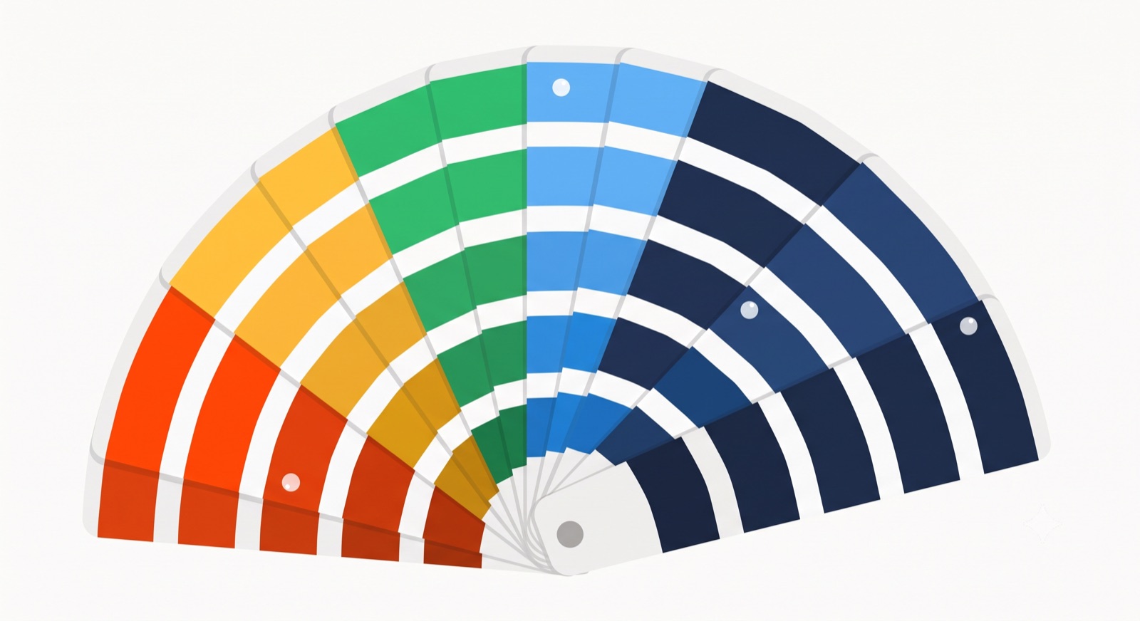
- Color. Recognition first, emotion second. A distinctive palette is one of your fastest recognition tools.
- Imagery and layout. Where credibility is won or lost repeatedly, because this is what fills every page, ad, and deck.
A logo you love with everything else improvised is not really an identity. It is a costume you put on for the homepage. The system is what keeps the fortieth social post looking like the same company as the first.
Consistency is where the design work pays for itself
Here is the unglamorous truth about graphic design. The value is not in the hero moment. It is in the repetition.
Consistent brand presentation across channels is associated with a revenue uplift in the range of roughly 10 to 33%, based on self-reported data from more than 400 brand managers. Treat that as directional rather than precise, but the direction is right and it matches what I see. Every time your design drifts, someone using an off-brand template or an old logo or a color that is close-but-not-quite, you spend a little of the recognition you built. Drift is a slow leak.
This is why a brand style guide earns its place. It is the thing that lets ten different people produce work that looks like it came from one place. Without it, consistency depends on whoever happens to be making the asset that day, and that is not a plan. If you want the failure cases in detail, we keep a running list of common branding mistakes and how they compound.
The color stat everyone repeats, and what the research actually says
Now the part I care about most, because bad data is everywhere in this field.
You have seen the claim that “color increases brand recognition by 80%.” It gets cited constantly, in decks, on agency sites, in LinkedIn posts. It is misattributed. The underlying Loyola research it traces back to measured color’s effect on how people process information in documents and graphs, not brand recognition at all. The number got laundered through repetition until it became “fact.” It never was one.
So what does hold up? Color clearly matters to first impressions, and that part is real. The often-cited figure is that people form a fast subconscious judgment about a product within about 90 seconds, and that a large share of that assessment is driven by color, attributed to the Institute for Color Research. Treat that one as older and softer than the McKinsey or Stanford numbers, because the original methodology is hard to trace. My read: color is a powerful recognition and emotion lever, and you should choose it deliberately, but you do not need an inflated statistic to justify caring about it. The precise multiplier does not change what you do.
I am spending a paragraph on this because the willingness to repeat a comfortable number without checking it is exactly how a field loses credibility. Design decisions should rest on the effects that replicate: how fast a first impression forms, how much weight visual design carries in trust judgments, what consistency pays back. They should not rest on a stat that sounds impressive in a pitch. If you are choosing a palette, the honest research is plenty. Our guide to creating brand guidelines is a better next step than any single percentage.
Getting this right as you grow
The hard part is not designing a good logo once. It is keeping the whole visible layer consistent while a dozen people ship work across a dozen channels every week. That is the moment most brands start to drift, and it is the moment a clear system and someone accountable for it earns back everything it costs. At Moonb we work as an embedded creative team that keeps a brand’s graphic design coherent as it scales, so the recognition you build does not leak out the sides. If that is the problem you are staring at, here is how we keep a brand’s design consistent.
Frequently asked questions
No. Branding is the strategy: your positioning, values, and the promise you make to customers. Graphic design is how that strategy shows up on a surface through your logo, type, color, and layouts. Design expresses the brand; it does not decide what the brand stands for.
To launch, you need a working core: a logo, one or two typefaces, a small color palette, and a couple of templates you can produce quickly. The deeper system (full guidelines, a photography direction, motion) can come once you know which channels actually matter to you. Building all of it before you have traction usually means redoing half of it.
A logo alone will not carry you far, because a single mark cannot keep every page, ad, and deck looking like the same company. You need at least a minimal system: the logo plus consistent type and color and a template or two. That is the difference between a costume you wear on the homepage and an identity people start to recognize.

