12 logo design agencies that build a full identity
Twelve logo design agencies and studios: the marks they have drawn, who each one suits, what they say about price and one limitation apiece.

Hire a logo design agency and you should get more than a mark. You should also get the versions, colors, type and usage rules that stop it drifting once other people start using it. The twelve studios worth a call are Moonb (where I work), Chermayeff & Geismar & Haviv, Pentagram, Mucho, Koto, Base Design, Instrument, JKR, Lippincott, Wolff Olins, COLLINS and Moving Brands.
The most common logo mistake shows up months after the invoice. Somebody paid for a lovely mark, got a folder of PNGs, and only then found that nobody had made a one-color version for an embroidered cap, or one that still reads at favicon size. Studio details come from each one’s own site, read in November 2026. Price comes up in the table at the end, not in the entries, because none of the other eleven studios puts a number on its site.
Logo designer, branding studio or contest site
A freelance logo designer is one person who draws the mark and hands over the files. There are lots of them: the US Bureau of Labor Statistics counts about 253,100 graphic designer jobs in 2025, with self-employed workers making up 20% of them. For a small company that already knows what it is, a good freelancer is excellent value. It gets thin after the mark, because one person rarely has time to write guidelines and build templates as well.
A branding studio (every entry on this list is one) treats the logo as one part of an identity, so the mark comes with color, type, layout rules, social avatars, sometimes motion, and guidelines your team can follow without phoning the designer each time.
Contest sites have dozens of designers submit concepts on spec, and you pick one. Fine for a placeholder while you work out the business. Nothing you get there has research behind it, though, so in eighteen months nobody can tell you why the mark looks like that.
What a proper logo project delivers
Whoever you hire, get the deliverables in writing before the kickoff call. Research should come first: your category, your competitors’ marks, and every place the logo has to appear, from an app icon to a trade show banner. Then a small number of distinct concepts, each with a reason attached, and refinement rounds on the one you pick. The finished mark arrives as a responsive set (a full version, a simplified one, an icon or monogram, a one-color version and a reversed version for dark backgrounds), with the palette and typefaces chosen alongside it. You want editable vector masters plus the everyday exports, and guidelines covering clear space, minimum sizes and misuses. Our guide to writing brand guidelines goes through what that document should hold.
Shrink the logo to the size of a browser tab icon and see if it still reads. Then print it in one color and picture it stitched onto a cap. If apparel is anywhere on your roadmap, FLYP’s walkthrough of clothing logo design ideas goes through ten logo styles, from monograms to badges, with notes on how each one survives embroidery and print on merch.
People skip the accessibility check. The W3C’s contrast guidance sets a 4.5:1 minimum for regular text and exempts text that is part of a logo, but it also says brand guidelines don’t exempt anything else. Pale brand colors are where I see this go wrong most often, fine inside the logo and unreadable as button text. Ask the studio for accessible color pairings along with the palette.
Twelve logo studios
1. Moonb
More on Moonb
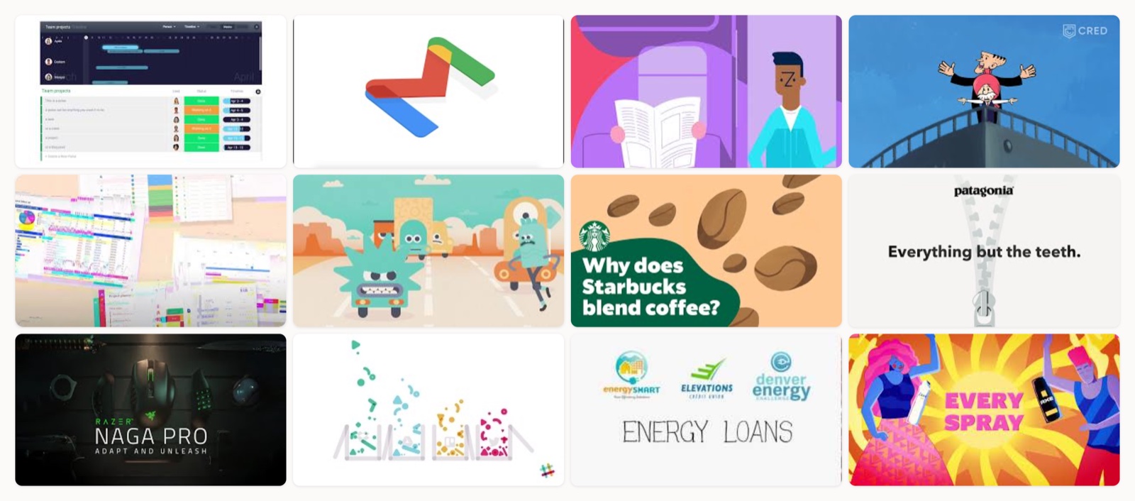
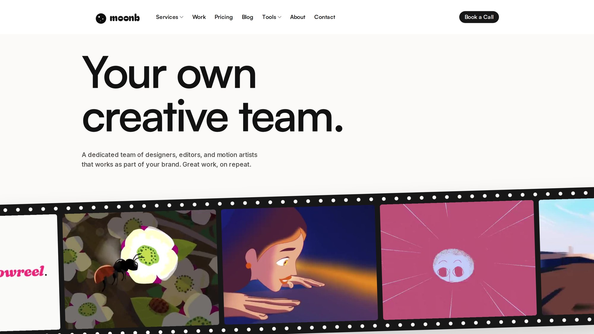
Moonb works for companies of all sizes as their design, motion, video and strategy department. Logo work runs through the same team that later animates the mark and builds the templates around it, so the person who decided the clear space is often the one applying it months later.
Animating the mark is one of the jobs that follow launch, and we have a public example of it. In the 32-second Meet Franz film we made, app icons and stacked chat windows build toward the reveal of the Franz logo.
2. Chermayeff & Geismar & Haviv
More on Chermayeff & Geismar & Haviv
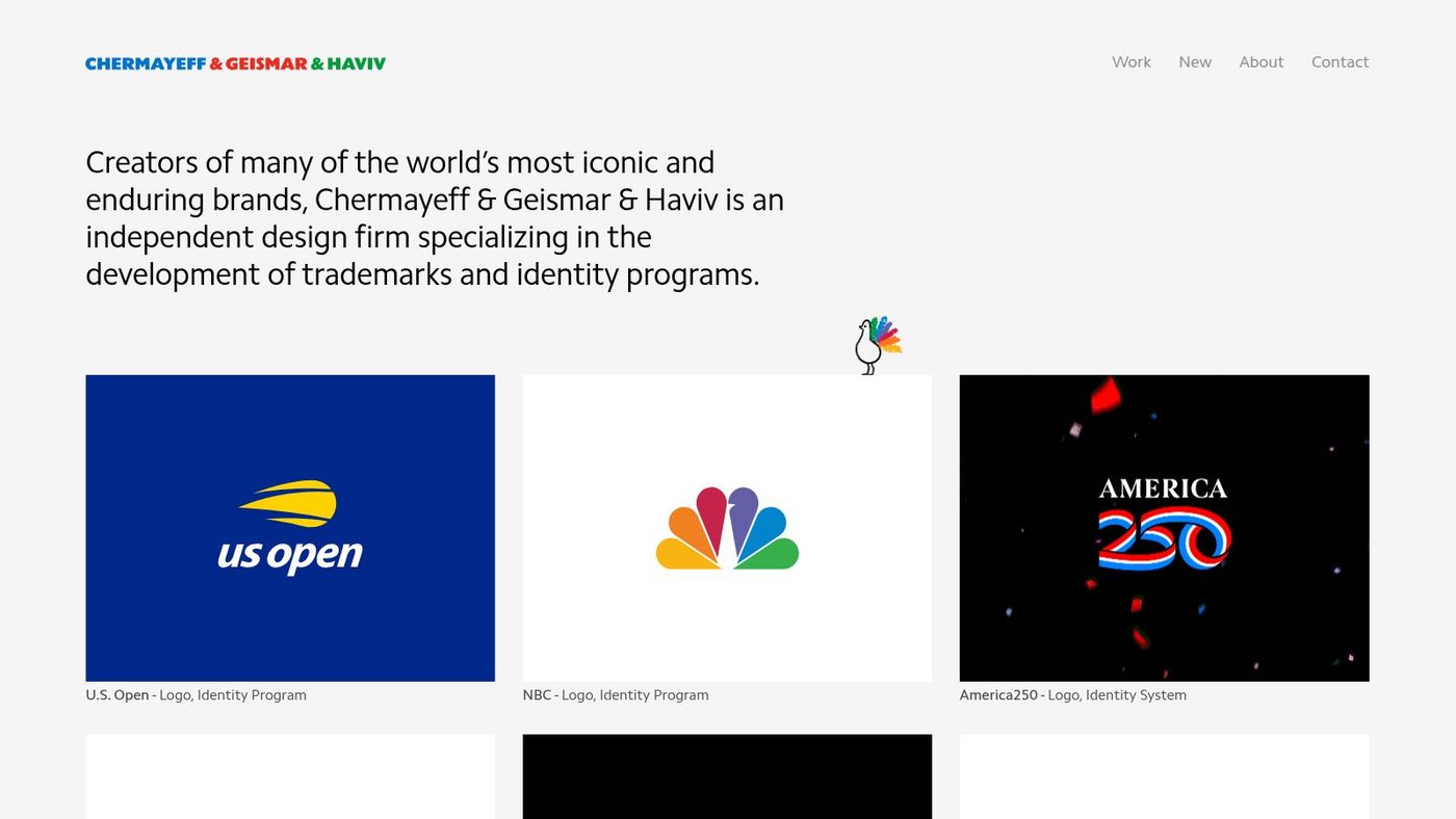
The firm dates to 1957 and works from its New York office. According to its about page, the people leading it are Tom Geismar (founding partner), Sagi Haviv (partner) and two principal designers, Melanie McElduff and Mackey Saturday. Beyond logos it lists exhibitions, print and motion graphics, and art in architecture.
If a logo has to carry a company through mergers, new product lines and decades of use, this is the specialist I’d call first. In this interview with the design publication STIR, Haviv talks through the identity his firm made for Warner Bros. Discovery.
3. Pentagram
More on Pentagram
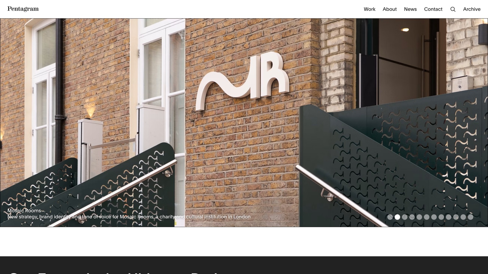
Pentagram calls itself the world's largest independent design consultancy and dates itself to 1972; industrial designer Sir Kenneth Grange was one of its five founders. Its work list spans identity, packaging, exhibitions, websites, typefaces, sound and motion. This month the homepage features a new brand identity for Mosaic Rooms in London, next to naming and identity work for a new Tokyo museum. The site also argues for custom typefaces owned by one organization, which matters if you want a wordmark nobody else can license.
Pentagram makes the most sense when the logo is the start of a much bigger design program and they want one senior designer answerable for all of it. For a designer’s case for simple marks, Michael Bierut’s short Design Indaba interview on the primitive power of logos takes about four minutes.
4. Mucho
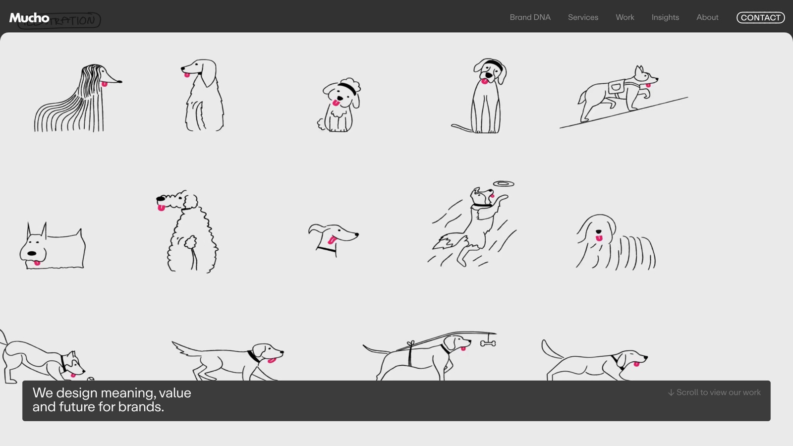
More on Mucho
Mucho runs a San Francisco office on Geary Street and a studio in Barcelona, and says it partners with everyone from startups to global brands; its work carousel includes Fútbol Club Barcelona. The CD PROJEKT RED write-up describes refining the existing identity, keeping its essence while giving it a simpler and stronger presence. Other posts on its site follow the refreshed logo into Cyberpunk: Edgerunners 2 and The Witcher 3: Wild Hunt Remastered, and I wish more portfolios did that, showing the mark out in the world after the reveal.
5. Koto
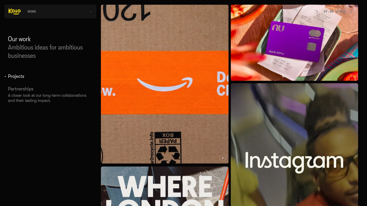
More on Koto
Koto describes itself as five offices and one studio, in London, Berlin, Sydney, Los Angeles and New York, and it has acquired Stereo Creative, a 60-person studio with teams in London, San Francisco, Los Angeles, Portland and Dubai. Its Instagram brief was to reimagine a globally recognized wordmark, bring it in line with an evolving brand system and make it stand the test of time.
6. Base Design
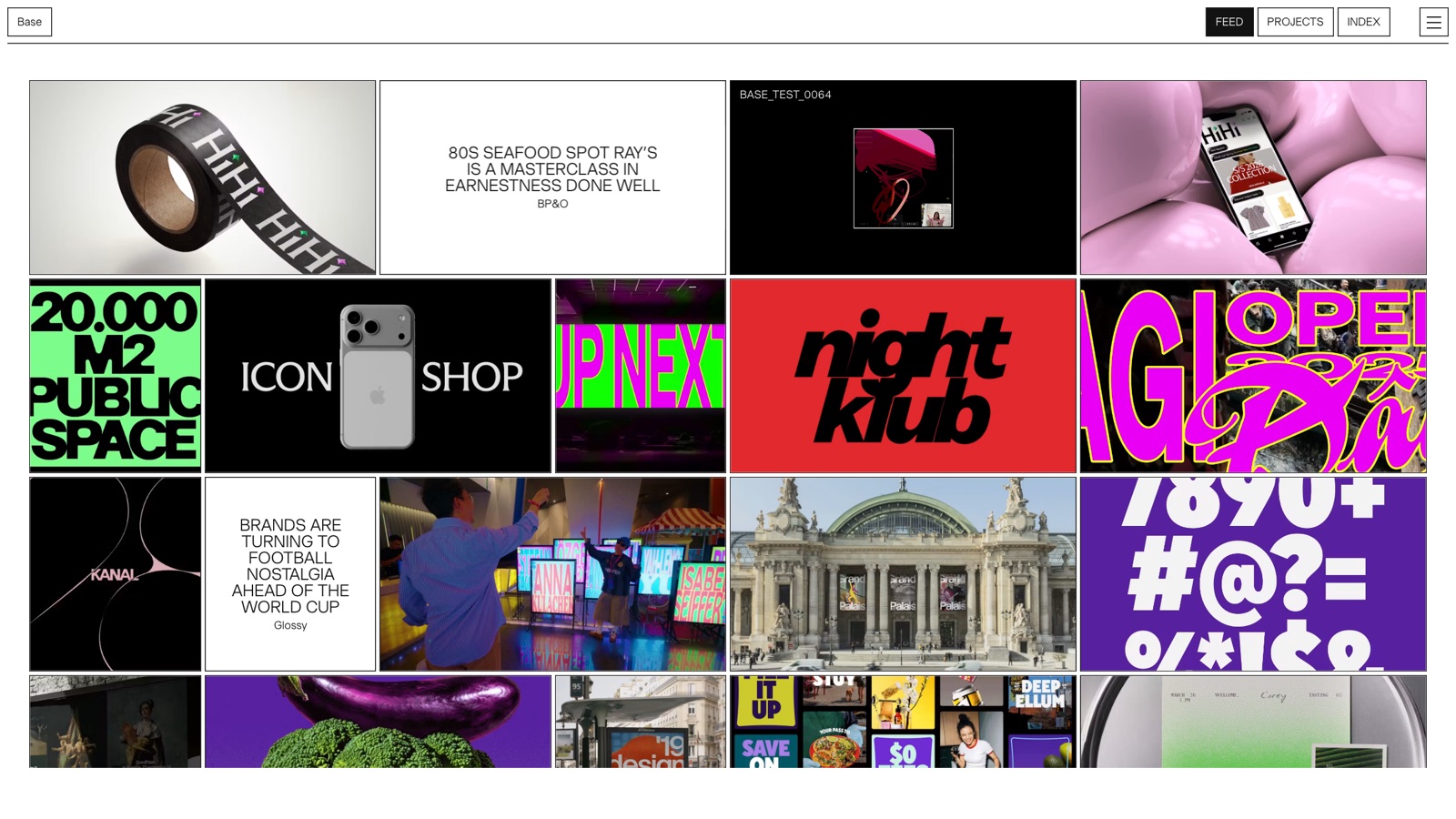
More on Base Design
Base calls itself one network of five studios, and its about page lists New York, Brussels, Geneva, Melbourne and Saigon, plus Base Digital. The team listed there includes Min Lew, managing partner and executive creative director in New York. Its pitch is that every brand is a culture, so identity work starts by finding what is real about an organization and then gives it form with, in their phrase, less decoration and more meaning. The project index is long enough that you'll probably find your own category in it before the first call.
7. Instrument
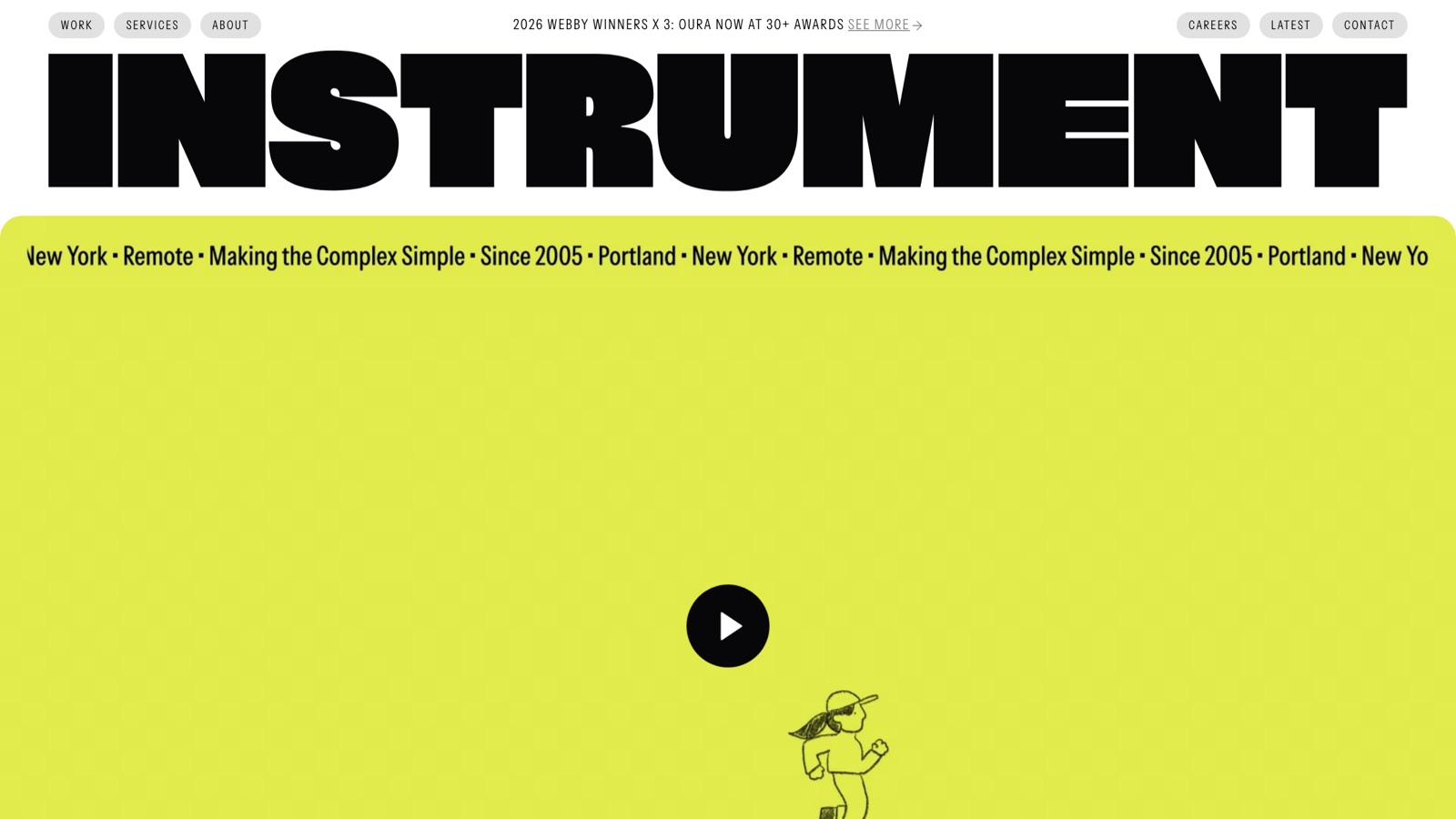
More on Instrument
The EA case study keeps heritage blue at the core of a wider palette and adds a motion toolkit that scales from a main stage to a deck template. Instrument also built custom tools for EA's teams that auto-crop IP imagery into brand shapes and generate custom logos and color styles. Whoever you hire, it's worth asking how your own team will make on-brand assets once the studio has gone.
8. JKR
More on JKR
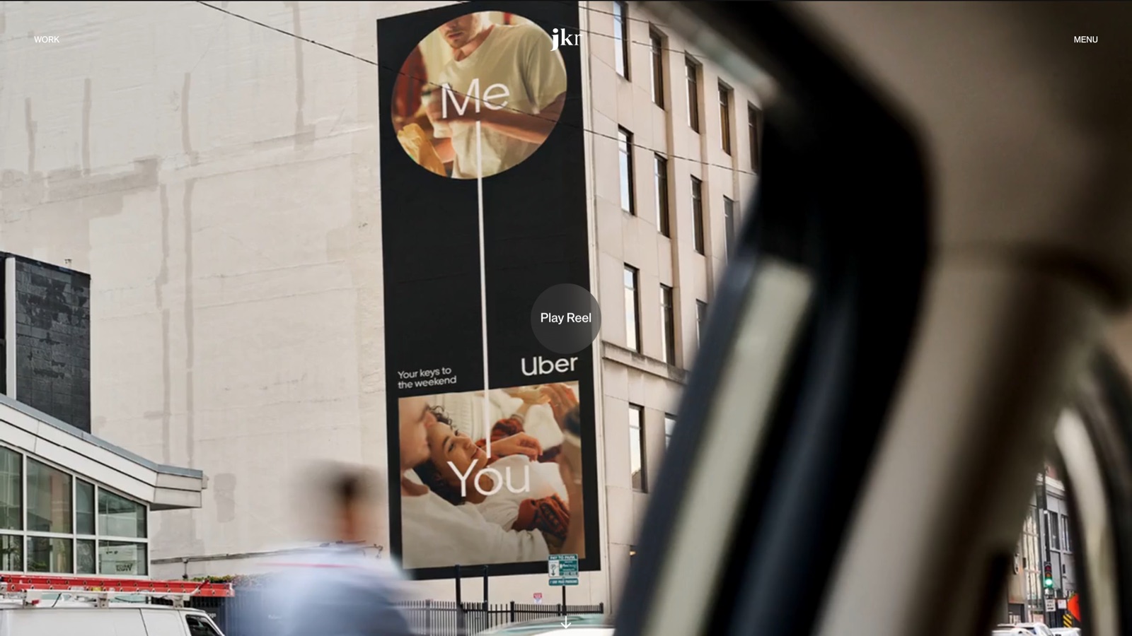
JKR (Jones Knowles Ritchie) opened in London in 1990 and in New York in 2012, and says it employs about 300 people across the two offices. For the RSPCA, a 200-year-old charity, it designed a flexible logo device it calls the octopunct, built to carry rotating animal illustrations across more than 140 branches. It describes its Coca-Cola work as the brand's first global visual identity system, consistent across more than 200 markets.
9. Lippincott
More on Lippincott
Lippincott was founded in 1943 and says its founders coined the concept of corporate identity that year. For Korean Air it paired the new symbol with a refined logotype, had Latin and Hangul brand fonts made with Dalton Maag, worked with AkzoNobel on a bespoke metallic blue, and dropped the word Air from the fuselage. I'd only bring Lippincott in while the company is still working out what it is; once that's settled, a design-led studio higher up this list will get to the mark faster.
10. Wolff Olins
More on Wolff Olins
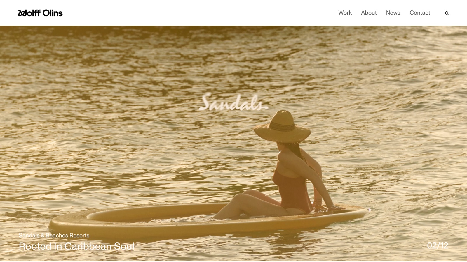
Wolff Olins started in 1965, and its about page title lists London, New York, San Francisco and Los Angeles. According to the Met write-up, the old formal name was keeping museumgoers at arm's length, which is why the name changed along with the logo. The studio also claims the museum's visitor base has been the largest and most diverse in its history since the rebrand.
11. COLLINS
More on COLLINS
COLLINS was co-founded by designer Brian Collins and Leland Maschmeyer, its chief executive. The site sorts its engagements into eleven programs, and the homepage leads with four of them: brand refresh, reposition, expansion and turnaround. Its case list includes Bose, Red Wing Shoes, YouTube Gaming, the San Francisco Symphony and Robinhood. For Robinhood, research recast investors as futurists, and that idea shaped the visual world around the identity.
12. Moving Brands
More on Moving Brands
Moving Brands calls itself an independent global design studio, and the copyright line on its site runs from 1998. It now describes its work as strategy, brand, digital and campaigns, and says it designs distinctive identity systems that create recognition across every touchpoint. For Nebula, it redefined the strategy and identity to move the brand beyond astrology toward a platform for lifelong self-discovery.
Moving Brands and Instrument overlap more than any other pair here. I’d lean Moving Brands when most people first meet your logo on a phone screen, and Instrument when the campaigns matter as much as the product.
Price and fit at a glance
| # | Studio | Best fit | Price on the site | Watch for |
|---|---|---|---|---|
| 1 | Moonb | A mark plus the ongoing work that applies it | One set monthly rate, or a per-project quote | No naming or custom typefaces |
| 2 | Chermayeff & Geismar & Haviv | Marks built to last decades | Not published | Not set up for weekly production after launch |
| 3 | Pentagram | A named partner owning a big identity program | Not published | Large-firm process even for a small mark |
| 4 | Mucho | A logo inside a researched brand core | Not published | Core-identity scope exceeds a minimal mark |
| 5 | Koto | Logo systems across many sub-brands and markets | Not published | May be more machine than a one-market company needs |
| 6 | Base Design | Expressive identities for culture and festivals | Not published | Confirm which studio leads the work |
| 7 | Instrument | Marks that live inside product and campaigns | Not published | A logo-only brief uses a fraction of its range |
| 8 | JKR | Consumer brands that need shelf and street recognition | Not published | Mostly very large clients |
| 9 | Lippincott | Mergers, spinoffs and repositioning | Not published | Research-heavy, consulting-style scoping |
| 10 | Wolff Olins | Bold repositioning, sometimes renaming | Not published | Needs leaders willing to defend the stance |
| 11 | COLLINS | Identity and product rebuilt at a turning point | Not published | Strategy and research come bundled |
| 12 | Moving Brands | Screen-first and app brands | Not published | Less suited to packaging-led marks |
Leaving price for the first conversation is normal for identity work, so don’t read anything into the blank column. For typical ranges, our breakdown of what branding costs splits them by type of supplier.
How to choose a logo studio
Start with how often you’ll need design once the mark is done. If the answer is rarely, a project studio fits, and the list above runs from trademark specialists to big consultancies. If it’s every week, look for a team that stays with the brand after launch. Our collection of rebrand examples shows how much of a rebrand comes down to the rollout.
On the first call I’d ask four things: who will draw the mark (by name, and whether that’s the person in the pitch), how many concepts and revision rounds are included and what happens after the last one, who owns the files and the rights and whether the handover includes editable vector masters and the font licenses, and whether guidelines are part of the price or a separate project.
If motion matters, ask to see how the studio animates a logo; these logo animation examples show how differently studios handle it. When the logo is one piece of a wider overhaul, our guide to corporate identity design covers what sits beyond the mark, and my roundup of brand identity agencies goes wider on the studio side.
The quickest comparison I know, and it takes about an afternoon, is to send two shortlisted studios the same one-page brief and line up what comes back on concepts, rounds, rights, file formats and timeline.
Frequently asked questions
Most identity studios don't publish prices, and none of the eleven project studios in this roundup lists fees on its site. Scope moves the number most. A mark with files costs far less than a full identity with research, a responsive logo set, color, type and guidelines, so ask for each quote broken down by those deliverables and compare them line by line.
Research, concepts and refinement can move quickly. Most of the calendar goes on waiting for feedback from your side, and board sign-off or legal review adds more. Ask for a schedule that shows your review dates next to the studio's, and name one person who can approve.
Before you approve the final design, and again before you file. Studios vary a lot in how much conflict checking they do at the concept stage, so ask, and bring in a trademark attorney for the clearance search and the filing.