12+ Rebrand Examples: What Worked and What Failed
A dozen real rebrand examples, from Airbnb and Mailchimp to Gap and Tropicana, with the business reason for each change and the lesson to steal.

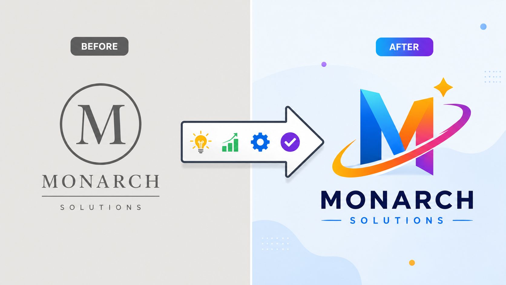
A new logo is not a new strategy. The strongest rebrand examples begin with a business problem. An identity that no longer works on modern screens. A company that has outgrown its name. A merger. A change of direction. A gap between how the company sees itself and how customers describe it. The logo then gives that decision a visible form.
I work at Moonb, a creative team that ships brand and video work for marketing departments, so I spend a lot of time studying rebrands that either landed or backfired. The cases below treat each rebrand as a decision under pressure. For every example, three questions do the diagnostic work: Why did the company change? What exactly changed? What did customers recognize, reject, or accept? That approach separates a strategic repositioning from a cosmetic refresh, and a careful evolution from an expensive loss of equity.
Use before-and-after visuals when presenting these cases. Show the mark in context, across packaging, product interfaces, campaigns, signage, and motion. For a broader foundation, compare this analysis with Moonb’s guides to corporate identity design and brand refresh versus rebrand. Outcome figures below only appear when a named source supports them.
1. Airbnb’s 2014 Bélo identity system

Airbnb’s 2014 change went deeper than replacing a familiar logo. The company moved from a more literal “A” mark to the abstract Bélo, created with DesignStudio, alongside a custom typeface, a defined color palette, and a flexible system for digital and physical use. The shift reflected a broader ambition, from arranging accommodation to building a brand around belonging and connection.
The Bélo gave Airbnb a symbol that could work across the app icon, website, host materials, campaigns, and physical spaces. Airbnb also explained what the symbol was intended to represent, rather than presenting the change as a purely aesthetic decision.
Practical rule: A bold symbol needs a clear story, especially when customers don’t recognize it yet.
The initial reaction was skeptical in some quarters because the mark looked unfamiliar and invited criticism. It held because Airbnb connected the identity to a real strategic direction and applied it consistently. The lesson for a brand team is to build a system, test the idea with real users, and plan a transition instead of expecting immediate affection.
2. Gap’s 2010 logo reversal

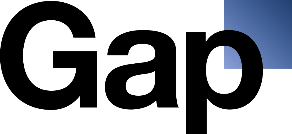
Gap’s 2010 logo change is one of the clearest examples of brand equity being discarded without enough explanation. The company replaced its long-standing blue square and serif wordmark with a cleaner sans-serif design that included a small blue square positioned behind the final letters.
The new mark appeared with little public explanation. Customers, designers, and press outlets criticized it as generic and unnecessary. Within about a week, Gap announced that it would return to the previous logo, turning the launch into a widely cited lesson in how quickly a familiar identity can become a public liability.
The issue wasn’t just that people disliked the new shape. Gap had removed a visual cue that customers already understood, without showing what business problem the change solved or why the replacement deserved trust. The company also appeared unprepared to defend the decision.
For a practical rollout framework, see Moonb’s guide on how to rebrand. Gap’s reversal makes the operating lesson plain:
- Explain the reason: Customers need context before they can judge a major change fairly.
- Test recognition: A new mark should be evaluated with existing customers, not only internal stakeholders.
- Protect familiar equity: Long-used symbols carry memory and meaning that design teams can’t recreate instantly.
3. Mailchimp’s 2018 brand refresh


Mailchimp faced a broader business challenge in 2018: its identity needed to support a company extending beyond email marketing. The team chose a refresh rather than a full replacement, keeping the Mailchimp name and core chimp mascot while refining the logo, expanding the color system, adding custom typography, and creating a more consistent illustration style for digital and print use.
That decision protected recognition while giving the brand more room to grow. Mailchimp continued to present itself as approachable and playful, but the identity could now work across more products, messages, and customer touchpoints. The company kept its personality, improved its flexibility, and avoided asking existing customers to relearn the brand.
A refresh changes how a brand behaves visually. A rebrand can also alter its name, positioning, or architecture. Teams should settle that strategic scope before commissioning design work. Moonb’s guide to refreshing a brand offers a useful framework for making that distinction.
The working principles are straightforward:
- Keep the essence: Retain the assets that carry recognition and personality.
- Modernize the system: Make typography, color, illustration, and layouts function consistently across customer touchpoints.
- Describe the change accurately: If the strategy remains familiar, present the work as an update rather than a total reinvention.
Mailchimp’s broadly favorable reception reflected that balance. The brand felt familiar, yet more capable. A strong refresh recovers flexibility without discarding hard-earned equity.
4. Tropicana’s 2009 packaging redesign reversal

Tropicana’s 2009 packaging redesign removed several cues that shoppers had long connected with the product. The familiar orange with a straw gave way to a cleaner package featuring a glass of orange juice, with less of the visual detail that had made the carton easy to identify.
The company described the change as a modernization, but customers quickly said the new packaging no longer felt like Tropicana. Sales reportedly declined, and the company announced a return to a version of the earlier design within weeks. Because the outcome figure isn’t being repeated without a named source, the reliable lesson comes from the reversal itself and the public response.
Tropicana’s mistake wasn’t trying to look current. It was treating recognition as clutter. Packaging has to work in a fast retail environment, where familiar shapes and images help people find a product before they read every word.
A heritage asset isn’t automatically old-fashioned. Sometimes it’s the fastest route to recognition.
Before removing a distinctive cue, teams should test whether customers use it to identify the product, distinguish it from competitors, or confirm that it’s the product they intended to buy. A modern package can still retain the orange, straw, color, and structure that make Tropicana unmistakable. A brand audit helps map those assets before a redesign turns them into assumptions.
5. Dunkin’ dropping “Donuts” from the name

Dunkin’ had a naming problem that the business itself had created. The company had expanded beyond donuts into coffee, breakfast sandwiches, and other food and beverage products, so “Dunkin’ Donuts” described only part of the customer experience.
The company announced the shorter name, Dunkin’, in 2018, with the change taking effect in 2019. Signage, cups, marketing materials, and other customer-facing assets adopted the new name while retaining the brand’s recognizable colors and visual character.
This was a stronger basis for change than a leadership team wanting something fresher. The company had outgrown the category implied by its name. The rebrand gave the business room to talk about convenience, beverages, breakfast, delivery, and wider food occasions without pretending that donuts were the entire proposition.
Dunkin’ also communicated the reason for the change, which helped customers interpret the shorter name as an expansion rather than a rejection of its history. The lesson is useful for any company considering a name change:
- Name the shift: Explain what the company now does that the old name failed to express.
- Keep recognition where it helps: A shorter name doesn’t require abandoning every familiar visual cue.
- Roll out with operational discipline: Franchised locations, packaging, digital channels, and customer service all need aligned instructions.
6. Instagram’s 2016 gradient icon redesign


Instagram’s 2016 icon redesign replaced the detailed camera illustration with a simplified camera outline filled by a warm gradient moving from orange through pink and purple. The company also updated its logotype and wider visual language.
The change modernized a skeuomorphic icon that looked like a physical camera. Instagram kept the central idea, though. Users still saw a camera, but in a form designed for small screens, app grids, and a product that had grown beyond the feeling of a simple photo album.
The first reaction was mixed because the gradient was a sharp departure from the old brown camera. Yet the new icon became a strong memory cue through repeated use. Instagram succeeded where many visual changes fail because it preserved the concept while changing the execution.
The case offers three practical decisions for digital brands:
- Retain the category reference: Customers should still understand the connection between the old and new identity.
- Design for actual scale: An app icon needs clarity at small sizes, not only detail in a presentation.
- Give the change a reason: Modernization is easier to accept when the product has evolved.
Instagram didn’t need to explain a new business name or erase its history. It needed a simpler, more flexible expression of an established idea. That narrower brief reduced the risk.
7. Burberry’s font switch and strategic reversal


Burberry’s identity changes show the tension between modern fashion language and heritage recognition. In 2018, creative director Riccardo Tisci introduced a flat sans-serif wordmark, replacing the classic serif treatment associated with the brand for decades. The move looked cleaner and more digital-first.
By 2023, Burberry had moved back toward a serif wordmark and stronger heritage cues. The return didn’t mean that every modern element disappeared. It signaled that the earlier simplification had removed some of the distinctive character required of a luxury house.
Burberry’s sequence is more useful than either logo viewed alone. A brand can follow a current design direction and still discover that the result resembles too many other brands. Luxury identity depends on recognizable codes, including typography, equestrian references, color, and the relationship between history and present-day expression.
The practical trade-off is clear:
- Modernize with a reason: Digital usability can justify refinement, but it doesn’t justify erasing distinction.
- Protect category signals: A luxury brand shouldn’t look interchangeable with a technology company.
- Avoid constant correction: Course-correcting is better than defending a weak decision forever, but repeated shifts can weaken consistency.
Burberry’s return to serif typography is an instructive reversal because it acknowledges that heritage can be a competitive asset, not a constraint.
8. Pepsi’s 2023 return to classic design cues
Pepsi’s 2023 identity update drew on visual elements associated with earlier versions of the brand. The system gave greater emphasis to the red, white, and blue globe, used bolder typography, and brought back a more prominent serif treatment in the wordmark.
The move followed years of flatter, more minimalist design language. Pepsi framed the update around heritage and confidence in visual assets that customers already recognized. The result aimed to combine retro reference with a contemporary system rather than reproduce an old package without adaptation.
That distinction separates nostalgia from strategy. A heritage cue earns its place when it helps customers identify the brand, supports the product’s current position, and can work across packaging, digital campaigns, retail, and motion.
Pepsi’s case also reinforces the value of testing. The company used consumer input to assess which classic elements still resonated across generations. The useful question isn’t whether a design looks old or new. It’s whether the identity has distinctive assets that customers can recognize and the business can use.
A successful heritage-led update should answer three questions:
- What should return? Select the cues that carry recognition, not every historical detail.
- What needs to change? Refine spacing, typography, motion, and application rules for current channels.
- What does the strategy require? Make the identity support current products and campaigns, rather than turning the brand into a museum piece.
9. Old Spice’s 2010 repositioning
Old Spice had a perception problem. Younger consumers associated the brand with an older generation, so a logo change alone wouldn’t have solved the issue. In 2010, the company combined a visual refresh with a major advertising and positioning shift, including “The Man Your Man Could Smell Like” campaign by Wieden+Kennedy.
Old Spice kept recognizable heritage elements, including the ship and anchor idea, while updating packaging, color, tone, and campaign expression. The advertising made the brand humorous, confident, and culturally current. The identity supported the repositioning, but the communication did much of the perceptual work.
This is a useful contrast with logo-led rebrands. Old Spice didn’t ask a new mark to carry a new meaning by itself. It repeated the new personality through advertising, retail presence, product expansion, and a distinctive voice.
Repositioning needs repeated behavior. A new promise becomes credible when the product, campaign, packaging, and customer experience keep expressing it.
The lesson for legacy brands is to preserve enough equity for existing customers to recognize the product while changing the context in which they understand it. Old Spice updated the conversation around its heritage instead of pretending the heritage didn’t exist.
10. Facebook to Meta in 2021


Facebook’s 2021 change to Meta was a corporate rebrand tied to a stated strategic focus on the metaverse and virtual reality. This was deeper than a visual refresh. The company wanted Meta to serve as the parent identity while Facebook remained the name of a social media product.
The new name and visual language created separation between the corporate organization and its established product portfolio. It also made a large claim about future direction. That created a higher burden of proof than a logo update, because audiences judged the name through the company’s existing reputation and public controversies.
Reception was mixed. Some observers saw the change as a way to signal a new technology direction, while others interpreted it as an attempt to distance the corporate parent from negative associations with Facebook. Both readings show why a new identity can’t control the whole meaning of a strategic move.
A corporate rebrand should clarify:
- What changed in the business: A new name needs an actual organizational or strategic basis.
- What didn’t change: Products, responsibilities, and customer relationships still need clear labels.
- What the identity can’t repair: A logo cannot substitute for operational improvements, accountability, or trust-building.
Before estimating the scope of a corporate change, teams can use Moonb’s practical guide to how much branding costs, then separate design work from the wider implementation burden.
11. Dropbox’s 2017 bold visual rebrand


Dropbox’s 2017 rebrand responded to a broader business ambition. The company had become associated mainly with file storage and sharing, while it wanted to appear more connected to creative collaboration and varied forms of work.
The new identity used a more expressive color system, a simplified wordmark, and a broader visual language built for campaigns, editorial content, collaboration themes, and motion. The important change wasn’t only the logo. Dropbox gave its marketing team more room to show ideas, relationships, and creative work.
That created a strategic tension. Existing customers still understood Dropbox through the practical utility of storing and sharing files. A more expressive identity could help the company expand its story, but it also risked moving faster than the product experience or customer understanding.
For teams planning a similar move, the useful sequence is:
- Define the expansion first: State what the company wants to be known for beyond its current category.
- Show the new meaning repeatedly: One launch campaign won’t establish a broader position.
- Build production rules: Color, typography, motion, imagery, and layout need clear guidance before many teams start producing work.
- Check the product promise: The identity should describe a direction customers can experience.
Dropbox illustrates why a rebrand needs applications, not only a brand book. The new idea becomes believable when the system appears consistently in product communication, campaigns, editorial work, and customer touchpoints.
12. Uber’s 2018 identity refresh


Uber’s 2018 identity refresh followed criticism of the company’s earlier 2016 identity and broader reputational problems. The visual system moved away from the more complex symbol toward a simpler wordmark and clearer expression.
A simpler identity made the company easier to understand, but the work also had a clear limit. It could support a leadership and reputation reset, yet it couldn’t create trust on its own. Riders, drivers, employees, regulators, and investors evaluate Uber through their experiences with the company, not only through its typography.
That makes Uber a useful rebrand example for companies facing reputational pressure. The identity should explain what the organization is trying to become, while leadership and operations provide evidence that the change is real.
The right measurement plan should separate different outcomes:
- Recognition: Do people identify the new mark as belonging to the company?
- Understanding: Can they explain what the company does and who it serves?
- Trust: Has the wider experience changed enough to affect perception?
- Execution: Do the website, app, campaigns, support materials, and internal communications tell the same story?
A cleaner visual system can remove confusion. It can’t remove accountability. Teams should say what the rebrand supports and what it doesn’t fix.
13. Mastercard’s name-free logo


Mastercard stopped putting its name beside the red and yellow interlocking circles in selected contexts. That only works when the symbol already carries enough recognition to survive without explanation.
The company kept the circles rather than replacing a familiar asset, then used them alone across cards, digital products, payment contexts, and campaigns. This reduced the information needed in compact placements while preserving a visual cue customers already associated with Mastercard.
The decision also depended on context. A name-free mark can function like an app icon in a small digital space, but unfamiliar audiences may still need the full logo or a verbal introduction. Removing the wordmark everywhere would have traded clarity for simplicity.
That trade-off gives brand teams a practical test. Identify which assets perform recognition work, then separate familiar environments from unfamiliar ones. Keep the full name where context is weak, and let the symbol stand alone where recognition is stronger. A staged rollout protects equity while showing whether the mark can carry the identity independently.
Remove supporting text only after the symbol has earned the right to stand alone.
Mastercard did not start over. It reduced verbal support, recovered more space for digital use, and kept the visual equity built into the circles. The lesson is specific: simplicity becomes safer when recognition has already been earned.
14. Weight Watchers to WW


Weight Watchers wanted to be WW. The strategy made sense. The name did not carry the promise.
In 2018, the company changed its corporate name as it moved from a weight-loss focus toward wellness. The shorter name created room for services and messages beyond dieting, but it also removed much of the meaning customers had learned over decades. “WW” needed explanation before it could communicate a specific role.
That tension shaped the rebrand. Weight Watchers was trying to recover relevance in a broader category without discarding the recognition attached to its old name. The change could signal ambition, but it could not prove that the company belonged in wellness. Products, messaging, customer journeys, and campaign language had to make that case through the experience itself.
The practical question is whether the new identity earns understanding quickly enough. A name can create room for growth, yet still leave existing customers unsure about what remains and what has changed.
Brand teams considering a similar move should check:
- Recognition and comprehension: Can people identify the company and explain its new role separately?
- Useful legacy equity: Which familiar words, services, or associations can support the transition?
- Product proof: Does the customer experience visibly support the broader promise?
- Transition language: Where will the company explain the change, and how consistently will teams use that explanation?
WW kept a familiar business behind a less descriptive name. The lesson is to broaden the offer without making customers supply the meaning themselves.
15. Twitter to X


Twitter’s 2023 shift to X discarded one of social media’s most established names and symbol systems in favor of a single letter. The change supported a broader stated ambition, but it also removed the bird, familiar Twitter language, and product terms that had made the service immediately legible.
The pressure was unusually high because the old identity held verbal and visual equity at once. People recognized the name, used it as a verb, understood the bird as a symbol, and relied on a shared vocabulary for product actions. X therefore had to name a new direction while rebuilding recognition during the transition.
Public reception was mixed and often skeptical. That assessment does not require unsupported business or user-performance figures. The clearer issue is rollout: a new name appeared before the replacement identity had fully explained what the product was becoming or which familiar meanings would survive.
For brand teams, the case calls for an equity audit before a change of this scale:
- Verbal equity: Record names, verbs, product terms, and phrases customers use naturally.
- Visual equity: Identify symbols, colors, shapes, and interface cues that support recognition.
- Operational meaning: Preserve labels that help customers find features and understand updates.
- Transition needs: Give customers, employees, partners, and support teams language they can use consistently.
X shows that when a name carries verbal and visual equity, the replacement must do double work. It must name the product’s direction while rebuilding the symbol system people once recognized instantly.
16. Animal Planet’s return to a nature cue

Animal Planet’s rebrand succeeds or fails on screen, not on a logo sheet. Motion is where the promise lives or dies.
The channel has moved through different visual expressions, including periods with a more polished television style and later work that restored stronger animal and nature associations. That shift reflects a practical tension: modern design can refresh a television brand, but it cannot obscure the relationship audiences expect with animals and the natural world.
The equity worth keeping is the name’s direct promise. The identity can discard dated styling while recovering cues that make the category immediately clear. Its limits are equally important. A nature reference cannot compensate for programming, packaging, or storytelling that feels disconnected from the subject.
Motion gives the brand room to prove its meaning through energy, behavior, habitats, sound, and narrative. Those elements should work across broadcast packaging, social clips, streaming environments, and promotional campaigns, rather than appearing only in a channel logo.
Assess the system through practical checks:
- Promise: Can viewers identify the channel’s subject quickly?
- Recognition: Do the logo and typography support that category?
- Meaning: Does motion add information and feeling, rather than decoration?
- Portability: Does the identity remain clear outside television?
The exact history still needs checking against documented brand materials, especially for dates, logos, idents, typography, and campaign language. Animal Planet shows that a content brand is experienced through transitions, promos, program packaging, social video, and the tone of its stories. That is where the rebrand earns recognition, or loses it.
17. Kodak’s identity and heritage reassessment

Kodak carries unusually strong associations with photography, film, and its yellow-and-red palette. That makes it a useful heritage case, but it also requires precision. Kodak has changed identity elements across different periods and business contexts, so a serious analysis should identify the specific update, date, scope, and source rather than treating every logo adjustment as one continuous rebrand.
The practical question is how a legacy company can use familiar assets while adapting to current products and markets. Kodak’s palette and visual memory can aid recognition, but those assets don’t explain a new product by themselves. The identity needs supporting typography, photography, packaging, product communication, and positioning that make the current offer clear.
Heritage brands often make one of two mistakes. They either preserve every historical cue until the system feels trapped in the past, or they remove the cues that customers use to find and trust the brand. Kodak is most useful when studied as a balance between those extremes.
Use the case to examine:
- Scope: Define exactly which identity change is being evaluated.
- Recognition: Identify the assets customers already associate with Kodak.
- Relevance: Show how those assets appear around current products and channels.
- Evidence: Keep reception and business outcomes qualitative unless a named source supports a specific claim.
Comparing 17 Rebrand Case Studies
| Case | Implementation complexity | Resource requirements | Expected outcomes | Ideal use cases | Key advantages |
|---|---|---|---|---|---|
| Airbnb’s 2014 Bélo Identity System | High, custom typeface + modular system | High, agency, global testing, guidelines | Scalable global identity; emotional repositioning | Strategic repositioning and global expansion | Flexible system; defensible mark tied to narrative |
| Gap’s 2010 Logo Reversal | Low technical, high stakeholder risk | Low, moderate (logo rollout) | Intended modernization but swift backlash and reversal | Cautionary example, avoid silent swaps | Teaches importance of audience buy-in |
| Mailchimp’s 2018 Brand Refresh | Moderate, refresh not overhaul | Moderate, typeface, palette, comms | Modernized look while retaining recognition | Visual refreshs that preserve brand essence | Minimal disruption; clear evolution messaging |
| Tropicana’s 2009 Packaging Redesign Reversal | Low, moderate, packaging redesign | Moderate, packaging production, distribution | Sales drop and quick reversal; restored equity | Avoid replacing iconic cues without testing | Shows need to protect familiar visual equity |
| Dunkin’ dropping “Donuts” (2018, 19) | Moderate, name + phased rollout | High, franchise signage, comms | Name aligns with broader menu; accepted | Brands outgrowing literal names | Clear rationale and phased execution |
| Instagram’s 2016 Gradient Icon Redesign | Moderate, icon + palette shift | Moderate, design, platform rendering | Modern, mobile-friendly identity; iconic gradient | Modernization that retains core reference | Highly recognizable; optimized for small screens |
| Burberry’s font switch and reversal (2018→2023) | Medium, typography shifts over time | High, global identity updates | Tension then rebalanced heritage + modernity | Luxury/heritage brands balancing trend vs. history | Demonstrates course-correction and balance |
| Pepsi’s 2023 return to classic cues | Moderate, retro + contemporary blend | Moderate, testing, packaging, rollout | Heritage-forward, distinctive identity | Brands mining heritage for distinctiveness | Resonates across generations; confident positioning |
| Old Spice’s 2010 repositioning | High, packaging + major ad campaign | High, large advertising spend | Repositioned to younger audience; strong awareness | Repositioning legacy brands to new demos | Keeps equity while reframing tone via ads |
| Facebook → Meta (2021) | Very high, corporate name + strategy shift | Very high, investor comms, product separation | Strategic signal toward metaverse; mixed reception | Major corporate strategic pivots | Separates corporate identity from product brands |
| Dropbox’s 2017 bold visual rebrand | Moderate, high, expanded visual system | Moderate, design system, application rules | Broader expressive identity; more campaign room | Brand expanding category role beyond core product | System-first approach enables richer expression |
| Uber’s 2018 identity refresh | Moderate, simplify and clarify wordmark | Moderate, rollout tied to reputation work | Clearer visual recognition; limited trust impact | Visual clarity during reputational resets | Removes visual friction; easier application |
| Mastercard’s name-free evolution | Low, moderate, staged removal of wordmark | Low, testing and phased applications | Symbol functions standalone where recognized | Strong, widely recognized marks becoming emblematic | Greater flexibility for small/digital contexts |
| Weight Watchers → WW (2018) | High, corporate renaming + repositioning | High, messaging, product alignment | Enables wellness positioning; recognition risk | Names to support broader strategic scope | Creates space for category expansion |
| Twitter → X (2023) | Very high, name, symbol, product language | Very high, rapid, wide-ranging rollout | Major strategic break; confusion and meaning gap | Radical corporate/product rebrands (high risk) | Short, flexible name signaling new ambition |
| Animal Planet’s return to nature cues | Moderate, reintroduce category signals | Moderate, creative, motion, verification | Stronger category clarity and promise alignment | Media/content brands needing subject clarity | Restores visible category promise |
| Kodak’s heritage reassessment | Variable, depends on chosen update | Moderate, heritage asset management | Preserve recognition while modernizing | Heritage brands balancing nostalgia and relevance | Continuity via color/asset preservation |
The best rebrands know what to keep
The strongest rebrand examples solve a real problem. A company may have outgrown its name or positioning, as Dunkin’ did. It may have changed direction through a merger, acquisition, or major strategic shift. Its identity may have become difficult to use on modern screens, or it may be entering markets where the old story no longer fits. A genuine reputational reset can also justify change, although design can’t do the operational work required to rebuild trust.
Weak reasons sound different. A new executive wants a mark of their own. The team is bored with the current color palette. A competitor launched a campaign that looks more current. Those motives can produce activity, but they don’t define a business problem. Rebranding for novelty often creates confusion without giving customers a clearer reason to choose the company.
Across these cases, the same failure patterns appear:
- Familiar equity disappears too quickly: Gap, Tropicana, Burberry, and Twitter each show the risk of removing cues that customers already understand.
- The change arrives without context: A silent swap gives people no reason to interpret the new identity generously.
- The logo carries an impossible burden: Meta and Uber demonstrate that identity can signal a new direction, but it can’t repair reputation or operations alone.
- The rollout is incomplete: A new website paired with old product screens, packaging, support materials, or campaign assets creates doubt.
- The strategy and expression disagree: A broader promise needs products, messaging, and repeated applications that support it.
Most companies need a refresh rather than a teardown. A refresh can modernize typography, color, layouts, illustration, motion, and logo details while protecting the central identity. A full rebrand belongs to deeper changes involving the name, positioning, architecture, or strategic role of the company. The difference is explained more fully in Moonb’s guide to brand refresh versus rebrand.
Before approving the work, ask six questions:
- What problem are we solving?
- Which existing assets create recognition and trust?
- Does the business need a refresh or a full rebrand?
- Have real customers seen and tested the direction?
- How will old and new identities coexist during transition?
- Can every team apply the story across product, packaging, campaigns, motion, and internal communication?
A major M&A brand study of S&P Global 100 companies found that 74% rebranded an acquired asset within seven years, while more than half of acquisitions were rebranded within the first three years, according to Bynder’s summary of rebranding statistics. That pattern reinforces the practical point. Rebranding is often an operational milestone tied to growth, ownership, and strategic change, not a decorative exercise.
Research summarized by Bynder also reports that the average rebrand takes about seven months and may require updates to 215 assets, as described in this rebranding campaign analysis. The work deserves a rollout plan with owners, sequencing, testing, internal guidance, and a way to measure recognition, associations, awareness, and perceived quality. Academic research summarized in this study of rebranding outcomes identifies those dimensions as more useful than treating traffic or sentiment as the whole scorecard.
Use the examples as decision tools. Keep what customers recognize, change what blocks the next stage of the business, and make the reason visible before the new identity asks people to accept it.
If your team is preparing a rebrand, start by auditing the assets customers already use to find, understand, and trust you. Then define the rollout system across identity, motion, product communication, campaigns, and internal content. Moonb can work as a dedicated creative team alongside brand and marketing teams, delivering identity, video, animation, and brand content on a steady weekly rhythm, on brand and ready when needed.
Frequently asked questions
Wildly variable, so ranges from listicles are misleading. A visual refresh from a small studio can be a fraction of a full strategic rebrand from a global consultancy, and the cost inside a global company is dominated by rollout, not design. Get scoped quotes from three shops in different tiers before you anchor on any number.
A refresh usually runs a few weeks. A full rebrand with new positioning, architecture, and multi-market rollout runs months, sometimes a year or more inside a large company. The visible design work is the fast part. Aligning the people who will live with the decision, and rolling the brand across every surface, is the slow part where most timelines slip.
Test recognition, not preference. Ask whether customers can still identify you at a glance, whether the story feels credible for what you actually sell, and whether the new system makes anything they used to do harder. Do not ask which logo they like more; that is a design-by-committee trap, and it rewards familiarity over strategic intent.



