Corporate Identity Design: A Practical Guide
A practical guide to corporate identity design: what it actually includes, how to build one that survives handoffs, real examples from IBM to NASA, and how to decide whether you need a full system or just a logo.

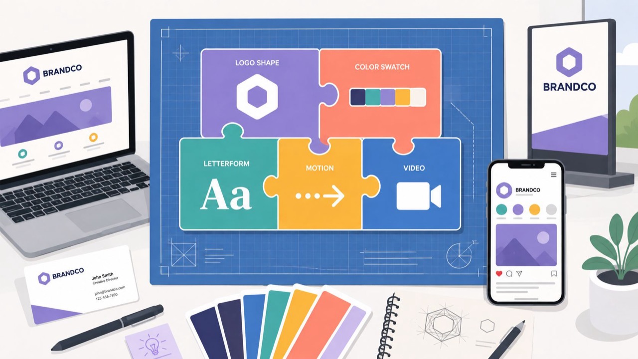
Corporate identity design is the coordinated system that keeps a company looking and sounding like itself everywhere it appears. The logo is one part of that system. The rest is color, type, imagery, motion, voice, and the written rules that hold those parts in place when ten different people touch the brand in a single week.
I co-founded Moonb, a creative studio, and most identity problems clients bring us come down to consistency. A company has a workable logo and nothing built around it, so the homepage and the pitch deck read like they came from two different businesses. When the system is strong, the brand stays recognizable even when a marketer, a partner, and a new hire all produce work in the same month.
What corporate identity design actually is
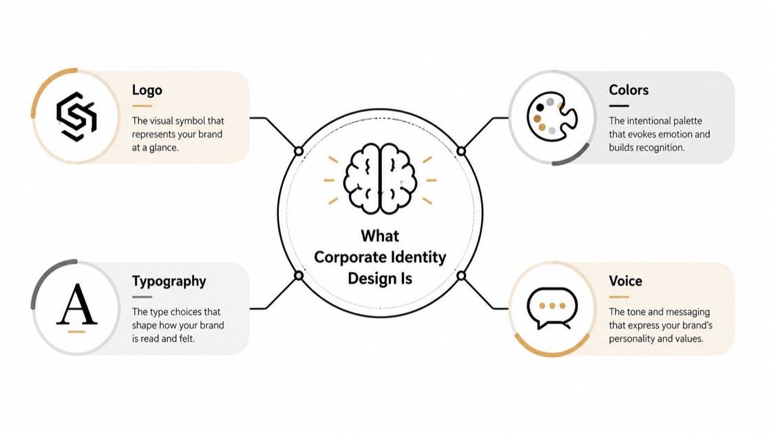
Corporate identity design is the visual and verbal system a company uses to present a recognizable face across every place it shows up, from a product screen to a trade-show wall. A logo is a single asset. An identity is the operating system around it, including the rules that decide how that asset behaves in each context.
The idea has a history worth knowing. The University of Essex traces corporate identity, as a distinct communication concept, to around the 1960s, when it was tied closely to corporate visual design (University of Essex). The discipline matured through the mid-20th century, when large organizations needed to look consistent across new media and new countries. That pressure produced the first real standards manuals, the documents that governed how a mark appeared in every application. The programs people still study, IBM under Paul Rand and NASA’s Graphics Standards Manual among them, came out of that period.
The components, and who owns each one
A corporate identity system works when every part has a clear rule and a clear owner. A logo cannot carry that load by itself. The software company Templafy frames the visual side as logo, color, typography, imagery, tone of voice, and brand guidelines, which is a useful checklist when you commission or review the work (Templafy).
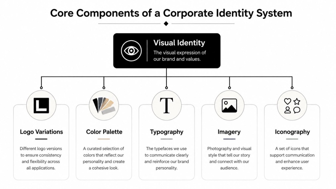
Here is how I map the parts, and who tends to be responsible for each in a working team.
| Element | The rule it needs | Who usually owns it |
|---|---|---|
| Logo and its variations | Primary, stacked, horizontal, and small-use versions, with clear-space rules | Design lead |
| Color | Exact values for screen and print, and where each one is allowed | Design lead |
| Typography | Primary and secondary faces, plus hierarchy and web fallbacks | Design lead |
| Imagery and iconography | Subject matter, crop, contrast, and a shared line weight | Art director |
| Motion | How the mark and type behave in video and product | Motion designer |
| Voice and tone | How the brand sounds in a headline versus an error message | Content lead |
The owner column matters more than it looks. A rule with no owner is a suggestion. If a color value lives in a PDF that no one maintains, it stops being true the first time someone builds a slide under deadline.
How to build one, in order
The fastest way to waste money on identity work is to start with logo sketches. Strategy comes first. If the positioning is fuzzy, the design will decorate that fuzziness at scale.
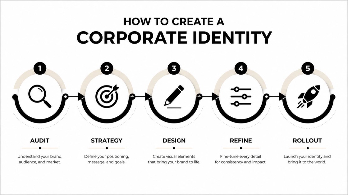
Start with an audit. Look at what the brand uses today and where it actually shows up, then line that against the competitor set. This usually surfaces the gap between what leadership thinks exists and what teams are really using. A structured brand audit gives you a review list so nothing gets missed.
Then define the position. Decide what the company stands for and how it should feel before anyone opens a design tool. Clear brand positioning makes the later design choices easier to settle, because you can test each option against something fixed instead of against opinion.
Concept work comes next, where a few directions get pressure-tested against the strategy. Only after that does the full system get designed. The part teams underestimate is the last one, guidelines and rollout. That is where the operating value sits, because the system has to survive handoffs and repeated use by people who were not in the room when it was made.
Do you need a full system, or just a logo
Not every business needs a full system on day one. A solo project or a pre-launch idea that one person controls can move forward with a clean logo, a small palette, and a type choice that stays out of the way. A documented system earns its cost once the brand is no longer controlled by one person.
Identity works because of how people’s minds file brands away. Dan Cobley’s TED talk borrows from physics to explain why those associations behave the way they do.
Here is the decision I walk clients through.
| Level | What it covers | Right for | What breaks if you stop here |
|---|---|---|---|
| Logo only | A primary mark and one or two colors | A test or a pre-launch idea that one person controls | The moment a second person makes a slide, nothing tells them what to do |
| Visual identity kit | Logo set, palette, type, and basic usage notes | A small team shipping a site and a few channels | Motion and voice get improvised, and edge cases have no answer |
| Full corporate identity system | Marks, color, type, imagery, motion, voice, and layout, plus documented rules and named owners | A brand touched by many hands across many channels | Very little breaks, because the rules travel and someone owns them |
The trigger is the number of hands on the brand, not the size of the company. Once people outside the founding team are producing decks and ads, the question stops being whether the identity looks nice and becomes whether someone who was not in the room can apply it correctly. If a new hire needs three follow-up questions to use the logo, the system is not finished. Cost scales with that scope, and I have broken down the ranges separately in how much branding costs.
Examples worth studying
The strongest identity systems keep working when the brand is used again and again by different people under different pressures. That behavior is what to study in the famous marks. The mark itself is the least transferable part.
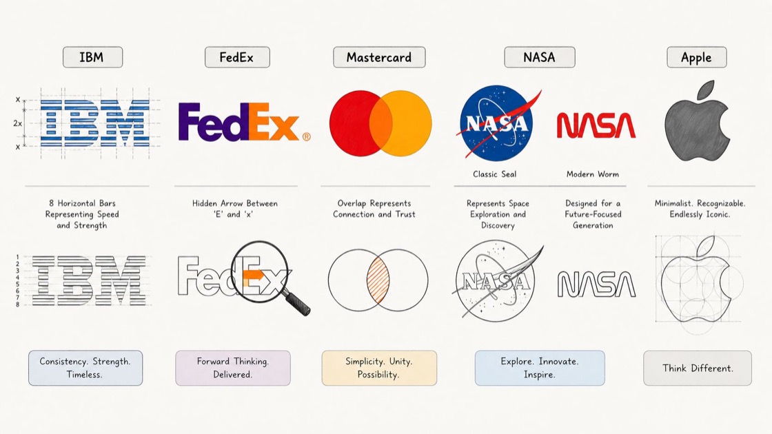
IBM is the clearest case for discipline. The Paul Rand system stayed coherent across decades because the same rules were respected on everything from packaging to annual reports. The lesson is that consistency is a management decision more than a design one.
FedEx works because the wordmark reads fast, and the arrow hidden between the E and the x rewards a second look without making the mark fussy. A clever detail is fine as long as it survives real production at small sizes.
Coca-Cola shows what long-term consistency does for recognition. The Spencerian script has stayed recognizable for well over a century, and that steadiness is a large part of why the brand reads as dependable. Copy the discipline behind it, not the style itself.
Mastercard is simplification done with control. In 2019 the company removed its name from the logo and kept the two interlocking circles, which only works because the surrounding system was strong enough to carry the meaning. A reduced mark can still support a large brand when the rules around it are clear.
NASA is worth studying in two forms, the classic seal and the modern worm logotype from 1975. One organization can run different marks for different contexts as long as the system stays legible and intentional. That flexibility is exactly what a rebrand has to plan for, because most identity change is about managing two expressions at once rather than flipping a switch.
Apple and Google show coherence across huge product ranges. The lesson is coherence itself. A large ecosystem needs clear visual logic so people never feel lost moving from one surface to the next, no matter how many products sit under the brand.
The common thread is governance. Each system survives because someone decided what can change and what cannot, then held that line across teams and vendors. Smaller teams tend to skip that decision, then pay for it later in cleanup.
The mistakes I see most
The failure I see most is inconsistency that compounds. A team starts with a good mark, then every channel bends it a little. The homepage uses one blue while sales picks another, and a stretched logo turns up on social. The brand slowly loses its shape.
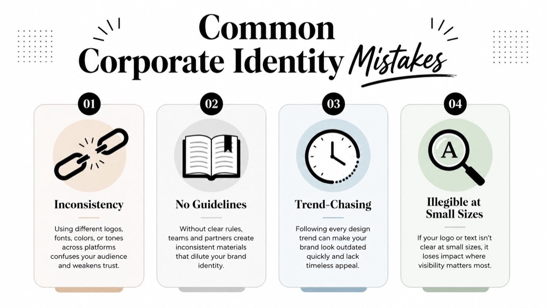
You fix that with documentation. Give people approved files and clear examples of right and wrong application so nobody has to guess.
Trend-chasing is the next trap. If every refresh follows the current style wave, the identity can feel dated before the year is out. Anchor the choices in strategy so the system outlasts one season’s look.
Illegibility at small sizes is a real production failure. Test every mark in one color and at favicon scale, on both dark and light backgrounds. If it disappears, simplify it.
No maintenance plan is the hidden cost. New hires and new channels keep appearing after launch, so a system with no owner comes apart on its own. A short review each year keeps it whole.
Who should build and maintain this
There are a few routes, and the right one depends on how often the brand needs new work. You can hire in-house, or bring in a studio for a one-time build. The third route, and the model I run at Moonb, is an embedded creative team that maintains the identity and produces on-brand work every week. That model helps most when the brand now lives in motion and product, where the rules are easy to break and someone has to hold them.
A strong identity is really a system maintained for decades. This CNBC breakdown of Coca-Cola shows what that kind of long-term stewardship looks like in practice.
Whatever route you pick, staff it realistically. Identity work needs a strategist and a designer at minimum, plus someone who owns how the brand moves, so it is rarely a single salary. As a rough market anchor, the US Bureau of Labor Statistics put the median wage for graphic designers at $61,300 in May 2024, with the top ten percent above $103,030 (BLS). If ongoing output is the real need, creative design services is the model to compare against a full-time hire, because it keeps the same people on your brand without adding fixed headcount.
If your company is crossing from “we have a logo” into “we need every channel to feel like one brand,” spend a week auditing where the identity shows up today. Then brief a real system rather than a single mark. The logo is the easy part. The system is what keeps the brand recognizable after it leaves your hands.
Further reading: The postwar history of corporate identity design, small business branding guide, rollout tips for brand guidelines.
Frequently asked questions
A brand is how people perceive your company, built from every experience they have with it. Corporate identity is the system you control to shape that perception, meaning the marks and the rules that govern how they are used everywhere. You design the identity, and over time it influences the brand. One is the impression, the other is the deliberate work you do to steer it.
A basic visual kit can come together in a few weeks. A full documented system, running from strategy through applications and guidelines, usually takes a few months. The rollout across teams often takes longer than the design work itself, and rushing the guidelines is where most systems break down later. Plan the handoff, not just the reveal.
Keep applications and templates current all the time, but treat the core marks and rules as long-lived. A full rebrand should follow a real business change (a merger or a name change, for example), not a passing design trend. A light review once a year keeps the system usable without forcing an overhaul nobody asked for.



