21 Digital Marketing Video Ad Examples Worth Studying
Twenty-one digital marketing video ads worth studying, with a maker's teardown of the one craft choice behind each, from Dumb Ways to Die to Moldy Whopper.

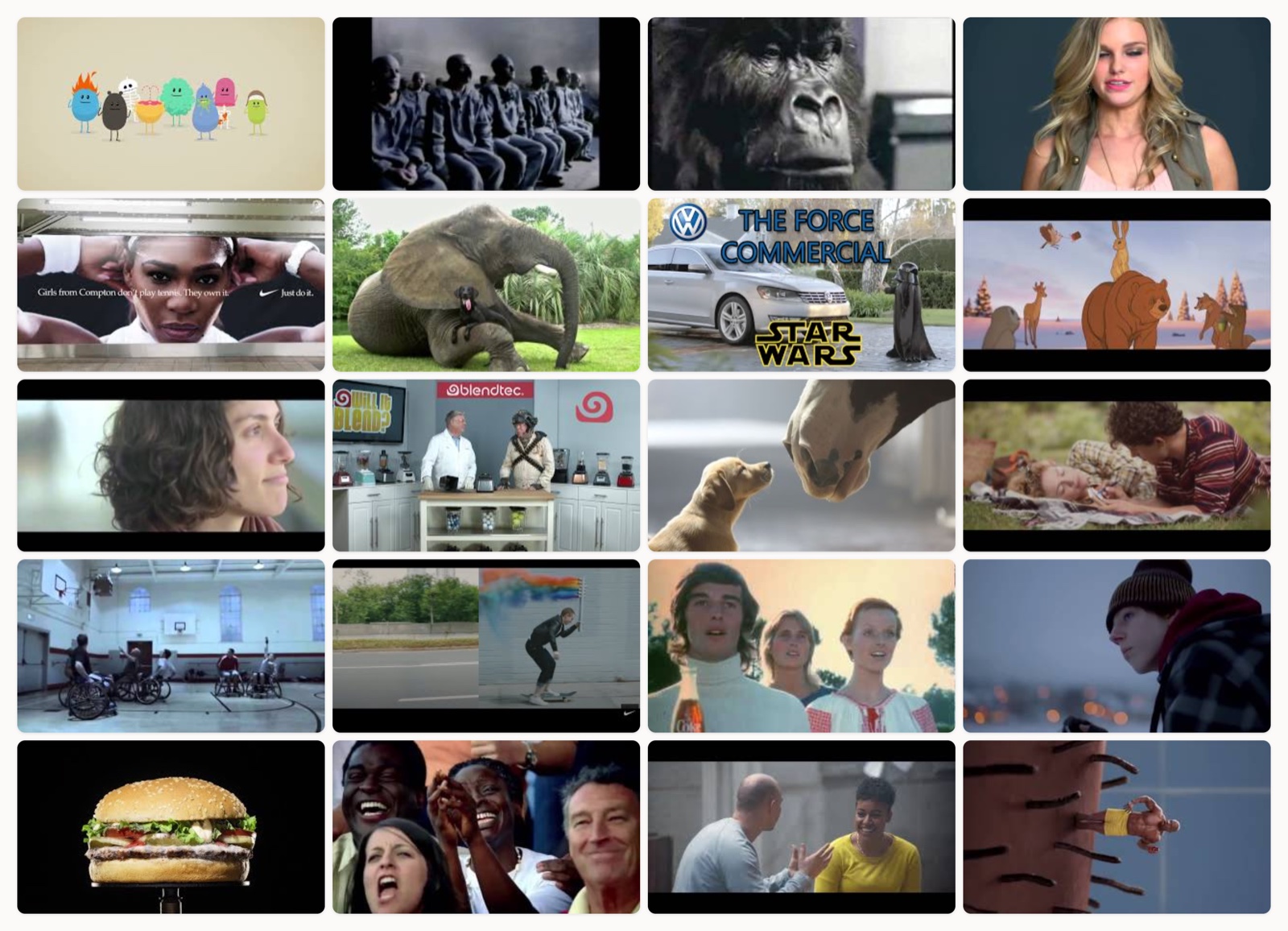
I have sat through more marketing videos than I can count, and most of them are gone from my memory before the last frame fades. The ads on this page stuck. They are the ones I pull up when a client asks what “good” actually looks like, because each solves a specific creative problem in a way you can point at and learn from. Every pick here does one thing so well that it is worth studying on its own terms.
When I watch an ad as a maker instead of a viewer, I am looking for a few things. Does it earn attention in the first few seconds without shouting? Does the idea hold up if you strip the logo off the end? Is the craft in service of a feeling, or is it decoration? The strongest work answers yes to all three, and it tends to look effortless because the decisions underneath were hard. If you want the deeper version of that argument, my breakdown of storytelling ads goes further into why narrative beats a feature list.
How I picked these
I skipped anything that only worked because of a giant media spend behind it. What I wanted were ads where the idea and the execution do the heavy lifting, the kind of thing a small team could study even without a Super Bowl slot. Some of these are thirty years old and some are recent. A few come from brands you would expect, and a few will surprise you. I ordered them to keep you moving, not to rank them.
Metro Trains, a safety PSA turned earworm
The song does the persuading. It spends most of its runtime being cheerfully absurd, cartoon blobs dying in ridiculous ways set to a tune you cannot shake, so by the time the actual rail-safety line arrives you have already dropped your guard and laughed. Public-service work usually lectures. This one earns the lesson by being fun first and instructive second. The detail I keep coming back to is the melody itself, written as a genuine pop hook rather than a jingle, which is why people voluntarily replayed it thousands of times and taught it to each other.
Apple, a dystopian launch spot
There is almost no product in it. Ridley Scott shoots a grey conformist dystopia, a runner hurls a hammer through the screen, and the copy promises the Macintosh will keep 1984 from being “1984.” The confidence is the whole move. Apple sold a feeling of rebellion and trusted you to connect it to a computer you had not seen. Most launch films over-explain. This one under-explains on purpose and lets the myth carry the weight. Look at the colour grade too: the drones are drained to near monochrome while the runner arrives in saturated red and white, so your eye picks the side before the copy ever spells it out.
Cadbury, a mood film with no product until the end
A gorilla sits in soft light for ninety seconds, waits out the Phil Collins intro, and then plays the drum fill. That is the entire ad. It works because it commits fully to tension and release with zero interest in explaining chocolate to you. The payoff lands only because the build was patient enough to make you lean in. Watch the eyebrow twitch right before the drums hit. That single bit of animatronic acting is what turns a stunt into a moment, because it tells you the release is coming a half-second before it does.
Always, a social experiment that reframes an insult
The structure is the argument. It asks adults to run “like a girl,” films the mocking version, then asks young girls the same thing and films them sprinting with everything they have. Laying the two on top of each other does more than any slogan could. The brand barely appears, and it does not need to, because the reframe is the product. The casting of the older performers matters here: they are not villains, they are ordinary people who absorbed the insult without noticing, which is exactly what makes the correction land instead of scold.
Nike, a voiceover hero film with nerve
Colin Kaepernick narrates over a montage of athletes chasing improbable goals, and the film stakes out a clear moral position instead of hedging. The edit keeps escalating the stakes until the “believe in something” line feels earned rather than pasted on. What I take from it is the nerve. It picks a point of view and refuses to soften it for the room. The quiet craft move is putting Kaepernick’s own face last, held in tight close-up, so the abstract montage collapses into one specific person taking one specific risk.
Android, a shareable montage engineered to travel
A dog naps on a horse, a parrot rides a dog, and it keeps stacking unlikely-friendship clips against the “be together, not the same” line. It was built to be passed around, and it became one of the most-shared ads of its year for a reason that is easy to miss. The brand idea and the content are the same thing. The message is togetherness and every clip literally shows it. The pacing is the underrated part: each pairing gets just enough screen time to register as “aww” and then cuts before you tire of it, which is what keeps you watching to the end.
Volkswagen, a comedy built on one reveal
A tiny kid in a Darth Vader costume tries to use the Force on everything in the house and nothing happens, until the car roars to life at his gesture. Dad is off camera with a remote key. The whole ad exists to set up that one beat, and it spends its runtime earning it through the kid’s mounting frustration. Restraint is the craft here. No dialogue, one payoff, done. The kid’s body language sells it, because the little arm-thrusts get more desperate each time, so the win feels like relief rather than a gag.
John Lewis, an animated Christmas parable
A hare who cannot hibernate gives a sleeping bear an alarm clock so he can experience Christmas morning for the first time. It is a gift-giving story told without a word of dialogue, with a gentle cover song carrying the emotion the animation sets up. The score is doing enormous work here. Music is a story tool, never just background. The animation style earns a mention too, hand-drawn 2D warmth deliberately chosen over slick 3D, because the roughness reads as handmade and handmade reads as heartfelt.
Dove, a hidden-camera experiment
A forensic artist draws each woman twice, once from her own description and once from a stranger’s, and the stranger’s version is always kinder. The gap between the two sketches is the whole insight, and because it plays out in real time on real faces, it never feels engineered into a message. The format found the truth instead of asserting it. The choice to keep the artist behind a curtain, unable to see his subjects, is what makes the exercise feel like evidence rather than a setup.
Blendtec, a product demo as spectacle
A founder in a lab coat drops an iPhone into a blender and grinds it to black dust, purely to prove the machine is powerful. It is a functional demo dressed as a stunt, and that framing is why people choose to watch a spec claim. The lesson is easy to apply. Find the most dramatic possible way to show what your thing does, then show it. The deadpan delivery is doing quiet work, because playing a violent stunt completely straight is funnier and more convincing than winking at the camera would be.
Budweiser, an animal narrative that plays like a short film
A puppy keeps escaping to befriend the Clydesdale horses next door, and the horses eventually block a road to bring the runaway home. There is barely a beer in it. Budweiser bet the whole spot on friendship-and-separation stakes and let the brand heritage carry the logo, which is why it reads like a short film rather than a commercial. Those Clydesdales are decades of brand equity standing in a field, so the brand gets to be present and invisible at the same time.
Extra Gum, a love story with the product as the thread
A relationship unfolds across years, and the gum wrappers he sketches on become the throughline, shown at the end as a gallery of their moments. The product sits in almost every scene without ever becoming the point. That is the hard trick, making a mundane object carry emotional weight by letting it recur instead of selling it. The wrapper sketches are planted so lightly in the early scenes that you barely clock them, which is exactly why the gallery reveal hits when they all reappear at once.
Guinness, a twist that rewards your attention
A group of men play an intense wheelchair basketball game, and at the final whistle all but one stand up and walk out, revealing they play in chairs so their friend never plays alone. The reveal recontextualizes everything you assumed about who these guys are. It rewards you for paying attention, which is a rare and generous thing for an ad to do. The game footage is shot as straight sport, sweaty and competitive, so the film never tips its hand until the men rise from the chairs.
Nike, split-screen match cuts as the whole idea
Thirty-six pairs of clips are split down the middle and matched so precisely that two different athletes, in different sports and eras, appear to move as one body across the seam. The editing is not decoration, it is the argument that sport connects us even when we are apart. This is a case where the craft itself is the concept, and pulling it off took obsessive frame-matching. The team reportedly sifted through thousands of archive clips to find pairs whose limbs and momentum lined up on the exact frame, which is why the seam disappears.
Coca-Cola, an anthem that outlived the ad
A hillside of people from everywhere sing a wish for harmony while holding a Coke. It is almost aggressively simple, and it works by fusing the brand to a feeling rather than a benefit. The song outlived the ad, which is the whole ambition of this kind of work. Leave something behind that people carry around without the logo attached. The tune was reworked into a standalone pop single that charted on its own, which is about the clearest proof there is that a jingle became culture.
Apple, a holiday story built on a late reveal
A teenager seems glued to his phone through the family holiday, ignoring everyone, until the reveal shows he was filming and editing a family video the whole time. The ad withholds the twist so the ending reframes his behavior from rude to loving. It is a small, patient piece of misdirection, and it sells the product by showing what someone made with it rather than what it does. The home movie he plays back is shot on the phone itself, so the product demo and the emotional payoff are the same forty seconds of footage.
Burger King, a provocative visual that dramatizes a claim
A Whopper decays in time-lapse over 34 days until it is furred with mould, purely to prove the burger carries no artificial preservatives. Showing your own product rotting is an unusually risky idea, and that is exactly why it cut through. The claim that real food spoils is dramatized in the most unappetizing, unforgettable way possible, which took real nerve to approve. The time-lapse is scored and lit like a nature documentary, slow and almost beautiful, which is what stops it reading as disgusting and starts it reading as proof.
P&G, an emotional montage tied to one relationship
It follows several mothers doing the unseen work behind their kids’ athletic careers, the early mornings and the endless loads of laundry, then lands on the Olympic stage. P&G ties a sprawling product portfolio to one universal relationship instead of any single item. The thesis that mothers do the hardest job is simple, and the montage earns it by showing the labor before the payoff. The film deliberately holds on the mundane repetition, the same drive to practice done over and over, so the Olympic finish feels like the sum of ten thousand small mornings.
Heineken, a social experiment on real tension
Strangers with opposing beliefs build furniture together, then discover via video how much they disagree, then choose whether to talk it out over a beer. The tension holds because the people are not actors and the disagreement is not staged. It is a brave format for a beer brand, and the product shows up only as the thing that keeps the conversation going. The shared task comes first for a reason, because by the time each pair learns how far apart they are, they have already built something together, and the film is betting that the labor buys enough goodwill to stay in the room.
Old Spice, absurdist comedy carried by one performer
Terry Crews yells, flexes, and detonates through a barrage of non-sequiturs at a pace that never lets you settle. The whole thing runs on one performer’s manic charisma, and it commits to the bit so hard that the absurdity becomes the brand voice. Comedy this loud only works if you never blink, and Old Spice never does. The muscle sound effects were done in-camera by Crews flexing against contact mics, which is the kind of committed silliness that makes the whole thing feel handmade rather than post-produced.
Nike, a montage that reclaims a loaded word
Serena Williams narrates a montage of female athletes being called “crazy” for showing emotion or ambition, then turns the word back into a dare. It takes an insult aimed at women in sport and hands it back as the rallying cry. Same house voice as Dream Crazy, but the move of owning the word is what gives it its edge. The escalation is the craft, because the film starts with small slights and builds to footage of women winning at the highest level, so “crazy” flips from accusation to badge across the runtime.
What the best ones share
Look back across these twenty-one and the same handful of patterns keep surfacing.
The product shows up late, or barely at all. Gorilla, 1984, Puppy Love, and The Bear and the Hare all withhold the thing they are selling. They earn a feeling first and attach the brand second.
One idea, executed completely. None of these hedge. Dumb Ways to Die is a song. You Can’t Stop Us is a match cut. The Force is a single reveal. Each picks one move and rides it all the way.
Sound carries the emotion. The John Lewis cover song, the Cadbury drum build, the Coca-Cola anthem. In this work music is the story, not the wallpaper behind it.
The idea survives without the logo. Strip the brand off Real Beauty Sketches or #LikeAGirl and you still have something worth watching. That is the real test, and it overlaps with everything I flagged in my roundup of the best video ads.
And nerve. The Moldy Whopper, Dream Crazy, and Worlds Apart all risked something real. Safe work is forgettable work.
How to get this right
If you are making one of these rather than admiring them, a few principles travel.
Start with a feeling, not a feature. Every ad above knows what it wants you to feel before it knows what it wants to show. Write that down first.
Give the idea room. Most of these run longer than a standard cutdown because the payoff needs a build. If your concept only works at fifteen seconds, it is probably a message, not a story.
Protect the one move. The fastest way to ruin work like this is to bolt on a second idea to hedge the first. Pick the strongest one and cut everything that competes with it.
Cast the craft to the idea. A match cut, a cover song, a hidden camera. The technique should be the argument itself, not a flourish stapled on at the end.
Make peace with risk. None of the memorable work here was safe. If your ad could belong to any brand in your category, it will be forgotten like most of them are.
Where this leaves you
Most of these came from teams with time and taste, working alongside people who could tell an idea from a decoration. That is the part no template hands you. If you are trying to make video that people remember rather than scroll past, the constraint is rarely the camera or the line item. It is having someone in the room who knows which of your three concepts is the real one. That is the work I care most about at Moonb, and it is why a list like this is worth studying before you brief anything.
Frequently asked questions
One clear idea, executed completely, that earns a feeling before it shows the product. The most effective ads pick a single creative move, a song, a reveal, a real experiment, and commit to it, so the brand attaches to an emotion the viewer actually felt rather than a feature they were told about.
Long enough for the payoff to land and no longer. Story-driven spots like Puppy Love or The Bear and the Hare run 60 to 90 seconds because the build needs room, while a demo or a single-joke concept can work in under 30. If your idea only holds for fifteen seconds, it is a message, not a story, and you should cut it tight.
Emotion-led brand films tend to travel furthest for awareness, because people share how a piece made them feel more than what it advertised. Montage, music, and social-experiment formats all work well here, and the common thread is that the idea stays memorable even with the logo stripped off the end.



