Animated explainer videos: 12 examples across 8 styles
Twelve real animated explainer videos from 2023 to 2026, grouped by style, from Deel's 2D vector overview to ASML's 3D machine and Attio's kinetic type.

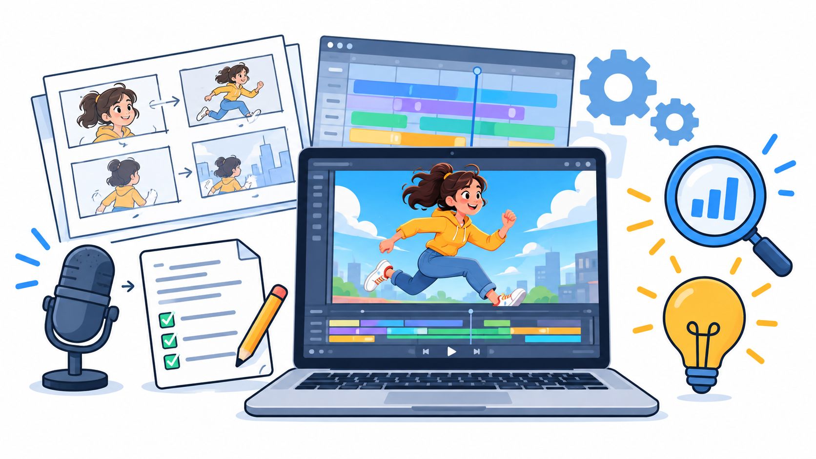
An animated explainer video is a short film, usually one to two minutes, that uses illustration, characters, motion graphics, 3D or animated product screens to make one idea about a product easy to picture. All twelve below come from the brands’ own YouTube channels, 2023 to 2026, grouped by animation style.
I co-founded Moonb, and the people who come to us for an explainer have usually settled “what should it say”. Where they get stuck is “what should it look like”, because nobody has given them words for the visuals. The quickest fix I know is a real video they can point at and call “that one”, so each style below has one or two recent ones (years are YouTube upload dates). The famous older explainers are in our 31 explainer video examples.
The 12 at a glance
| # | Brand | Product | Style | Year | Length | What to notice |
|---|---|---|---|---|---|---|
| 1 | Deel | Global payroll, HR and hiring platform | 2D vector | 2023 | 1:43 | Puts “global HR” on a map |
| 2 | Coinbase | Crypto exchange (education series) | 2D vector | 2023 | 2:10 | New ideas set next to familiar ones |
| 3 | Klarna | Pay now, pay later or finance at checkout | Character | 2025 | 1:22 | Company history with cartoon villains |
| 4 | Octopus Energy | Energy supplier and home solar installer | Character, with some live footage | 2023 | 3:05 | Teaches first, sells in the description |
| 5 | Plaid | Connects bank accounts to apps | Motion graphics | 2025 | 1:00 | An invisible connection as two people and a bridge |
| 6 | Spotify for Artists | Showcase, a campaign tool for promoting releases | Motion graphics | 2023 | 2:04 | Sells reach with barely a number |
| 7 | Lemonade | Renters, pet and car insurance | Hand-drawn line art | 2024 | 1:21 | Gray lines, pink on anything covered |
| 8 | ASML | High NA EUV lithography machine | 3D product visualization | 2024 | 1:39 | A machine almost nobody will see in person |
| 9 | Boston Scientific | WATCHMAN FLX Pro heart implant | 3D product visualization | 2025 | 1:07 | An implant no camera could film at work |
| 10 | Too Good To Go | Surplus food platform for retailers | Hybrid | 2024 | 1:51 | Presenter for trust, animation for the workflow |
| 11 | Todoist | Task manager | Product demo animation | 2024 | 1:56 | Doodles first, then the real interface |
| 12 | Attio | Ask Attio, an AI layer for its CRM | Kinetic typography | 2026 | 0:47 | A few words on black, cut like a trailer |
Nine of the twelve run under two minutes. The median is about a minute and forty, a little long for my taste, since on a product page I aim for 60 to 90 seconds. Octopus Energy’s 3:05 would be far too long there, but it’s a lesson for kids, so I let it go. Where the video lives changes the answer, and I went through that placement by placement, from a homepage hero down to a 15-second social cut, in how long an explainer video should be.
2D vector animation
Flat color, clean shapes, icons, illustrated scenes. For systems and processes it’s usually the right call, since photorealism would only add detail. Nothing is easier to update, either. A changed feature means somebody redraws an icon. Our 2D explainer videos roundup has 22 more like the two below.
1. Deel, “Deel Overview” (2023)
Global payroll, HR and hiring is about as abstract as B2B software gets. Deel sums its product up as simplifying “global team management, payments, and HR”, and “Hire anywhere” is hard to picture as a phrase, so the video puts it on a flat green world map with one pink marker. You get it instantly.
After the map comes a row of integration logos above a stylized Deel dashboard and a grid of app tiles. I like that the dashboard is simplified, because it stays readable on a phone and won’t date every time Deel changes the real interface.
2. Coinbase, “What is Cryptocurrency” (2023)
The concepts underneath Coinbase’s crypto exchange get their own series, Crypto University, and this episode is mostly comparison, the old teaching trick of holding a new idea next to one you already know. You see crypto coins set against a stack of banknotes with a big “VS” between them, a decentralized network diagram next to a centralized bank building, and a numbered point reading “Secure and Transparent”. It’s flat and bright on a blue background, which suits the trick, since the coins and the banknotes get drawn in the same style.
Character animation
Characters give the viewer someone to follow. However abstract the product, people will watch a cartoon hit a problem and work toward a fix. No other style carries tone as well, which is why I’m careful with it in healthcare or finance, where a playful cast can undercut a serious message if the writing slips.
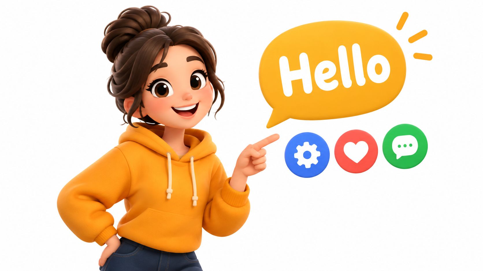
Give a character its own way of moving and reacting, and keep its proportions the same in every shot. The second video then costs less than the first, because the character already exists. Features pushed a little past realistic still read on a small screen. I wrote more on keeping a character from feeling generic in how to make a cartoon.
3. Klarna, “A brief history of online payments” (2025)
Plenty of companies say they want to make payments simpler. Klarna’s description says it entered online payments “20 years ago with a commitment to make it simpler and better for everyone”, and this film tells that origin story as a cartoon with villains. A gang of suited figures under the label “TheMob” stands in front of the word “STARTUP”, a rainbow scene follows, and later a parade of odd, colorful creatures marches under a Klarna banner.
By the end of its 82 seconds you’re rooting for one side, and the actual product (paying right away, paying later interest-free, financing a purchase over time) never comes up.
4. Octopus Energy, “How does solar energy work?” (2023)
This one gives character animation a different job. Octopus Energy is a UK energy supplier that also installs home solar, and the video belongs to a series its title tags “Educational Videos for kids”. Cartoon characters carry the science. An elderly physicist in front of a French flag is captioned as Edmond Becquerel discovering the effect of sunlight; later a child powers a toy Ferris wheel, and a few real shots of installers on a solar farm come in near the end.
Parents and teachers will sit through a cartoon about how solar energy works, which I doubt they’d do for an energy company’s ad. The selling happens in the description, which links straight to a home solar quote.
Motion graphics and data visualization
Motion graphics is type, numbers, charts, icons and transitions doing the explaining, and it’s what I reach for when the viewer has to follow a flow or compare two things. Our motion graphics explainer guide is about the scripting side, getting the voice and the screen to say the same thing. On screen, I want information arriving in steps with a beat to take in each piece, and any chart animation that doesn’t show what changed should go.
5. Plaid, “How Plaid Works” (2025)
Most of the people who use Plaid never see it. It connects bank accounts to the apps people use, and by its own count “more than half of Americans with a bank account have used Plaid to connect to an app or service”, so being invisible is the problem this video has to solve. It places a person’s portrait in a circle, orbits it with the logos of companies such as Chime, Adyen and H&R Block, then shows a second portrait with a Plaid mark sitting between them and arrows passing across.
If a nervous client wanted a single reference from this list, it’s probably the one I’d send. It runs a minute and never wanders past the connection itself. The real photos help too, putting people into what’s otherwise a data product, and Plaid’s pitch leans on trust and safety.
6. Spotify for Artists, “Showcase” (2023)
Showcase is a Spotify for Artists format for marketing music, now part of its display campaigns, and this was its launch explainer. It lets artists and their teams promote the releases they choose to the listeners they want to reach, on Spotify’s Home screen. Small interface cards float around a line of type against a purple gradient, abstract 3D shards break apart, and a pie chart turns up under the line “And this is just a small slice”.
It sells reach to musicians and barely asks them to read a number. Most of the interface cards are cut down to a thumbnail and a couple of gray bars, so the idea of a release turning up in lots of listeners’ feeds gets across before anyone opens a menu. I could live without the 3D shards, though.
Whiteboard and hand-drawn animation
Old-school whiteboard animation shows a hand drawing the explanation as it goes. The modern version is cleaner, usually thin lines on white with no hand in sight, but you still feel walked through it. I like it for teaching and for categories people find tedious, and it’s a weak fit for premium hardware or anything that needs realistic texture.
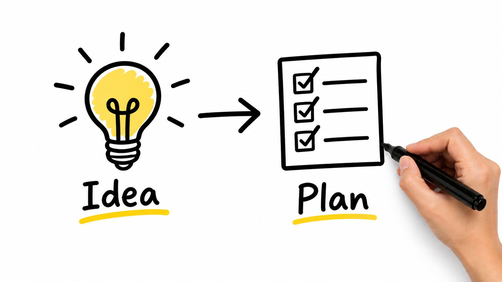
Simple, high-contrast drawing reads best. Before full animation starts I always time the whole thing as an animatic, because a slow explanation is expensive to fix late. These storyboard examples show how studios from Pixar to Blender Studio board a scene before that point.
7. Lemonade, “Lemonade Insurance, How It Works” (2024)
The description on Lemonade’s explainer opens with “Insurance can be complicated, slow, expensive, inconvenient, untrustworthy”, roughly how most people feel about buying renters, pet or car insurance (Lemonade sells all three, among other lines). The video is drawn mostly in thin gray lines, with pink as the only accent, and anything pink reads as “this is protected” without the voiceover having to say so. A living room has pink hotspot dots on the chair, the lamp and the laptop, the things a policy covers, and a person on a phone is surrounded by pink tags reading “Fast”, “Simple”, “Customizable” and “Lovable”.
3D animation and product visualization
I’m strictest about 3D, because a beautiful model can still leave the mechanism unclear. It can show depth, rotation, materials, internal structure and the way parts fit together, but every camera move should answer a question, and labels or voiceover should tell the viewer where to look.
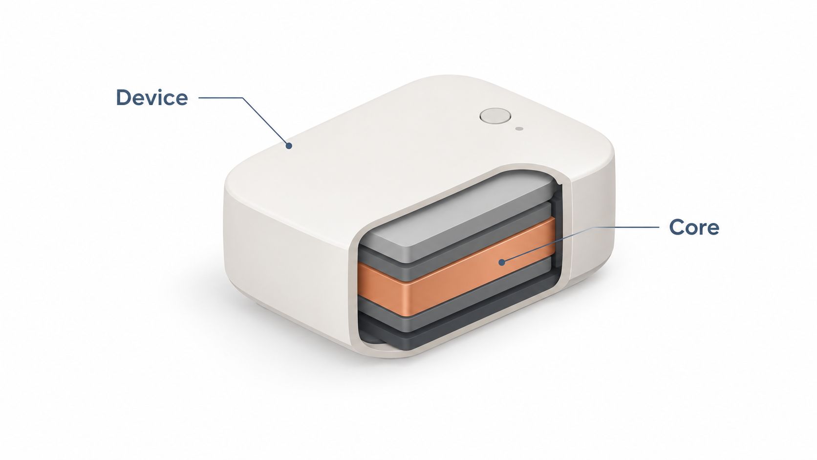
Models, materials, lighting, rendering and revisions all need planning, so the cost makes sense for products that are physical, complex, very expensive or impossible to film in use, especially when you need a view inside or the same product from several angles and in several variants. Mattresses have that problem, with the selling points inside where no camera can reach, and this guide to product video animation applies the same thinking to them.
8. ASML, “Unveiling High NA EUV” (2024)
Of all the 3D explainers I’ve collected, including the 22 in 3D explainer videos, this is the clearest case for the style. ASML builds the lithography machines chipmakers use to print circuits onto silicon, and almost nobody watching will ever stand next to one. What goes on inside happens at a scale no camera can capture, while a 3D camera can go in there and hold on a single number long enough for it to register.
This film introduces the High NA EUV platform, the TWINSCAN EXE, and it’s almost entirely 3D, from the machine’s interior rendered in cool metal to a glowing pink plasma sphere and a moving stage labeled “8 nm resolution”. ASML says the platform “improves imaging contrast by 40% (compared to NXE)”.
9. Boston Scientific, “WATCHMAN FLX Pro: Advancing LAAC for Larger Anatomies” (2025)
WATCHMAN FLX Pro is a Boston Scientific implant designed, in the company’s words, “to close the left atrial appendage in the heart in an effort to reduce the risk of stroke”. This short video, from the company’s EMEA channel, introduces a new 40mm size, new radiopaque markers and the coating technology mentioned in its write-up. The device appears as clean white renders under the line “Close with Confidence”, and a navy, purple and cyan chevron graphic sits between scenes.
Nobody is filming an implant inside a heart for a product video, so for a device like this 3D is the only real option. The renders let a clinician study the shape and the new markers from any angle, in about a minute.
Hybrid animation
Hybrid mixes two or more approaches, usually live action for human credibility and animation for whatever a camera can’t show. The risk is that it looks like two videos stitched together, so I settle palette, type, transitions and sound before production and keep them identical in both modes.
10. Too Good To Go, “Too Good To Go Platform” (2024)
Too Good To Go sells retailers what it calls “the simple end-to-end solution for retailers to manage surplus food”, and a retailer buying a food waste system wants to see a real person standing behind it. So there’s a presenter, facing the camera. The workflow itself happens on a scanner in a back room, and that’s where the animation takes over: a handheld device showing the app, set against Too Good To Go bags full of groceries, with a painted green swirl in the brand’s colors carrying you between scenes. Both halves keep the same palette the whole way through.
Screen recording and product demo animation
For software, the most convincing explainer is often just the actual interface (there are more software examples in our SaaS product demo video roundup). Staged or rebuilt, it stays readable on a phone, which a raw screen capture rarely does, and overlays, zooms, cursor moves and callouts make each step easy to follow. I push for one task per video and a short pause before each important click.
11. Todoist, “What is Todoist?” (2024)
Todoist calls itself “simple, yet powerful task management for individuals and teams alike”. The video sets up the problem with loose hand-drawn doodles of everyday chores, labeled things like “Water plants”, “Email photographer”, “Reply to texts” and “Do the dishes”. Then it cuts to the real product, a clean sidebar with “Add task”, “Search” and “Inbox”, surrounded by teammates’ avatars, and later a scatter of five-star review cards.
Because the doodles are messy and the interface is tidy, you get the argument from the change in drawing style before the voiceover makes it. The interface shots are big and uncluttered too, so those three sidebar controls stay legible.
Kinetic typography
In kinetic typography the words are the main visual. They move and change color on the beat of the music or the voice, and if there’s one phrase you want remembered, this is the style for it. It’s also the most likely to fall apart on a small screen. Each important word has to stay up long enough to read, and the biggest move should go on that one phrase.
12. Attio, “Introducing Ask Attio” (2026)
I think type is the right call for AI features in particular, since there’s nothing physical to show and one chat box looks a lot like another. Attio’s CRM got an AI layer, which the company described at launch as a way to “search, update, and create across your entire CRM by asking”, and the launch film is mostly words. Short phrases such as “creates signal” and “Universal Context” appear one at a time, white on black over a faint waveform, and then it cuts to a clean white end card with the Attio logo.
At 47 seconds it’s the shortest video on the list.
Picking a style, and what moves the price
Before anyone draws a frame, write down the one sentence the viewer should remember. The style comes after that, from what the viewer has to see. If that’s something invisible, like a process or a data flow, it’s usually 2D vector or motion graphics. A physical product that’s hard to film points to 3D, and characters come in when the story needs warmth or a point of view. When buyers mostly need to trust the people behind a service, go live action or hybrid, because a service built on people’s expertise tends to lose its best proof once it’s reduced to icons. Each option gets more room in explainer video types, and how to make an explainer video takes production from brief to final export.
Style also moves the price more than anything else. In my experience 3D and full character animation usually cost the most, kinetic type and simple 2D the least. After that it’s how much illustration gets drawn from scratch versus adapted, then voice talent and music, plus revision rounds and the number of cut-down versions. Length is what people tend to ask about, and it matters less than style does. Alexandra on our team wrote the guide to the cost of an explainer video, with ranges by production model. If you’re weighing generative tools for early drafts or rough animatics, this roundup of AI video generators compares the current options.
Frequently asked questions
A short film, usually one to two minutes, that uses illustration, characters, motion graphics, 3D or animated product screens to make one idea about a product easy to picture. The good ones stick to that one idea, like how a payment connects or what an implant does inside the body, and leave the rest of the feature list to the website and the sales call.
Work backward from what the viewer has to see. A process or a data flow that nobody can film usually suits 2D vector or motion graphics, a physical product that's hard to film is where 3D is worth what it costs, and characters help when the story needs warmth. If buyers mostly need to trust the people behind a service, live action or a hybrid of live action and animation will usually do better than any fully animated style. Since style moves the price more than anything else, it's also worth asking whether a simpler style would show the same thing.
Live action is the better choice for a clinic, a coach, a consultant or any service where buyers want to see who will actually help them. Seeing the actual people, and where they work, answers that faster than an illustrated metaphor can. Animation is the better tool when the thing can't be filmed at all (software logic, data moving between systems, the inside of a machine), and a product that needs both can go hybrid.



