12 carousel ad examples and what each swipe is for
Twelve documented carousel ads from 2023 to 2026, from Vitamasques and SEGA on TikTok to Sharpie and Aperol on Pinterest, with the card sequence and craft decision behind each, plus current specs per platform.

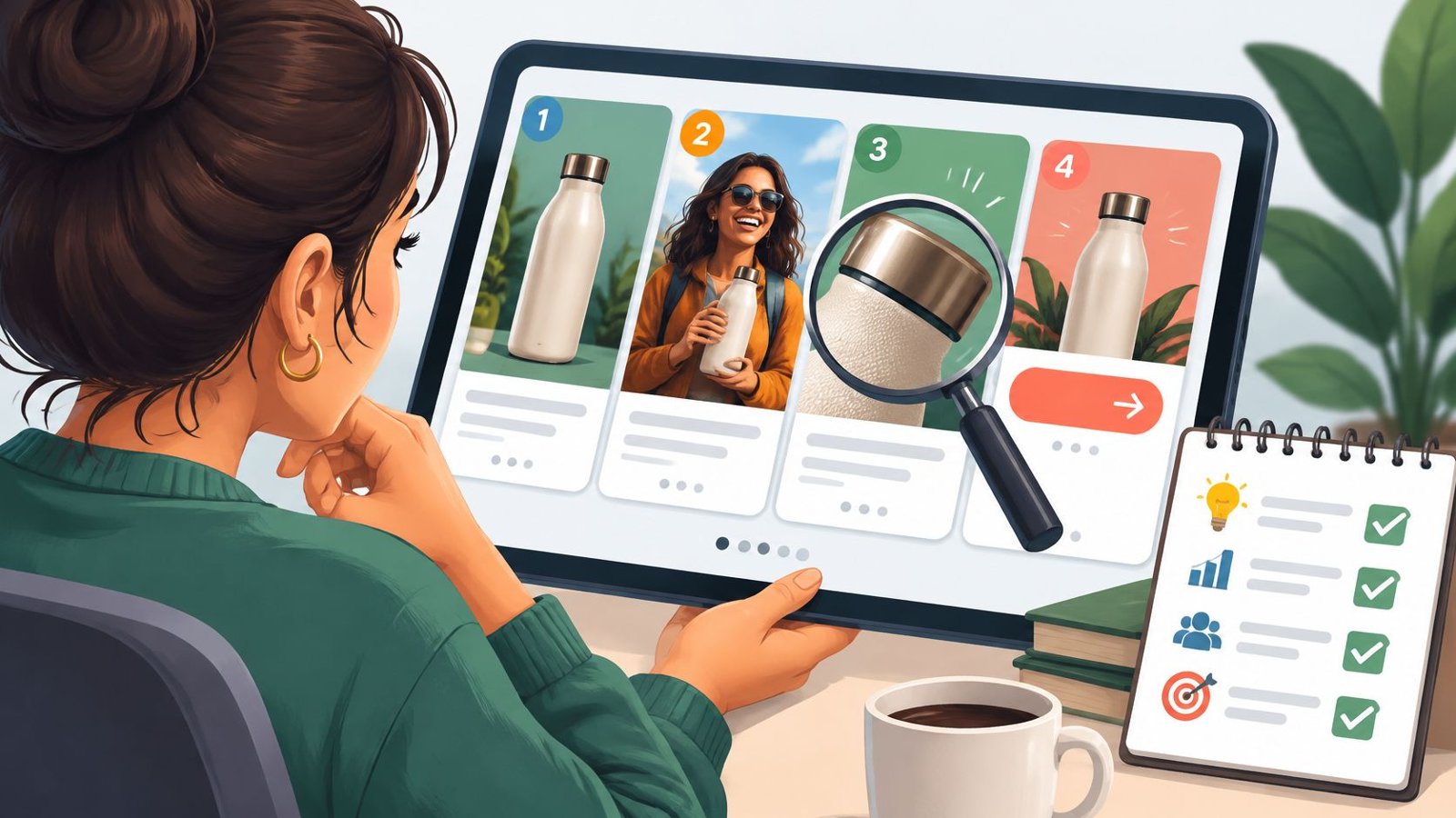
Vitamasques, Ello, New Look, Supré, SEGA, Tom Ford Fragrances and Alpro on the product side, and Wizz, Dhumy, Sharpie, Aperol and The Perfume Shop on the story side, are the twelve carousel ad examples I’d put in front of a paid social team today.
I’ve lost count of the carousel sets we’ve reviewed at Moonb, my creative studio, and the weak ones all go wrong the same way. Card one is lovely. Card two is card one with a different crop, and by card three nobody is swiping. The ads below get past that in different ways, and a few of them were built from photos the brand already had lying around, which is less glamorous than a fresh shoot and, I’d argue, more useful.
Every example comes from a case study the platform itself published between 2023 and 2026. TikTok and Pinterest are the two whose write-ups often say what was on the cards. The LinkedIn carousel stories I could read either predate 2021 or skip the cards entirely, and I found no recent Meta or X success stories that describe them. LinkedIn shows up in the specs table further down; Meta and X don’t, for reasons I explain there.
Product carousels: one ad, several things to buy
Each card in a product carousel should add a choice the previous card didn’t have: shade, size, flavor, title. Cards you could shuffle without losing anything add up to a catalog page, which is fine when the link goes to a catalog too.

1. Vitamasques: a new skincare lineup in one ad (TikTok, 2024)
Vitamasques’ in-house paid social team tried TikTok’s carousel format as soon as it launched. According to TikTok’s November 2024 case study the first goal was practical, “to minimize barriers to creative generation, allowing the use of existing image materials to produce many advertising creatives.” They wanted better performance from lighter production, and an ad that showcased “multiple SKUs within a single ad.”
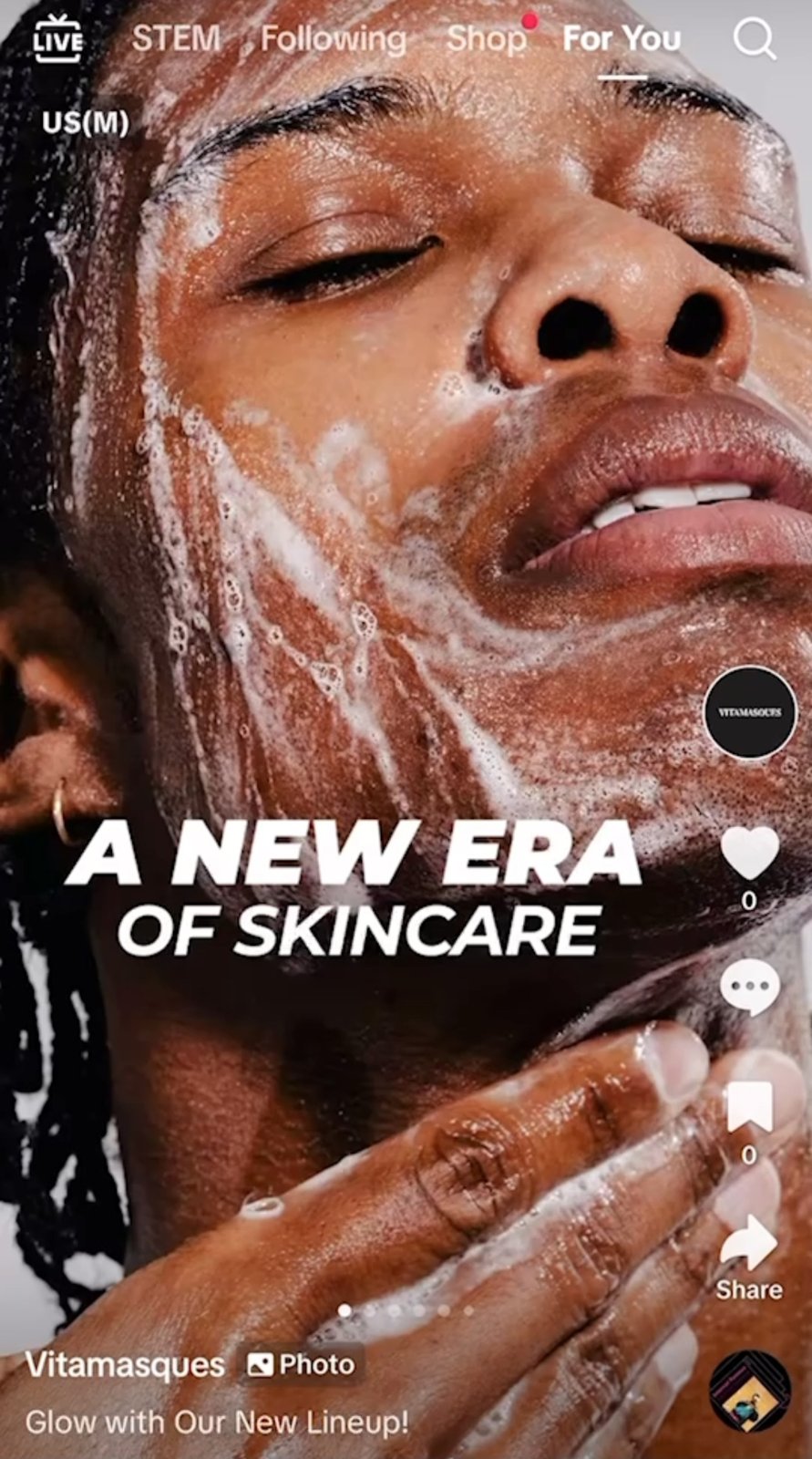
Card one is a big face, foam and “A NEW ERA OF SKINCARE” in heavy type, with the caption “Glow with Our New Lineup!” and a row of dots telling you there’s more. The lineup comes first and the individual products wait on the cards behind it, which is the right order when those cards are SKUs. TikTok puts the carousel’s CTR at twice that of video, and its conversion rate at roughly three times the average of TikTok video ads.
2. Ello: a kids’ water bottle in a template you could run all year (TikTok, 2024)
Ello wanted traffic for new product launches over the holidays, and built the carousels from image creatives it already had on Instagram. TikTok’s case study names the craft choice outright: “the use of cartoon-style images, along with maintaining template consistency and layout uniformity.” The reported result was a 6x higher CTR during the holidays.
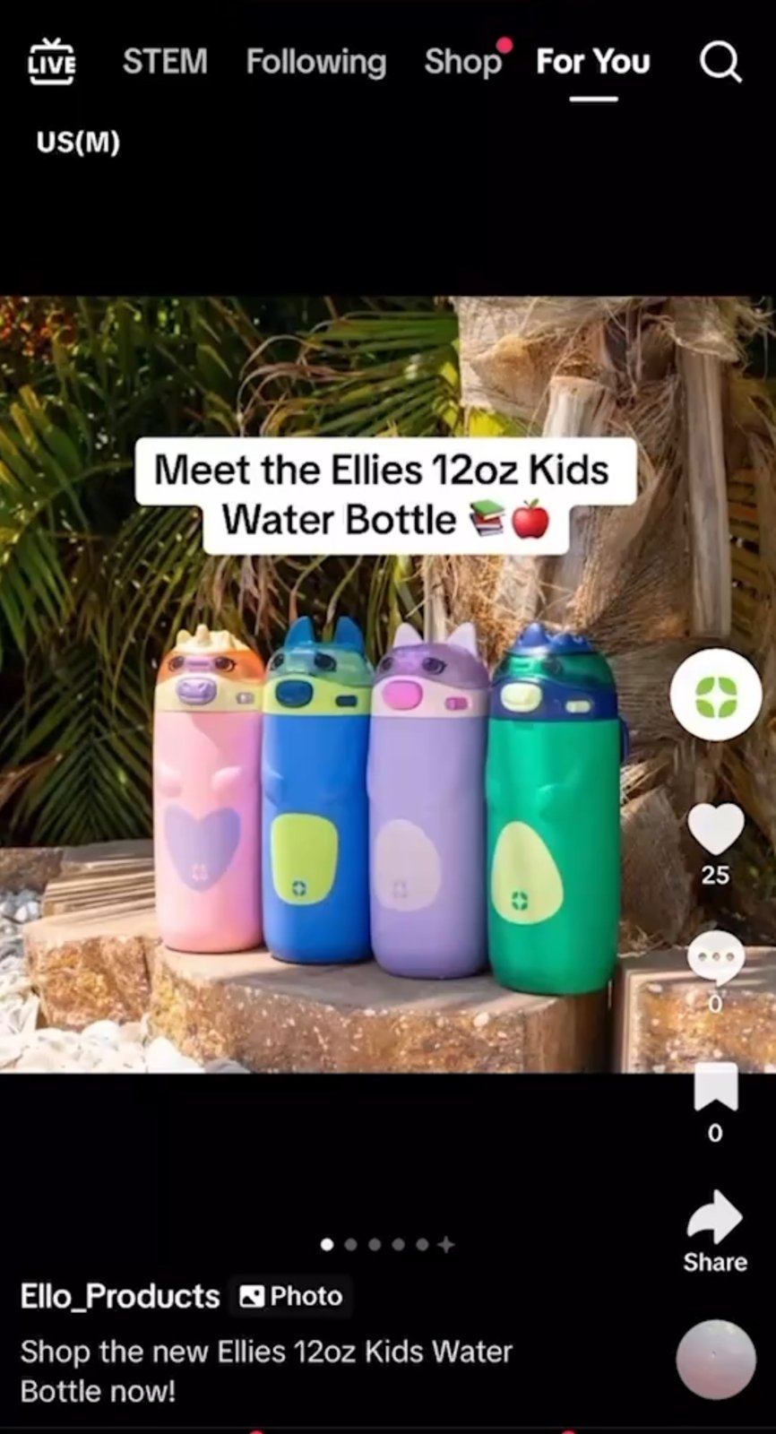
Four bottles in four colors on one step, a white label reading “Meet the Ellies 12oz Kids Water Bottle,” and a caption that repeats the product name. Someone who only ever sees this card knows what the product is and how big it is.
3. New Look: a video opener with a product shelf behind it (TikTok, 2025)
New Look ran an A/B test inside TikTok Catalog Ads. The control was video only. The test opened with “an initial attention-grabbing video” and followed it with “a product carousel allowing interactive browsing of multiple items, each linking to product pages.” Products were pulled from the catalog based on each person’s activity on the site.

I’d copy this structure for any fashion retailer with a decent product feed, with the video up front for mood and every card tapping through to its own product page. TikTok’s May 2025 write-up has the carousel-plus-video version beating video only by 61% on ROAS, 32% on conversion rate and 54% on CTR.
4. Supré: Luxe Essentials with the features called out (TikTok, 2024)
The Australian brand compared a carousel-only Video Shopping Ads campaign with one that paired the carousel with a single video carrying product cards. Aimed at women 18 to 34, the creative for the Luxe Essentials range “featured modelled products from the range alongside call outs to the key product features and the bundling offer.”

The pairing won, with a 42% reduction in CPA, a 77% increase in ROAS and a 57% higher conversion rate than the carousel-only campaign. I get more out of this result than out of the ones where carousel just beats video. In most of the sets I see, the carousel works best as the browsing layer sitting under something that moves, and here’s a test that shows it.
5. SEGA: nine game images for people already searching (TikTok, 2026 case study)
SEGA used TikTok Search Ads in the UK for the first time, to push people to sale pages during promotional periods. TikTok’s January 2026 case study describes “Carousel ads featuring nine static images, highlighting SEGA’s diverse game portfolio,” matched to keywords such as Sonic the Hedgehog, Yakuza, Total War, Persona, Football Manager, Two Point Museum and Shinobi: Art of Vengeance, with a “Learn More” button to a Steam landing page.

Someone who typed “Persona” wants proof the ad is about Persona, and nine titles in one placement give a catalog that many chances to show the right one. Static carousel assets drove 78% of the campaign’s total traffic.
6. Tom Ford Fragrances: branded carousels matched to search terms (TikTok, 2025)
Tom Ford Fragrances split its TikTok Search Ads into a branded ad group and a non-branded one, picked carousels “for their strong cost efficiency,” and added branded assets to match what people were searching for.

Carousels were the top-performing format, and the stat bar at the top puts carousel ads at 10x more cost-efficient than video ads. The campaign as a whole came in at 45% lower CPC and an 8.7x higher CTR against business as usual. I put it right after SEGA on purpose, because both ran carousels against search terms people had already typed.
7. Alpro: the barista range, lined up (Pinterest, 2025 case study)
Alpro took Pinterest’s Predicts trend badge for “Café Core,” a 2024 Pinterest Predicts trend, and ran video, image and carousel ads in the UK. Pinterest’s case study is specific about the job each format had: “Image ads showed the product in coffee settings, while Carousel ads displayed various milk varieties all in line.” Every format pointed to a cashback landing page.
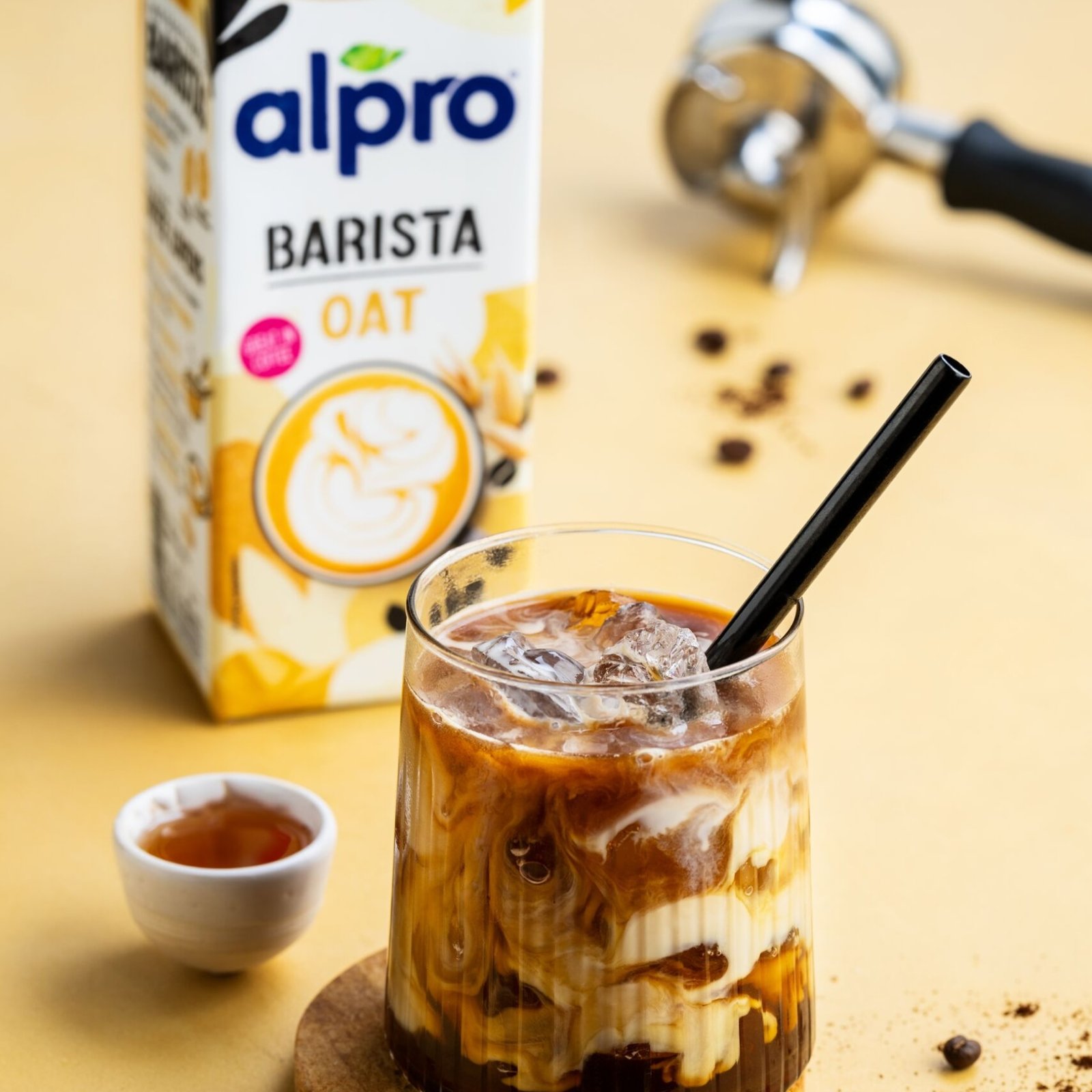
I like this split a lot. The coffee scene stays in the single image, so none of the carousel cards has to sell a mood and a lineup at once. Sales of Alpro Barista rose 3.1% during the campaign, and ROAS came in 53% above Circana benchmarks for the category.
Story carousels: cards that only make sense in order
The order or the theme carries these ads more than any single card does. Aperol’s and The Perfume Shop’s case studies never describe their cards (Tom Ford’s, further up, doesn’t either), so for those I go by the brief and the results and leave the cards alone.

8. Wizz: a chat thread, then the app (TikTok, 2023)
Wizz is a “make new friends” app whose most efficient TikTok format had been 30-second in-feed videos. When TikTok offered carousels, the team built a set that “kicked off with captivating text messages infused with TikTok slang,” followed by “screenshots from the app, providing a comprehensive glimpse into what Wizz has to offer and how it functions.”
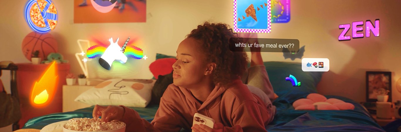
The slang hook sounds like the people you’d meet on the app, and the screenshots answer the obvious next thought, “fine, but how does it work.” With the screenshots first, it would open as a product tour. TikTok’s December 2023 case study reports a conversion rate three times that of standard ads and a 20% lower cost per install, and Wizz doubled its investment on the platform afterward. More hooks written in the platform’s own voice are in the best TikTok ads.
9. Dhumy: letting older learners read at their own pace (TikTok, 2025)
My favorite on the list, because the format was picked for the audience. Dhumy sells professional diploma programs in Malaysia to retirees and people over 50, who “often found short-form videos difficult to absorb and retain information.” Carousels let them “swipe through content at their own pace, creating a smoother, more comfortable learning experience for older audiences.”
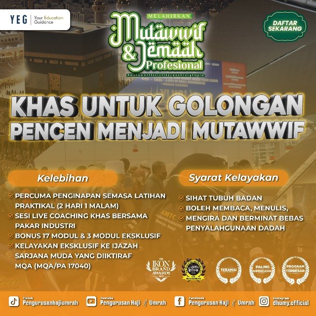
By TikTok standards the ad image in the case study is dense: a headline aimed at pensioners, benefits under “Kelebihan,” eligibility under “Syarat Kelayakan,” award badges along the bottom. I’d cut half of it for a 25-year-old flicking through the feed, but someone weighing up a course gets to read it like a brochure page, as slowly as they like. Two of Dhumy’s tips in the case study are trust (credentials and real testimonials) and direct calls to action like “Register Now.” TikTok’s write-up also says campaigns combining carousels with video beat video alone on cost per action, though a footnote ties its headline numbers to a test of AI-generated creatives.
10. Sharpie: one marker, a range of colors and projects (Pinterest, 2025)
After a 2024 awareness push for the Creative Marker, Sharpie spent 2025 chasing purchase intent around Mother’s Day and back to school. On Pinterest it used carousel ads “to showcase the Creative Marker’s range of colors and project possibilities,” and the campaign linked shoppers straight to carts at retailers like Target, Walmart and Amazon.
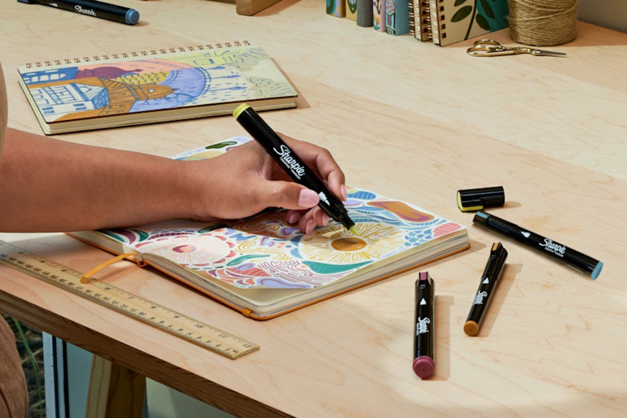
I’d file project carousels under stories, even when they look like product sets. Every project card is a small “I could do that,” and the viewer puts the story together while swiping. Pinterest says the carousels drove an incremental return on ad spend more than 10x above the NCS Household Care category median. Sharpie’s 2024 launch spot, on its own YouTube channel, shows the product those carousels were selling.
11. Aperol: an orange thread through spring (Pinterest, 2025 case study)
Aperol’s Australian “Spritz Takeover” opened with a launch-day platform takeover, then ran “UGC-style videos, carousels, and collages” tied to spring trends like “sunset aesthetic” and “spring nails.” Aperol also went after people whose interests overlapped visually with its orange, orange nail art and orange sunsets included, which I think was the clever part.
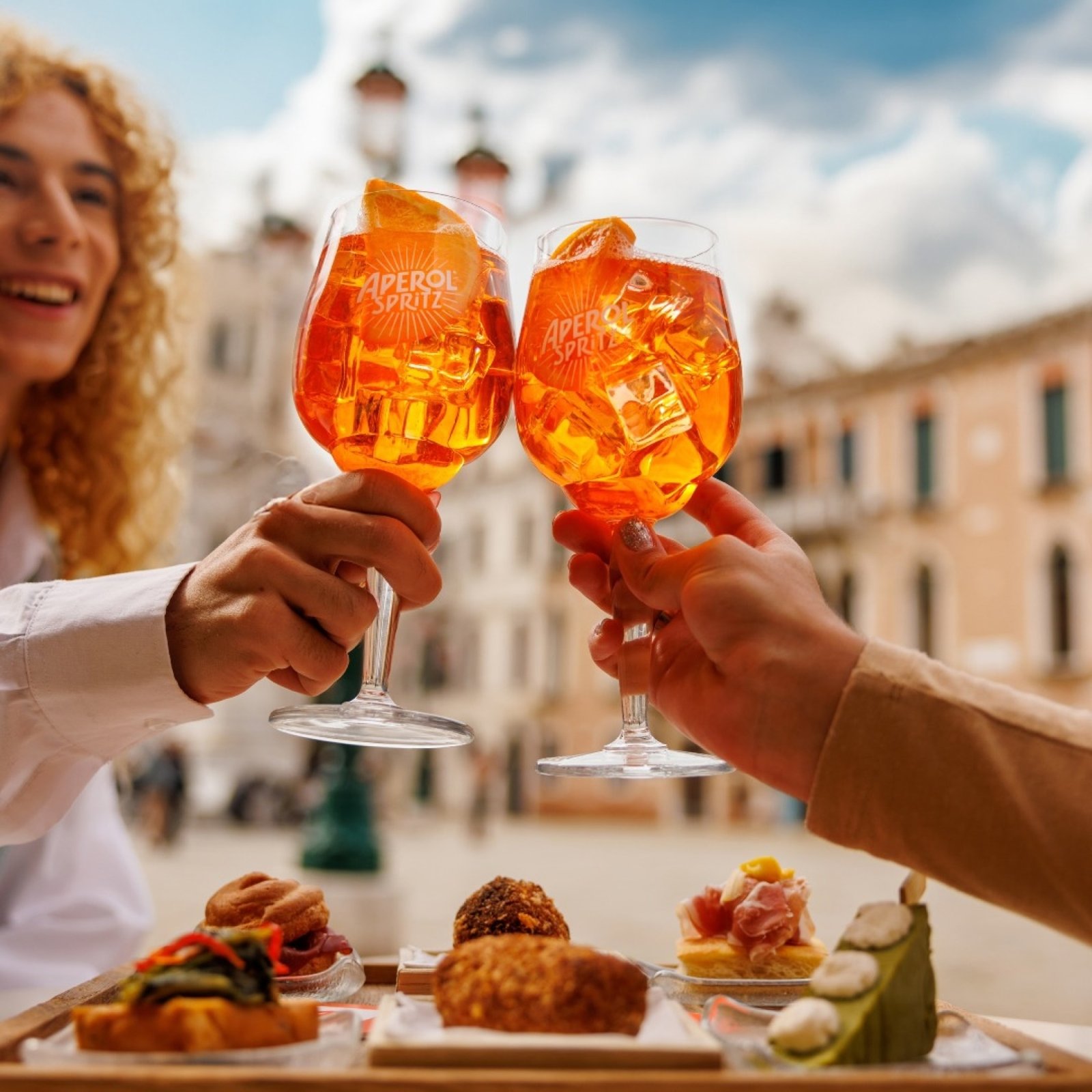
Pinterest says the carousels with orange keyword targeting performed exceptionally well, with a 7.8+ lift in ad recall. My read is that a brand owning a color the way Aperol does can run a very loose sequence, basically “things that are this color,” and the set still reads as one ad.
12. The Perfume Shop: holiday gifting for people searching for it (TikTok, 2025 case study)
Before the holidays, the UK retailer ran TikTok Search Ads with “brand-tailored, seasonally relevant creative that showcased its product range and gifting options,” then added carousels and native videos to the mix.

The brief was range plus gifting, and gifting comes with a plot every shopper already knows (someone to buy for, something to find). The carousel hit a 7.66% CTR against 3.35% for videos alone, and the campaign overall reached 5.16% against a 2023 account average of 0.87% for traffic campaigns. With SEGA and Tom Ford, that makes three search campaigns on this list where carousels did well, and the seasonal hook here only helped.
All twelve carousels in one table
| Brand | Platform, year | Objective | Card sequence | Craft decision |
|---|---|---|---|---|
| Vitamasques | TikTok, 2024 | Performance with lighter production | Lineup cover card, then individual SKUs | Reused existing product images to make many variations |
| Ello | TikTok, 2024 | Traffic for new launches | Product cards from existing Instagram images | Cartoon style and one consistent template |
| New Look | TikTok, 2025 | Online sales | Video opener, then catalog products, each linked | Personalized products from site activity |
| Supré | TikTok, 2024 | Consideration and conversions | Modeled Luxe Essentials with feature and bundle call-outs | Carousel paired with a single video |
| SEGA | TikTok, 2026 case study | Traffic to sale pages | Nine static game images | Many titles in one ad, shown on franchise search terms |
| Tom Ford Fragrances | TikTok, 2025 | Traffic from search | Branded assets (cards not listed) | Branded and non-branded search groups |
| Alpro | Pinterest, 2025 case study | Awareness to sales | Milk varieties in a line | Range in the carousel, mood in single images |
| Wizz | TikTok, 2023 | App installs | Slang text messages, then app screenshots | Voice first, product second |
| Dhumy | TikTok, 2025 | Student leads | Text-heavy cards (benefits, eligibility) | Self-paced reading for a 50+ audience |
| Sharpie | Pinterest, 2025 | Consideration and sales | Colors and project ideas | Projects as a story the viewer finishes |
| Aperol | Pinterest, 2025 case study | Awareness | Not listed; tied to spring trends | Targeting by color overlap |
| The Perfume Shop | TikTok, 2025 case study | Web traffic | Not listed; creative showed range and gifting | Seasonal creative matched to search intent |
Carousel specs per platform, checked October 2026
These come from each platform’s own spec pages. They change, so check again on the day you export.
| Platform | Cards | Image size and ratio | Files | One link or many |
|---|---|---|---|---|
| TikTok (standard carousel) | Upload 2 to 35, shows 2 to 20 | Horizontal 1200 x 628, square 640 x 640, vertical 720 x 1280 | JPG or PNG, 100 KB or less suggested; music required | One URL for all images (catalog carousels can link each product) |
| 2 to 10 | 1080 x 1080 at 1:1 recommended, max 4320 x 4320 | JPG, PNG or non-animated GIF, 10 MB per card; no video | Cards can go to different URLs (one Lead Gen Form for all) | |
| Pinterest (non-Sales) | 2 to 5 images | 1:1 or 2:3 | PNG or JPEG, 20 MB per image | Catalog carousels for Sales take 2 to 10 images and video |
Sources: TikTok’s carousel specifications (last updated September 2026), LinkedIn’s carousel ad specifications and Pinterest’s ad specs. For Meta and X, open each platform’s own ads guide before you build. Neither page would load for me on the day I checked, so they aren’t in the table.
Some details in those pages matter more for design than the sizes do. TikTok’s standard carousel gets one caption, one call to action and one URL for every image, so a card that promises a specific product needs a landing page that shows it. LinkedIn gives each card its own headline, cut after two lines, and lets cards point to different URLs. Pinterest caps non-Sales carousels at five images. TikTok’s own carousel playbook suggests three images, or seven to nine, saying those counts “usually have better CTR and CVR,” and recommends turning on Smart Order so the best image shows first.
So the card you designed as the opener may not open the ad, which is the best reason I know to make every card stand alone. If you need the other placement sizes alongside these, our social media sizes tool keeps them in one place, and display ad examples and banner ad examples cover the static placements outside the feed.
Pinterest’s own walkthrough of Ads Manager goes from objective to targeting, and the “Create your ads” chapter starts at 3:22.
A carousel set from one shoot
Count how many of the twelve started from images the brand already had. Vitamasques used existing image materials, Ello used its Instagram assets, and Alpro “breathed new life into existing social assets.”
When we plan a shoot with cards in mind, I ask for four kinds of frames before anyone talks about mood. First, a hero frame that can be card one with no context at all. Then detail frames, one per thing you’ll want to point at (a shade, a cap, a fabric, a screen). Then use frames with hands or people in them, since those are the cards that turn a range into a story, the way Sharpie’s project cards do. And one or two clean closing frames with room for a call to action. Shoot every setup in vertical and square, and pull stills from the video takes while you’re there; our notes on video production for social media cover planning those setups so one day feeds both a short cut and a set of cards.
Then lock the template, so nothing about the layout shifts between cards. Ello’s case study says that kind of “template consistency and layout uniformity” helped its CTR. The words need the same discipline. A card headline gets a handful of words, and a written style guide stops card four from naming the product differently than card one. ClothME’s roundup of seven real style guides, Mailchimp, GOV.UK and Shopify Polaris among them, shows how other teams set those rules down.
Last, write the card order down even if the platform might shuffle it. If the set only works in sequence, put that in the brief and switch off automatic ordering where you can. If it’s a range, test a different card one against the same remaining cards before you reshoot anything, and you’ll find out whether the hook failed or the whole set did.
If a client isn’t sure a carousel is even the right format, I send them social media ad examples first, and our guide to ad creatives for how to test it.
Frequently asked questions
Fewer than the platform allows. LinkedIn takes up to 10 cards, TikTok shows up to 20, and Pinterest caps non-Sales carousels at 5 images. TikTok's own carousel playbook says 3 images, or 7 to 9, tend to perform better. I stop adding cards when the next one would only be the last one recropped.
Look at whether the order survives a shuffle. A product carousel (a range of shades, a catalog) works in any order, so every card has to stand on its own. A story carousel, say a chat hook followed by app screens, only works in sequence. For those, turn off automatic card ordering where the platform lets you, and make card one good enough that people want to see card two.
Yes. Vitamasques and Ello built their TikTok carousels from image assets they already had, and Alpro reworked existing social creative for Pinterest. Reused photos hold together when every card follows one template, with type size, label position and crop logic kept identical, so the set reads as a single ad.


