Brand Identity Design Services: A Buyer's Map
What brand identity design services include: six core deliverables, three scope tiers, five delivery models, and the questions that expose weak proposals.

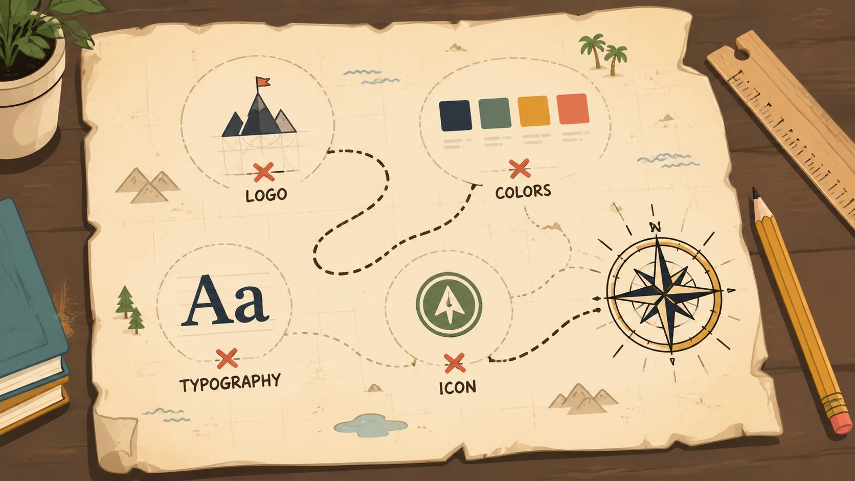
Brand identity design services turn a company’s positioning into a governed visual system: a logo suite, color system, typography, imagery and iconography direction, brand guidelines, and working templates that keep every channel recognizable as one brand.
I run Moonb, a creative studio that builds and maintains identity systems for client teams, and almost every identity conversation I sit in starts the same way. A healthcare client came to us with an investor deck, a website, and a sales one-pager built by three different freelancers over two years. Each piece looked fine on its own and wrong next to the others. Nobody in that room needed a new logo. They needed rules that other people could follow.
That is the frame for this guide. As a buyer, you should expect six core deliverables, and you should choose between three scope tiers: a focused refresh, a full identity system, or a strategy-led rebrand. Everything else in a proposal hangs off those two decisions.
The same logic extends to motion. When identity has to live on screen, motion rules and visual consistency matter as much as static design, which is why a good identity brief now covers how the system behaves in video and animation, not only in print; resources like Brand Video Production are helpful when teams are thinking through that motion layer. And if you need the line between identity and branding clarified before you brief anyone, the cleanest explanation is in this guide to brand identity versus branding.
What brand identity design services actually include
Brand identity design services cover far more than logo creation. They are the build-out of a repeatable visual system, the kind that helps a team apply the same rules across web, social, pitch decks, packaging, print, and product surfaces. If a proposal only talks about a logo, it is underselling the job. That shift from standalone marks to disciplined systems came out of the rise of corporate identity in the mid-20th century; academic work on the field traces five broad stages, from early industrial-era visual identity through to modern identity systems built around consistency, typography, and color governance (historical overview). Once the identity exists, the weekly work that follows is on our graphic design services page.
If you want a sense of how seriously the best identity designers treat this work, Paula Scher, who has drawn some of the most recognizable corporate marks in the world, explains her approach here.
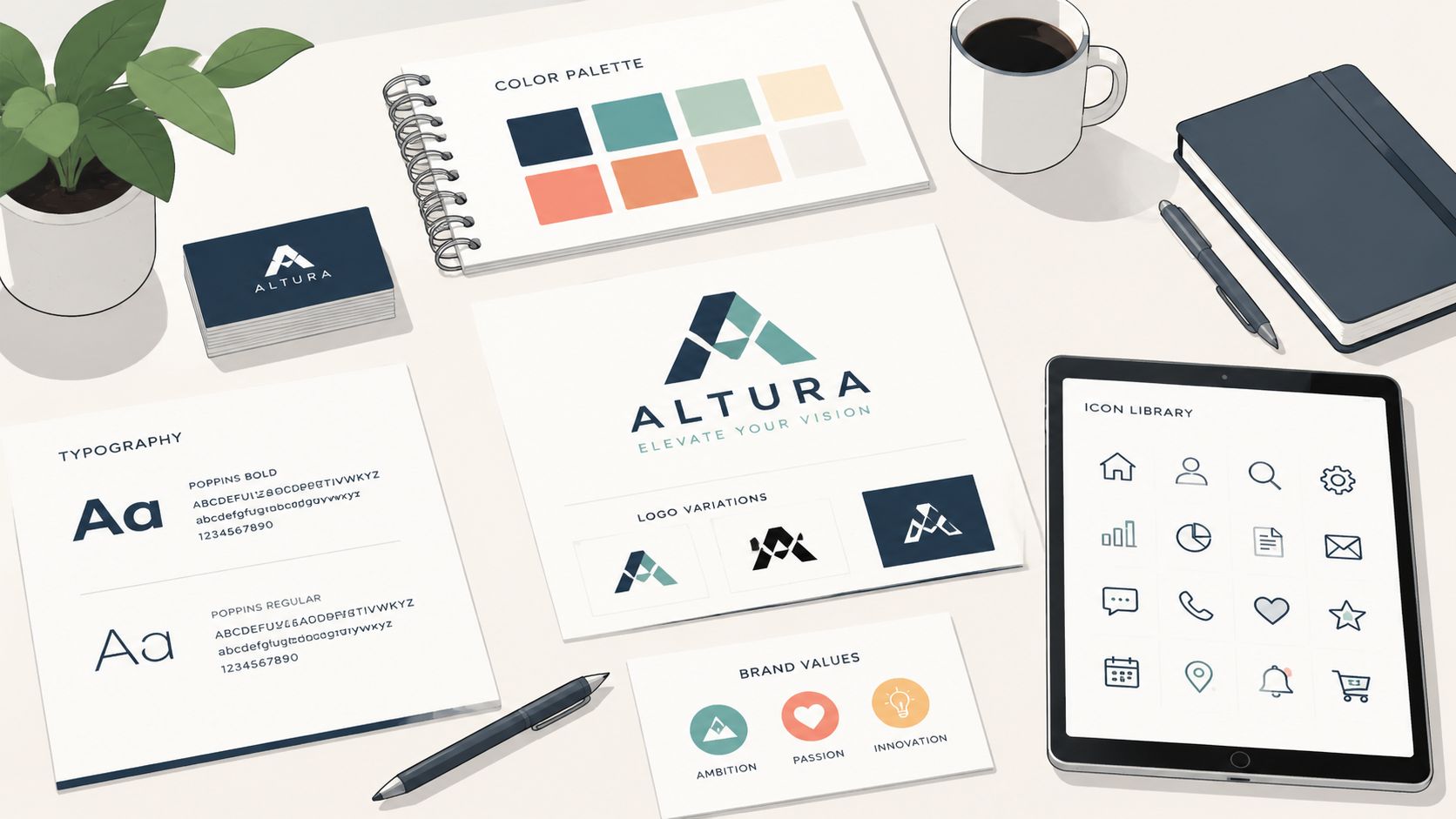
The six core deliverables most buyers should expect are straightforward. The system needs a logo suite, not a single file. It needs a color system with exact values, typography rules, imagery and iconography direction, guidelines that explain usage, and templates that people can use day to day. If the work won’t be applied by non-designers, it won’t hold.
A simple way to think about scope is by depth. Logo plus basics covers a cleaner mark and the minimum rules. A full identity system adds the visual logic and working assets needed for ongoing use. A strategy-led rebrand starts upstream, because the company’s position, audience, or offer has changed enough that design alone won’t solve the problem.
If you’re also deciding whether identity work should sit beside broader content production, a working visual system is what makes motion, social, and brand assets easier to extend later. That’s where consistency starts to save real time instead of only producing polish.
Deliverables, formats, and what done looks like
The fastest way to judge a proposal is to ask what arrives at handoff. A logo presentation can look finished and still leave a team without usable files, exact color values, or anything a marketer can apply without calling design again. Standardized logo proportions, color parameters, and layout logic are what let a brand hold together across platforms and regions; the presentation deck is decoration by comparison.
| Deliverable | What it is | What done looks like | Formats you should receive |
|---|---|---|---|
| Logo system | Primary mark, secondary variations, and an icon or monogram | The logo works at small sizes, on light and dark backgrounds, and in tight spaces | AI, EPS, SVG, PNG |
| Color system | Approved brand colors for digital and print use | Colors are specified clearly and match across surfaces | HEX, RGB, CMYK, sometimes Pantone |
| Typography | Typefaces and hierarchy rules | Headlines, subheads, body copy, and captions follow one logic | Font files or licensed type names, usage rules |
| Imagery and iconography direction | Guidance for photography, illustration, and icons | Visual choices feel like one brand, not a mix of styles | Reference sheets, examples, usage notes |
| Brand guidelines | The operating manual for the system | Non-designers can apply the brand without guessing | PDF or web-based guide, plus source files |
| Working templates | Decks, social layouts, and other repeatable assets | Teams can launch content without rebuilding each piece | Editable presentation, social, and document templates |
The color system deserves special attention. A complete set should define the palette across HEX, RGB, CMYK, and sometimes Pantone, because the same brand has to reproduce consistently on screen, in print, and in physical materials. Without that, small differences creep in fast. I have watched a client’s print vendor eyeball a HEX value into CMYK and ship five thousand folders in a blue nobody approved; exact values in the guidelines are what prevent that conversation.
Guidelines also need to be usable, not ornamental. A long PDF is fine if people read it. A short, practical guide plus templates often works better because it gives sales, marketing, and product teams something they can open and use. A good handoff means the team can make the next deck, post, or page without reinventing the brand. If you want to see how strong guidance is usually structured, brand guidelines examples are worth reviewing before you approve any final handoff.
Three scope tiers for brand identity projects
Most buyers don’t need the same depth of work. The right scope depends on whether the brand is basically sound, the mark needs a refresh, or the business itself has changed enough that the system needs a reset. Published cost explainers vary, but they consistently show that scope, along with the seniority of the people doing the work, is the biggest lever on price, which is why a focused refresh and a strategy-led rebrand belong in different buckets (cost overview).
| Scope tier | What is included | Who it fits | Timeline range |
|---|---|---|---|
| Logo plus basics | Light logo cleanup, basic color and type rules, simple usage guidance | Teams with a stable position and a mark that still works, but downstream assets drift | Commonly published timelines are a few weeks, depending on feedback speed |
| Full identity system | Logo suite, color, type, imagery direction, guidelines, and templates | Brands that need consistency across channels and want a system teams can actually use | Commonly published timelines are several weeks to a couple of months |
| Strategy-led rebrand | Strategy, positioning check, identity redesign, and rollout assets | Companies that changed what they sell, who they sell to, or how they compete | Commonly published timelines are several months, especially when alignment takes time |
The decision rule is simple. If positioning is stable and the logo is fine but the work around it keeps drifting, buy the system and keep the logo. If the mark is dated, hard to read, or legally risky, refresh the mark and the system together. Legally risky is worth taking seriously, by the way: a federal trademark application starts at $350 per class of goods or services on the USPTO’s current fee schedule, which is a small line item next to renaming a company after a dispute. And if the company changed its market, audience, or product direction, strategy has to come first, or the design will get reworked again later. For buyers still sorting that out, how to rebrand is a better next stop than another logo review.
Scope pressure also comes from fashion. Plenty of companies have paid for full rebrands chasing the flat, stripped-down look of the moment; Bloomberg’s report on the debranding wave is a useful caution before you let a trend set your scope.
Client feedback speed is usually the biggest variable in any of these tiers. A clean project can drag when comments come late or get rewritten by committee. A messy one can still move if one decision-maker stays close and responds quickly.
Five delivery models and honest trade-offs
The person or team you hire changes the result. A freelancer, a boutique studio, a full-service branding agency, a marketplace, and an embedded design team each solve a different problem, and the trade-offs show up once the identity has to work across real channels. For a neutral comparison of the agency side of that choice, in-house versus agency is a useful lens.
| Delivery model | Trade-offs | Best for |
|---|---|---|
| Freelance designer | Strong craft, fast start, but one person carries strategy, production, and continuity. If they move on, your system can drift. | Small projects with a clear brief and an internal team that can maintain the brand after handoff |
| Boutique identity studio | Senior craft and a defined process, with strong identity thinking, but ongoing asset production usually moves back to your team or another vendor after launch. | Companies that want a focused identity project with careful art direction |
| Full-service branding agency | Strategy, research, and rollout can sit under one roof, but overhead is heavier and the process is usually more involved. | Larger rebrands that need governance, alignment, and broad stakeholder management |
| Marketplace or contest platform | Lower barrier to entry, but originality checks, system depth, and long-term consistency are weak points. | Exploratory logo hunting when the stakes are low |
| Embedded design team at a set monthly cost | Continuity is the advantage, because the same people build the identity and keep applying it. Less useful for a one-off logo-only job. This is the model my own studio runs, so weigh my bias accordingly. | Teams that need identity plus ongoing design execution without rebuilding the brief every time |
A freelancer can be the right answer when the brief is tight and your team can carry the system afterward. A studio fits when the identity needs careful craft and a clean process. An embedded team makes more sense when the identity will keep showing up in decks, campaigns, and content week after week.
Marketplace work deserves special caution. A mark can cost very little to source and still be expensive to fix later if the system around it never gets built. Compare proposals on the depth of the rules and files, not on the first logo comp.
One more split matters: who owns the work after launch. A freelancer or studio may hand you a strong package, then step away. An embedded team keeps the same people close, which helps if the brand keeps changing or internal capacity is thin. A full-service agency can cover more of the rollout, but that broader scope can bring more meetings and more layers of approval. The right model is the one that matches your actual operating reality, not the one that sounds most impressive in a pitch.
How a brand identity project runs from start to handoff
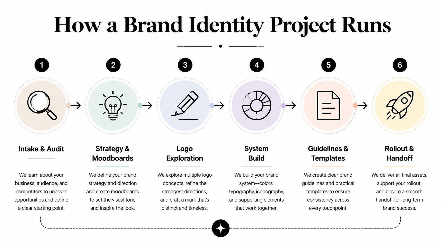
The process should feel disciplined, not mysterious. A strong team starts by auditing what already exists: current logo files, decks, web pages, competitors, and audience expectations. Then it moves to a short strategic brief, or a deeper positioning phase if the business doesn’t already have one.
After that, the team should show moodboards or stylescapes before drawing logos. That step matters because it gets the direction agreed before the mark starts to take shape. If you want a useful comparison point for process structure, the logic is similar to the steps in UX design, where early alignment prevents expensive changes later.
- Intake and audit. The client shares existing assets, the current logo, and examples of what feels off. A good studio responds with a clear readout of strengths, inconsistencies, and gaps.
- Strategy and moodboards. The client confirms positioning, audience, and tone, then reacts to a small number of visual directions. The key decision about style happens here.
- Logo exploration. Two or three directions are usually enough to compare. Dozens of options create noise, not clarity.
- Refinement. The chosen route gets sharpened, cleaned up, and tested across sizes and contexts.
- System build. Color, type, grid, iconography, and imagery rules get defined so the brand can repeat itself properly.
- Guidelines and templates. The team delivers the rules and the working files, then lists what has to be updated first in rollout.
Timelines vary with scope, but the honest range holds: a few weeks for a focused system, several months for a strategy-led rebrand. Feedback speed is what usually stretches the calendar. A client who consolidates comments and decides quickly will move much faster than a committee that rewrites every round. I have seen a two-month project take five because every round of comments reopened the round before it.
An eight-question checklist for comparing proposals
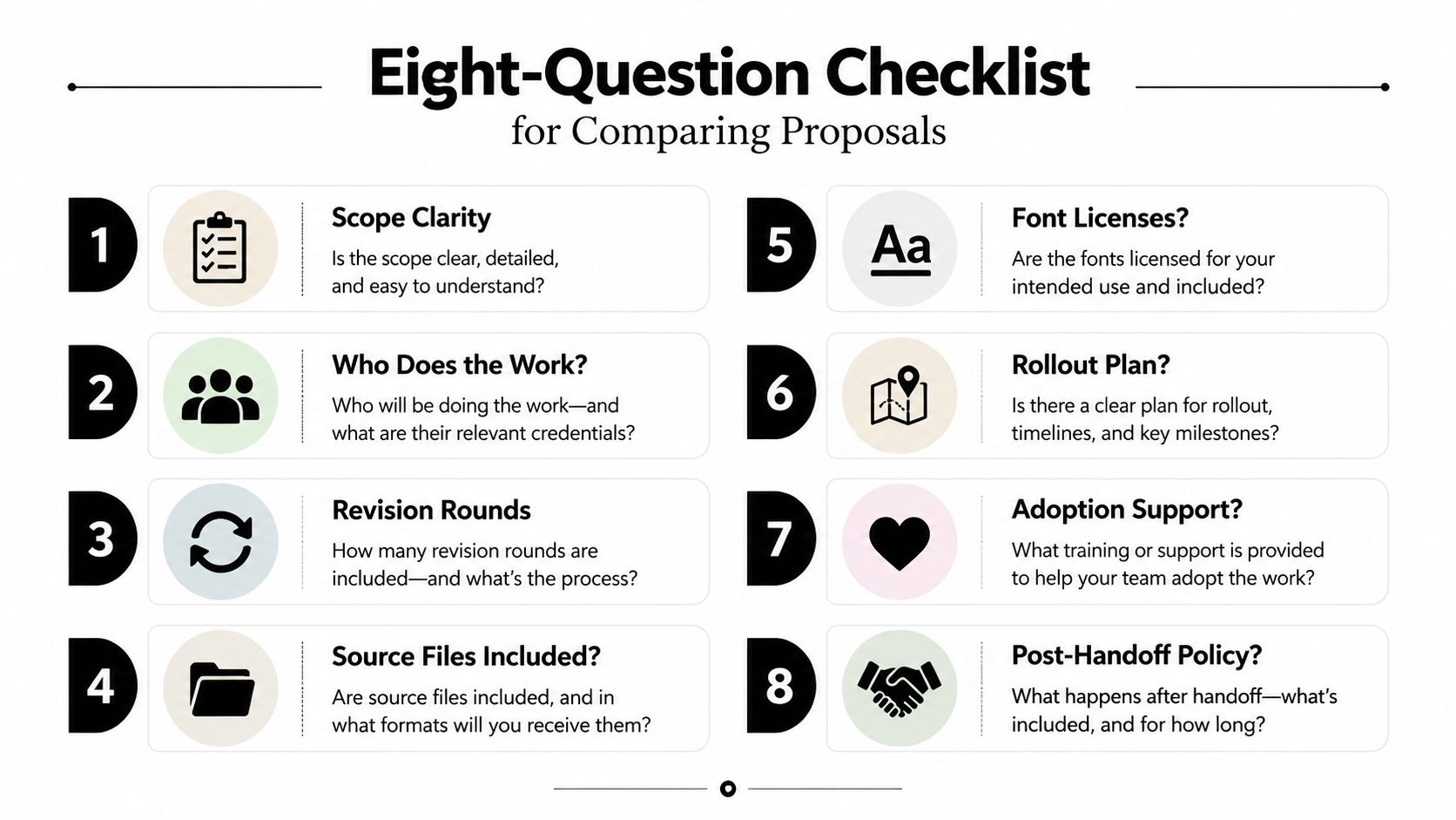
Before you sign anything, ask the same eight questions of every proposal. That keeps style decks from distracting you from the parts that protect the brand.
- What exactly is included, and what is out of scope? This shows whether the vendor understands the size of the job.
- Who does the work? You want to know if the person pitching is the person producing.
- How do revision rounds work? Clear revision structure prevents slow, endless churn.
- Which source files are included? This protects ownership and future use.
- Are font licenses included or required separately? Type files matter, and licensing can become a problem later.
- What rollout assets are included? A good identity project should account for the places the brand will appear.
- Is the guidelines document usable by non-designers? If the answer is no, adoption will be weak.
- What happens after handoff? You want to know whether maintenance and updates are part of the relationship or a separate problem later.
A proposal that answers those questions clearly is easy to compare. One that dodges them usually creates friction later, especially around ownership, formats, and how many directions you’re really buying. If you’re building a brief to send out, the creative brief generator can help you frame the ask before proposals come back.
A realistic brand identity project example
A common identity engagement starts with a company that likes its logo but can’t keep the rest of the system steady. One enterprise SaaS team came in with three shades of blue in circulation, decks built by whoever was free that week, and a sales one-pager that looked unrelated to the website. The logo was fine; the system around it was the problem.
What got built was practical. The team received a corrected color system with screen and print values, a type scale, layout rules, deck and social templates, and a short guidelines document written for non-designers. That last part mattered as much as the visual work, because it gave people outside design a way to use the brand without guessing.
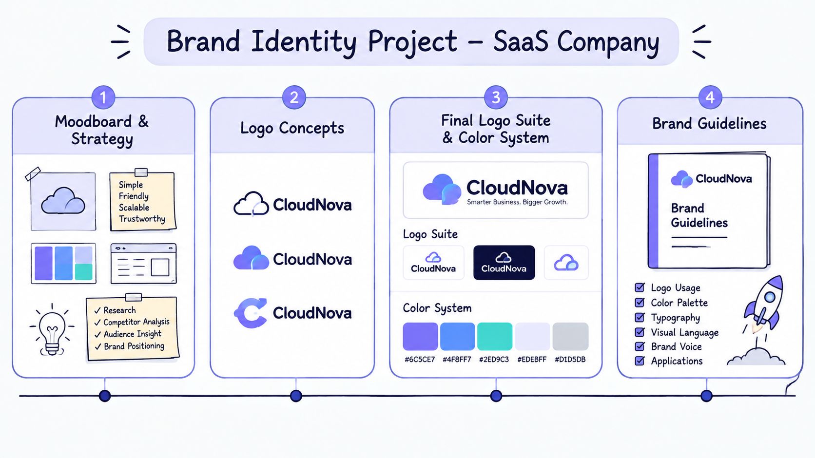
Operationally, the change was simple. New assets came out consistent because the same rules were being used by the same people. Sales didn’t need to rebuild the deck from scratch, and marketing had fewer off-brand escalations to clean up. That’s what a healthy identity system does: it reduces the amount of re-explaining the brand every time a new piece of content gets made.
Common mistakes when buying brand identity services
Most identity budgets get spent on the mark while the drift lives in everything around it. Ask yourselves whether you need a cleaner mark or a usable identity system. If the honest answer is system drift, a logo-only engagement won’t hold, no matter how good the new mark is.
Skipping the strategic brief is next. If nobody can say which positioning and audience decisions are already settled before design starts, the studio will design to taste instead of to business reality. Asking for too many directions creates a related problem: more options mean weaker feedback, so agree upfront how many directions you’ll evaluate and who decides.
A few more checks protect the handoff itself. Confirm who produces the work after the pitch, because the person who sold the project is not always the person who builds it. Get source files, font licenses, and color values in every format you need, in writing. Test whether non-designers can use the guidelines without calling design every time; if they can’t, the system won’t spread. Scope the rollout surfaces honestly (website, decks, social, signage, product UI), and ask what happens after launch if the brand starts drifting. Where there’s no adoption plan, drift is close to guaranteed.
If you’re still deciding whether your problem is a refresh, a system, or a full reset, go back to the definition at the top and the scope table; most bad identity purchases start with a mislabeled problem, and most good ones start with an unglamorous audit.
If you’re collecting proposals right now, use the tables above as your filter. Ask for the exact deliverables, the working formats, the rollout scope, and the person who will do the work, then compare answers side by side. The vendor who answers plainly is usually the one whose system will still be holding a year in.
Frequently asked questions
You should, but only if the contract says so. Ask for a written assignment of intellectual property that transfers on final payment and covers the logo, the system, and the source files. Two common gaps: fonts, which are licensed to your company separately rather than owned, and stock imagery, which keeps its own license terms. If a vendor wants to retain ownership and license the mark back to you, treat that as a red flag.
Run the search before you fall in love, and file before you launch. A knockout search during the design phase costs little and prevents the worst outcome, which is rolling out an identity you later have to abandon. In the US, you file with the USPTO per class of goods or services; most companies use a trademark attorney to pick classes and handle office actions. Design vendors can flag risk, but clearance is legal work, not design work.
Sequence it instead of flipping everything at once. Start with the surfaces customers see most, usually the website, product, and social profiles, then work through sales collateral and internal documents on a published schedule. Give the old assets a hard retirement date so they stop circulating, and brief employees before the public sees anything, since off-brand decks from your own team are the most common leak. A short FAQ for customers covers the rest.



