Pitch Deck Examples: 12 Startup Lessons That Work
Twelve real pitch decks, from Airbnb and Buffer to Uber and Snapchat, with the specific move each one teaches founders raising a round today.

Investor attention on a first-look deck is short. DocSend’s fundraising research, tracked across thousands of decks over the last decade, consistently reports that partners spend only a few minutes on their initial pass and that the earliest slides carry most of the decision weight. That is why the strongest pitch deck examples win the next meeting with a short story backed by evidence, not a pile of slides.
I run Moonb, a creative team that builds decks and brand systems for founders and marketing teams, so I have a soft spot for pitches that treat evidence as design. A pitch deck is a short presentation founders use to raise investment. Its job is to earn interest and get the next meeting, not close the round on the spot. That is different from a sales deck, which is built to close customers, so if you are comparing the two, see Moonb’s sales deck examples post. For a broader structure guide, Moonb’s perfect presentation deck post is a useful companion.
The best decks feel like a focused proof packet. They use evidence, product shots, motion, and the occasional demo to clarify the argument, not decorate it. A first-meeting deck is often around 10 to 15 slides, with an appendix for detail, and live decks can be sparser than decks sent ahead. The examples below separate what is publicly documented from what founders should take from it, because the lesson is rarely copy the slides. It is usually copy the thinking.
1. Airbnb’s 2009 Pitch Deck Shows How Clean Narrative Wins
Michael Seibel, a longtime partner at Y Combinator, the accelerator that backed Airbnb, explains why a pitch to investors is built differently from a pitch to customers.
Airbnb is the classic example of a deck that moves in a straight line. It starts with a real travel problem, a simple peer-to-peer solution, and a market story that feels legible fast. That structure matters because investors don’t need a tour of every feature, they need to understand the tension, the fix, and why the opportunity is real.

What founders can borrow
The strongest lesson is restraint. Each slide should advance the story, and each sentence should pull its weight.
- Lead with the customer pain: Start with a specific problem people already feel.
- Use a real scenario: Show how the problem appears in day-to-day life, not in abstract category language.
- Keep the solution narrow: One or two features that solve the named problem are enough.
- Test the flow out loud: If someone outside your space can follow it, an investor probably can too.
That’s why Airbnb-style decks work so well for early fundraising. They don’t overload the room with product detail. They make the need obvious, then show a clean answer. For founders, that’s a better first meeting than a crowded slide full of buzzwords.
2. Buffer’s Transparent Metrics Deck Makes Honesty Feel Investable
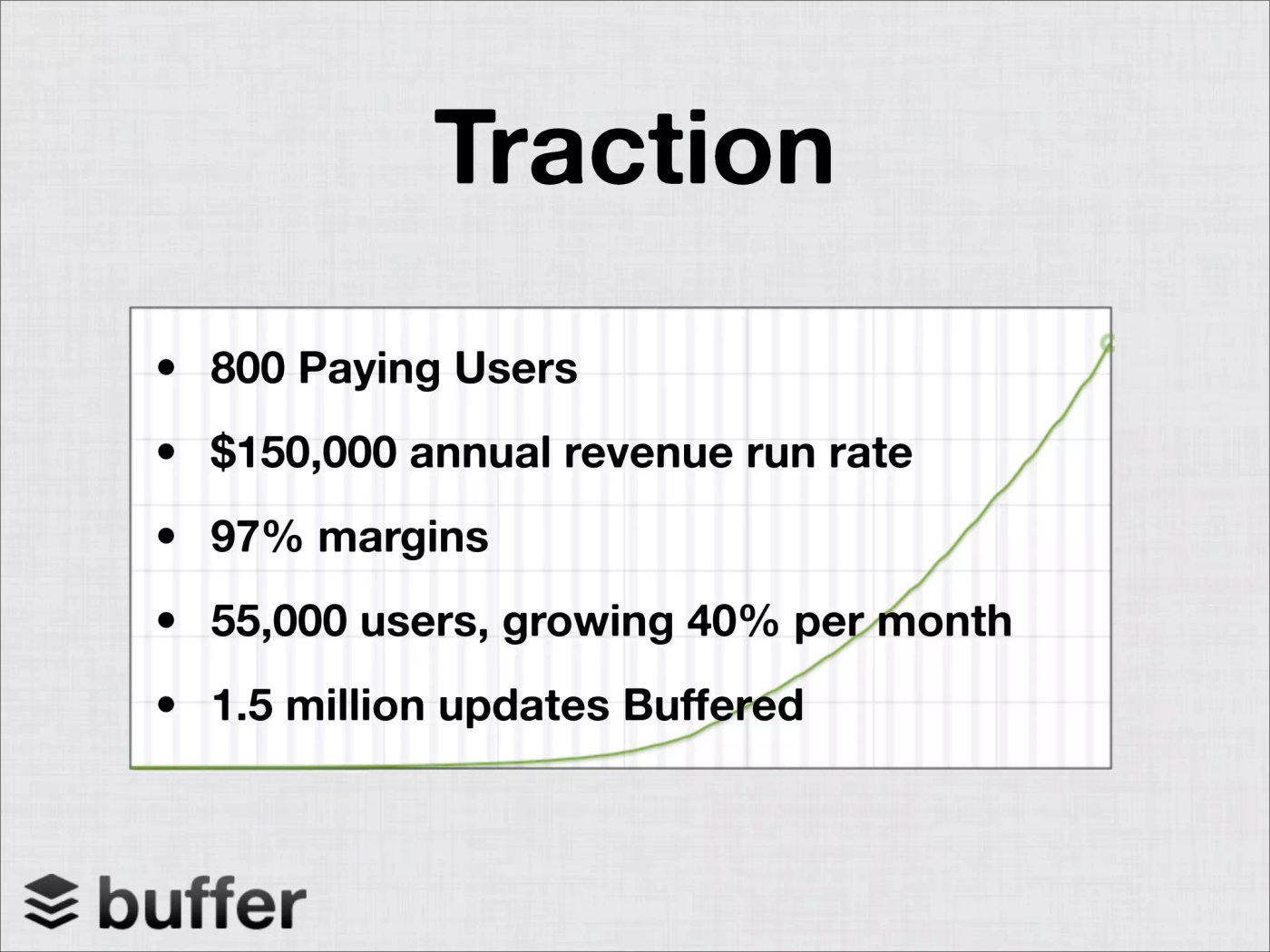
Buffer’s public deck shows why honest metrics can strengthen a fundraising story. It treats performance as evidence, not decoration, using clear numbers to show the business as it stands. That gives investors something concrete to assess instead of asking them to accept broad claims about momentum.
Show the math, even when it’s modest
Traction belongs on the slide, including traction that still looks small. State the customer count, revenue, period, and trend plainly. “We have paying customers and recurring revenue” gives investors more to evaluate than “strong early adoption.” Use the same standard in supporting material, such as a video marketing ROI analysis, where clear inputs make the result easier to judge.
Practical rule: Separate current performance from future expectations. Keep real metrics together, place projections elsewhere, and explain any dip without trying to disguise it.
The transferable lesson from Buffer is precision. A deck does not need to make the company look larger than it is. It needs to show what has been measured, what remains uncertain, and why the next stage is plausible. That framing also helps founders choose the right visual: one readable chart with a defined period often works better than several crowded metrics. Truthful numbers create room for a credible fundraising conversation.
3. Uber’s Early Pitch Deck Proves Unit Economics Matter Early
Mike Vernal of Sequoia Capital sums up what the best decks Sequoia sees have in common in this 80-second clip from NFX.
Uber’s early deck makes a practical point: investors need to see the economics behind each transaction before they trust the growth story. Show the revenue, direct costs, and path to repeatability. A model that works only after hidden assumptions will not survive basic questions.

Build the slide around one transaction
Start with one sale, ride, booking, or shipment. Show who pays, what the company keeps, which costs vary, and what remains after fulfillment. If the result is negative, explain the condition that could change it. Investors can work with an imperfect model when its assumptions are visible.
Use a direct or adjacent business as a benchmark when it adds context. Then show a conservative case beside a base case. A single optimistic forecast hides the trade-offs that matter most.
Link the assumptions to evidence. Founders testing production-heavy ideas can also review video production costs to separate one-time setup expenses from costs that rise with every customer. That distinction keeps the unit model useful beyond the pitch.
- Model the transaction: Make the inputs and output readable at a glance.
- Test market constraints: Explain why weak economics in one market may improve elsewhere.
- Name what remains unproven: Separate measured results from planned improvements.
This lesson applies to SaaS, marketplaces, logistics, and consumer apps. Investors are assessing whether the business can repeat a healthy transaction, not just whether the market sounds large.
4. Dropbox Kept Its Deck Simple Because the Product Carried the Story

Dropbox shows that a pitch deck can persuade through restraint. Its core value was easy to grasp: access and share files across devices through a folder that syncs everywhere. The deck supported that understanding instead of burying it under technical detail.
Let the demo do some of the work
A product that makes sense in under two minutes does not need crowded slides. Show the workflow with screenshots or a short clip, then move supporting detail to the appendix. A clear product visual often explains more than several paragraphs.
A product demo also needs preparation. One glitch can distract from the value, so rehearse the flow until each step feels routine. The handoff from slide to product should be deliberate, with the same problem and outcome visible in both places. Founders planning a short demonstration can use this guide to create effective product demo videos.
If the product is the proof, the deck should make room for it.
Simple does not mean incomplete. Include enough context for investors to understand the user, the problem, and what the product proves. Keep the main story focused, then place architecture, edge cases, and deeper evidence in the appendix. That trade-off preserves attention without hiding important work.
5. Intercom’s Deck Shows How to Win in a Crowded Category
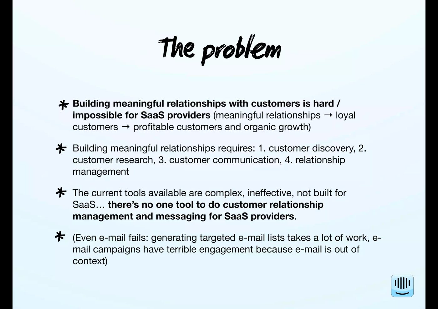
Intercom entered a crowded communication market, so its deck had to answer a direct question: why fund another tool? The answer was a focused position around meaningful in-app customer conversations. It did not claim to replace every incumbent immediately.
Positioning matters when competitors already exist
A crowded market makes boundaries more valuable than a long feature list. State the problem, the customer, and the context you serve. Then explain what you deliberately leave out. Investors can see a clear entry point instead of another interchangeable product.
Strong positioning also connects the market choice to the team. A founder should show relevant experience, customer insight, or a product decision that competitors are less prepared to make. The brand positioning guide can help clarify that argument before it becomes a slide.
Use four practical moves:
- Name the narrow wedge: Show the specific problem you solve better than alternatives.
- Use social proof carefully: Include customer logos or quotes only when they are real and relevant.
- Tie team experience to the niche: Explain why this group understands the problem and can serve the buyer.
- Avoid feature parity slides: Checklists invite comparison on surface details and weaken the category story.
Intercom’s lesson is simple. In a crowded category, define a defendable entry point first, then show how the company can expand from it.
6. LinkedIn’s Early Deck Explains Network Effects Clearly
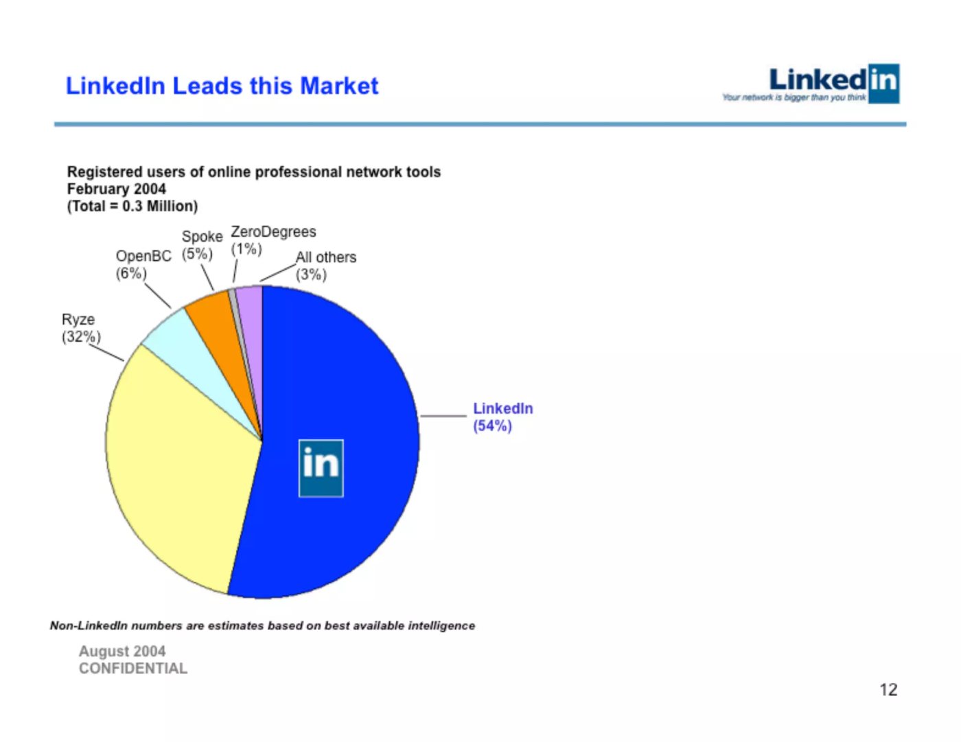
LinkedIn’s early pitch worked because it turned a fuzzy category into a compounding asset. The platform becomes more useful as more professionals join, and that network effect creates defensibility over time. Investors understand that kind of loop quickly when it’s explained plainly.
Make the flywheel visible
If your business has network effects, name them directly. Don’t assume the audience will infer them from a product screenshot. Show how growth compounds, who benefits first, and why a later entrant can’t easily recreate the same graph.
The key discipline is sequence. Don’t try to grow both sides equally at the beginning if one side matters more. Explain which user group creates the first meaningful loop, then show how that loop expands.
LinkedIn is also a strong example of how a deck can frame defensibility without sounding defensive. It doesn’t have to shout about moats. It just has to make the compounding logic easy to follow.
7. Front and YouTube Show That Clarity Beats Pretending
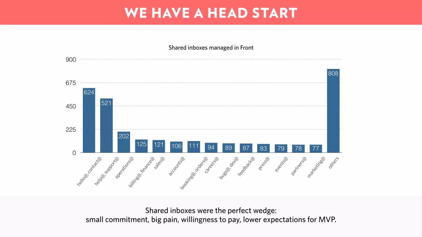
Front is useful because it says what the company is, and what it isn’t. That kind of precision helps in a market where “communication” could mean almost anything. YouTube’s early public decks, by contrast, are often used as a cautionary example of what happens when metrics and explanation get blurry.
The broader playbook investors expect
Most funded startups follow a familiar order, even when the design is different. The usual sequence is problem, solution, market size, product, business model, traction, competition, team, financials, ask. A detailed 10-slide model also includes a simple financial overview and a final management team slide, with the financial slide kept simple rather than overloaded (Zamora Design’s 10-slide investor read).
Practical rule: If you have strong traction, move it earlier. If the product is the proof, show it before you over-explain the market.
Deck length matters here too. Guy Kawasaki’s rule is 10 slides, 20 minutes, and no font smaller than 30 points (Winning Presentations on investor pitch deck basics). Another investor-facing guide says a concise deck is usually 10 to 20 slides (Slidebean’s pitch deck examples guide). In practice, a first-meeting deck often lands around 10 to 15 slides, with an appendix for everything the investor may ask later.
8. The Standard Slide Order Still Exists for a Reason
Most examples, even the famous ones that look different on the surface, still map back to the same investor logic. The deck opens with the problem because investors need friction first. Then it gives the solution, market, product, model, traction, competition, team, financials, and ask because that order mirrors how people evaluate risk.
What each slide needs to do
- Problem: Make the pain obvious and current.
- Solution: Show the simplest answer, not the full roadmap.
- Market size: Use transparent, bottom-up reasoning, not a vague giant number.
- Product: Demonstrate what it looks like in use.
- Business model: Explain how money comes in.
- Traction: Prove the business is real now.
- Competition: Show that you know the category and your lane.
- Team: Connect the people to the problem.
- Financials: Keep the story simple and believable.
- Ask: State the raise and use of funds clearly.
Most decks get weaker when they bury the ask or try to use the financial slide as a wall of assumptions. Investors don’t need a spreadsheet recital in the meeting. They need a clear argument, then a place to dig deeper if they care.
9. Fundable Decks Feel Specific, Honest, and Easy to Read
The best decks don’t just look polished. They feel believable. That usually comes from a sharp problem, a clear solution, honest market sizing, credible traction, a team that makes sense for the work, and a specific ask with real use-of-funds buckets.
What separates fundable from forgettable
A forgettable deck often has one of three problems. It’s vague, it’s overloaded, or it’s evasive about weak numbers. A fundable one does the opposite. It states the case cleanly, uses charts that are readable at a glance, and makes room for questions without hiding the hard parts.
The most convincing founders often sound more measured, not more dramatic. They explain the stage they’re at and don’t try to project past it. That kind of honesty tends to build more trust than inflated forecasts.
A believable market also matters. A top-down “the market is huge” slide doesn’t tell investors enough. A bottom-up frame does more work because it shows the actual buyer, the likely spend, and the route to capture.
10. The Most Common Pitch Deck Mistakes Are Easy to Fix
Bad decks usually fail in the same ways. Too many slides. Vague market math. No clear ask. Too much text. A feature dump instead of a story. Weak traction hidden behind design. None of that is mysterious, and none of it is hard to improve.
Quick fixes founders can apply
- Too many slides: Cut everything that doesn’t move the decision forward.
- Vague market math: Show the customer count, spend, and capture logic.
- No clear ask: Put the raise and use of funds on the page.
- Weak traction hidden: State the current numbers plainly, then explain the plan.
- Feature dump: Reframe around the customer problem and outcome.
- Dense text: Replace paragraphs with short bullets and clean visuals.
- Generic template: Add a specific narrative, even if the design stays simple.
If you’re sending the deck before the meeting, make it more self-contained. If you’re presenting live, keep it lighter and let your voice do more work. In both cases, the deck should read fast, because that’s how investors review it.
11. Front-Loaded Proof Beats Long Explanations
A lot of example galleries overfocus on what a deck looks like. The better question is how investors read it now. They skim the beginning hard, and they decide fast whether the story feels real. That means the first 30 to 60 seconds matter more than the full set of pretty slides.
What to optimize first
Lead with the strongest proof you have. If that’s traction, use it early. If it’s a product demo, make the deck create room for it. If it’s a category wedge, define that wedge before you talk about the future.
Modern decks also tend to work better when they feel like proof packets, not presentations trying to impress through volume. Metric-rich narratives, believable go-to-market logic, and defensible positioning carry more weight than generic storytelling. The design should support that. Clean hierarchy. Readable charts. Short clips when they help. Motion that clarifies, not motion that entertains for its own sake.
That’s where a dedicated creative team can help. Moonb works as an embedded creative team that delivers presentation design, video, motion graphics, and animation on a steady weekly rhythm, so founders and operators can keep the material sharp without rebuilding their internal team around every deck.
Keep the deck tight, then use the appendix like a backup room.
7 Pitch Decks: Core Focus Comparison
| Example | Implementation complexity | Resource requirements | Expected outcomes | Ideal use cases | Key advantages |
|---|---|---|---|---|---|
| Airbnb’s 2009 Pitch Deck: Problem-Solution-Market Flow | Low, narrative-driven slides, simple visuals | Customer stories, basic market spend data, concise visuals | Clear investor understanding and engagement; meetings advanced | Early-stage consumer marketplaces focused on human need | Strong clarity and storytelling; user-centered framing |
| Buffer’s 2011 Transparent Metrics Deck: Show Real Traction Honestly | Moderate, requires accurate metric presentation | Real MRR, cohort data, financials, analytics dashboards | Builds trust and credibility; smoother due diligence | Startups with measurable revenue and growth | Honest, verifiable traction; credibility with investors |
| Uber’s Early Pitch Deck: Ruthless Focus on Unit Economics | High, detailed modeling and scenario analysis | Unit-level revenue/costs, acquisition metrics, benchmarks | Demonstrates repeatability and scalable margins; investment for scale | Two-sided marketplaces and high-volume transaction models | Rigorous financial grounding; clear scalability proof |
| Dropbox’s 2011 Pitch Deck: Simplicity and Product Demonstration | Low, sparse slides plus live demo | Working product/demo, high-quality screenshots or video | Strong investor enthusiasm driven by product clarity | Consumer products where core value is demonstrable | Product-first persuasion; concise, memorable pitch |
| Intercom’s 2013 Pitch Deck: Positioning in a Crowded Category | Moderate, focused positioning and social proof | Early customer logos, testimonials, team bios | Differentiation and faster credibility in crowded markets | SaaS in competitive categories needing niche focus | Clear positioning, social proof, founder credibility |
| LinkedIn’s 2004 Pitch Deck: B2B Network Effects and Defensibility | Moderate, conceptual mapping and go-to-market sequencing | Early engagement metrics, segmented acquisition plan | Shows defensibility and long-term value; multi-year thesis | Platform/network businesses and B2B marketplaces | Network-effect defensibility and methodical GTM |
| Pitch Deck Playbook: Best Practices, Sequence, and Common Mistakes | Low, Moderate, template-driven but requires homework | Market research, financial models, customer evidence | Consistent, investor-friendly decks and higher meeting rates | Any startup preparing to fundraise | Proven sequence, common-mistake fixes, design guidance |
12. Turn the Examples Into Your Own Fundraising Story
The cleanest way to build a pitch deck is to write the story in plain language first. Start with the problem and solution. Add the evidence that demand is real. Size the market with transparent math. Explain the product and business model. Frame traction accurately. Connect the team to the problem. State the raise and use of funds. Move supporting detail into the appendix.
The examples make the pattern easy to see. Airbnb shows clarity. Buffer shows honest evidence. Uber shows unit economics. Dropbox shows how far a simple product demonstration can carry a deck. Intercom shows focused positioning in a crowded category. LinkedIn shows how defensibility sounds when network effects are real.
A final visual pass matters too. Check hierarchy first. Then readability. Then chart simplicity. Keep animation restrained. Use short product clips when they help. Leave motion to the presenter where possible. If a slide still works when read without sound, it’s probably doing its job.
For teams that need recurring help turning investor materials into clear, branded assets, Moonb can extend an existing team with presentation design, video, motion graphics, and animation on a steady weekly rhythm. If you’re also thinking beyond the deck, the fundraiser story starts to connect with broader investor context, including the role of angels in the capital stack, which this breakdown on why angel investors matter in M&A explores in more detail.
The best pitch deck examples don’t try to win the room with volume. They win by making the next step obvious. That’s the standard to aim for.
Frequently asked questions
Rarely in the first-meeting deck. Cover the size of the raise and how the money will be used, and leave valuation and terms for the follow-up conversation, when the fund is already interested and you have context on their portfolio. Putting a valuation on slide four often ends the conversation you were trying to start.
They skim the deck once, decide whether the meeting is worth taking, and, if it is, come back to specific slides during and after the call. That is why the first three or four slides carry so much weight, and why the appendix matters more than founders think. Design for the skim first and the deep read second, not the other way around.
The problem slide, in most cases. If the reader does not agree the problem is real and worth solving, no traction or product slide can rescue the pitch. Spend disproportionate time getting the problem framing right; the rest of the deck flows from it.



