The Architecture of a Perfect Presentation Deck
Discover the architecture of a perfect presentation deck. Learn our proven framework to build compelling narratives that captivate audiences and inspire action.
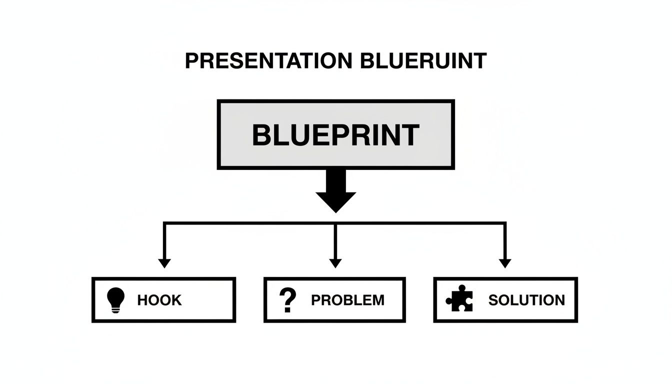
A killer presentation deck isn't built on flashy graphics or a mountain of data. It’s built on a story—a strategic narrative that follows a proven, five-act structure. This simple framework (Hook, Problem, Solution, Proof, and Ask) is designed to pull your audience in, guide them through your logic, and leave them ready to act.
The Blueprint for a Persuasive Presentation
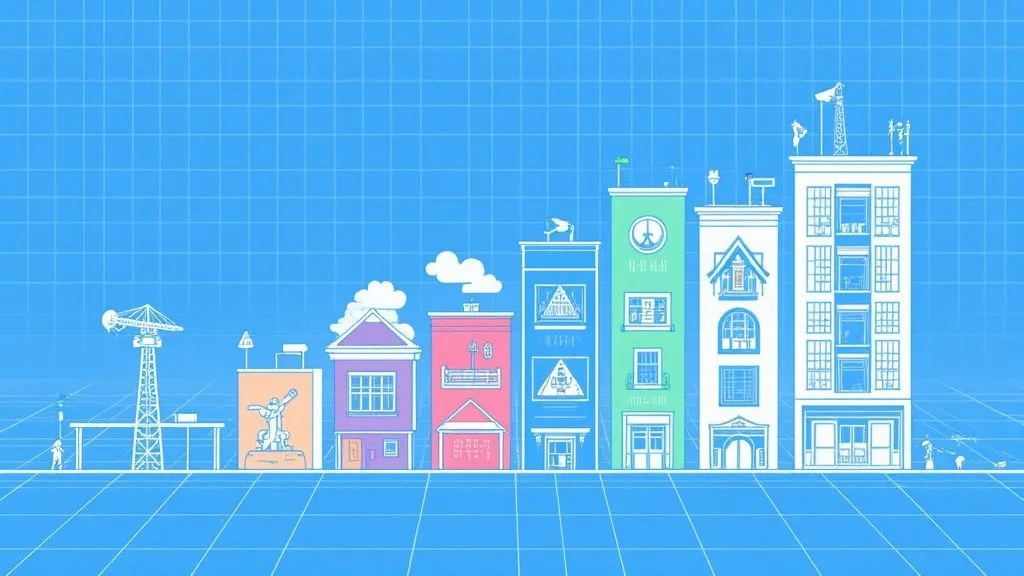
Every powerful presentation is built on a solid foundation, not just a random collection of slides. Think of it like an architectural blueprint for a house. Each room has a job, but they all flow together to create a space that feels right. The same goes for your deck—every section plays a specific role in building a single, compelling argument.
This five-act structure is a universal roadmap. It works whether you're pitching investors, launching a new product, or outlining a marketing strategy. It turns a pile of facts and ideas into a journey, connecting with your audience on both an emotional and intellectual level. Follow this blueprint, and your message won't just be heard; it will be felt and acted upon.
The Five-Part Narrative Framework
At its core, this architecture is a simple story that taps into how people naturally process information and make decisions. Each piece logically builds on the last, creating momentum that makes your final request feel like the only possible conclusion.
These five pillars are your guideposts:
- The Hook: Your opening move. Grab their attention immediately and make it clear why they should care.
- The Problem: Define the pain. Articulate a significant challenge or unmet need that your audience recognizes.
- The Solution: Introduce the hero. This is where your idea, product, or strategy comes in to save the day.
- The Proof: Show, don't just tell. This is your evidence—data, testimonials, case studies—that proves your solution works.
- The Ask: The grand finale. A clear, confident, and direct call to action. Tell them exactly what you want them to do next.
This flow is so effective because it mirrors classic storytelling. You establish a conflict (the Problem), introduce a hero (your Solution), and drive toward a resolution (the Ask). For a deeper dive into how this applies specifically to marketing materials, our guide on building effective marketing decks has some great practical examples.
A great presentation isn't a lecture; it's a well-told story. The structure is the plot that guides the audience, making the final conclusion feel inevitable and right.
We've summarized this entire framework into a quick-reference table. Use it as a checklist to make sure your narrative hits all the right notes.
The Five-Act Structure of a Perfect Presentation
Pitch Deck Architecture Overview
| Architectural Section | Core Purpose | Key Questions to Answer | Typical Slide Count |
|---|---|---|---|
| The Hook | Grab attention and establish relevance. | Why should they listen? What is the big idea? | 1 to 2 |
| The Problem | Frame a compelling pain point. | What is the specific problem? Who has it? | 2 to 4 |
| The Solution | Introduce your unique answer. | What is your solution? How does it work? | 3 to 5 |
| The Proof | Build credibility and trust. | Why should they believe you? What is the evidence? | 3 to 6 |
| The Ask | Drive a specific action. | What do you want from them, exactly? | 1 |
This table lays out the entire narrative arc, helping you organize your thoughts before you even open your slide software.
Why Structure Matters More Than Slides
Without this underlying architecture, even the most beautifully designed slides will fall flat. A classic mistake is diving straight into slide content—cramming in bullet points and charts without a narrative to hold it all together. That’s how you get disjointed, confusing presentations that leave the audience thinking, "So what?"
When you start with the blueprint, you ensure every slide, every statistic, and every sentence serves the larger story. If you're building a deck for fundraising, this ultimate guide to creating a winning pitch deck is an excellent resource that builds on these same principles. At the end of the day, the architecture is what makes a presentation stick—and what makes it persuade.
Building Your Narrative Pillar by Pillar
With the blueprint ready, it's time to build the actual narrative, one pillar at a time. The next five sections are the emotional and logical core of your entire presentation. Each one needs to flow naturally into the next, creating a smooth journey that pulls your audience from initial curiosity all the way to a firm commitment.
Think of it like building a bridge. Every pillar has to be solid and placed in the right order for the whole thing to stand. If you rush a section or get them mixed up, the entire argument can come crashing down. A truly great presentation deck is built on this deliberate, step-by-step construction.
The Hook: Seizing Initial Attention
You only get a few seconds to make a real impression. Your Hook is your opening move, designed to slice through the noise and signal that what you have to say is worth their time. This isn't about giving a summary of your whole deck; it's about making an instant connection.
A powerful hook can come in a few different flavors:
- A Startling Statistic: Hit them with a surprising number that immediately shows the scale or urgency of the problem you're about to tackle.
- A Provocative Question: Ask something that makes them challenge a common assumption or think about their own experiences.
- A Compelling Anecdote: Share a short, relatable story that perfectly frames the conflict your solution will eventually resolve.
Getting this initial moment right is absolutely critical. Data shows that 82% of viewers who stick around past the first three slides will finish the entire deck. That makes those first few moments make-or-break. You can find more trends like this in this in-depth look at design insights.
The Problem: Articulating the Pain
Once you have their attention, the next job is to build empathy. The Problem section is where you dig into the specific pain point your audience is dealing with. Forget listing features for a minute—this is all about making the audience feel completely understood.
A well-defined problem creates a sense of urgency. It takes the conversation from a vague idea to a real, pressing issue that demands a solution. You need to frame the problem using their words, describing the challenges and frustrations they face every day.
Your audience doesn't care about your solution until they are fully convinced you understand their problem. Articulate the pain better than they can, and you've earned their trust.
This diagram shows how these first foundational pillars fit together.
As you can see, it's a clear progression. The hook creates curiosity, which leads you right into the core challenge your solution is built to solve.
The Solution: Introducing the Hero
With the problem hanging in the air, the stage is perfectly set for a hero to make an entrance. Your Solution is that hero. This is your moment to introduce your product, service, or idea as the obvious and compelling answer to the pain you just described.
Your value proposition has to be sharp and dead simple to understand. Don't get bogged down in technical jargon or a laundry list of features. Instead, zero in on the main benefit. How do you make their life better, their work easier, or their goals more achievable? This section should be the "aha" moment for your audience.
The Proof: Building Unshakable Credibility
Big claims need big proof. The Proof section is where you back up everything you've said with cold, hard evidence. This might just be the most important pillar for building trust and shutting down any skepticism. Without it, your solution is nothing more than a nice idea.
Proof can come in many forms, and a good mix is usually the most effective strategy:
- Hard Data: Show off metrics, research findings, or performance analytics that quantitatively prove your points.
- Testimonials: Use direct quotes from happy customers to provide that all-important social proof.
- Case Studies: Tell a quick story of how a specific client used your solution to fix their problem and get real, measurable results.
- Live Demonstrations: If you can swing it, showing your solution in action is one of the most powerful forms of proof there is.
These elements turn your story from a simple pitch into a rock-solid business case. Learning how to present this proof effectively is a huge part of great communication, and you can explore more ways to do it in our article on powerful visual storytelling examples.
The Ask: A Clear Call to Action
Every story needs an ending. The Ask is the finale of your narrative, where you tell the audience exactly what you want them to do next. A weak or vague ask can unravel all the great work you did in the previous sections.
Your call to action has to be specific, actionable, and reasonable. Don't make people guess. Whether you want them to sign up for a trial, approve a budget, or book a follow-up call, just say it. This final pillar is what turns a good presentation into a great one by turning interest into action.
Designing Slides That Enhance Your Story
Even the most powerful story can fall flat if it's trapped in a clunky or distracting slide deck. Think of your slides as the stage where your narrative performs; the visual design is just as important as the words you speak. Great design doesn't just decorate your information—it clarifies it, gives it an emotional punch, and tells your audience exactly where to look.
We've all sat through those presentations. The ones with dense paragraphs and a dozen bullet points crammed onto a single slide. Thankfully, that era is over. Today’s best presentations feel more like a cinematic experience, where visuals and text are partners in telling a unified story. Your slide should be a billboard, not a page from a textbook. It needs to land one clear idea, instantly.
Establishing a Cohesive Visual Language
Consistency is the bedrock of professional design. Before you even think about building your first slide, you need to lock in a visual theme that will carry through the entire presentation. This theme becomes your deck’s visual signature, making it feel polished, intentional, and unified.
Your visual language really just comes down to a few core elements:
- Color Palette: Pick a primary color for emphasis, a secondary for support, and a neutral for your text and backgrounds. That's it. Sticking to a limited palette keeps things clean.
- Typography: Choose one or two fonts that are dead simple to read. A bold, impactful font for headlines and a clean, straightforward one for body text will create a natural visual hierarchy.
- Imagery Style: Decide on a consistent feel for all your photos, icons, and illustrations. Whether you go for high-contrast photography or minimalist line icons, they should all look like they belong in the same family.
When everything is visually consistent, your audience isn't thrown off by jarring changes from one slide to the next. They can just relax and focus on your message. The entire https://www.moonb.io/blog/design-process-in-graphic-design hinges on creating these kinds of systematic rules to make sure your message is clear and impactful.
Embracing Simplicity and Whitespace
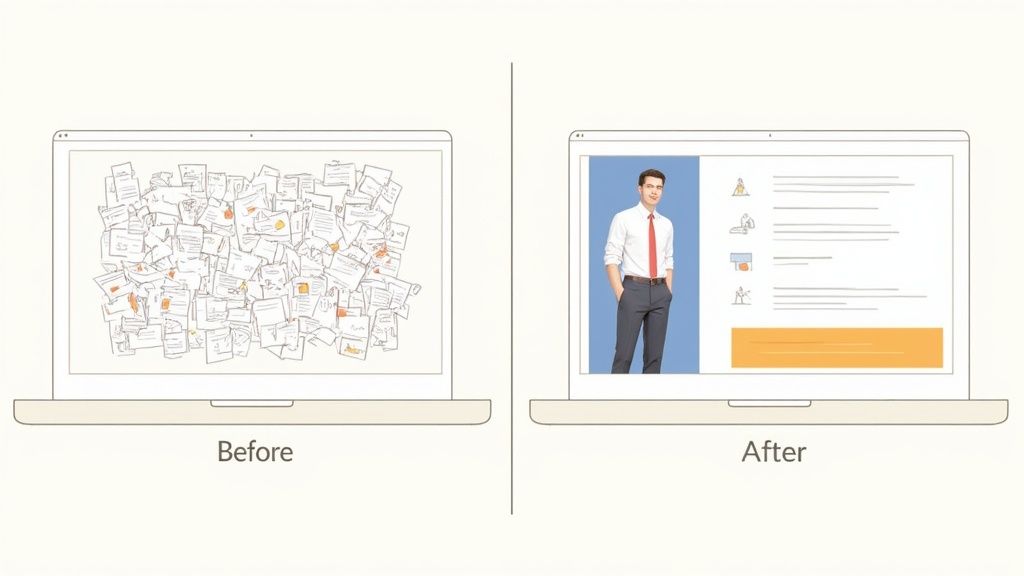
The single most common design mistake? Information overload. When a slide is cluttered, your audience has no idea where to look, and your main point gets completely lost in the noise. The fix is simpler than you think: whitespace.
Whitespace isn't just empty, wasted real estate; it's an active part of your design. It gives your content room to breathe, eases the mental load on your audience, and guides their eyes straight to what matters most. Honestly, a slide with one powerful image and a single, short sentence will almost always hit harder than a slide packed with ten bullet points.
"Perfection is achieved, not when there is nothing more to add, but when there is nothing left to take away." - Antoine de Saint-Exupéry
This idea is the absolute core of building a perfect presentation deck. You have to be ruthless. Edit each slide down to only what is absolutely essential to support what you're saying. Remember, your slides are a visual aid, not your teleprompter.
Designing for a Modern Audience
Today, your deck might be viewed on a massive boardroom projector or a tiny phone screen. With remote and hybrid work becoming the norm, weekly presentations are now a ritual for over 50% of teams. This shift means your design has to be sharp and adaptable, no matter the device.
To tackle this, focus on high-contrast designs, big and legible fonts, and simple layouts that don't break on smaller screens. Knowing how to create presentation slides that connect with your audience on any medium is a non-negotiable skill now. When you put clarity and visual impact first, you build a deck that works anywhere, for anyone.
Turning Data Into a Compelling Narrative
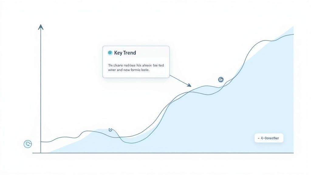
Let's be honest: raw data is just noise. A spreadsheet full of numbers, on its own, persuades absolutely no one. The real magic happens when you weave that data into a story—a clear, visual narrative that makes your argument impossible to ignore. This is where the architecture of a great presentation deck really shines, by turning complicated info into simple, powerful insights.
Too many presenters fall into the trap of just dumping charts and graphs onto a slide, assuming the numbers will speak for themselves. They almost never do. Your job is to be the interpreter. You have to connect the dots for your audience and frame the data in a way that hammers home your core message. Every single chart should have one main takeaway, and it needs to be obvious at a glance.
Choosing the Right Visual for Your Data
The first move in data storytelling is picking the right tool for the job. Different charts do different things, and choosing the wrong one can muddy your message or, even worse, mislead your audience. You're looking for the simplest, most direct way to illustrate your point.
This isn’t about making the fanciest visualization; it’s all about clarity. Here’s a quick rundown of how to match your data to the right visual:
- Bar Charts are your go-to for comparing distinct categories, like sales figures across different product lines.
- Line Charts are perfect for showing trends over time, like website traffic over the last 12 months.
- Pie Charts should be used sparingly, but they work well for showing parts of a whole, like market share percentages.
- Scatter Plots are fantastic for spotting relationships or correlations between two different variables.
When you pick the right chart, you give your audience an intuitive shortcut to understanding the information. A well-chosen visual doesn’t need a long-winded explanation; its meaning is clear right away, making your entire argument that much stronger.
One of the most common mistakes is chasing visual complexity over clarity. A simple bar chart that tells a clear story will always beat a convoluted 3D graph that just leaves people confused.
This idea is central to building a deck that persuades. You aren't just showing data; you're guiding your audience to a specific conclusion.
The Art of Pacing and Breather Slides
Just as important as the visuals themselves is the pacing of your story. Hitting your audience with a relentless barrage of data-heavy slides is a surefire way to make them tune out. To keep them locked in, you need to build momentum and give them moments to digest what you're saying. This is where pacing and breather slides come in.
Think of your presentation like a movie. It needs its high-action scenes and its quiet, reflective moments.
A breather slide is deliberately simple. It has just one powerful element that reinforces your last point or sets up the next one. It could be:
- A killer quote from an industry expert or a happy customer.
- A high-impact, full-screen photo that stirs the right emotion.
- A single, bold number or statistic that you really want to stick.
These slides break up the cognitive load and stop your audience's eyes from glazing over. They act like punctuation in your story, giving your most critical data points the space they need to land with maximum impact. A deck with thoughtful pacing respects the audience’s attention span, making the whole experience more memorable and, ultimately, more persuasive.
Common Architectural Flaws to Avoid
Even with the perfect five-act structure in mind, it's surprisingly easy for a presentation's foundation to crack under its own weight. I've seen it happen time and time again. Spotting these common architectural flaws is the first step to building a deck that’s genuinely persuasive and professional, not just a collection of slides.
The biggest mistake I see is simply trying to say too much at once. When a slide is drowning in bullet points and tiny text, it forces the audience to read instead of listen. That immediately severs the connection between you and them, turning your presentation into a glorified document.
Information Overload on a Single Slide
If you take one thing away from this, let it be the golden rule of modern slide design: one idea per slide. A slide should be a visual billboard that reinforces what you're saying, not a teleprompter that contains your entire script. Jamming too much onto a slide creates cognitive friction, making your audience work way too hard just to figure out what matters.
This is more critical than ever. The sweet spot for a modern deck is often 10 slides or fewer, built to be presented in under 15 minutes to match today's shrinking attention spans. And with 32% of decks now being opened on mobile devices, a minimalist design isn’t just a nice-to-have; it's a necessity. If you're curious about how design trends are shifting, you can discover more insights about presentation design best practices.
A cluttered slide is a sign of a cluttered mind. If you can’t distill your point into a single, clear statement supported by a simple visual, you haven’t refined your message enough.
Instead of building a wall of text, break your points into a sequence of simple, visually driven slides. This simple shift dramatically improves your pacing and makes sure every key message gets the spotlight it deserves.
A Disconnected and Episodic Narrative
Another critical flaw is a story that just doesn't flow. This is what happens when a presentation feels like a random collection of interesting-but-unrelated facts rather than a cohesive argument. Each slide might look great on its own, but if they don't logically build on each other, the audience is left completely lost.
This problem usually starts when people build their slides in isolation without a master blueprint. To fix this, always map out your five-act narrative—Hook, Problem, Solution, Proof, Ask—before you even think about opening PowerPoint or Google Slides. This ensures every single slide has a specific job to do in moving the story forward.
A connected narrative builds momentum. It takes your audience on a journey, guiding them from one logical point to the next until your final ask feels like the only possible conclusion.
A Weak or Missing Call to Action
This one might be the most damaging flaw of all: ending with a whimper instead of a bang. After building a compelling case, so many presenters fumble the final step with a vague or nonexistent call to action (CTA). An ending like, "Any questions?" leaves the audience wondering what on earth they're supposed to do next.
Your "Ask" needs to be direct, clear, and confident. This isn't the time to be shy. Tell them exactly what you want.
- Bad CTA: "Let me know what you think."
- Good CTA: "I'm asking for a $50,000 budget to launch this campaign in Q3. Can I get your approval by Friday?"
A strong CTA is the capstone of your presentation's architecture. It's the whole reason you built the narrative in the first place, and delivering it with clarity is what turns an informative session into a powerful tool for action.
Streamlining Your Deck Creation Process
Let's be honest: building the perfect deck shouldn't feel like a week-long ordeal that completely hijacks your schedule. The real goal is to get your story across with maximum impact, but to do it efficiently. This frees you up to nail down your core message and, you know, actually prepare to deliver the presentation. Modern tools and smarter workflows are the secret to striking this balance without cutting corners on quality.
Thinking about the architecture of a perfect presentation deck means looking at the creation process itself. It’s time to move past the grind of building every single slide from the ground up. Today’s AI-powered presentation tools can be a massive help, generating solid first drafts, suggesting layouts that work, and even helping you sharpen your writing. Think of them as a creative co-pilot, there to handle the initial grunt work.
The Power of Reusable Templates
One of the single most effective things you can do is build a library of reusable templates for the presentations you give most often. Think about the decks your team makes again and again—sales pitches, quarterly business reviews, or new project kickoffs. When you create a master template for each, you lock in brand consistency and claw back countless hours.
A great template is more than just a logo and a color palette. It should be a blueprint for your narrative, with placeholder slides for each of the five core pillars: the Hook, Problem, Solution, Proof, and Ask. This gives your team a proven structure to follow every time. To see how this fits into a bigger picture, you can check out our deep dive into building an effective creative workflow process.
Your presentation templates are more than just a design shortcut; they are a strategic asset. They codify your most successful narratives, making it easier for anyone on your team to build a persuasive and on-brand deck quickly.
When you systematize the process like this, you can stop messing with design mechanics and spend your energy where it really counts: perfecting the story that will win over your audience.
Modern Presentation Tool Comparison
To build decks efficiently, you need the right tools in your corner. While PowerPoint and Keynote are the old standbys, a new wave of platforms is making it easier than ever to create visually stunning and persuasive presentations, often with a huge assist from AI. These tools can help with everything from initial brainstorming and content generation to final design polish.
Here’s a quick comparison of some popular options:
AI Presentation Tools Comparison
| Tool | Best For | Key AI Features | Template Quality |
|---|---|---|---|
| Beautiful.ai | Teams needing brand consistency and design automation. | Smart slide templates that auto-format content and AI-driven design suggestions. | High-quality, professional, and easily customizable. |
| Pitch | Collaborative teams building investor or sales decks. | AI-powered content generation and template recommendations based on deck type. | Modern, stylish, and geared toward startup and tech narratives. |
| Tome | Storytelling and creating interactive, web-based narratives. | Generative AI for creating entire presentations from a prompt, including image generation. | Visually unique and narrative-focused, less traditional. |
| Canva | All-around design for teams who need more than just decks. | Magic Write for text generation, AI image editing, and template suggestions. | Massive library with huge variety, from corporate to creative. |
Choosing the right platform often comes down to your team's specific needs—whether it's collaboration, design automation, or pure storytelling power. But incorporating any of these modern tools can dramatically cut down on creation time.
Knowing When to Outsource
While templates and AI tools are perfect for most day-to-day needs, some moments call for the heavy hitters. For those high-stakes meetings—a make-or-break investor pitch, a major product launch—outsourcing your presentation design can be a truly game-changing investment.
Think about this: the average manager-level office worker spends at least 4 hours per week just making slides. That’s over 200 hours a year sunk into building decks. With that much time on the line, it's easy to see why outsourcing is becoming such a common strategy. Bringing in a professional designer for your most critical presentations ensures your message lands with the strongest possible visual impact. When the stakes are that high, you can't afford to leave anything to chance.
A Few Common Questions
Even with a great game plan, a few questions always pop up when you're in the trenches building a presentation. Let's tackle some of the most common ones with quick, practical advice to help you get your deck polished and ready to persuade.
What's the Ideal Length for a Presentation Deck?
There's no single magic number here, but the golden rule is always brevity. Your goal is to tell a complete story as concisely as you possibly can.
For most situations, aim for 10-15 slides. This forces you to zero in on your core message and, just as importantly, shows you respect your audience's time. Your deck is a visual aid, not a script you're reading from. Each slide should be a backdrop that supports what you're saying.
How Much Text Should I Put on a Single Slide?
Less is more. A lot more. A great slide has one—and only one—clear takeaway.
Think of it this way: a headline and maybe one or two short sentences or a few bullet points is your absolute max. If you crowd a slide with text, people will read it instead of listening to you. The connection is broken, and your message gets lost.
The best slides are billboards, not book pages. They should communicate one idea, instantly, and visually reinforce the point you are making at that moment.
Keeping the text minimal makes sure your voice and your message are the real stars of the show.
Should I Use a Template for My Presentation?
Absolutely. Starting with a template is a no-brainer. It saves a ton of time, keeps your branding consistent, and gives you a proven narrative structure right out of the box. A good template acts as your guide, with pre-built sections for your Hook, Problem, Solution, and Ask.
If you're struggling to organize your ideas even before you get to the slides, our guide on building a creative brief template can give you a solid foundation for your thinking.
The efficiency boost is huge. With companies reporting 71% AI adoption in presentations and a market expected to hit $5 billion by 2031, using smart tools and templates isn't just a shortcut—it's a strategic advantage. As you can see in this analysis of presentation trends, the best decks are architected for clarity and story from the very beginning.
Frequently asked questions
Treating it as a one-off deliverable instead of a system. Most of the return on creative production comes from compounding output over time, not from the first asset shipped.
Look at the gap between the work you have today and what you wish you could publish. If that gap shows up repeatedly across campaigns, creative production has a signal.
Best as one node in a system: creative production paired with your site, your sales enablement, and your help center. Standalone, it underperforms what it could.

