Sales Deck Examples and Playbooks That Close Deals
Real sales decks from Zuora, Uber, LinkedIn, Snapchat and Gong, plus the deck-type playbooks and the specific moves each one teaches for a modern B2B pitch.


A strong sales deck moves from the buyer’s problem to the stakes, the solution, proof, pricing or how it works, and one clear next step. A practical version usually fits roughly 10 to 20 slides.
I run Moonb, a creative team that builds sales and pitch decks for B2B teams, so I look at a lot of these. A sales deck is the presentation a rep or founder uses to move a prospect toward buying. It focuses on the customer’s problem, the outcome they want, evidence you can deliver it, and the next decision they should make. A pitch deck raises investment and centers on market size, traction, business model, and team. A sales deck closes a customer; a pitch deck closes an investor. If you are building the second kind, Moonb’s pitch deck examples guide is the better companion.
The cases below are public or widely shared. Their value is not that every slide should be copied. It is that each deck demonstrates a teachable move: naming a market shift, showing a product in context, separating two audiences, or answering stakeholder objections before they become blockers.
The most useful sales decks also respect the way people actually read presentations. Presentation-analytics providers such as Storydoc consistently report that a large share of viewers drop off in the first few slides, and that those who make it through the opening tend to finish. Your opening slide and the sequence that follows deserve more attention than decorative polish.
A presented deck should stay sparse enough for the speaker to carry the story. A send-ahead or leave-behind deck needs more explanation because it may be forwarded without the presenter. For more perspective on the human side of selling, see these top tweets about selling.
1. Zuora and the Name the Enemy Narrative Structure
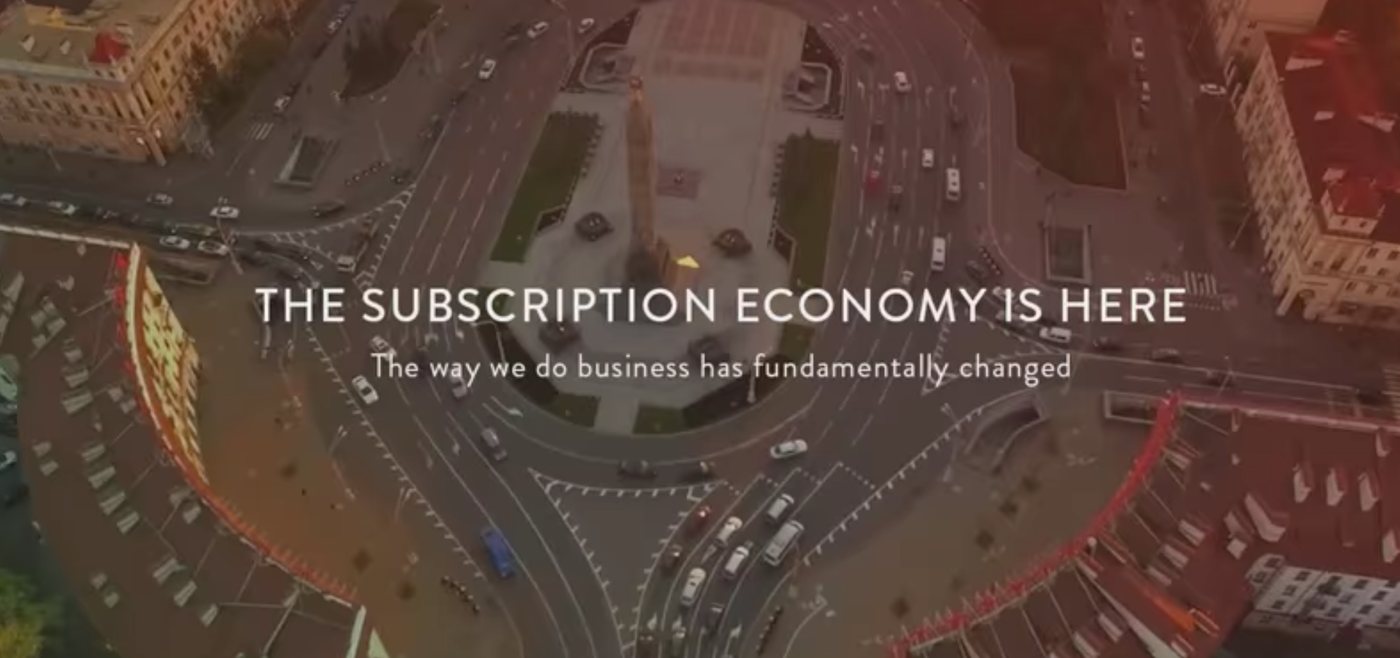
The classic Zuora deck is widely cited for a simple narrative move: it names the change confronting the buyer before introducing the product. Instead of opening with a feature tour, the story frames the shift toward recurring-revenue businesses (the thesis Zuora itself has published about at length) as a change that breaks older operating models.
That order matters. The buyer first sees the old world, then the new reality, then the need to adapt. Zuora appears as a response to that change, rather than as a company searching for a problem to solve.
The transferable move
Build the deck around a visible contrast:
- Old way: Explain the manual process, outdated assumption, or operational constraint that creates friction.
- Market shift: Show what has changed in customer behavior, buying patterns, regulation, or technology.
- New requirement: Define what the buyer must now do differently.
- Your role: Introduce the product as a practical response to that requirement.
- Proof: Use customer evidence that reinforces the shift, not a disconnected logo wall.
The “enemy” doesn’t have to be a competitor. It can be spreadsheet-based reporting, fragmented approvals, slow onboarding, or a billing model that no longer fits the business. Keep it specific. “The old way is inefficient” gives the buyer nothing to recognize. “Finance waits for three teams before it can explain recurring revenue” creates a concrete problem.
A deck using this structure can move from the old world to the new one, then into solution, proof, pricing, and a single next step. The ask might be a customized demo, a pilot, or a budget review.
Practical rule: Name the buyer’s enemy in the first or second slide. Don’t make prospects wait through company history to discover why the problem matters.
Use visual storytelling examples when you need to turn a before-and-after business change into a slide sequence people can follow quickly.
2. Uber’s Early Deck and the Problem Solution Vision Arc
Uber’s early public deck is often shared as an example of a clean three-act story. It starts with the broken taxi experience, introduces the service in functional terms, and then expands toward a broader vision for city transportation.
That sequence gives the audience a reason to care before it asks them to understand the product. The solution is easier to grasp because the deck has already established the inconvenience it addresses.
Show the product at the moment it matters
The strongest lesson is contextual demonstration. A map, mobile interface, or booking flow carries more weight when it follows a recognizable customer problem. Product screenshots shouldn’t be reduced to tiny thumbnails surrounded by labels. Show the important screen at a useful size, then annotate only what the buyer needs to notice.
For a modern version of this structure, keep the acts distinct:
- The problem: Describe the customer experience in plain language. A short story can work better than a broad market claim.
- The solution: Show what the user does and what happens next.
- The vision: Explain the larger future state without promising more than the product can support.
The business model also deserves its own slide. Explain how money moves through the product without hiding it in a footnote. For a marketplace or transaction-based service, show who pays, what they pay for, and what creates repeat use.

A vision slide should help the buyer see the consequence of adoption. It might show how teams coordinate work across departments, how a physical system operates with less friction, or how a customer completes a task that used to require several handoffs. It shouldn’t become a second problem slide filled with grand language.
The practical move is simple: problem, product moment, future state. That spine works for software, hardware, and services when the buyer needs to understand both the immediate experience and the wider business effect.
3. LinkedIn’s Early Deck and One Idea Per Slide
LinkedIn’s early deck is widely circulated as a public example of restrained slide design. Its useful lesson isn’t visual fashion. It’s the discipline of introducing one feature or benefit at a time.
That approach creates rhythm. The audience doesn’t have to decode a product map, a dense feature matrix, and a long paragraph at the same time. Each slide advances the story by one step.
Make the headline do the work
Write the headline before you choose the image. It should make one clear statement, such as “Recruiters can reach qualified candidates through trusted connections.” A question or vague label like “Our platform” forces the presenter to supply the meaning.
Then make the visual and sentence complement each other. If the screenshot already shows the workflow, don’t repeat every button in the copy. Use the text to explain the business consequence.
The feature order should follow the buyer’s understanding, not your internal product hierarchy:
- Start with the user’s problem: Show why fragmented professional relationships create a gap.
- Introduce the first action: Explain how a new user begins.
- Add the next behavior: Show how the product builds value through use.
- Connect activity to outcome: Tie product behavior to a business result.
- Close with proof or adoption evidence: Use a clear, honest metric when one is publicly documented.
Keep the same grid and visual language across the sequence. Consistency helps the audience focus on the changing idea rather than the changing layout.

“If a slide needs a paragraph to explain what the visual means, the visual probably isn’t doing enough.”
For more guidance on keeping a deck coherent from opening slide to final ask, see this presentation deck guide. The transferable lesson is restraint. One slide, one idea, one reason that idea matters.
4. Snapchat’s Early Deck and the Use Case First Sequence
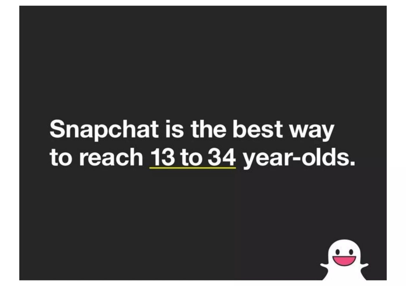
Snapchat’s early public deck is often discussed because it leads with a user behavior rather than a technical category. The audience encounters disappearing photos, casual communication, and a different social interaction before being asked to classify the product.
That’s a useful approach for products that create a new habit. If you lead with “mobile communication platform,” you may sound interchangeable with established tools. If you show the moment a user sends something temporary because permanence changes the social pressure, the product’s difference becomes easier to understand.
Sell the behavior before the category
Start with a short user moment. Who sends something? What are they trying to do? What changes because the message, image, or action behaves differently?
Then ask three questions:
- What behavior does the product create?
- Why would someone choose that behavior over the familiar alternative?
- What emotional or practical friction disappears?
The product explanation should follow the use case. Show the interface, but don’t let interface labels become the story. A screenshot is proof of how the product works. It isn’t automatically proof that the buyer needs it.
For consumer products, real user language can make the narrative feel grounded. Use verified testimonials or public user comments where permission and context allow. Don’t replace evidence with celebrity association or broad claims about cultural impact.
The design should match the product’s tone, but consistency matters more than decoration. A playful product can still use a clear grid. A serious product can still use a strong visual moment.
The closing action also depends on the product. It might be a download, an invitation, a trial, or a request to bring another user into the workflow. “Learn more” is rarely enough. The buyer should understand what happens after the deck.
See these app walkthrough examples for ways to connect interface screens to a user journey rather than presenting isolated features.
5. Gong’s SaaS Demo Deck and the Workflow, Proof, Pricing Spine

Gong, the revenue-intelligence platform, is often held up as the model for a SaaS sales deck, partly because it argues from its own product data rather than adjectives and even publishes its template. A strong SaaS demo deck follows a predictable buyer-first sequence. It opens with a specific problem, shows the workflow before and after, introduces the product as the answer, adds proof, explains pricing or packaging, and ends with a defined next step.
The structure works because it prevents the demo from becoming a feature inventory. Buyers don’t need to see every capability. They need to understand how the product changes work they already recognize.
Keep the workflow short
Use the workflow section to answer four questions:
- What does the buyer do today?
- Where does the process slow down or break?
- What does the buyer do in the new workflow?
- What outcome becomes easier to achieve?
A practical workflow usually needs only a few slides. If the sequence becomes a long product tour, attention shifts from the business problem to interface details.
Proof should appear immediately after the relevant claim. Pair a customer result with a customer quote from the same role when both are available and approved. A finance leader may care about reporting effort. An operations leader may care about handoffs. The proof should match the person making the decision.
Pricing belongs in the story when the buyer needs it to evaluate fit. Explain packaging in terms the audience can use, such as users, transactions, outcomes, or implementation scope. Avoid presenting a price without explaining what the buyer receives and what decision the price supports.
A live deck can stay visually sparse, with speaker notes carrying detail. A leave-behind needs more context, captions, and definitions because it may circulate without the presenter.
Watch the walkthrough first, then use these SaaS demo best practices to connect product motion to buyer outcomes.
The key move is sequencing. Show the work before you show the software.
6. The Services Deck Playbook: Work Samples, Process, Outcome
A services deck cannot rely on a product trial to prove its value. The buyer needs to see the work, understand how the team operates, and judge whether the engagement fits the problem.
Lead with the client’s business challenge, then show a focused set of relevant projects. Each example should connect the team’s actions to an outcome. A gallery of attractive slides is weaker than a small portfolio that explains why each piece mattered.
Make the work tangible
Use real deliverables where possible. A campaign video, identity system, landing page, product animation, or presentation design sample gives the buyer something concrete to evaluate. Mockups can clarify the presentation, but they should not stand in for finished work.
A case study slide should answer three questions:
- What was the client trying to change?
- What did the team make or deliver?
- What happened after the work was used?
Choose an approved client quote that addresses the result or the working experience. Generic praise offers little help with fit. The quote should support the capability demonstrated on that slide, not introduce an unrelated benefit.
The process section reduces delivery risk by making the engagement visible. Show a simple workflow or timeline, such as discovery, concept, production, review, and delivery. Use plain language. A prospect needs to know who participates, where feedback happens, and what arrives at each stage.
Give the buyer a specific next step. Two or three options can provide a clear entry point, such as a workshop, audit, or proposal meeting. Each option needs a distinct purpose, and the team must be able to deliver it well. Choice helps only when it reflects real capacity and different buying situations.
For a dedicated creative team, the same logic applies. Moonb can support a high-stakes deck with presentation design, motion, video, or brand work, extending an existing team. Companies looking for a B2B creative agency can use this model to assess both the output and the collaboration.
The transferable lesson is work, method, outcome. Remove any slide that does not help the buyer evaluate one of those three things.
7. The Marketplace Deck Playbook: A Supply and Demand Dual Narrative
The clearest real model here is Airbnb, whose early deck sold a two-sided market by speaking to hosts and guests as separate audiences with separate reasons to join. Marketplace decks must persuade two audiences with different reasons to participate. Suppliers want access to qualified demand. Buyers want selection, trust, and a reliable transaction. A deck that explains only one side leaves the other side unconvinced.
The best marketplace examples start with shared market friction, then split the story into parallel narratives. They show how the platform creates value for supply and demand without pretending those groups have the same needs.
Explain the network without hiding the bootstrap problem
A useful structure looks like this:
- Shared problem: Explain why the existing market is difficult for both sides.
- Supplier value: Show how providers gain access, visibility, or better utilization.
- Buyer value: Show how customers find, compare, and purchase what they need.
- Network proof: Use verified evidence of participation, transactions, or repeat activity.
- Economic model: Explain the commission, take rate, listing model, or other revenue mechanism.
- Separate asks: Tell suppliers and buyers what action each should take next.
Network effects can sound abstract unless the deck shows how one side’s participation improves the other side’s experience. If supply is limited, explain how the marketplace built initial inventory. If demand is uncertain, explain how it was developed. Don’t skip the early-market mechanics because they’re uncomfortable.
Proof should reflect marketplace health. A user count alone may not explain whether transactions happen. Use the strongest verified evidence available, with context that makes the measure meaningful.
The final slide should not ask everyone to “join the platform.” Suppliers and buyers need different instructions. One might submit inventory. The other might browse a category or request a match.
For a concrete marketplace reference point, you can browse the Vocuno marketplace. The transferable move is to show both sides making a decision, not merely place two audience labels on one slide.
8. The Enterprise Software Deck Playbook: Proactive Objection Handling
Salesforce is the reference point many enterprise decks still borrow from, using one hostile line about legacy software, its famous “No Software” positioning, to reframe the category before any feature appears. Enterprise buyers rarely evaluate a product through one person’s priorities. A CFO may want cost justification. A CTO may need integration and security detail. Operations may focus on implementation. End users may care about training and daily usability.
An enterprise sales deck should preserve one central problem and solution while changing the proof for each stakeholder. That’s more useful than creating separate stories that contradict one another.
Build sections around stakeholder decisions
After the shared business problem, organize the deck into focused sections:
- Financial case: Explain the cost of the current process, the expected value, and the assumptions behind the calculation.
- Technical fit: Address integration, security, data handling, and operational requirements with specific evidence.
- Implementation: Show ownership, change management, training, and the path to adoption.
- User experience: Demonstrate how the people doing the work interact with the product.
- Decision path: State what each stakeholder needs to approve or provide.
Section breaks help a buying committee move through the material. A live presenter can skip or expand sections. A leave-behind can give each stakeholder a clear route to the information they need.
Proof should be tiered. A customer reference from a similar technical environment may matter more to the CTO than a general brand logo. A documented implementation process may matter more to operations than a broad product claim. Put evidence beside the objection it answers.
Pricing and ROI deserve careful treatment. Don’t present a single figure without scope, assumptions, implementation context, or the decision it enables. Enterprise buyers often need to circulate the deck internally, so define terms that a non-presenter could misunderstand.
Close with more than one possible next step if the deal requires coordination. A technical validation, security review, business case workshop, or stakeholder meeting may be more realistic than a generic demo request.
The transferable move is to vary the proof, not the story. Everyone should understand the same problem, solution, and intended outcome.
8 Sales Deck Structures Compared
| Deck / Pattern | Implementation complexity | Resource requirements | Expected outcomes | Ideal use cases | Key advantages |
|---|---|---|---|---|---|
| Zuora: “Name the Enemy” Narrative Structure | Medium, High, requires coherent market narrative | Market research, case studies, strong visuals, disciplined writing | Reframes buyer perspective, higher receptivity before product pitch | SaaS, fintech, enterprise software, crowded categories | Positions market shift first; mid-deck proof reinforces credibility |
| Uber Early Deck: Problem‑Solution‑Vision | Low, Medium, simple three‑act flow but needs real product | Live product screenshots, early traction data, concise copy | Clear problem→solution mapping and believable early traction | Marketplaces, consumer services, on‑demand, logistics | Real screenshots build trust; concise vision shows scale potential |
| LinkedIn Early Deck: One Feature at a Time | Medium, rigorous slide discipline and sequencing | Consistent design templates, product screens, user metrics | Highly scannable, memorable presentation of features | SaaS, social platforms, B2B networks, productivity tools | Clarity through one idea per slide; easy to update and scale |
| Snapchat Early Deck: Use Case First, Then Product | Low, Medium, story and tone focused, less technical detail | User stories, testimonials, UX visuals aligned to tone | Strong emotional resonance and behavior‑first framing | Consumer apps, social/messaging, creator tools | Leads with user behavior and emotion; authentic voice increases appeal |
| Gong: a SaaS demo on the Workflow‑Proof‑Pricing spine | Medium, High, requires buyer workflow expertise | User interviews, measurable proof, pricing models, speaker notes | Demonstrable ROI in context; smooth demo-to-deal motion | SaaS, enterprise software, fintech, healthcare tech | Walks buyer through workflow; metrics‑based proof and transparent pricing |
| Services Agency Deck: Work Samples, Process, Outcome | Medium, curated case studies and visual samples needed | Client work samples, permission, testimonials, process visuals | Builds trust quickly; helps prospects see comparable outcomes | Creative/design/marketing agencies, brand consultancies, production | Actual deliverables sell better than claims; clear engagement options |
| Marketplace Deck: Supply & Demand Dual‑Narrative | High, must address two audiences and network dynamics | Network growth metrics, transaction data, dual CTAs, visuals | Demonstrates network effects and bootstrapping strategy | Marketplaces, e‑commerce platforms, B2B exchanges, logistics | Solves chicken‑and‑egg upfront; shows momentum for both sides |
| Enterprise Software Deck: Stakeholder Objection Handling | High, multi‑stakeholder tailoring and deep evidence | ROI analysis, security/compliance details, stakeholder references | Reduces committee friction; targeted answers for each role | Enterprise software, fintech, healthcare, compliance‑heavy sectors | Proactively addresses stakeholder concerns with role‑specific proof |
Turn the Best Moves Into Your Next Deck
The strongest sales deck examples share a useful pattern. They don’t ask the buyer to admire the company before understanding the problem. They create a clear path from recognition to decision.
Start with a hook or reframe. Name the change, tension, or customer moment that makes the conversation relevant. Then define the buyer’s problem in language they use themselves. If the prospect doesn’t recognize the situation, the rest of the deck becomes a product explanation without urgency.
Next, show the stakes. What does the current process cost in time, risk, missed opportunity, or internal effort? Use real numbers when you have approved evidence. If you don’t, describe the consequence directly instead of inventing precision.
Introduce your approach after the buyer understands the problem. Explain how the product, service, or process changes the work. A demo belongs here, not at the beginning. The buyer needs context before interface details can mean anything.
Then place proof close to the claim it supports. Use named customer stories, verified results, screenshots, references, or specific deliverables. A logo wall can establish recognition, but it rarely explains why the solution worked for a company like the prospect.
Explain pricing or how it works in a way that supports the next decision. Give the buyer enough context to understand scope, packaging, implementation, or commercial fit. End with one specific next step, such as a customized demo, technical review, proposal meeting, or pilot definition.
Use a practical slide range
A sales deck will often land in the 10 to 20 slide range. The right length depends on the buying stage and audience. A discovery-led live deck may be shorter, while a leave-behind needs enough explanation to survive internal forwarding.
A benchmark analysis cited by Prospeo says buyers spend under three minutes on sales content on average, with most viewing on desktop. The B2B sales presentation benchmark supports a short, high-signal approach. Keep one core idea on each slide. A presenter can add nuance aloud, while a leave-behind can use captions, speaker notes, and concise supporting detail.
The opening deserves special care. Presentations.ai’s presentation statistics overview reports that roughly 35 million PowerPoint presentations are delivered every day by about 500 million users worldwide. Presentation content is working material for sales, marketing, and client communication, not an occasional document. Buyers have seen enough decks to recognize when a slide exists only because someone felt it had to.
Fix the common failures
- Leading with company history: Start with the buyer’s problem, then introduce the company when its relevance is clear.
- Opening with features: Show the workflow or consequence first. Connect each feature to a job the buyer needs done.
- Burying proof: Put evidence beside the claim. Don’t make prospects search for reasons to believe you.
- Using dense text: Reduce each slide to one idea and let the presenter or speaker notes carry the explanation.
- Choosing generic stock imagery: Use real screenshots, customer environments, diagrams, or product moments that add meaning.
- Leaving out the ask: Name the next meeting, review, test, or approval you want.
- Sending one deck to everyone: Create a core narrative, then adapt examples, proof, pricing context, and objections for the audience.
- Treating a live deck like a leave-behind: Add notes and definitions when the file will circulate without a presenter.
A deck made by a non-designer can still look considered. Use Google Slides, Keynote, PowerPoint, Pitch, Canva, or a consistent template. Limit the system to two fonts and a small color set. Align elements to a grid. Use real screenshots and real numbers instead of clip art. Keep motion restrained. Video and animation should clarify a workflow or product moment, not decorate an otherwise unclear slide.
For a high-stakes enterprise deal or a brand-defining presentation, a dedicated creative team such as Moonb can support presentation design, motion, video, and brand work while extending the client’s team.
Before you present or send the deck, audit it in this order:
- Narrative: Can a buyer summarize the problem, stakes, solution, and outcome?
- Evidence: Does every important claim have relevant proof?
- Visuals: Does each image, screenshot, chart, or animation explain something?
- Pricing: Can the audience understand what the commercial information includes?
- Objections: Have finance, technical, operational, and user concerns been addressed where relevant?
- Next step: Is there one clear action, with an owner and a reason to take it now?
Revise until every slide helps the buyer make the next decision. Then remove anything that only helps the presenter feel prepared.
Frequently asked questions
For a live presented deck, aim for 10 to 15 slides that carry the story with a speaker driving the pace. For a leave-behind or send-ahead deck, expect 20 to 30 slides because the reader needs more written context. Same story, two very different builds; using one for the other is the most common mistake in this format.
Not everywhere. Show the product at the moment the buyer's problem is fresh, right after the tension slide. A demo before the problem is set up feels like a features tour, and a demo saved for the end feels like an afterthought. One well-timed product shot beats five spread across the deck.
It depends on the deal size and cycle. In transactional or self-serve motions, price on a slide keeps the process honest and shortens the cycle. In complex enterprise deals, hold pricing for a scoped conversation after discovery, so the number is anchored to the buyer's specific need rather than a generic list. Either way, do not let price be discovered by accident on slide 27.



