Explainer video marketing: how to make it pay for itself
Explainer video marketing after the video exists: where to place it, how to open and cut it for each channel, and how to measure it against conversion.


Explainer video marketing starts the day the explainer is finished. Mostly it’s placement and cutting, getting the video in front of a buyer at the point they’re deciding, in a version that fits the channel. Then you check it against signups or demo requests, whatever the page is for.
Most of the disappointing explainers I come across at Moonb, where I work, were made perfectly well. They went up on the homepage, got shared in Slack once, and after that nobody placed them anywhere new, re-cut them or measured them. So this is for the marketer who already has the video and now has to show it was worth the money. Making one is covered in our pieces on how to make an explainer video, writing the script and what one costs.
When a good explainer starts going stale
Launch day feels like the end. Script approved, animation signed off, master published, a few nice comments.
Then the product moves on. A feature changes the workflow, or the pricing page gets reorganized, and the explainer keeps playing above the fold with total confidence, describing a product that no longer exists in quite that form.
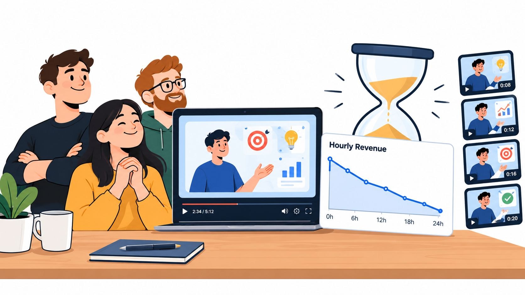
I’d give it a refresh date before it gets a launch date. Product names, interface screens, pricing language and calls to action all age at different speeds, and a master built from clean, separable scenes is far easier to patch than one long continuous animation. Most refreshes turn out small (a new end card, updated captions, one re-recorded voiceover line, a fresh cut from scenes you already own). I’d check it whenever someone touches the headline beside it.
Give it one job per placement
Plenty of explainers get called failures for missing a target nobody set. The same 90 seconds is supposed to win over a cold visitor and also settle pricing doubts for people already comparing tiers, and it ends up doing both so-so.
My order is job first, then placement, then the edit. The benefits of an explainer shift with the stage of the funnel. For a cold visitor it buys understanding; for someone already comparing options it has to remove one specific doubt. After the sale the job changes again, to getting a new customer to their first success sooner, which is a different edit altogether. Those jobs want different openings and lengths, and you’ll be watching a different number on the dashboard for each.
Where to put it on the page
The page closest to the action comes first. On a product or landing page I put the explainer next to the hero headline, with a plain statement of the problem and one clear next step beside it. The first line of the video should answer the question the page raises, usually “what does this help me do?” Opening on a logo sting or a sweeping brand statement burns the seconds when a visitor is most willing to listen, and it’s the habit I’d break first. There’s more on layouts in our video landing pages piece.
Pricing pages are tenser. People there are weighing tiers and limits, plus how much setup it takes and what could go wrong. A short cut that shows what happens after signup, or what changes between tiers, helps them far more than the homepage pitch played a second time.
In onboarding emails the job is activation, so show the first task the new customer has to complete and stop there. It worked if people complete that task and the same question stops arriving in support.
Paid social punishes an uncut master hardest. Someone scrolling has no context and no reason to wait, so the opening needs a problem or a product shot that makes sense on its own. Exerta’s guide to short-form video for paid social conversions argues that the comment thread under a paid clip is part of the ad, and that the objections people leave there are your next creative angles. That matches how I’d work: read the comments before briefing the next cut.
A table for the edit timeline
I’d pin this above the timeline while cutting. Channel lengths come from each platform’s own help pages, linked under the table.
| Placement | What the opening must do | Length | The metric that matters |
|---|---|---|---|
| Product or landing page hero | Name the problem the visitor arrived with and show the outcome | The full master | Conversion rate of visitors who started the video against those who did not |
| Pricing page | Answer the doubt the page creates (what is included, what setup takes) | A focused cut of the relevant scenes | Signups or sales enquiries from that page |
| Onboarding email | Show the first task the new customer has to complete | One task per clip | Completion of that task, and support tickets about it |
| YouTube skippable in-stream ad | Give a reason to keep watching before the skip button appears at 5 seconds | No maximum; Google recommends under 3 minutes | Site conversions from the campaign, with view rate as a diagnostic |
| YouTube bumper ad | Carry one idea and one product shot | 5 to 6 seconds | Reach inside the audience you actually sell to |
| LinkedIn feed video ad | Make sense with the sound off and captions on | 15 to 30 seconds recommended | Qualified leads or form completions |
Google’s video ad format page lists skippable in-stream ads with “No max length (<3 min recommended)” and says that “After 5 seconds, the viewer has an option to skip the ad.” Bumpers it calls “non-skippable video ads lasting between 5 and 6 seconds”. LinkedIn’s video ad specifications accept anything from three seconds to 30 minutes, though they recommend “15-30 seconds long, so they can qualify for all possible placements across the LinkedIn Feed and the Audience Network”. In-stream ads there can run up to 90 seconds.
On your own page no platform sets a limit, so the master’s length is a story call. That question got a whole piece of its own: how long an explainer should be.
Thumbnails and captions
Before anyone presses play, all they have to go on is the thumbnail, so pick a frame showing the product or the outcome and add a short phrase that still reads on a phone. I’d skip the logo-on-a-gradient frame so many explainers default to.
If the video also lives on YouTube, the custom thumbnail guidance recommends a 3840 x 2160 image with a minimum width of 640 pixels, at an aspect ratio of 16:9 for regular videos. Make the thumbnail promise what the first 30 seconds actually show; YouTube’s retention help (more on it below) ties a strong intro to content that “matched the viewer’s expectation of the video’s thumbnail and title.”
Captions are where I see the most corners cut, and it bugs me, because a burned-in subtitle track that drops the sound cues fails exactly the people who need captions most. The W3C’s guidance on prerecorded captions says captions convey “not only the content of spoken dialogue, but also equivalents for non-dialogue audio information needed to understand the program content, including sound effects, music, laughter, speaker identification and location.” And it’s a big group. The World Health Organization’s fact sheet on deafness and hearing loss says over 5% of the world’s population, or 430 million people, need rehabilitation for disabling hearing loss. Keep a clean caption file for every cut. LinkedIn’s video ad specs, for one, accept captions only as SRT files.
One master, many cuts
The master shouldn’t be the only thing the project gives you. A well-planned explainer can also feed vertical cuts of its strongest scenes, a short hook for paid social, stills for thumbnails and email headers, a voiceover script that doubles as page copy, and a clean audio track for later edits.
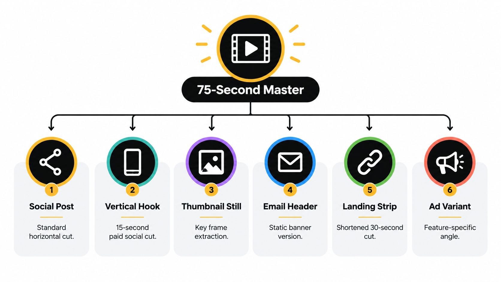
Annoyingly, most of that is decided before production, so if your video is already finished, file this under the next one. A master framed only for widescreen loses detail in a vertical crop, and captions sitting near the edge collide with social interface overlays. Long transitions are the other trap, since a scene glued to its neighbors that way is hard to lift out as a clip. Working from an existing master, I scrub through it and mark every scene that makes sense alone; those become the cutdowns.
For screen recordings, capture clean interface states with no cursor wandering around, so a single feature can be lifted out with its context intact. For vertical versions specifically, see short-form video and Reels. Once there are more versions than one editor can track by hand, RenderIO’s guide to video marketing automation covers the pipeline side, meaning what happens “when one approved concept becomes dozens of aspect ratios, languages, captions, campaign variants, and platform-specific exports”, and why approvals and quality checks matter more than the generator.
Measuring an explainer against conversion
The question your boss will ask is whether the video helped anyone buy, and the view count can’t answer it.
On any page with an embedded YouTube explainer, I’d start with GA4’s enhanced measurement. Google’s enhanced measurement documentation says that for YouTube embeds with JS API support enabled it fires video_start, video_progress “when the video progresses past 10%, 25%, 50%, and 75% duration time”, and video_complete “when the video ends”. Next, mark the action the page exists for (signup, demo request, trial start) as a key event, which Google’s key events help describes as how you “measure actions that are important to your business”. With both in place you can compare people who started the video against people who didn’t, on the same page over the same period.
Google Analytics’ own Academy lesson walks through creating key events (it was recorded when they were still called conversions, as the description notes):
I treat that comparison as correlation, since people who press play are often more interested to begin with. With enough traffic, A/B test the page with and without the video. Without it, watch the trend after each change to the opening or the placement.
Read the retention curve before you rewrite anything
On the YouTube copy, the audience retention report shows where the explainer loses people. YouTube’s help page on key moments for audience retention defines the intro figure as how much of the audience “still watched your video after the first 30 seconds”, describes dips as moments that “were either skipped or moments where viewers stopped watching your video completely”, and gives “Your content isn’t clear and your audience had to rewatch a section” as one possible reason for a spike.
That last one catches explainers in particular. A spike on the pricing or setup scene is often confusion, and unless you know to look for it, it reads as interest.
The quickest way to find these reports is YouTube Creators’ tour of Analytics in YouTube Studio. It was recorded in 2020, so a few screens have moved since, but it still has chapters for the Overview, Reach, Engagement, Audience and Revenue tabs:
When people are gone before the first progress mark, I look at the opening first and the thumbnail and placement after it, because something there is wrong for whoever is arriving. When they sit through the opening and leave mid-explanation, the script or the visuals lose them at that point. Strong retention with weak conversion sends me away from the video entirely, toward the call to action, the page itself, or the audience you’re paying to send there. Tying all this back to revenue is a bigger topic, and video marketing ROI covers it.
Keep it true after launch
The video is published, the project is closed, and nobody owns the question of whether the story still matches the product. Of everything in this piece, that’s the one I see most.
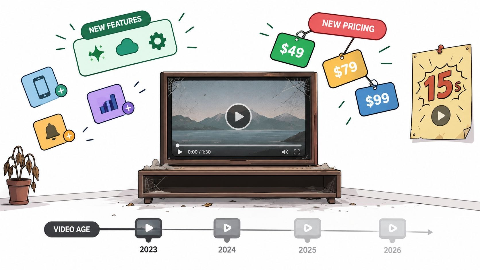
How much work the fix takes depends on what changed.
- If only wording changed, swap the captions, transcript or on-screen text.
- A new call to action needs a new end card and an updated embed.
- Pricing and packaging changes are a bit more work, since the affected voiceover lines get re-recorded and those scenes revised.
- Change the core workflow and that sequence has to be rebuilt, or you produce a new cut.
- New positioning or a new audience is the expensive one. That’s back to the script and the distribution choices.
Put the review in the campaign calendar and let product releases and pricing changes trigger it, along with any repositioning. Keep the project files, the clean voiceover, the caption files and the approved brand assets somewhere the next editor can find them, with one named person listed as the video’s owner.
Frequently asked questions
On the page closest to the action, which usually means beside the hero headline of a product or landing page with one clear next step next to it. Pricing pages and onboarding emails suit shorter cuts, each answering one doubt or teaching one first task. Bury it below a long feature list and I'd expect it to get played mostly by people who have already decided.
Against the action the page exists for. GA4's enhanced measurement can record starts, progress marks and completions for embedded YouTube videos, and you mark the signup or demo request as a key event. Compare visitors who started the video with those who did not, and treat the gap as something to test, because people who press play were often more interested to begin with.
Whenever the product, pricing, positioning or audience changes, with a standing review in the campaign calendar on top. Most updates are small, often just new captions or a new end card, sometimes one re-recorded voiceover line. If the project files and a clean voiceover are kept somewhere findable, along with the caption files, those fixes stay a short job.



