Brand guidelines template.
A fillable guide to your voice, logo, colors, type and imagery. Type straight into the PDF, or use the Word file.
Free, no sign-up, no email.
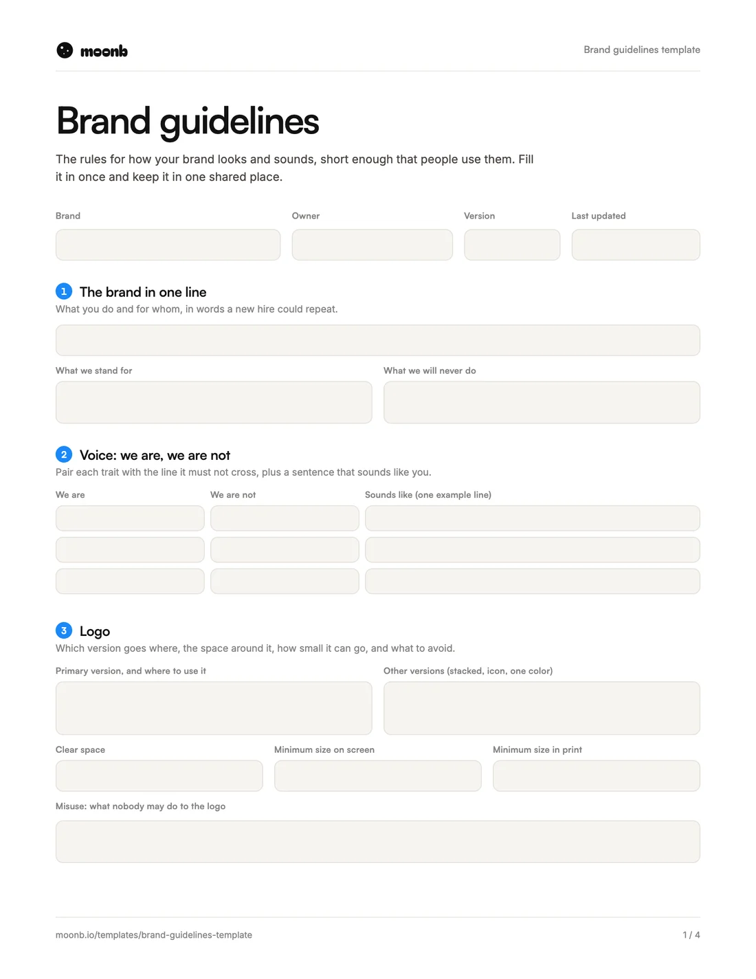
- Page 1
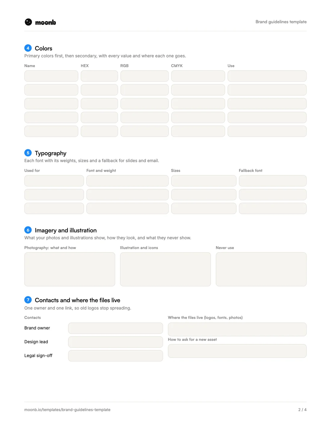 Page 2
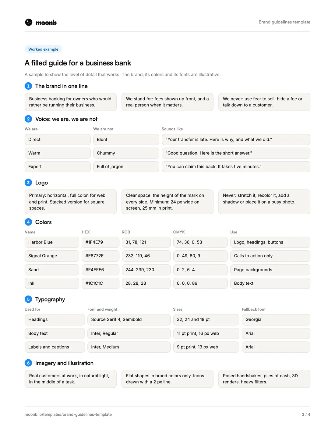 Page 3
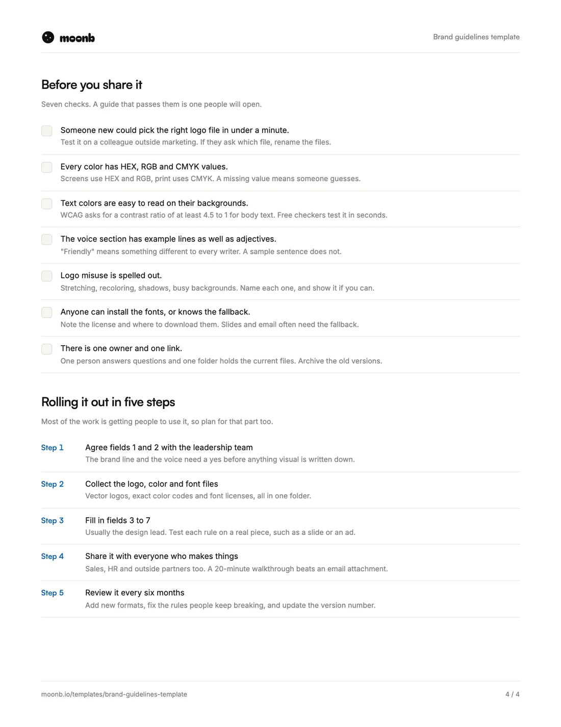 Page 4
Brand guidelines are the rules for how your brand looks and sounds, written down so anyone can follow them. The new hire making slides, the sales team building a one-pager and the studio making your next ad should all end up with work that looks and sounds like you.
A short guide is enough for that, as long as it answers the questions people ask most: which logo, which blue, which font. This template does it in seven fields, with a filled-in example on page three and a checklist on page four. Use it as a brand style guide, or as the first draft of a full brand book.
What is in it
| Field | What goes in it | The usual mistake |
|---|---|---|
| 1. The brand in one line | What you do, for whom, what you stand for | A mission statement nobody can repeat |
| 2. Voice | Traits, their opposites, an example line each | Adjectives with no example |
| 3. Logo | Versions, clear space, minimum size, misuse | One logo file for every use |
| 4. Colors | Name, HEX, RGB, CMYK and where each one goes | Screen colors with no print values |
| 5. Typography | Fonts, weights, sizes and fallbacks | No fallback for slides and email |
| 6. Imagery | Photo and illustration rules, and what to avoid | “High-quality images” |
| 7. Contacts and files | Who owns it and where the files live | Five versions in five folders |
How to fill it in
- The brand in one line. Write what you do and for whom, in words a new hire could repeat on day one. Then add what you will never do.
- Voice. Pair each trait with the line it must not cross: direct but not blunt, warm but not chummy. Add one sentence that sounds like you.
- Logo. List each version and when to use it. Set clear space as a share of the logo itself so it scales, and give a minimum size for screen and print.
- Colors. Fill in every column. Screens use HEX and RGB, print uses CMYK, and the “Use” column stops your accent color from turning into a background.
- Typography. Name the font, the weights you use and a fallback. Slides and email often can’t load brand fonts, so say what to use instead.
- Imagery. Describe what your photos show and what they never show. Do the same for illustration and icons.
- Contacts and files. One owner and one link to the current files. Old logos spread when there are three folders.
Writing them is the easy part
Getting people to follow them is harder. In research by Lucidpress (now Marq), the 2019 State of Brand Consistency report, only 25 percent of organizations said they had formal guidelines that were consistently enforced. And 26 percent said theirs were hard to find.
That’s why this template is short and asks for an owner and a single link. A two-page guide people open every week does more than a long one nobody can find.
Next steps
For ideas, look through these brand guidelines examples from real companies, or read our longer guide on how to create brand guidelines. If you need the identity itself designed before you write the rules, that’s part of our brand identity work at Moonb.
Frequently Asked Questions
Most people use the three names for the same thing. A brand book often adds the story and strategy behind the brand, while a style guide sticks to the practical rules. This template covers the rules, and you can put a strategy page in front if you want a fuller brand book.
Review them once or twice a year, and whenever you add a new channel or format. Change the version number and date on page one each time, so people can tell which copy is current.
You can write the brand line and the voice yourself. The logo, color and type sections need the original design files, so ask whoever designed your identity for vector logos, exact color codes and font licenses. If nobody has them, getting them back is the first job.
More free templates
Briefs, plans and production sheets, built the way we use them.
The templates are free. The team isn't.
Need the video, design or motion actually made? Tell us what you're working on.