18 Tech Explainer Videos Worth Studying
A working breakdown of 18 tech explainer videos, from Dropbox's paper cutouts to Superhuman's macro UI, with notes on the craft choice that makes each one land.

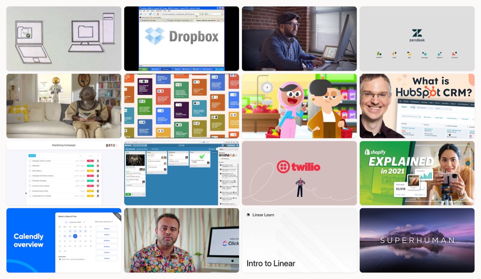
I have watched a lot of explainer videos. Most of them blur together within a week, and I could not tell you a single frame. A handful stick for years, and those are the ones I keep pulling up when a client asks what good actually looks like for a software product nobody can see or touch.
That is the real problem with a tech explainer. The thing you are selling is invisible. It is a database, an API, a workflow, a habit change. You cannot photograph it the way you photograph a sneaker. So the whole job is finding a way to make an abstract product feel legible and worth caring about in about ninety seconds, before the viewer’s thumb moves on.
When I watch one of these, I am really asking three things. Did they earn my attention in the first five seconds, or did they open with a stock shot of a woman laughing at a laptop. Do I understand what the product does by the end, not only that it exists. And did any single moment make me feel something, because feeling is what I actually remember. Below are eighteen that clear that bar, each for a different reason, and I want to be specific about why.
How I picked these
I skipped the polished nothings. Every video here does one thing on purpose and does it well, whether that is a founder talking into a webcam or a studio spending real money on cinematography. I put them in a rough order that runs from the scrappy and the historic through to the glossy and the recent, so you can watch the format grow up as you scroll. The point is not to copy any one of them. It is to notice the choice underneath, because the choice is the part you can steal.
Dropbox, the paper cutout that invented the genre
This is the Common Craft cut-paper explainer, and half the explainer videos made since are its descendants. What holds up is the discipline. It opens on the pain of having your files on the wrong computer before it ever names the product. Hands slide paper shapes across a white table, so the animation costs almost nothing and every idea reads instantly. It proves that clarity is the thing that dates well, not production spend.
Dropbox, the founder demo that sold a product before it existed
Drew Houston screen-recorded the product working and narrated it himself, and that four-minute clip validated demand before there was a real product to ship. There is no music bed, no motion design, no polish. It works because the person who built the thing is walking you through the exact moment it saves him, and you believe him. If you are pre-launch, this is a reminder that a screen recording and an honest voice can outperform a video that costs fifty times more.
Slack, the mockumentary that let a real team sell the product
Sandwich built this as a self-aware mockumentary, and the people on screen are a real company using the product, not actors reading benefits. The humor gives it cover to explain features without feeling like a demo, so you learn how Slack works while you are busy laughing. By the end you feel like you have already been on the team for a month. It is still the bar for making software feel human.
Zendesk, the brand reveal that lets typography carry the load
This one leans on bold typography and clean motion, cutting between confident type cards and glimpses of the product interface. The restraint is the skill. Nothing on screen fights for attention, so the eye lands exactly where the edit wants it, and the product moments feel like punctuation rather than a sales dump. When your brand system is strong, this is how you let it do the talking.
Zendesk, the astronaut spot that dramatizes a metaphor
Same company, a completely different register. This is a written, character-driven live-action piece that turns the idea of a complicated customer relationship into an actual comedic story. The writing carries the weight here, and the product almost recedes so the metaphor can land. I love pairing this with the brand reveal above, because it shows one company confident enough to explain itself two opposite ways.
Zapier, the animation that makes triggers and actions visible
Automation is hard to picture, and this snappy animation solves it with simple iconography. One app fires, a line travels, another app responds. The abstract triggers-and-actions logic becomes a thing you can watch move across the screen. It never slows down to over-explain, which is right, because the visual metaphor already carries the meaning. This is the cleanest answer I know to the question of how you show an invisible workflow.
Duolingo, the mascot piece that matches the app’s own voice
The animation style here is the exact illustration language of the app, so the video feels like an extension of the product rather than a commercial for it. The mascot does the explaining, and the playful tone tells you what using the thing will feel like before you download it. Tone matching sounds obvious, and almost nobody actually does it. Duolingo treats the explainer as part of the product experience, and it shows.
HubSpot, the talking head that reframes a sprawling platform
A CRM does a hundred things, which is exactly why most CRM videos are unwatchable. This one puts a real host on camera and pins animated UI callouts next to them, then refuses to list every feature. It picks a single benefit to build around and lets everything else stay in the background. The lesson is subtraction. A platform video works when it is brave enough to leave things out.
Asana, the flat-vector before and after
Bright flat-vector motion graphics take scattered, chaotic work and visibly resolve it into an organized structure on screen. The whole idea is a before and after you can watch happen, which is a very satisfying shape for a productivity tool. Color and rhythm keep it light so the underlying message about turning chaos into order never feels like a lecture. If your product’s promise is order, show the mess first.
Trello, the screen walkthrough that teaches the mental model
Sometimes you do not need a concept, you need to teach the thing. This is a guided screen capture that walks through boards, lists, and cards in the real interface until the mental model clicks. It is not trying to be a brand film, and it should not be. For a visual tool like Trello, watching someone actually drag a card across the board is more persuasive than any metaphor. Match the format to the job.
Twilio, the developer explainer that makes an API tangible
Communications APIs are about as invisible as a product gets, and this explainer makes them physical through animation. A message leaves one place, moves through Twilio, and arrives somewhere else. It respects a technical audience without drowning them in jargon, which is a narrow line to walk. The visual keeps the pace up while the voiceover stays precise. Developer audiences can smell condescension, and this avoids it.
Shopify, the founder journey that ties a platform to a person
This one blends live action with interface footage and hangs the whole thing on a founder’s arc, from first sale to real scale. The platform stops being a set of features and becomes the thing that carried someone’s ambition. Tying software to a human story is how you make a broad, do-everything product feel personal. People do not fall for platforms, they fall for what a platform let them become.
Calendly, the overview that reframes a simple tool
Everyone thinks they already know what Calendly is, so this video’s whole job is to widen the frame from a scheduling link to a workflow layer. It leads with the outcome rather than the mechanics, which is the right move when the mechanics are already familiar. The reframe is the entire strategic idea. If your product is boxed into a small definition in people’s heads, an explainer is where you pry the box open.
ClickUp, the high-energy presenter cramming in a dense product
ClickUp does an enormous amount, and rather than hide that, this piece leans into it with a fast, high-energy presenter format that keeps a dense feature set entertaining. The pace is the trick. It moves quickly enough that the volume of features reads as power instead of exhaustion. This is a risky register, and it needs a truly charismatic host to survive, but when it works it turns overwhelming into capable.
Linear, the restrained tour that mirrors the product
Linear’s whole brand is calm, fast, and precise, and the video’s restrained motion mirrors that exactly. There are no gimmicks, just controlled pacing and clean type that feel like the app itself. This is the deeper version of tone matching. The editing style becomes an argument for the product’s values. When form and product agree this completely, the medium is part of the pitch.
Superhuman, the cinematic film that sells feel
Superhuman is an email client, which should be impossible to make cinematic, and this film sells the feel of speed through crisp macro shots of the interface. You are not being told the product is fast, you are watching it feel fast, frame by frame. Macro UI photography treats software the way a car ad treats a car. It is a reminder that premium is communicated through craft and restraint, not through a longer feature list.
Grammarly, the clean explainer that shows the product in context
Grammarly’s product only makes sense in the flow of real writing, so the video shows it working inside actual documents across different surfaces. Seeing the suggestions appear where you would actually type is more convincing than any abstract explanation of what it does. Context is the persuasion. When a product lives inside other tools, the smartest explainer is one that plants it back into the moment of use.
Notion, the use case that follows one thing to shipped
Notion can be anything, which makes it hard to explain, and this video wisely refuses to explain everything. It follows one real workflow, a single feature moving from feedback to shipped inside the actual interface. By narrowing to one concrete story, an infinitely flexible tool finally becomes graspable. When your product is a blank canvas, resist the urge to show the whole canvas. Show one painting.
What the best ones share
Watch enough of these back to back and the same handful of moves keep surfacing.
They open on a problem or a feeling, not on the product. Dropbox names the pain of the wrong computer. Zendesk’s astronaut spot opens on a relationship. The product shows up once you already care.
They pick one idea. The videos that try to say everything say nothing. HubSpot builds on a single benefit, Notion follows a single workflow, Calendly reframes a single definition. Discipline reads as confidence.
The style matches the product. Duolingo animates in its own hand, Linear edits with its own calm, Superhuman shoots email like it matters. The medium is making the argument on its own.
And the memorable ones make you feel something, even in B2B. Slack makes you laugh. Shopify makes you root for a founder. Comprehension gets you understood, and emotion gets you remembered, and remembered is what moves a buyer weeks later when the money conversation finally happens.
How to get this right
If you are about to make one, a few things save you real pain.
Write the script first, and cut it in half. The industry rule of thumb is around one hundred fifty words a minute, and you want breathing room under that, not over it. Say less and people remember more. If you want the deeper version of this, we wrote a whole piece on how to make an explainer video that goes past the script stage.
Decide the format based on the product, not on what looks impressive. A visual tool wants a screen walkthrough. An invisible one wants animation or metaphor. A premium one wants cinematography. Choosing the wrong container is the most common expensive mistake I see.
Sort out the voice and the sound early, because bad audio kills a good picture faster than anything. And if you are torn between drawing it and filming it, that decision has real consequences worth thinking through before you spend, which is why we broke down animation versus live action separately.
Then plan the launch before you have the file, not after. Know where it lives, how it gets seen, and which page it anchors. A great explainer nobody finds is just an expensive private video.
Where this leaves you
None of these videos are great because of a template. They are great because someone made a specific, opinionated choice about how to make an invisible product feel real, and then executed it with taste. That is the actual work, and it is the part that does not get easier just because the tools do.
If you are staring at a product that is hard to explain and a blank storyboard, that gap is exactly the thing an embedded creative team like Moonb exists to close. But even if you never talk to us, watch these eighteen once more with the sound up and steal the choice, not the look. The choice is where all the value sits.
Frequently asked questions
For a top-of-funnel explainer, aim for sixty to ninety seconds. Most of the videos on this list that are meant to introduce a product sit in that range, because attention drops fast and a shorter cut forces you to pick one idea. Detailed product walkthroughs and demos can run longer, since the viewer arriving at those has already opted in and wants the depth.
Let the product decide. Invisible products like APIs and automation tools usually need animation or metaphor to become legible, which is why Zapier and Twilio animate. Visual, hands-on tools like Trello are better served by a screen walkthrough, and products selling premium feel, like Superhuman, benefit from live-action cinematography. The format is a strategic choice, not an aesthetic one.
Three things show up in almost every strong one. It opens on a problem or a feeling rather than the product, it commits to a single idea instead of listing every feature, and its visual style matches what the product itself feels like. The ones people still remember years later also make you feel something, even in B2B, because emotion is what survives long after the details fade.



