8 Startup Explainer Video Examples to Learn From
Eight canonical startup explainer videos, each embedded and broken down for the one move that made a new product instantly make sense.

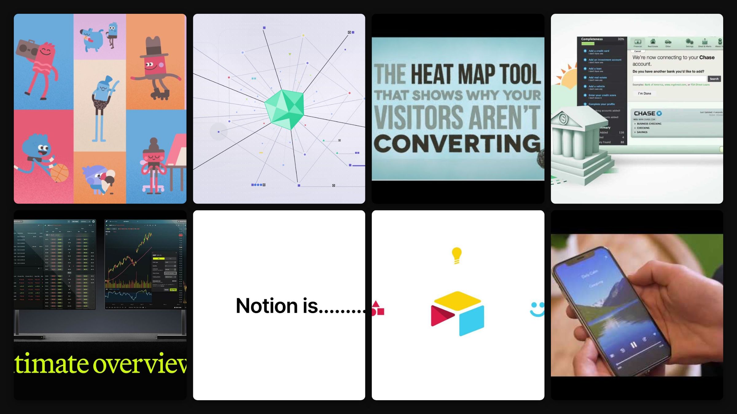
A startup explainer has the hardest job in video: make a stranger understand a product that did not exist last year, in under two minutes, before they lose interest. The eight below are the ones the industry keeps pointing to, and for good reason. Each is the company’s own upload, and after each I have named the exact move that made an unfamiliar product click.
The thread through all of them is restraint. The best explainers resist showing everything the product does, and instead make you feel one clear thing it does for you.
The eight explainers, and the move behind each
Headspace, “How It Works”
Co-founder Andy Puddicombe, a former monk, narrates in a calm voice that is itself the product experience, so the ad demonstrates the app before you download it. The move: let the tone of the explainer be a sample of the product. If your product is a feeling, the video should give the viewer a taste of that feeling directly.
Grammarly, “How Does Grammarly Work?”
It shows the product working inside real writing contexts, emails, essays, messages, rather than talking about features. The value is demonstrated in situ, not described. The move: put the product in the exact moment the user needs it. Watching it fix a real email is worth more than any list of what it can do.
Airtable, “Meet Airtable”
It compresses an abstract product, a flexible database, into concrete relatable use cases in under two minutes, showing the interface doing real work instead of explaining the concept. The move: skip the category definition and jump to specific jobs the viewer recognises. People understand “plan a wedding, track inventory” faster than “relational database.”
Notion, “What Is Notion?”
It compresses Notion’s entire value proposition, docs, projects, knowledge, and AI in one workspace, into a fast benefit-led narrative rather than a feature tour. The move: lead with the single promise (everything in one place) and let the features illustrate it. A product that does many things needs one sentence people can repeat.
Robinhood, “Legend Overview”
A product-led explainer that walks through the Legend trading platform feature by feature using the real interface, aimed at users who want to see the actual thing. The move: for a power-user product, show the genuine UI in action. Sophisticated buyers trust a real screen recording over a stylised abstraction.
Calm, “The Calm App”
Calm’s own explainer opens with the mission, a healthier and happier world through mindfulness, then shows the app as the route to it. The why comes before the what. The move: open on the mission, not the mechanics. For a purpose-driven product, the reason it exists is more compelling than the feature that delivers it.
Slack, “Slack vs Email”
Slack’s explainer opens on email, the tool every team already finds painful, and only then introduces the product as the better way to work. It follows the structure the early startup explainers made famous. The move: name the problem before the product. The classic explainer structure (pain, then relief) still works because it earns attention before it asks for it.
Crazy Egg, the homepage explainer
The canonical proof point for the whole format: Crazy Egg’s original animated homepage explainer reportedly lifted conversions by 64 percent, the number founders have cited ever since. The embed is the company’s current overview, a quick tour of heatmaps, scroll maps and testing. The move: put the explainer where the decision happens, on the homepage, not just on YouTube. An explainer earns its keep at the point of conversion, not as a piece of content off to the side.
What the best startup explainers share
Strip them down and the same instincts appear.
- One clear promise, not a feature tour. Each leads with a single idea a viewer can repeat, then uses features to prove it.
- Show the product doing real work. Concrete use cases and real interfaces beat abstract concept animation for making a new thing understood.
- Lead with pain or mission. The strongest openings earn attention with a problem the viewer feels or a reason to care, before introducing the product.
- Place it where it converts. The explainer belongs on the homepage and in the signup flow, not only on a channel people have to find.
One from us, and a straight note
At Moonb we make explainers and brand video, plenty of it for startups. Here is a Moonb explainer for the therapy startup Unobravo:
I work at Moonb, so factor in the bias: the hard part of a startup explainer is not the animation, it is the editorial judgment about what to leave out so the one idea survives. That is the work a dedicated team does. If you want it, see how Moonb works, and if you are still choosing a partner, our roundup of explainer video agencies is the natural next read. For the wider case beyond explainers, how video helps a startup stand out is worth a look too.
Frequently asked questions
It depends on who is watching and how finished the product is. Power-user and technical buyers tend to trust a real screen recording, which is why Robinhood's Legend walkthrough uses the actual UI. An abstract or still-rough product often reads clearer as animation, because animation lets you skip the messy parts of the interface. A common startup mistake is animating something a thirty-second screen capture would have explained faster, so try the recording first and reach for animation only when the real thing gets in the way of the one idea.
If you cannot yet say in one sentence what the product does for one kind of person, it is too early, because that sentence is the whole video. A lot of pre-launch teams commission an explainer hoping it will figure out their positioning for them, which is the wrong order and usually shows on screen. Wait until you have a clear single promise and at least a working interface to point a camera at, even a rough one, then build the film around that.
Less often than you would expect, if it is built around the core promise rather than a feature tour. Videos that walk through specific screens date quickly and want a re-cut every time the interface shifts. A video that sells one idea can outlast several redesigns. A practical split is to keep one short evergreen explainer on the promise, and let smaller feature clips carry the parts that change month to month.



