Healthcare Explainer Videos: 22 That Actually Work
I break down 22 healthcare and medical explainer videos that actually land, from vaccine animation to robotic surgery, and the craft choices behind each one.

I have watched a lot of healthcare explainer videos, and most of them fail the same way. They try to say everything at once. A patient sits there with a diagnosis they did not ask for, a device they do not understand, or a drug name they cannot pronounce, and the video answers by throwing twelve facts at the screen in ninety seconds. Nobody remembers a single one.
The good ones do the opposite. They pick one thing the viewer needs to understand, and they build the whole piece around making that one thing land. When I judge a healthcare video I am really asking three things. Does it respect how scared or confused the viewer might be? Does it use the right technique for the subject, since a molecule and a mood need different tools? Does it leave me with one idea I could repeat to a friend?
Below are 22 examples I keep coming back to. Some are pharma-grade 3D animation. Some are cel-animated product tours. A couple are live-action. What ties them together is discipline, and I will point out exactly where each one earns it. If you are still deciding between formats, I wrote a longer piece on animation vs live action that pairs well with this list.
How I picked these
I did not rank these by view count or polish alone. I looked for videos where a specific craft decision solves a specific communication problem, because that is the part you can actually learn from. Each one below teaches something you can take into your own brief, whether you are explaining a mechanism of action, calming a nervous patient, or selling an insurance benefit nobody wants to read about.
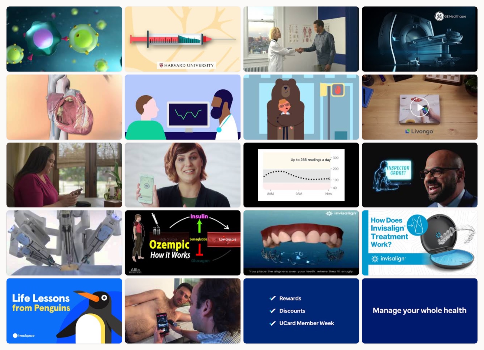
CDC, a 2D animation of how COVID-19 vaccines work
The restraint here is what I admire. It shows one step of the immune response at a time and holds each beat long enough for a non-scientist to actually read it. The shapes are flat and color-coded so you never lose track of which cell is which, and the camera does not move for the sake of moving. This is a public-health brief, and it behaves like one.
Public health education, a molecular look at how mRNA vaccines work
mRNA is invisible and abstract, which makes it exactly the kind of thing animation was built for. What I like is how the piece turns a chemical instruction into something you can point at on screen, then labels each part only at the moment it becomes relevant. The pacing is slow on purpose. It trusts that if you can watch the mechanism assemble, you will believe it.
Zocdoc, a cel-animated walk through booking care
Here the subject is a product flow, so the makers reached for friendly character animation instead of cold UI screens. The character gives you someone to follow, and following a person through the steps feels warmer than watching cursor clicks. I would use this approach any time the real anxiety is not the technology but the fear of getting it wrong.
GE HealthCare, a photoreal 3D render of the Signa MRI
This one sells the hardware as an object of desire. The photoreal 3D render lets you show the machine from angles a camera on a hospital floor never could, and the lighting treats a scanner like a product hero. When the buyer is a hospital administrator comparing capital equipment, that beauty pass does real work.
Medtronic, a 3D animation of the Micra implant
Showing a device placed inside a beating heart could easily read as frightening. Instead the animation keeps the anatomy stylized and the camera calm, so you understand where this tiny pacemaker goes without feeling like you are watching surgery. That balance between accurate and reassuring is the hardest thing to hit in patient education, and this clears it.
Medtronic, a procedure walkthrough for the Bravo test
The whole job of this video is to lower a patient’s heart rate before a procedure. It walks through what will happen step by step, at a pace that says there is nothing here to fear. I notice the soft color palette and the unhurried narration are doing as much emotional work as the visuals. Anxiety is the real enemy in pre-procedure content, and this treats it as the priority.
Oscar Health, a live-action spot with a sense of humor
Insurance is the least fun subject on this list, so Oscar sells a benefit with comedy instead of a benefits sheet. The live-action format and the comic timing make a dry product feel human, and the humor buys enough goodwill that you actually stay for the point. I bring this up whenever a client insists their category is too boring for personality.
Livongo, a warm onboarding for a diabetes program
Onboarding a chronic-care patient is a delicate moment, and this frames the program as support rather than another task to manage. The tone is welcoming from the first second, which matters because someone living with diabetes has heard plenty of clinical lectures already. It sells belonging before it sells features.
Livongo, a program overview mixing device shots and motion graphics
This companion piece leans into the how, blending real device footage with motion graphics that explain the data behind it. Cutting between the physical meter and the animated readout keeps the abstract part grounded in something you can hold. It is a smart way to make a software-plus-hardware program feel like one connected thing.
Dexcom, an animated cutaway of the G6 sensor
A sensor sitting under the skin is impossible to photograph, so animation cuts away to show exactly what is happening beneath the surface. Making the invisible tangible is the core value of this piece, and it does it without dwelling on the needle, which is the part patients dread. I would study the shot choices here before writing any wearable-device brief.
Dexcom, a 3D visualization of CGM data in motion
Where the first Dexcom piece focuses on the body, this one follows the glucose data as it flows to the display. The crisp 3D makes a data pipeline feel physical, which is a neat trick for explaining anything that moves information from a sensor to a screen. Cleanliness is the point. Nothing on screen is there by accident.
Intuitive, a 3D explainer that demystifies the da Vinci system
The phrase robotic surgery scares people, and this animation exists to make it understandable instead. It uses 3D to show that the surgeon is fully in control and the robot is an instrument, not a decision-maker. Reframing the fear is the whole job, and the clarity of the system view does it better than any voiceover promise could.
Intuitive, a step-by-step animation of the procedure
This one goes procedural, walking through minimally invasive surgery one stage at a time. Breaking a complex operation into ordered steps lets a patient build a mental model instead of a fear. I like that it never rushes to the next stage before the current one has settled.
Alila Medical Media, a molecular mechanism of action for semaglutide
This is a dense, detailed mechanism-of-action animation for one of the most talked-about drugs around, and it does not water the science down. It is built for a clinical or educated audience, and it trusts them to follow receptor-level detail. When your viewer is a physician rather than a patient, that willingness to stay technical is a feature.
Invisalign, a simple 3D animation of teeth shifting
The value proposition of Invisalign is time-lapse, so the animation shows teeth moving into place across a treatment. A simple 3D visualization of the aligners doing their slow work says more than any list of benefits. Sometimes the clearest explainer is just showing the before and the after with the middle animated in.
Invisalign, an updated and more polished product explainer
This later version keeps the same core idea and raises the production ceiling, with cleaner product visualization and a more branded feel. Watching the two back to back is a useful lesson in how a brand refines a proven explainer over time rather than reinventing it. The message stayed. The finish got sharper.
Headspace, an abstract idea made concrete through penguins
Mindfulness is about as abstract as a subject gets, and Headspace makes it concrete with its signature character animation. The penguins give a formless concept a body and a bit of charm, which is why the brand’s illustration style has become so recognizable. Character is the strategy here, not decoration.
Butterfly Network, a hands-on demo of a handheld ultrasound
For a device this novel, a straight product demo beats any animation. Watching a full ultrasound shrink into something that plugs into a phone makes the leap believable in a way a diagram never would. When your product really looks like the future, the most persuasive move is to point a camera at it and press record.
UnitedHealthcare, a motion-graphics take on member benefits
Member benefits are the kind of content people skim and forget, so motion graphics carry the weight here. Animated icons and clean transitions turn a list of perks into something with rhythm and momentum. It will not win awards, and it does not need to. It needs a confused member to leave knowing what they get.
UnitedHealthcare, an animated breakdown of a complex plan
Chronic Special Needs Plans are a complicated product, and this video’s job is to make the structure legible. Animation lets it show one layer of the plan at a time so the complexity never arrives all at once. That layering is the technique to steal any time a policy or plan has too many moving parts to explain in a sentence.
Genentech, a biotech animation of tumor biology and biomarkers
This visualizes cutting-edge tumor biology and biomarker science at a level that signals real research credibility. The animation earns authority by being specific about the biology rather than gesturing at it. For a biotech brand talking to a sophisticated audience, that scientific precision is the brand.
Cancer immunotherapy education, a cellular drama of the immune system
I saved this one for last because it does something the others mostly avoid. It dramatizes. The cellular animation stages T-cells attacking cancer like a scene with stakes, and that touch of narrative tension makes a microscopic process feel urgent and hopeful at the same time. Handled carelessly, dramatization would cheapen the science. Handled like this, it makes people care.
What the best ones share
Watch enough of these and the same patterns keep surfacing.
The strongest videos commit to one idea. They decide what the viewer must walk away understanding, and they protect that idea from every fact that would dilute it.
They match the technique to the subject. Photoreal 3D for hardware you want to admire. Cel animation for warmth and product flows. Cutaway animation for anything happening inside the body. Live action when the real point is emotion. The medium is a decision, not a default.
They earn trust before they ask for anything. In healthcare the viewer is often scared or skeptical or both, so the good videos lower the temperature first and pitch second, if they pitch at all. Their narration sounds like a person talking, not a compliance document being read aloud. If you want to go deeper on that, my guide to making an explainer video covers the script-first workflow these all seem to follow.
How to get this right
If you are briefing one of these, a few things separate the videos above from the forgettable ones.
Start with the single sentence you want repeated back to you, then cut anything that does not serve it. Pick your medium before you pick your style, because a mechanism of action and a member-benefit reel are not the same job. Write the script before anyone touches the visuals, since the pacing lives in the words first. And get a real clinician or regulatory reviewer to check every claim, because in this category an inaccurate frame is not a style note, it is a liability. Keep it shorter than feels comfortable. Nobody has ever complained that a healthcare explainer was too easy to follow.
If you are the one who has to make it
The videos on this list came from teams that understood both the science and the storytelling, and kept the two in balance. That combination is rare, and it is the hard part to hire for. It is also why I run Moonb as an embedded creative team rather than a one-off vendor, since medical work rewards people who learn your brand, your product, and your compliance constraints once and carry that context into everything they make next. Whatever you build, steal the discipline these examples show. One idea, the right medium, and a real respect for the person on the other side of the screen.
Frequently asked questions
The effective ones commit to a single idea, choose the right technique for the subject, and lower the viewer's anxiety before asking for anything. In practice that means 3D or cutaway animation for anatomy and devices, cel animation for warmth and product flows, and live action when the point is emotion, plus a script that sounds like a person and every clinical claim checked by a real reviewer.
Shorter than you think. Most of the strongest examples run around 60 to 120 seconds, long enough to make one point land and short enough that a patient or busy clinician actually finishes it. If the subject really needs more time, such as a detailed mechanism of action for a professional audience, extend it, but only with information that earns its place.
Match the format to the job. Use animation for anything invisible or internal, like a molecule, a sensor under the skin, or a device inside the body, since a camera cannot show those. Use live action when the real subject is human emotion or trust, like a patient story or a benefit that needs personality. Several brands on this list use both across different videos for exactly that reason.



