16 eCommerce Video Ads Worth Studying
A first-person breakdown of 16 eCommerce video ads, from Purple's egg test to Apple's product films, and the craft choices that make each one sell.

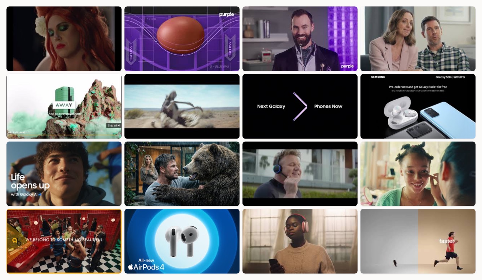
I have watched a lot of eCommerce video ads. Most of them blur together within a day, and I forget the product before I forget the ad. The ones that stick do something specific with the craft, and that is what I want to pull apart here.
This is not a list of ads that “went viral.” Virality follows a good decision someone made in a script meeting or an edit bay, and that decision is the part you can actually copy. So I picked sixteen spots and looked at each one the way I look at work coming through my own studio. What is the single idea, where does the story turn, and why does the pacing feel the way it feels.
A quick word on how I chose. I wanted range, not sixteen versions of the same glossy hero shot. There are one-take proof demos next to sixty-second brand films, celebrity comedy next to silent product photography, and a few brands showing up more than once because they solve the same problem in different registers. Watch them in order and you will start to see the moves repeat. Here they are.
Dollar Shave Club, the ensemble getting-ready film
Dollar Shave Club built its name on one snarky founder monologue, so watching them make a wide, warm ensemble film is a real shift. This one strings together a lot of different people running through the same morning ritual, and the product just lives inside that ritual instead of interrupting it. The casting is the argument here. The range of faces tells you who the brand thinks its customer is before a single word does. It reads as grooming for everyone, cut to a rhythm that never sits still long enough to feel like a chore.
Purple, the raw egg test
This is my favorite kind of eCommerce ad because the demo is the whole ad. Purple lowers a sheet of glass backed by four raw eggs onto the mattress, then a 330-pound person presses down on it, and the eggs do not break. That is a physical stand-in for how the material spreads pressure across a wide area instead of concentrating it under one point. I do not need a voiceover explaining pressure mapping when I can watch four eggs survive being sat on. The claim and the proof happen in the same shot, so there is nothing left to disbelieve.
Purple, the Humpty Dumpty character spot
Here is the same egg-test proof point again, and I love that Purple trusted it enough to run it twice in totally different clothes. This version hands the demo to a full-costume Humpty Dumpty who reviews the mattress as the one product that could have saved his shell. The absurdist comedy does the memory work that a straight demo cannot, and the technical claim rides along inside the joke. One proof point, two tones, both earning their place.
Casper, the unboxing vignette
Casper had to sell something people were nervous about, which is buying a mattress they had never lain on. So the ad does not sell the mattress. It sells the box arriving at the door, the moment it expands out of its plastic, the softness of the room it lands in. It is a warm lifestyle vignette that answers the real objection, and the whole direct-to-door promise becomes something you can picture happening in your own hallway.
Away, the travel mood film
Away sells a suitcase, but you would not know it from how little time this ad spends on the suitcase. The film is a cinematic travel mood piece, and the luggage sits inside the trip as a lifestyle object rather than a spec sheet. I think that is the smart read on the category. Nobody dreams about a compartment layout, they dream about the places the bag goes. The mood does the selling and the product borrows the glamour.
Samsung, the Ostrich VFX story
This one is a small film, not a commercial, and it deserved the awards it won. An ostrich stumbles into a VR headset and, believing it can fly, finally does. There are no specs and no feature callouts, just a full emotional arc built on visual effects that stay invisible enough to keep you inside the story. It sells capability by making you feel what the technology unlocks, which is a far harder brief than listing what the technology is.
Samsung, the Unpacked launch teaser
A launch teaser has one job, which is to make you want to be there when the thing is revealed, and this trailer understands that restraint is the whole tool. It shows almost nothing. The cutting is tight, the sound design builds, and the product stays mostly out of frame so your curiosity has to do the rest. I like it as a study in withholding. The less it shows, the more the anticipation carries.
Samsung, the S20 Ultra product hero
After all that withholding, this is the opposite move. Macro hero shots get close enough to read the machining on the camera housing. The ad is basically product photography set in motion, and it works because the hardware is nice to look at. When the object itself carries the desire, you shoot it like jewelry and let the finish do the talking. Nothing here is trying to be clever, and it does not need to be.
Samsung, the Galaxy AI benefit montage
Selling AI features is a trap, because the features are abstract and the demos are dull. Samsung dodges it by translating each capability into a human moment. A live translated call, a photo fixed on the spot, a note that writes itself. The montage never lingers on the mechanism, only on the small relief the mechanism gives someone. That is the right instinct with any feature-heavy product, and I wish more software brands took it.
Amazon, the Alexa Super Bowl gag
Amazon runs a running gag with Chris Hemsworth and lets the comedy carry a real product demo underneath. Every laugh is also a feature. You are watching what the assistant can actually do, dressed up as a bit about a celebrity being a little too demanding. The star pulls you in and the joke keeps you there long enough to absorb the pitch. Comedy is expensive to get right, and this earns its production by never forgetting to demo the thing.
Amazon, the Alexa Loses Her Voice ensemble
This older Super Bowl spot is built on one clean premise. Alexa loses her voice, so a parade of famous replacements fill in and get it hilariously wrong. The whole thing rests on a single idea strong enough to hold a series of escalating cameos without collapsing. I keep coming back to how simple the engine is. Find one premise that can generate ten jokes, then cast people who make each joke land, and the structure does the rest.
Sephora, the identity brand film
Sephora sells thousands of products and chose to sell none of them here. The film is about identity and belonging, positioning the brand as the place where a certain idea of beauty is welcome. It is a bet that people buy the meaning first and the lipstick second, and for a retailer that lives on repeat visits I think that bet is correct. The craft is in the casting and the edit, both tuned to feel like a movement rather than a catalog.
Sephora, the community manifesto
This is the same belonging idea sharpened into a manifesto. The faces come fast, the framing pulls the individual into a collective, and the copy speaks in the first-person plural on purpose. Where the previous film was a mood, this one is a statement of who is included. Running both tells you Sephora treats identity as a long campaign rather than a one-off, and the consistency is why it reads as sincere instead of opportunistic.
Apple, the AirPods Max 2 intro
Apple has a house grammar for introducing a product and this is a clean example of it. Macro hardware, precise motion, almost no words. The camera moves are choreographed to the sound design, the copy stays out of the way, and the object floats in a void so nothing competes with it. It is disciplined to the point of feeling simple, which is the hardest kind of simple to pull off. Every studio should study how little Apple lets on screen.
Apple, the AirPods Max sensory film
The AirPods Max film pushes the same grammar into pure sensory territory. Color, texture, and sound design carry almost the entire message, and the product is presented like a premium object you want to touch before you know what it costs. I notice how much the audio does the persuading, which is a nice bit of self-reference for a pair of headphones. It sells feel, and feel is the thing a spec sheet can never capture.
Apple, the Switch to iPhone pitch
This one has an actual conversion job, which is to move someone off another phone, and Apple keeps it in the restrained house style rather than turning it into a comparison brawl. The benefits are shown plainly, the tone stays confident, and the pitch never sounds anxious about the competition. I respect that a brand with a real switching ask still refuses to raise its voice. Calm confidence is its own persuasion.
What the best ones share
Watch all sixteen back to back and a few through-lines surface. Every ad that works has exactly one idea. Purple has an egg. Amazon has a lost voice. Sephora has belonging. None of them tries to say five things, because five things is the same as zero things at this length. When I review scripts, the first cut I make is always the second idea.
The next pattern is that proof and story are not opposites. The egg test is a proof point wrapped in a demo, the Ostrich film is a feeling wrapped in visual effects, and the Apple intros are hardware worship wrapped in restraint. The brands that repeat, like Purple and Sephora and Samsung, take one asset and dress it in different tones instead of inventing a brand-new concept every quarter. That is how a campaign compounds. If you want to go deeper on the narrative side of this, my piece on storytelling ads covers the structure underneath most of these.
The last one is pacing discipline. The good ads cut on the beat, hold only as long as the shot earns, and end before you want them to. The weak eCommerce ads I see all share the same flaw, which is that they linger, and lingering reads as a lack of confidence in the material.
How to get this right
If you are briefing an eCommerce video, start by naming the single objection you are answering. Casper answered “I can’t try it first.” Away answered “why would I care about a suitcase.” Write that objection at the top of the brief and cut anything that does not serve it.
Then decide your register before you decide your shots. Comedy, proof demo, mood film, and product hero are four different machines, and mixing them mid-edit is where most ads go soft. Pick one and commit. Our guide on how to make a commercial video walks through that decision in more detail.
Last, protect the pacing in the edit. The concept can survive a modest production, but a flabby cut kills a great concept every time. Get a real editor on it, watch it with the sound off, and if your attention drifts even once, the audience already left.
Where this leaves you
These sixteen ads span a lot of production scales, but the thing that separates them from the forgettable middle is not spend. It is a clear idea, a confident register, and an edit that respects the viewer’s time. Those are craft decisions, and craft decisions are learnable.
If you are building a steady stream of eCommerce video rather than one hero spot, the harder problem is keeping that level of taste consistent across every asset, which is the part an embedded creative team like mine at Moonb exists to solve. Either way, study the ones above until the moves feel obvious, then go make the version only your product could make.
Frequently asked questions
One clear idea tied to a single customer objection, delivered in a committed register (proof demo, comedy, mood film, or product hero) with tight pacing. The ads that convert answer the exact reason someone hesitates to buy, then get out of the way. Trying to say several things at once is the most common reason an ad falls flat.
It depends on the job. Performance and social ads usually live in the fifteen to thirty second range because attention is short and you are answering one objection. Brand films like Sephora's or Samsung's Ostrich spot run longer because they are building a feeling, not driving an immediate click. Match the length to the register, and cut anything that does not serve the single idea.
No. Purple's egg test and Amazon's single-premise comedy prove that a strong idea beats spend. What separates memorable ads from the forgettable middle is a clear concept, a confident register, and a disciplined edit, all of which are craft decisions rather than line items. A modest production with a sharp idea outperforms an expensive one with a muddy one.



