21 B2B Explainer Videos Worth Studying
A working breakdown of 21 B2B explainer videos, with what each one does well and the craft choices you can borrow for your own product.

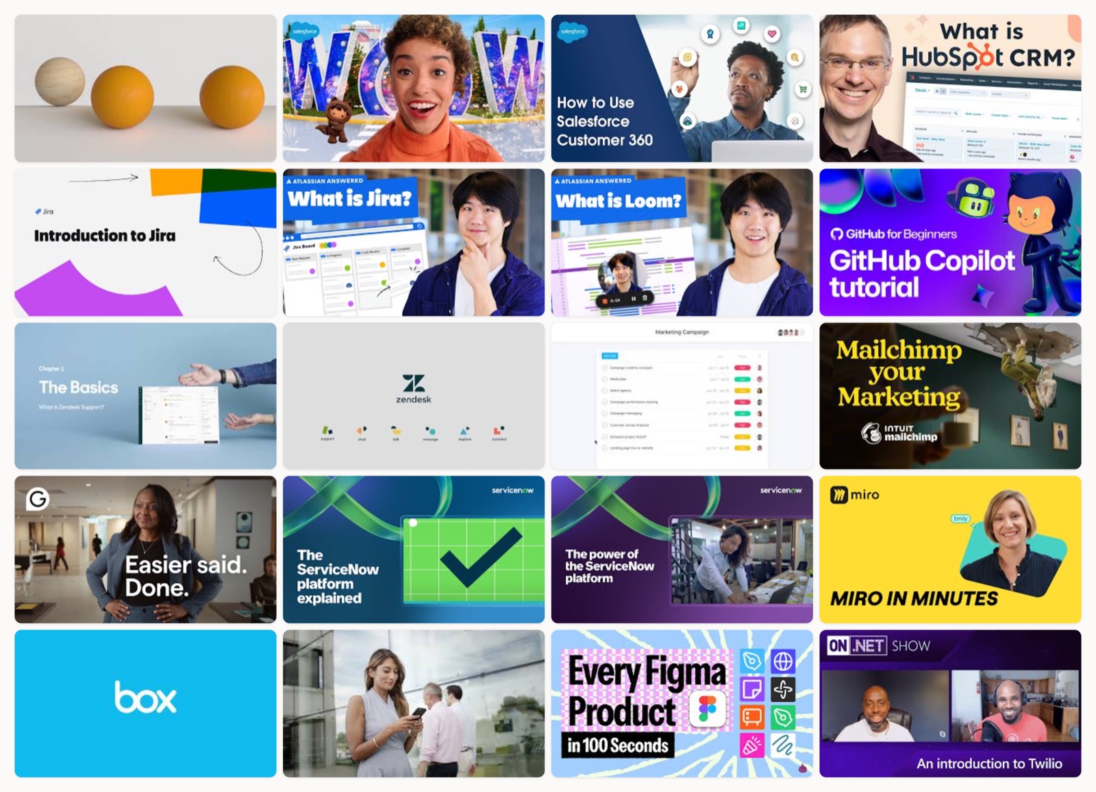
I have watched an absurd number of B2B explainer videos. It comes with the job. Most of them slide off my memory before the thirty-second mark, and I forget the product name faster than that. A small number stick, and after enough of them I started noticing why.
The ones I remember do one thing on purpose. They pick a single job (make me understand this, make me feel something, show me the clicks) and they commit to it. The rest try to do everything at once, and end up doing nothing you can recall an hour later.
So when someone on my team is about to brief a new explainer, I do not send them a checklist. I send them videos. Watching a piece that works teaches me more in two minutes than a page of rules ever will. This is that reference list, opened up, with what each one is actually doing under the hood.
How I picked these
Every video here is one I would show a client as a real reference, and every one still plays (I checked). I deliberately spread them across formats: brand films, character animation, screen walkthroughs, live-action-plus-UI, and the old cut-paper classic that started the whole category. Some are made by companies with enormous production money. That is fine. The money is not the lesson. The choices are. You can copy a choice at any size. If you want the mechanics behind building one, I wrote a separate piece on how to make an explainer video, but this is about taste, not process.
Let me walk through them.
Slack, a data-story brand film
This one treats research as the plot. Numbers rise onto the screen in time with the narration, so a statistic feels like a beat instead of a bullet point. The typography does most of the heavy lifting: figures set large, held for a full second, then wiped before the next one arrives so nothing crowds. The voiceover is paced slowly enough that each number lands. It is building a case for a way of working, and Slack itself only sits at the end of that case. I admire the nerve of holding the product back that long.
Salesforce, character animation for an abstract platform
Customer 360 is a hard thing to picture. It is a concept, not an object. The animation solves that by handing the idea to characters and running a tiny story through them, so you feel the messy before and the tidy after. Bright, flat staging keeps the abstraction from turning into fog. When the product is invisible, give the viewer people to follow.
Salesforce, the how-it-actually-works walkthrough
Here is the same product doing the opposite job. The buyer already knows what Customer 360 is, so this one skips the metaphor and shows the clicks over a clean screen capture with a guided voiceover. It is worth watching right after the one above, because together they show a truth most brands miss. One product usually needs more than one video, because a curious prospect and a ready buyer are not asking the same question.
HubSpot, a host who makes a big platform feel small
A real person on camera earns trust that pure motion graphics cannot. HubSpot leans on that, then uses animated UI callouts to keep the interface legible while the host talks. The smart part is the framing. A sprawling CRM gets reduced to one benefit you can hold in your head, and the host never rushes past it. Complexity hidden behind a friendly face.
Atlassian, mapping a Jira workflow step by step
Flat vector motion graphics get a bad reputation for looking generic, but this shows the format at its best. The animation traces a team’s workflow one stage at a time, and the restraint is the point. Nothing on screen competes with the flow you are meant to follow. When the concept is a process, the visual should be a clear line through it.
Atlassian, the sixty-second answer
Same product, a much shorter cut. This one answers the literal question “what is Jira” in under a minute and then stops. I admire the discipline. Not every viewer wants the full workflow tour. Plenty of them just typed the name into a search bar and want a fast, honest picture before they decide to care. Give that person their sixty seconds.
Loom, problem first and warmth throughout
Loom opens on the ache everyone recognises: the meeting that should have been a message, the thread that will not die. Then it offers the product as relief. The animation carries real warmth, which matters, because the whole pitch is emotional before it is functional. A tight problem-solution structure only works if the problem feels true, and this one does.
GitHub, speaking to developers in their own room
Developers can smell marketing from a mile off, so this does not try to sell them. It shows Copilot inside the editor, in the environment they already live in, and uses kinetic code overlays to stop a screen recording from flattening out. The craft respects the audience’s intelligence. If you are selling to a technical buyer, this is the register to study.
Zendesk, a demo built around a support scenario
Most product demos list features. This one wraps them in a support scenario, so every capability shows up at the moment a real agent would need it. The voiceover is buyer-first, and it plays over actual interface recordings rather than glossy fakery. Context is what turns a feature tour into something a prospect can imagine using.
Zendesk, the launch film
Now the same brand in a completely different key. This is a high-production launch film with sleek product reveals and bold typography, made to create a feeling rather than teach a workflow. Watching it back to back with the demo above is a small masterclass in matching format to intent. One video explains, one video announces, and Zendesk knew not to blur the two.
Asana, a metaphor that carries the whole idea
Scattered tasks resolve into an ordered structure, and that visual transformation is the message. There is no need to explain the benefit in words because you have already watched chaos become clarity on screen. Colorful, playful, built around a single strong metaphor. When you can show the value instead of stating it, show it.
Mailchimp, where the craft is the brand
This barely explains a feature, and it does not need to. The quirky hand-drawn animation is so unmistakably Mailchimp that the style itself does the selling. It is a reminder that an explainer can build brand memory as much as product understanding, and for a company with a distinct visual voice, leaning all the way into that voice is a strategy, not an indulgence.
Grammarly, leading with the outcome
Grammarly for Business opens on the result a team wants (less time lost to writing) and only then shows the product delivering it inline. Live-action teams give the video a human weight, and the animated UI keeps the feature visible without breaking the scene. Outcome first, mechanism second. That ordering is worth stealing for almost any B2B piece.
ServiceNow, one flow out of a sprawling platform
Enterprise platforms are the hardest thing to explain because they do so much. ServiceNow’s answer is to draw one connected flow through the whole thing, using motion graphics to simplify rather than to impress. The discipline is in what they left out. A platform video that tries to show everything shows nothing, and this one resists that.
ServiceNow, the cinematic counterpart
Right after the explainer, here is the brand-tech film. Cinematic, confident, built on scale and impact rather than step-by-step clarity. It is another example of a single company running two videos for two moments in the buyer’s head, and it works because neither one pretends to be the other.
Miro, speed that matches the tool
A fast-paced screen tour that shows the collaborative canvas doing real work at real speed. The tempo is not an accident. A whiteboard tool lives or dies on how fluid it feels, so the editing moves as quickly as the product does. Let the pacing of your video echo the feeling of the product, and viewers absorb the benefit without being told.
Box, the dependable classic done well
Clean iconographic motion graphics, a clear voiceover, a straightforward structure. This is the corporate explainer template, and I include it precisely because it is unglamorous. Executed with care, the standard format still communicates. Not every video needs to reinvent the category. Sometimes the job is just to be clear, and clear is harder than it looks.
DocuSign, walking the flow in order
Signing a document electronically can feel legally scary, so DocuSign walks the whole process step by step until there is nothing left to wonder about. The animation exists to remove uncertainty. That is the underrated power of a how-it-works video. It answers the anxious question before a prospect has to ask it, and a calmer buyer is a closer buyer.
Figma, a whole suite in a hundred seconds
Figma packs its entire product family into a rapid-fire hundred-second montage, and the momentum is the whole appeal. It should feel overwhelming and somehow does not, because the editing is tight enough to keep each product distinct as it flies past. A format worth borrowing when you have a lot to cover and a viewer with very little patience.
Twilio, making invisible APIs visible
Communications APIs are about as abstract as software gets. You cannot photograph a message routing through a channel. Twilio’s explainer gives that invisible flow a visual body, so a developer-adjacent buyer can picture what the platform actually does. When the product has no physical form, animation is not decoration. It is the only way to show the thing at all.
Dropbox, the one that defined the format
I had to end here. This is the landmark Common Craft cut-paper explainer, the video that arguably invented the whole modern explainer category. Plain narration, simple paper cutouts, a problem stated before the product appears. Everything in this list is a descendant of the choices in these two minutes. Watch it and notice how little it needs to be effective.
What the best ones share
After twenty-one of these, the through-lines are hard to miss.
They earn attention with a real problem before they mention the product. Slack, Loom, Asana, and Dropbox all put the pain on screen first, and it buys them the right to explain the solution.
They match the craft to the audience. GitHub talks to developers inside the editor. Mailchimp talks to marketers through its own illustration voice. Twilio makes an invisible API tangible. Nobody borrows a style that does not fit the person watching.
They pick one job per video. The clearest signal in the whole list is how often a single company runs two different videos (Salesforce, Zendesk, ServiceNow, and Atlassian all do it) because they refuse to make one piece explain, announce, and demo all at once.
And the pacing always has intent. Miro moves fast because the product feels fast. Slack moves slowly because it wants each number to land. Speed is a decision, never a default.
How to get this right
If you are about to brief an explainer, a few things save you from the forgettable middle.
Decide the one job first. Are you making someone understand, making them feel something, or showing them the clicks? Write it down. If you cannot name it in a sentence, the video will wander.
Script the problem before the product. The fastest way to lose a business buyer is to open on a feature. Open on the reason they should care, then arrive at the product as the answer.
Match the visual style to your brand and your buyer, not to whatever looks impressive in a showreel. A polished cinematic film aimed at a skeptical developer will bounce off. Fit beats flash.
Keep it short, and put the product where the clicks actually matter. If someone is close to buying, show the interface. If they are still curious, show the story. Most products need both videos eventually, and a script that respects that difference is worth more than a bigger animation. If you want a starting structure, this walk-through of the explainer video script is where I usually point people.
Where to go from here
The videos above are not a style to copy. They are proof that a clear decision, made early and held all the way through, is what separates the ones you remember from the ones you scroll past. Pick your one job, tell the problem honestly, and let the craft serve the message instead of the other way around.
That last part, craft in service of the message, is the whole thing I care about, and it is why my studio Moonb exists in the first place. But you do not need us to start. You need to watch a few of these one more time and steal the choices that fit your product.
Frequently asked questions
It depends on the job. A top-of-funnel piece that answers 'what is this' works best under 90 seconds, and several examples here (like Atlassian's Jira answer) come in under a minute. A product walkthrough for a buyer who is close to deciding can run longer because that viewer wants detail. Match the length to where the person is in their decision, not to a fixed rule.
Both work, and the choice should follow your product and audience. Animation is strongest when the product is abstract or invisible, like Twilio's APIs or Asana's workflow, because you can show a concept that has no physical form. Live-action or a live-action-plus-UI mix, like HubSpot or Grammarly, builds trust through a real human face. Pick the format that makes your specific idea easiest to grasp.
Usually not. The clearest lesson from this list is that Salesforce, Zendesk, ServiceNow, and Atlassian each run more than one video for the same product. A curious prospect and a ready buyer are asking different questions, so one video explains the concept and another shows the clicks. Planning for two or three focused pieces beats forcing a single video to do every job at once.



