
A Marketer's Guide to Graphic Design Terms


When you’re trying to bring a marketing vision to life, speaking the same language as your designer is everything. Graphic design terms are simply the shared vocabulary that helps you describe visual elements like typography, color, and layout with clarity.
Getting a handle on core concepts like hierarchy, kerning, and the difference between RGB and CMYK is the key to better creative briefs, fewer revisions, and getting the exact marketing assets you need.
Your Quick-Reference Design Glossary
Let's be real—navigating the design world without knowing the lingo can be frustrating. When you and your designer aren't on the same page, feedback gets vague, projects drag on, and the final result can completely miss the mark. A shared vocabulary is the bridge that turns your strategic vision into visuals that actually work.
Knowing just a few key design terms lets you move past subjective feedback like "make it pop" and give specific, actionable direction instead. This clarity doesn't just improve the final piece; it builds a stronger, more collaborative relationship with your creative team. It’s the difference between asking for a "stronger headline" and requesting "tighter tracking on the headline font to create more impact."
Key Terms at a Glance
To get started, it helps to organize the most common terms into a few core buckets. This approach makes the vocabulary feel less intimidating and way easier to apply to your day-to-day work.
Every marketer should be familiar with these four areas:
- Typography: This is the art of arranging text. It covers everything from which font to use to the tiny spaces between letters and lines.
- Color: Think of this as the science behind color choices, like using RGB for screens versus CMYK for print, creating harmony, and understanding psychological impact.
- Composition: This is all about how visual elements are arranged on the page. Principles like hierarchy, white space, and alignment are used to guide the viewer’s eye.
- Digital Formats: You need to know the difference between file types like raster (JPEG, PNG) and vector (SVG, AI) to know when to use each one.
Essential Graphic Design Terms Cheat Sheet
Here’s a quick-lookup table to serve as your cheat sheet for the most critical terms. Keep it handy when you're writing briefs or giving feedback to make sure your design projects nail your campaign goals right from the start.
With these terms in your back pocket, you're already on your way to communicating more effectively and driving better creative outcomes.
Essential Typography and Text Terminology
Typography is the craft of making text easy and enjoyable to read. It's so much more than just picking a font; it's a core piece of graphic design that shapes how your audience feels about your brand and understands your message.
Great typography can make a design look polished and authoritative. On the flip side, poor choices can make things confusing or just plain unprofessional. Getting a handle on a few key terms will help you give feedback that is specific, clear, and leads to a better final product.
Key Font Categories
The first step is knowing the difference between the two main font families. This single choice can set the entire tone for a design before anyone even reads a word.
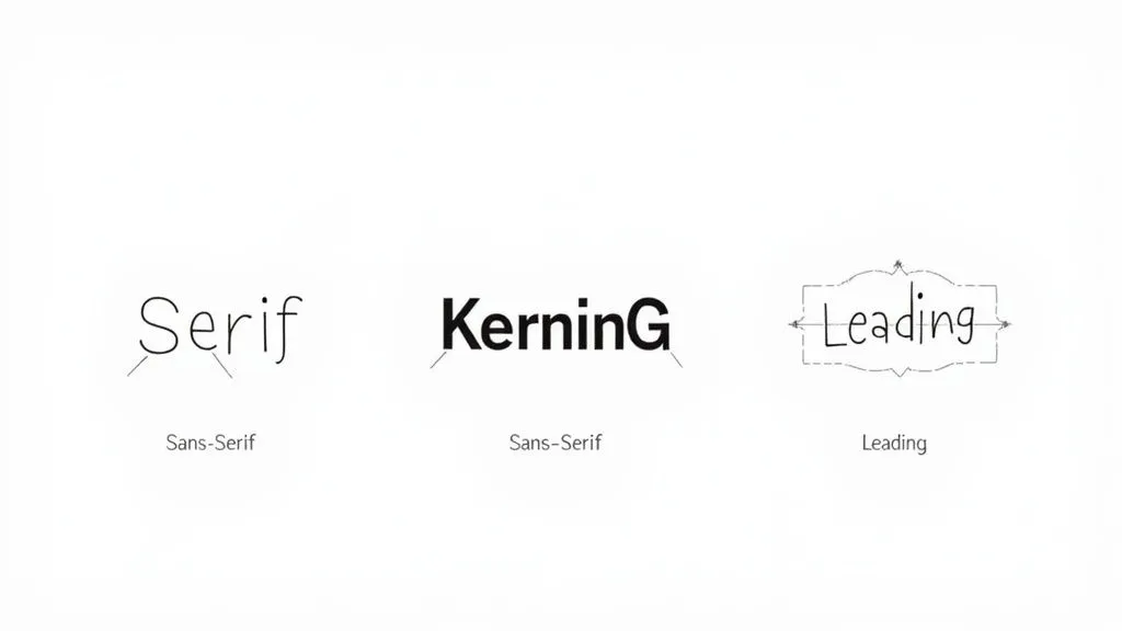
- Serif Typeface: These fonts have tiny decorative lines, often called "feet," at the ends of the letters. They tend to feel traditional, trustworthy, and formal. Think about the fonts used in most books and newspapers—that's a serif.
- Sans-Serif Typeface: "Sans" literally means "without," so these fonts don't have those little feet. This gives them a cleaner, more modern, and straightforward feel. You'll see them everywhere on digital screens and in minimalist branding.
For instance, a law firm looking to project authority and decades of experience would likely lean on a classic serif font. In contrast, a new tech startup will almost always go for a clean sans-serif to feel modern and approachable.
Understanding Spacing and Readability
Beyond the font style, the real magic happens in the spacing. The subtle adjustments between letters and lines are often what separate amateur work from a professional design. These details are critical graphic design terms to know because they have a massive impact on how readable and beautiful text looks.
Kerning is all about adjusting the space between individual pairs of letters so they look just right. Some letter combos, like 'AV' or 'To', can look awkward without a little manual tweaking. Designers will meticulously adjust the kerning in headlines and logos to make sure everything feels balanced and intentional.
Marketer Tip: If the text in a logo or headline just feels a little "off," you can give your designer perfect, actionable feedback by asking, "Could we take a look at the kerning here? Some of the letters feel a bit crunched together."
Tracking is a lot like kerning, but it affects the spacing across a whole block of text—a word, a sentence, or a paragraph—not just specific pairs. Increasing the tracking can make text feel more open and airy, while tightening it can create a dense, powerful headline. It’s about managing the overall texture of the text.
Leading (pronounced "ledding," like the metal) is the vertical space between lines of text. The name comes from the old days of printing presses when typesetters used actual strips of lead to separate lines. Getting the leading right is absolutely essential for paragraph readability. Too tight, and the text is a cramped mess; too loose, and the lines feel disconnected.
For body text, a good rule of thumb is to set the leading to about 120-145% of the font size. This gives the eye enough room to move comfortably from one line to the next, making the entire reading experience better.
Decoding Color Models and Theory
Color is so much more than just an aesthetic choice. Think of it as a technical component that can absolutely make or break your marketing materials. Getting the language of color right ensures your brand looks sharp and consistent everywhere it appears, from a backlit phone screen to a freshly printed brochure.
If you don't have a handle on these basic terms, you can end up with some costly and frustrating mistakes. The most common trip-up for marketers? That would be color models.
Digital vs. Print Color Systems
A color model is just a system for creating a full spectrum of colors from a small set of primary ones. The two you absolutely need to know are RGB and CMYK.
RGB (Red, Green, Blue) is what's called an additive color model, and it’s built specifically for digital screens. It works by mixing red, green, and blue light in different combinations and intensities to create all the colors you see on your monitor, phone, or TV. When you combine all three at their brightest, you get pure white light.
CMYK (Cyan, Magenta, Yellow, Key/Black) is the polar opposite. It’s a subtractive color model used for printing. Instead of adding light, it subtracts brightness from a white surface (like paper) by layering inks. The more ink you add, the darker the color gets. This is exactly why that vibrant blue on your screen can look a bit duller when it's printed on a business card.
To keep your brand consistent, your designer has to convert files to the right color model for the job. A graphic for an Instagram post needs to be in RGB. A flyer headed to the printer must be in CMYK.
Here's a classic mistake: approving a digital proof (in RGB) for a print job without ever seeing a physical sample. The colors you see on your screen are made with light; they will never perfectly match colors made with ink. For any color-critical project, always, always ask for a physical proof.
Going Beyond the Basics
Once you've got RGB and CMYK down, a few other terms will help you describe and apply color with more precision.
- Pantone (PMS): The Pantone Matching System is a standardized library of colors. It's the secret to getting extreme color accuracy in printing. Instead of a printer mixing CMYK inks to approximate a color, they use a pre-mixed, specific Pantone ink. This is non-negotiable for brand colors that have to be exact every single time, like Coca-Cola Red or Tiffany Blue.
- Hue: This is the purest version of a color. Think of the foundational colors on a color wheel—red, yellow, green, blue. That's the hue.
- Saturation: This describes a hue's intensity or vibrancy. High saturation makes a color look rich and punchy. Low saturation makes it appear muted, faded, or grayish.
- Tint, Tone, and Shade: These are all just ways to describe variations of a single hue. A tint is created by adding white, a tone by adding gray, and a shade by adding black.
Knowing these terms helps you give much clearer, more effective feedback. Instead of just saying "make it brighter," you can ask, "Can we increase the saturation of the primary blue?" or "Let's try a lighter tint for the background." If you're stuck on where to even start, playing around with color palette generators is a fantastic way to find inspiration for any new project.
Color Models Compared: RGB vs. CMYK vs. Pantone
Trying to keep these color models straight can be tricky. Here's a simple comparison table to help you remember which one to use and when. It breaks down what each model is best for and the key thing to keep in mind when you're using it.
Ultimately, choosing the right color model comes down to one simple question: where will people see this design? If it's on a screen, it's RGB. If it's being printed with ink, it's CMYK. And if that printed color needs to be perfect every time, Pantone is your best friend.
Understanding Composition and Layout Principles
Good composition is the invisible force that makes a design feel right. It's how a designer thoughtfully arranges every element—text, images, shapes—to lead the viewer's eye and get a message across clearly. For marketers, getting a handle on these basic principles is the key to giving feedback that's actually helpful, moving beyond vague comments like "it just looks too busy."
Think of these principles as the grammar of visual language. Without them, even the most stunning individual elements can create a confusing jumble. Understanding terms like hierarchy, alignment, and white space gives you the vocabulary to explain why a layout works or doesn't, making sure every design hits its mark.
Creating Order with Grids and Alignment
At its heart, professional design is all about structure, and the grid system is the skeleton that holds everything together. A grid is a hidden framework of intersecting lines that designers use to align elements with precision. It brings a sense of order to the page, giving every component a deliberate home.
This image shows a classic column grid, a staple in web design.
The grid makes sure headlines, body copy, and images all line up, creating a clean look that’s easy for users to follow.
Working hand-in-hand with grids is alignment, which is simply how elements are positioned relative to each other. Whether text is aligned to the left, right, or center, what matters most is consistency. Solid alignment forges a strong visual connection between different parts of the design, making the whole thing feel intentional and polished, not scattered and amateurish.
Guiding the Eye with Hierarchy and Proximity
Not all information carries the same weight, and visual hierarchy is all about making the most important stuff stand out first. Designers have a few go-to tricks to establish this pecking order:
- Size: Bigger elements grab more attention. It’s why headlines are always larger than subheadings.
- Color: Bright, bold, or contrasting colors make an element impossible to ignore.
- Placement: We tend to see things at the top or center of a design as more important.
Proximity is the simple but powerful idea that related items should be grouped together. When you place a headline, its supporting paragraph, and a call-to-action button in a tight cluster, you signal that they are one unit of information. This helps people process what they're seeing much faster. These principles are also the foundation of powerful visual narratives, which you can see in these great visual storytelling examples that use hierarchy and proximity to tell a story without a single word.
The Power of White Space
One of the most misunderstood terms in design is white space (also called negative space). It’s not just “empty” area—it’s an active, crucial part of the design. White space is what gives your content room to breathe, cuts down on clutter, and sharpens focus.
A rookie mistake is feeling the need to fill every single pixel. But using white space strategically can make a design feel more high-end, improve readability by up to 20%, and pull the viewer’s eye right where you want it. It's the silence between the notes that makes the music work.
Navigating Image and File Format Terminology
The world of digital files can feel like a minefield of confusing acronyms. But choosing the right file format for the job is one of the most critical parts of any project—it directly impacts the final quality of your marketing assets. Getting these terms right is essential for making sure your visuals look professional and crisp everywhere they appear.
This decision tree gives you a peek into how a designer thinks, showing how focusing on layout clarity and balance leads to a much more effective design.
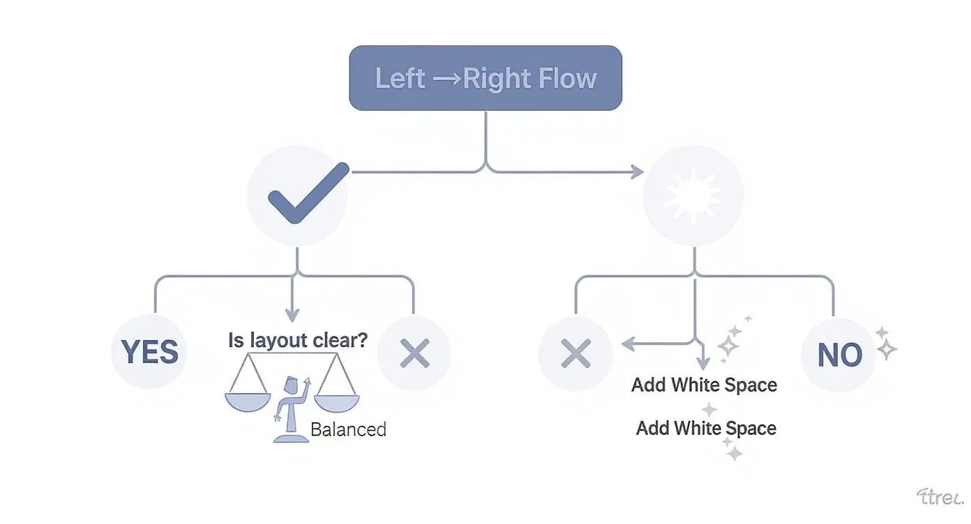
As the flowchart shows, a core design principle is that if a layout feels cluttered, the first and best solution is almost always adding more white space. It’s the secret to creating balance and clarity.
Raster vs. Vector: The Fundamental Divide
Every single image file falls into one of two main categories: raster or vector. For marketers, knowing the difference isn't just helpful; it's non-negotiable.
Raster graphics are what most people are familiar with. They're built from a finite grid of tiny colored squares called pixels. Photographs are the classic example. Because they have a set number of pixels, they get blurry or "pixelated" when you try to make them bigger. That's image quality you can't get back.
Vector graphics, on the other hand, are built with math. They use formulas to create paths, points, and curves instead of pixels. This means they are infinitely scalable. You can blow up a vector file from the size of a postage stamp to a billboard, and it will stay perfectly sharp and clean. Your logo should always be in a vector format. No exceptions.
Common File Types You Need to Know
Picking the right format is the difference between an image that loads fast and looks great, and one that... doesn't. Here are the big four you'll encounter constantly.
- JPEG (or JPG): A raster format that's the go-to for photographs on the web. It uses compression to keep file sizes small, which is great for page speed, but it doesn't support transparency.
- PNG: This is another raster format, but its superpower is transparency. It’s ideal for web graphics like icons or logos, especially when you need to place them on a colored background without that ugly white box around them.
- SVG (Scalable Vector Graphic): A vector format made specifically for the web. It’s perfect for logos, icons, and simple illustrations online because it’s scalable and usually has a tiny file size.
- EPS (Encapsulated PostScript): A classic vector format you'll often see used for professional printing. This is one of the main file types a designer will give you for your logo so it can be used in any print materials.
Key Takeaway: When writing a creative brief, always ask for final logo files in vector formats like SVG and EPS. For web images, specify if you need JPEGs for photos or PNGs for graphics that need a transparent background. This one simple step will prevent so many headaches down the line.
Resolution and Print-Ready Essentials
When you're talking about image quality, resolution is the term that matters most. It’s measured differently for screens versus print, and confusing the two is a recipe for disaster.
PPI (Pixels Per Inch) is all about the resolution of a digital image on a screen. For web use, the long-standing standard is 72 PPI.
DPI (Dots Per Inch) refers to the resolution of a printed image. For high-quality print work, images need to be at least 300 DPI. If you try to use a 72 PPI web image for a printed flyer, it will look like a blurry, unprofessional mess. If your image resolution is too low, you can try using some of the best free image resizing tools to adjust it, though be warned that scaling up a low-res image rarely ends well. You can get more details by checking image metadata.
Finally, let's talk about bleed. This is the small, extra margin of image or color that extends beyond the final trim edge of a print design. Printers need this buffer zone to make sure no unprinted white edges show up on your business cards or brochures after they're cut to size.
Key Branding and Identity Design Concepts
Beyond the specific design elements, there are bigger, more strategic concepts that form the foundation of your entire visual presence. Think of these not just as assets, but as the architectural plans for building a brand that people instantly recognize and connect with. For any marketer looking to build long-term brand equity, getting these right is non-negotiable.
A strong brand identity is really a system where every single visual works together in harmony. In fact, research shows that brand consistency can boost revenue by up to 23%, which makes a unified visual strategy a direct contributor to your bottom line. And it all starts with the most recognizable piece of the puzzle: the logo.
Differentiating Your Logo Elements
We often use "logo" as a catch-all term, but it’s actually made up of specific components that have different jobs. Knowing the lingo helps you ask for the right asset for the right situation.
- Logotype: This is a logo made up entirely of the company’s name, set in a specific, stylized typeface. Think Google, Coca-Cola, or Visa. A logotype, also called a wordmark, is fantastic for building name recognition right out of the gate.
- Logomark: This is the purely symbolic part of a logo, with no company name in sight. The Apple icon or the Twitter bird are perfect examples. Logomarks are incredibly powerful, but they work best for brands that are already household names.
- Combination Mark: Just like it sounds, this type combines a logotype and a logomark into one unified lockup. It's the most common and versatile approach, giving you the best of both worlds—name recognition and a memorable symbol.
Having these different logo variations gives you incredible flexibility. You can use a simple logomark for a tiny social media profile picture and the full combination mark for a big, splashy magazine ad.
The Brand Guide as Your Rulebook
If there’s one document that’s absolutely critical for keeping your visual identity consistent, it’s the brand guide (sometimes called a style guide). This is your brand's rulebook, spelling out exactly how every brand asset should—and shouldn't—be used. It's the key to making sure your brand looks and feels the same, no matter where people see it. Of course, a great identity starts with a great name, so it's also helpful to understand what brand naming entails and how it influences the design process from the very beginning.
A brand guide isn’t just for designers; it’s for the entire organization. It empowers marketers, salespeople, and partners to represent the brand correctly, preventing the dilution of your brand identity over time.
This guide gets into the nitty-gritty, providing specific instructions on logo usage, color palettes (with exact HEX, RGB, and CMYK codes), typography, and even the style of imagery to use. To learn more about structuring this essential document, check out this complete guide on how to create brand guidelines. Having these clear rules ensures every touchpoint, from an email signature to a massive trade show booth, reinforces the same powerful brand message.
Applying Your Knowledge in a Creative Brief
Knowing all these graphic design terms is great, but putting them into practice is where the magic happens. A well-written creative brief is probably the single most important document you'll create for any design project. Using precise language turns a vague wish list into a clear, actionable roadmap for your designer. It’s the difference between a successful launch and a dozen painful revisions.
Clear communication doesn't just save time; it ensures you get the best possible work from your creative partners. Think about it: in the United States, around 90% of designers work as freelancers or independent contractors. This makes a crystal-clear brief absolutely essential for a smooth workflow. For more context on the industry, you can check out these graphic design statistics. When you speak their language, you empower them to deliver exactly what you need.
Building a Better Brief
Instead of saying something like, "Make the headline pop," you can now give specific, technical direction that your designer will immediately understand. This eliminates the guesswork and gets everyone on the same page from day one. If you want to dive deeper, our creative brief template provides a solid structure for capturing all of these critical project details.
Here’s how you can weave your new vocabulary into the key sections of your next brief:
- On Typography: Instead of asking for a "modern font," try this: "We need a clean, sans-serif typeface for the body copy to keep it readable. For headlines, let's use tight tracking to create a bold, impactful feel."
- On Color: Go beyond "use our brand colors." A much better instruction is: "Primary call-to-action buttons should use our brand's main Pantone blue for print materials, and the corresponding HEX code for all digital assets to ensure total consistency."
- On Imagery and Files: A vague request for "images" is a recipe for delays. Be precise: "Please provide the final photos as high-resolution (300 DPI) JPEGs. The company logo needs to be in a vector format, specifically as an SVG and EPS file."
Key Takeaway: A brief that's packed with precise graphic design terms is like a contract of clarity. It ensures your designer understands not just what you want, but why you want it. This leads to a final product that hits your strategic goals, not just your aesthetic preferences.
Frequently Asked Questions
Let's be honest, navigating the world of graphic design can feel like trying to order coffee in a foreign country. To help you solve some everyday creative challenges, I've tackled a few of the most practical questions marketers ask when working with designers.
Getting these fundamentals down clears up a ton of confusion, makes collaboration smoother, and ensures your vision actually makes it to the finish line.
What Is the Difference Between Vector and Raster Files?
This is easily one of the most critical concepts to get right. Think of raster files (like JPEGs and PNGs) as a mosaic made of tiny colored squares, or pixels. They're great for photos and detailed images. But when you try to enlarge them, you're just stretching those same pixels, which is why they get blurry and jagged.
On the other hand, vector files (like SVGs, AI, and EPS) are built with math—points, lines, and curves defined by formulas. Because of this, they can be scaled up to the size of a billboard or down to a tiny app icon without losing a single bit of sharpness. This is precisely why your logo must always be a vector file.
Why Can't I Just Use Images I Find on Google?
It’s so tempting to do a quick search and grab a perfect image, but that's a shortcut you really can't afford to take. There are two huge reasons why. First, almost every image online is protected by copyright. Using one for your business without the right license is a legal minefield that can lead to some seriously expensive fines.
Second, images you find on the web are almost always low-resolution (72 PPI) so that websites can load quickly. That’s nowhere near the quality needed for professional printing, which demands at least 300 DPI. If you use a web image in a brochure, it’s going to look pixelated and unprofessional. Always stick to licensed stock photos or, even better, create your own.
What Are the Three Most Important Design Terms for Marketers?
If you only have the bandwidth to learn a few terms, make them these three. They’ll have the biggest impact on your marketing materials and instantly make your creative feedback more effective.
- Hierarchy: This is all about arranging elements to show their importance. It's how a designer guides the viewer's eye to the main message first. Understanding this helps you give clear feedback on whether a design is actually hitting its primary goal.
- RGB vs. CMYK: Getting this right is crucial for brand consistency. RGB (Red, Green, Blue) is the color model for digital screens, while CMYK (Cyan, Magenta, Yellow, Black) is for anything that gets printed. Using the wrong one is the #1 reason brand colors look off when you compare a website to a business card.
- White Space: Often called negative space, this isn't just empty area—it's an active design tool. It gives your content room to breathe, reduces clutter, creates focus, and makes the whole design feel more polished and high-end.
Key Takeaway: You don't need to become a designer to be a great collaborator. Just by grasping a few core concepts—like why you need a vector logo, the risks of web images, and the "big three" of hierarchy, color, and white space—you can give feedback that’s clear, actionable, and gets you better results.