Best Free Fonts: 12 Trusted Sources for 2026
The 12 best places to download free fonts that look professional, from Google Fonts to modern foundries, with real licensing notes for 2026.

Typography carries more weight in corporate content than most people give it credit for. The right typeface makes a report feel considered and a landing page feel current. The wrong one makes even strong work look unfinished. And with free fonts, the problem was never availability. It was trust: a lot of “free” downloads carry murky licensing, missing weights, or terms that fall apart the moment money is involved.
I run a creative team, and the list below is where we actually pull type from when a project needs a professional look without paying a license fee. I cut the pure marketplaces that only hand out trials and kept the places that give you real fonts you can ship. Type is a core part of brand identity, not something you bolt on at the end, so before you open a single font site, a clear creative brief will tell you whether the work wants neutral and trustworthy or bold and expressive. That one decision narrows the whole search.
One rule before you download anything: “free” and “free for commercial use” are not the same sentence. A font can be free to install and still forbid you from putting it in paid brand work. Every entry below flags its license, but always open the font’s own license file before it reaches a client. Choosing type is one step in a wider design process, not a box to tick at the end.
1. Google Fonts
More on Google Fonts
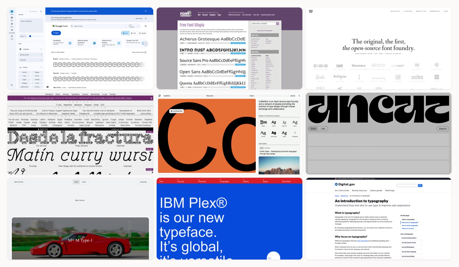
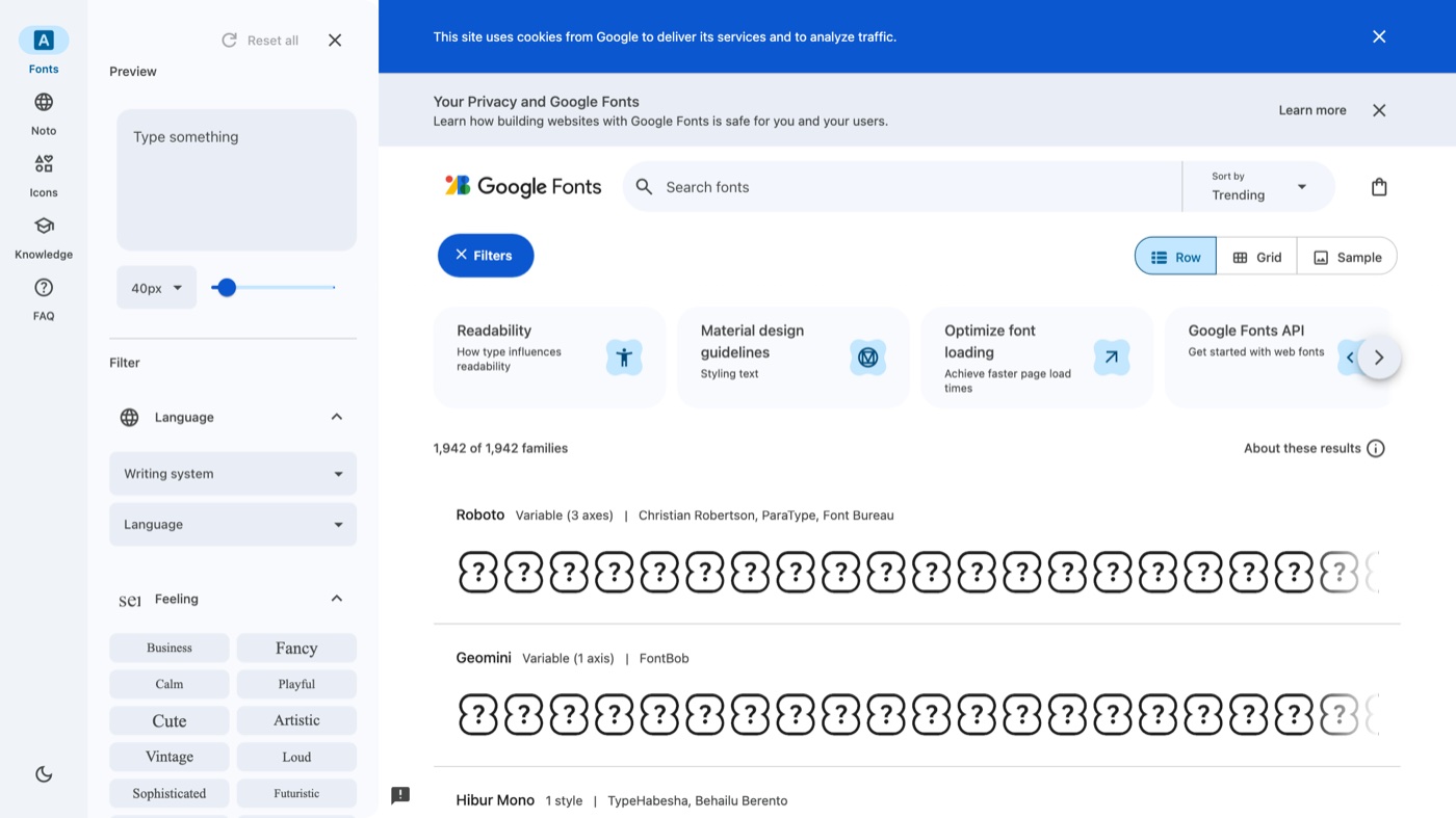
Google Fonts is the library nearly every designer starts with, and after more than a decade it has grown past 1,700 families. Everything is open source, so you can serve fonts from Google's servers, self-host them for privacy and speed, or download them for desktop apps, and the same files work across web, print, and internal docs. It also plugs straight into Google Workspace, so a chosen family shows up in Docs and Slides without extra setup. The trade-off is quality control: flagship families like Inter, Roboto, Work Sans, and Lora are superb, while the long tail includes plenty of forgettable type. Treat it as your default first stop and lean on the popular, well-maintained families for client work.
2. Fontshare
More on Fontshare
Fontshare is the free-font arm of the Indian Type Foundry, and it is the first place I send anyone who wants type that looks paid-for at no cost. It is the home of Satoshi, Clash Display, General Sans, Chillax, and other families you will recognize from premium product sites. Every family is cleared for both personal and commercial use, with real weight ranges and variable versions, so you get a full system rather than a single teaser weight. The catalog is deliberately small and curated, which means you will not find something for every obscure need, but what is there is consistently strong. For modern brand and interface work, this is the highest hit-rate source on the list.
3. Font Squirrel
More on Font Squirrel
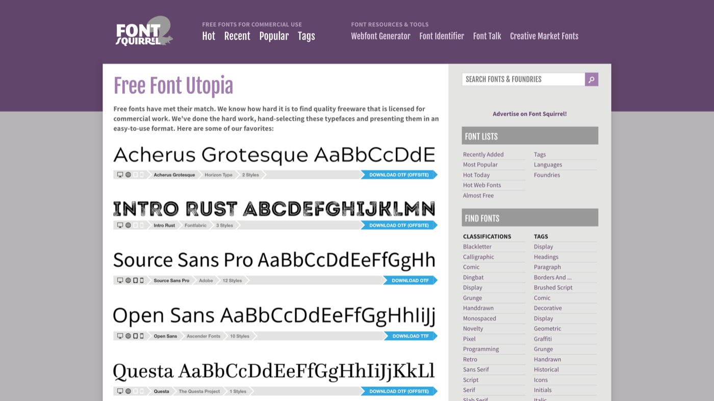
Font Squirrel earned its reputation by doing the boring work: hand-checking that every font it lists is cleared for commercial use, which spares you the license guesswork. Its standout feature is the Webfont Generator, which takes a font file and outputs a ready at-font-face kit for self-hosting, still useful when you need full control over how type loads. The interface feels dated next to newer foundries, and the catalog is smaller than Google Fonts, but the curation is the value. I still treat a Font Squirrel listing as a strong signal that a font is safe to ship. Even so, open the included license file, since a few families carry specific conditions.
4. The League of Moveable Type
More on The League of Moveable Type
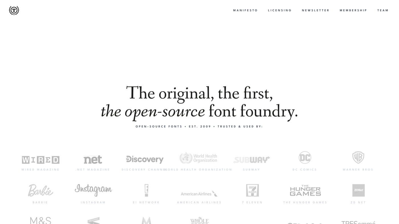
The League of Moveable Type calls itself the original open-source font foundry, running since 2009, and its small catalog punches well above its size. League Spartan, League Gothic, League Mono, Ostrich Sans, and Raleway are modern staples, all under the SIL Open Font License. Because they are truly libre, you can fork the source files and tailor a typeface to exact brand specs, which matters if you want a custom feel without commissioning bespoke type. The collection is curated rather than comprehensive, so think of it as a strong starting palette rather than a one-stop library. For brands that value clean, impactful type they can legally modify, it is a rare resource.
5. Velvetyne
More on Velvetyne
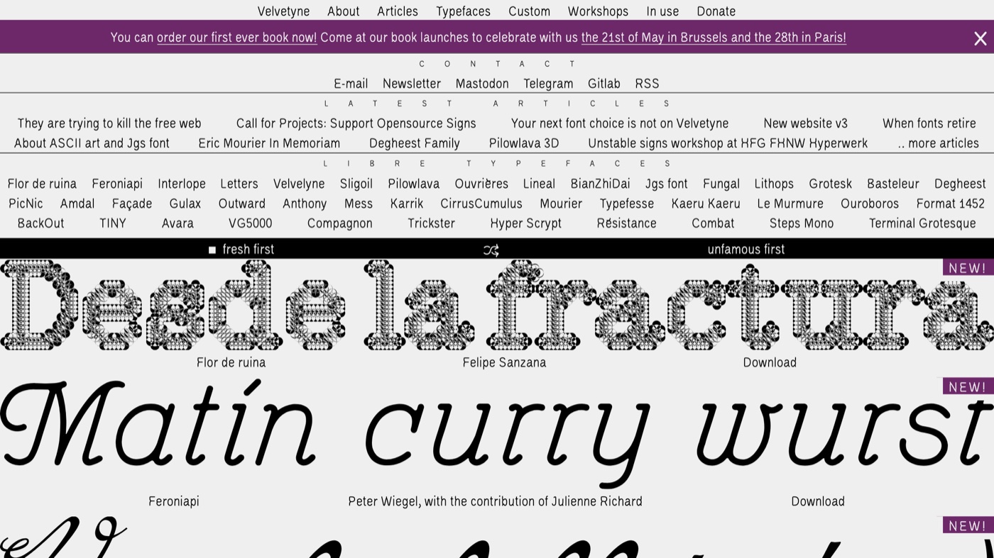
Velvetyne is a French-rooted libre foundry where each typeface reads like an art project, and it is my go-to when a brand needs a real point of view. Families like Terminal Grotesque, VG5000, Compagnon, and Avara are released under libre licenses that let you use, study, modify, and redistribute them, commercial work included. The catalog leans expressive, so it is better for headlines, posters, and identity work than for long body copy. For neutral text you will pair it with something calmer, but for character no one else is using, few free sources compete. It is also an active community with regular releases, so the shelf keeps growing.
6. Collletttivo
More on Collletttivo
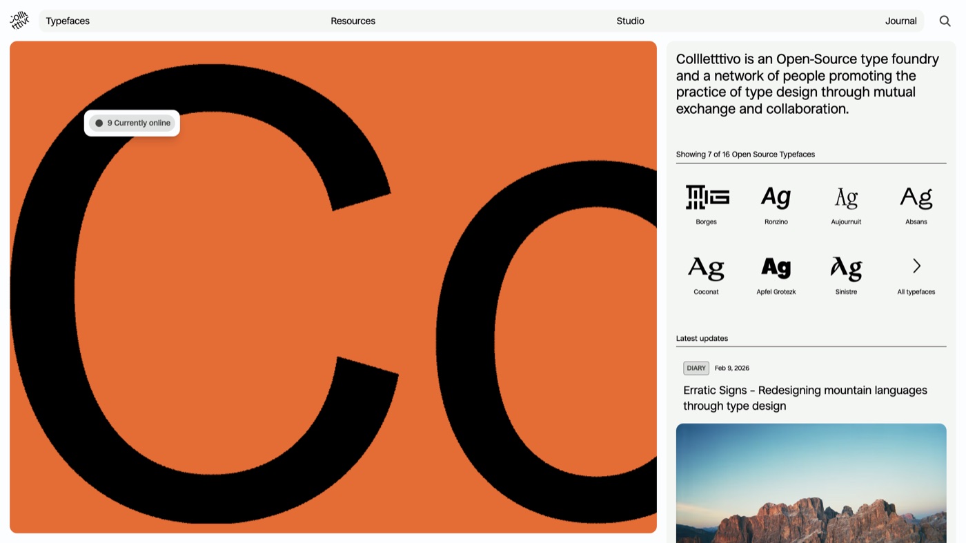
Collletttivo is an open-source type collective with Italian roots, built as a network of designers sharing work rather than a single studio. Its sixteen or so families, including Apfel Grotezk, Ronzino, Absans, and Coconat, are polished enough to carry real client projects, and the whole catalog is open source with donations welcome. Because it is a collective, each typeface comes with the maker's context, which makes it a nice place to find distinctive editorial and cultural type. The catalog is boutique-sized, so it is a place to find one perfect face rather than to shop a full system. If you like supporting the people behind the fonts, this is an easy source to root for.
7. Uncut.wtf
More on Uncut.wtf
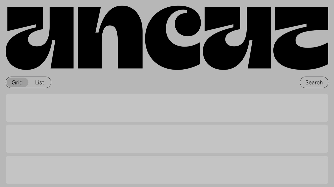
Uncut is a tightly curated library of contemporary typefaces, all cleared for commercial use, and it is where I look when a project needs to feel current. It leans heavily into display faces and modern grotesks, the kind of type you see on freshly launched sites and campaigns. The selection is refreshed often, so it reads more like a living gallery than a static archive, and every download is commercial-ready. Because it is display-forward, you will usually pair an Uncut headline face with a steadier family for body text. For landing pages and launch work that needs to look of-the-moment, it is one of the strongest free sources going.
8. Open Foundry
More on Open Foundry
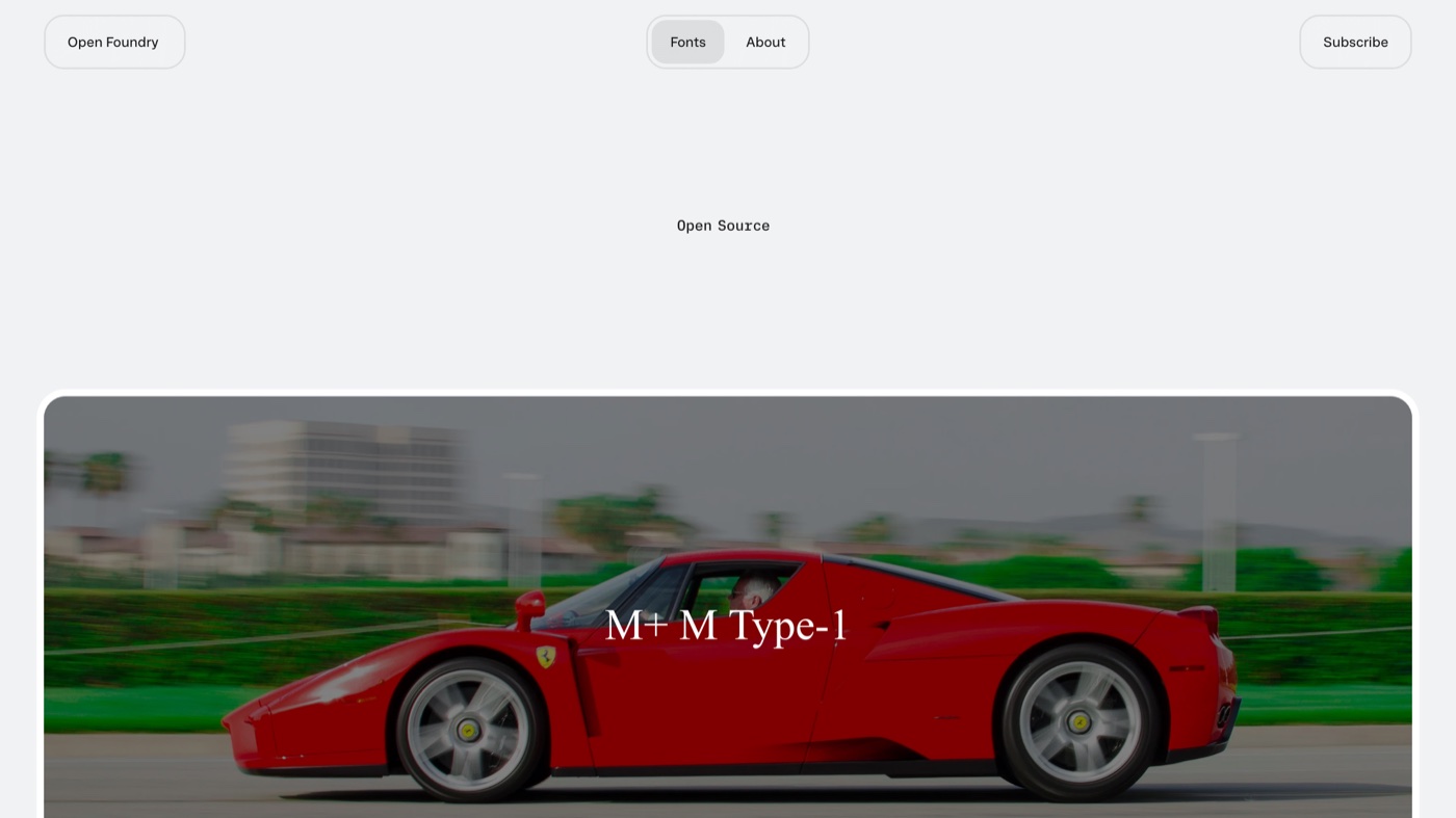
Open Foundry is a curated, editorial platform for open-source typefaces that presents each font properly instead of burying it in a grid. It is more a discovery layer than a warehouse: it points you to quality open-source fonts and tells the story of the people who made them. That framing makes it a good place to slow down and actually understand a typeface before you commit it to a brand. The catalog is smaller and pointed toward well-known open-source families, so it complements Google Fonts rather than replacing it. If you want taste and context alongside the download, this is where to browse.
9. IBM Plex
More on IBM Plex
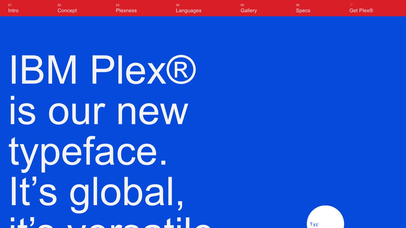
IBM Plex is what happens when a global company builds its own corporate typeface and then gives it away. It is a complete system, Plex Sans, Serif, and Mono, each with a full range of weights, engineered to feel both human and mechanical. Under the SIL Open Font License, it is free for any use including modification and self-hosting, which makes it a safe backbone for product UI, documentation, and brand systems. The character is deliberately corporate and precise, so it will not read as warm or playful, but that consistency is exactly why so many tech brands reach for it. If you need one free family that holds a whole design system together, Plex is hard to beat.
10. Public Sans
More on Public Sans
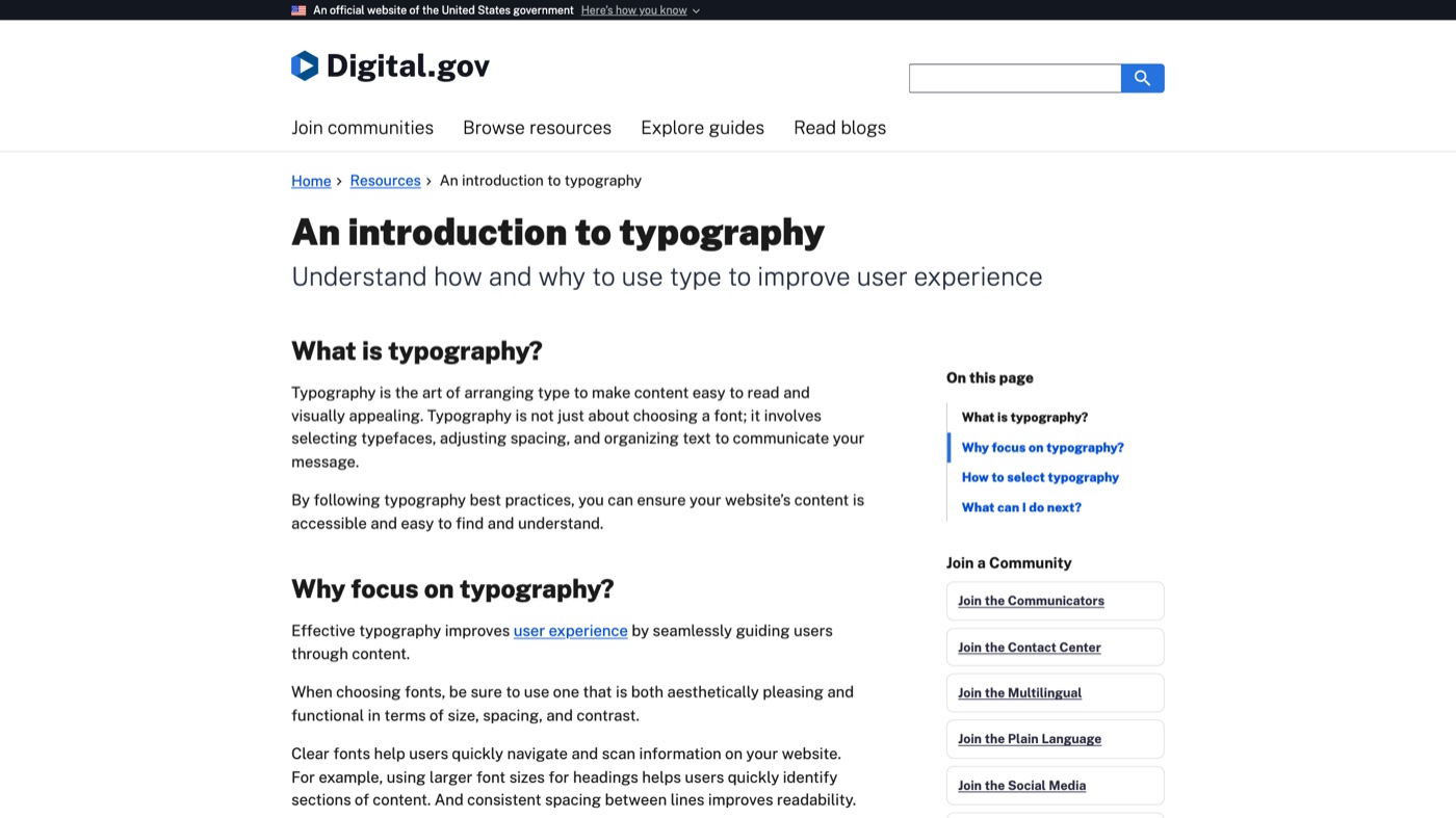
Public Sans comes from the US Web Design System, built to be a strong, neutral sans-serif for government interfaces, and that neutrality is its whole appeal. It is a variable font with a wide weight range under the SIL Open Font License 1.1, so it flexes across a full type hierarchy from small labels to headings. It intentionally resembles familiar system fonts, which makes it feel invisible in the best way for reports, dashboards, and long-form reading. This is a workhorse, not a signature: if you need a brand to stand out, look elsewhere, but for clarity and credibility it is excellent. For finance, public sector, and any interface where legibility wins, it is a reliable default.
11. Atipo Foundry
More on Atipo Foundry
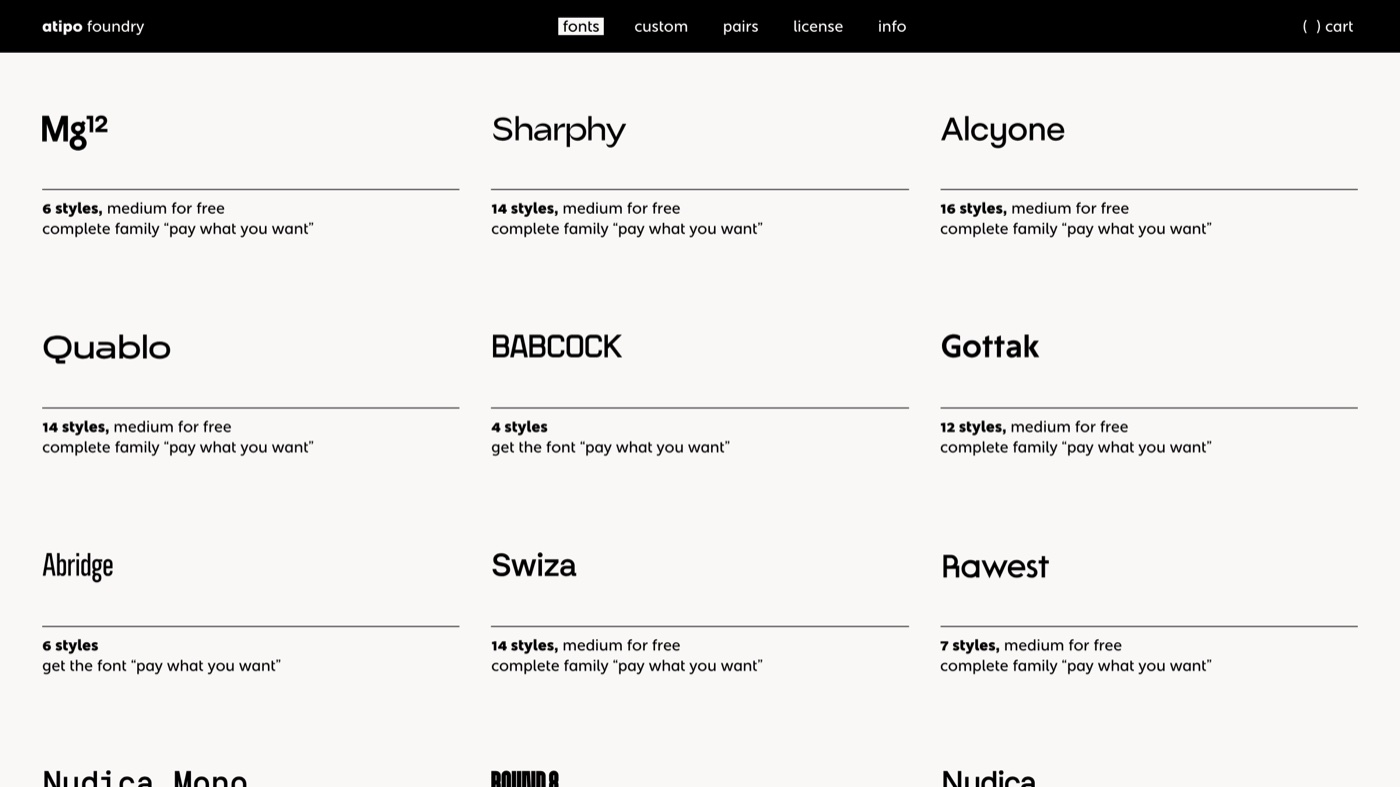
Atipo is a Spanish foundry running a pay-what-you-want model, where many typefaces offer a free weight and the full family is yours for whatever you choose to contribute. Geomanist, Silka, Basier, and Noway are foundry-grade families that look every bit as considered as paid type. The model is fair to everyone: grab a single weight for a small project at no cost, and pay the maker when a bigger rollout can support it. Free access is usually limited to one or two styles, so a full multi-weight family for a large brand may ask for a contribution. For distinctive type where you would happily support the designer, it is one of the better-value sources around.
12. Fontesk
More on Fontesk
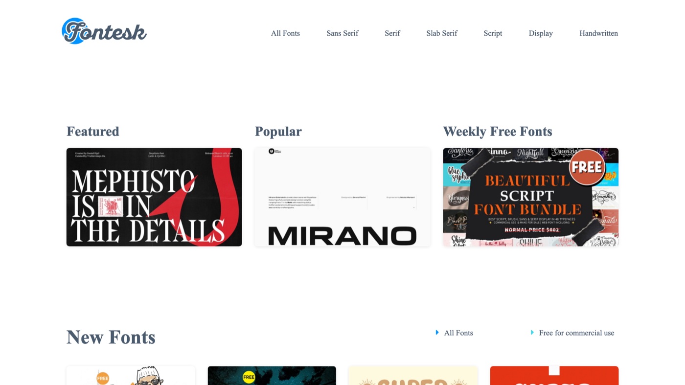
Fontesk is a curated feed of new free typefaces, and its best feature is that every listing states the license plainly, commercial or personal, right up front. You can browse by category or filter directly by license type, which cuts out the usual guesswork about whether a font is safe to ship. Because it aggregates work from many independent makers, quality and support vary from font to font, so it rewards a careful eye. It is the source I use to stay current on fresh releases rather than to find a proven workhorse. Always click through to the individual font's own license before using it commercially, since Fontesk points to the maker's terms rather than setting its own.
| # | Tool | Best for | Pricing | Limitation |
|---|---|---|---|---|
| 1 | Google Fonts | Web projects and any team that wants one library covering nearly every language and use case. | Free (open source) | The catalog is enormous, so quality varies. The flagship families are excellent, but the long tail is uneven. |
| 2 | Fontshare | Modern brand and product work that wants a paid-for feel at no cost. | Free for commercial use | The catalog is small and curated, so it is depth over breadth. You will not find a face for every niche. |
| 3 | Font Squirrel | Teams that need certainty a free font is cleared for commercial use. | Free | Smaller than Google Fonts, and the interface shows its age. Open the license file to confirm the specific terms. |
| 4 | The League of Moveable Type | Brands that want to modify a typeface, not just use it. | Free (SIL Open Font License) | The catalog is small and curated, so treat it as a starting palette rather than a full library. |
| 5 | Velvetyne | Design-led brands that want type with a point of view. | Free (libre / open source) | Much of the catalog is expressive rather than neutral, so pick the restrained families for body text. |
| 6 | Collletttivo | Editorial and cultural projects that want distinctive, well-drawn open-source type. | Free (open source, donations welcome) | Around sixteen families in total, so it is a boutique shelf, not a warehouse. |
| 7 | Uncut.wtf | Contemporary display and grotesk type for landing pages and campaigns. | Free for commercial use | Heavy on display and grotesks, so you will pair it with something calmer for long-form reading. |
| 8 | Open Foundry | Discovering open-source fonts with real context on their makers. | Free (open source) | It is a discovery layer more than a large host, so it points you to files as much as it stores them. |
| 9 | IBM Plex | Product, UI, and corporate systems that need one coherent family. | Free (SIL Open Font License) | It carries an engineered, corporate character. That is the point, but it will not feel warm or playful. |
| 10 | Public Sans | Interfaces, reports, and dashboards where clarity beats personality. | Free (SIL Open Font License 1.1) | Deliberately plain. It is a workhorse, not a signature. |
| 11 | Atipo Foundry | Distinctive families where you would happily pay the designer what you can. | Pay what you want | Free access is usually one or two weights; a full family for a big rollout may ask for a contribution. |
| 12 | Fontesk | Browsing fresh free releases with the license spelled out per font. | Free (per-font license) | It aggregates fonts from many makers, so read each font's own license before you ship it. |
Who should actually do this
A strong free typeface gets you a fast start. Turning it into a brand identity system is the harder part: pairing it, setting a type scale, and holding that system across a launch film, a pitch deck, a hundred social posts, and every page in between. When a team keeps downloading fonts but the output still looks inconsistent, the gap is usually production capacity, not the font. That is the work Moonb takes on as an embedded creative team, with a dedicated Creative Director and a crew who treat your type system as something to protect rather than rebuild every week. Whichever source above you start from, lock the winning pairing into your brand guidelines so it survives contact with real projects.
See it in action
If you would rather see a stack of these families in use before downloading, this walkthrough from a type-focused channel is a solid tour of current free options.
Frequently asked questions
Mostly, if you check. Fonts under the SIL Open Font License (Google Fonts, IBM Plex, The League of Moveable Type) are cleared for commercial use, modification, and self-hosting. The risk sits with sites that mix 'free for personal use' downloads into the same catalog, so open each font's own license file before it ships in paid work.
The sources here give you fonts you can download and keep at no cost. Marketplaces mostly sell licenses and offer trials, which is useful for testing premium type, but you are paying to actually use it. I left the pure marketplaces off this list because the goal was fonts you can ship without a fee.
For a neutral, safe system, Inter from Google Fonts or IBM Plex cover almost everything. For something more current, Fontshare's Satoshi and General Sans look premium and cost nothing. Pick one workhorse for body text and one family with more character for headings, then pair and test them before rollout.



