Instagram Story Specs 2026: The Ultimate Guide
Get the latest Instagram Story specs for 2026. This guide covers dimensions, safe zones, file sizes, and export settings that keep content sharp.

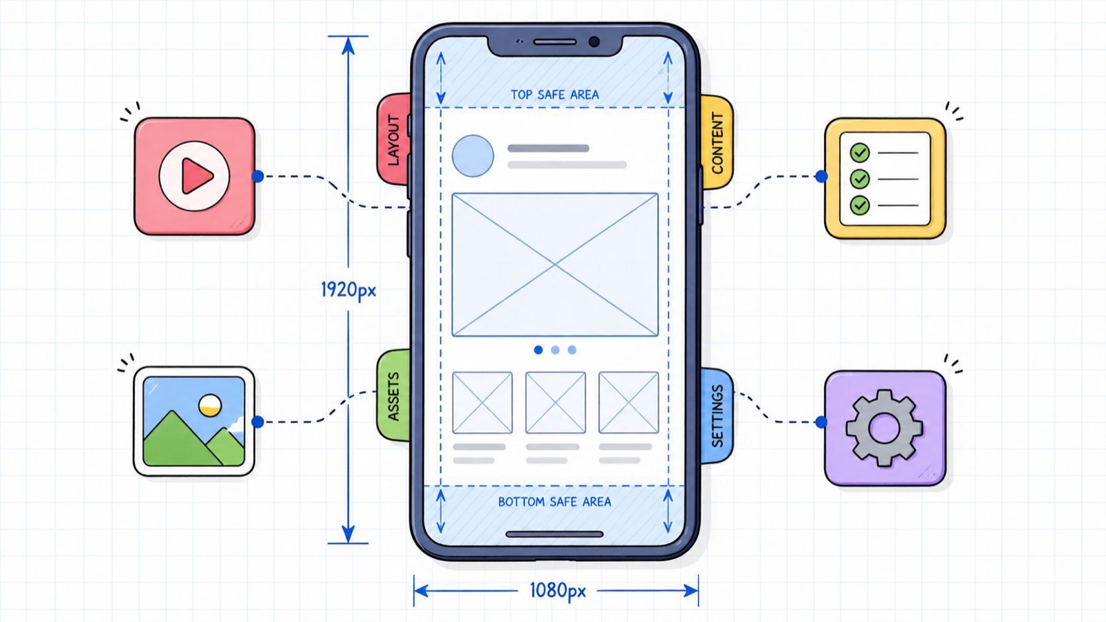
You finish the edit, export the file, upload it to your Instagram Story, and it looks worse than the master sitting on your machine. The type feels cramped. The logo hides under the interface. The video looks softer than it did in Premiere Pro or Canva. Nothing is technically broken, but the polish is gone.
I have shipped enough Stories to know this is almost always a production problem, not a creative one. Instagram Story specs look simple on paper, and then the small stuff bites: a wrong canvas size, the wrong color profile, a thin bitrate, or a headline placed too low. Any one of them can make a strong idea read as rushed.
So I am not going to hand you another generic checklist. I want to walk through why the numbers matter, where Stories usually fall apart, and what I lock before I hit export. If you are also planning paid placements, Website Builder Australia’s ad guide is a useful companion, because it frames Story creative inside a wider ad setup rather than just the file itself.
Why Perfect Instagram Story Specs Matter
Instagram Stories are unforgiving. People watch them full screen, on current phones, at speed. If your asset is soft, misframed, or half-covered by interface elements, the viewer clocks it right away.
The trouble usually starts upstream. A designer builds on the wrong canvas. A marketer reuses a Feed asset and stretches it to fit. Someone exports with whatever preset was already loaded. Then Instagram compresses the file one more time, and every small mistake gets louder.
What good specs actually protect
Getting the specs right protects three things:
- Sharpness: The asset holds up on current phone screens instead of looking blurry or resampled.
- Legibility: Headlines, pricing, logos, and faces stay visible instead of sliding under the UI.
- Pacing: Images and videos behave the way you expect once they are live, which matters most when the message is time-sensitive.
Practical rule: If the specs are an afterthought, the creative will look like one too.
This is why I stopped treating the technical setup as separate from the creative. In production terms it is the creative. A good Story starts with the right frame, then survives export, upload, and playback without losing what you meant by it.
The Quick-Check Reference Table
Sometimes you do not need the reasoning. You need the numbers in one place while you are mid-production. I keep this list open and check it before export, not after a bad upload.
If you need dimensions for other platforms too, Moonb’s social media sizes tool is handy for cross-checking sizes as you work.
Instagram Story Specs Quick Reference 2026
| Specification | Requirement |
|---|---|
| Canvas size | 1080 x 1920 pixels |
| Aspect ratio | 9:16 |
| Minimum accepted resolution | 720 x 1280 pixels |
| Organic safe zone | Keep critical content between y=250 and y=1580 |
| Central creative area | 1080 x 1420 pixels |
| Video codec | H.264 |
| Audio codec | AAC |
| Audio sample rate | 44.1 kHz |
| Color space | sRGB |
| Recommended frame rate | 30 FPS |
| Working video bitrate | 3,500 kbps |
| Recommended bitrate for paid ads | 5,000 to 8,000 kbps |
| Max image file size | 30 MB |
| Max video file size | 4 GB |
| Max Story video segment | 60 seconds |
| Default image display time | 5 seconds |
| Video file types | MP4, MOV |
| Image file types | JPG, PNG |
Core Technical Specs Explained
Open a Story on a recent iPhone or Samsung and weak production choices show up fast. A file that looked fine in the design app can turn soft, cramped, or badly cropped the moment Instagram processes it.
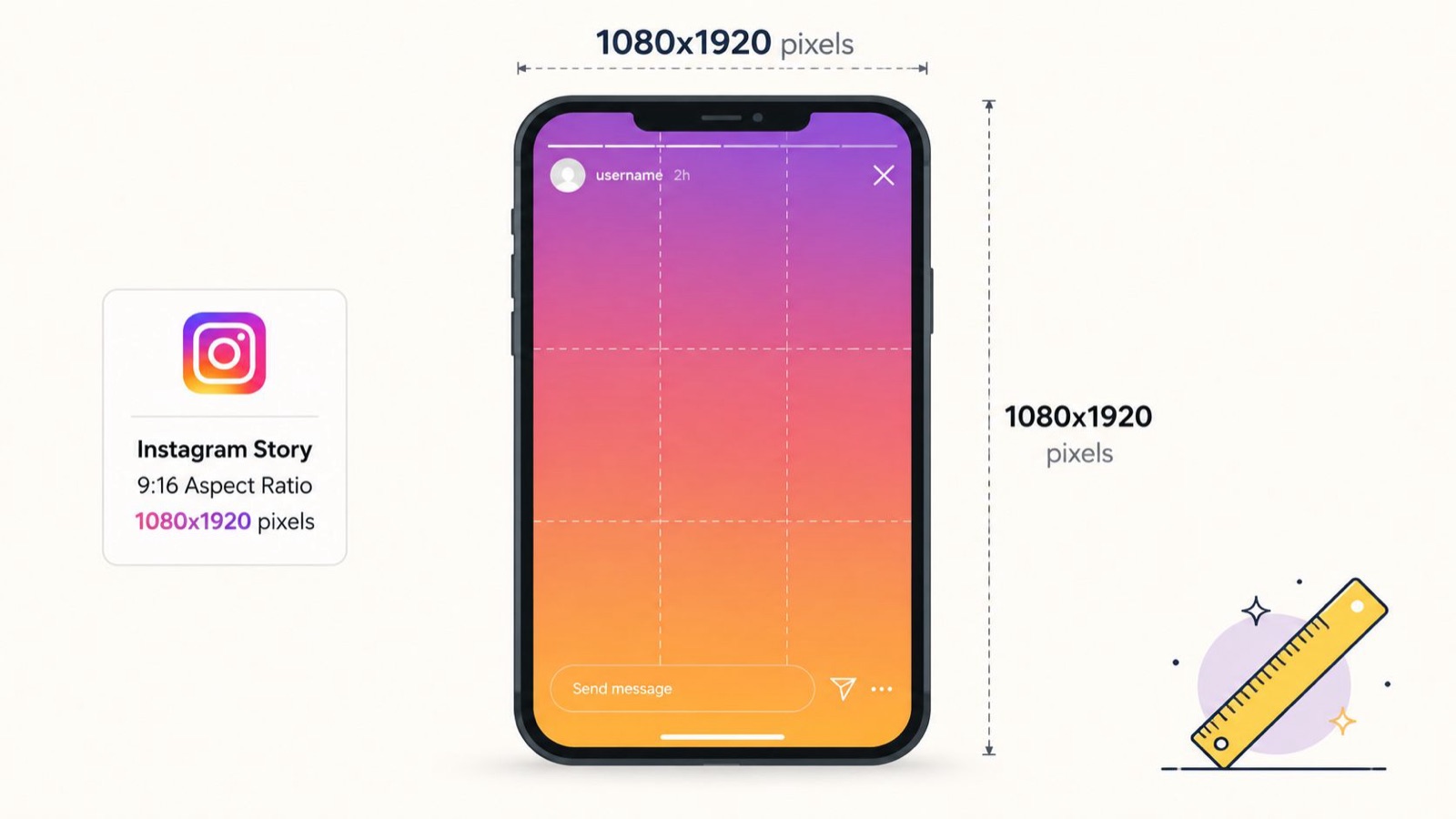
1080 x 1920 pixels is the working canvas because it matches the platform’s native 9:16 full-screen format. 720 x 1280 may still upload, but it hands Instagram less image data to work with after compression. I see that trade-off as soft text, muddy product edges, and gradients that break apart on high-density screens.
Why 9 to 16 is required
Instagram Stories fill a vertical screen. If the asset is built at 1:1, 4:5, or 16:9, the platform has to crop, scale, or pad it. That hurts composition first, then legibility.
A native 9:16 file keeps the decisions where they belong, in the edit. It lets me decide:
- How faces and products are framed
- How much negative space supports the message
- How large text can sit without feeling cramped
- Where motion starts and ends inside the frame
That control matters more in Stories than in most placements, because the format is full-screen and fast. Small framing mistakes feel bigger here.
Why minimum accepted resolution is not the production standard
Accepted and dependable are not the same thing. I run into this every time someone repurposes an old asset, exports from Canva at the wrong size, or pulls a vertical cut from a larger campaign file.
Starting at 720 x 1280 creates two problems. The file has less detail before upload, and Instagram may compress it again after upload, stripping out more. The result is familiar:
- Text loses clean edges
- Fine product texture disappears
- Animated graphics smear during movement
- Color transitions posterize instead of staying smooth
For teams building one system across Stories, Reels, and paid vertical placements, Moonb’s guide to vertical video dimensions for social production workflows helps keep sizing consistent before the file reaches export.
My rule is simple. Build at 1080 x 1920 from the start, design for 9:16, and treat lower resolutions as fallback uploads, never as the standard.
Mastering The Instagram Story Safe Zones
A Story can be built at the right size and still fail the moment Instagram drops its interface on top of it. The casualty is rarely the background. It is the message. A headline gets clipped by the top UI, a logo vanishes into a corner, or a paid Story control lands right on the CTA you needed people to read.
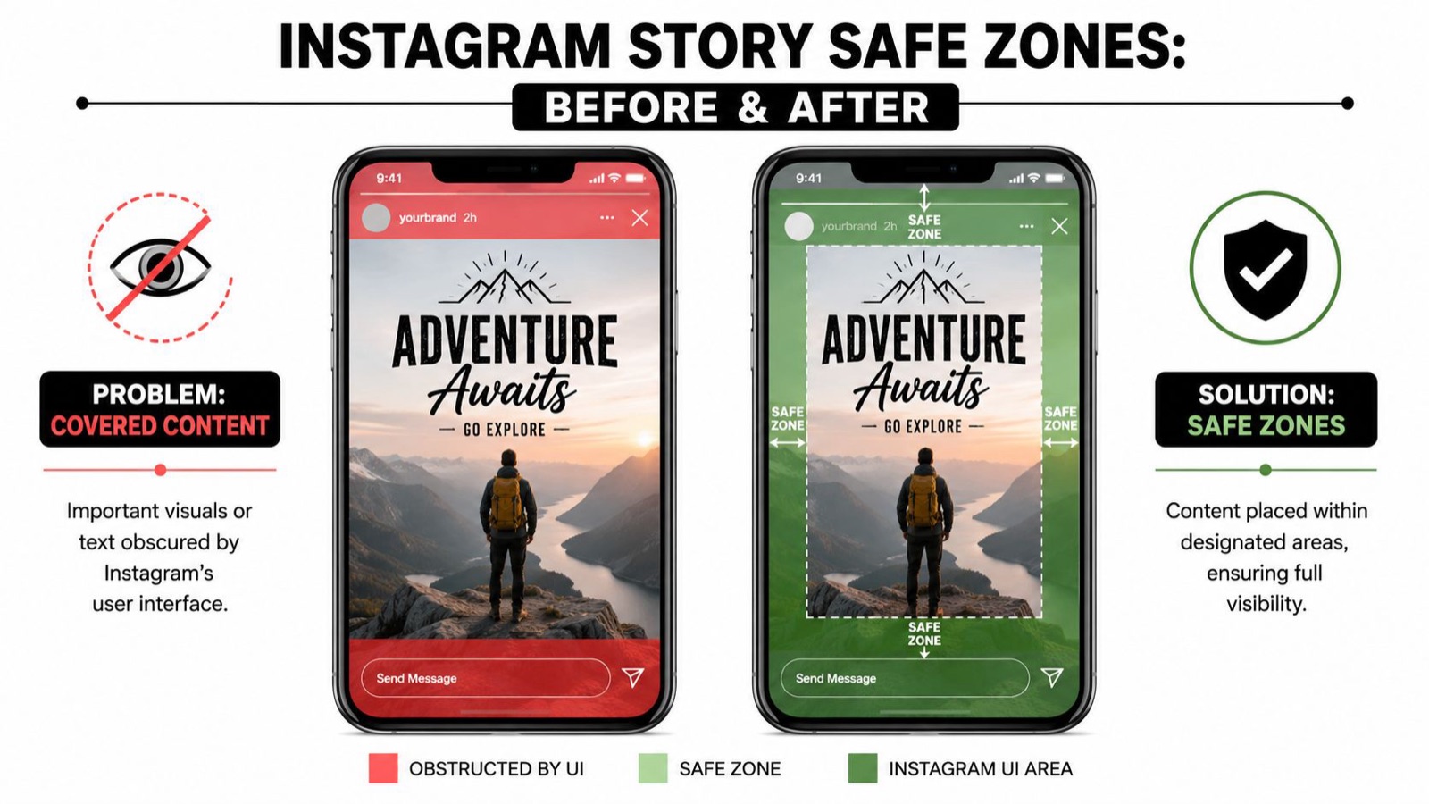
For production, the safe zone is the area that still reads clearly after Instagram adds profile info, interface controls, and reply or ad overlays. My working rule: keep key content in the center of the frame, leave roughly 250 pixels clear at the top, and reserve about 340 pixels at the bottom. That gives you a dependable active area of about 1080 x 1420 pixels for the elements that carry the Story.
Organic and ad layouts need different spacing
A layout that survives an organic Story often breaks in paid placement. It catches people out when they duplicate a design, swap the media, and assume the same text block works everywhere.
Paid Stories need more discipline in the lower part of the frame, because the platform can drop a CTA over that area. Organic Stories lose space to interface elements too, but the problem is different. In ads, the bottom zone is exactly where brands try to place the text they most need people to notice.
The fix is operational. Build two review versions if the asset will run in both placements: one for organic, one for paid. If your team is also planning multiple card lengths, Moonb’s guide to Instagram Stories video length for ads and organic posts helps line up duration decisions with the layout.
What belongs inside the safe area
Use the middle band for anything that has to stay visible on every view.
- Headlines: Keep the core message out of the top interface area and above the lower overlays.
- Logos: Place them where they stay visible without fighting the UI.
- Faces and products: Keep the focal point clear of the upper and lower margins, especially if eye contact or product detail carries the ad.
- CTA text: Put supporting action copy above the paid CTA zone, not where the platform may cover it.
A practical review method
Safe-zone review works best as a pre-export check, not a last-minute opinion round.
I start by ignoring the background and looking only at the elements that carry meaning: headline, brand mark, face, product, price, CTA. Then I imagine the top and bottom strips going unusable. If the concept still reads, the layout is probably sound. If the message falls apart, the file needs another pass before it goes out.
Review the lower third with extra care. That is where paid Story creative usually slips.
Then check it on an actual phone. Desktop previews hide spacing problems, because everything looks smaller and cleaner than it does in the hand.
If a viewer can lose the message to platform UI, the layout is not finished.
Video Specifications For Flawless Playback
A Story video can look sharp in the edit suite and still fall apart after upload. The cause is rarely the concept. It is an export that gives Instagram too little data to hold detail once the platform compresses it again.
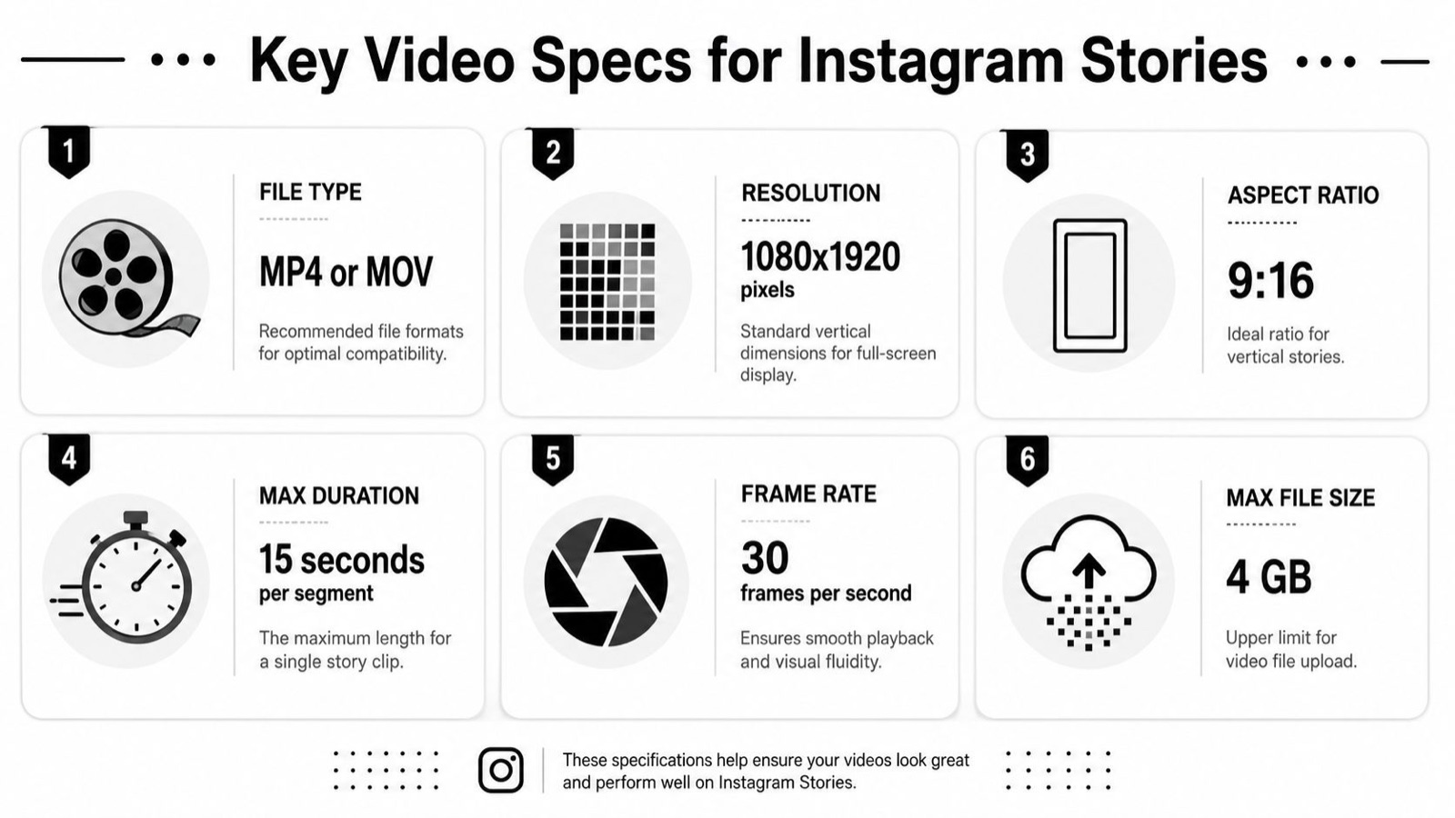
Use H.264 for video and AAC for audio. Those are the safe choice because Instagram handles them the same way across organic Stories and paid placements. The exact file limit matters less day to day than the result on a phone screen, so my goal is plain: export a file that stays clean after one more round of compression.
Codec and bitrate choices that actually matter
H.264 is still the working standard for Story delivery. It is easy to process, widely supported, and predictable in Meta’s pipeline. AAC audio avoids playback issues and keeps file sizes under control.
Bitrate is where quality usually gets lost. Export too low and Instagram compresses an already thin file: motion breaks apart, shadows turn muddy, gradients band. Export far higher than the platform needs and you mostly get a heavier file, a slower handoff, and little visible gain after upload.
A practical range beats chasing extremes:
- Use H.264
- Use AAC
- Keep the bitrate high enough to protect detail in motion
- For paid Story ads, give the export more headroom so Meta’s compression has a better source to work from
Fast cuts, camera movement, particles, and fine texture all need more data than a static talking-head frame. That is the part teams miss. A bitrate that looks fine on a simple testimonial can collapse on product footage with reflections, fabric texture, or rapid transitions.
Edit for Story playback, not just for the timeline
Instagram can play longer Story uploads, but good Story creative is still built in deliberate beats. If the message hangs on one long uninterrupted clip, the pacing sags and people tap away. Shorter, intentional segments hold up better, because each one has a single job: hook, explain, prove, or push the next action.
That matters before export. If you are planning a multi-part sequence, cut it as a sequence on purpose instead of handing Instagram a long file and hoping the breaks feel natural. Moonb’s guide to Instagram Stories video length and clip planning is a useful reference for structuring those segments before you render.
One more production note. Always review the final upload on an actual phone using mobile data, not just a desktop preview on office Wi-Fi. Compression artifacts show up fastest in skin tones, text over motion, dark scenes, and branded gradients. If those hold together on-device, the export is usually in good shape.
Image Specifications For Crisp Static Stories
A static Story usually fails in one of two places: it looks soft after upload, or it asks for more reading time than the format gives you. Both problems start in production, not in the app.
Static frames still do real work. Sale announcements, launch reminders, quote cards, before-and-after visuals, pricing callouts, and simple product frames often perform better as stills, because the viewer gets the point immediately. The trade-off is that a still has no motion to carry attention, so every production choice has to hold up on its own.
File type is the first decision. JPG is the practical choice for photos and lifestyle imagery because it keeps file sizes manageable. PNG is the safer choice for graphic layouts, illustrations, logos, and text-heavy designs, because the edges stay cleaner. If the frame is mostly a product photo with a small headline, JPG is usually fine. If the design leans on crisp typography or flat brand shapes, export a PNG and check the upload on a phone before you approve it.
The color setting teams miss
Use sRGB for every Story image.
That one setting prevents the color shifts that show up after upload when a design was built in a wider or mismatched profile. The issue is easy to miss on a desktop monitor and obvious on a phone: brand reds shift, skin tones flatten, and subtle gradients band faster than you would expect. If a campaign depends on exact product color or polished beauty imagery, this setting does more work than the file format.
Design for the actual viewing behavior
A static Story gets a short viewing window, so dense layouts underperform even when the art direction looks great in the design file. The frame has to land in the first second. That changes how you build it.
Use a simple structure:
- One message: a single offer, announcement, or takeaway
- One focal point: the product, person, or headline that should win first attention
- One action: swipe, tap, reply, or remember the date
Teams often treat a static Story like a mini poster and keep adding details because there is room on the canvas. On a phone, that extra copy rarely helps. It creates hesitation. If a detail is important, move it to the next frame in the sequence.
If you build static Stories in Canva, Moonb’s guide on how to use Canva like a pro is a practical reference for setting up cleaner layouts and exports.
Text Placement And Interactive Elements
A technically correct Story can still be hard to read. Usually that is a text problem, not a spec problem.
Story viewers move fast. They do not study layouts, they scan. So text has to sit where the eye naturally lands, sized for a phone screen, with enough contrast to read instantly. If your type treatment asks for effort, it is too subtle for the placement.
What works on screen
The best Story text tends to do three things well.
- It leads with one message. One headline beats three competing statements.
- It respects hierarchy. The viewer should know what to read first, second, and not at all.
- It uses contrast on purpose. White text over a bright image with no backing plate is usually a gamble.
Short lines win too. Long copy blocks create friction, especially over busy footage or a detailed background.
Stickers should support the layout
Polls, quizzes, link stickers, emoji sliders, and questions can make a Story feel active, but they also pile up clutter fast. The mistake is treating them like decoration.
Use them when they help the message:
- A poll works when the audience can answer in a second.
- A quiz works when the answer itself reinforces the brand or product.
- A link sticker works when the visual already built enough intent to tap.
Do not stack multiple interactive elements on one frame unless each one has a job. A poll plus a link plus a location sticker plus a mention often turns the screen into interface noise.
Keep the Story readable before you add interaction. If the base layout is messy, stickers will not fix it.
CTA text needs breathing room
If you want a tap, make the path obvious. CTA text should sit close enough to the sticker or tap target to feel connected, but not so tight that the layout feels cramped. Give the action some negative space.
A useful review question: if someone saw the frame for a second or two, would they know where to look and what to do? If the answer is maybe, the layout needs trimming.
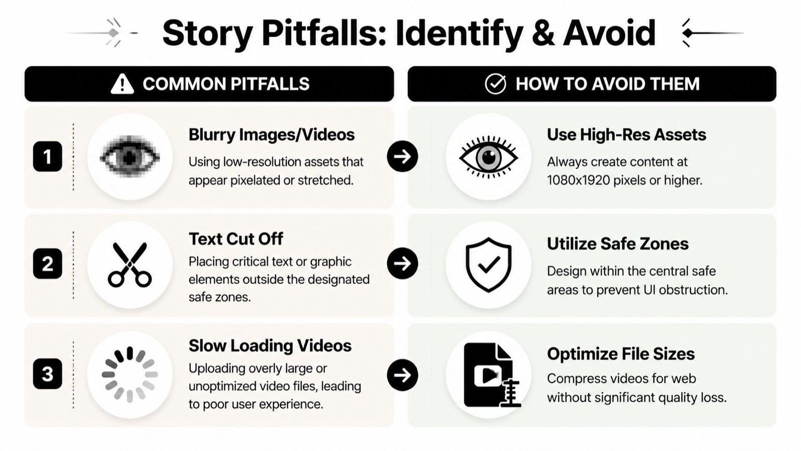
Common Pitfalls And How To Avoid Them
Most bad Story uploads come from familiar habits. Teams reuse assets from the wrong placement. They export with convenience presets. They download, reupload, and compress the same file more than once. Then they blame Instagram for damage they introduced earlier.
That is fixable once you treat Story production like a workflow instead of a last-mile chore.
Pitfall one, using low-quality source files
A blurry upload usually starts with a blurry source. If the original asset is undersized, already compressed, or pulled from another social post, you are working from a damaged master.
What I do instead:
- Export from the original edit file
- Use the proper Story canvas from the start
- Avoid downloading my own social post and reposting it
Every extra encode softens the result.
Pitfall two, trusting desktop previews too much
Layouts that look clean on a big monitor can fail on a phone. Text looks smaller, the lower edge feels tighter, and cropping or interface overlap becomes obvious.
A better review flow:
- Preview on the target device
- Check bright and dark surroundings visually
- Look at the frame at normal hand-held distance
- Ask whether the message lands without pinching or pausing
Pitfall three, ignoring color management
Color shifts usually trace back to export settings. If your asset leaves Adobe apps in a non-sRGB profile, branded colors can feel off once Instagram processes the file.
The simplest fix is consistency. Design, export, and review with Story output in mind. Do not assume a file that looks right in one app looks identical in another.
Pitfall four, letting the platform make editorial decisions
Some teams upload a long video and let Instagram split it. Others drop a Feed cut into Story and accept whatever framing happens. It saves a few minutes and costs polish.
What works better is controlled adaptation:
- Edit the sequence for Story
- Reframe older assets instead of stretching them
- Build lower-third and title positions around the placement, not around the source file
Good Story production is mostly prevention. Once the platform starts making decisions for you, quality tends to slide.
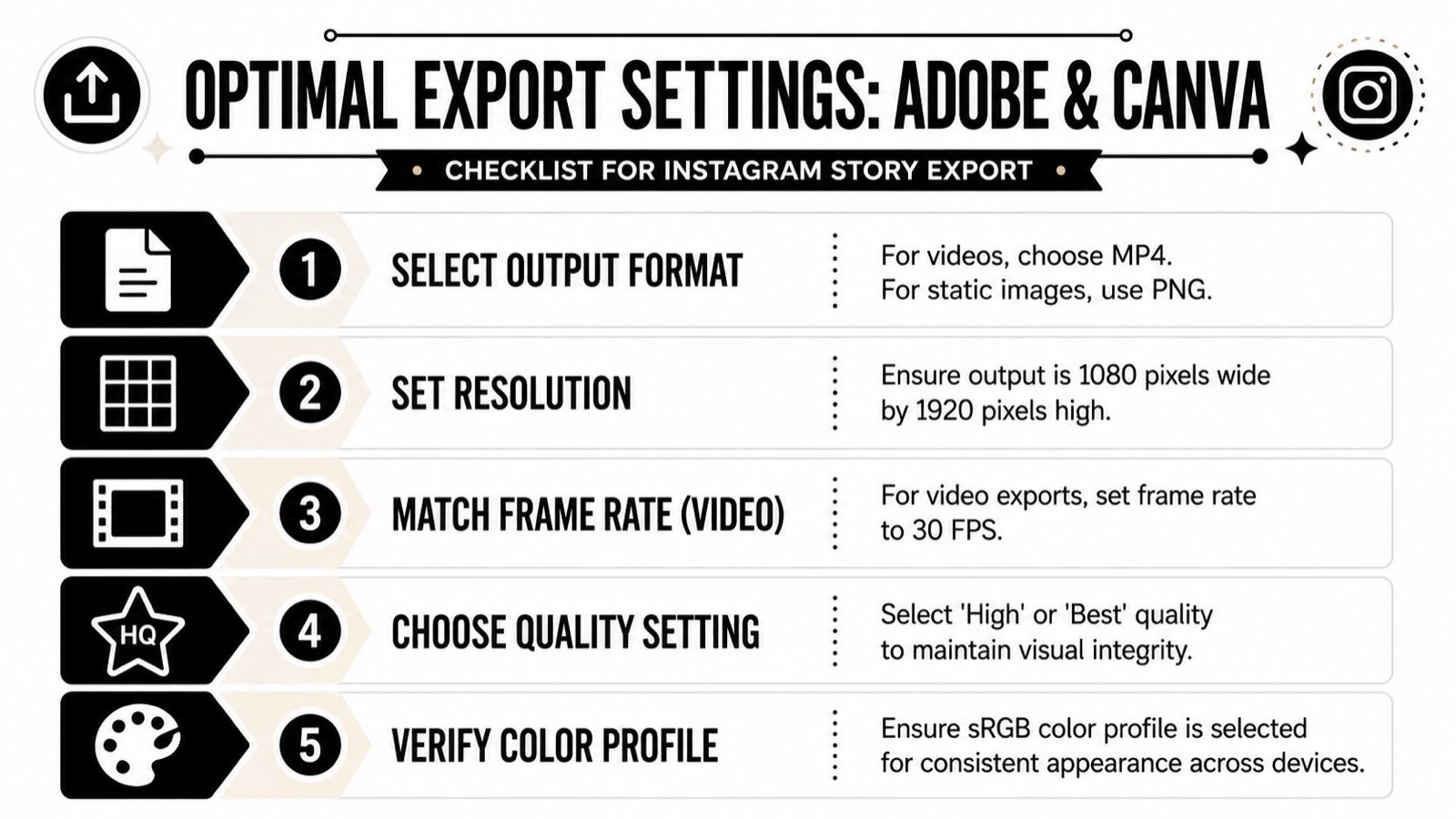
Optimal Export Settings For Adobe And Canva
Export is where good work often gets lost. The design is right, the animation is right, the edit is right. Then someone picks a generic preset and the upload comes out soft, shifted, or heavier than it needs to be.
The safer approach is to build repeatable export presets inside the tools your team already uses.
Adobe Premiere Pro and After Effects
In Adobe apps, keep the output conservative and clean. You are not exporting for cinema delivery, you are exporting for Instagram’s compression pipeline.
Use this checklist:
- Format: H.264 for video output
- Frame size: 1080 x 1920
- Frame rate: 30 FPS
- Audio: AAC, 44.1 kHz
- Color profile: sRGB workflow for anything headed to social
- Bitrate: At least 3,500 kbps, moving into the higher paid range when the footage needs it
If you are sending files across Slack, Drive, or another handoff step before posting, compress carefully rather than exporting weak masters. Moonb’s guide to the best video formats helps when you need to keep a handoff file small without visibly harming the asset.
Canva export habits that keep files clean
Canva is fast, and it also makes it easy to export the wrong thing if the document was set up loosely. Start with the Story-sized document, not a square or Feed preset you resize later.
For Canva, my practical rules:
- Build on a 1080 x 1920 canvas
- Use PNG for static designs where text sharpness matters
- Keep visuals inside the intended safe area while designing
- Review colors on a phone after export
- Choose the highest quality setting available for video output
Save presets, don’t rely on memory
Teams make fewer mistakes when they do not have to remember every setting by hand. Name the presets clearly. Keep one for organic Story video, one for paid Story video, and one for static Story graphics. That removes guesswork and makes reviews faster.
A preset is not glamorous, but it saves real time. More important, it protects consistency across campaigns, editors, and last-minute changes.
If you would rather see the sizing and safe zones walked through on screen before you set up your own presets, this quick overview covers it well:
A Steady Rhythm Of Great Social Content
Plenty of social teams already know the right specs. The harder part is staying disciplined when deadlines stack up. One week it is a product launch. The next it is event coverage, paid creative, internal reviews, and a dozen resized versions across channels.
That is where a dedicated creative team changes the day-to-day. The technical work does not disappear, but it stops slowing down the strategy. Someone is already thinking about frame size, export settings, readability, pacing, and whether the Story will hold up after upload.
The strongest setups usually look boring behind the scenes. There is a clear production rhythm, templates are built properly, and review steps are consistent, so assets arrive on brand and ready to post. That is what keeps output sharp when content has to move every week.
Moonb is a dedicated creative team that ships great work on a steady weekly rhythm, on brand and ready when you need it. If your team wants help producing Story creative that stays sharp, fits the platform, and holds up across campaigns, see how Moonb works.
Frequently asked questions
Build at 1080 x 1920 pixels, a 9:16 vertical frame, from the start. That matches Instagram's native full-screen format. You can upload 720 x 1280 at a minimum, but starting there gives the platform less image data to work with, so text and product edges soften after compression. Resizing a Feed asset up to fit is the fast way to get a blurry Story.
The top roughly 250 pixels carry your profile info and close button, and the bottom roughly 340 pixels get covered by the reply bar, stickers, and any paid ad CTA. Keep headlines, logos, prices, and CTAs inside the central band, about 1080 x 1420 pixels, so nothing important slides under the interface. Background imagery can run to the full canvas.
I export H.264 video with AAC audio at 44.1 kHz, in sRGB, at 1080 x 1920 and 30 fps. The goal is a file that stays clean after Instagram compresses it one more time, so keep the bitrate high enough to protect detail in motion and give paid ads extra headroom. Then check the final upload on an actual phone on mobile data, not just a desktop preview.



