
10 User Experience Design Best Practices for Marketing Teams in 2026


In today's competitive landscape, a functional product isn't enough. The difference between a tool that gathers dust and one that becomes indispensable often comes down to its user experience (UX). For busy marketing and creative teams, a seamless, intuitive platform can be a game-changer, eliminating friction and unlocking productivity. A strong UX foundation is not just about aesthetics; it's about creating an efficient, enjoyable environment where creativity can flourish.
This article moves beyond generic advice to provide a prioritized roundup of the top 10 user experience design best practices that directly impact creative workflows. We'll explore not just the 'what,' but the critical 'why' and 'how,' complete with actionable steps, real-world examples, and key metrics to measure your success. These principles are designed to be immediately applicable, whether you are building an in-house tool, refining an existing platform, or evaluating a new software solution.
Each point in our list is structured to provide clear, practical guidance. You will learn how to implement a user-centered design process, build intuitive navigation, ensure accessibility, and optimize performance. To truly grasp how UX serves as a marketing team's secret weapon, it's beneficial to explore comprehensive guides like these 10 Ecommerce UX Best Practices to Elevate Luxury Brands in 2026. By mastering these core concepts, you can transform how your team collaborates, creates, and ultimately, delivers exceptional results. This guide provides the blueprint for turning good design into a tangible competitive advantage for your entire marketing operation.
1. User-Centered Design Process
A user-centered design (UCD) process is a foundational methodology that prioritizes the end-user's needs, behaviors, and pain points at every stage of product development. Instead of building features based on internal assumptions, UCD relies on empirical data gathered through research, testing, and direct user feedback. This approach ensures the final product is not just functional but also intuitive, efficient, and genuinely helpful to its target audience, making it one of the most critical user experience design best practices.
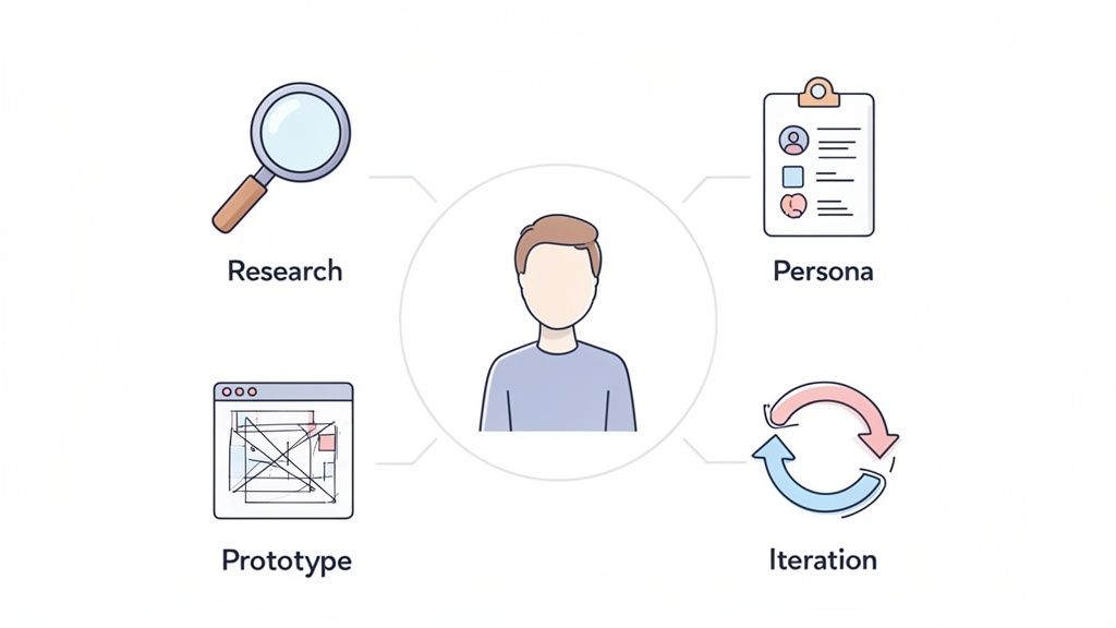
The core principle, popularized by pioneers like Don Norman, is to design for the user, not just at them. This iterative cycle involves understanding the context of use, specifying user requirements, creating design solutions, and evaluating those designs against the requirements.
Why It's a Top UX Practice
Adopting a UCD framework directly translates to higher user adoption, increased satisfaction, and reduced long-term development costs. By validating design decisions with real users early and often, teams avoid building features that miss the mark. For marketing and creative teams, this means tools and platforms designed with UCD feel like an extension of their natural workflow, significantly cutting down on onboarding time and support tickets.
How to Implement a User-Centered Process
- Conduct User Research: Start with qualitative research. Schedule monthly interviews with 5-8 representative users, like marketing directors or creative leads, to understand their goals and frustrations.
- Create Detailed Personas: Synthesize your research into user personas. For example, create "Maria the Marketing Director," who needs high-level reporting, and "Leo the Lead Designer," who requires granular asset management tools.
- Prototype and Test: Before committing to code, build low-fidelity wireframes or interactive prototypes. Test these with actual users to gather immediate feedback on navigation, layout, and feature clarity.
- Analyze and Iterate: Use analytics tools to identify user drop-off points or areas of friction in your live product. Combine this quantitative data with qualitative feedback to continuously refine the experience.
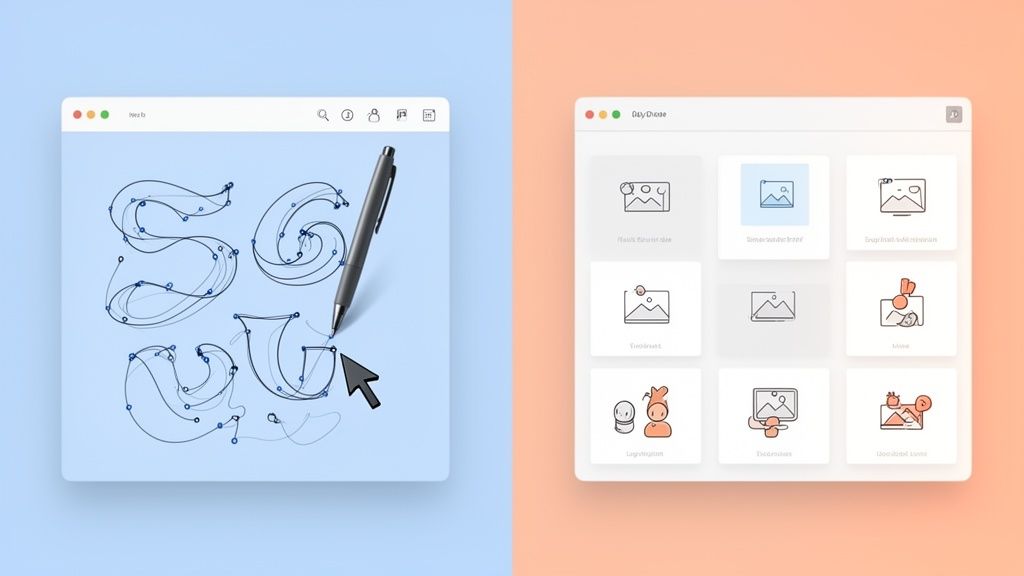
Modern prototyping tools can significantly accelerate this testing phase. Platforms like Magic Patterns, Figma, and similar tools enable teams to quickly generate interface concepts and experiment with different layouts before development begins. This approach makes it easier to gather feedback early and refine ideas through rapid iteration.
2. Information Architecture and Navigation
Effective Information Architecture (IA) is the art and science of organizing, structuring, and labeling content in a way that helps users find information and complete tasks. It serves as the blueprint for a digital product's structure, ensuring that everything from creative requests to project status updates is placed logically and predictably. For marketing and creative teams, a well-designed IA means less time hunting for assets and more time creating, making it a cornerstone of user experience design best practices.
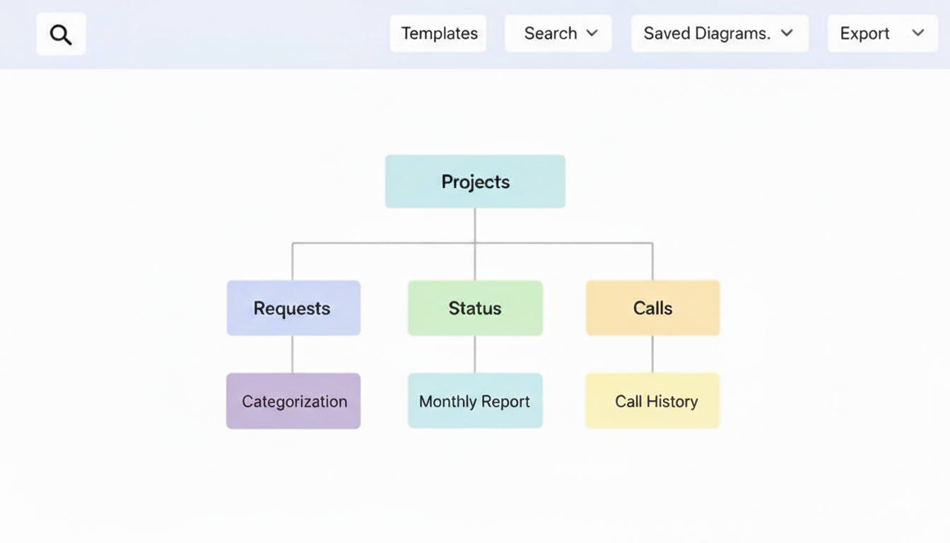
Pioneered by figures like Peter Morville and Lou Rosenfeld, strong IA reduces cognitive load by making navigation intuitive. It answers the user's subconscious questions: "Where am I?", "What can I do here?", and "Where can I go next?". When information is easy to find, user frustration plummets and efficiency soars.
Why It's a Top UX Practice
A logical IA directly impacts productivity and user adoption. For busy marketing directors, an organized dashboard like Adobe Creative Cloud's or Monday.com's means projects can be located and assessed in seconds. Without it, a platform becomes a cluttered digital attic, where valuable information gets lost. Clear navigation prevents user errors, reduces the need for extensive training, and empowers teams to manage complex creative workflows with confidence and clarity.
How to Implement Strong Information Architecture
- Conduct Content Audits and Card Sorting: Begin by inventorying all existing content and features. Use card sorting exercises with real users, like creative leads, to understand how they naturally group concepts like "video requests," "design assets," and "strategy calls."
- Develop a Clear Hierarchy: Structure information from broad to specific. For example, a top-level category might be "Projects," which branches into "Active," "In Review," and "Completed," each containing individual project folders with their own assets and communications.
- Use Clear and Consistent Labeling: Label navigation items with familiar, user-centric language. Avoid internal jargon. A button labeled "Submit New Request" is far more intuitive than "Initiate Creative Workflow."
- Implement Effective Navigation Patterns: Use established patterns like breadcrumbs to show users their location within the hierarchy. Create distinct but integrated views for different user roles, such as requesters and creators, to show them only the information relevant to their tasks.
3. Responsive and Accessible Design
Responsive and accessible design is a dual-focused approach that ensures an interface functions flawlessly across all devices while being usable by people with varying abilities. This practice combines flexible grid layouts and media queries for device adaptability with inclusive design principles for accessibility. It addresses the needs of users with visual, auditory, motor, and cognitive disabilities, making it a non-negotiable aspect of modern user experience design best practices.
Pioneered by organizations like the Web Accessibility Initiative (WAI) and the World Wide Web Consortium (W3C), this approach is about creating a single, equitable experience for everyone. For marketing teams, this means a marketing director can review campaign analytics on their phone, while a creative with a motor disability can navigate an asset library using only a keyboard.
Why It's a Top UX Practice
Implementing responsive and accessible design dramatically expands your potential audience and enhances brand reputation. It ensures compliance with legal standards like the ADA and improves SEO, as search engines favor mobile-friendly and accessible sites. For creative and marketing teams, this practice guarantees that vital tools and platforms are consistently usable, whether in the office on a large monitor or checking project status on a tablet during a commute.
How to Implement Responsive and Accessible Design
- Prioritize Mobile-First Layouts: Design for the smallest screen first and then scale up. This forces you to focus on core content and functionality, leading to a cleaner, more focused experience on all devices.
- Conduct Accessibility Audits: Regularly use automated tools like WAVE or Lighthouse to catch common issues like low contrast ratios or missing alt text. Supplement this with manual testing using screen readers (VoiceOver, NVDA) and keyboard-only navigation.
- Use Semantic HTML: Write clean, semantic HTML (e.g., using
<nav>,<main>,<button>) to provide context for assistive technologies. Ensure all interactive elements are reachable and operable via the keyboard. - Provide Content Alternatives: Offer transcripts for audio and video content, such as strategy call recordings or webinars. Use clear, simple language in all interface copy and instructions to support users with cognitive disabilities.
4. Clear Visual Hierarchy and Contrast
A clear visual hierarchy is the strategic arrangement of elements to guide a user’s eye to the most important information first. By using size, color, spacing, and typography, designers can create a path for users to follow, making interfaces feel intuitive and effortless. This principle is a cornerstone of effective user experience design best practices because it reduces cognitive load and helps users achieve their goals faster.
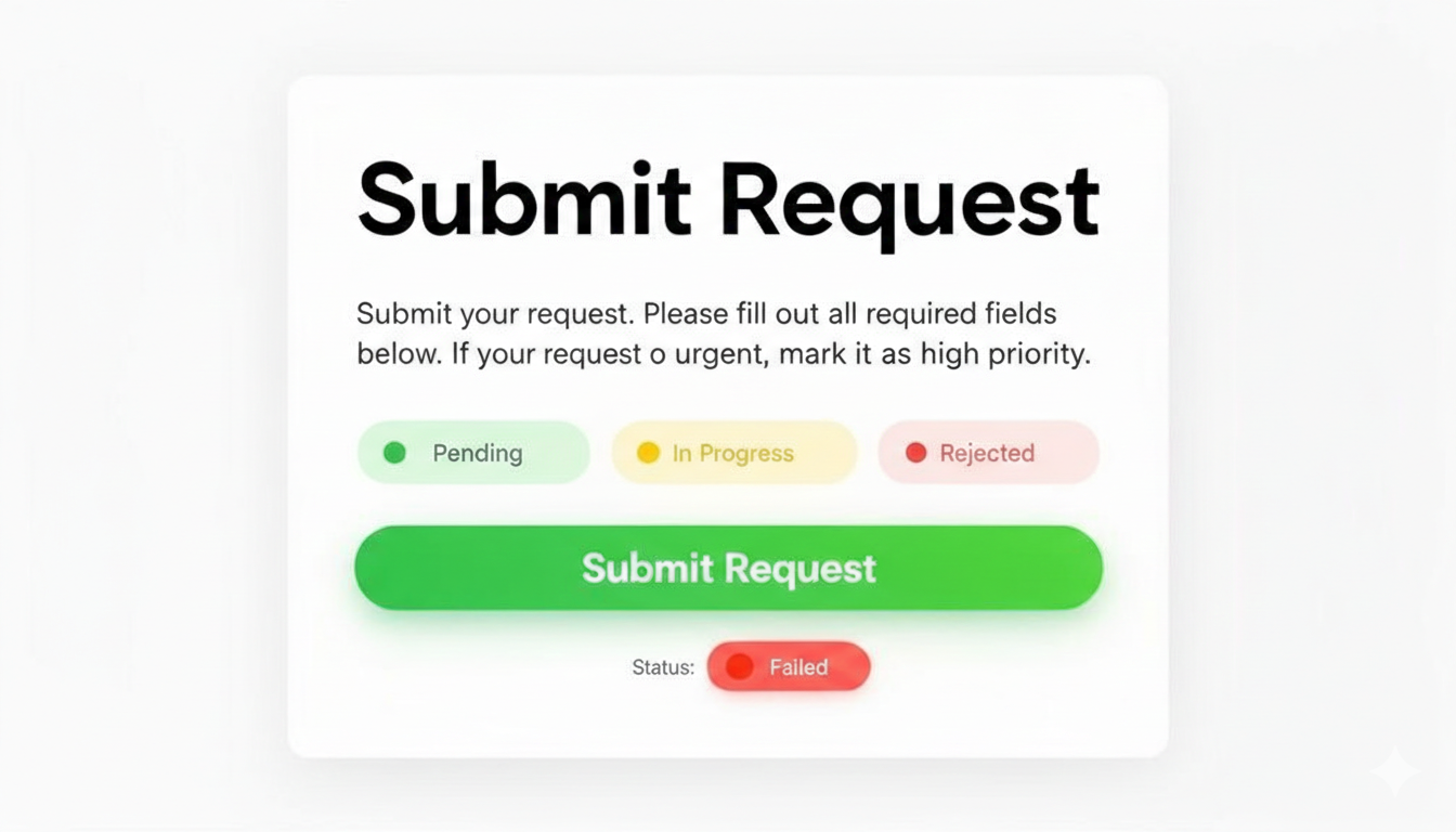
The concept is rooted in Gestalt psychology and popularized by figures like Edward Tufte. It ensures that when a marketing director lands on a project dashboard, their attention is immediately drawn to project statuses or urgent approval requests, not buried in less critical details. Strong contrast, especially in text, is a key component that ensures accessibility and readability for all users.
Why It's a Top UX Practice
Implementing a strong visual hierarchy makes a platform immediately understandable. For busy creative and marketing teams, this means less time deciphering an interface and more time completing critical tasks. Clear calls-to-action, like a prominent "Submit Request" button, eliminate ambiguity and drive action. This leads to higher task completion rates, fewer user errors, and a more professional, trustworthy feel.
How to Implement Clear Hierarchy and Contrast
- Establish a Typographic Scale: Use a clear and consistent scale for headings (H1, H2, H3) and body text. Make the most important text the largest and boldest to establish an immediate focal point on each screen.
- Use Color and Contrast Strategically: Designate a primary color for key actions (e.g., blue for links, green for submission buttons) and a secondary color for less critical functions. Ensure all text meets a minimum WCAG AA contrast ratio of 4.5:1 against its background.
- Leverage White Space: Use spacing to group related items together and separate unrelated ones. Generous spacing around a call-to-action button, for instance, makes it stand out without adding visual noise.
- Limit Primary Actions: To avoid decision paralysis, limit each screen to one or two primary actions. Make these actions the most visually dominant elements, such as a brightly colored, large button.
5. Consistency and Design Systems
Consistency is the practice of maintaining uniformity in design patterns, components, language, and interactions across a product. It ensures that users don't have to relearn how your interface works as they navigate different screens. A design system is the single source of truth that codifies this consistency, providing a library of reusable components and clear standards that govern their use. This approach is a cornerstone of modern user experience design best practices, enabling teams to build cohesive experiences at scale.
This methodology, heavily influenced by concepts like Brad Frost's Atomic Design, moves beyond simple style guides. It creates a shared language and toolkit for both designers and developers, ensuring that a button or a form field looks and behaves the same everywhere. For marketing and creative teams, this means the tools they use are predictable and reliable, reducing cognitive load and allowing them to focus on their work.
Why It's a Top UX Practice
Implementing a design system directly improves both user experience and development efficiency. A consistent interface is easier to learn and navigate, which boosts user satisfaction and task completion rates. For businesses, it drastically speeds up the design and development process, as teams can assemble new features from pre-built, pre-vetted components. This eliminates redundant work, reduces design debt, and ensures brand cohesion across all digital touchpoints.
How to Implement Consistency with a Design System
- Conduct a UI Audit: Start by cataloging all unique UI elements currently in use across your product. Identify inconsistencies in color, typography, button styles, and form fields to understand the scope of the problem.
- Establish Design Principles and Tokens: Define your foundational rules. Set design tokens for colors, spacing, and typography. These variables will be the building blocks for all components, ensuring global consistency.
- Build a Component Library: Create and document reusable UI components like buttons, inputs, cards, and modals. Use tools like Figma or Sketch to create a shared library for designers and a corresponding code library (e.g., in Storybook) for developers.
- Govern and Evolve the System: A design system is a living product. Establish a governance model for how new components are proposed, approved, and added. Regularly audit usage to find and fix inconsistencies and update the system based on user feedback and evolving needs.
6. Feedback and Error Prevention
Effective feedback and error prevention are about maintaining a clear, continuous dialogue with the user. This practice involves proactively guiding users to avoid mistakes and reactively providing clear, helpful information when errors do occur. It covers everything from real-time form validation and loading indicators to confirmation dialogues and constructive error messages, ensuring users always feel informed and in control. This proactive communication is a cornerstone of strong user experience design best practices.
This principle, heavily influenced by usability experts like Jakob Nielsen and Don Norman, focuses on visibility of system status and helping users recover from errors. The goal is to design systems that anticipate user needs and prevent problems, rather than just reporting failures after the fact.
Why It's a Top UX Practice
Implementing robust feedback and error prevention builds user trust and reduces frustration. For marketing and creative teams, this translates to fewer abandoned forms, higher task completion rates, and reduced need for support. When a platform clearly communicates what's happening (e.g., "Uploading your 5GB video file...") and provides helpful guidance ("Password must be at least 8 characters"), users feel more confident and efficient in their workflow.
How to Implement Feedback and Error Prevention
- Validate Forms in Real-Time: Provide immediate feedback as users fill out forms. Instead of waiting for submission, show a green checkmark for a valid email format or a red message like "This field is required" as soon as they click away.
- Use Plain Language for Errors: Avoid technical jargon. Instead of "Error 500: Server Authentication Failed," use a clear, human-friendly message like, "We couldn't save your changes. Please try again in a few moments."
- Provide Clear System Status: Use loading spinners, progress bars, or toast notifications to inform users about background processes. When a creative lead uploads a large batch of assets, a visible progress bar manages expectations and prevents them from navigating away.
- Confirm Destructive Actions: Before a user performs an irreversible action, like deleting a campaign or revoking a team member's access, use a confirmation modal. Ask a clear question, such as, "Are you sure you want to permanently delete this campaign?" to prevent critical mistakes.
7. Performance and Loading Optimization
Performance and loading optimization is the practice of designing and building interfaces that load quickly and respond instantly to user interactions. It focuses on minimizing both perceived and actual wait times through techniques like asset optimization, lazy loading, and efficient code delivery. For marketing and creative teams dealing with high-resolution assets and data-heavy dashboards, this is one of the most impactful user experience design best practices.
The core principle, championed by Google's Web Vitals initiative, is that speed is a feature, not an afterthought. A slow interface feels broken and frustrating, causing users to abandon tasks and lose trust in the platform. Fast, responsive interfaces make users feel in control and efficient, directly improving their perception of the tool's value.
Why It's a Top UX Practice
A high-performance interface directly reduces user friction and abandonment rates. For a creative director trying to review a campaign, a slow-loading asset library can kill momentum and productivity. By optimizing performance, teams ensure their tools feel snappy and reliable, which boosts user satisfaction and encourages deeper engagement. Achieving a rapid speed advantage for your website or platform is a fundamental aspect of excellent user experience design, directly impacting retention.
How to Implement Performance Optimization
- Optimize All Assets: Before uploading, compress all images, videos, and graphics. Use modern formats like WebP for images and ensure videos are properly encoded for streaming. For a creative asset manager, this means dashboard thumbnails load instantly.
- Implement Lazy Loading: Load content only when it becomes visible in the user's viewport. Apply this to long project lists, historical campaign data, or image galleries so the initial page load is lightning-fast.
- Utilize a Content Delivery Network (CDN): A CDN stores copies of your assets on servers around the world. This ensures that a marketing manager in another country can access campaign materials just as quickly as someone next door.
- Monitor Core Web Vitals: Regularly use tools like Google Lighthouse to track key performance metrics: Largest Contentful Paint (LCP), First Input Delay (FID), and Cumulative Layout Shift (CLS). Aim to keep these scores in the "good" range to ensure a consistently smooth experience.
8. Contextual Help and Onboarding
Contextual help and onboarding involve strategically placing educational content and guidance directly within the product interface. Instead of forcing users to consult external documentation, this approach provides support exactly when and where it is needed. This includes interactive tours, tooltips, inline help, and guided workflows that appear based on user actions, making it a critical user experience design best practices.
The goal is to reduce the time-to-first-value, helping users understand and successfully use a product without friction. By embedding support into the workflow, teams can increase feature adoption and user proficiency, preventing the frustration that leads to abandonment. This method, championed by product-led growth experts and platforms like Appcues, ensures users feel supported and empowered from their very first interaction.
Why It's a Top UX Practice
Effective onboarding is not just a "nice-to-have"; it directly impacts retention and lifetime value. For creative and marketing teams adopting a new platform, clear, contextual guidance drastically shortens the learning curve for complex tasks like campaign setup or asset management. This leads to faster adoption, fewer support tickets, and greater confidence in the tool. When users can learn by doing, they achieve their goals faster and are more likely to explore advanced features.
How to Implement Contextual Help and Onboarding
- Map the First-Time User Journey: Identify the key "aha!" moments a new marketing or creative user must experience. Build a brief, interactive product tour that guides them through these essential first steps, such as creating their first project or submitting a creative brief.
- Use Contextual Tooltips: Place tooltips on icons, buttons, or terminology that may be unfamiliar. For example, a tooltip could explain what a "WIP limit" is in a project management board or define "brand-safe" in an asset library.
- Implement Progressive Disclosure: Avoid overwhelming new users with every feature at once. Initially, show only the core functionality and reveal more advanced options as they gain proficiency or navigate to specific areas. For example, advanced reporting filters could be hidden until a user runs their first basic report.
- Provide Action-Triggered Guidance: Offer help when it is most relevant. If a marketing manager attempts to upload a non-compliant file type, display an inline message explaining the required format and providing a link to asset guidelines. Slack's interactive Slackbot onboarding is a prime example of this in action.
9. Personalization and Customization
Personalization and customization involve tailoring an interface, its content, and workflows to individual users based on their role, preferences, or behavior. Instead of a one-size-fits-all approach, the experience adapts to become more relevant and efficient for each person. This creates a powerful sense of ownership and relevance, making it a key component of modern user experience design best practices.
This strategy ranges from simple customizations like choosing a light or dark theme to complex personalization, where the system intelligently reconfigures itself based on user data. For creative and marketing platforms, this means showing a high-level project dashboard to a marketing director while presenting a detailed task queue to a graphic designer.
Why It's a Top UX Practice
A personalized experience significantly boosts efficiency and user satisfaction by removing irrelevant information and streamlining frequent tasks. When a platform conforms to a user's specific workflow, it reduces cognitive load and makes them feel understood and valued. This leads to higher adoption rates, deeper engagement, and a stronger competitive advantage, as seen in tools like Monday.com with its highly flexible workspace views.
How to Implement Personalization and Customization
- Define Role-Based Views: Start by creating distinct interfaces for key user roles. For instance, design a "Requester View" for marketing managers that prioritizes project submission forms and status dashboards, and a "Creator View" for designers that focuses on asset management and task lists.
- Offer Workflow Customization: Allow teams to define their own project stages, approval steps, and notification preferences. This empowers them to adapt the tool to their unique internal processes rather than forcing them into a rigid structure.
- Remember User Preferences: Save individual settings, such as default project types, preferred export formats, or frequently used filters. This simple step saves users time and makes the application feel more intuitive with every use.
- Implement Adaptive Onboarding: Guide new users through different setup paths based on their declared role. A creative director might be shown how to build a team, while a freelance designer is shown how to accept their first project.
10. Collaboration and Communication Features
Effective collaboration and communication features integrate teamwork directly into a product's interface, eliminating the need for disjointed, external tools. This involves building tools for real-time or asynchronous communication, feedback sharing, and collaborative work, such as comments, mentions, version history, and integrated messaging. This approach is one of the most impactful user experience design best practices because it turns a solitary tool into a shared workspace, keeping context and momentum within the platform.
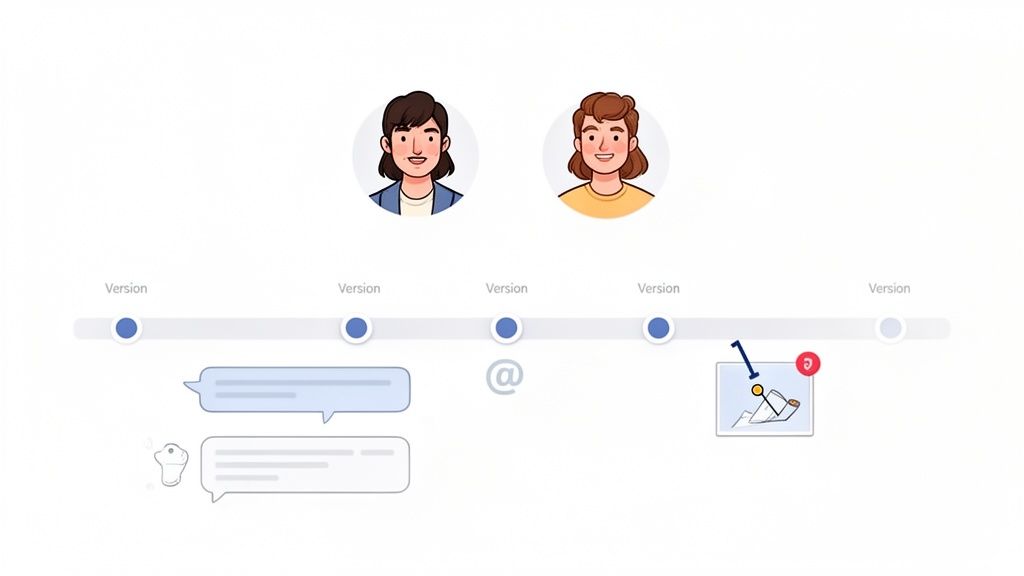
Pioneered by platforms like Figma and Asana, the goal is to create a single source of truth where creative assets and project discussions coexist. For marketing and creative teams, this means feedback on a design mockup or video draft is tied directly to the asset itself, preventing crucial context from getting lost in email chains or separate chat apps.
Why It's a Top UX Practice
Integrating collaboration tools directly reduces friction, prevents miscommunication, and accelerates project timelines. When a creative director can leave timestamped comments on a video or a marketing manager can tag a designer directly on a campaign visual, the feedback loop becomes shorter and more precise. This increases team velocity, reduces errors, and creates a transparent, historical record of all decisions made.
How to Implement Collaboration Features
- Enable Contextual Comments: Allow users to leave comments directly on specific elements of a creative asset, like a section of a design or a timestamp in a video. Frame.io's video annotation is a masterclass in this.
- Use @Mentions and Notifications: Implement an @mention system to notify relevant team members directly. Consolidate notifications into a digest email or a dedicated in-app center to avoid overwhelming users with alerts.
- Provide Clear Version History: Maintain a accessible revision history for all creative assets. This allows teams to track how an asset has evolved and easily revert to previous versions if needed.
- Offer Structured Feedback Templates: To guide more effective feedback, provide simple templates. For example, a "Like / Wish / Wonder" framework helps stakeholders provide constructive, actionable input instead of vague critiques.
10-Point UX Design Best Practices Comparison
Integrating UX Best Practices into Your Creative Engine
We have journeyed through ten foundational pillars of user experience, from the strategic importance of a user-centered design process to the nuanced power of personalization and collaboration. Each principle, whether it's building a clear information architecture, ensuring responsive and accessible design, or optimizing for performance, is not an isolated checkbox. Instead, these are interconnected threads that weave together to form a robust, intuitive, and empowering digital environment for your marketing and creative teams.
The core takeaway is that exceptional user experience design isn't about flashy aesthetics or chasing fleeting trends. It's a strategic commitment to empathy and efficiency. It’s about understanding the cognitive load on your team, anticipating their needs, and systematically removing friction from their creative workflows. When you prioritize a strong visual hierarchy, provide clear feedback, and build a consistent design system, you are not just making a platform easier to use; you are fundamentally respecting your team's time and talent. You are creating a creative engine, not a bottleneck.
From Theory to Tangible Action
Moving from understanding to implementation is the most critical step. The sheer volume of user experience design best practices can feel overwhelming, but progress is made through incremental, consistent effort, not a single, revolutionary overhaul. Your journey doesn’t require a complete teardown of your existing processes. It begins with a single, focused action.
To turn these insights into immediate momentum, consider these next steps:
- Conduct a "One-Hour UX Audit": Choose just one of the principles discussed, such as Feedback and Error Prevention. Spend an hour this week actively using your internal tools or creative request platform. Document every instance where feedback is unclear, where an error message is confusing, or where you wished the system had prevented a simple mistake. This small exercise will generate a powerful, actionable list of improvements.
- Start a "Consistency Log": Task a team member with creating a simple shared document to log inconsistencies across your digital assets and internal platforms. Note variations in button styles, typography, terminology, and interaction patterns. This log becomes the seed from which a more formal design system can grow, promoting a unified brand presence and a more predictable user experience.
- Interview a Colleague: Sit down with one person from your marketing or creative team for 30 minutes. Ask them to walk you through a recent task they completed. Pay close attention to their commentary, their hesitations, and where they get stuck. This direct, qualitative feedback is invaluable and will illuminate pain points you never knew existed.
The Lasting Impact of a Superior UX
Why is this effort so crucial? Because the long-term value extends far beyond a "nicer-looking" interface. Investing in these user experience design best practices directly translates to measurable business outcomes, especially for marketing and creative departments under constant pressure to deliver.
When your creative infrastructure is intuitive, teams spend less time fighting the tools and more time executing on high-value creative ideas. This accelerates production cycles, allowing you to launch campaigns faster and react to market changes with greater agility. It reduces errors, minimizes the need for frustrating revisions, and ultimately elevates the quality of the final creative output. This creates a virtuous cycle: a happy, empowered team produces better work, which drives better marketing results and strengthens your brand's impact. Ultimately, a superior internal UX is a competitive advantage that fuels external success.
The journey to mastering user experience is ongoing. It is a continuous loop of listening, building, testing, and refining. By adopting this mindset and implementing these foundational principles, you are not just building better tools; you are cultivating a culture of excellence and empowering your teams to achieve their full creative potential. Start small, stay consistent, and watch as you transform your creative process from a source of friction into a powerful engine for growth.
Ready to bypass the learning curve and implement these principles immediately? Moonb provides an on-demand creative infrastructure built from the ground up on these core user experience design best practices, offering your team an intuitive platform for unlimited requests and revisions. Learn how Moonb can become your team's creative engine.